Only Farmers: An Identity Designed to Be Given Away

Daniel G Bright
Verified

Only Farmers connects people with farms, and farmers with each other. A real product, a real audience, based in the Cotswolds. What it did not have was a system.
The credibility gap
A brand audit found it in one line: typography and asset drift across every surface. Normally that is a discipline problem and you fix it by writing the rules down.
Here the cause was structural. Only Farmers is a network, which means the brand does not live on surfaces Only Farmers controls. It lives on posts made by farmers, on their phones, about their own farms. Every one of those people was applying the identity without a designer, without the source files, and without any reason to care whether the green was the right green. The audit found drift. The real finding was that drift was guaranteed by who was doing the applying.
Overview
The decision: design it for the farmer, not the company
Most guidelines documents exist to protect a brand from the people using it. Restrictions, approvals, a request form for the logo. That model assumes the users are employees who can be governed. Only Farmers has no such leverage. Farmers do not file asset requests. If the system is hard, they screenshot the logo off the website and stretch it.
So the test for every decision became a single question: would a farmer be proud to put this on their own post? The brief pointed there first. The ask was for farmers to feel like celebrities, which is a permission problem before it is a design problem. The identity had to be good enough to borrow status from and simple enough to apply without help.
Positioning followed the same logic. Agriculture brands sort into two piles: heritage nostalgia, all wheat sheaves and sepia, or agritech corporate, all drones and dashboards and cold blue sans. Both talk about farmers. Neither sounds like one. The name had already solved it, because Only Farmers is the joke a farmer would make. The position: for farmers who would rather speak for themselves than be spoken for. The network hands them the microphone, and the brand to go with it.
One constraint, applied to every rule
Everything in the document was written against the same assumption. It will be used small, over a photograph, by someone who is not a designer.
Logo colourways
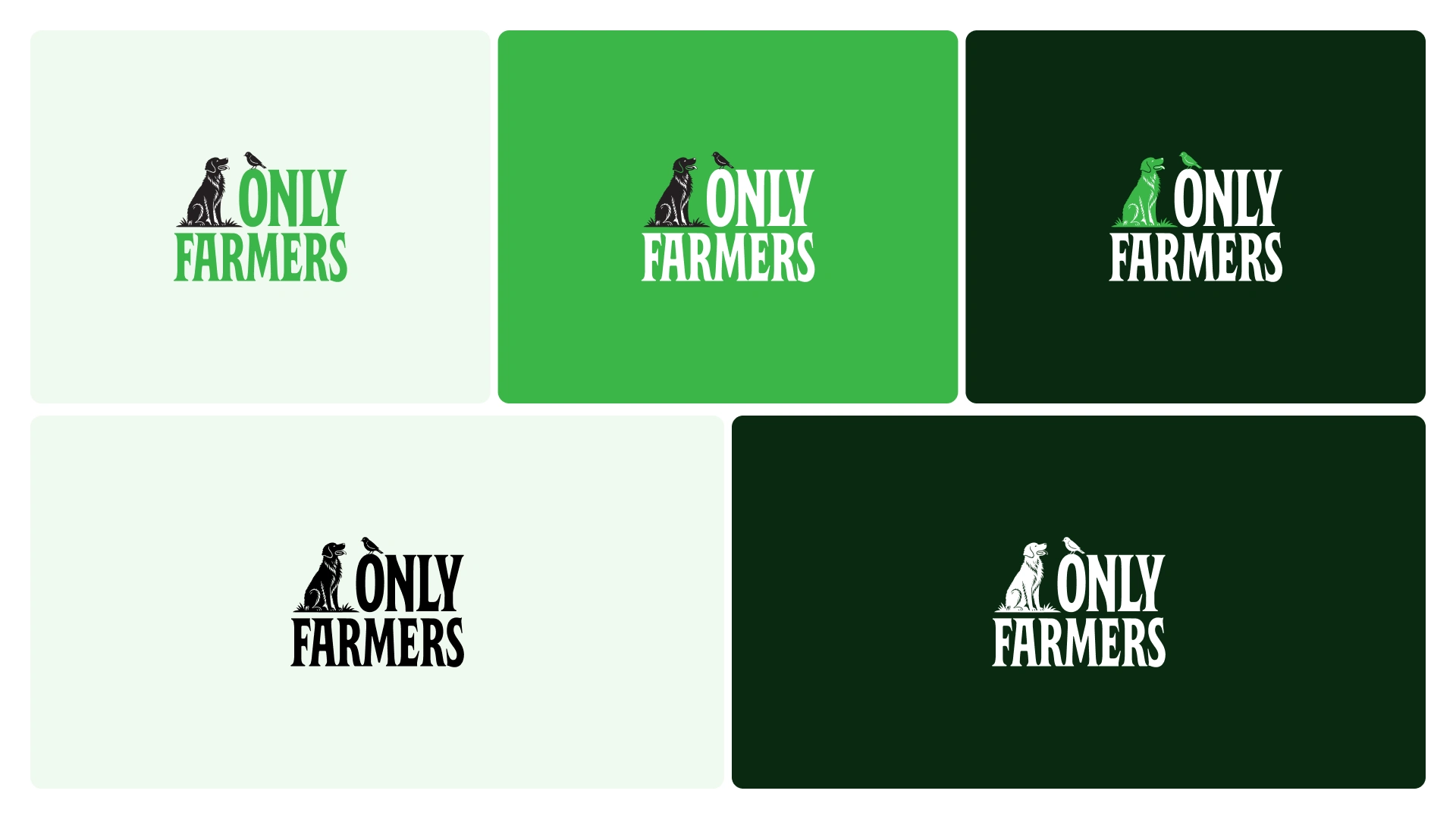
Three colourways and no more. Green on light, white on dark, solid black where printing is limited to one ink. Clear space is measured off the cap height of the F. Below the minimum size the submark replaces the lockup, so nothing gets shrunk into mud.
Colour system
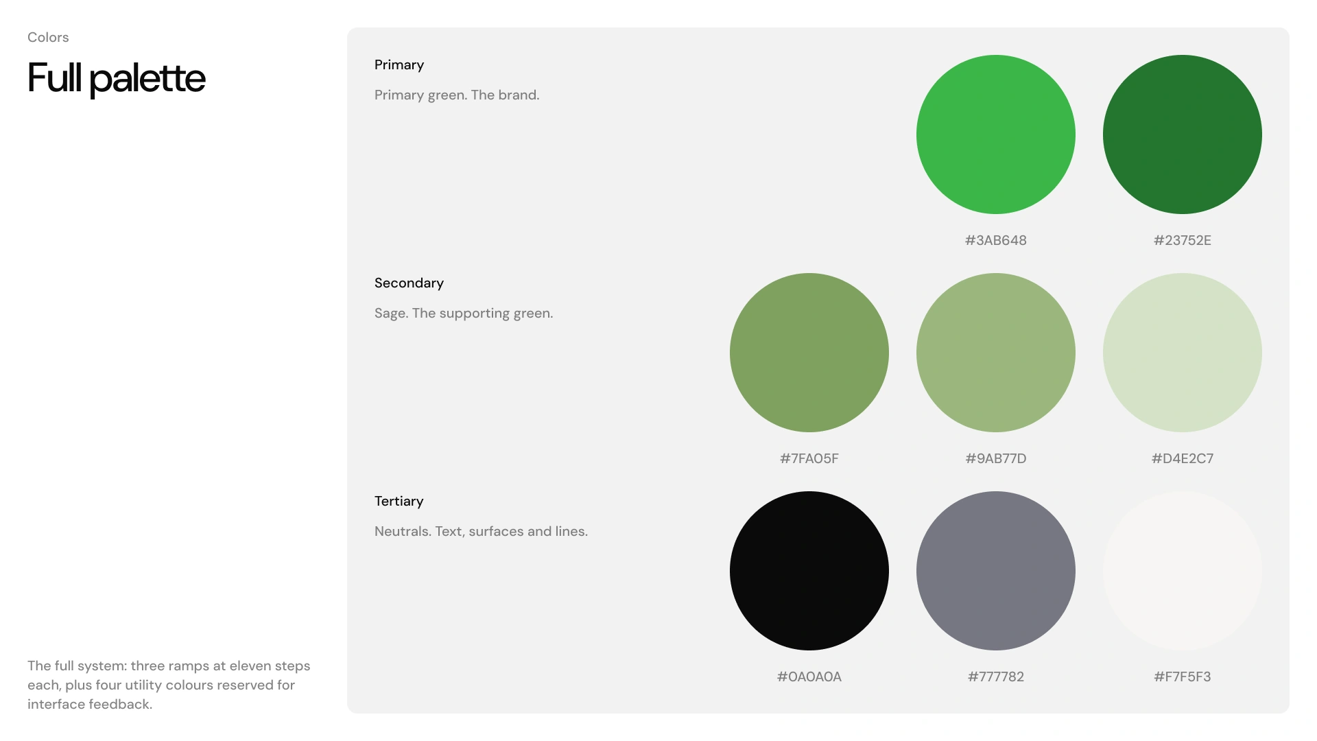
Kelly green leads. Sage is the quiet green for large areas and photography overlays, and the two never sit at equal weight. Three eleven-step ramps, plus four utility colours quarantined for interface states so they never leak into marketing.
The neutral ramp is drawn entirely from colours already living in the mark and on the site, so every grey in the system can be defended as coming from the brand rather than a stock palette. One exception got cut deliberately: a light grey that appears hundreds of times on the live site is Tailwind's default, not a decision anyone made.
Contrast pairings
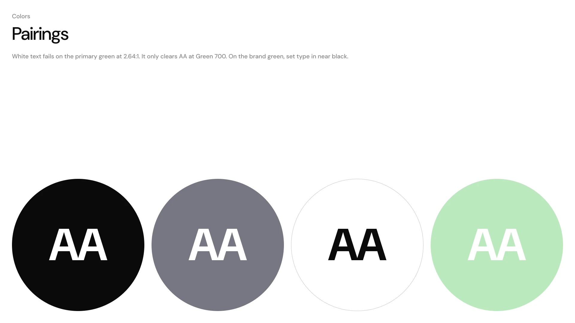
White type fails on the brand green at 2.64:1. It only clears AA at Green 700. On the primary, type is set in near black, which clears at 7.51:1. Most guidelines never write this down. When hundreds of people are going to set white text over a green box, writing it down is the entire job.
Type ramp
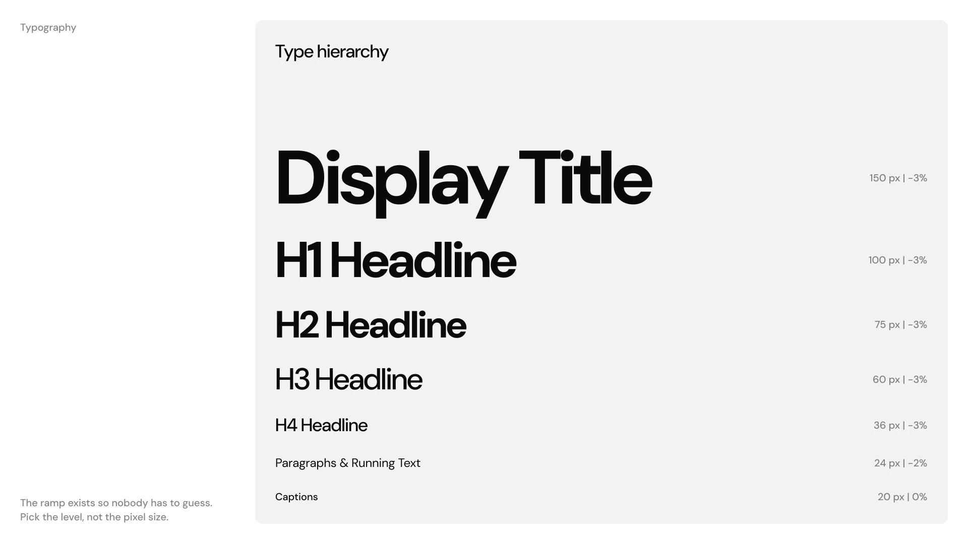
DM Sans. Medium for headings, Regular for body, nothing lighter than Regular at any size. Bold is the only weight above Medium and only at display sizes. A seven-step ramp so nobody has to guess a pixel value. Emphasis comes from weight, never from colour, underline or italics.
Graphic devices
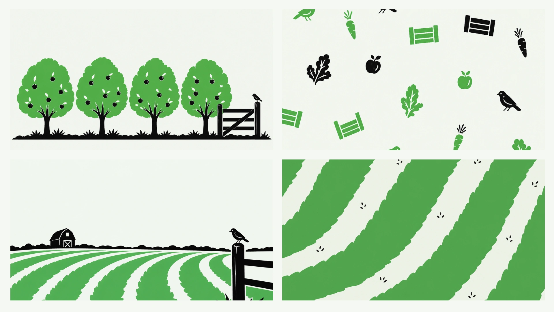
Flat two-colour field patterns, orchard rows, barn silhouettes and scattered produce marks. No gradients, no photography dependency, no detail that dies on a phone screen or a cheap print run.
Brand values
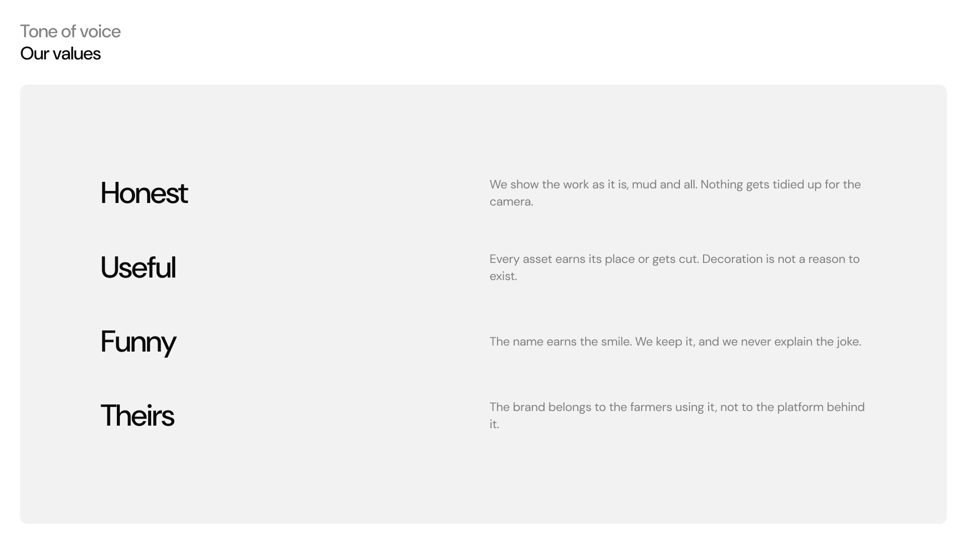
Four values written as filters rather than adjectives: Honest, Useful, Funny, Theirs. The last one carries the load. The brand belongs to the farmers using it, not to the platform behind it.
Underneath the document, the system is built in Figma as two variable collections, 56 primitives and 22 semantic role tokens, so it can be extended without anyone redefining a colour from scratch.
Applied
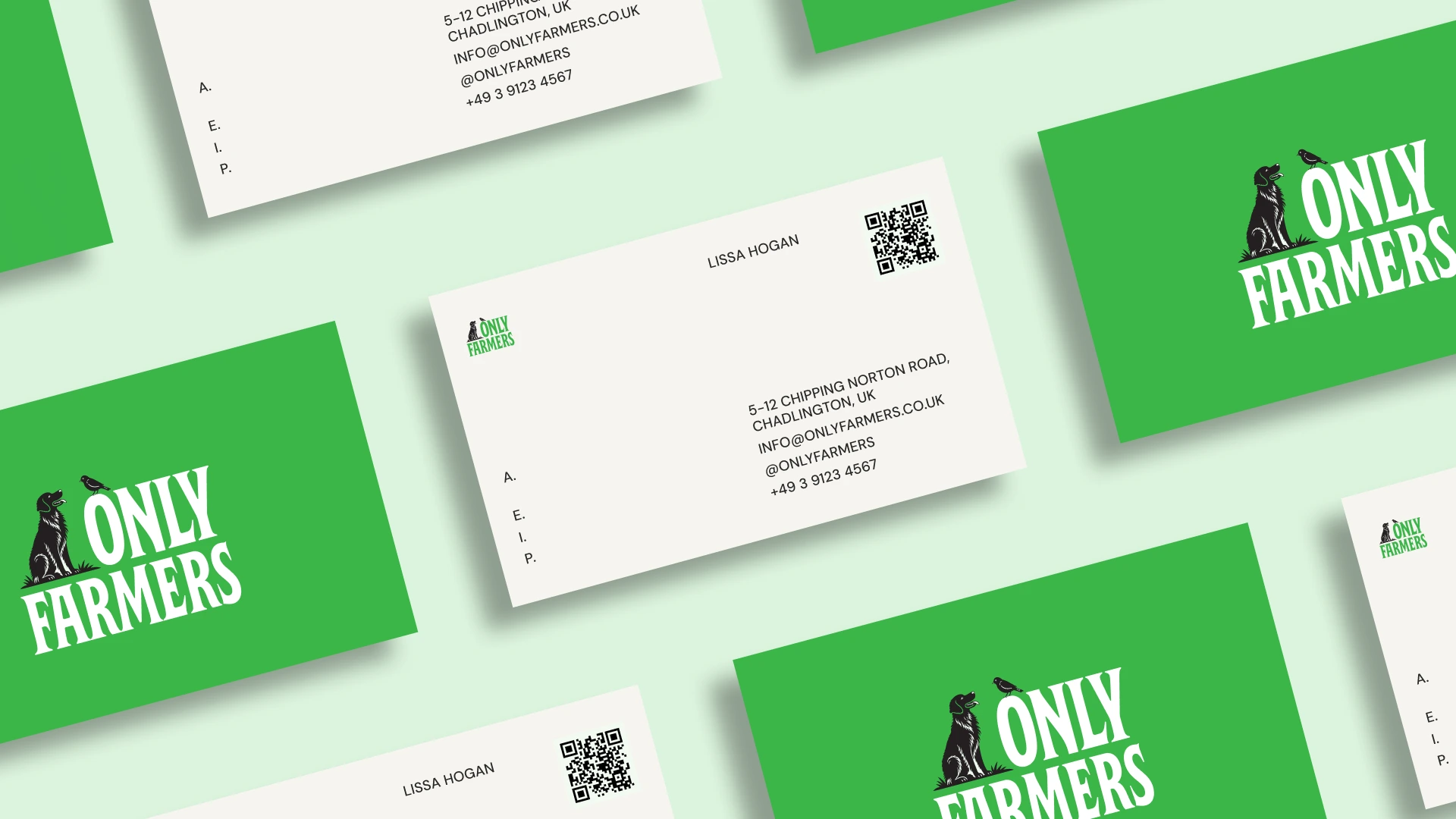
Stationery
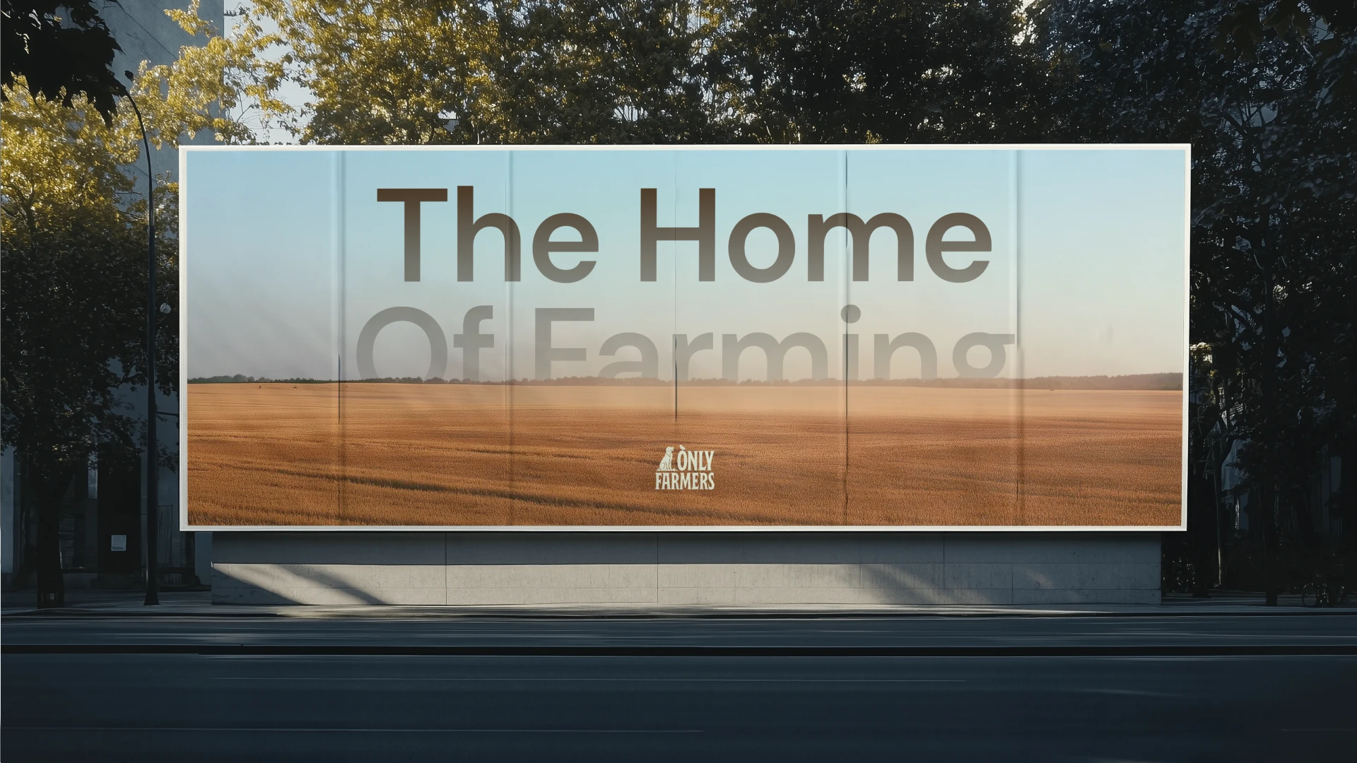
Out of home
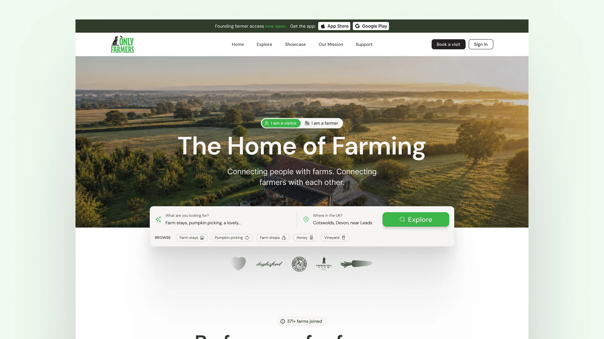
Website
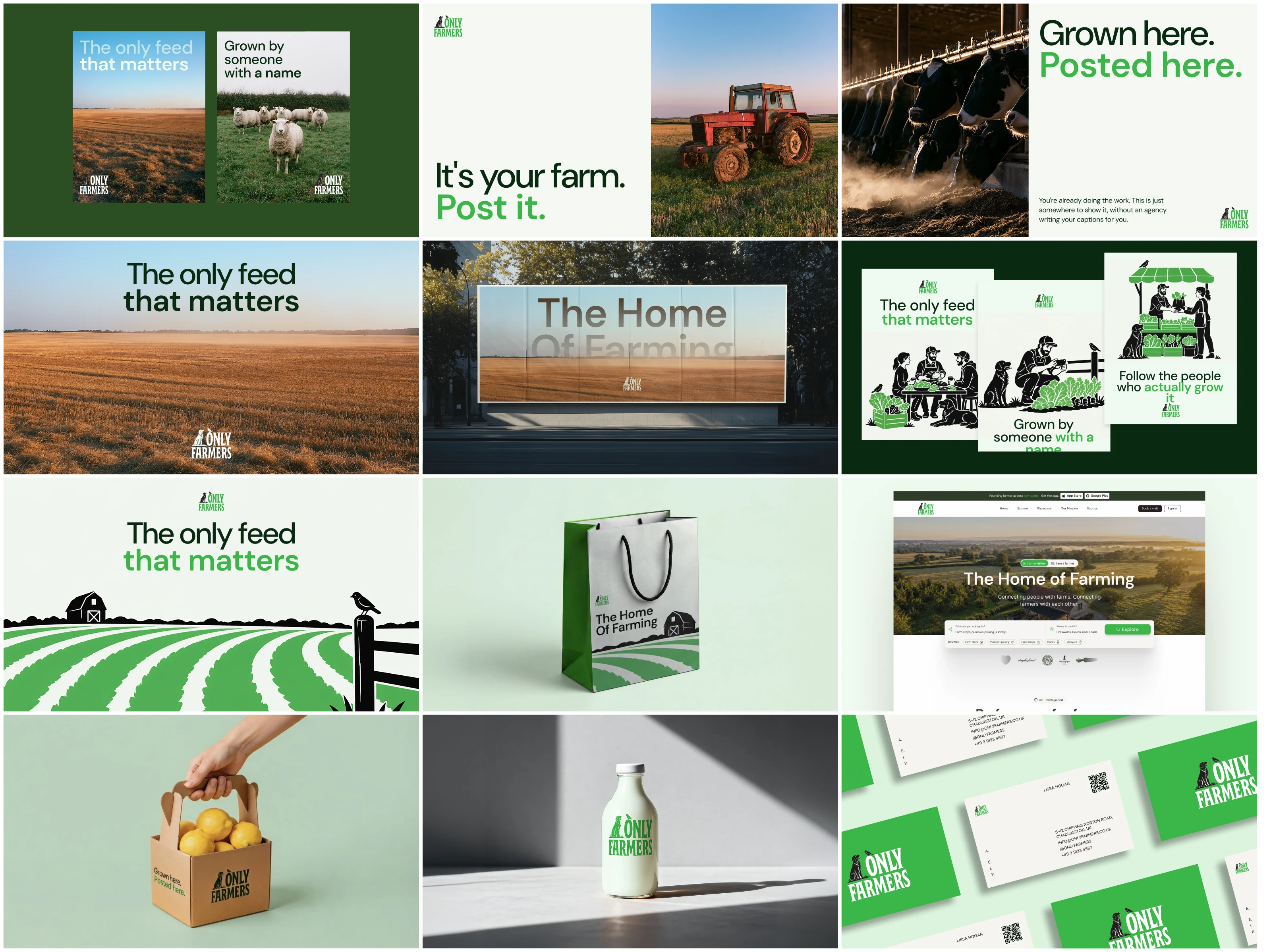
Business cards, letterhead, packaging, out-of-home, posters, photography direction, iconography, social profiles and a full website design. Every application is the same small set of rules doing its job again.
What changed
The drift now has a cause and a fix. Before, every surface was a judgment call made by whoever happened to be making it. Now the judgment is already made and written down where the person applying it can find it. Three logo options rather than an unknown number. One green that leads and one that supports. A contrast rule that kills the most common failure in the system before it can happen. A neutral ramp nobody has to invent.
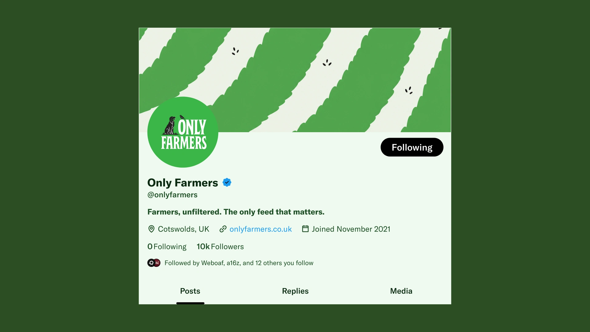
Social profile
The larger shift is the one the guidelines were built to force. Only Farmers stopped treating the brand as something to be protected and started treating it as something to hand out, which is what the farmer marketing kit is for: assets a farmer drops straight onto their own post, so the network shows up on posts the network did not make.
The takeaway
The real test of a brand system is not whether it survives a boardroom. It is whether the people applying it without you are proud to.
Like this project
Posted Aug 13, 2026
A UK farmer network had the audience and none of the system. Every surface drifted because the people applying the brand were never the ones who built it.
Likes
18
Views
347
Timeline
Aug 3, 2026 - Aug 5, 2026
Clients
Only Farmers