Label Redesign

Chantal Jemmott
Verified


Greatfill — Label Redesign
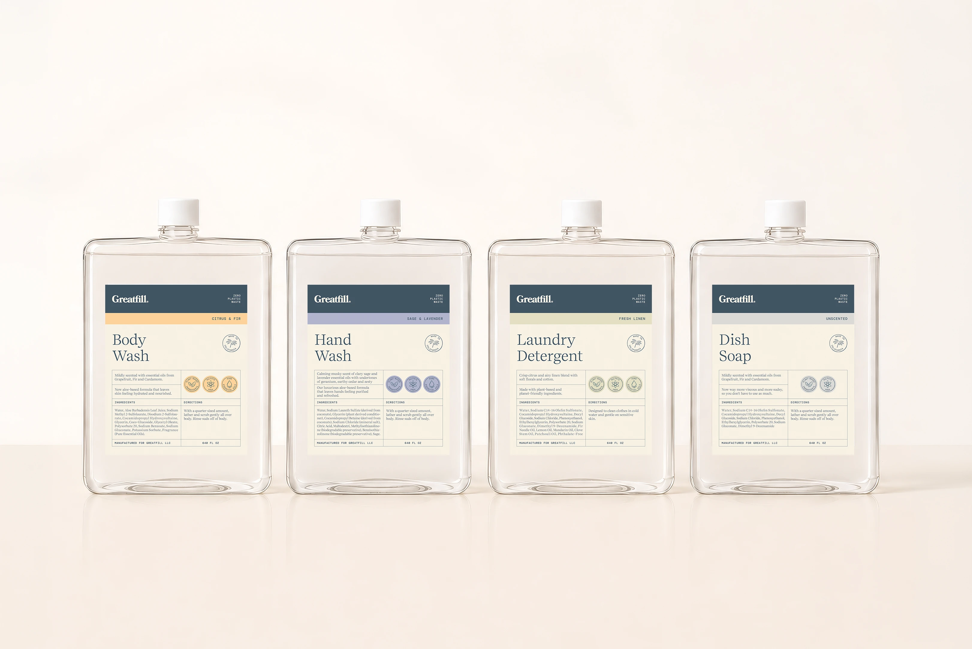
This brand wanted to elevate its existing bulk labels into a more premium, apothecary-inspired system while staying true to its sustainable, California-rooted identity.
The redesign refined the color palette with softer, natural tones and introduced a structured label system using clear hierarchy, sections, borders, seals, and icons to improve readability and product differentiation.
The final master label is production-ready and adaptable across containers, providing Greatfill with a flexible foundation for future products and scents.
Like this project
Posted Sep 1, 2026
Label Redesign. A scalable label system with scent-specific colors, custom iconography, and a clear structure that can be replicated across products.
Likes
0
Views
6
Clients
Greatfill