The network for creativity
Join 1.25M professional creatives like you
Connect with clients, get discovered, and run your business 100% commission-free
Creatives on Contra have earned over $150M and we are just getting started
Back to feedPost

I started this self-initiated project with a simple challenge: how do you make a rental-property brand feel connected to its world without reaching for the usual roofline or building icon?
I kept coming back to two ideas: access and space. A key represents the first; a floor plan represents the second. I brought them together in a compact symbol: a key whose head contains three rooms.
From there, I wanted the idea to do more than sit beside a wordmark. The rooms became a repeating pattern, the geometry informed the icon set, and the same shape guided a small logo animation. I also built out the wider identity across color, typography, product screens, social assets, and physical touchpoints, with guidelines to keep it consistent.
The part I found most interesting was making one idea work at different scales, from a tiny app icon to a broader visual system while keeping the result calm and clear.
Plotvera is a concept project, so the applications are illustrative rather than launch materials. I made it to explore how a focused brand idea can carry through an entire system.
I’d love to know: which detail makes the idea click for you. The key, the rooms, or the way the symbol carries into the system?


Amazing work!
The network for creativity
Join 1.25M professional creatives like you
Connect with clients, get discovered, and run your business 100% commission-free
Creatives on Contra have earned over $150M and we are just getting started











Related posts


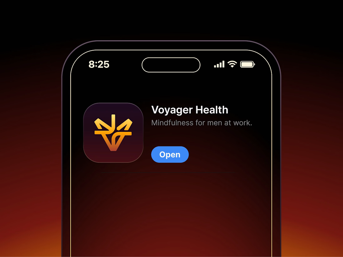

Aryna, that golden symbol pops so nicely against the plum background ✨

Second Serve Club — Exploring Visual Identity Through AI & Design.
For this branding challenge, I created a series of original logo marks in Adobe Illustrator, inspired by vintage tennis culture.
I then explored how these designs could come to life by combining my own typography, monograms and colour identity with AI-generated visuals using ChatGPT.
From the texture of a clay court to embroidered details on tennis balls, the goal was to bring the brand identity into a more tangible, realistic setting.
An exploration of how traditional graphic design and AI can work together to create a cohesive visual world.
Designed by me. Visualised with AI. 🎾
Full brand identity case study coming soon.
#BrandIdentity #VisualIdentity #GraphicDesign #AIDesign #ChatGPT
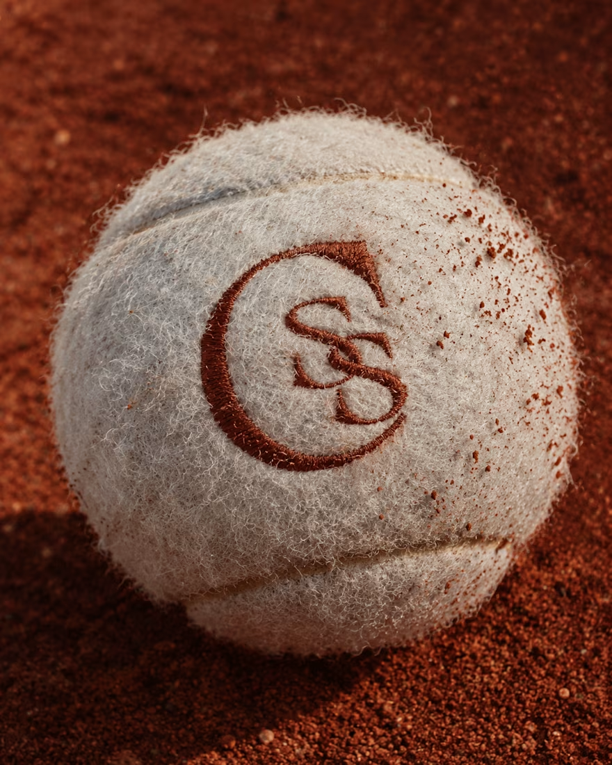
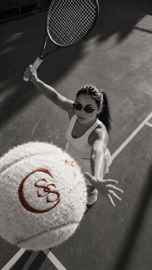
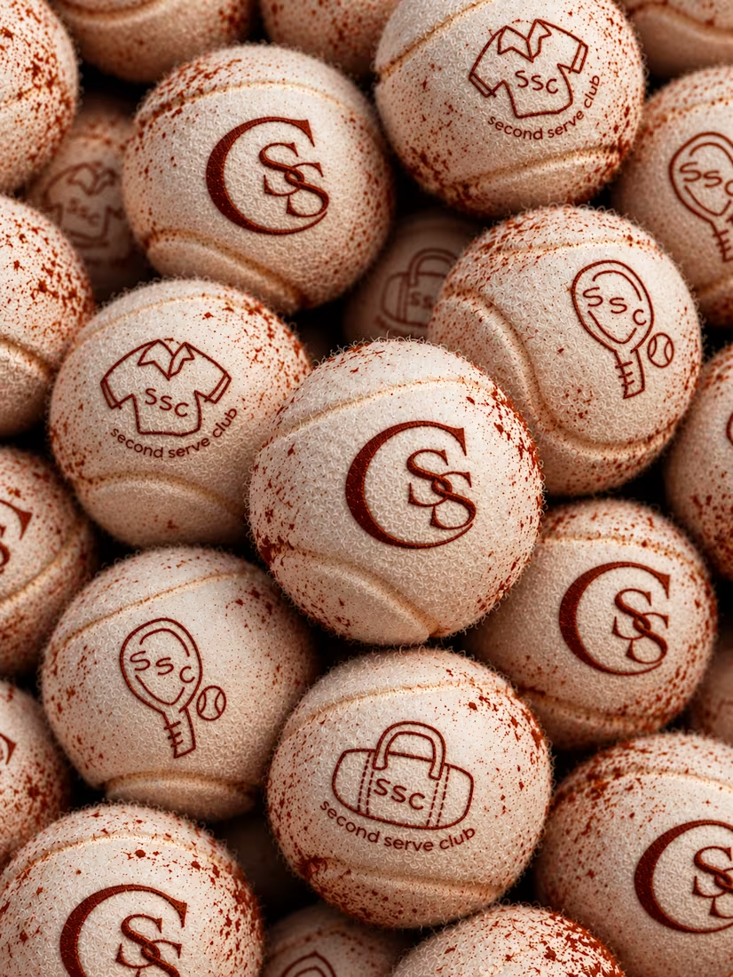

The SS mark stamped into the tennis ball felt is a great detail. Looks very real on the clay court.

Made these 2 concepts for a furniture shop, Rumah Home, a boutique store specialising in Indonesian-inspired furniture and homewares. “Rumah” means “house” in Indonesian, so the idea was to make the name itself feel like home.
Concept 1: An arched doorway frames an interlocked R and H, with sharp geometric details softened by a rounded shape. The olive and terracotta tones nod to Indonesian timber, clay and handcrafted pieces.
Concept 2: The letters turn into furniture: a bedside table, a seat and a lamp. Fine linework keeps it modern, and the handwritten “home” adds warmth.

Beautiful concept! The arched doorway idea is so clever - it instantly makes the word "Rumah" feel like a home. Concept 1 feels more premium and clean to me, the arch with the monogram is very memorable. Great storytelling behind the logo.