The network for creativity
Join 1.25M professional creatives like you
Connect with clients, get discovered, and run your business 100% commission-free
Creatives on Contra have earned over $150M and we are just getting started
Back to feedPost
AURÉLIA - Luxury Beauty Brand Identity & Packaging I designed a complete luxury beauty brand concept for AURÉLIA. What I created: - Gold Crown Logo - Luxury Packaging for Face Cream, Serum & Perfume - Beige & Gold Brand Color Palette - Elegant Product Photography Style My goal was to make the brand feel Royal, Soft & Premium. If you want a luxury brand like this for your beauty business, let's work together!


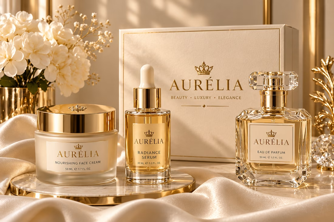

The crown mark against the beige and gold palette reads as soft, quiet luxury rather than loud. Did you check how it holds at the small perfume label size, where fine crown detail can fill in?

Thank you so much! That means a lot. ✨Yes, quiet luxury was exactly what I was going for with AURÉLIA - soft, royal, not loud. Great point about the small label size. I will test a simplified version of the crown for the small perfume label, so the details stay clean and readable. Thanks again for the helpful feedback!

Beige and gold can go flat so easily, the soft fabric folds really save it here. If a brand like this goes to retailers, a one-page line sheet in the same style would be the perfect next piece.
Thank you so much! ✨ I really wanted the beige & gold to feel soft, not flat, so the fabric texture helped a lot. And yes, a one-page line sheet in the same style is a great idea - I'll add that next! Thank you for the suggestion 💛
The network for creativity
Join 1.25M professional creatives like you
Connect with clients, get discovered, and run your business 100% commission-free
Creatives on Contra have earned over $150M and we are just getting started



Related posts

Rebuilt my portfolio with AI and added new case studies.
Brand, web, and product UI. All custom coded, all in one page.

One page with brand, web and product UI together is a strong move. Clients see the range without clicking around. Rebuilding mine with AI coding tools taught me the same thing: the speed lets you spend the saved time on the case study writing, which is what actually wins work.

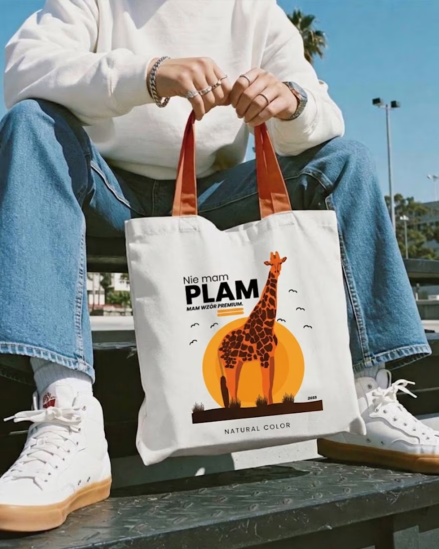
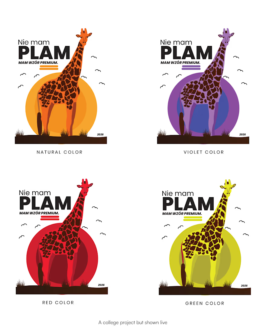
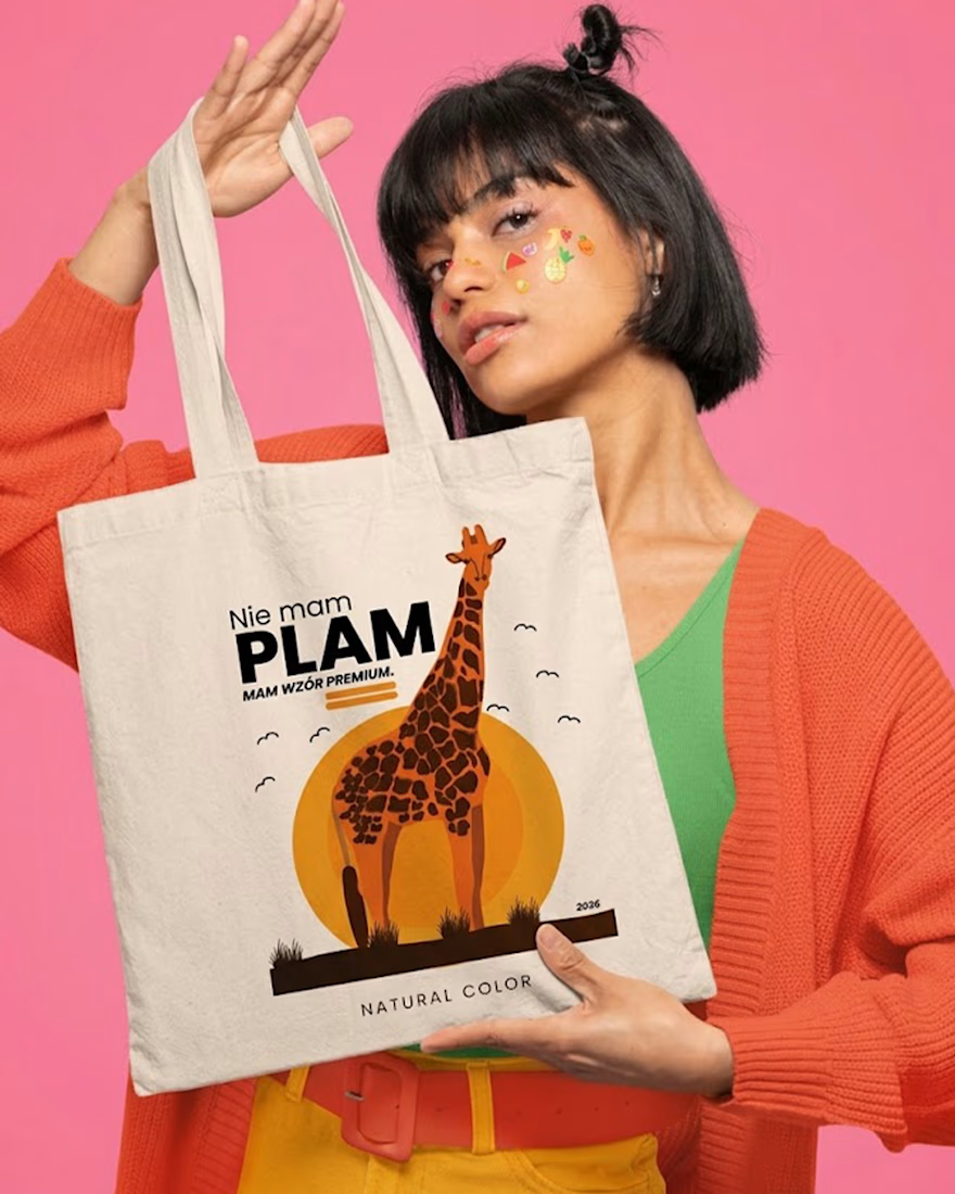
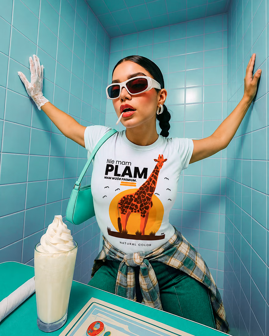
Not spots. Premium pattern 🦒
Started as a doodle in a lecture, ended up on tees and totes. One giraffe, one rising sun, and one line: “Nie mam plam. Mam wzór premium.” (“I don’t have spots. I have a premium pattern.”)
Four colorways, flat warm illustration, and a joke that works on any animal: zebra, leopard, dalmatian, cow are next. 🧡
Sometimes the best idea is the one you draw when you’re supposed to be taking notes.



Branding & Visual Identity for AirCon West based in London.
Designers! Present your work with motion! It breathes life into your work and conveys your ideas in a dynamic way.
Use free online motion tools to do it.
My favorites:
https://animos.app/
https://arqe.ai/
https://orelin.app/editor
https://openvid.dev/en
(Or animate it yourself, like I did here using EffectCraft!)


Nice work!!