The network for creativity
Join 1.25M professional creatives like you
Connect with clients, get discovered, and run your business 100% commission-free
Creatives on Contra have earned over $150M and we are just getting started
Back to feedPost

Rebuilt my portfolio with AI and added new case studies.
Brand, web, and product UI. All custom coded, all in one page.


Nice!

One page with brand, web and product UI together is a strong move. Clients see the range without clicking around. Rebuilding mine with AI coding tools taught me the same thing: the speed lets you spend the saved time on the case study writing, which is what actually wins work.

This is very nice 👌

Putting brand, web and product UI on one custom coded page makes it really easy to see your range in a single scroll. Nice refresh with the new case studies.
The network for creativity
Join 1.25M professional creatives like you
Connect with clients, get discovered, and run your business 100% commission-free
Creatives on Contra have earned over $150M and we are just getting started
Related posts


Rug Pad Wizard: a Figma design for a premium rug pad brand.
One site for two buyers, trade dealers and homeowners.

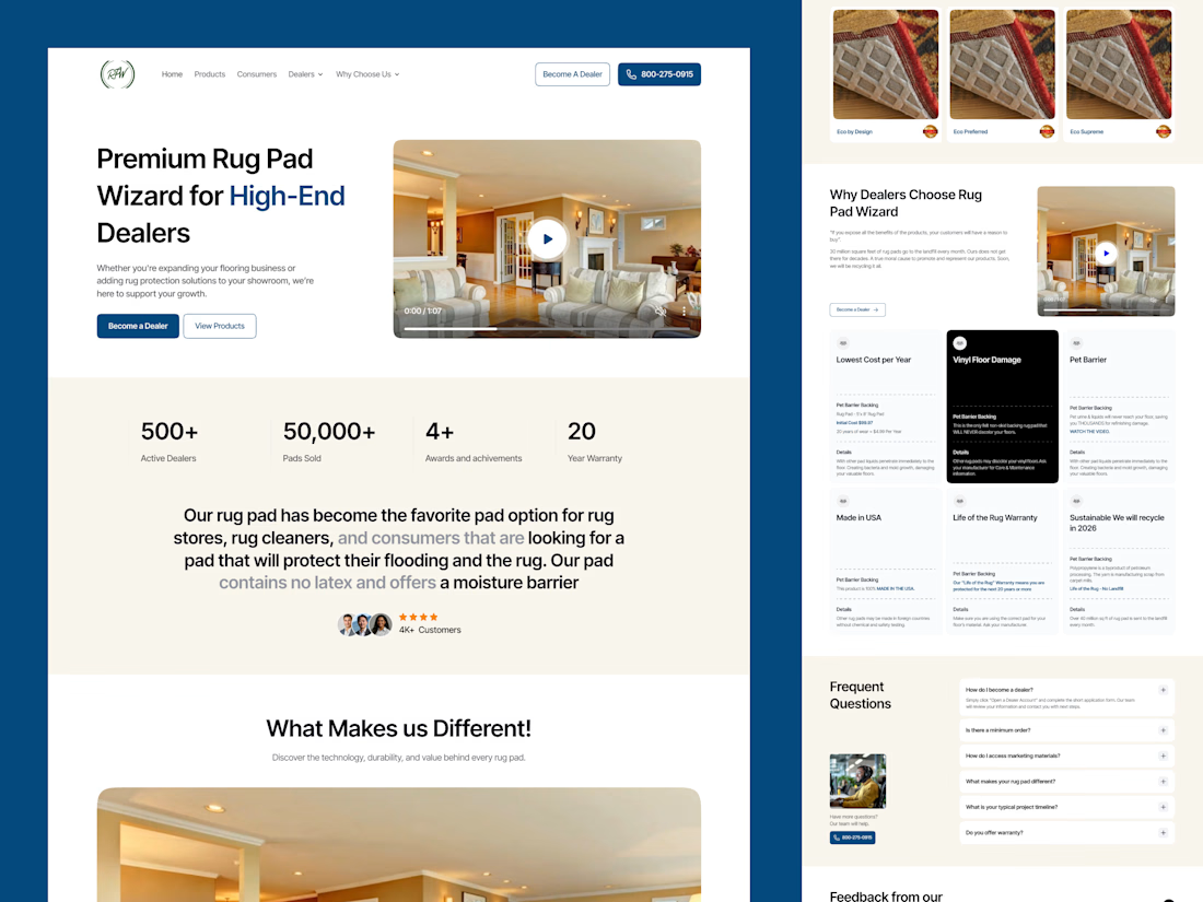

Smart to split dealers and homeowners on one site. The stats row under the hero is clean.

AI Freight landing page design completed for 5U AI.
They raised $3.2M recently.
I'm open for the new projects. 🤝

this is amazing website. smooth animation love the visual

13:40: a finished Figma frame. 15:48: this, live on Vercel
Claude wrote every line of the code. I spent those two hours on the part clients actually pay for: looking at each version and saying what's off
17 commits, each one deployed. My notes went in as screenshots with red circles:
→ make the button edges look like ticket cutouts
→ replay the story chips every time you scroll past them
→ spacing 156, then 92, then back to 156
What made it fast was one Figma frame called "Ready for Dev". Every size, color and gap came from there, so nobody had to guess what the mockup meant
For a founder this means a real link on day one, and a fix you ask for at lunch is live by the afternoon


