
amr ahmed
Brand Identity & Packaging Designer
New to Contra
amr is ready for their next project!

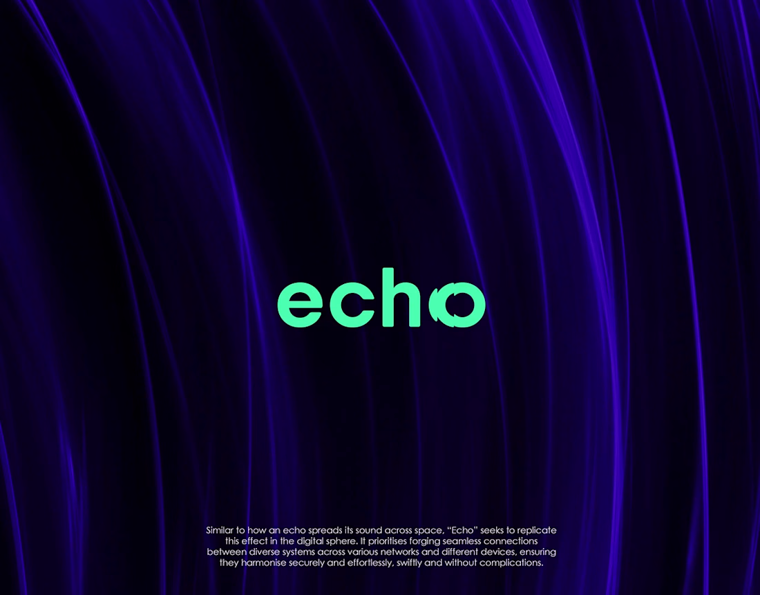
visual identity for the Echo smart payment system
0
2
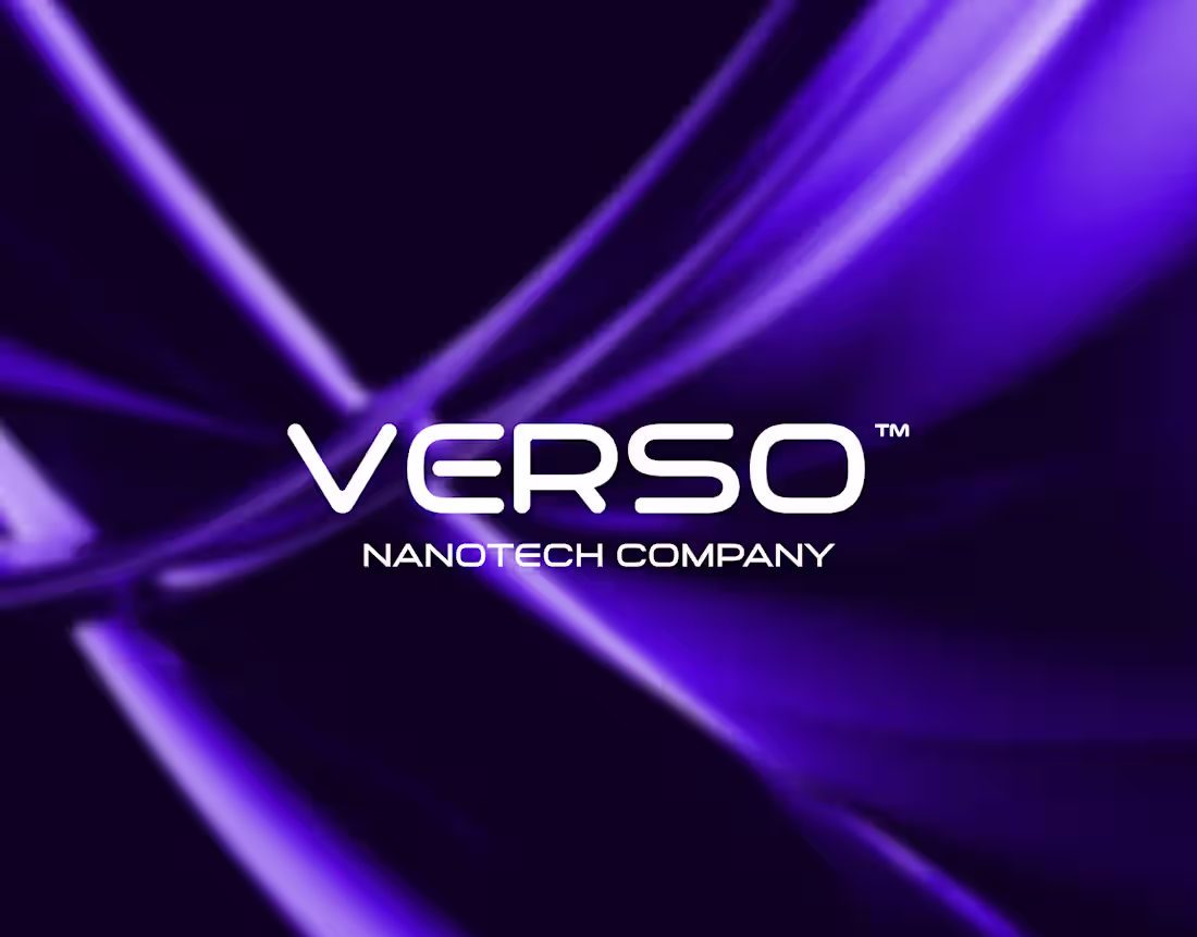
Updated Verso nanotehc logo and visual identity
0
1

Tutsvoi - marketing agency
0
1
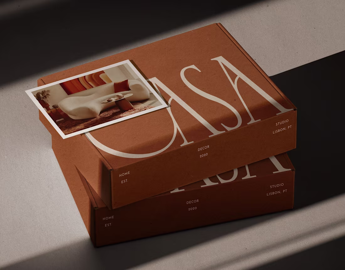
CASA | Brand Identity
0
1
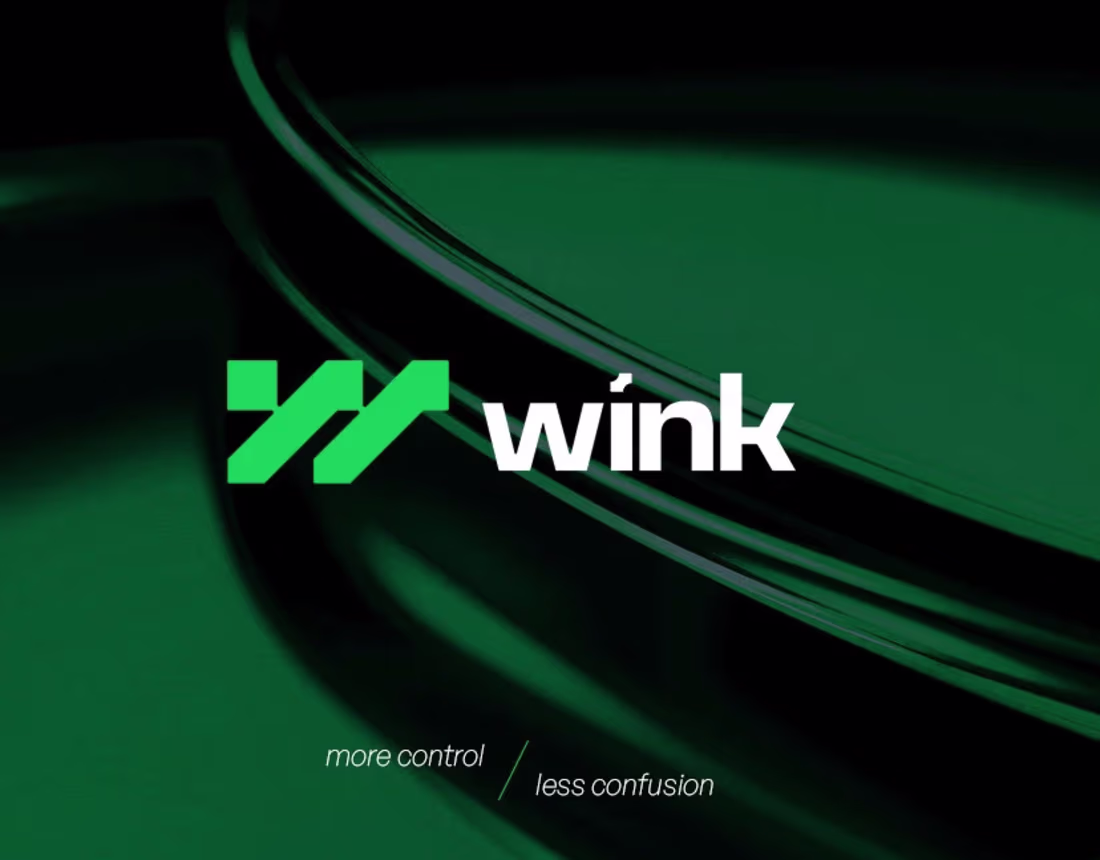
Wink • Brand Visual Identity
0
4
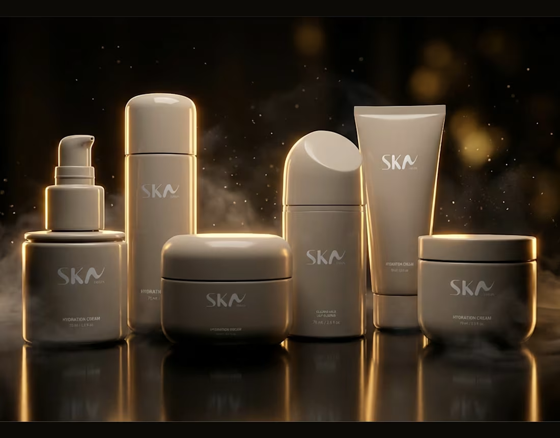
SKN Origin Skincare Branding, Packaging
0
1
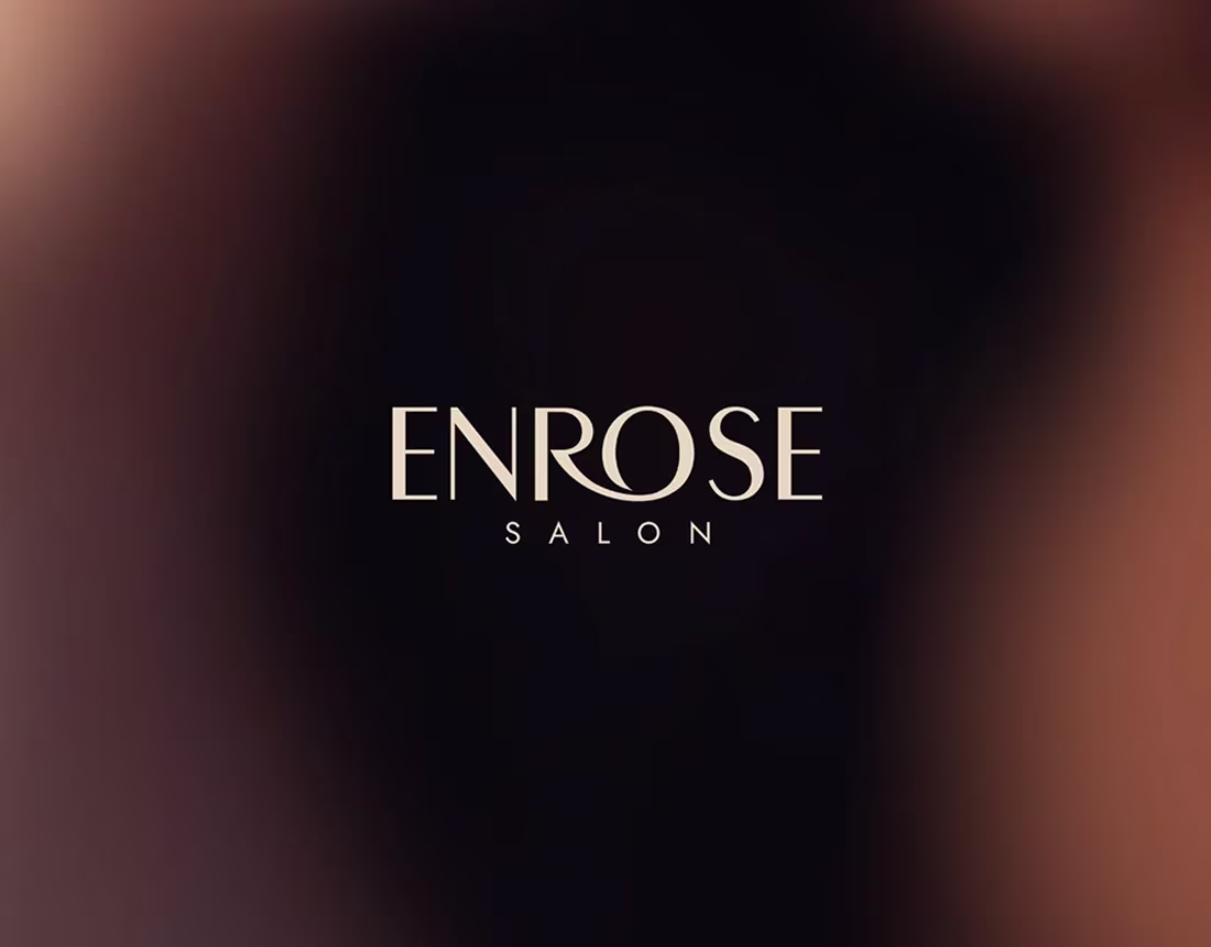
Luxury Salon | Brand & Visual Identity
0
2

Radar identity development
0
2

Nexara|Brand Guideline
0
3
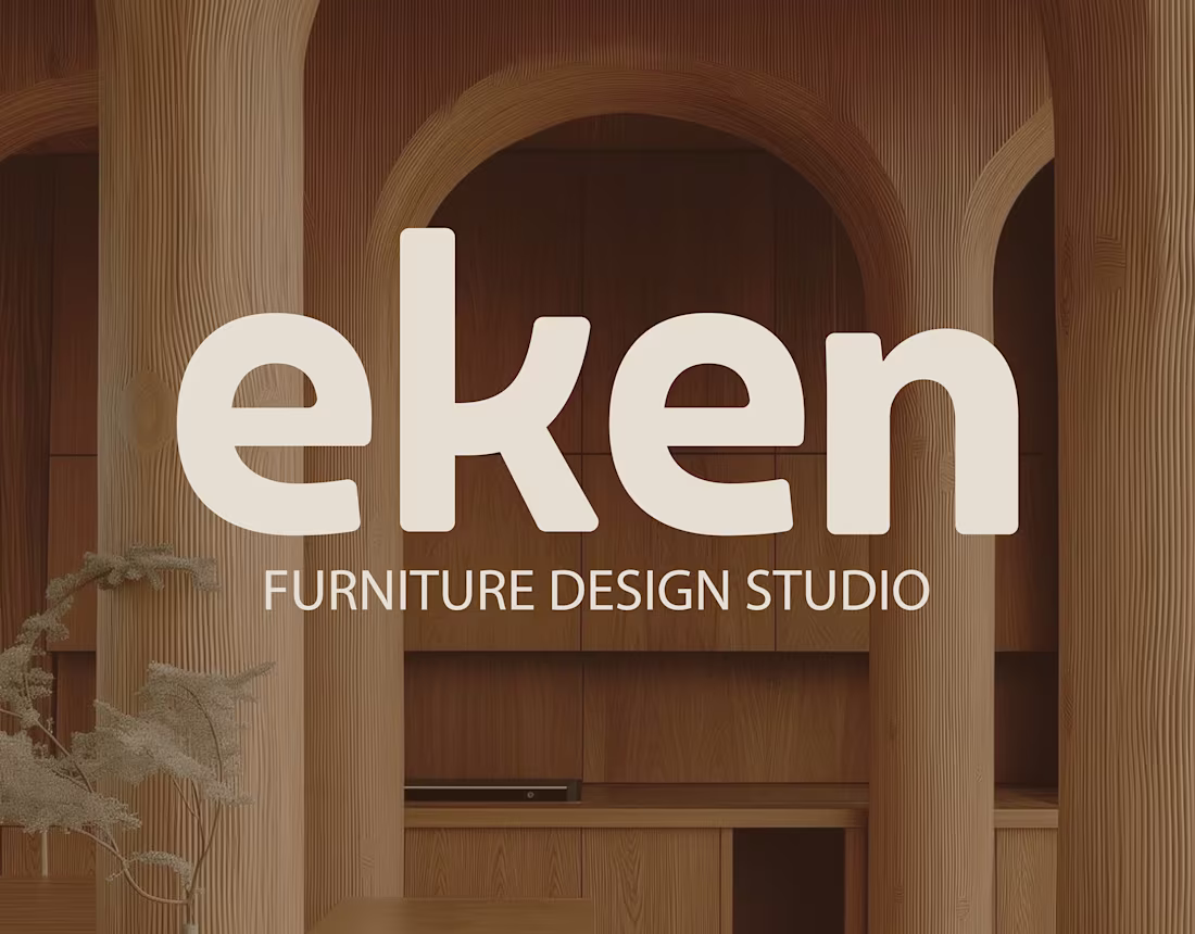
Branding and lookbook design furniture
0
3
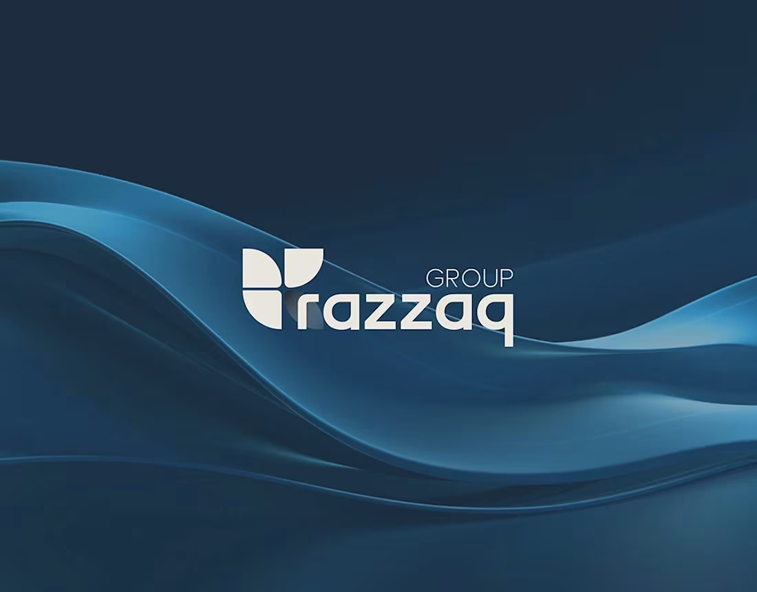
RAZZAQ BRAND IDENTITY
0
1
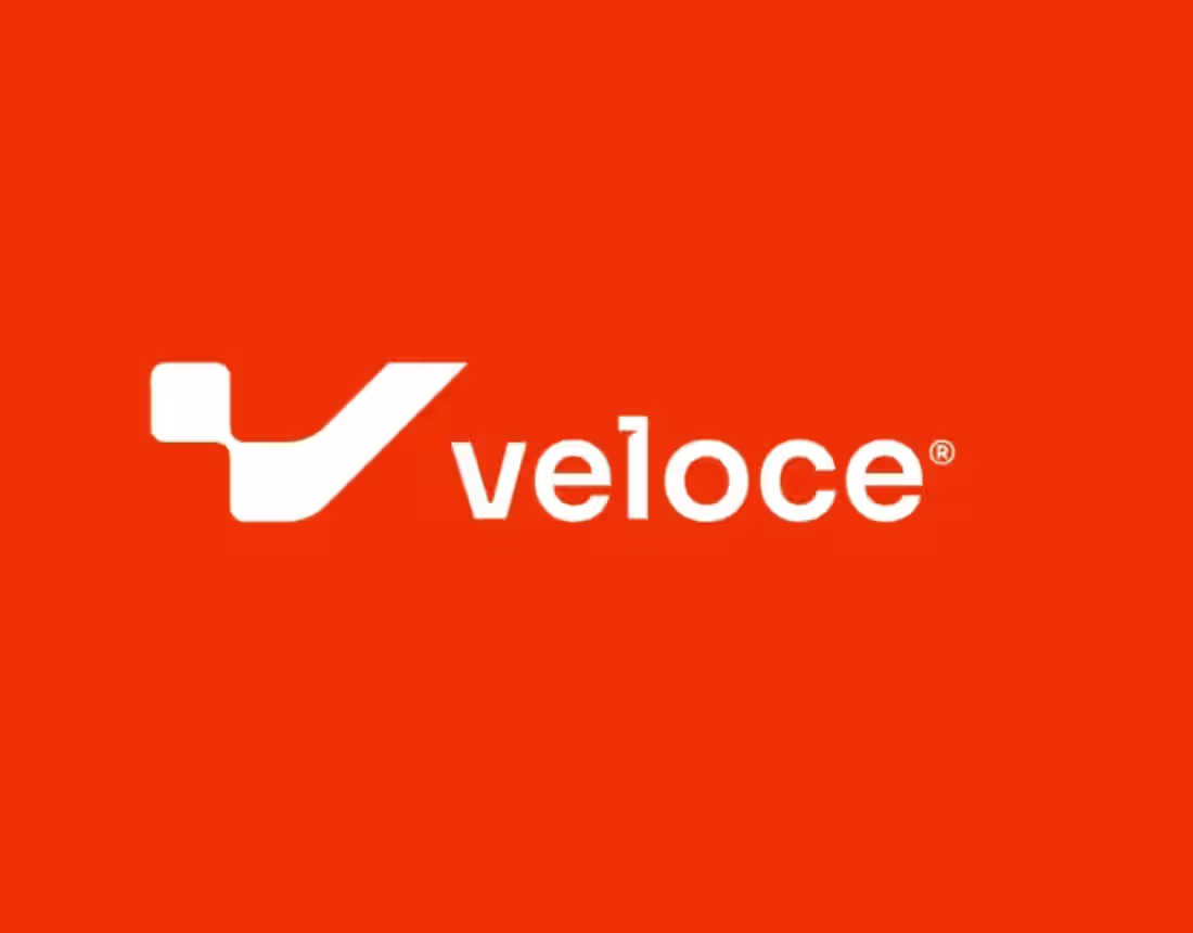
veloce | branding
0
1
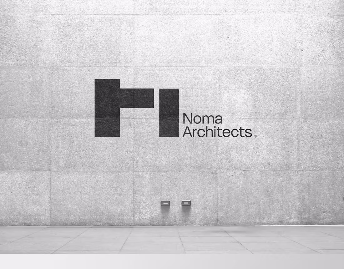
Noma-Architects | BRANDING
0
0
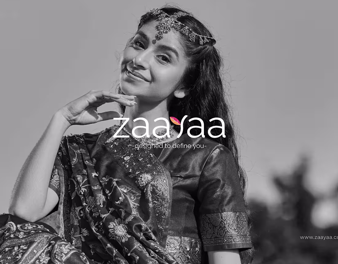
Zaayaa Fashion | Branding & Visual Identity
0
1
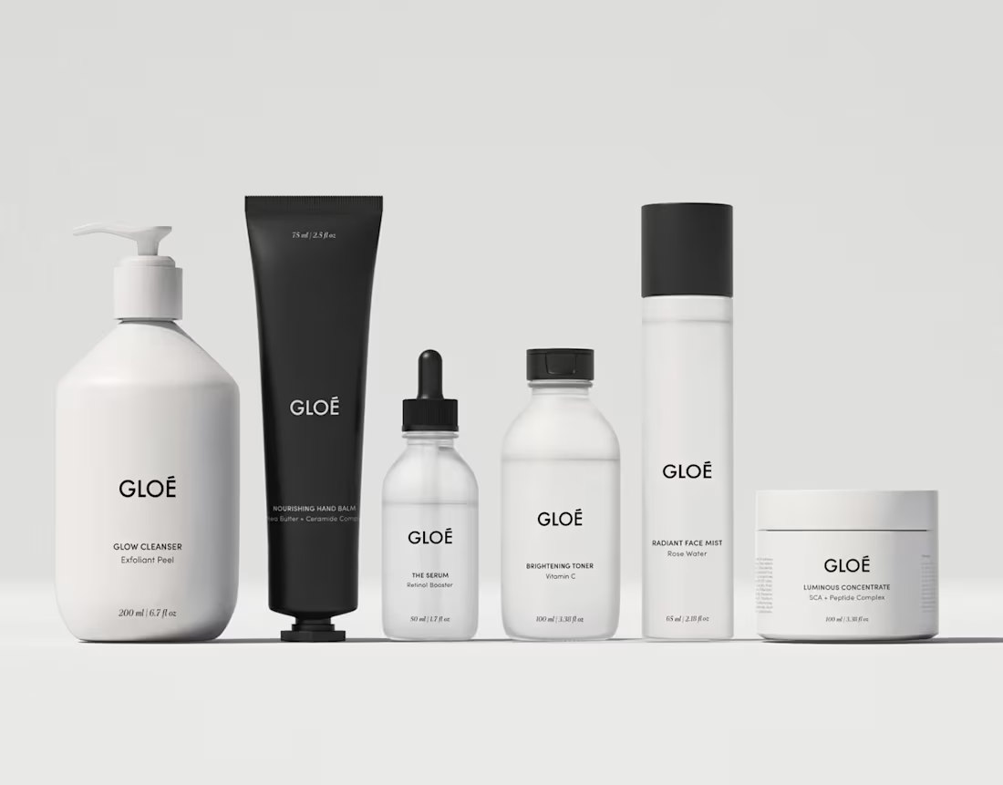
GLOE | Cosmetic
0
1

MUG HUG | COFFE
0
1
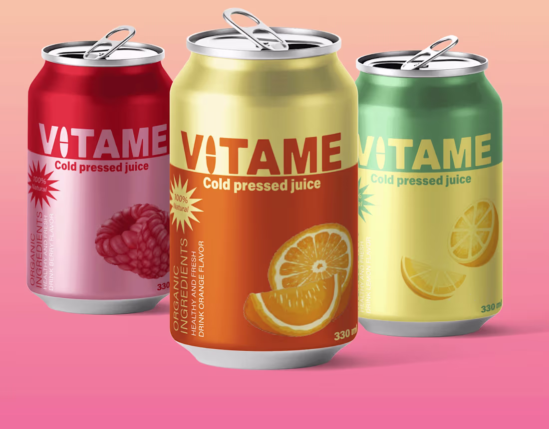
Vitame drink branding
0
1
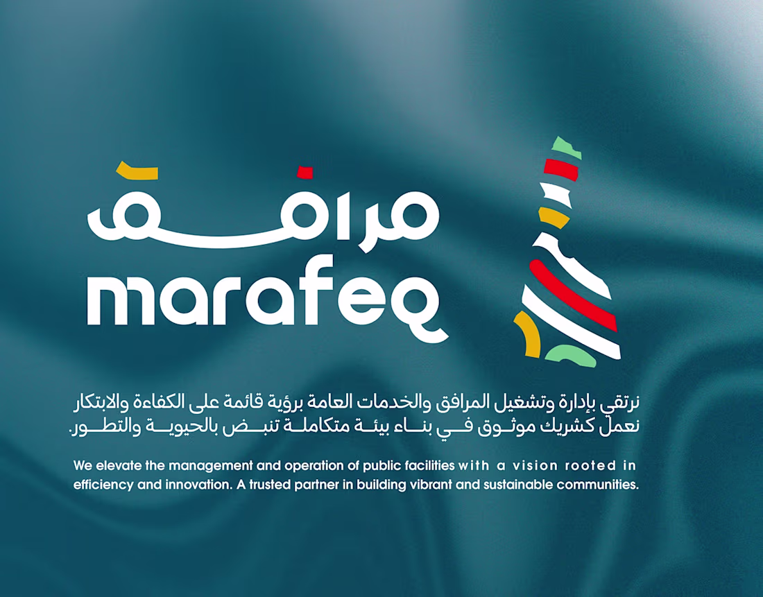
marafeq | Visual identity
0
0

DRAXON Construction — Visual Identity
0
0
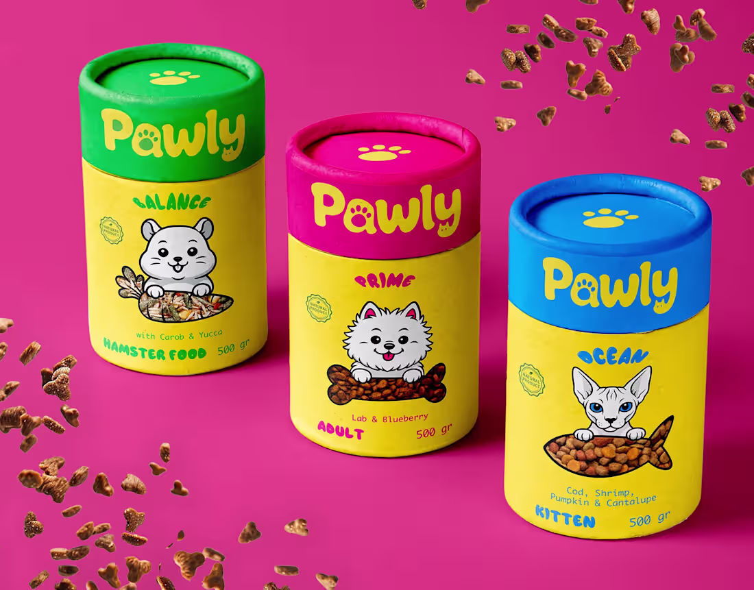
Pawly | Pets food
0
3