Branding and lookbook design furniture
amr ahmed
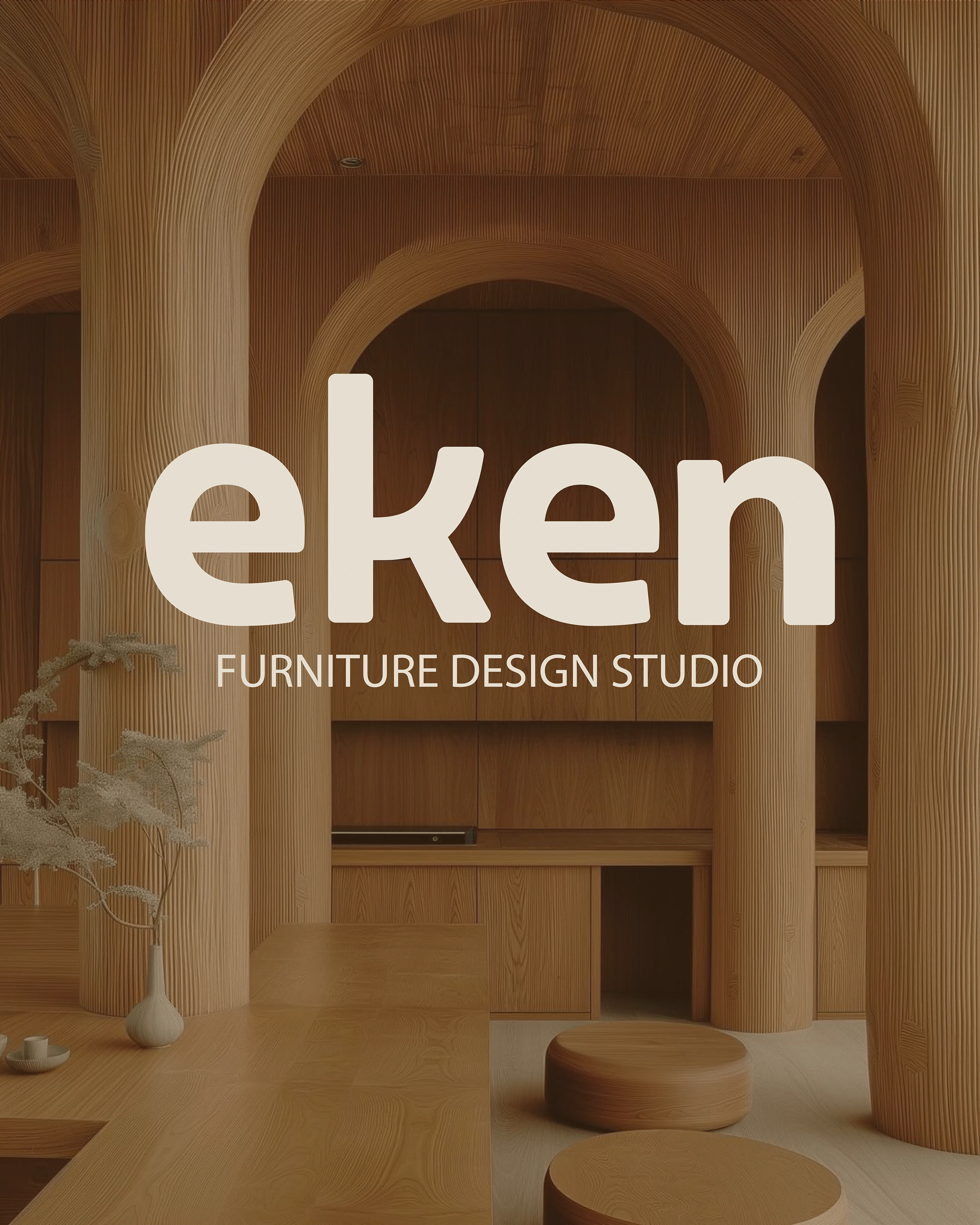
eken
Visual identity and logo
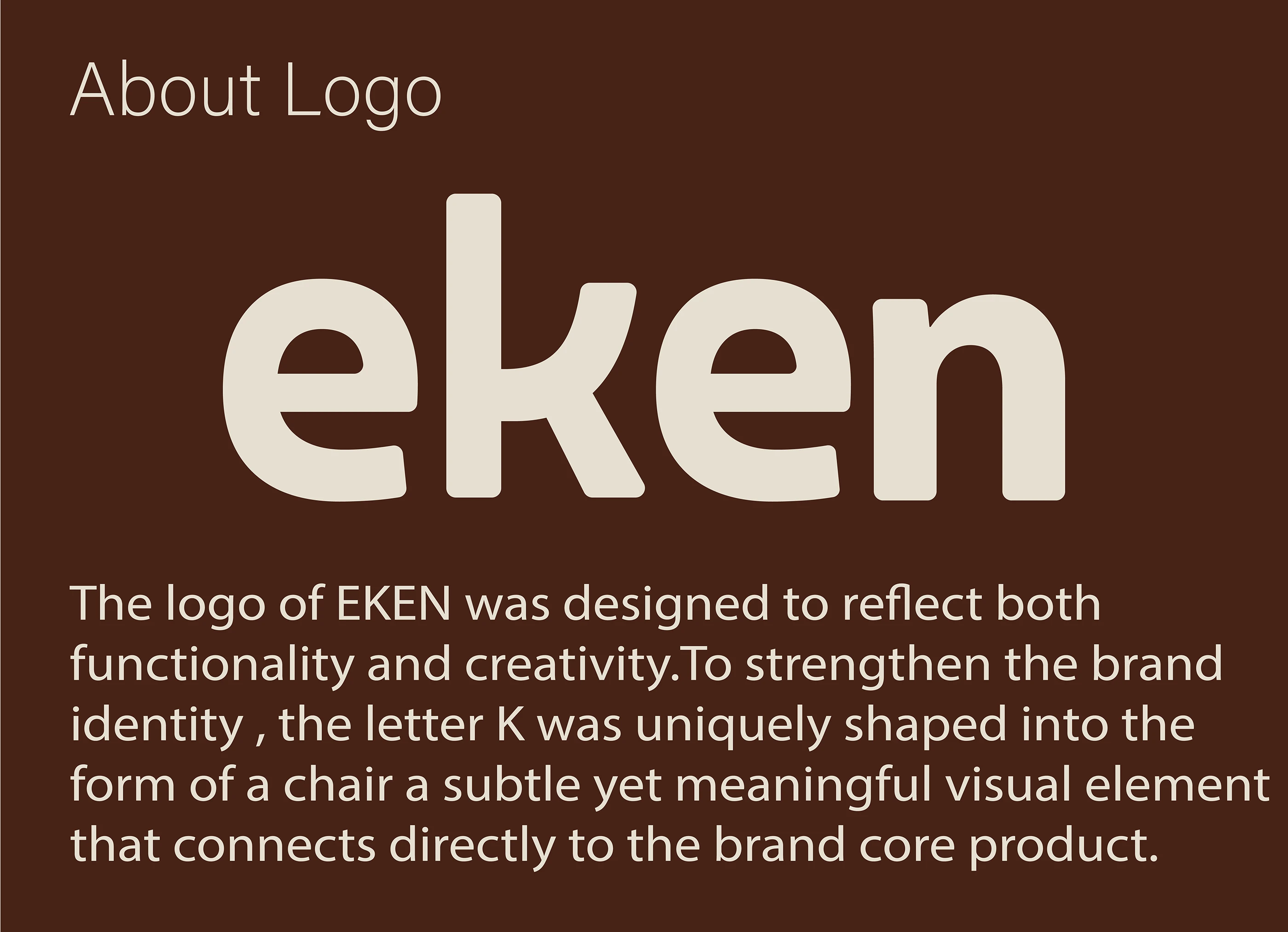
The logo is the centerpiece of the brand's visual identity and is cleverly designed to reflect its philosophy:
Logo: The “eken” logo features a clean design with rounded, friendly lettering. The most distinctive element is the letter ‘k’, which is uniquely shaped to resemble a simple chair. This visual integration not only directly links the logo to the brand's main product, but also adds a touch of creativity and functionality.
Colors: The brand uses a warm, nature-inspired color palette. A rich brown, inspired by oak wood, is used as a background or base color, while soft beige and white tones are used for the brand's logo or text, creating a contrast that is easy on the eye and reinforcing a sense of warmth and simplicity.
Key messages and communication
EKEN uses clear and direct slogans and messages to communicate its values to the public:
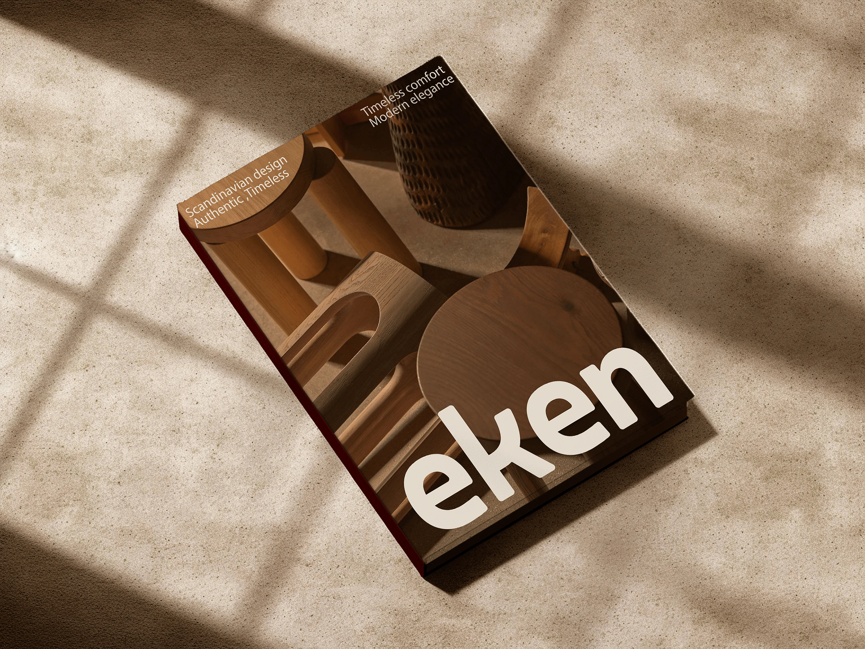
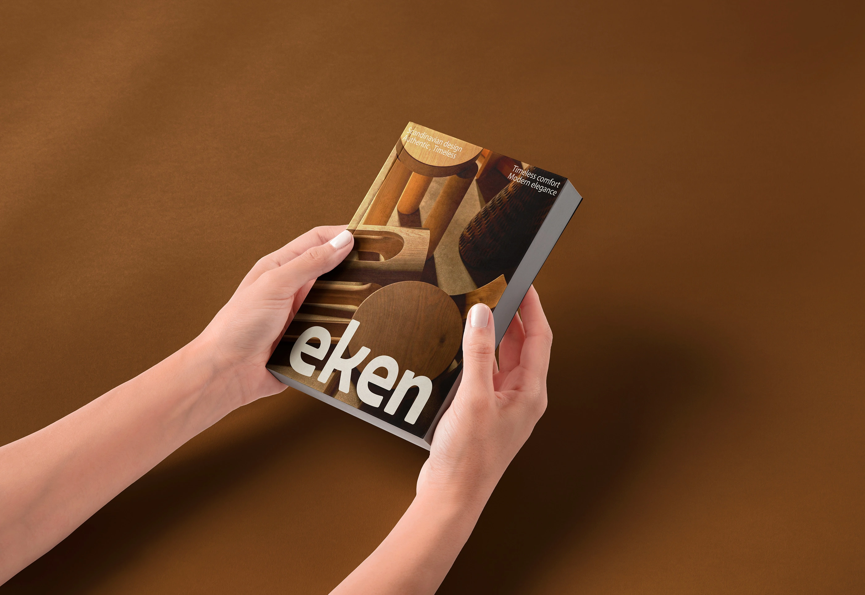
“Timeless comfort Modern elegance”: This slogan emphasizes the balance between classic comfort and contemporary elegance.
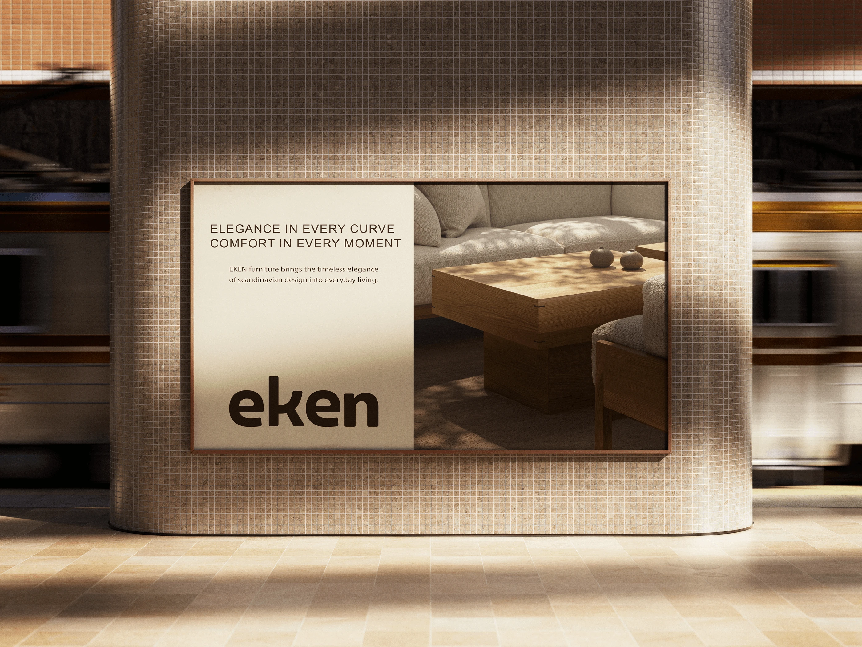
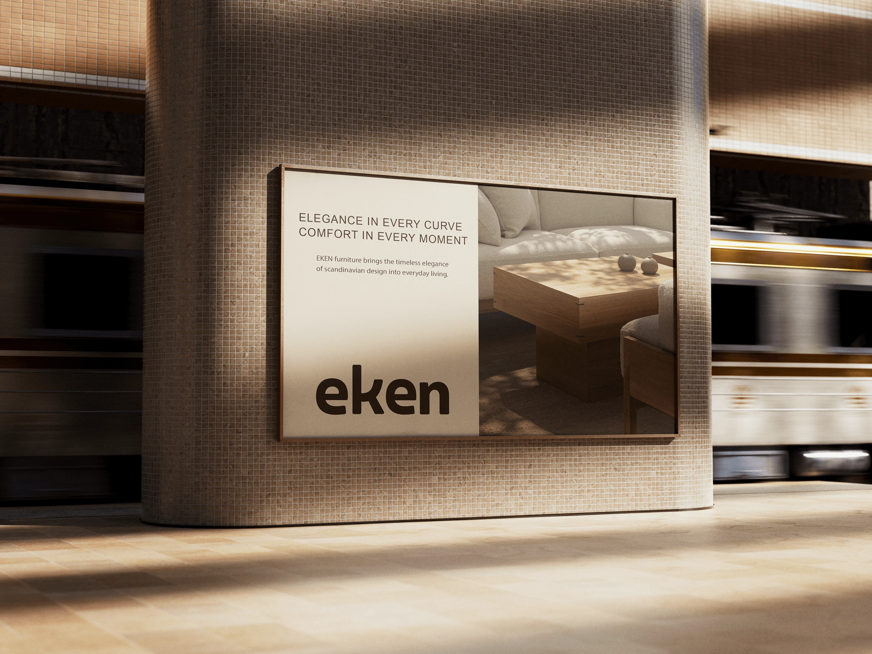
“Elegance in every curve, comfort in every moment”: This slogan links elegance to the fine details in the design of each piece, while emphasizing that the ultimate goal is to provide lasting comfort.
“Scandinavian design Authentic, Timeless”: This phrase serves as a concise definition of the brand's identity, identifying its source of inspiration and emphasizing its authenticity and timeless nature.
Identity Applications
The strength of EKEN's identity lies in its consistency across all applications, whether digital or print:
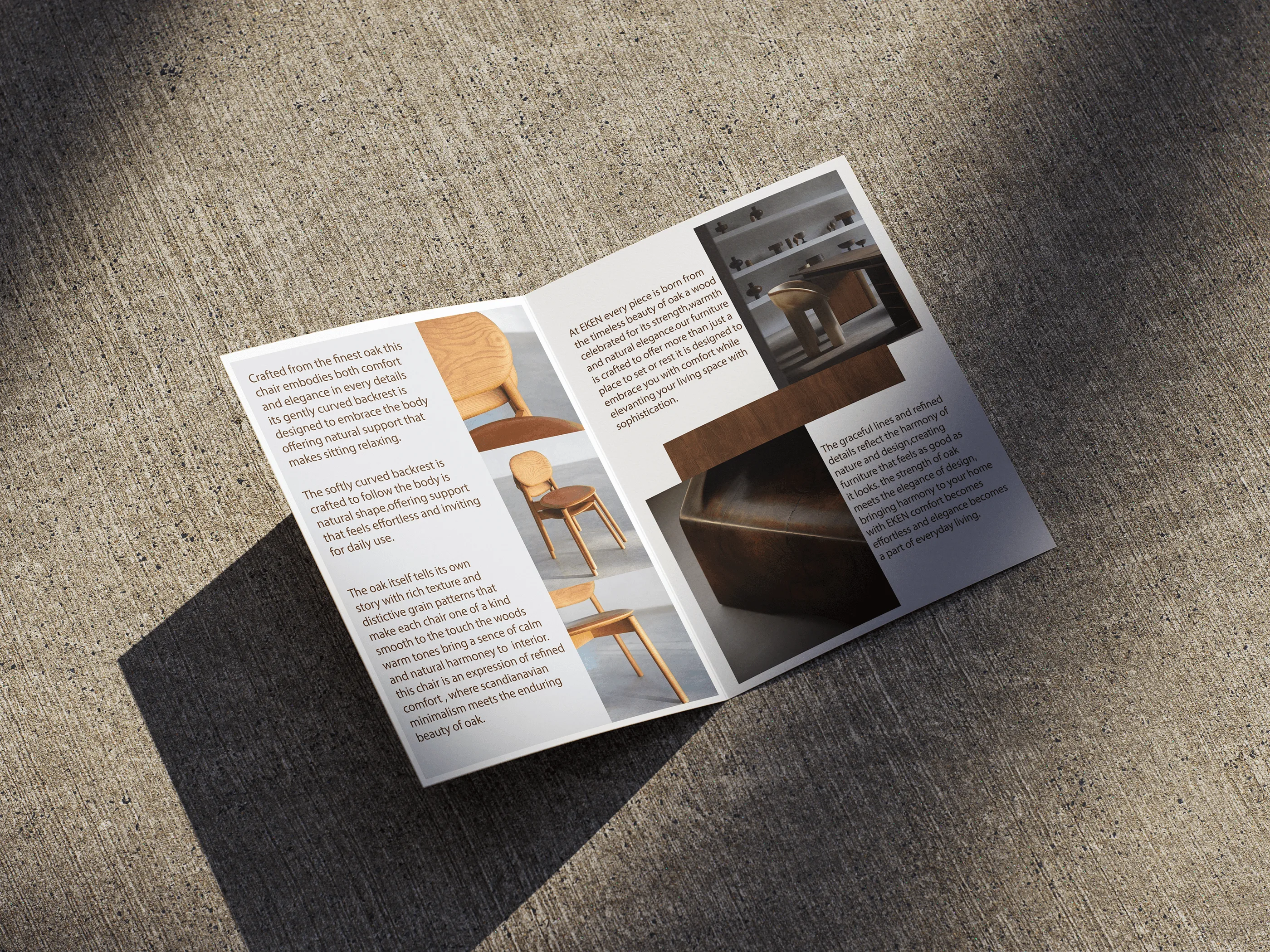
Lookbooks: These books are not just product showcases, but a means of telling the brand story. The exterior design of the book, which combines images of furniture with philosophical texts, reflects EKEN's identity in a tangible form.
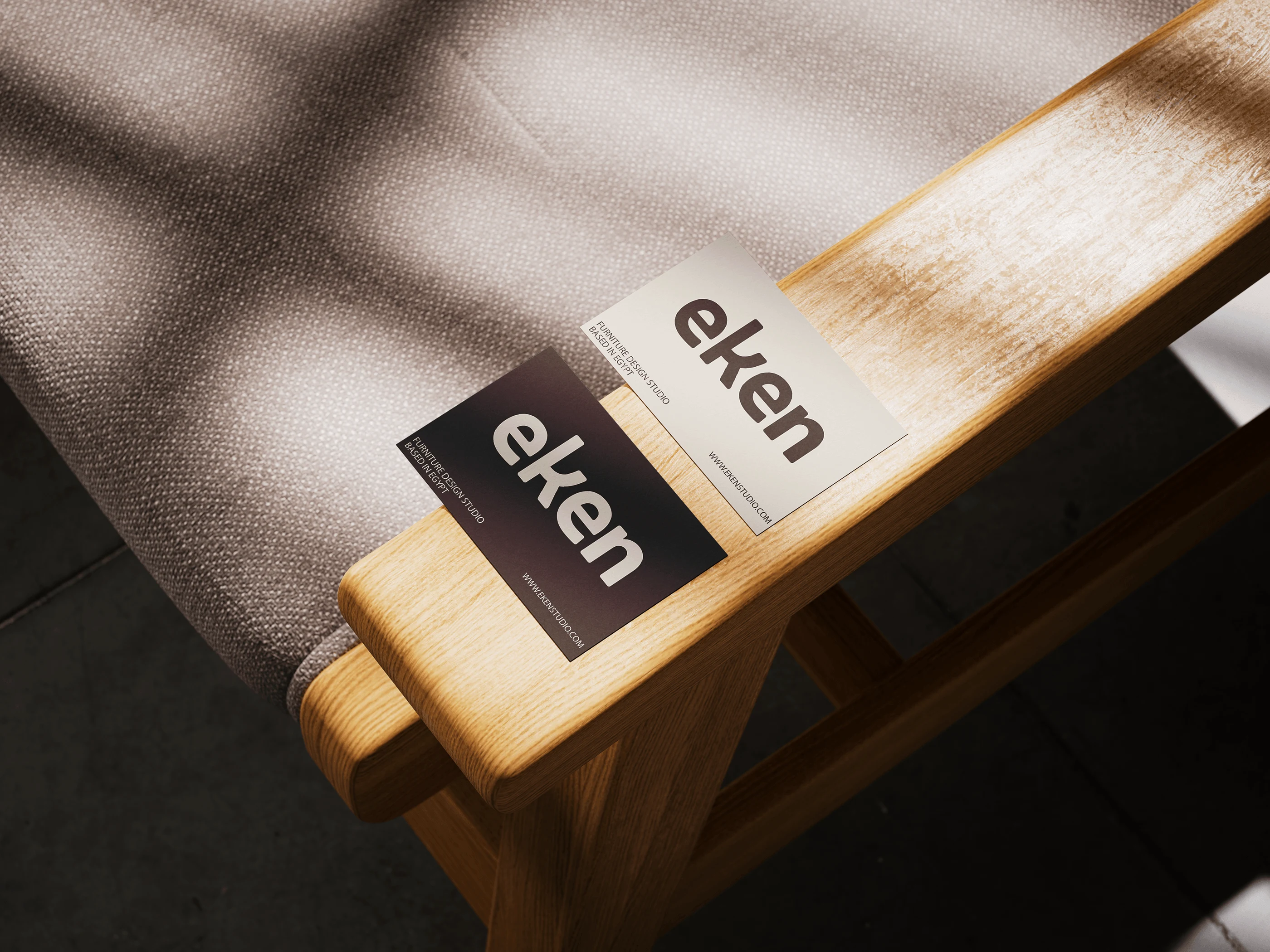
Print Collateral: Business cards showcase the simplicity and elegance of the identity, with the EKEN logo used only on contrasting backgrounds (black on white and white on black), reinforcing its modern look.
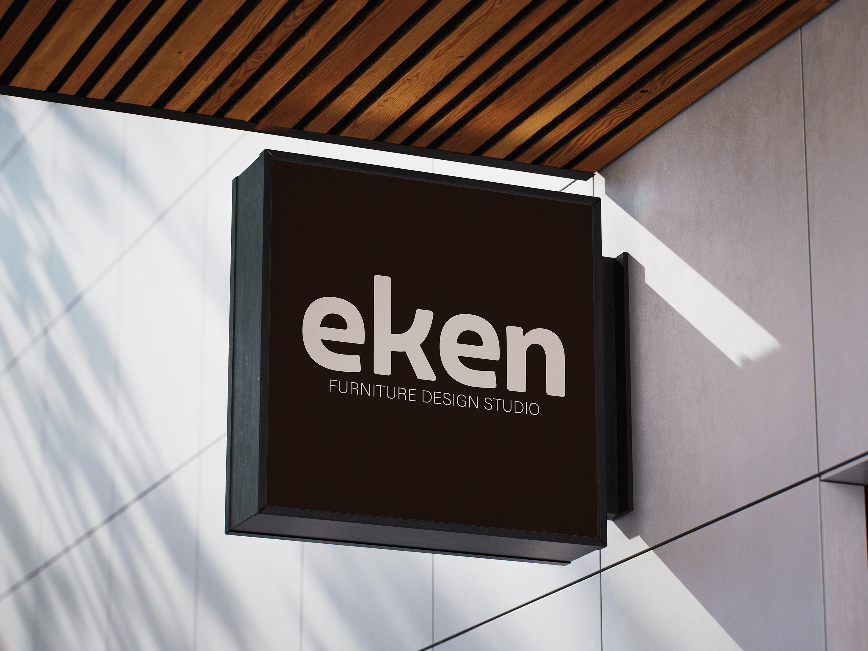
Signage and Advertising: Whether it's a sign for the studio headquarters or an advertisement on a digital billboard, the brand maintains its clean and simple look. The logo appears clearly, accompanied by a short and compelling slogan, ensuring easy brand recognition.
In conclusion, the EKEN brand identity is an excellent example of how to build a cohesive and compelling story that starts with a core philosophy, is cleverly translated into a unique logo, reinforced through consistent messaging, and applied seamlessly across all communication channels.
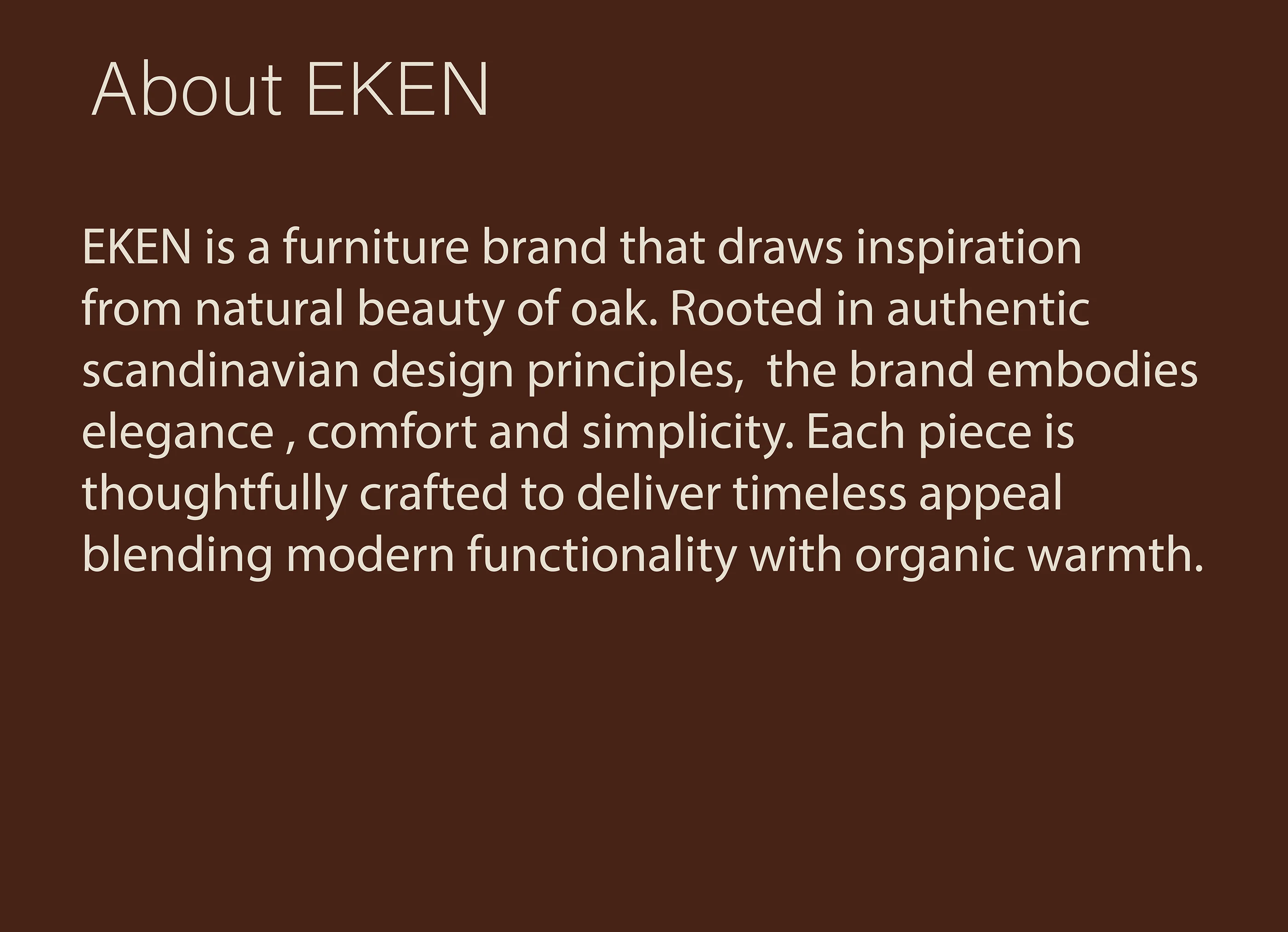
The EKEN brand identity is based on a deep design philosophy rooted in authentic Scandinavian design principles, with an emphasis on quality, simplicity, and connection to nature. All visual and textual elements are integrated to create a cohesive and compelling identity that speaks to customers through its core values.
Core Identity and Philosophy
EKEN is not just a furniture brand, but a design studio that strives to deliver pieces that combine the natural beauty and organic warmth of oak with contemporary functionality. Its philosophy is summed up in several key values:
Authenticity: EKEN draws inspiration from nature and uses real materials to offer a unique experience.
Timelessness: The brand steers clear of temporary trends to offer pieces with lasting appeal, making them an investment in style and comfort.
Elegance and simplicity: The pieces feature simple and elegant designs, combining comfort with beauty without pretension.
Like this project
Posted Jun 11, 2026