RAZZAQ BRAND IDENTITY
amr ahmed
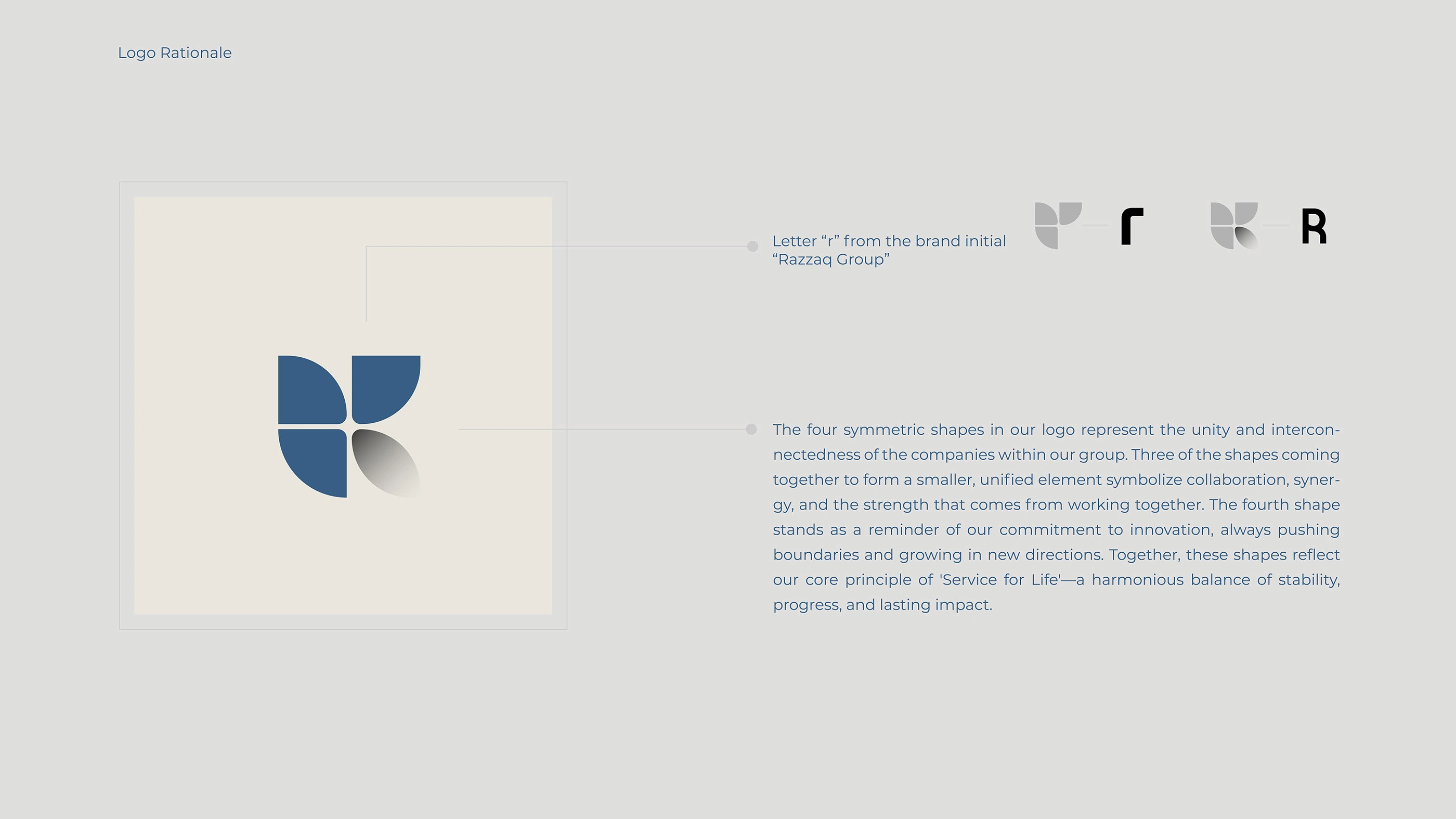
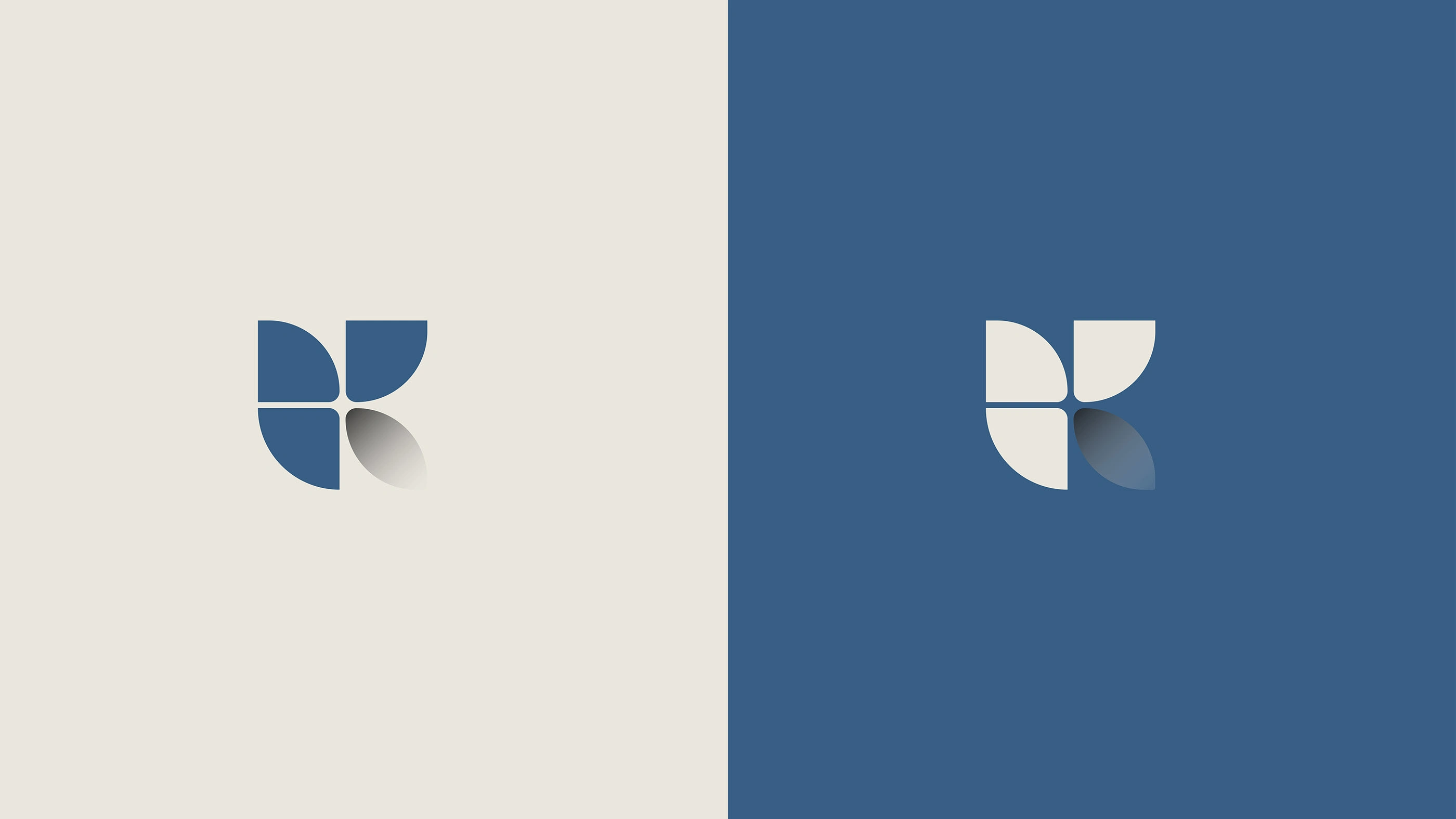
1. The LogomarkGeometric composition: The logomark is an abstract shape that combines the letter “R” (the first letter of the name) with geometric shapes resembling ‘segments’ or “petals.”Meanings:Integration and unity: Bringing together separate parts to form a single entity reflects the idea of a “group” consisting of several departments or companies working in harmony.Growth and prosperity: The shape suggests blossoming and growth (like a flower or an upward graph), linking the name “Razzak” (which suggests goodness and abundance) with continued success.
2. Font and Typography
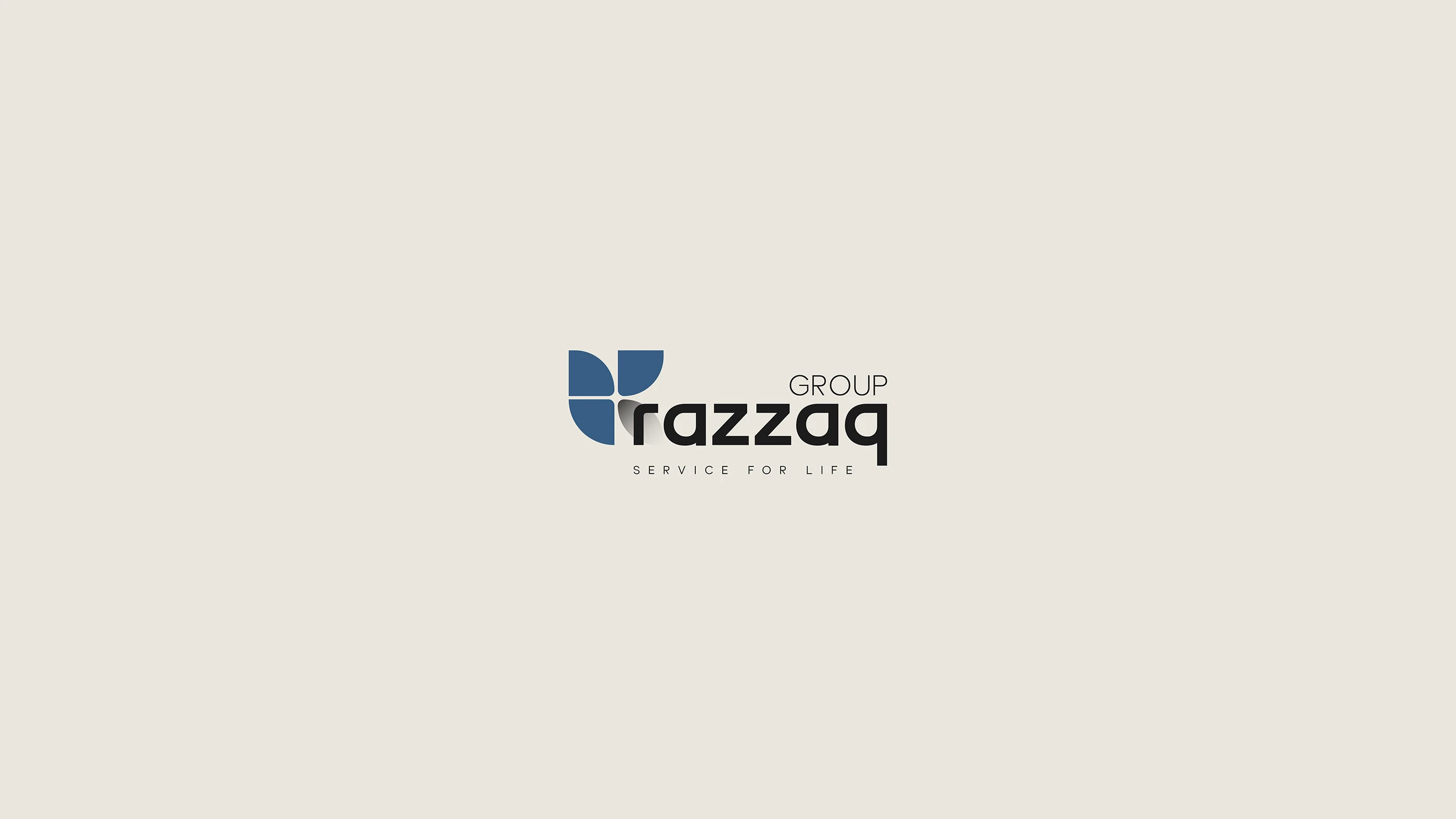
The name “razzaq” is written in lowercase letters, bold font, and a modern style. The use of lowercase letters gives an impression of modernity, closeness to the customer, and flexibility, moving away from traditional rigidity.
The word “GROUP”: written in uppercase letters, in a thinner font, and placed at the top. This creates visual balance and gives the company a sense of formality, prestige, and institutional umbrella.
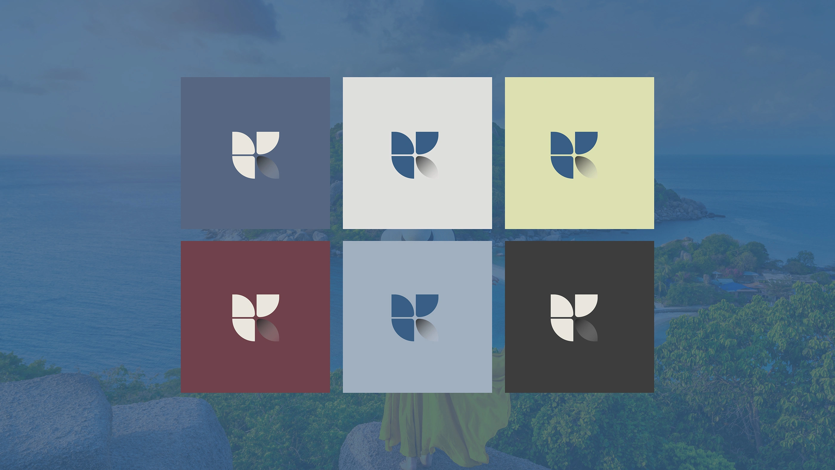
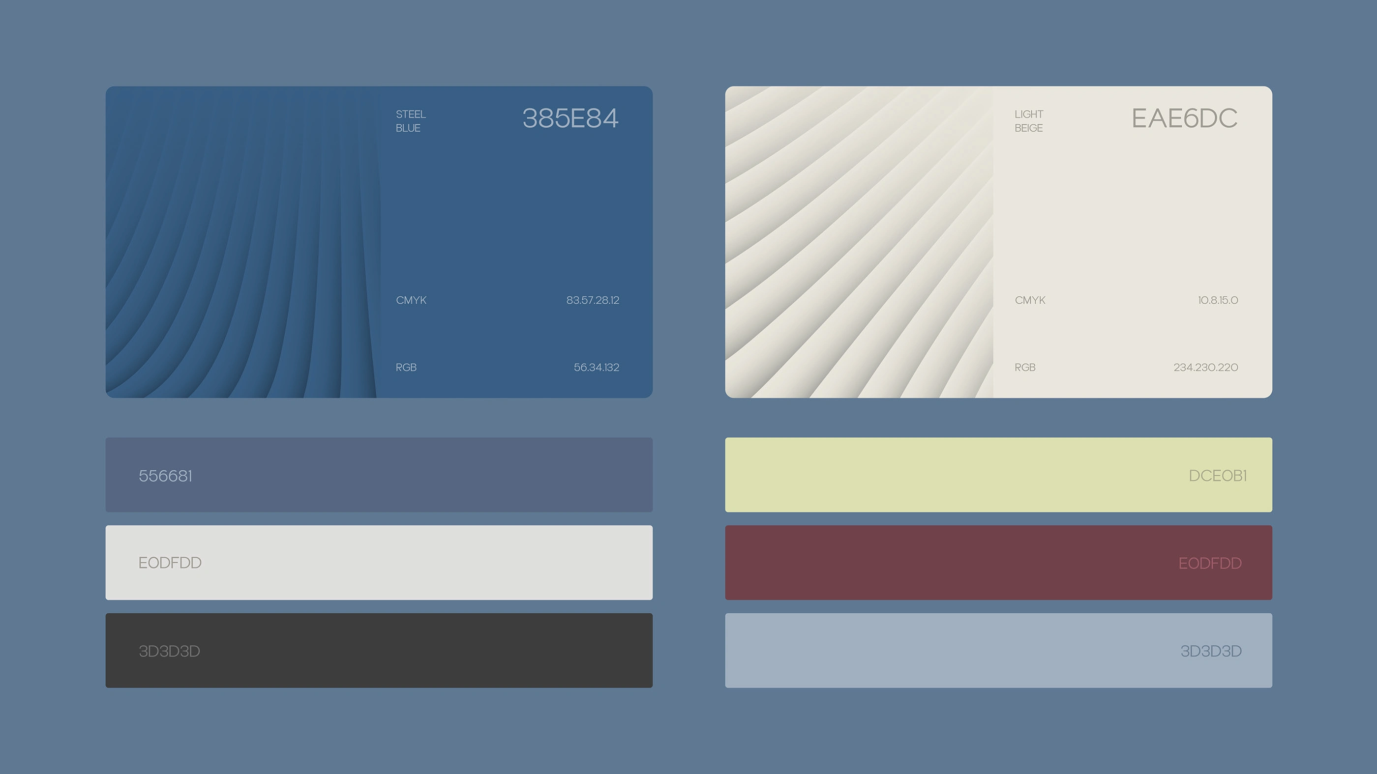
3. Color Palette
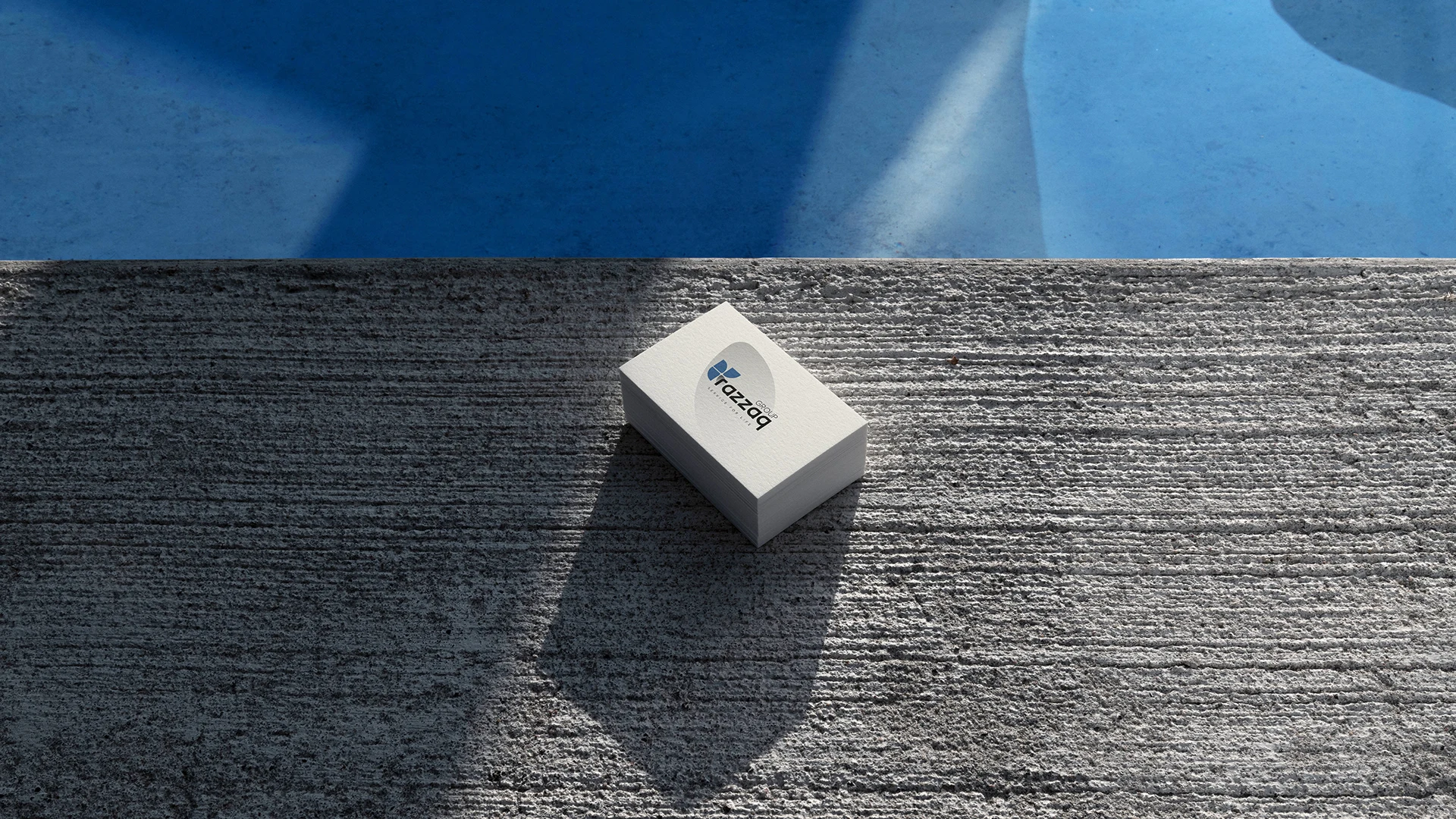
Navy Blue: This is the dominant color and the best choice for companies that want to convey confidence, stability, professionalism, and intelligence. It is the quintessential “business” color.
White: Used for the logo itself to stand out clearly against the background, reflecting transparency and clarity in dealing.
4. Background and Visual Language
Fluid Waves: The background contains soft waves of blue tones.
Meaning: This fluidity expresses agility, the ability to adapt to market changes, and move smoothly toward the future. It also gives the identity a technological and futuristic feel.
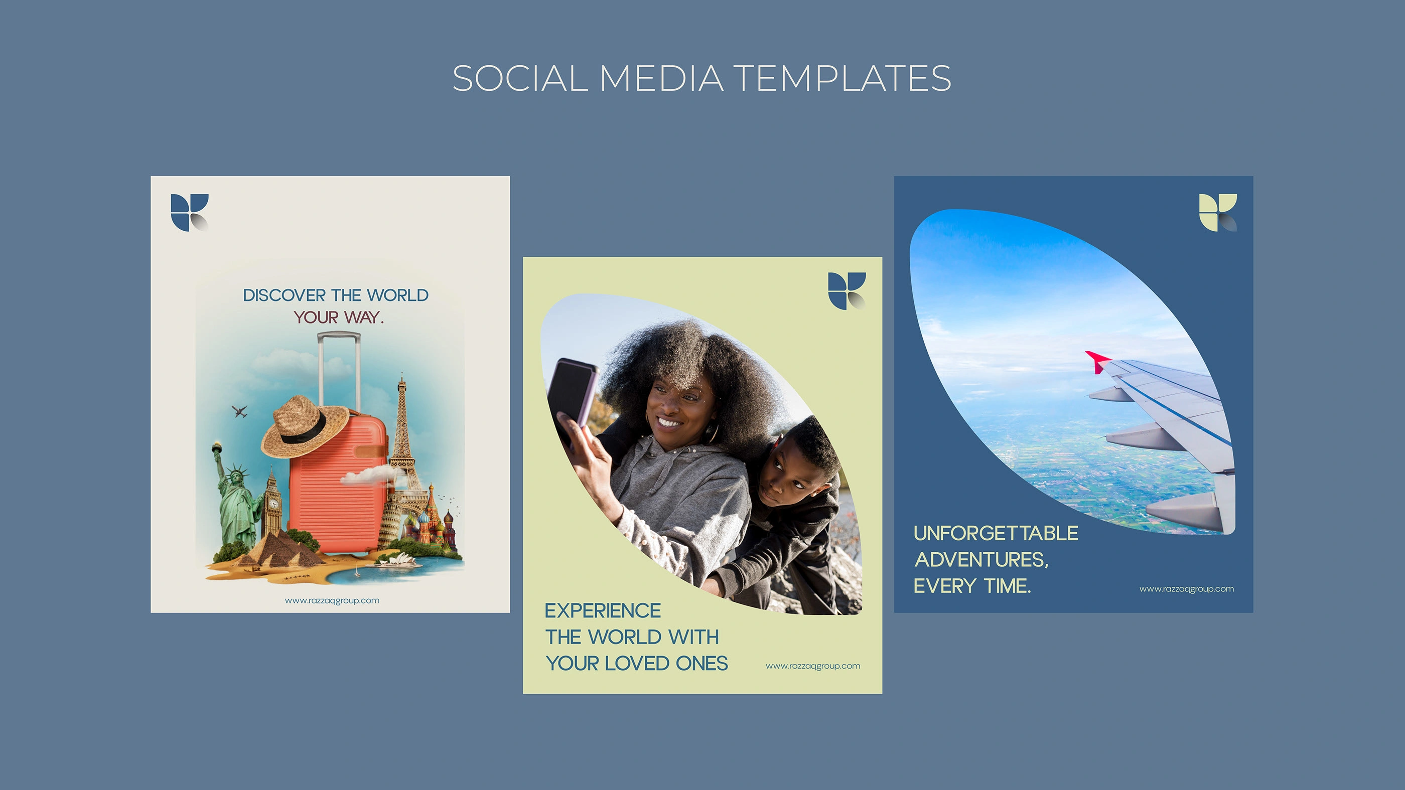
Analysis of visual identity application on digital platforms First: Image No. (9)
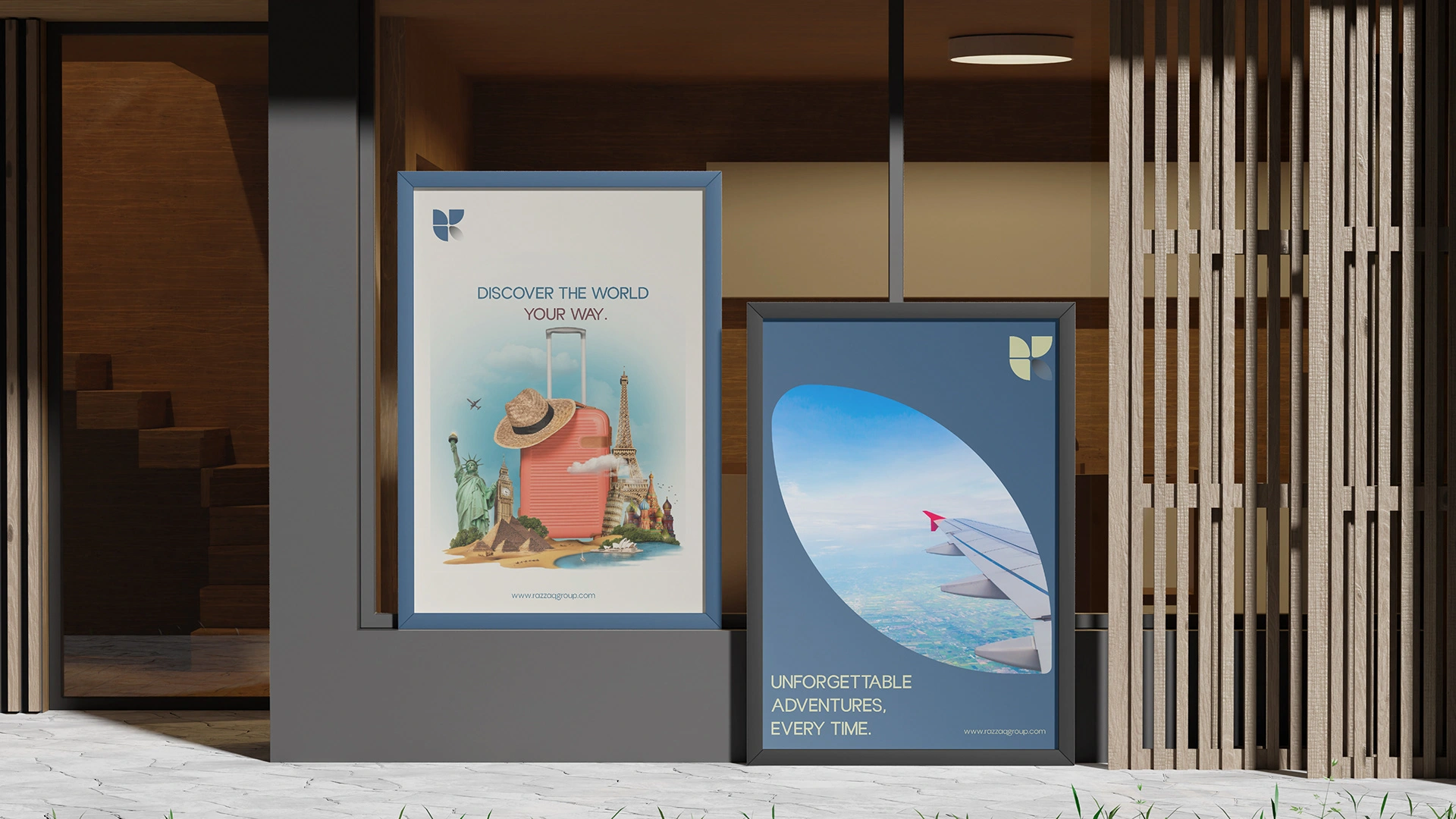
- Social media ad templates This image shows three different designs for social media posts, illustrating how visual identity can be flexible and serve different messages: Element Description and analysis Overall objective To show diversity in marketing content while maintaining visual consistency for the brand. Focus on symbolism The Razzaq logo (the R symbol) appears prominently in the upper right corner of each design, ensuring brand awareness.
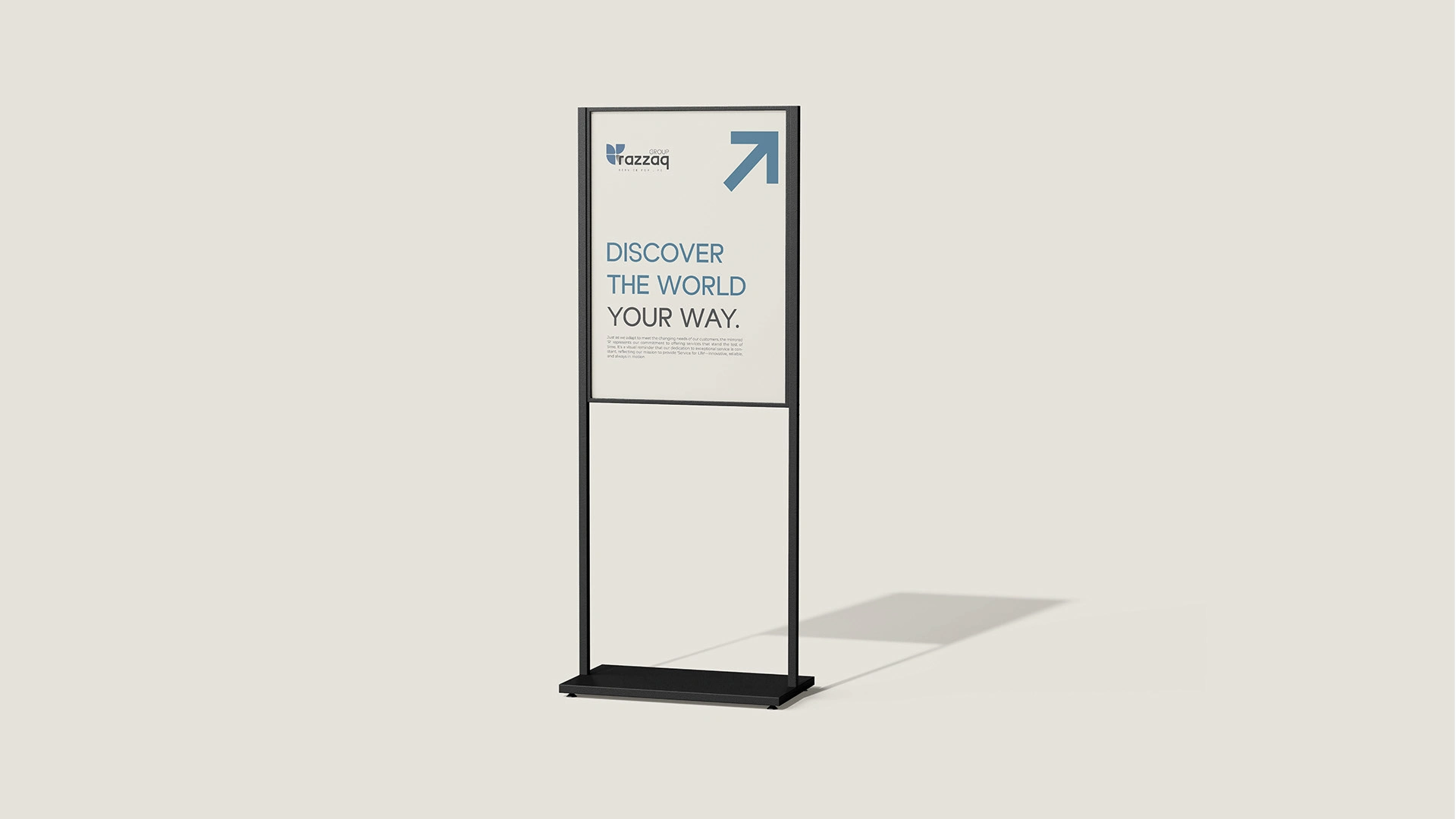
Message 1 (left) “DISCOVER THE WORLD YOUR WAY.” A message focused on personalization and freedom. The design combines global landmarks around a stylish orange suitcase, suggesting that Razzaq is your starting point for all destinations.
Message 2 (center) “EXPERIENCE THE WORLD WITH YOUR LOVED ONES.” An emotional message focusing on the family travel experience. The design uses a warm, light green background color and a curved oval shape to add a human and organic touch to the content, slightly contrasting with the sharpness of the corporate blue color.
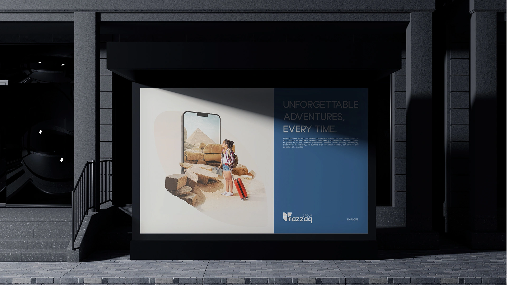
Message 3 (on the right) “UNFORGETTABLE ADVENTURES, EVERY TIME.” A message focused on promise, experience, and adventure. The design uses the corporate blue color as a frame around an image of an airplane from the window, connecting the Razzaq brand to the journey itself and suggesting safety and smooth travel. Consistency: All designs use clean, modern fonts (Sans-Serif) and place the website address (https://www.google.com/search?q=razzaqgroup.com) at the bottom to increase engagement.
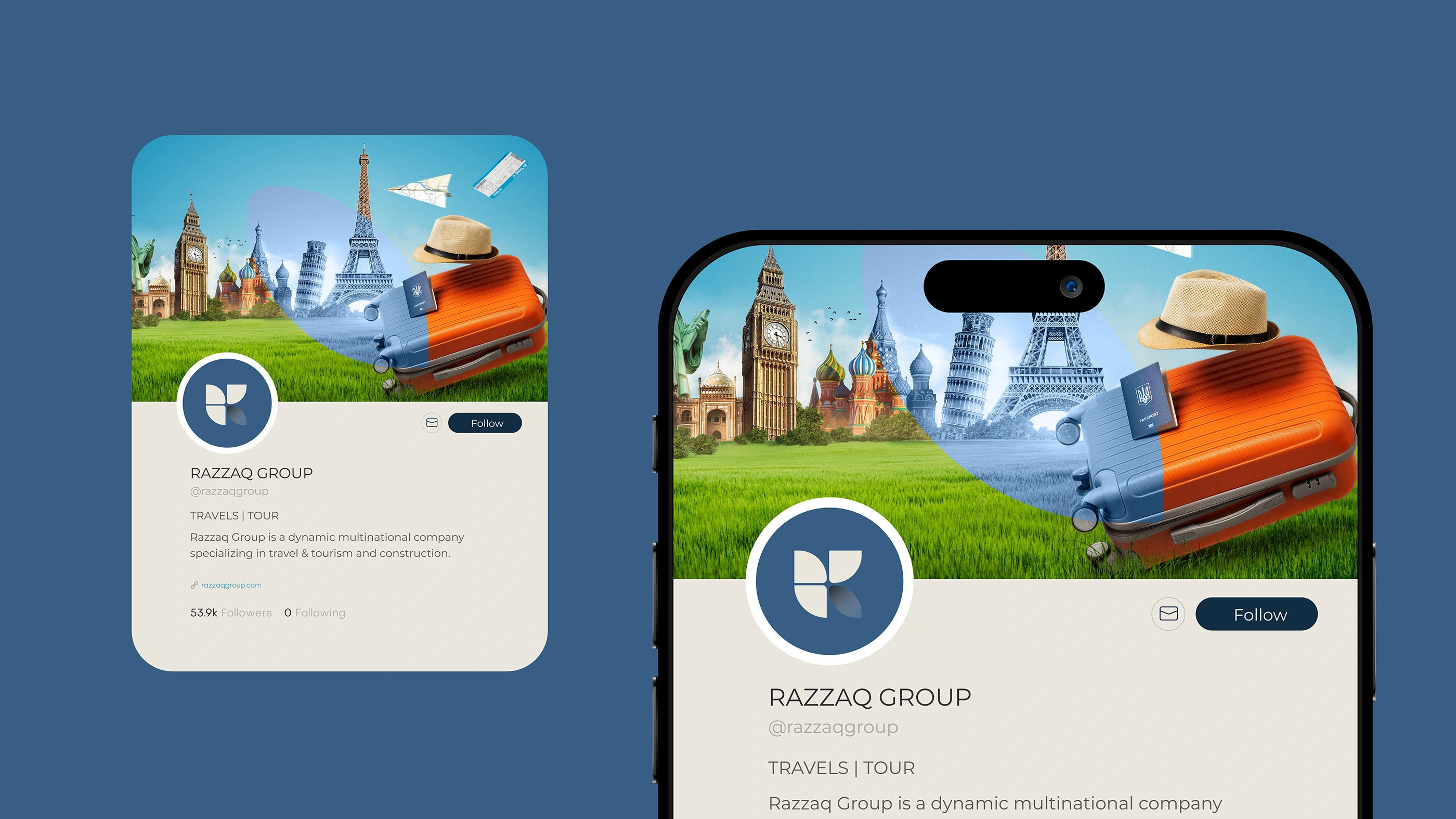
Second: Image #10 - Profile Mockup This image shows what the “Razzak Group” page looks like on a social media platform (suggesting it is X/Twitter), and is an excellent example of integrating identity into user interfaces: Profile picture (Avatar): The logo icon (white R symbol) is used inside a dark blue circle. This ensures that the logo is clear and recognizable even at a small size. Cover photo (Banner): A strong, dynamically divided cover photo (curved line) combines: Global destination: Famous landmarks (such as Big Ben, the Eiffel Tower, and the dome of St. Basil's Cathedral) drawn on a grassy background (expressing the open world). Travel accessories: A stylish suitcase (which appeared in the first ad) and some accessories such as a hat and passport, symbolizing readiness to go. Text details: The account details are clearly displayed: RAZZAQ GROUP followed by the classification TRAVELS | TOUR, confirming the specialization in tourism and travel. Important note: The bio mentions that the company specializes in “travel & tourism and construction,” reinforcing the idea that it is a holding group that integrates several sectors (which justifies the name “Group” in the logo). Conclusion: The images show that the brand uses modern, reliable, and dynamic visual language, applying the brand's primary colors (blue and orange/coral) to create an attractive contrast that catches the attention of travelers.
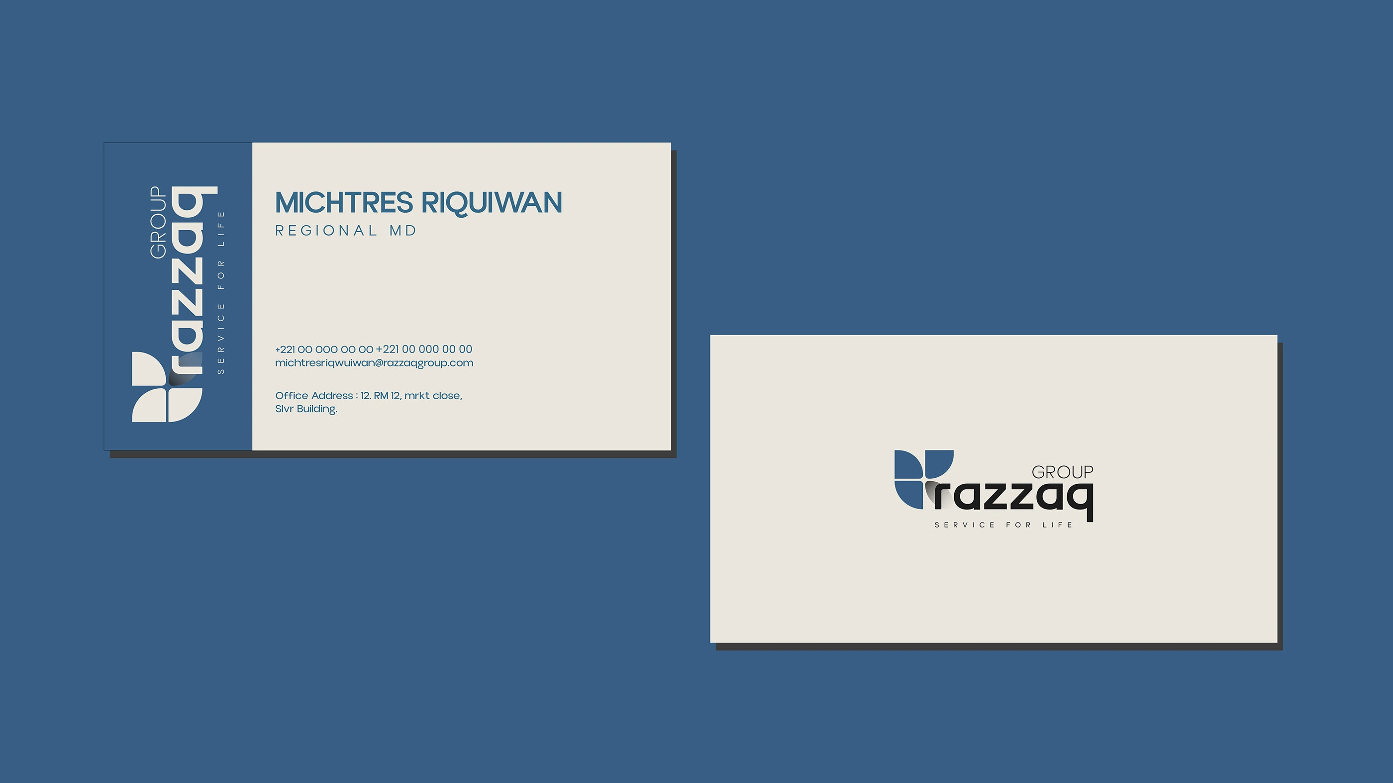
This collection of images shows the application of Razzaq Group's visual identity across a variety of physical assets and supplies, demonstrating the consistency and flexibility of the identity across various customer and employee touchpoints.
Here is a description and analysis of each image:
Application of visual identity on physical assets (Merchandise & Assets)
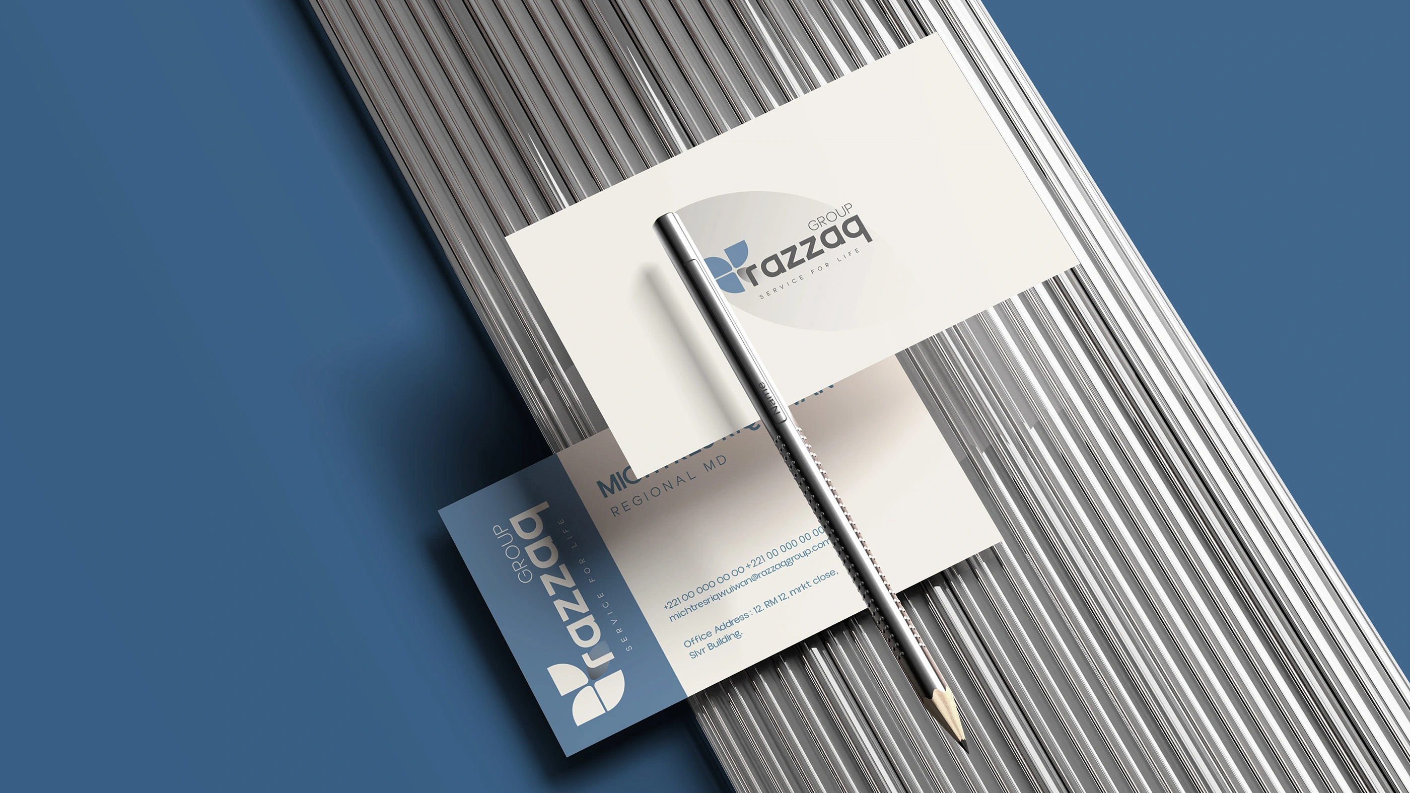
1. Image #16: Employee ID Badge
Description: A professional ID badge attached to a black lanyard with a blue metal clip (matching the brand color).
Identity elements:
Corporate design: The badge is based on a light, clean gray (off-white) color, which gives it a formal look.
Graphic lines: A curved design element in dark blue (derived from the wave motion in the core identity) is used to frame the employee's photo (Mr. MICHITRES RIQUIWAN, Regional Director). .
Logo usage: The logo appears in full on the back of the card and the letter “R” appears on the clip, ensuring consistency and confidence in the team's appearance.
Significance: Reflects the company's focus on organization, professionalism, and equipping its employees with high-quality work tools.
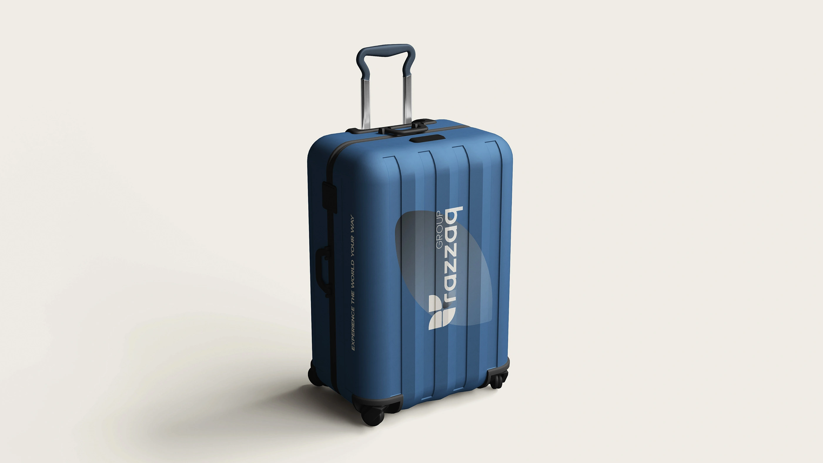
2. Image No. (14): Travel Bag (Branded Suitcase)
Description: A trolley suitcase with a modern and sturdy design.
Identity elements:
Base color: The suitcase is designed in the brand's signature navy blue, a color that symbolizes trust and security, perfectly suited to travel services.
Logo and message: The “RAZZAQ GROUP” logo appears in large but subtle lettering on the body of the suitcase, along with the slogan “EXPERIENCE THE WORLD YOUR WAY” printed vertically on the side.
Meaning: This suggests that the bag may be part of the company's luxury package or a souvenir for distinguished customers, linking the brand to the actual trip.
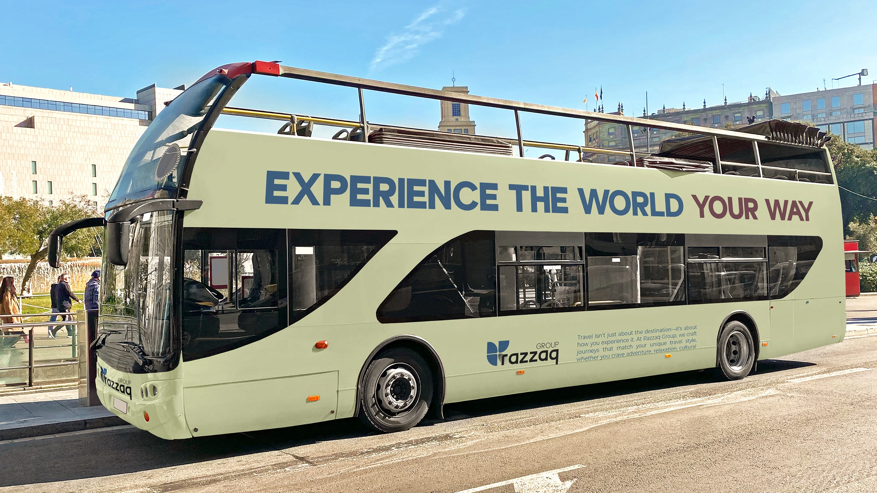
3. Image No. (13): Tour Bus Livery
Description: An open-top double-decker bus designed specifically for city tours.
Identity elements:
Contrasting colors: A light cream/pale yellow (Creamy Khaki) color was used for the body of the bus, which is different from blue but maintains a calm and professional tone.
Visual message: The tagline “EXPERIENCE THE WORLD YOUR WAY” is written in bold, clear blue lettering on the upper deck to ensure maximum visibility on the street.
Details: The slogan appears in full at the bottom with a short descriptive text (copywriting), confirming the company's presence in the tour industry.
Significance: This application demonstrates the brand's capacity to appear on large-scale assets and reinforces the company's main message (travel according to the customer's wishes).
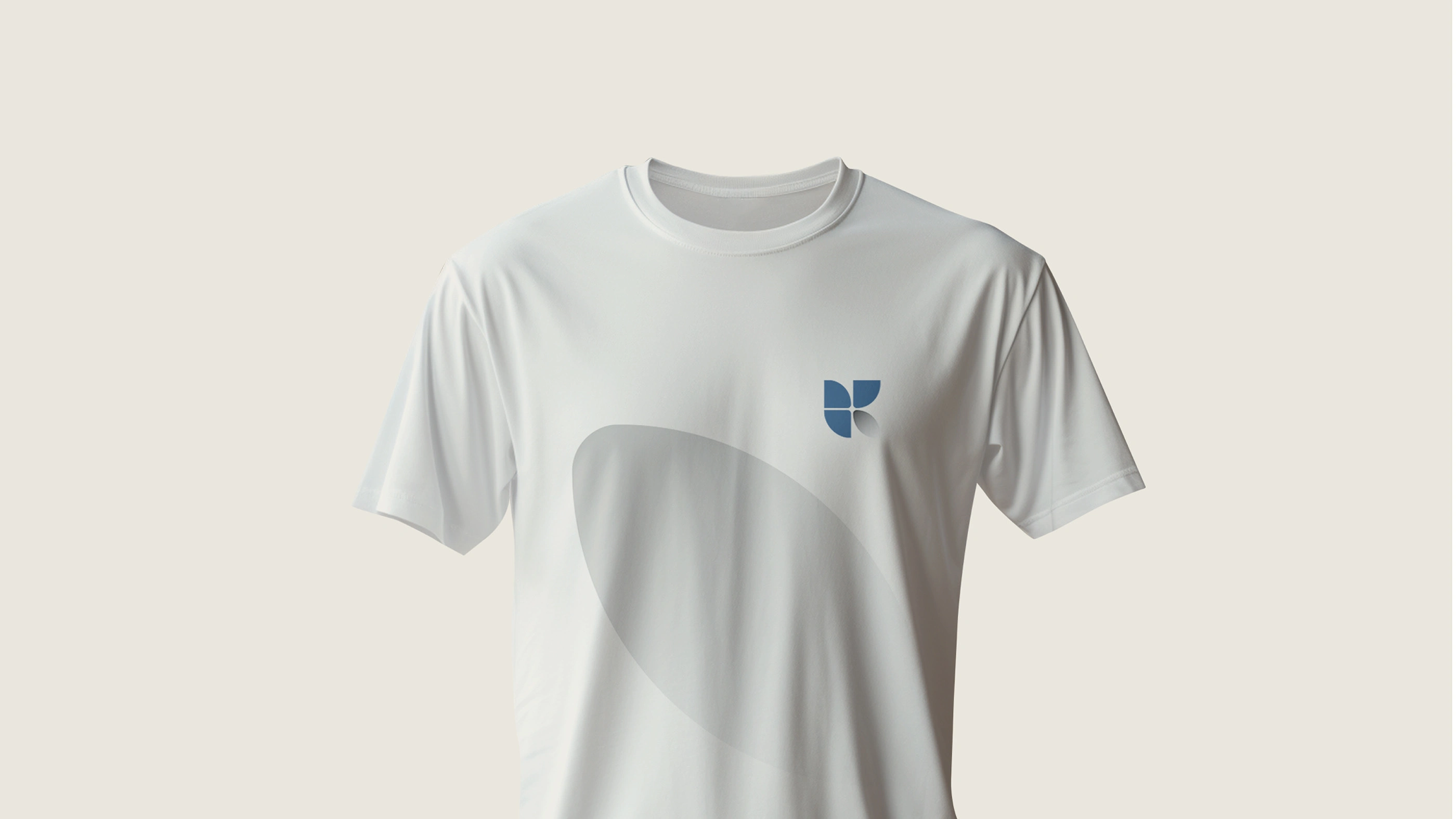
4. Image No. (15): Staff T-shirt
Description: A simple T-shirt with a round collar, suitable for tour guides or airport/hotel support staff.
Identity elements:
Simplification: Only the logo mark in dark blue is used on the chest, without text, indicating that the logo has become strong enough to identify the brand on its own.
Graphic element: A slightly curved oval shape (similar to waves) in light gray appears across the body, adding a distinctive and modern design touch without overwhelming the simplicity of the uniform.
Meaning: The use of a single symbol reflects the brand's confidence in itself and simplicity in appearance, which are important qualities for teams that deal directly with the public.
Contact us
Like this project
Posted Jun 11, 2026