Visual Identity Design for G-RYDR — Equestrian Lifestyle

Flávia Jackeline
1 collaborator


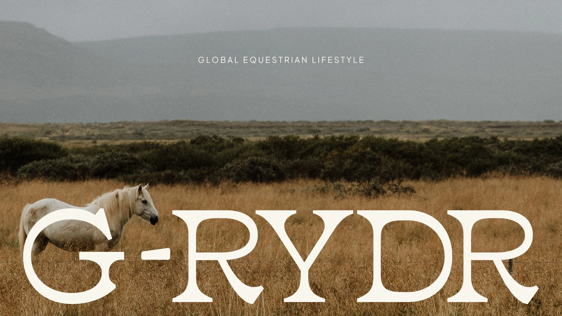
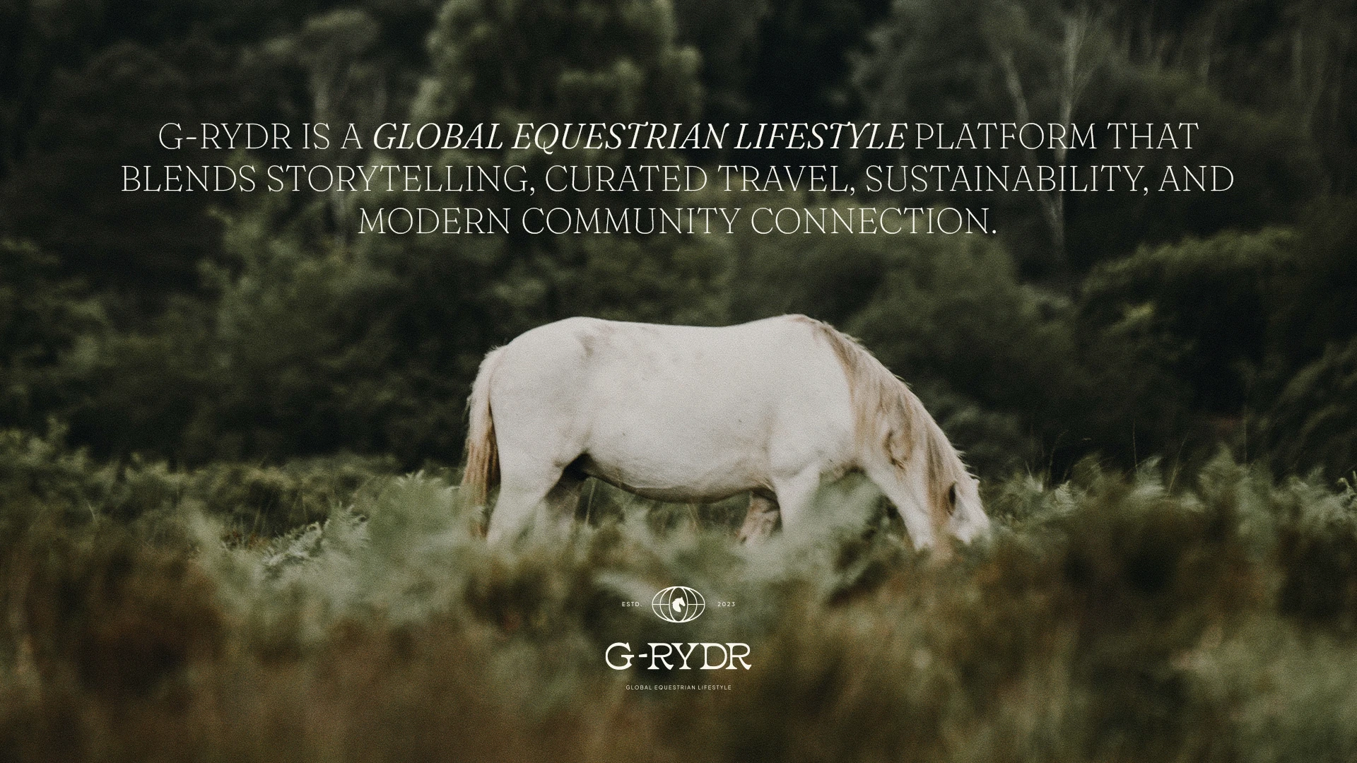
G-RYDR is a global platform created for those who see the equestrian world as more than sport. It is culture, travel and lifestyle.
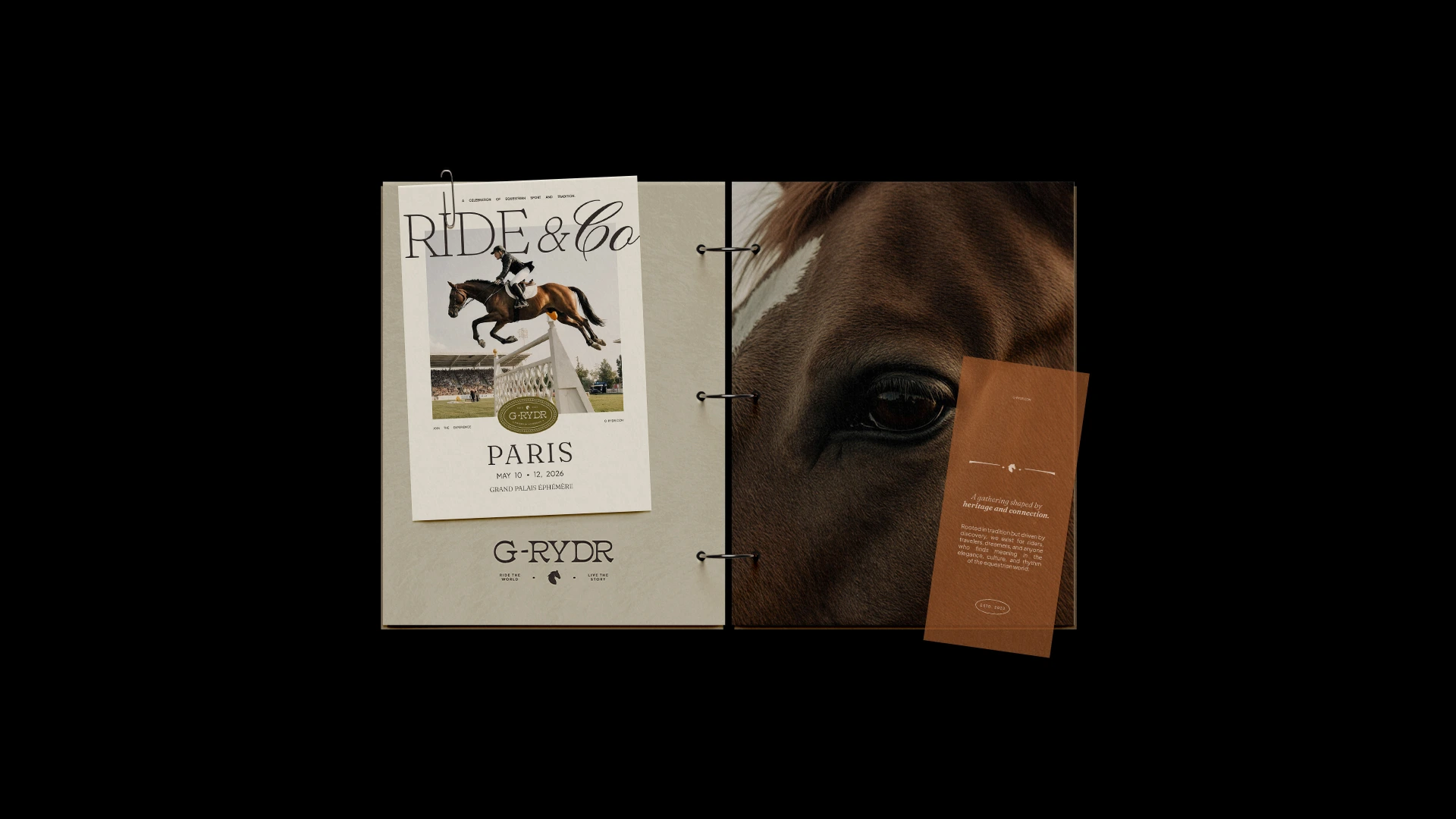
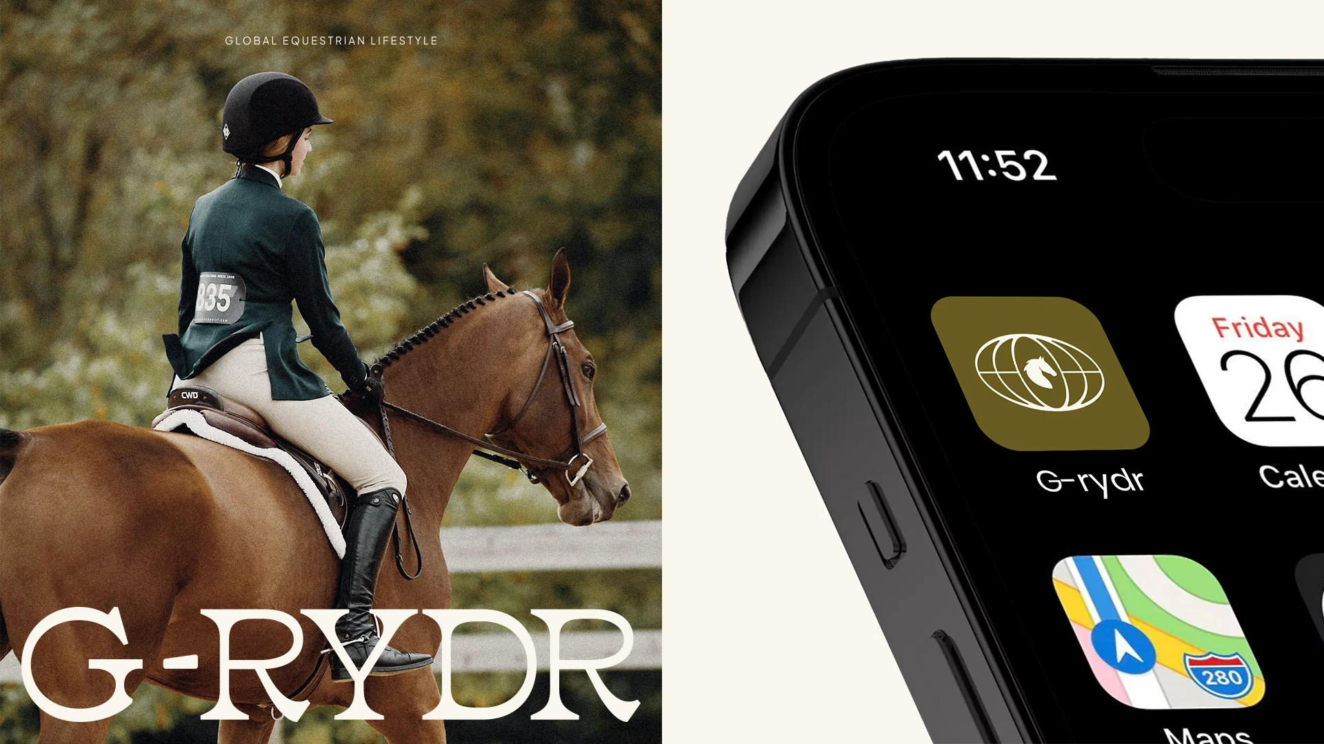
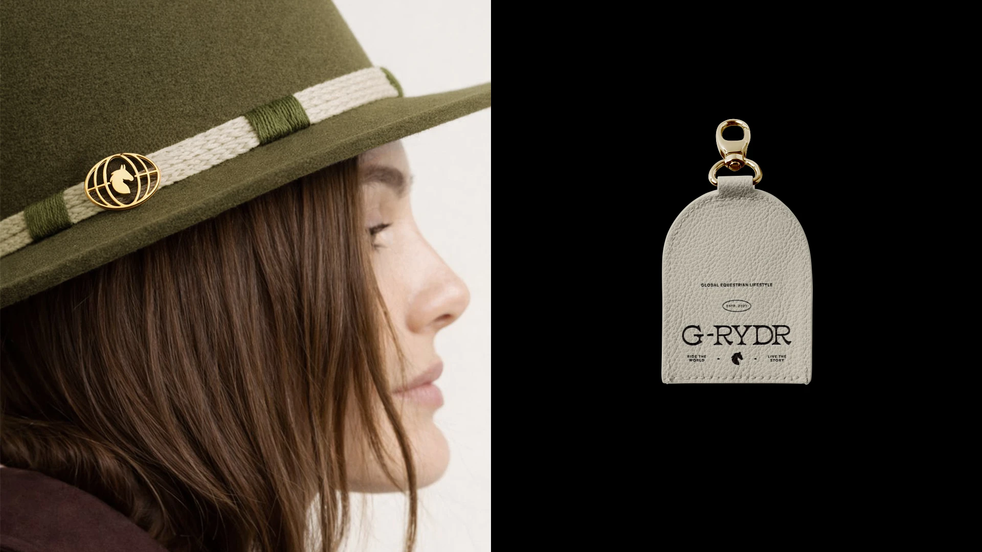
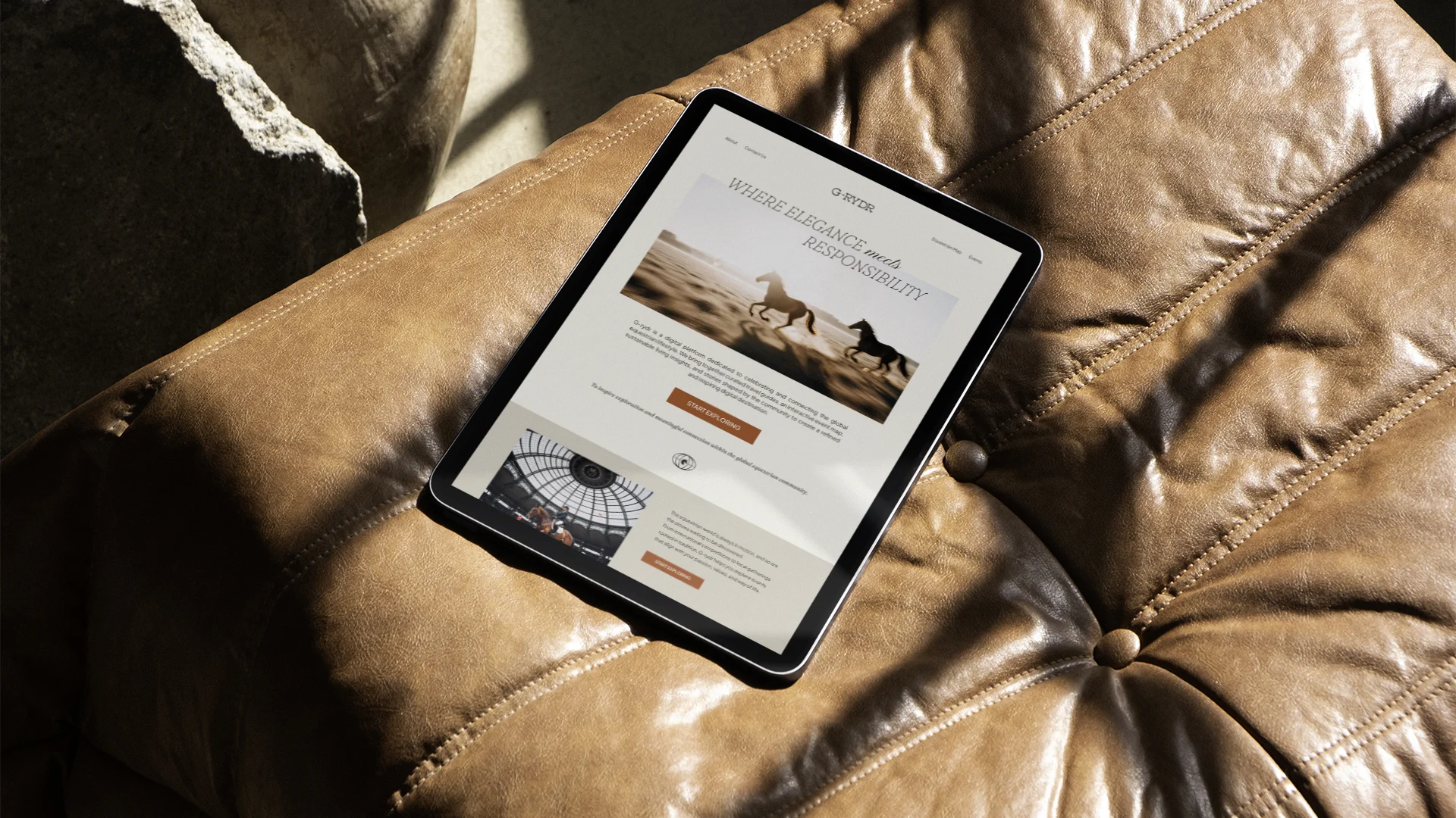
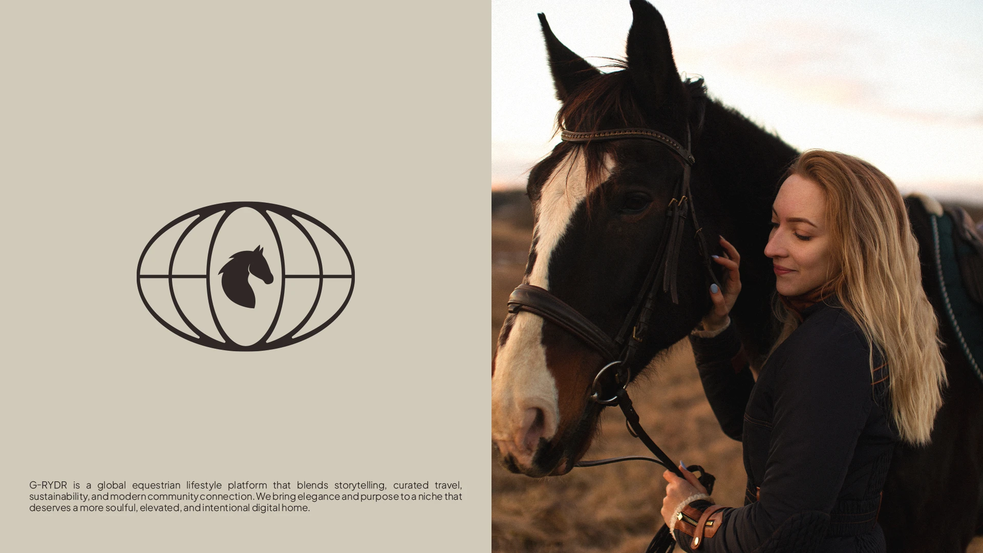
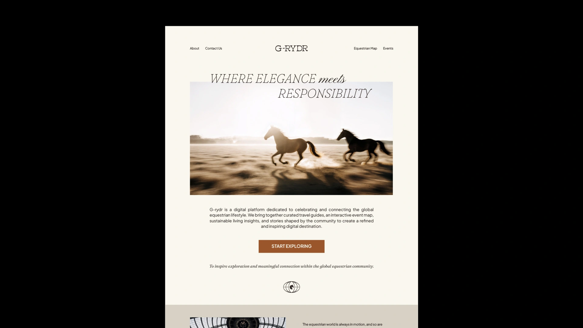
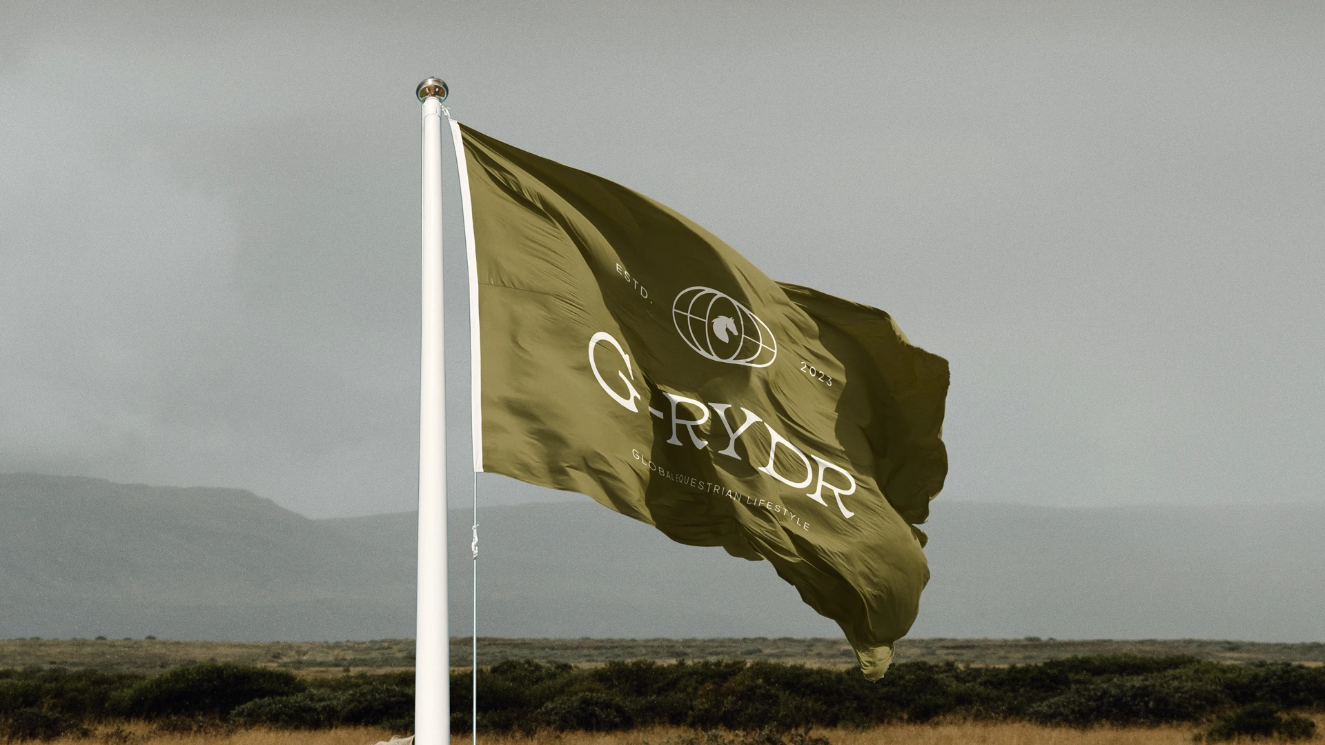
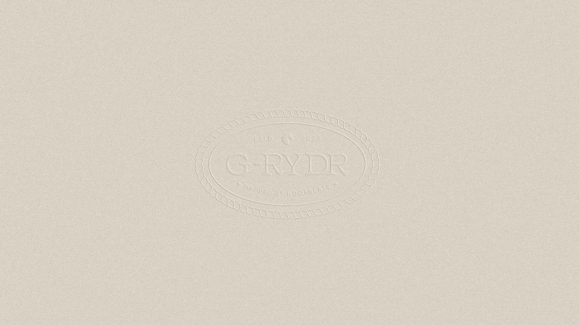
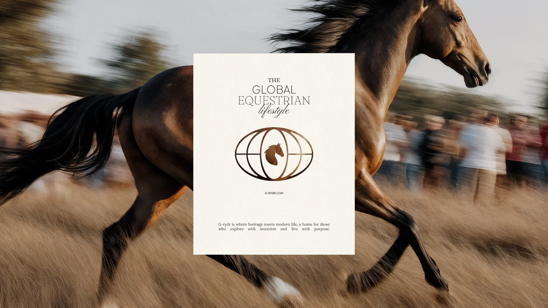
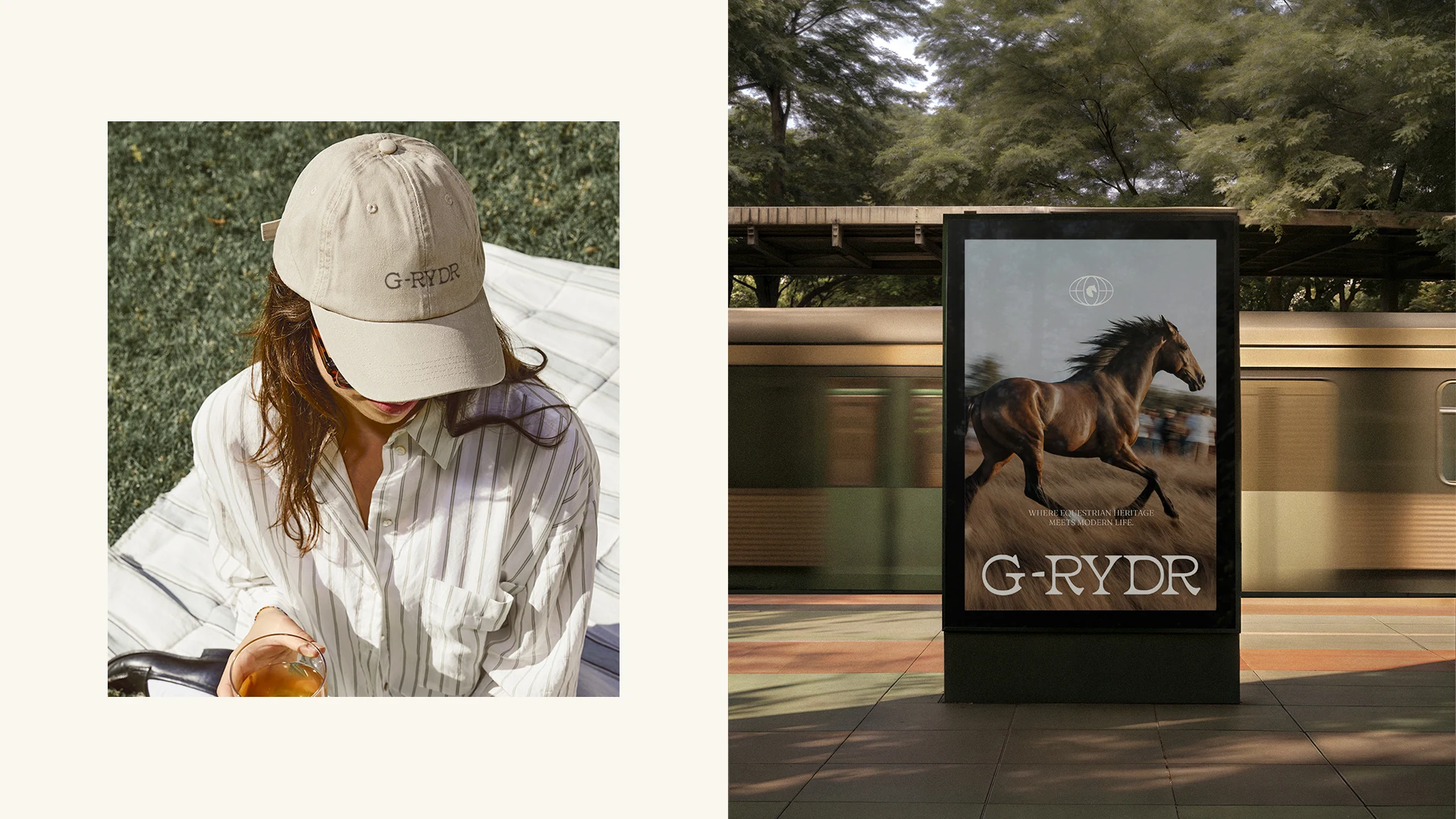
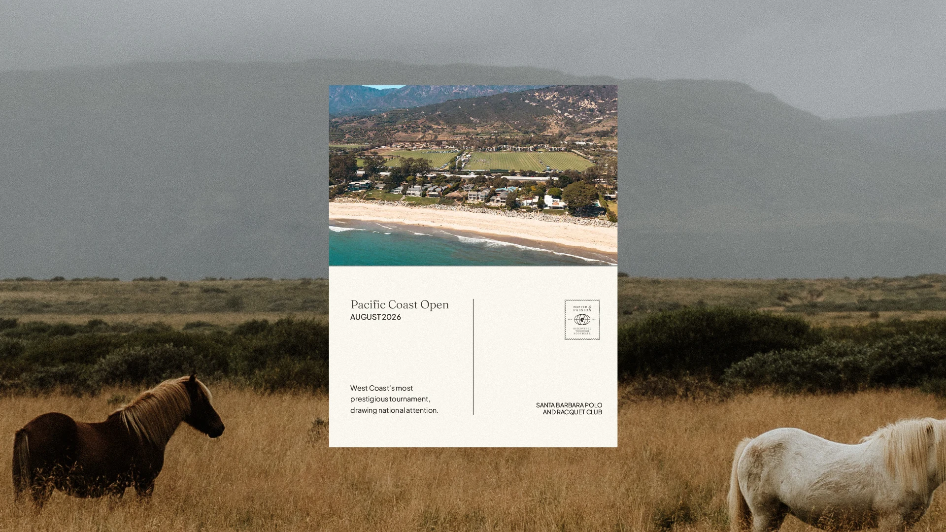
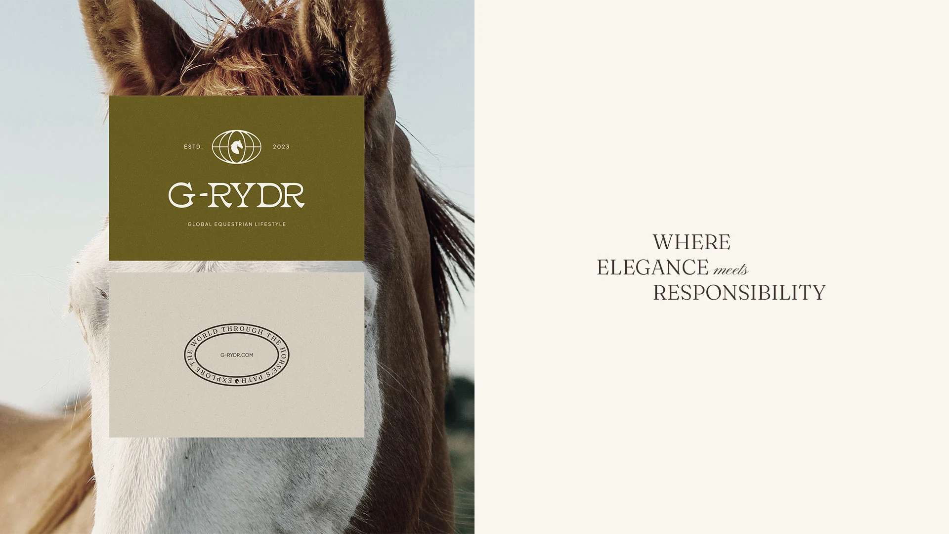
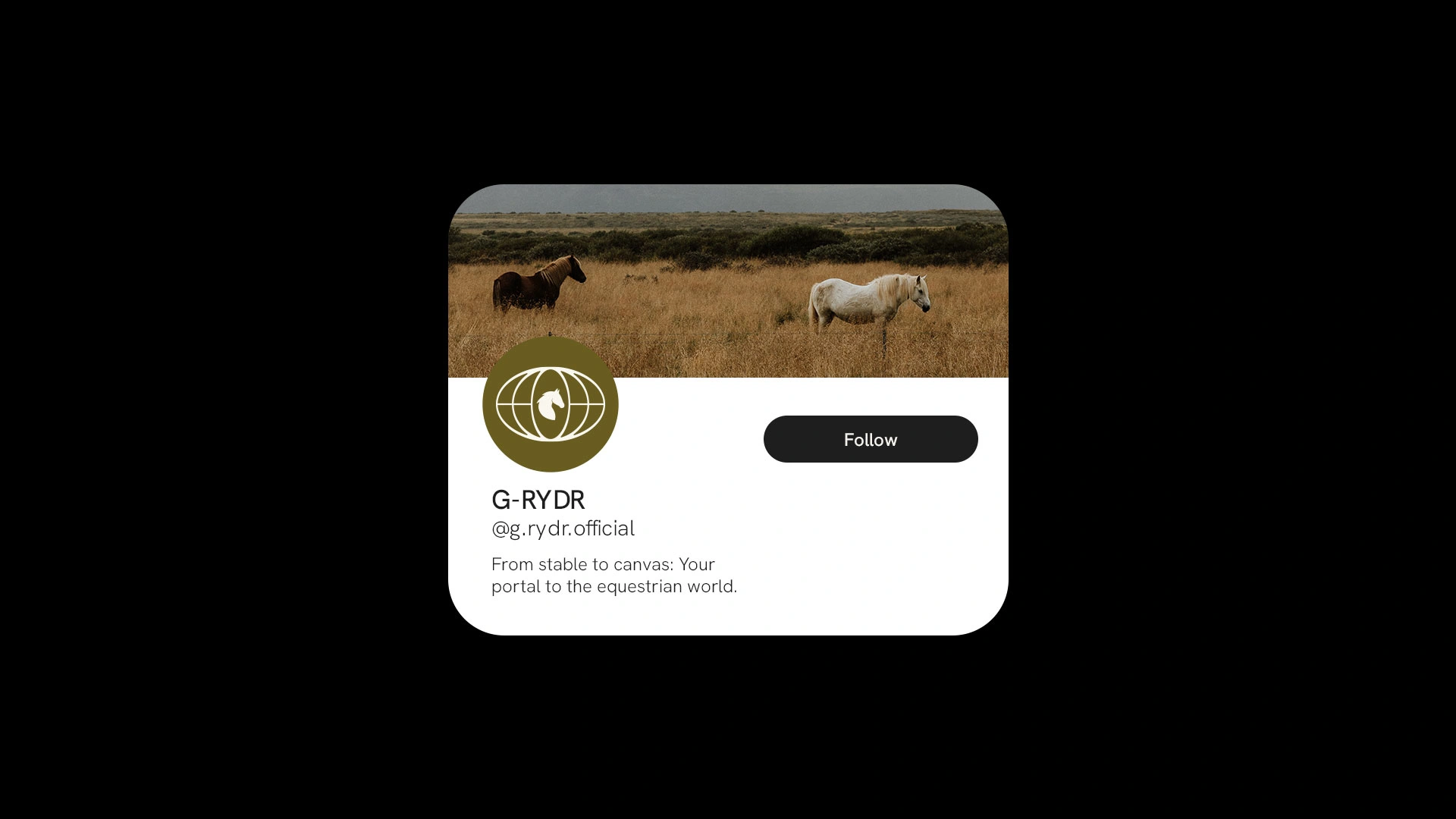
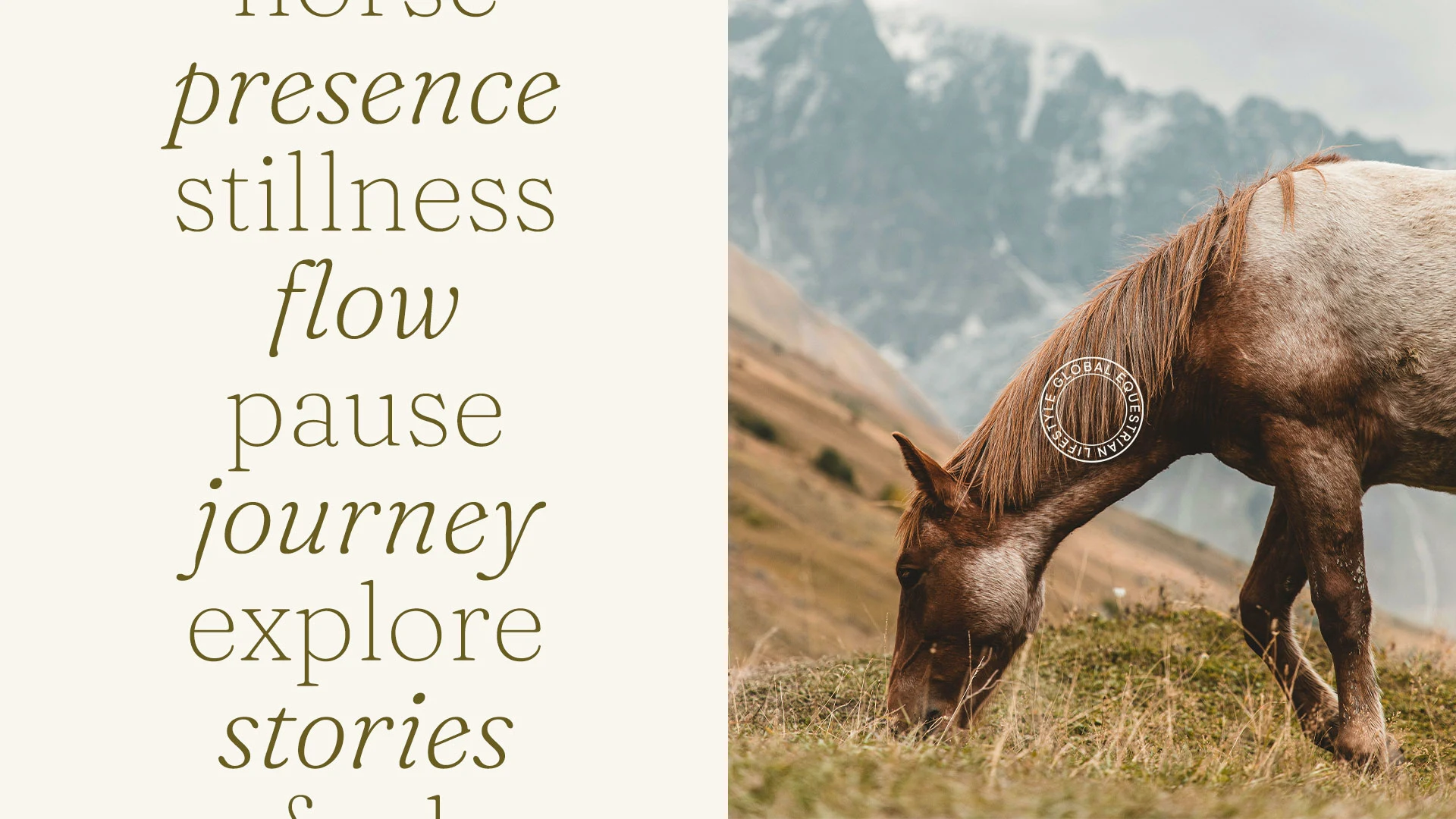
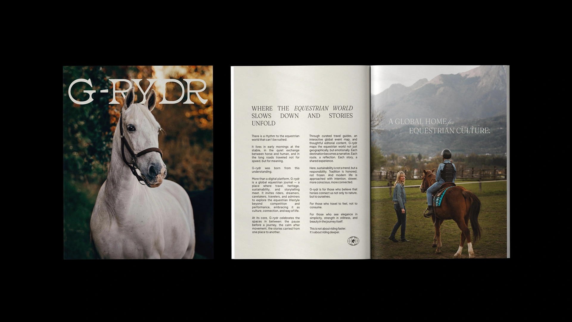
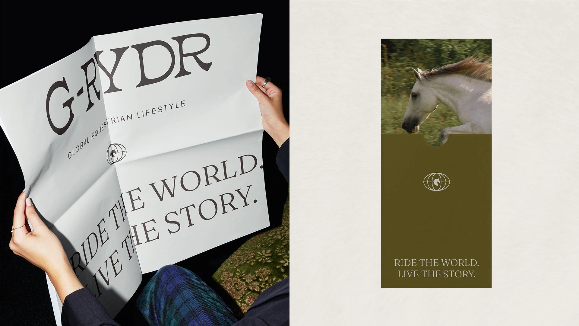
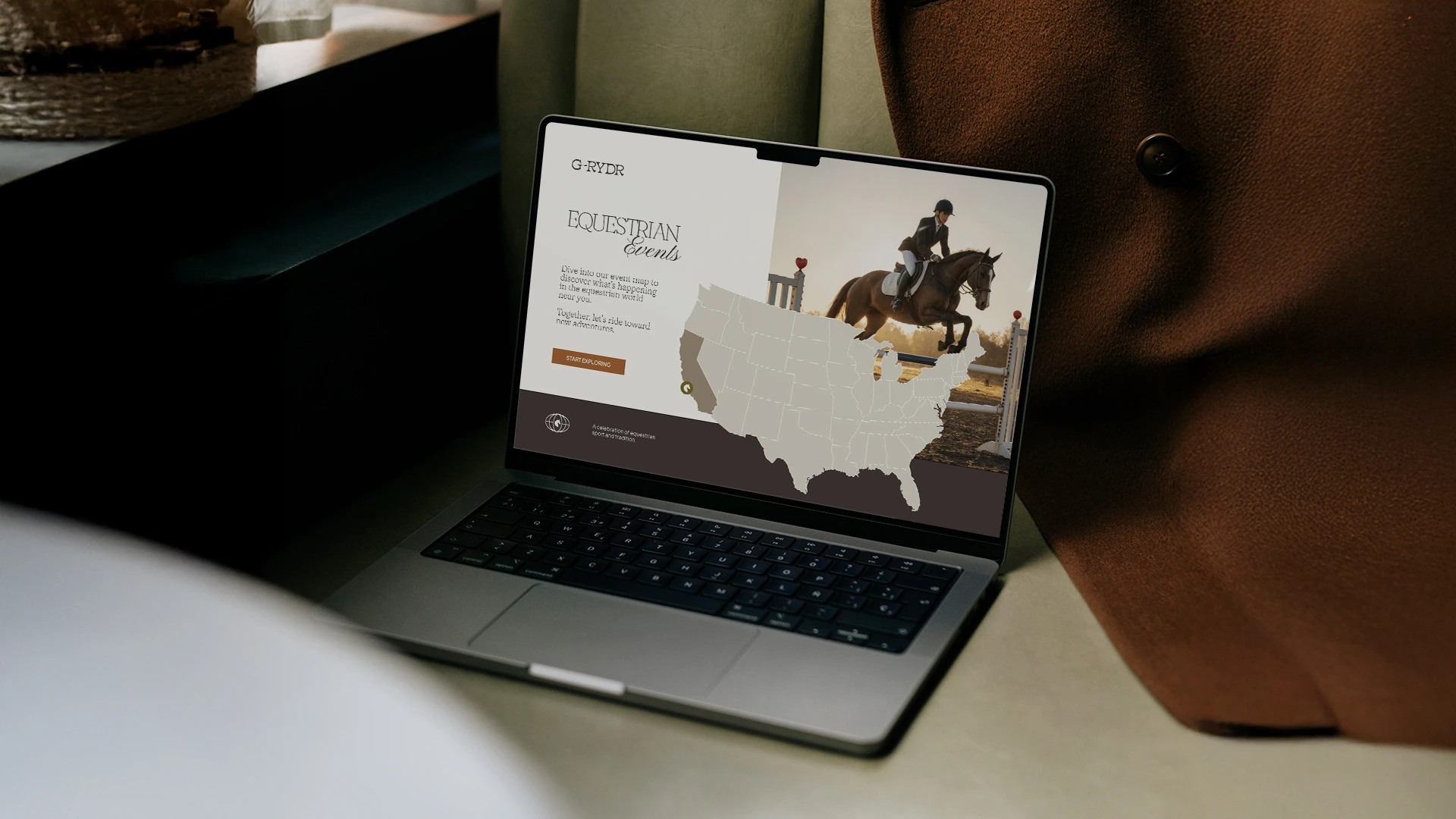
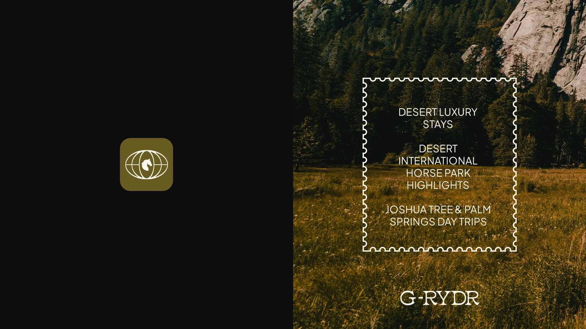
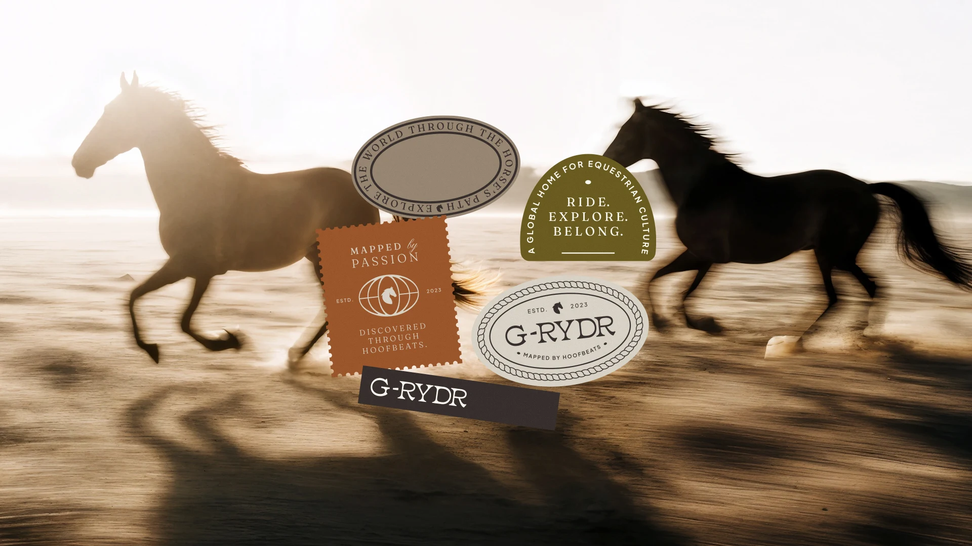
The visual identity was designed to feel editorial, timeless and refined. Inspired by heritage, landscapes and movement, the system positions the equestrian universe through a contemporary cultural lens. A confident wordmark anchors the brand while the connection between G and RYDR subtly represents the link between riders, places and stories. The symbol merges the globe and the horse, expressing a global community shaped by a shared passion. Through typography, textures and graphic marks inspired by travel stamps, the identity builds a flexible visual system for digital, editorial and lifestyle applications.
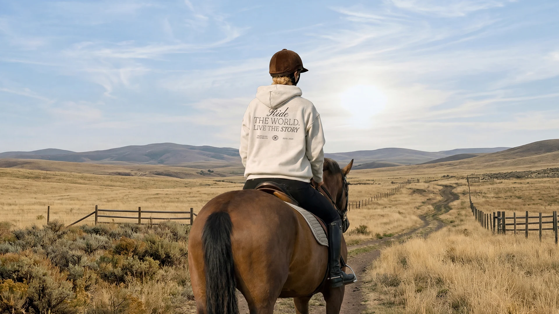
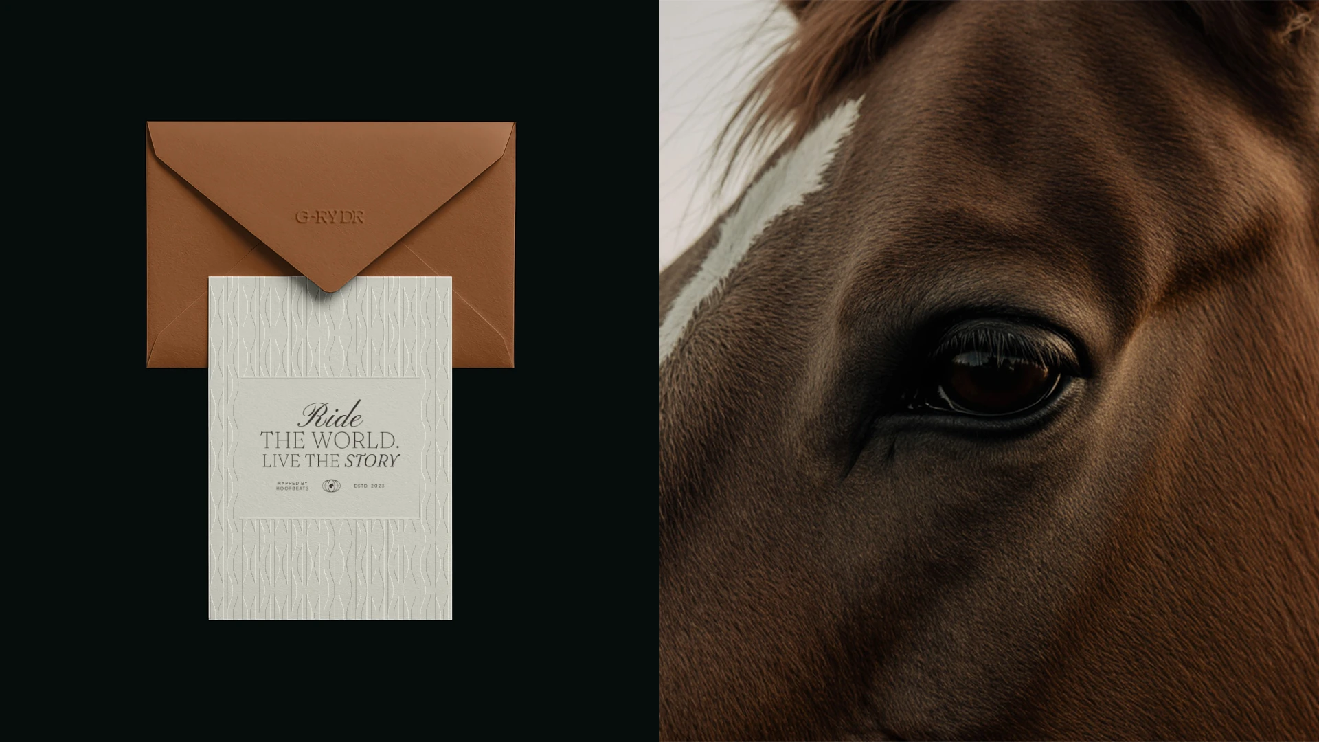
G-RYDR is not only about riding. It is about belonging to the story. Ride the world. Live the story.
¼
Like this project
Posted Aug 12, 2026
Created a refined visual identity for G-RYDR, a global equestrian lifestyle platform connecting riding, travel, culture and community.
Likes
29
Views
357
Collaborators