Luxury Travel Design Brand Identity

Flávia Jackeline


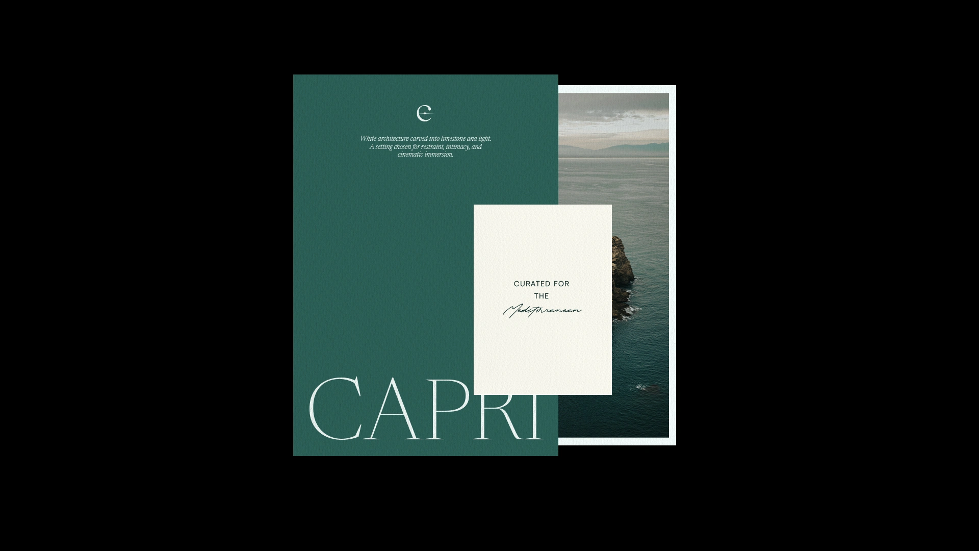
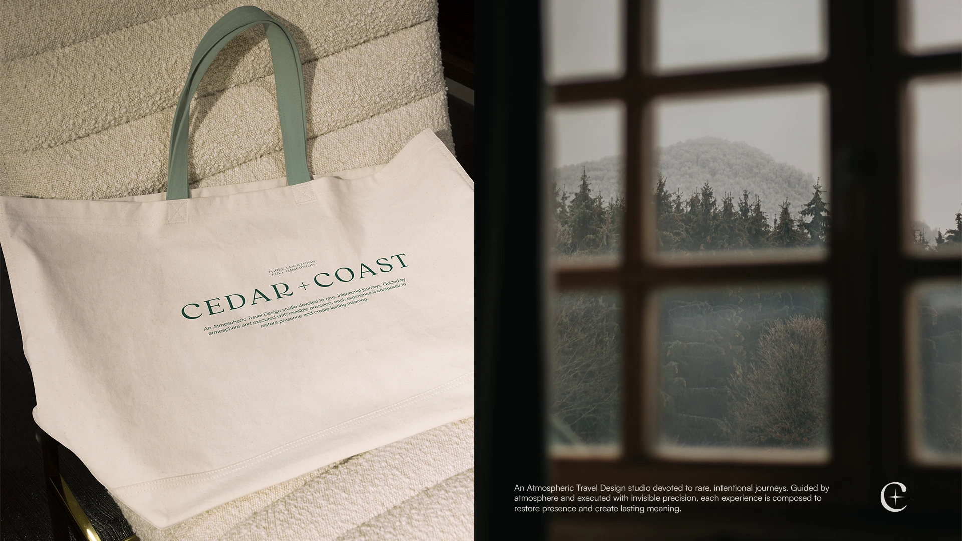
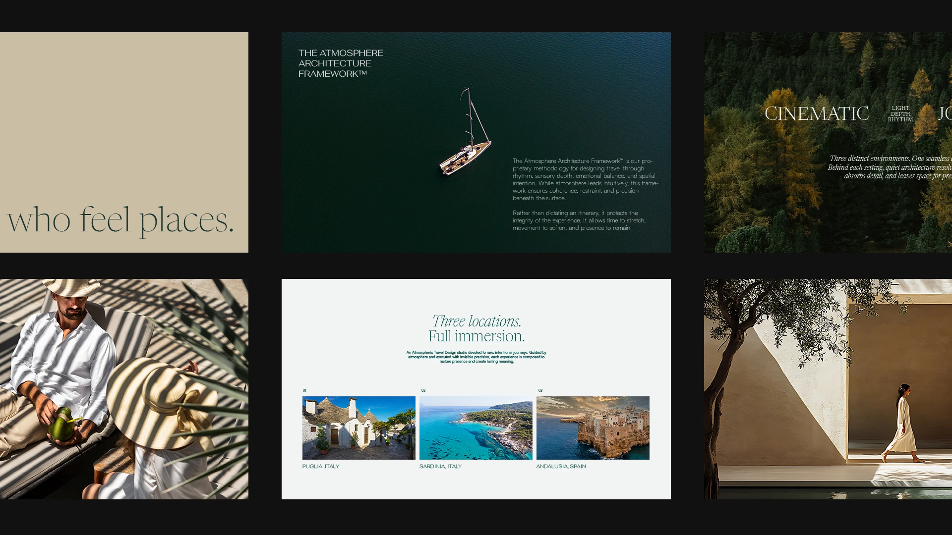
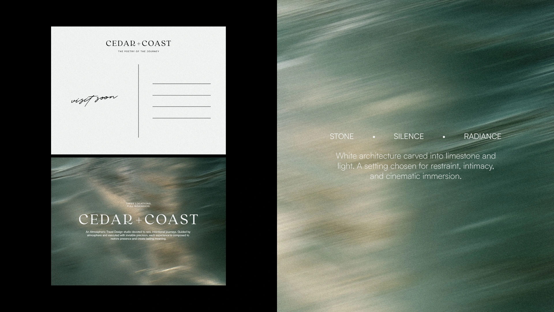
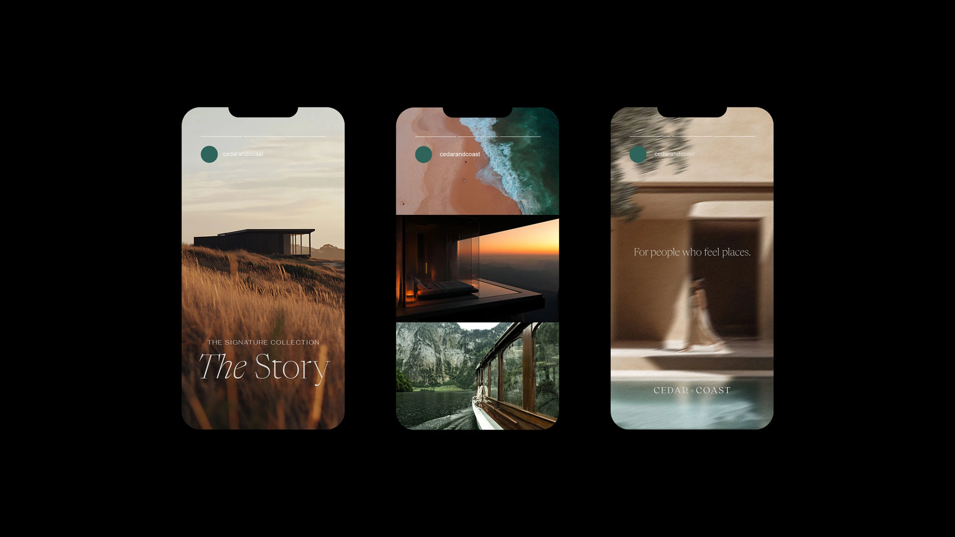
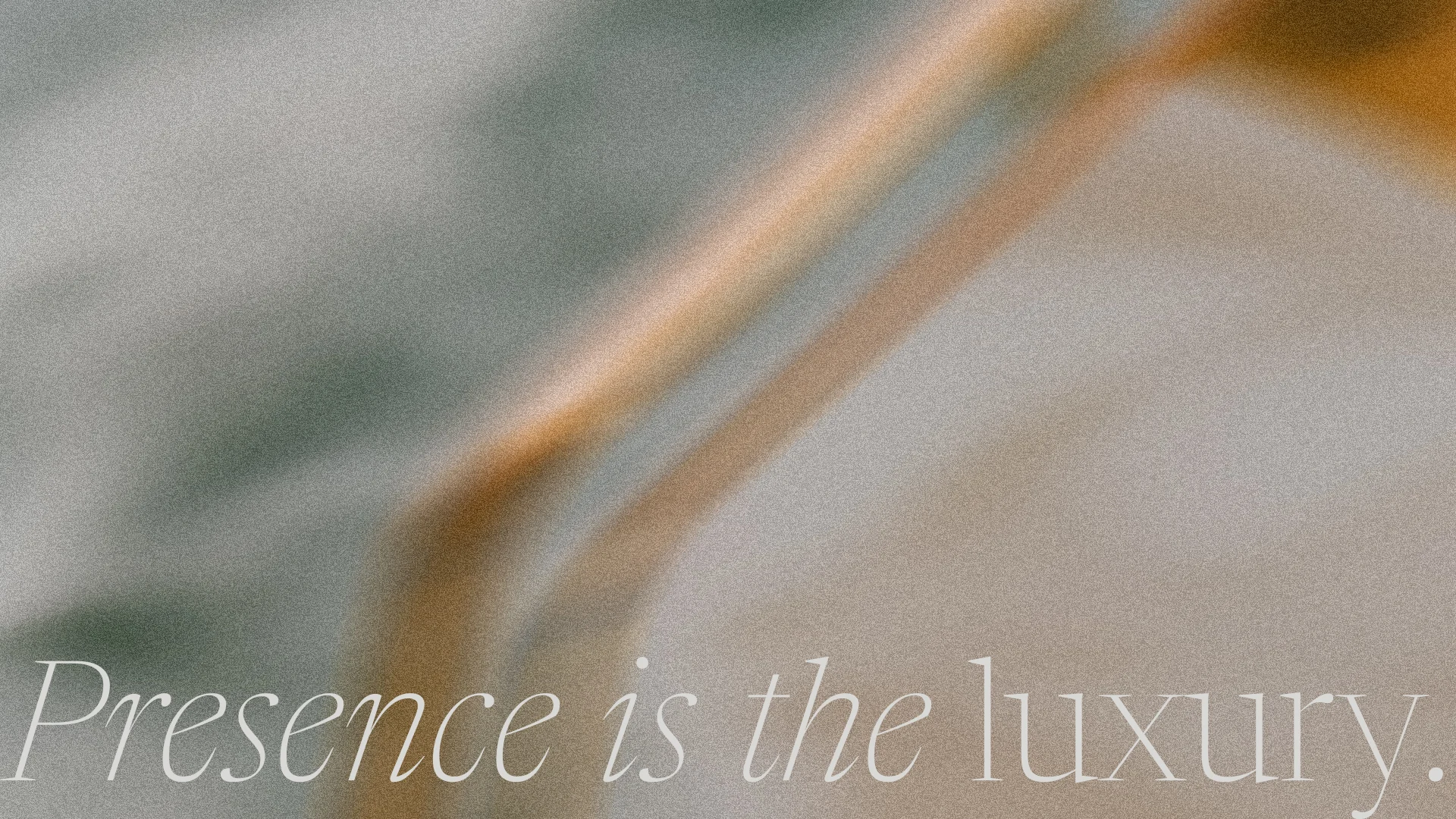
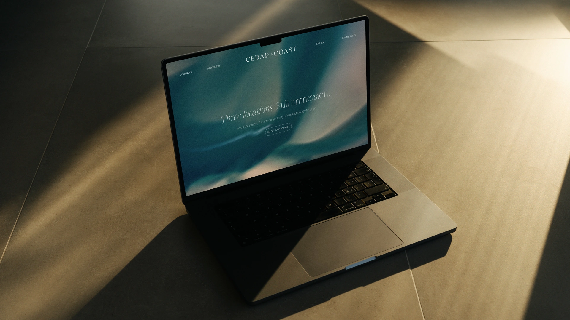
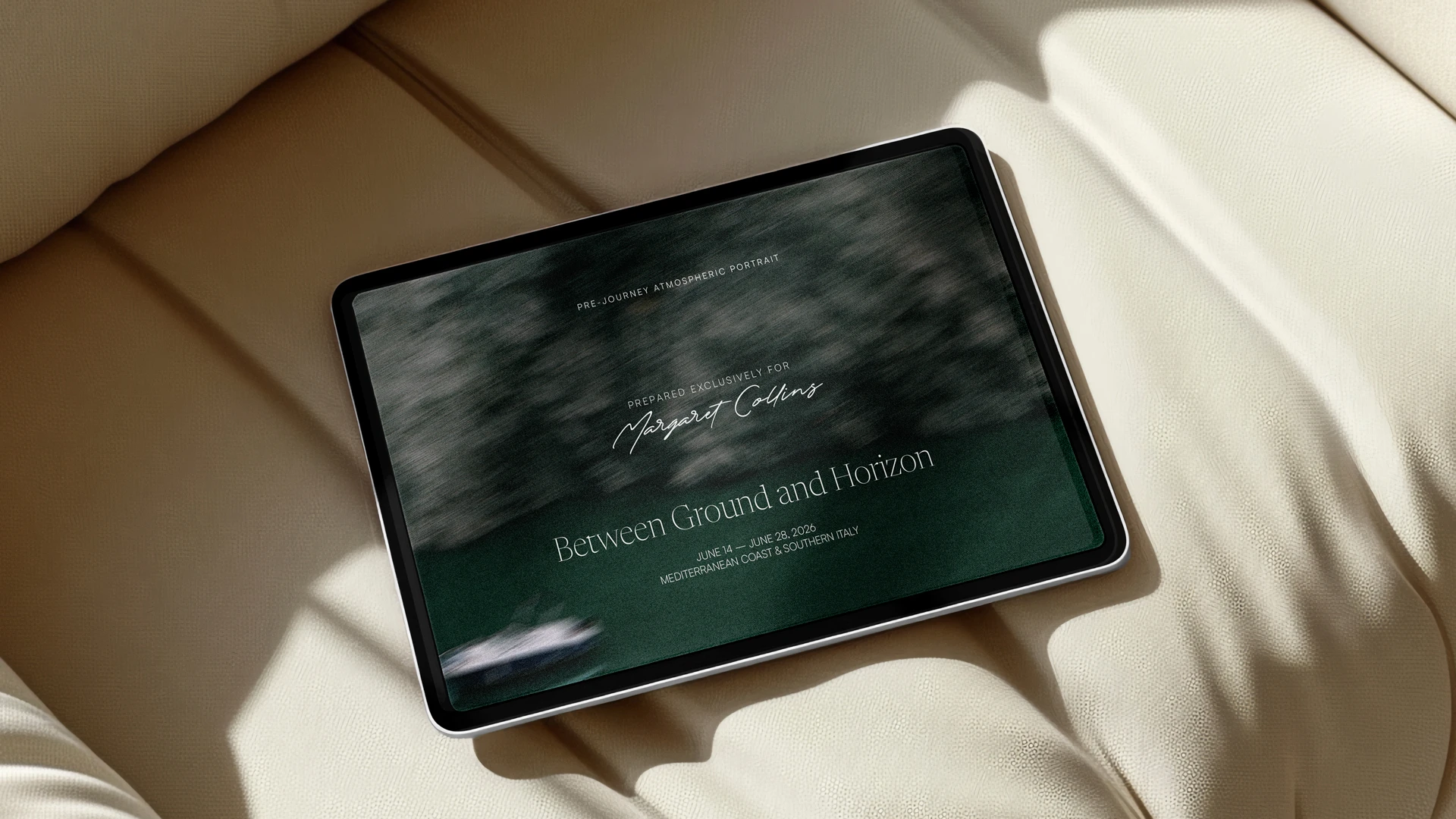
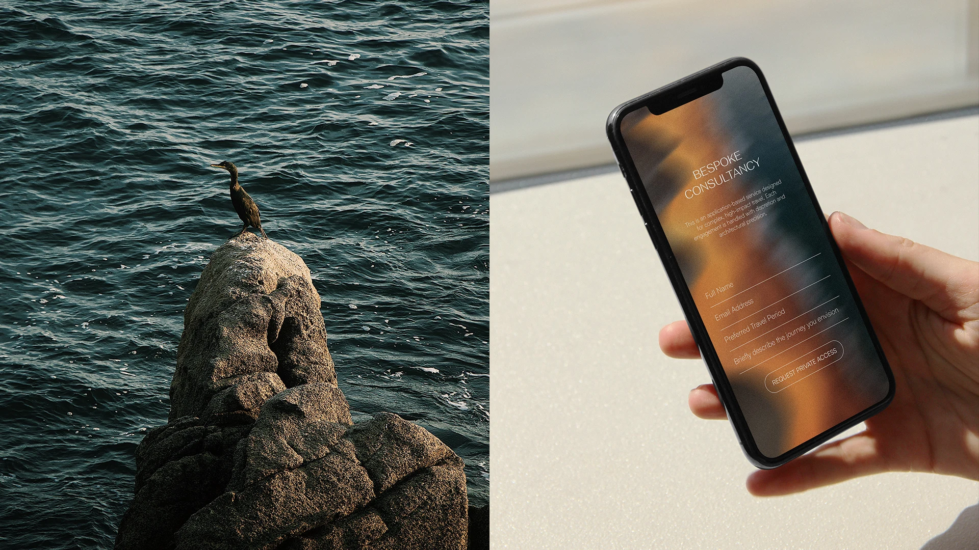
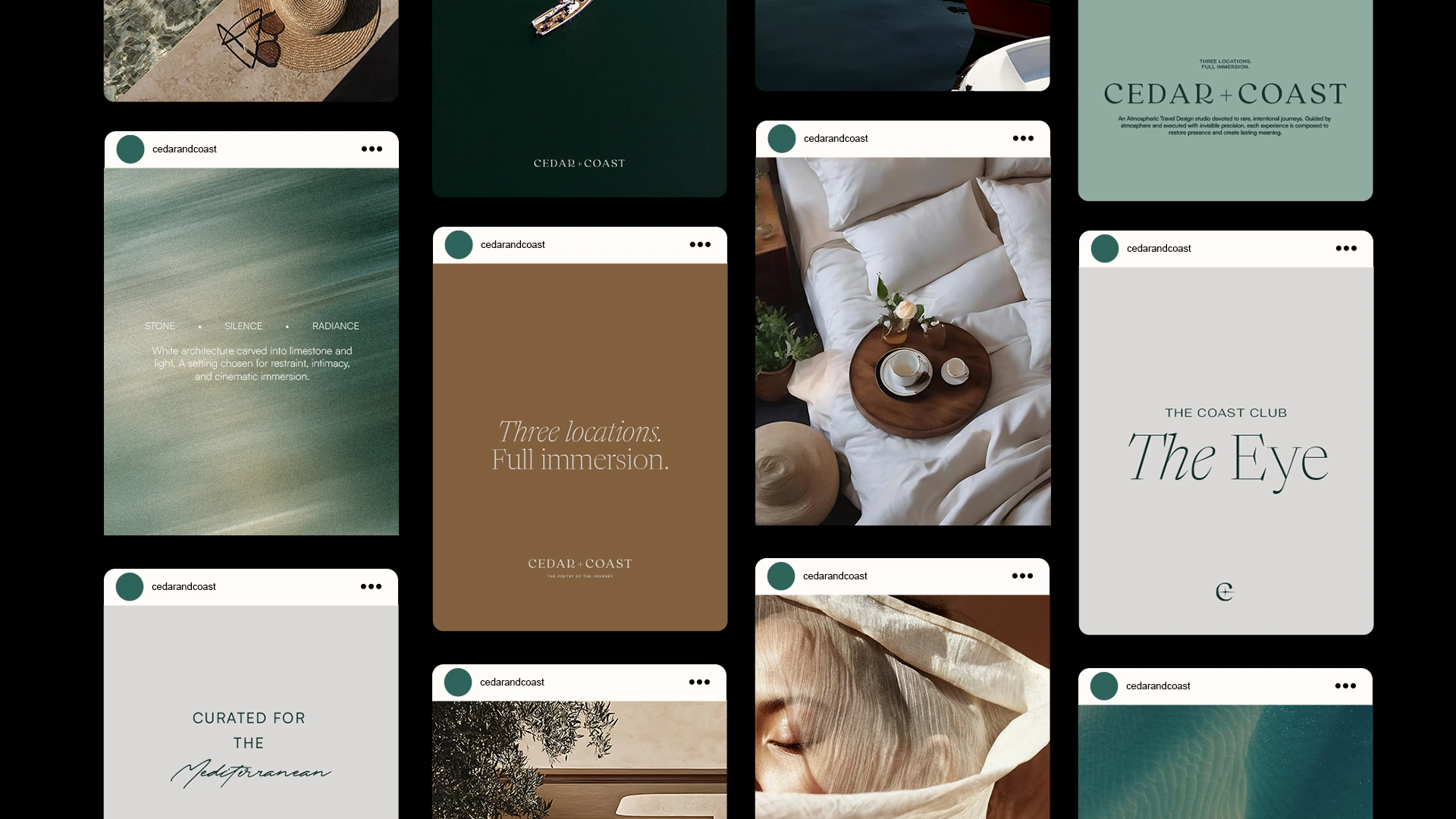
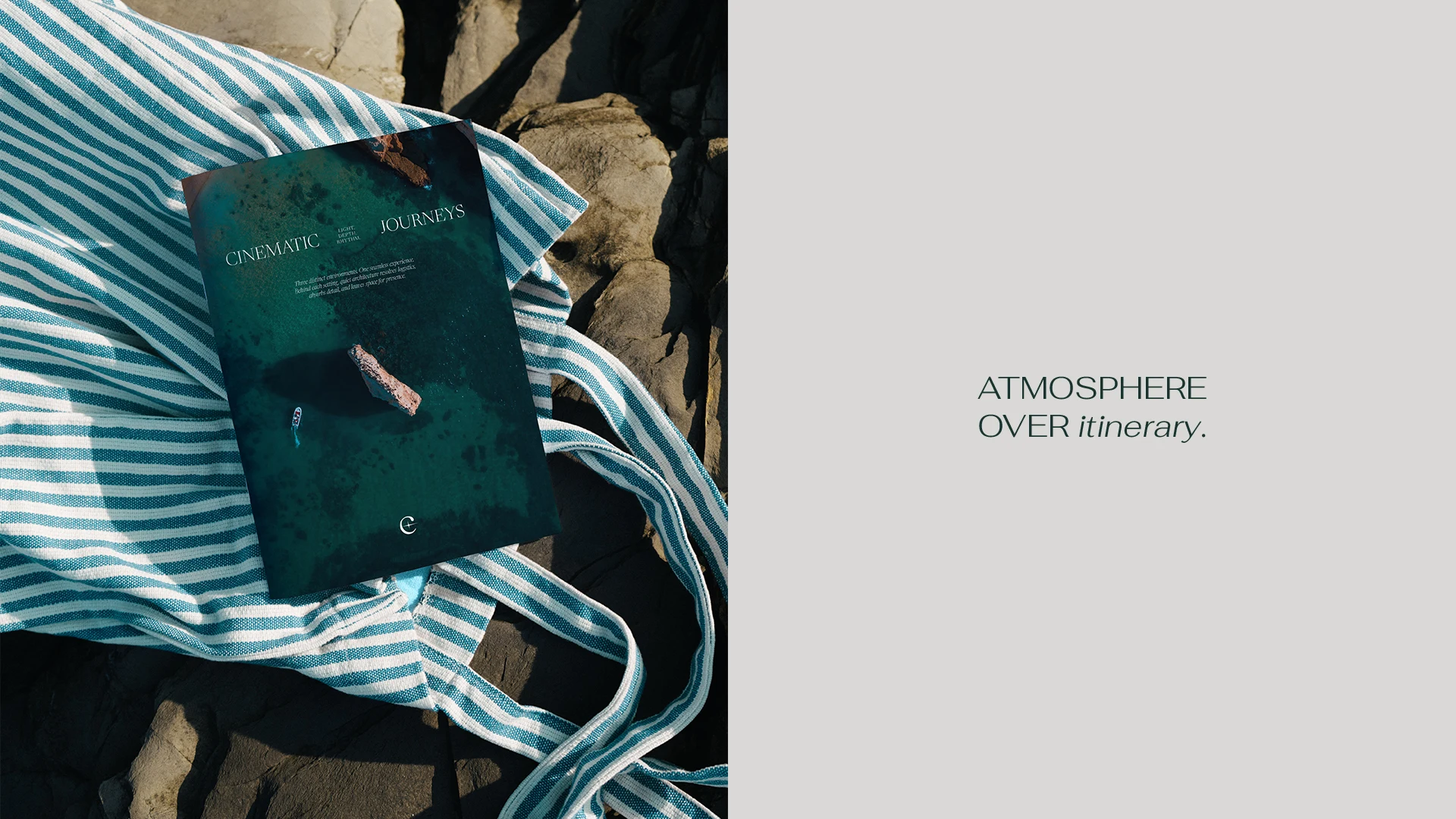
An Atmospheric Travel Design studio built on the belief that true luxury lives in atmosphere, not destination. Cedar + Coast approaches travel as authorship. Each journey composed with invisible precision, emotional depth, and deliberate restraint.
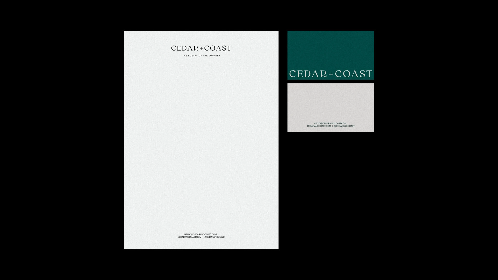
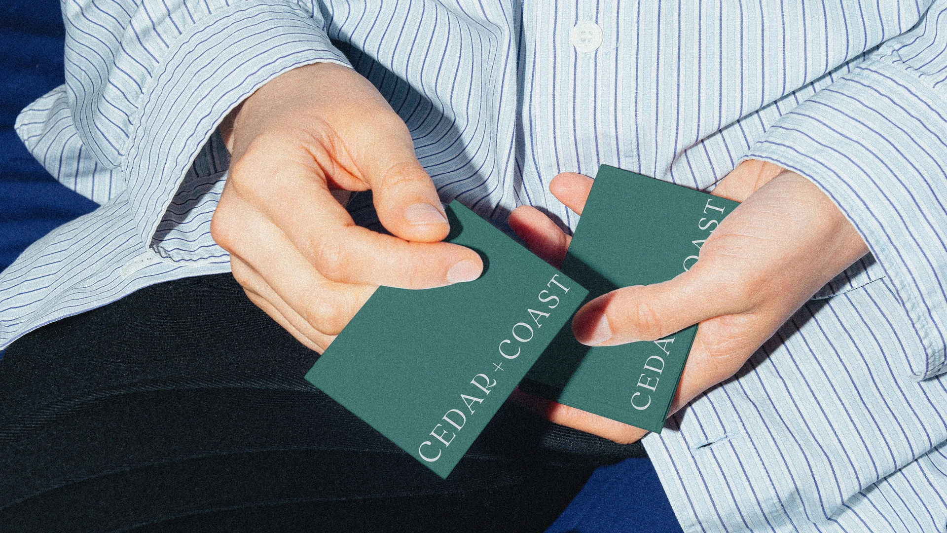
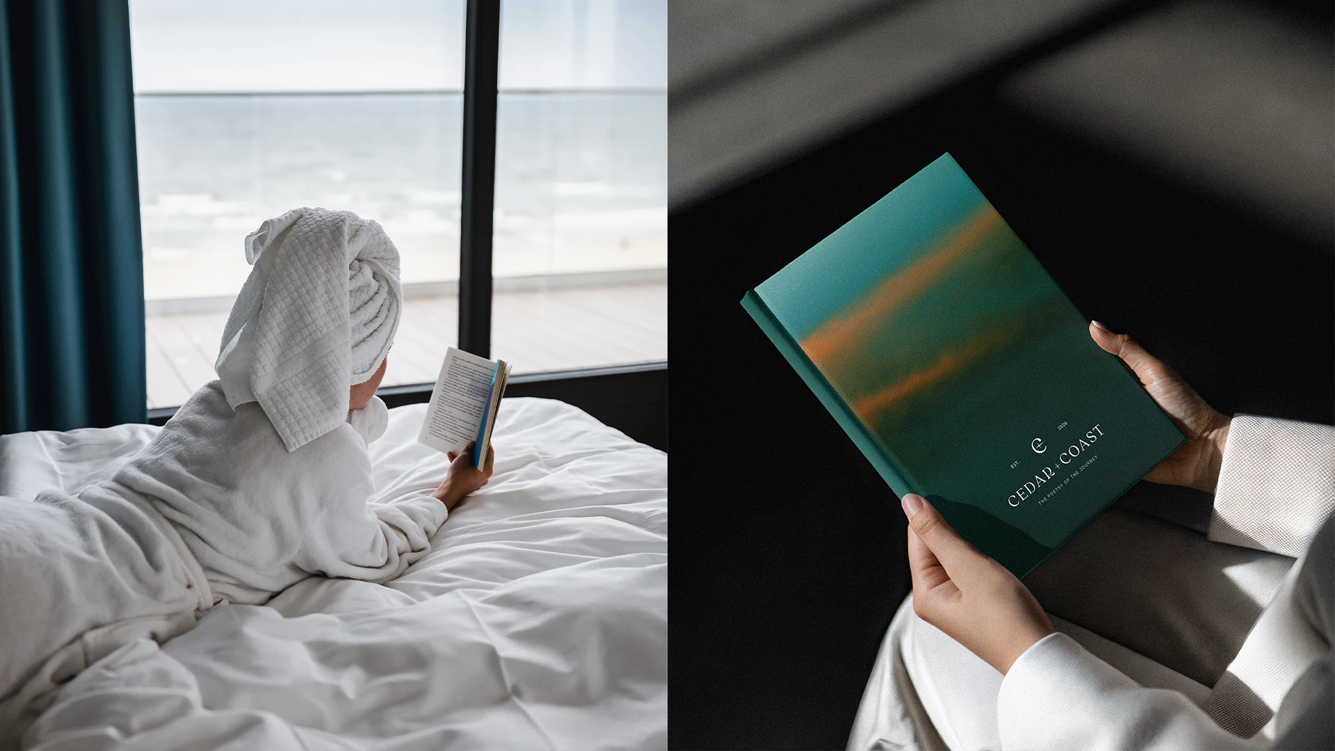
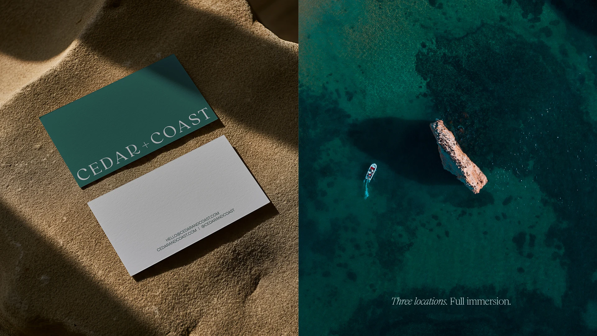
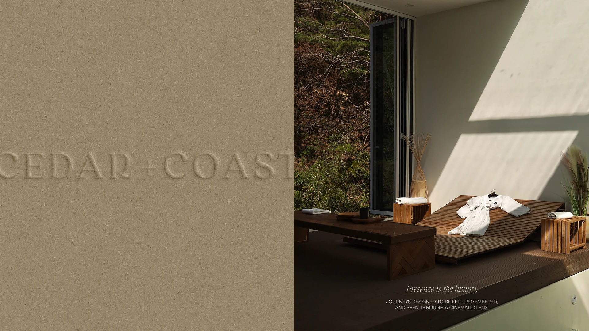
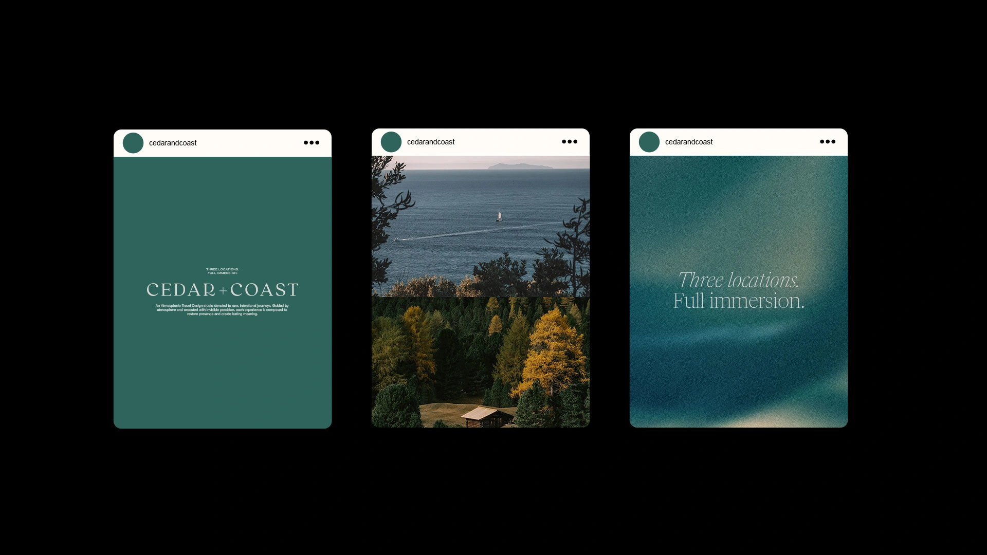
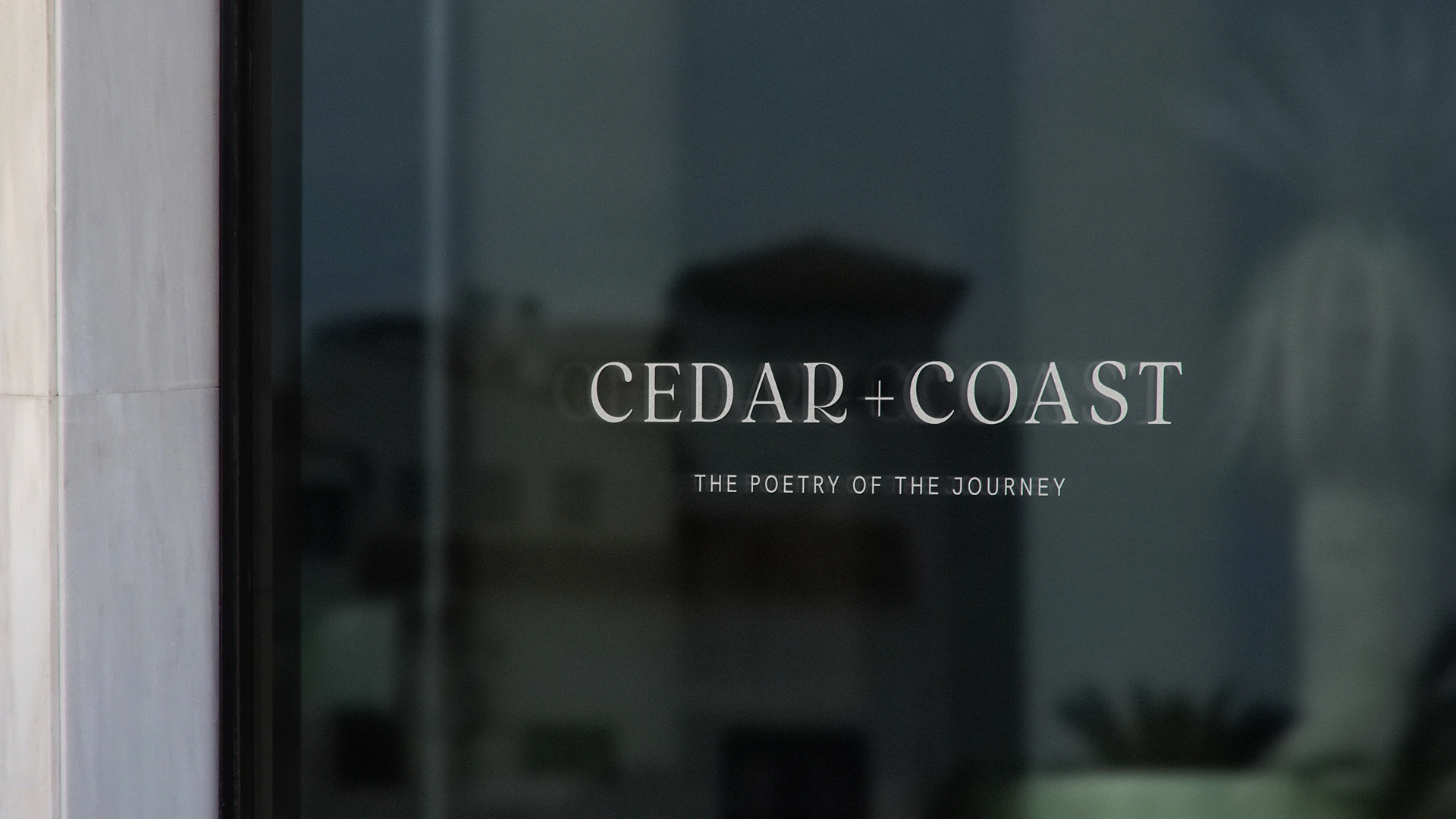
The identity reflects the brand's core duality: Cedar and Coast. Strength and fluidity. Land and water. This tension runs through every decision, from the deep blue-green palette anchored between sea and forest, to the logotype's architectural calm and quiet presence.
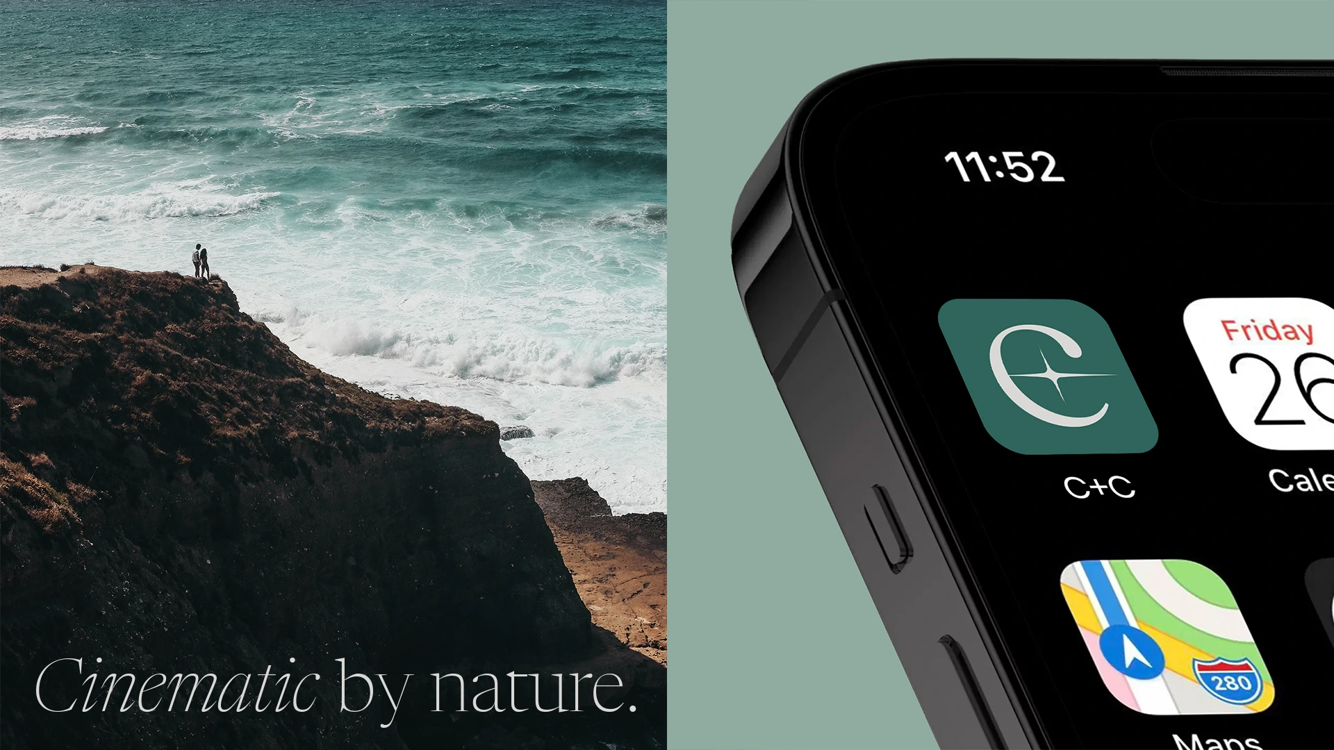
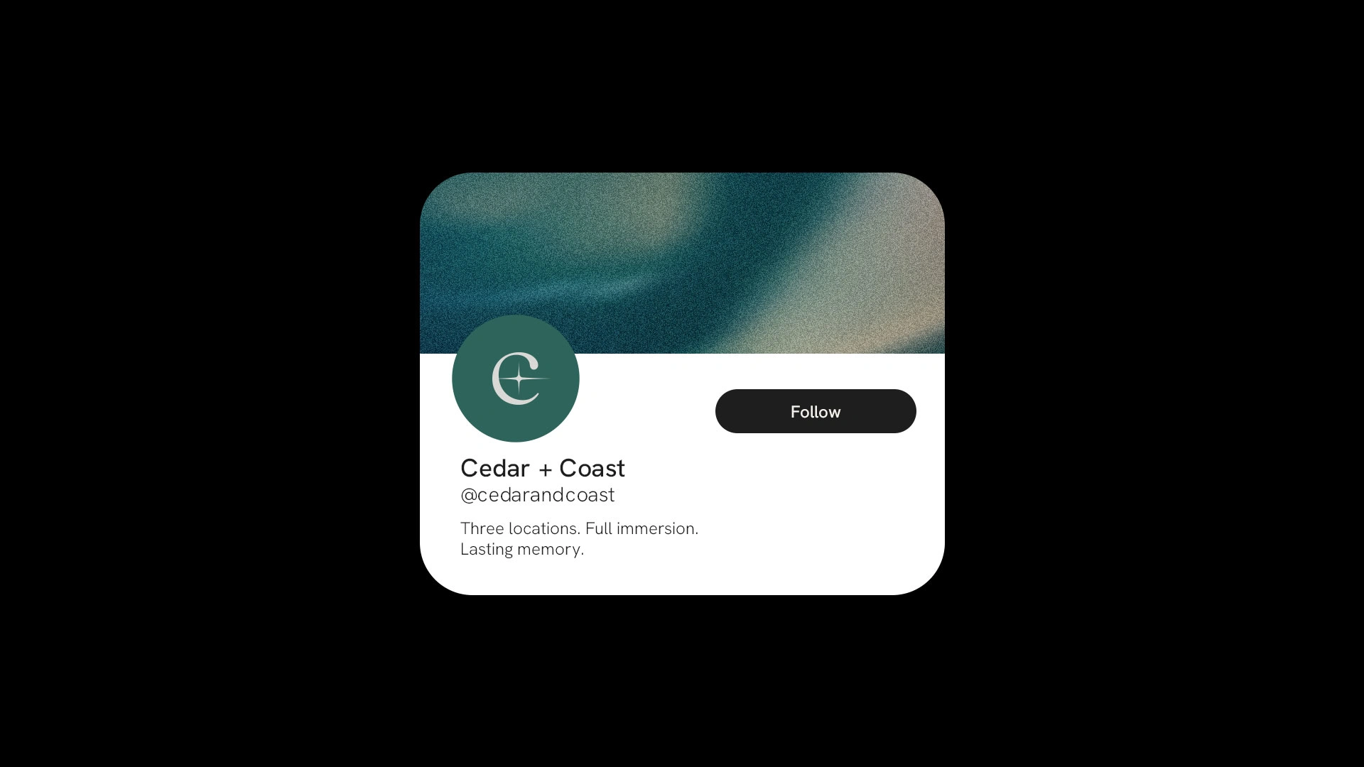
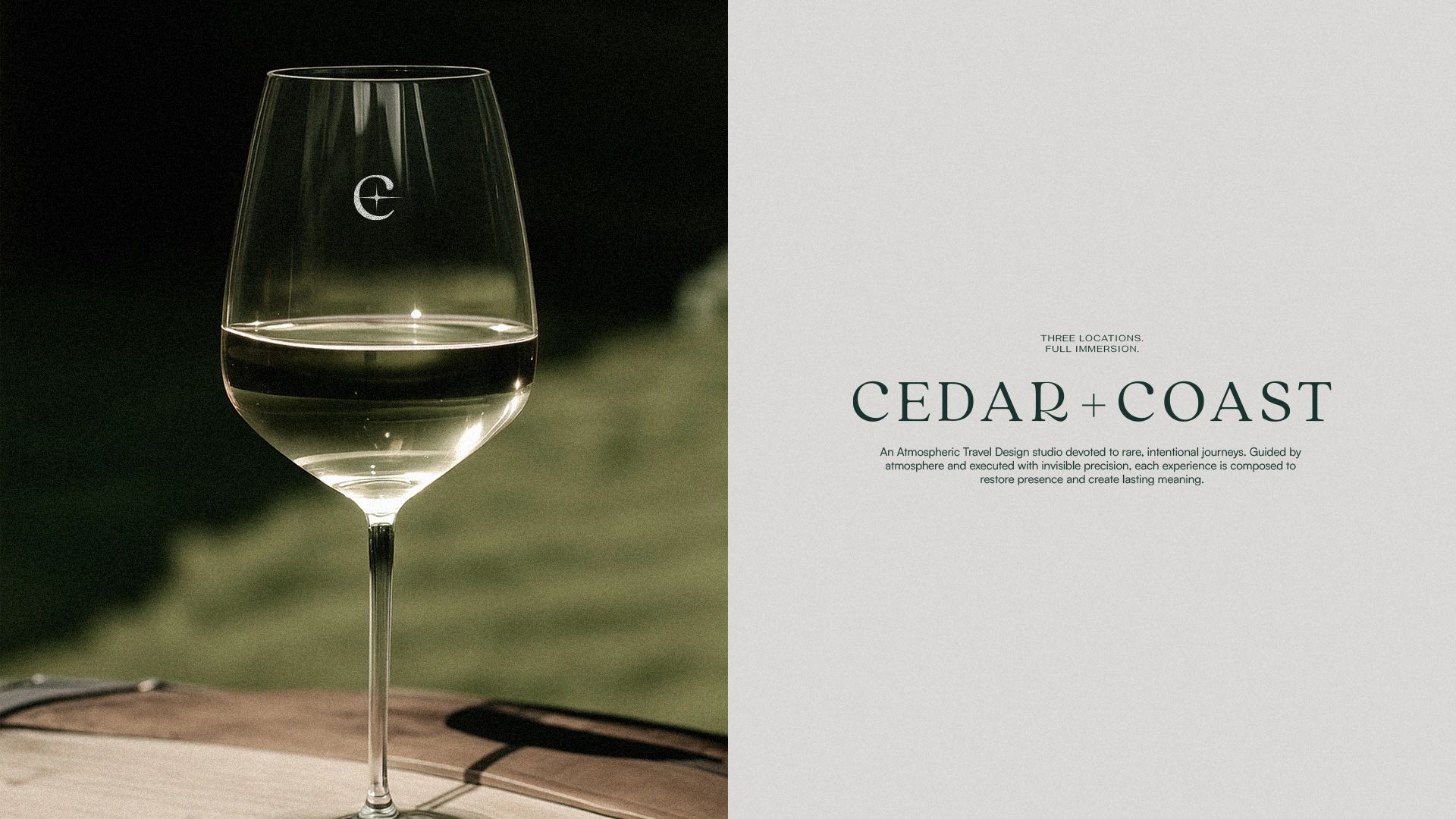
The monogram carries that same duality in its most silent form. The C evokes horizon, cycle, and continuity. The central star is not a literal symbol. It is a visual point of tension representing convergence and balance. Sun and moon without naming either. Land and water without illustrating either. The mark functions more as sensation than figure.
Nothing is excessive. Everything is intentional.

Flávia Jackeline © 2026
Like this project
Posted Aug 12, 2026
Created a brand identity for a luxury travel design studio.