MOVVA — Yoga & Pilates Website Design and Webflow Development

Anna Peredelskaia
1 collaborator


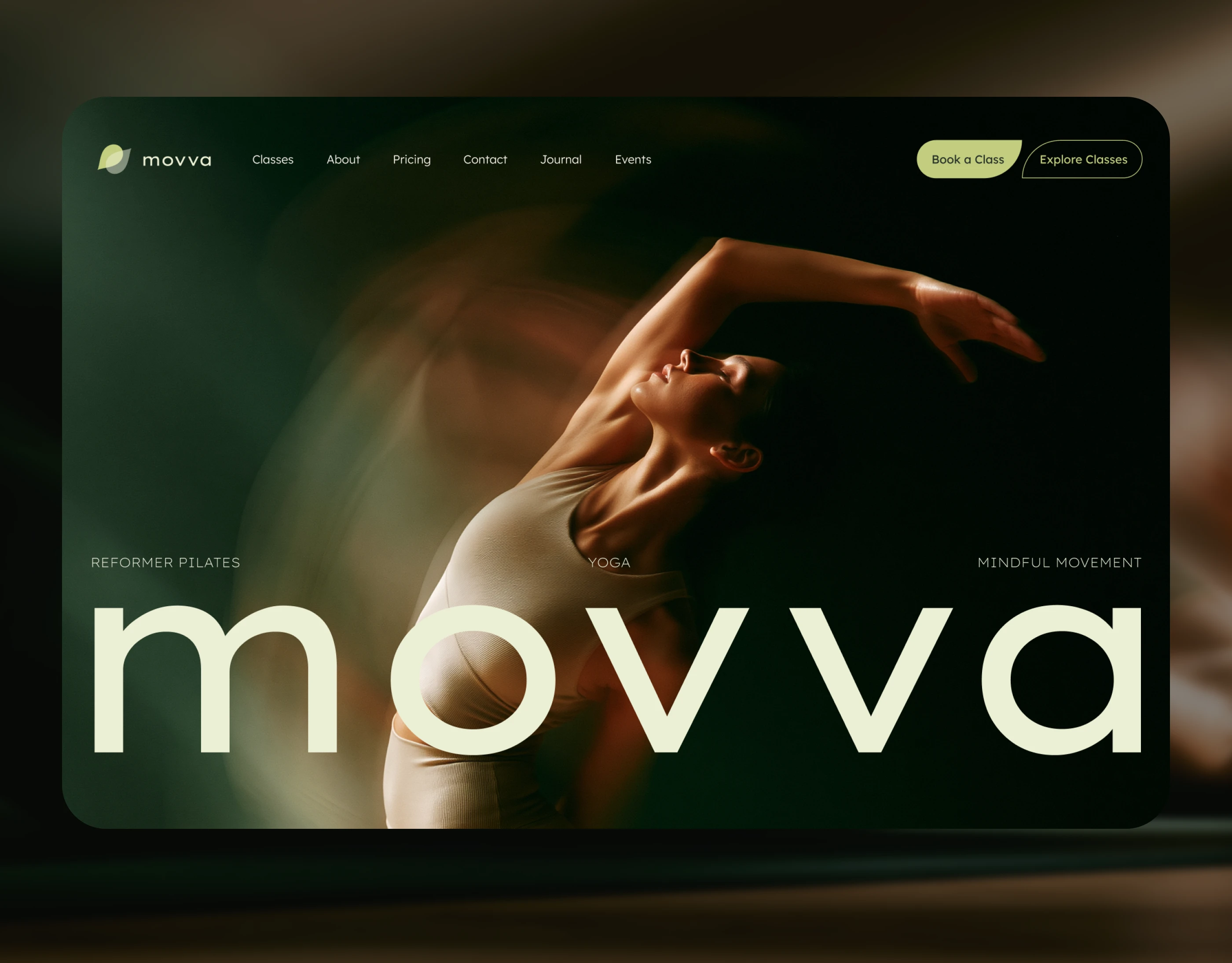
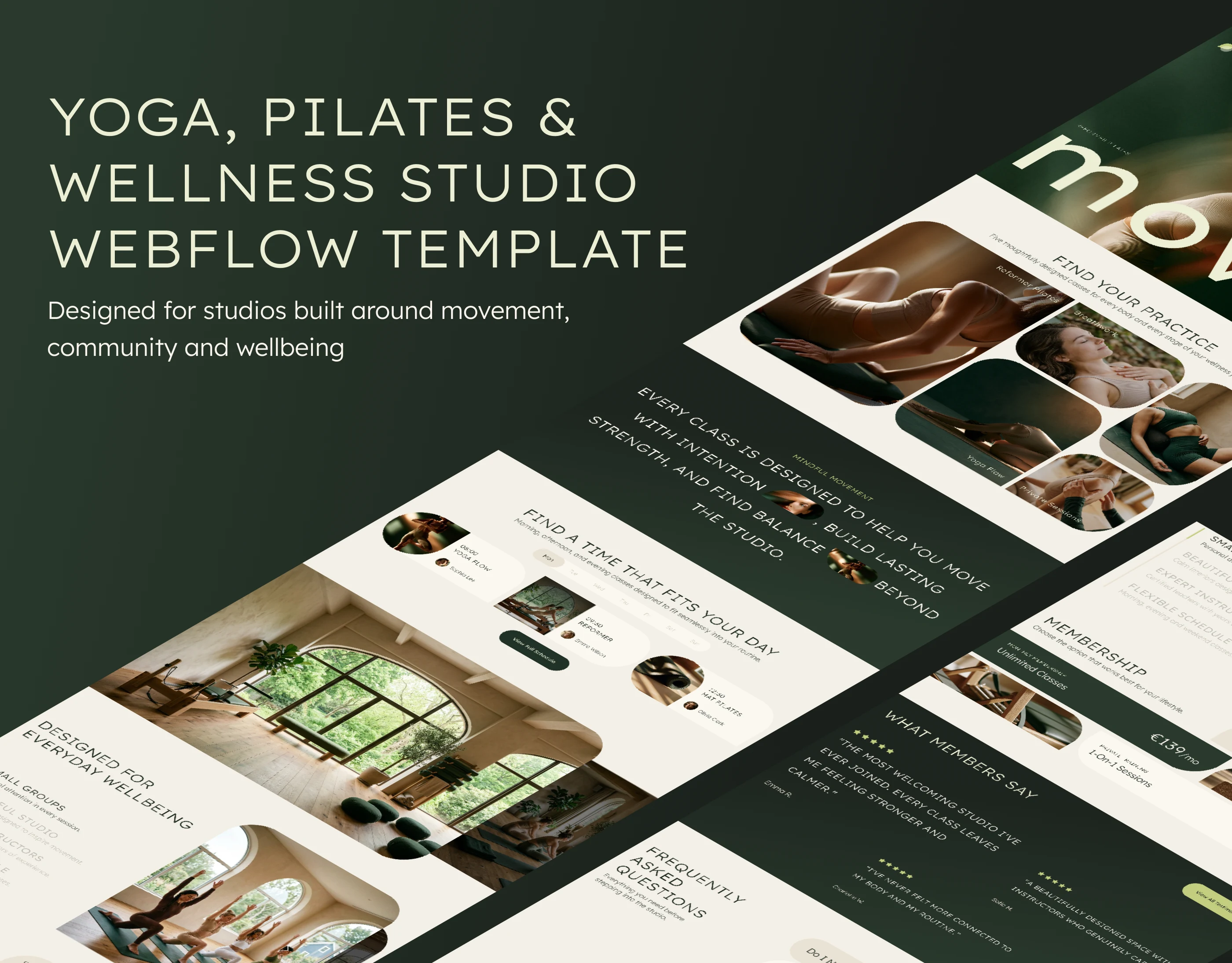
Yoga and Pilates website design with dedicated pages for classes, instructors, memberships and studio content.
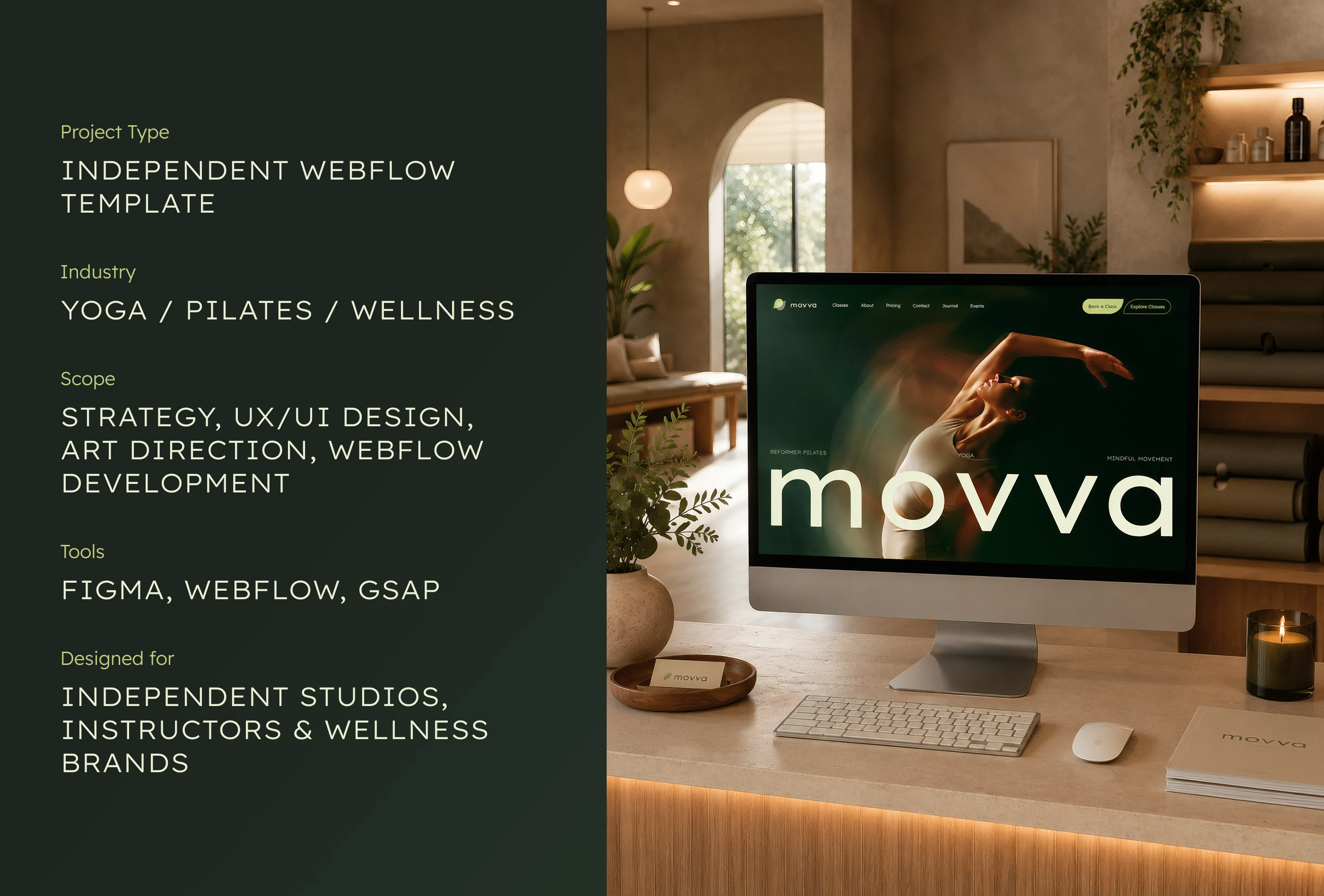
From website strategy and UX/UI design in Figma to Webflow development and GSAP interactions.
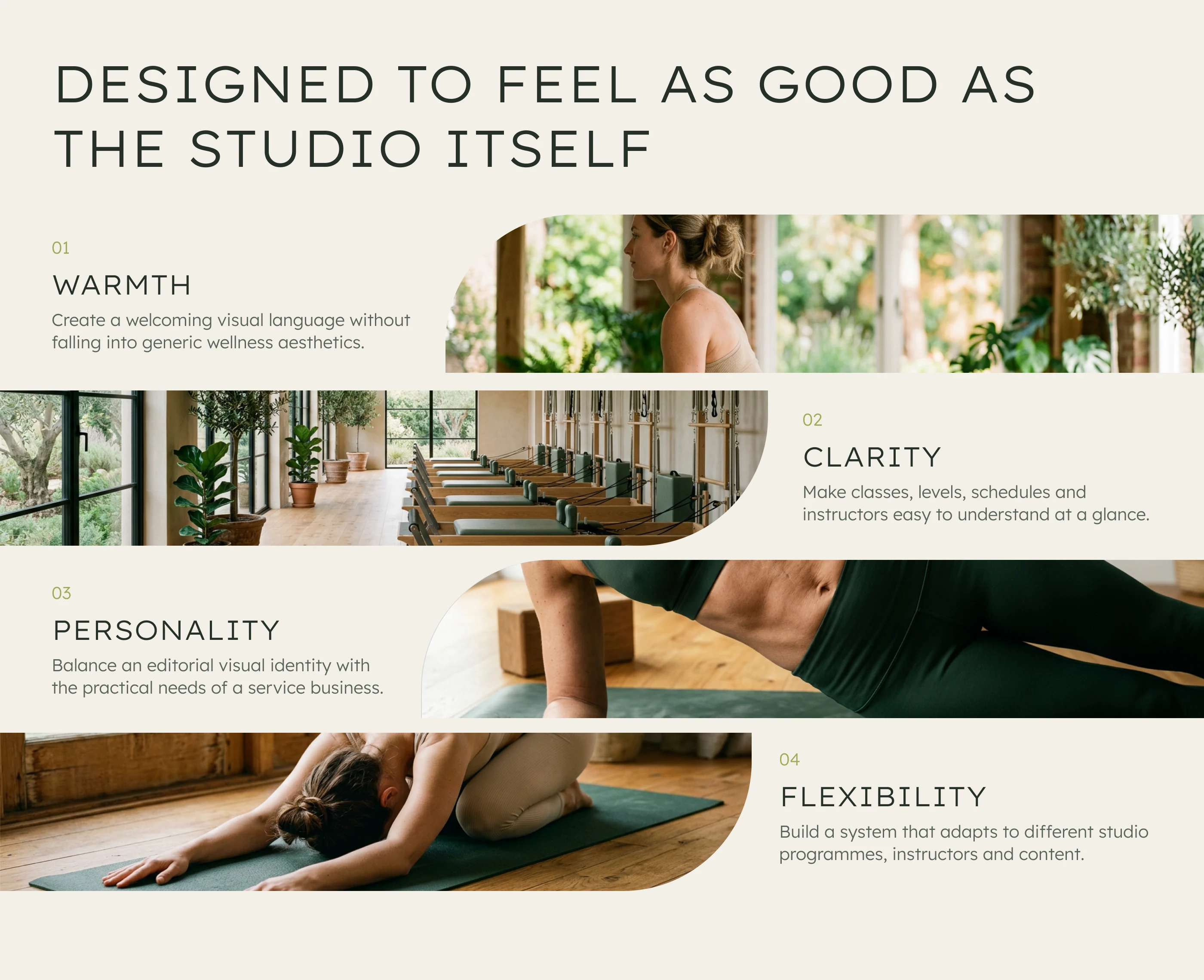
Wellness website UX built around clear navigation, a welcoming visual style and flexible layouts for different studio offerings.
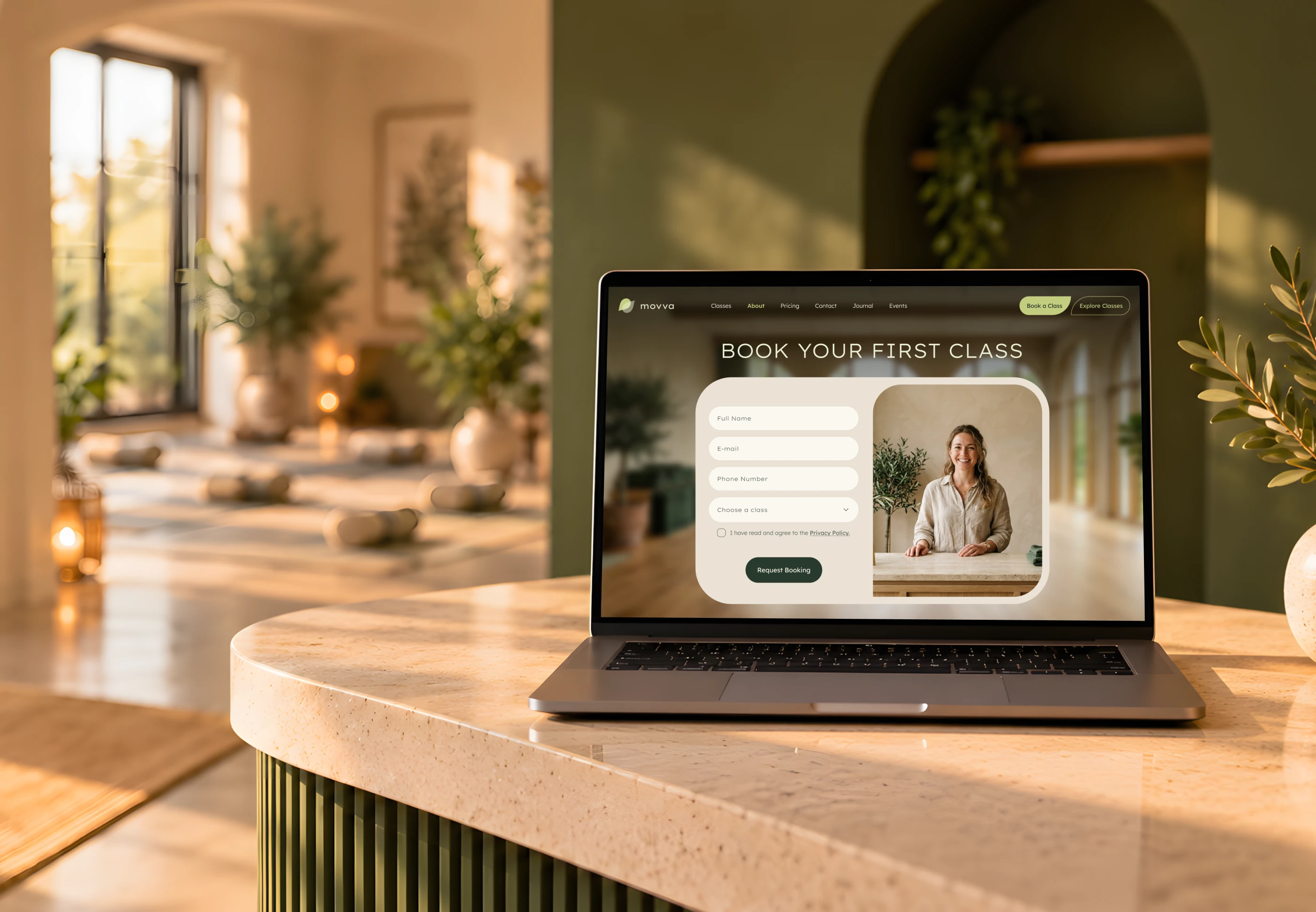
Class booking page design that gives new visitors a clear next step towards their first studio session.
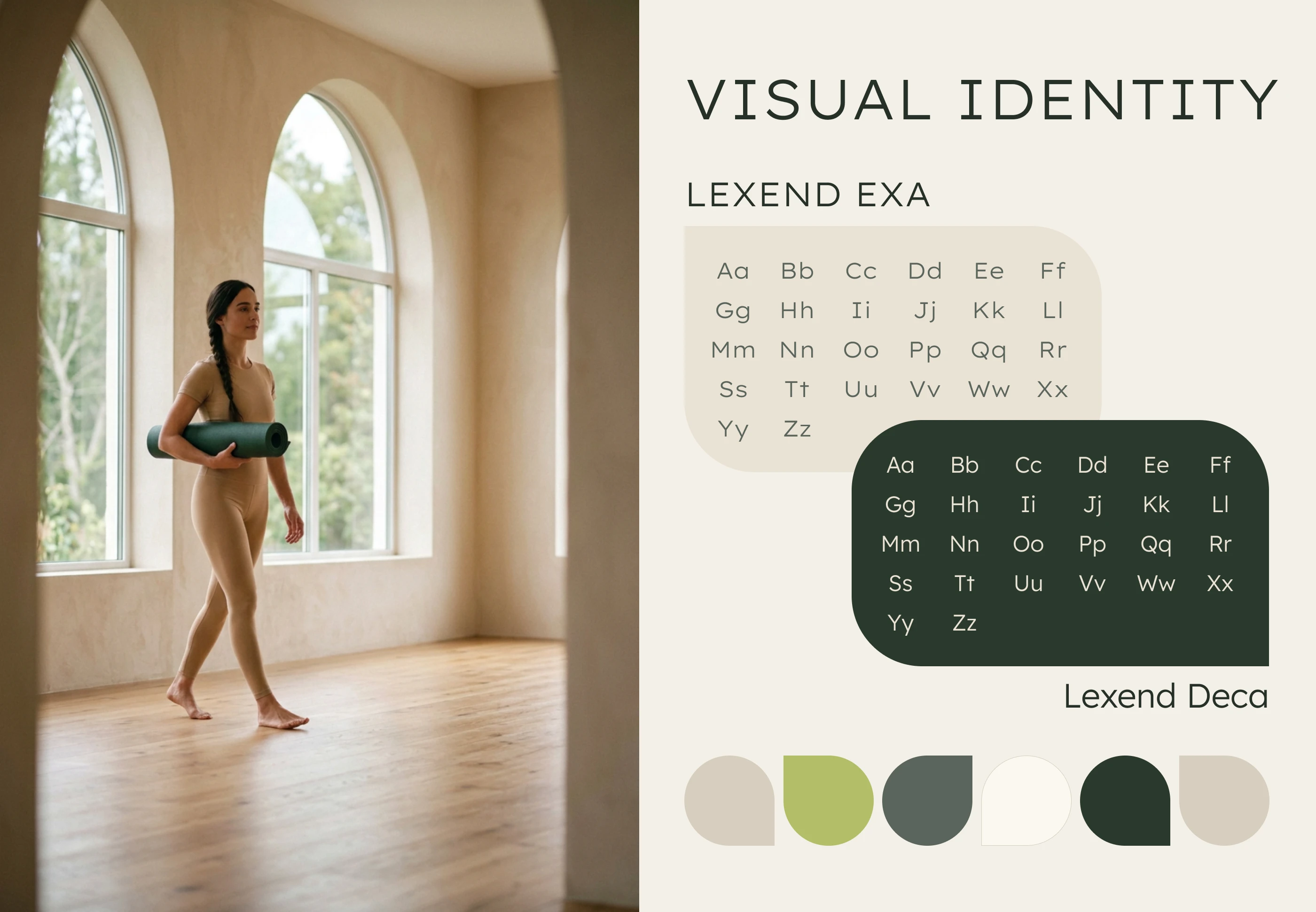
MOVVA’s visual identity combines Lexend typography, earthy greens and warm neutrals for a cohesive wellness website.
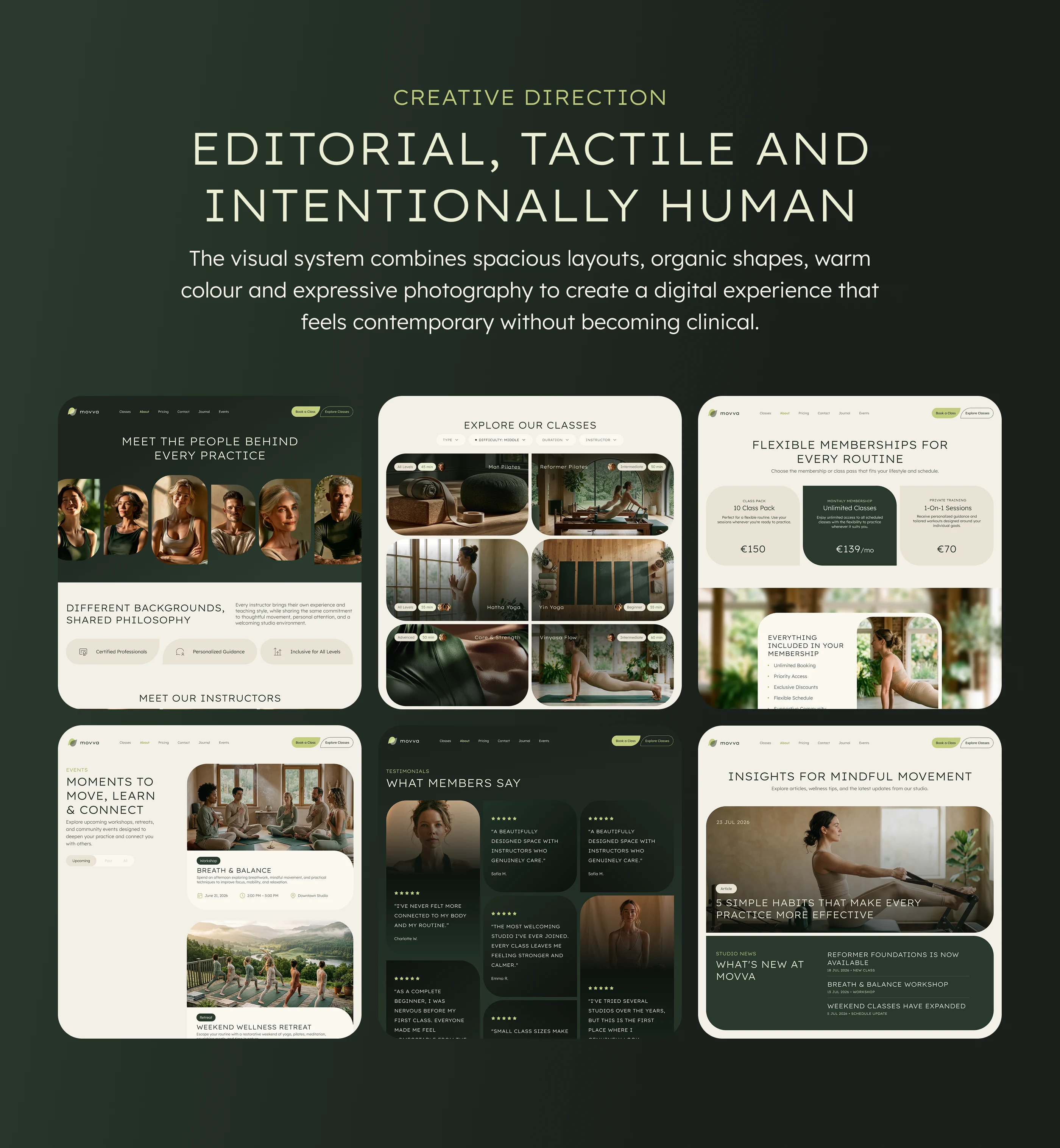
Editorial web design for a wellness brand, combining organic shapes, expressive typography and human-focused photography.
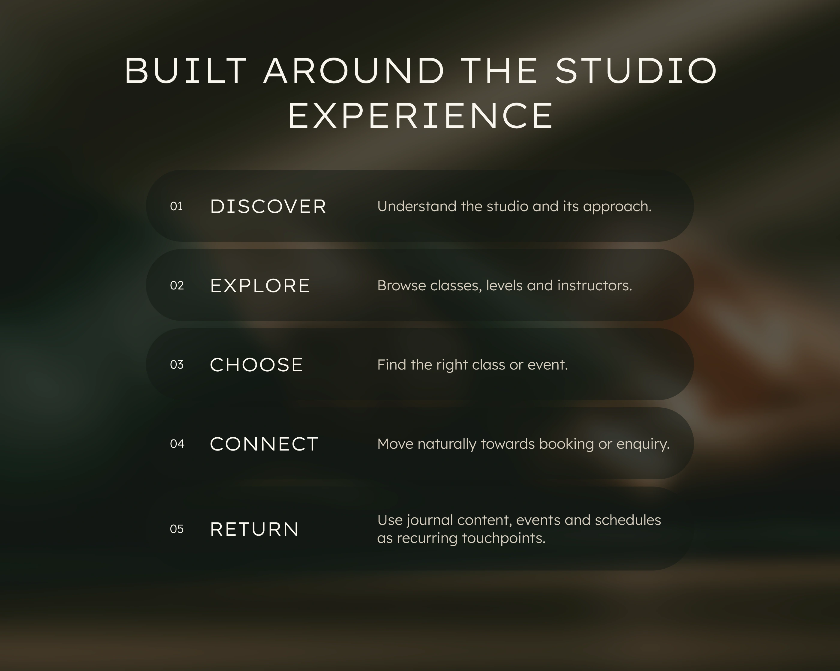
Website user journey connecting studio discovery, class exploration, membership selection and booking enquiries.
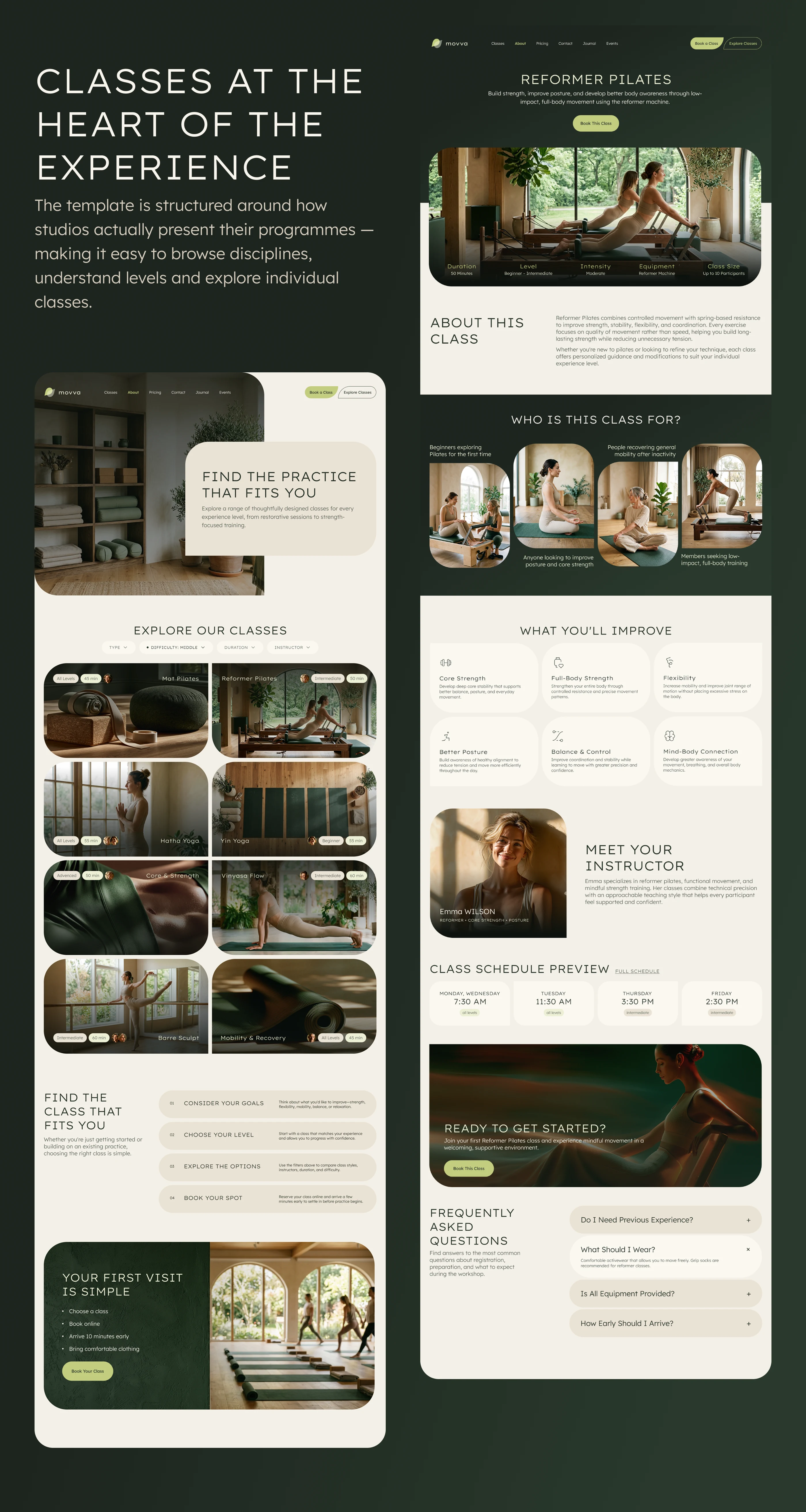
Pilates class page design with session details, instructor profiles, schedules and clear calls to action.
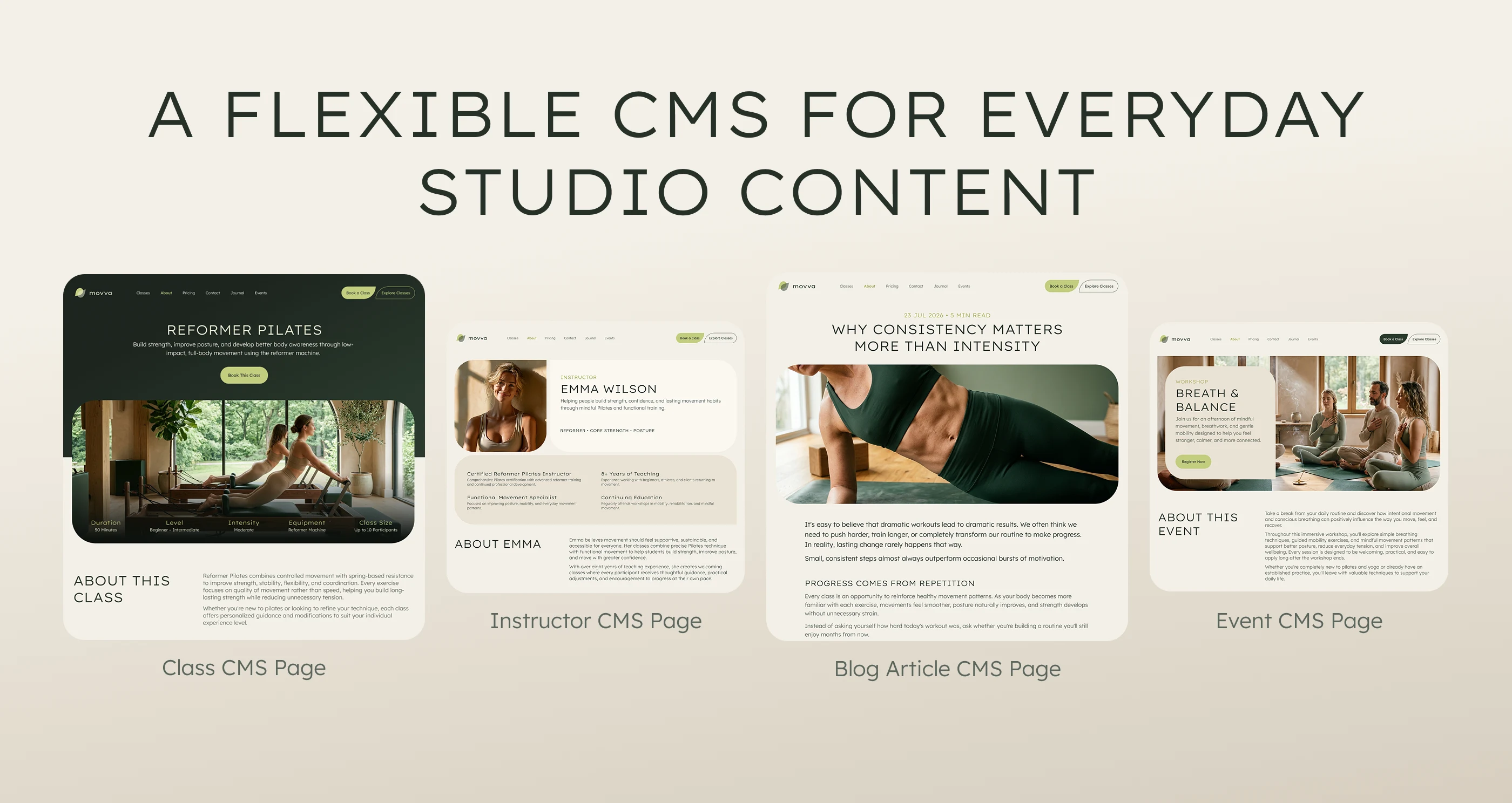
Four Webflow CMS collections for managing studio classes, instructors, journal articles and events.
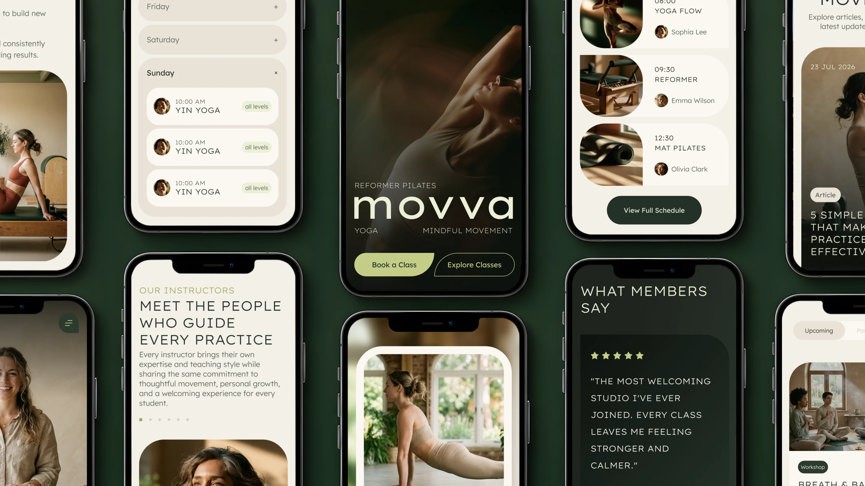
Responsive website design adapted for mobile browsing, with readable content, touch-friendly controls and clear navigation.
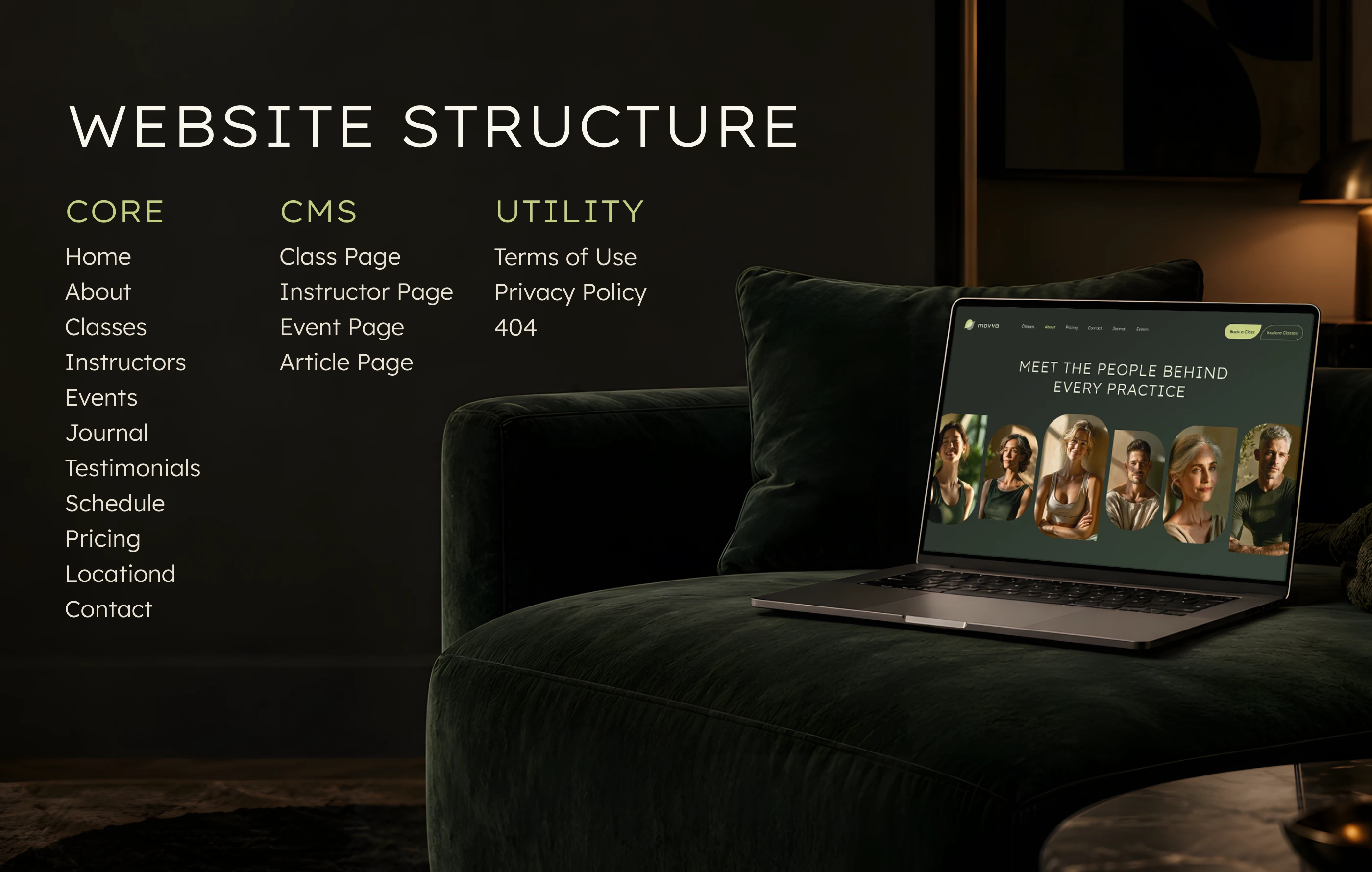
Wellness studio website architecture covering core pages, dynamic CMS content and essential utility pages.
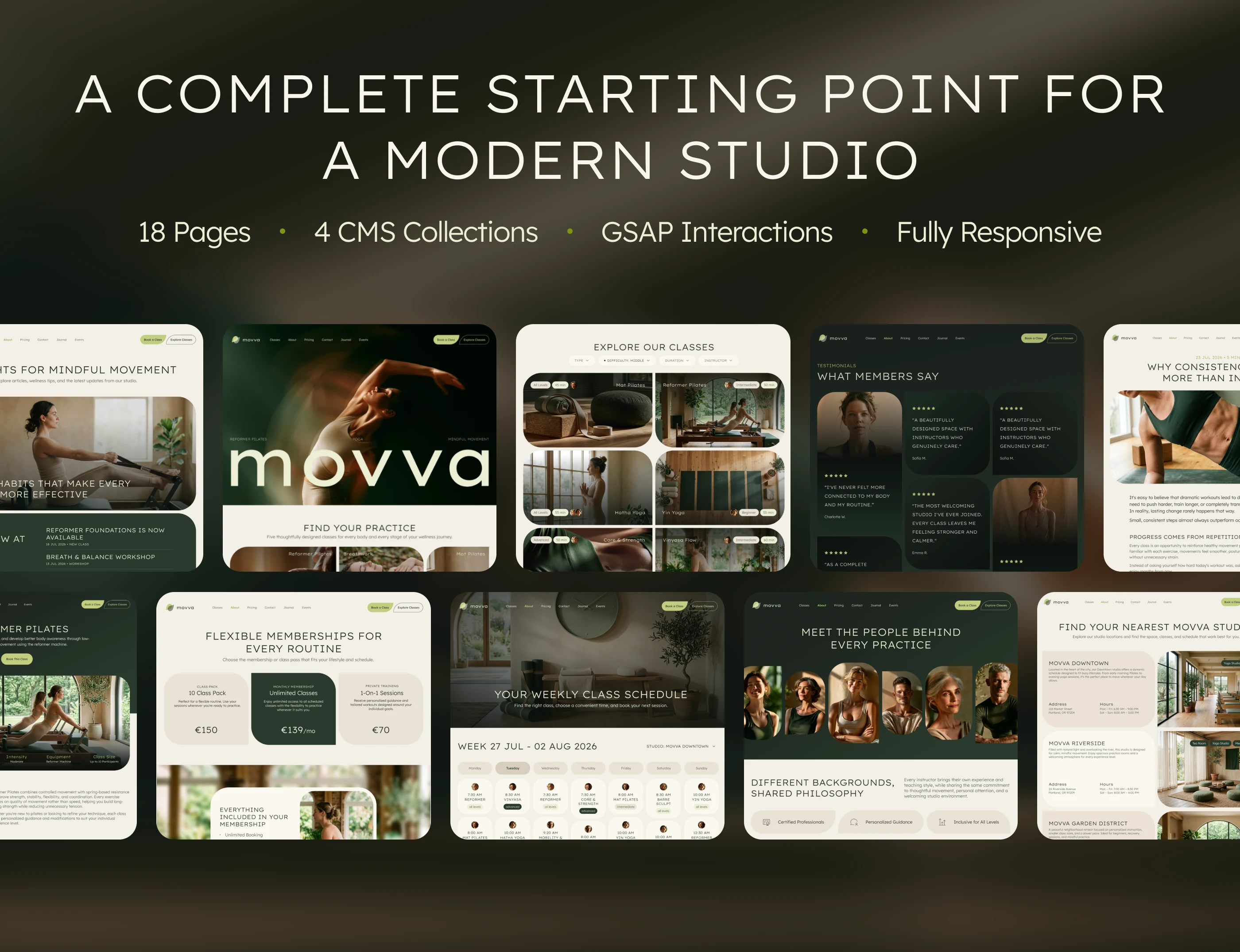
An 18-page Webflow template for modern wellness studios, with four CMS collections, GSAP interactions and responsive layouts.

MOVVA — website strategy, art direction, UX/UI design and Webflow development by Anna Peredelskaia at Collabas.
Structuring the visitor journey
One challenge was presenting several movement disciplines within the same website. Yoga, Pilates, and barre share a studio context, but visitors need to understand what makes each option different before choosing a class.
I gave class information, instructor profiles, and pricing distinct roles in that decision. Class pages explain the activity, instructor profiles introduce the people behind it, and pricing helps visitors assess their commitment. Together, these sections support the journey from initial interest to booking.
Balancing atmosphere and practical information
The visual direction creates a sense of movement and immersion, while the supporting pages provide space for more practical content. I used typography, spacing, and recurring layouts to connect these different types of pages.
This balance mattered: expressive imagery can introduce the studio’s personality, but visitors also need to find and compare information without working through a promotional story every time.
Planning for ongoing updates
The Webflow CMS separates recurring content from the page layouts, allowing a studio to update entries without rebuilding each page individually.
I also designed reusable sections to carry the same visual language across the website. This gives future additions an existing structure to follow and makes the site easier to maintain as the studio’s content changes.
Like this project
Posted Oct 7, 2026
Designed and built an 18-page Webflow template for yoga and Pilates studios, with 4 CMS collections, responsive layouts and GSAP interactions.
Likes
1
Views
3
Collaborators