
max
Filip Panov
I make founder brands premium, trusted & story-led
- $10k+
- Earned
- 12x
- Hired
- 5.00
- Rating
- 591
- Followers
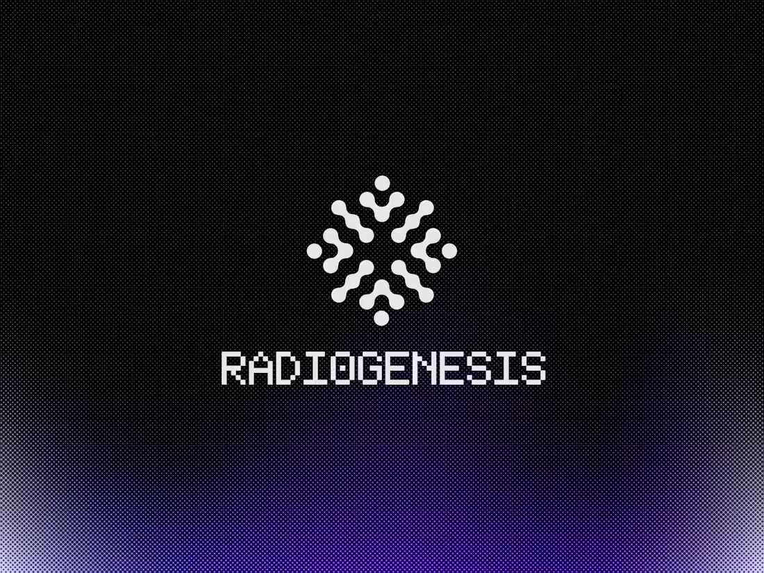
Radiogenesis Visual Identity Design
5
37
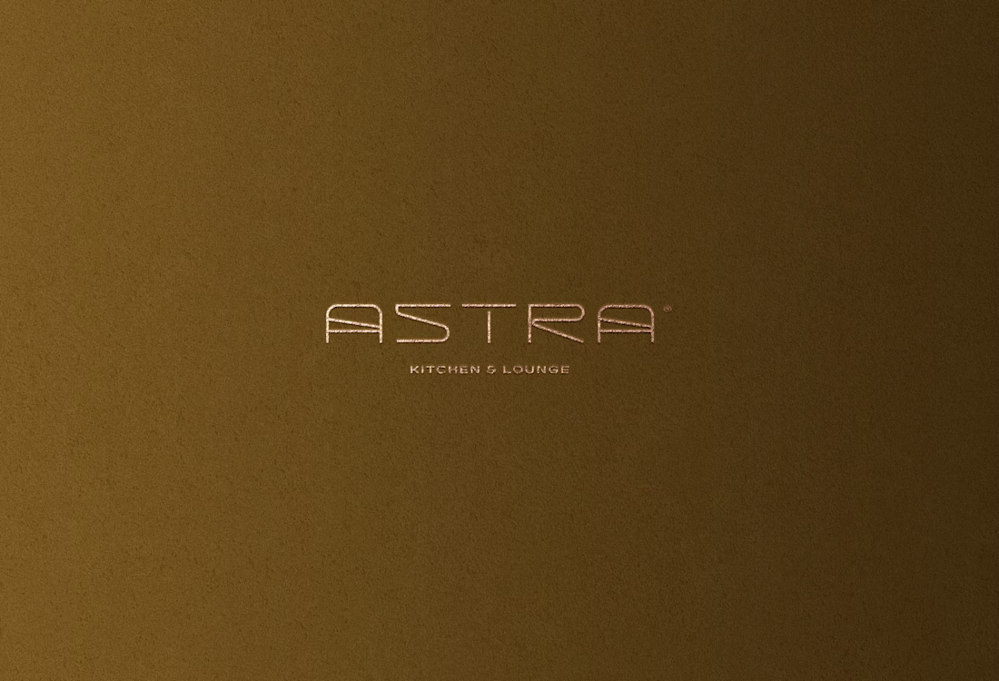
Astra Kitchen & Lounge Brand Identity
2
19
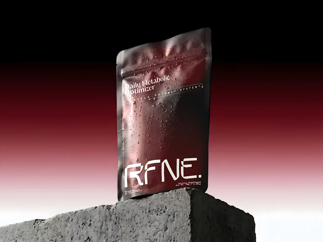
Brand Identity Design for RFNE
14
125
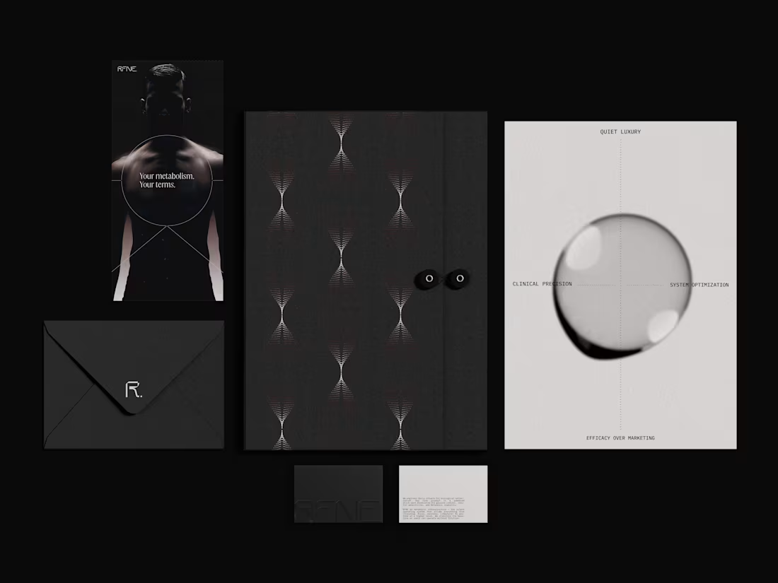
Branding & Packaging design for RFNE. 🧪
A precision metabolic support system engineered for high performers, a silent operating infrastructure designed to stabilize the body’s baseline and unlock elevated performance across training, focus, and recovery. Rooted in the concept of the bridge, the identity carefully balances scientific rigor with quiet luxury, creating a presence that feels both clinical and sophisticated.
You can see full project and narrative here (https://contra.com/p/FEcesO7Z-brand-identity-design-for-rfne?r=filippanov)
Feel free to like, comment and follow, kindly appreciated.
79
161
7.7K
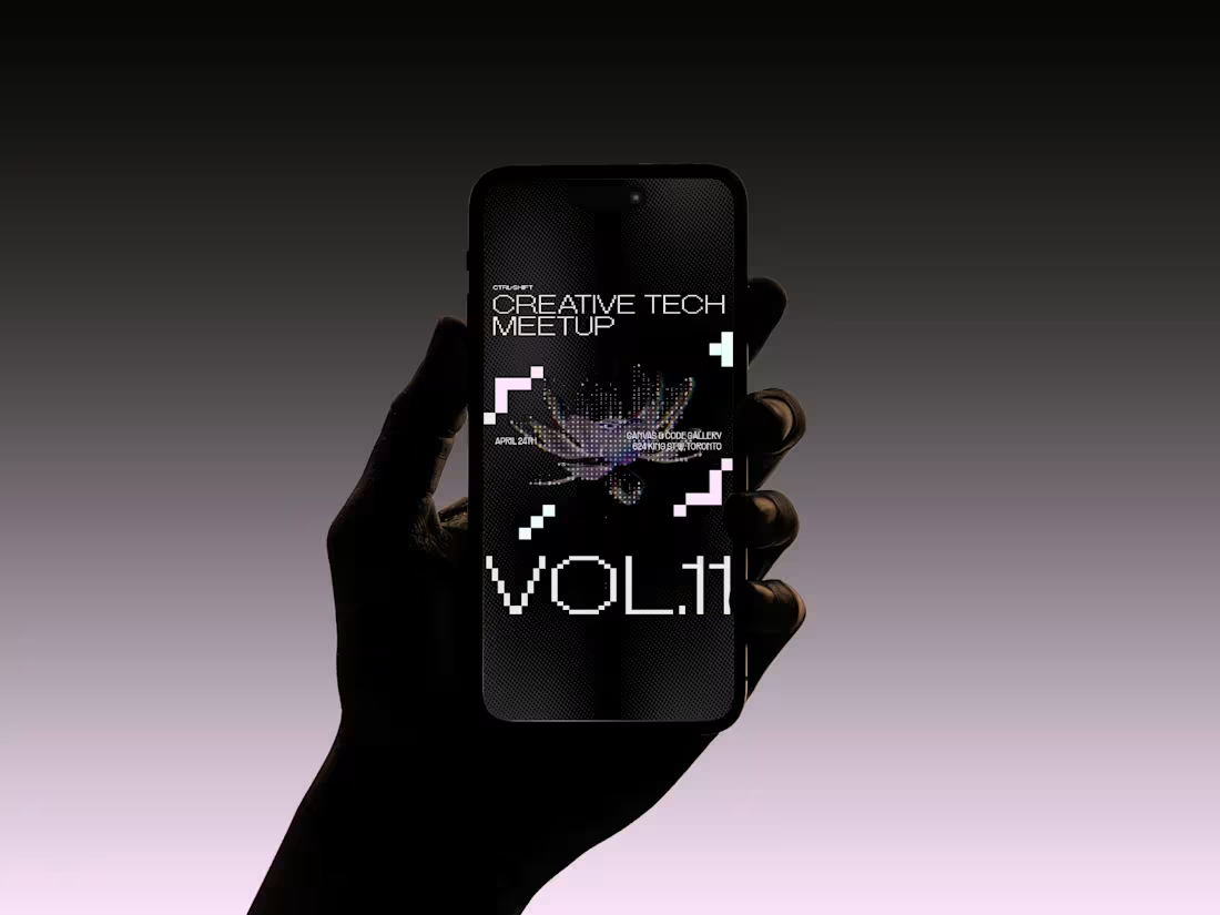
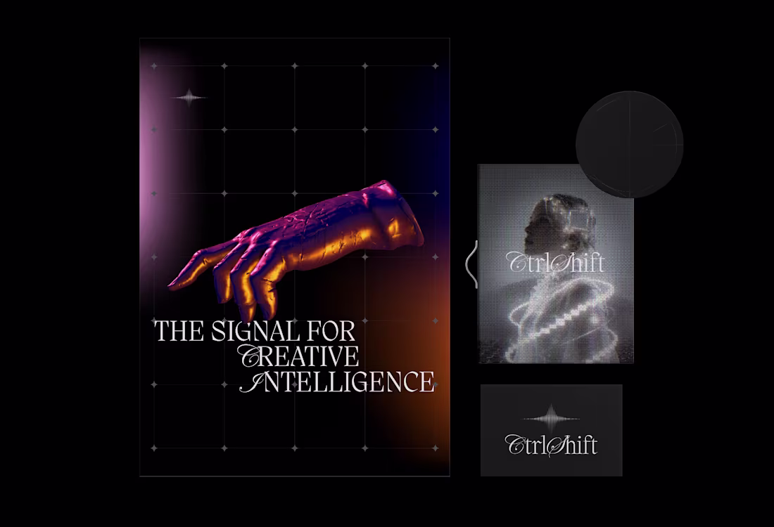
Just launched a recent brand identity project that I successfully completed for CTRL+SHIFT.
Ctrl+Shift is a brand identity project crafted for a forward-thinking platform operating at the intersection of creative technology, culture, and media. Through events, talks, content, and community, the brand brings together artists, builders, and technologists to explore creative intelligence, generative storytelling, and coding as cultural expression.
Editorial and confident, the identity is unapologetically creative-first—slightly irreverent, opinionated, and culture-forward. Designed to feel like a living platform rather than a campaign, the visual language leverages glyph dithering, color halftones, 3D ASCII graphics, and surreal soft sci-fi imagery. Anchored by a pitch-black foundation with vibrant color tints as accents, the system creates a bold yet sophisticated presence for a community built around curiosity, craft, and future-facing creativity.
You can see full project presentation here. (https://contra.com/p/mb6ZvFvO-ctrlshift-brand-identity-project?r=filippanov)
Feel free to like, comment and follow, kindly appreciated.
63
112
3.4K
Motion Graphics for the CTRL+SHIFT's (https://contra.com/p/mb6ZvFvO-ctrlshift-brand-identity-project?r=filippanov) Brand Identity.
Reflecting the primary essence of the ctrl+shift's symbol , the goal was to depict the pulsing neutrons in motion, through a spinning crt 2d brain. Hence, resembling the ideas generations as part of the creative intelligence.
I custom built the brain model in Omma then brought it to life with further ehancements in Unicorn Studio.
Feel free to share your feedback and ask anything related to the workflow.
19
28
1.8K
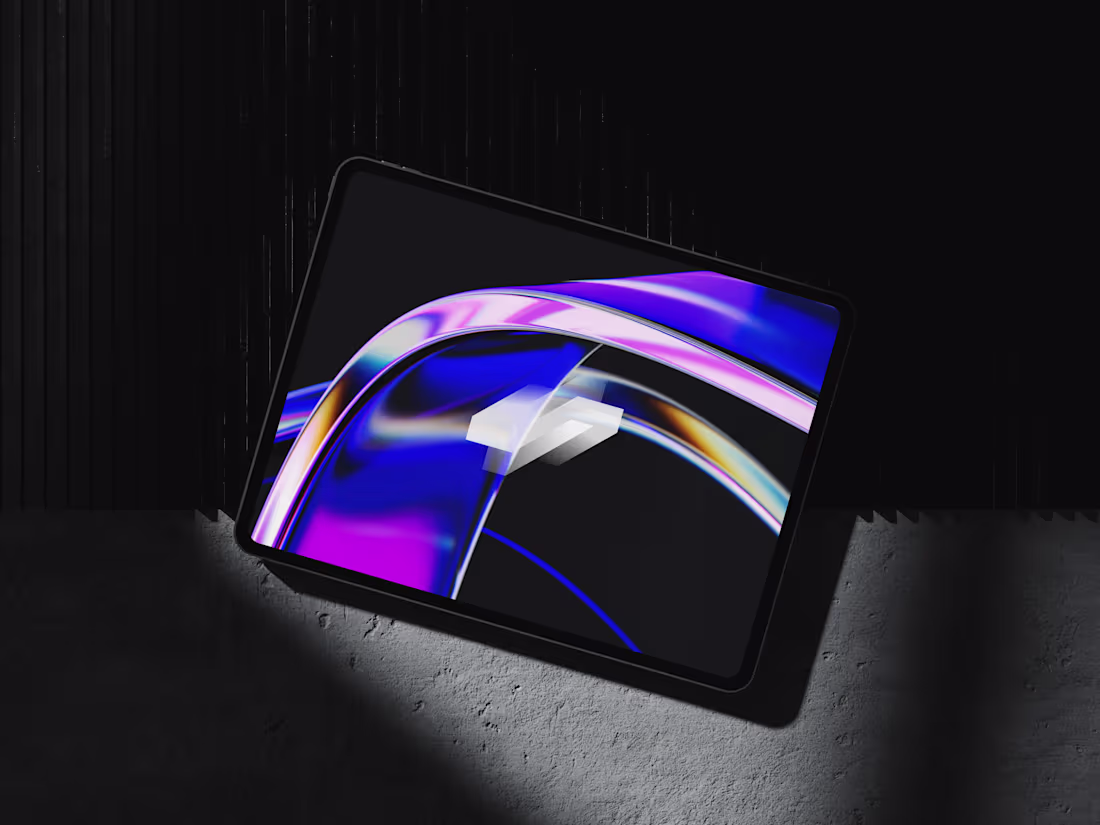
Ctrl+Shift Brand Identity Project
27
490
The Baller Fund | Brand Identity
13
203
Brand Identity for SalesCampaigns
10
86
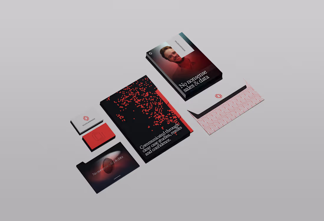
Brand Identity for SalesCampaigns
You can see full presentation just uploaded here. (https://contra.com/p/2Y2NmFoe-brand-identity-for-sales-campaigns?r=filip_panov_4bzzswaq)
85
142
3.8K
The Baller Foundation Brand Identity Project
4
26
Lately I've recognized this direction on the rise and been inspired to create a collection of 18 images blending the Classical Art - Renaissance oil painting mastery with digital pixel/ASCII aesthetics, Classcii. It is a mix of centuries, a modernized and futuristic direction of the classic.
Each image is crafted around a specific tension, the classical figure or scene rendered in full oil mastery, while the digital/ASCII layer intrudes at a specific point.
Using the @Contra Labs ecosystem to choose the most adequate Ai models from the Creative Arena Leaderboard, I wanted to briefly share my personal taste and evaluation on the outputs these models generated, based on the benhchmark methodology.
For the imagery references I used Seedream 5 Lite and Google Nano Banana 2, whereas for the Image to Video I used Kling 3.0 and Veo 3.1 Fast.
In terms of Visual quality & aesthetics overall I would rank them fairly simillar with Seedream having a slight edge on the composition, specfically achieving more symmetrical outcomes featuring center alignment and a better use of whitespace, opposed to Nano Banana 2 where the use of rule of thirds is more prominent, making it visually in comparison less balanced.
Considering the Prompt adherence & accuracy, I find both models very much aligned, having Nano Banana 2 more intensified use of asscii / pixels across all outcomes, which according to my minimal taste I would rank this a weakness rather than a strong side.
Finally, in terms of Motion Realism I would unanimously rank Kling 3.0 as the better option here, considering the fluidness and physics consistency among majority of the elements in the reference. Additional advantage will be the ability to perform better at no prompt insertion compared to Veo 3.1 fast.
You can download the collection here. (https://www.patreon.com/posts/classcii-imagery-155250591)
29
78
3K
Wujhat Brand Identity
15
216
CtrlShift Brand Identity
3
17
Brand Development for Lime Blue Music
6
33
If you actually want to know the real reason behind this, read below.
The Gen X Soft Club aesthetic, which thrived from the late ’90s through the 2000s, captured a sleek, urban vision of the future. Defined by cool muted tones, minimalist design, metallic textures, and city backdrops like train stations and nightclubs, it reflected a polished evolution of the Y2K look. Drawing from underground club culture, early electronic music, modern architecture, and tech-inspired visuals, it often featured blurry photos, bloom lighting, and smooth typography that evoked quiet sophistication.
Now, this style is being rediscovered by younger generations as a form of “quiet futurism” — a nostalgic yet refined take on what people once imagined the future would look like. Many describe it as “the future that never existed.”
My opinion below ⬇
44
97
4K
Geometric Logos
6
52
The Baller Fund | Brand Identity
The Baller Foundation is in the youth sports philanthropy sector. They provide scholarships, grants, and training resources to young athletes who demonstrate talent, drive, and commitment, but lack the financial means to participate in competitive club sports programs.
I helped them develop an inspiring & empowered identity which reflects their brand personality and values. As an outcome, I'm creating their path to establishing trust, building confidence be percieved prestigous.
See full project here
(https://contra.com/p/sQ7rvQZQ-the-baller-fund-or-brand-identity?r=filip_panov_4bzzswaq)
42
100
2.3K
The Crescent Cafe | Brand Identity Project
4
20
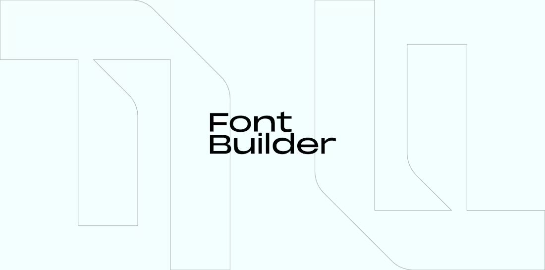
I'm proud to announce that I've been selected as one of the winners of the @FLORA Technique challenge 🥉
My technique (Font Builder (https://contra.com/community/MzfuLrdy-ever-thought-you-can-build-an)) was also selected for the Best Technique for Agencies & Creative Studios ✨
I wanna say thank you the @Contra HQ and @FLORA team for this amazing opportunity to allow us to showcase our skills and create an inspiring experiences & techniques that leave a lot of value to the table.
Flora is such an efficient tool for designers and offers endless opportunities to facilitate your workflow, I use it on a daily basis.
12
1.6K
Brand Identity for Stories Bar
10
86
Brand Guidelines + Strategy Kit Template
4
65
Achievement Unlocked | Brand Identity
9
56
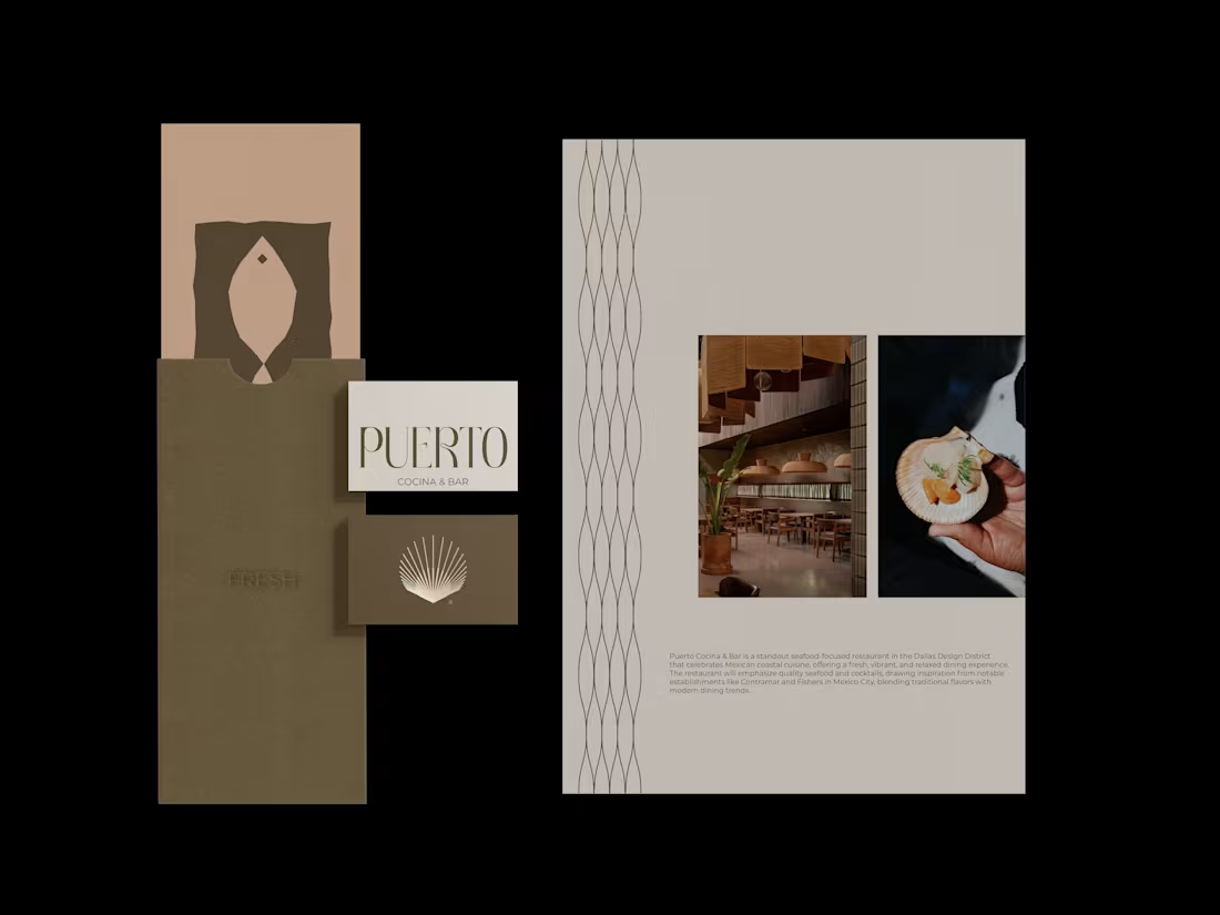
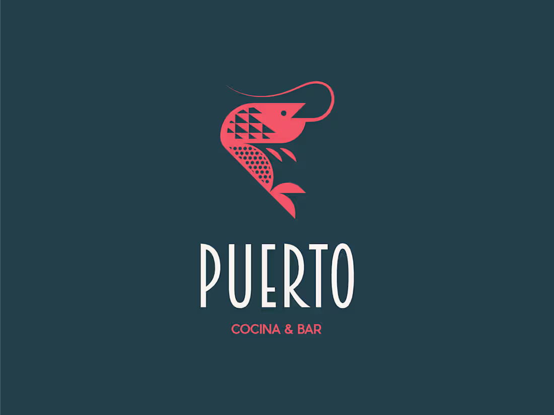
Puerto Cocina & Bar Brand Development
10
41
Introducing the Ultimate Brand Guidelines + Strategy Kit built for designers & large scale brands.
The Two-in-One Brand Template is an extensive brand guidelines and strategy kit spanning 39 pages, divided into 9 chapters and 28 sub-categories. Designed for Adobe Illustrator and InDesign, this template provides a comprehensive, dual-purpose solution covering all touchpoints where your customers encounter a brand, blending strategic insight with visual execution.
The time-consuming nature of creating a brand guidelines document is well known to all brand designers. We developed this clean and straightforward brand guidelines + strategy template as a result. We've already taken care of the details, so stop wasting time on them.
Available for download here (https://contra.com/products/fbBKVuE9-brand-guidelines-strategy-kit)
46
143
2.6K
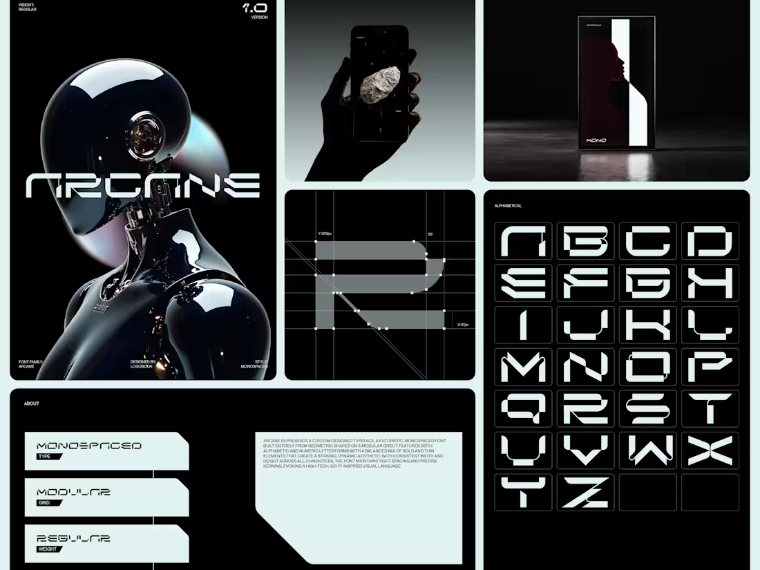
Arcane is my first ever custom-designed typeface, a futuristic, monospaced font built entirely from geometric shapes on a modular grid. I've spent many months of work and dedicated my time to design this in order to show gratitude and appreciation to my community. 🔥
I want to use this opportunity to share my hard work with you.
You can grab it for free, just reach out if interested. 😊
56
116
3.4K
Viewing at the logo you designed, in motion, is a next level satisfaction. I turned this progressive symbol into a 3D Chromatic, infinite spinning animation.
10
32
1.9K
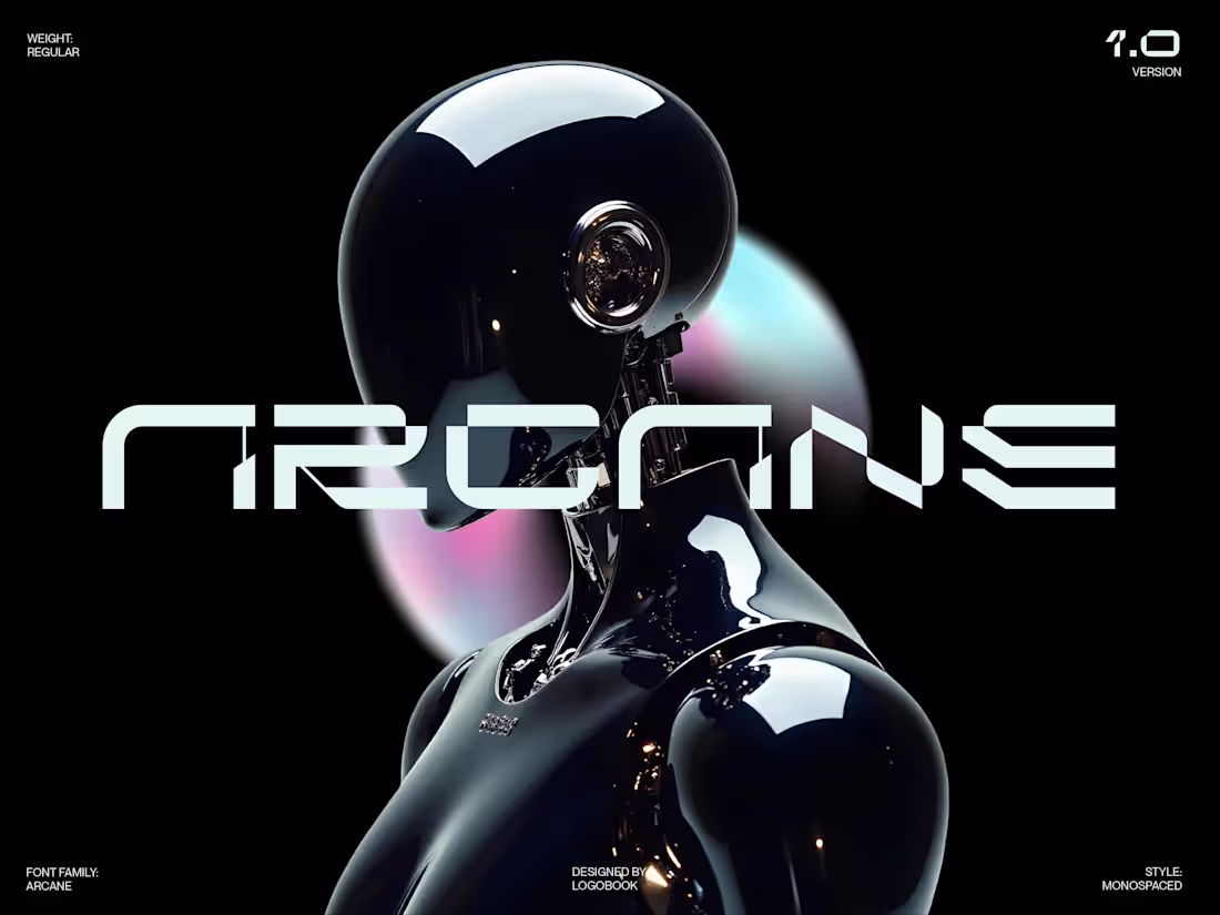
Arcane Typeface Design
22
374
A young wild horse, raised in a narrow canyon, had never seen open plains. One dawn a storm broke the fence that hemmed her in. She stepped out hesitantly, then felt the wind shift, suddenly she bolted, mane streaming like flame, covering more ground in an hour than in her entire life before. Freedom wasn’t given, it was seized the moment the barrier fell.
As we step into this Year of the Fire Horse, what are your big intentions, goals, or new beginnings for 2026?
Drop them below, I’d love to hear what fresh paths you’re charging toward.
#yearofthefirehorse
34
109
2.8K
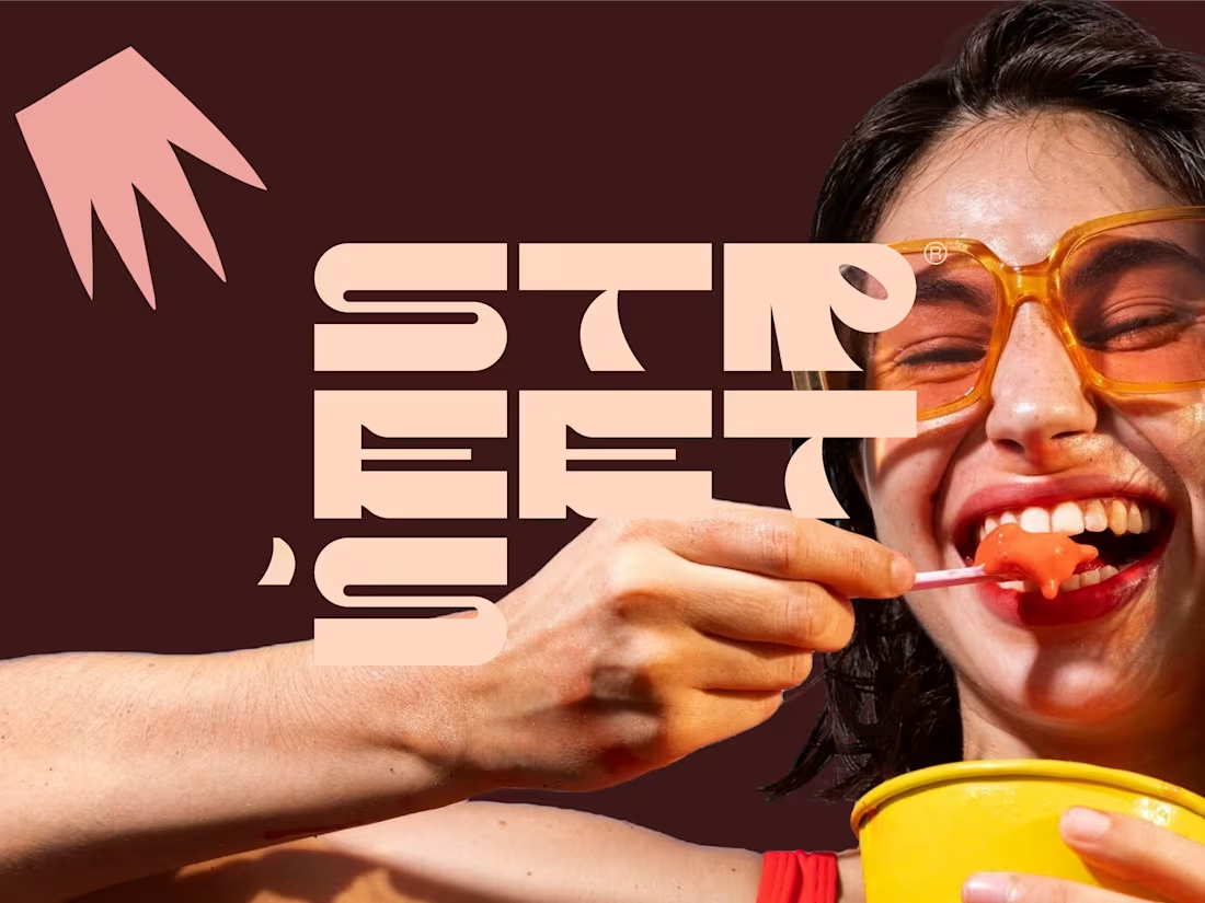
Street's Brand Identity Refresh
6
43
Hey everyone! 🖐🏻
I guess I'm part of the community now. 😊
I'm Filip, a dedicated brand designer with the aim of designing inspiring brand experiences.
An interesting fact about me as you may not know, I'm also the founder & curator of one of the larger design communities on Instagram, Logobook.
I'll jump straight in with one educational article (https://www.instagram.com/p/DPgcOD5jJ25/?img_index=1) I created today, hopefully you might find valuable.
I recently joined contra and thrive to bring value, inspire and be inspired among this extremely talented community. ⚡
33
94
2.4K
Dyna Edyne | Visual Identity
4
56
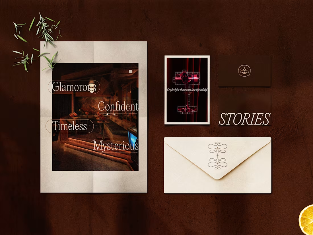
Stories Bar Brand Identity
8
56
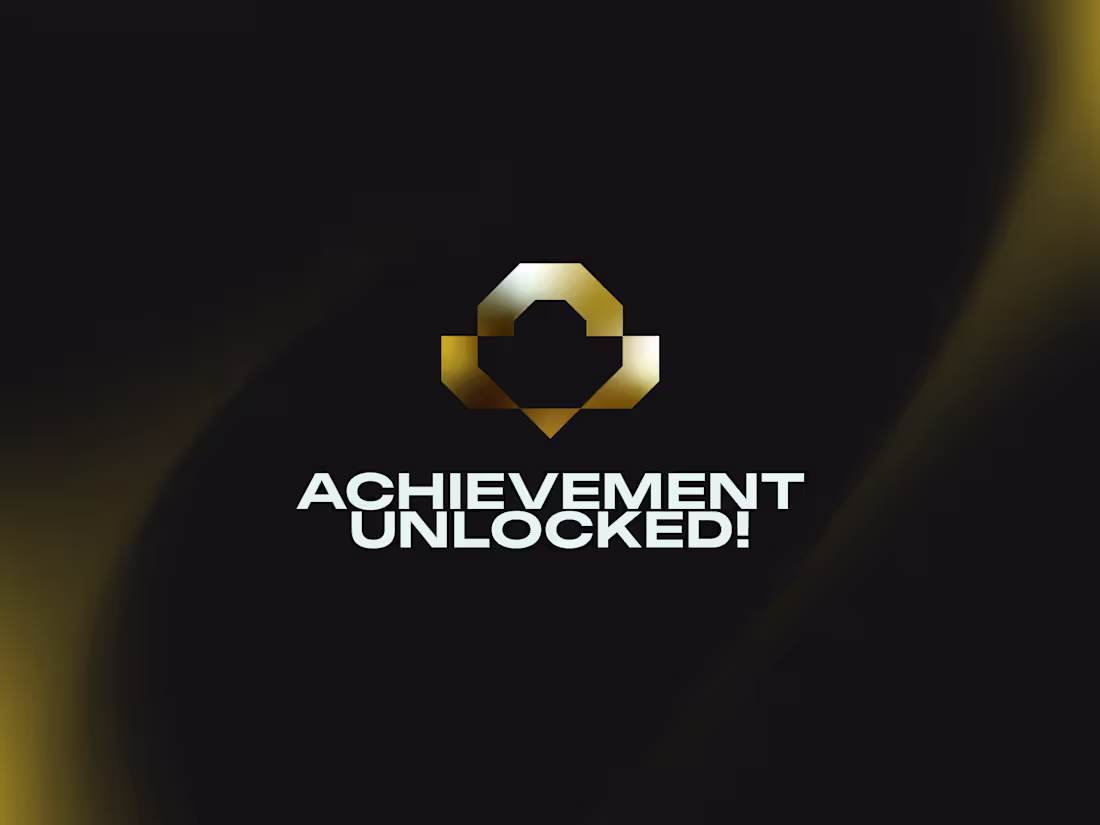
Achievement Unlocked | Brand Identity
7
32
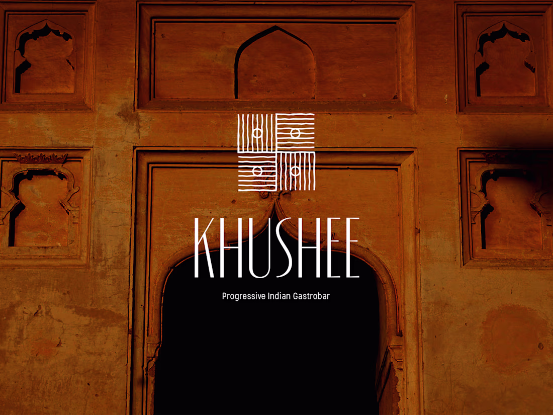
Khushee Brand Identity Design
6
69
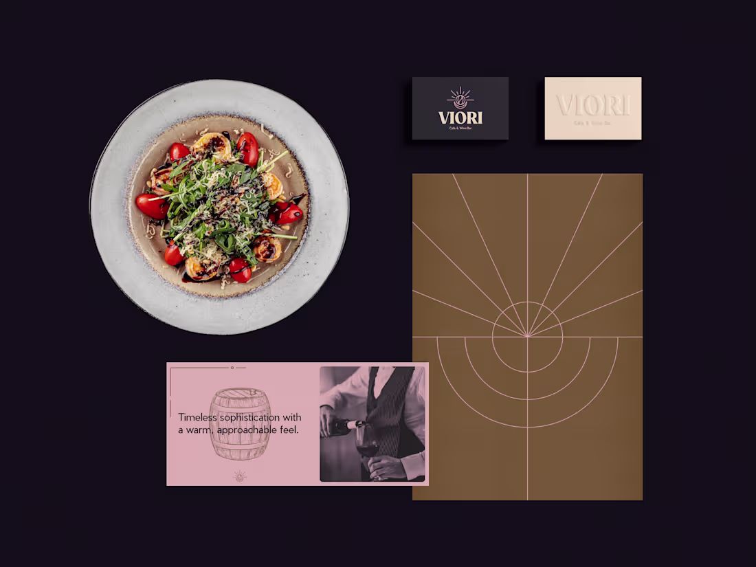
Viori Cafe & Wine Bar Brand Identity
5
25
I enjoyed building this smooth interactive animation using @Unicorn Studio , it will find its home soon. How do you like the dithered pattern integrated throughout?
3
2.1K
Branding for Puerto Cocina & Bar
3
26
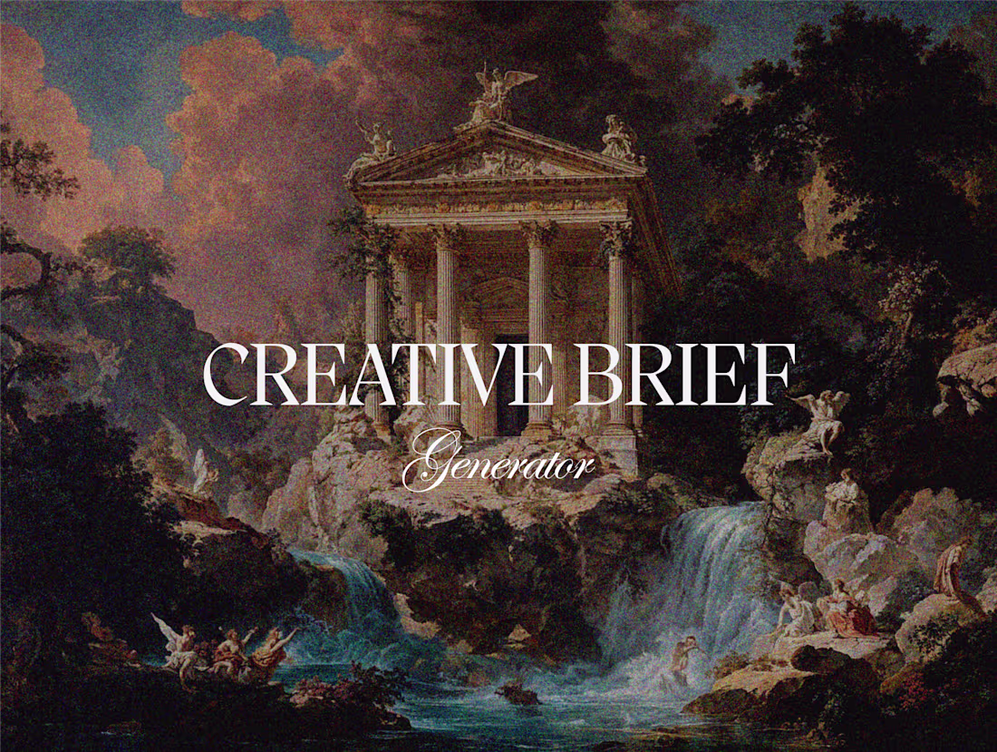
Creative Brief Generator - AI Agent
1
34
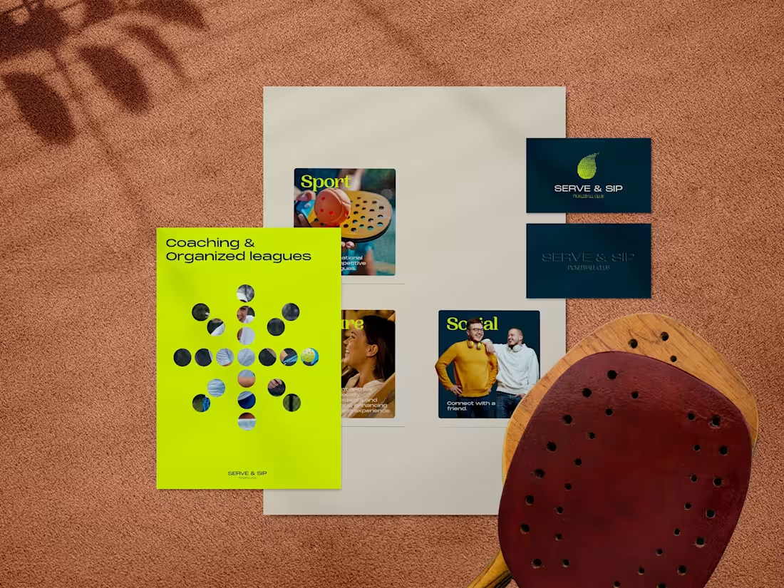
Branding for Serve & Sip Pickleball Club
16
55
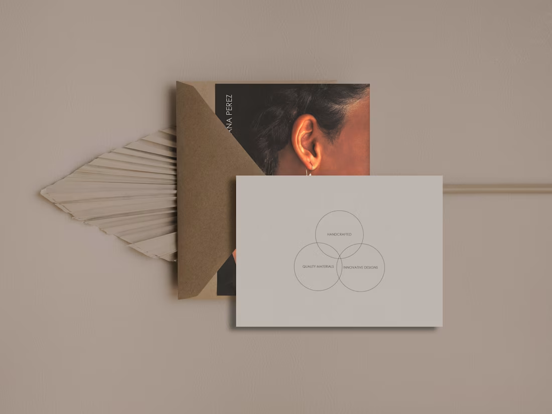
Adriana Perez Jewelry Brand Identity Project
2
23
Adriana Perez Jewelry | Brand Identity
14
72
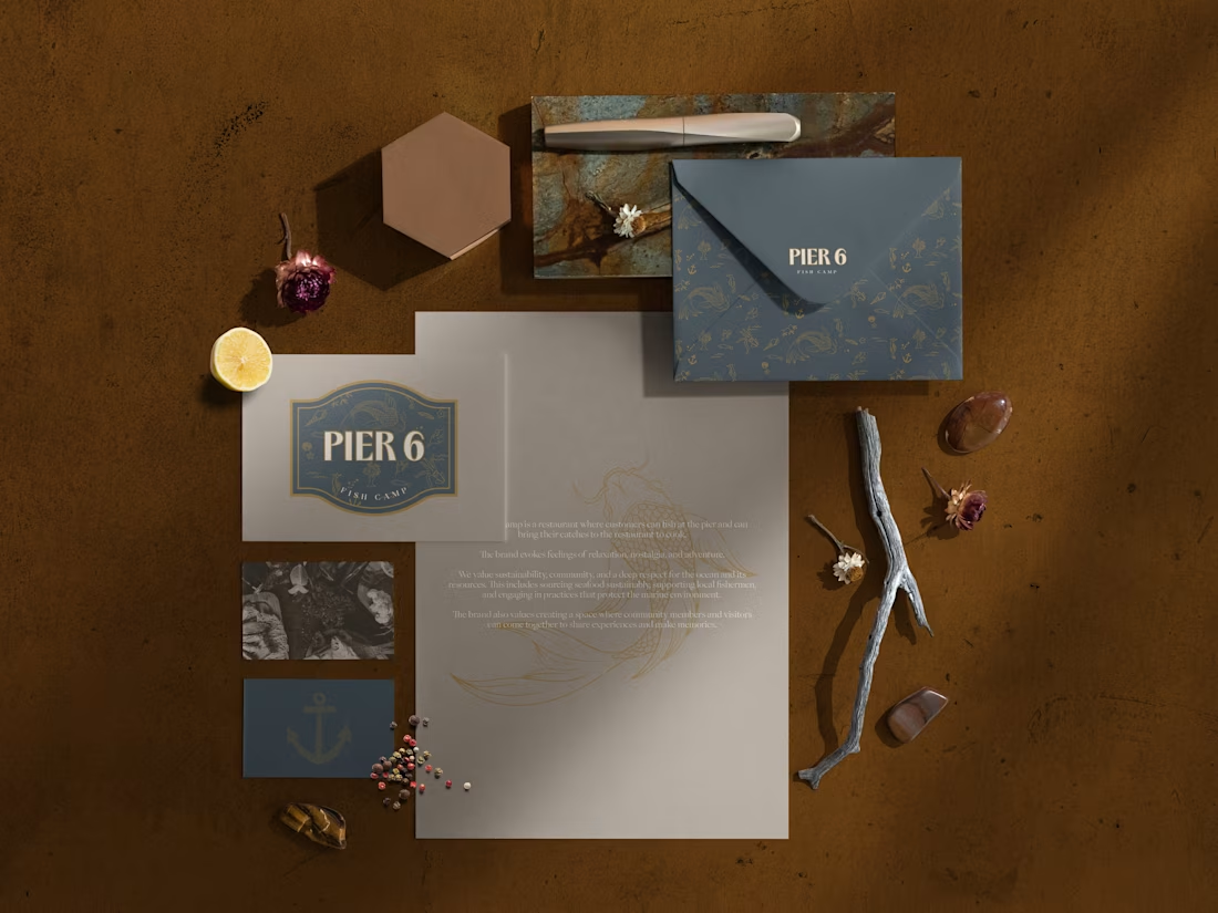
Pier 6 Fish Camp Brand Identity
9
57
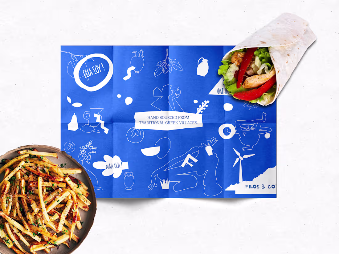
Filos Co. | Brand Identity
4
61
Pegasus Coffee Roastery | Brand Identity
12
95
ADV Imagine | Brand Identity
17
73
Brand Identity for Fish Taco Co.
30
106
Brand Identity | ACL Designs
2
29
Argentina Bakery Brand Identity Design
3
15
Parkwood American Grille | Brand Identity Project
3
21
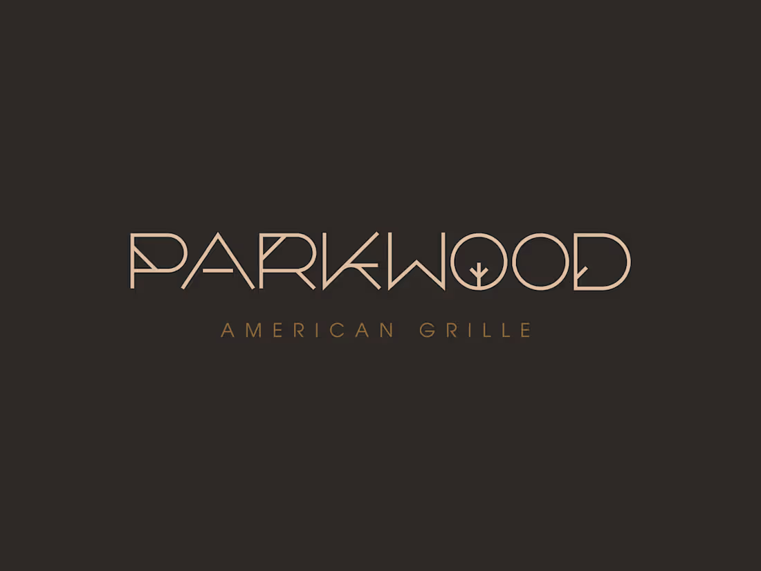
Parkwood American Grille | Brand Identity
3
28
Brand Identity Design for About Care Spa
3
18
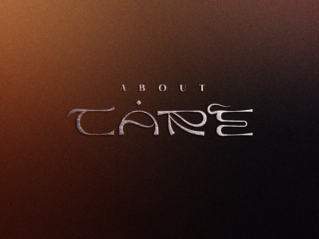
About Care | Brand Identity
4
23
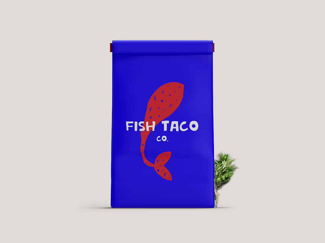
Fish Taco Co. Brand Identity Design
4
36
Snaptalent | Brand Identity Design
21
133
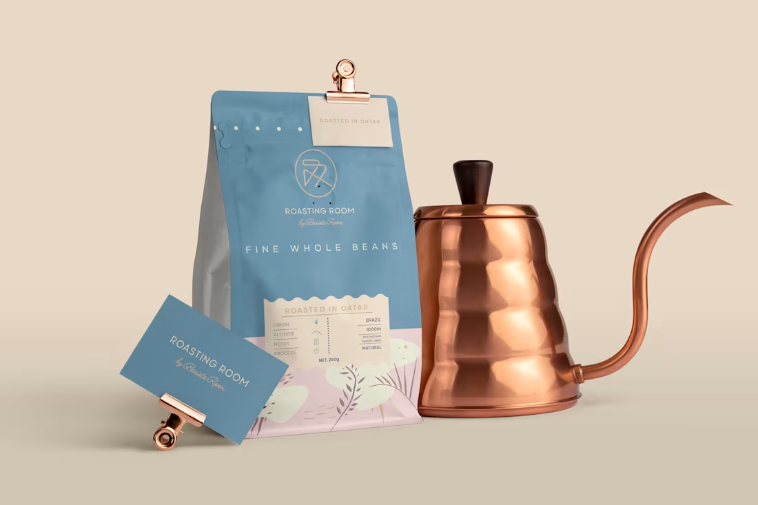
Roasting Room Coffee Branding and Packaging
23
145
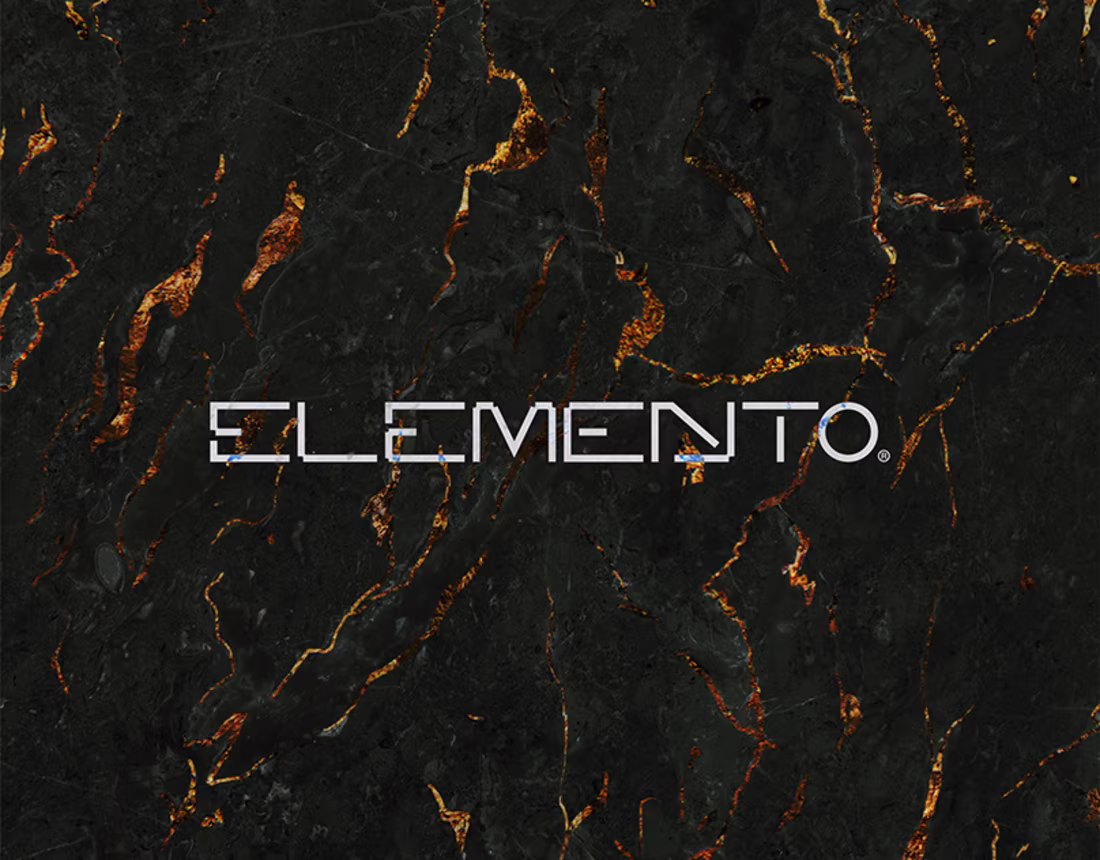
Elemento | Brand Identity Design
4
27
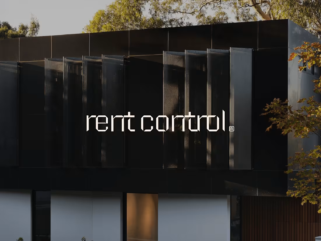
Rent Control Wordmark Design
4
32
Packaging & Branding for Sugar Taste
4
15
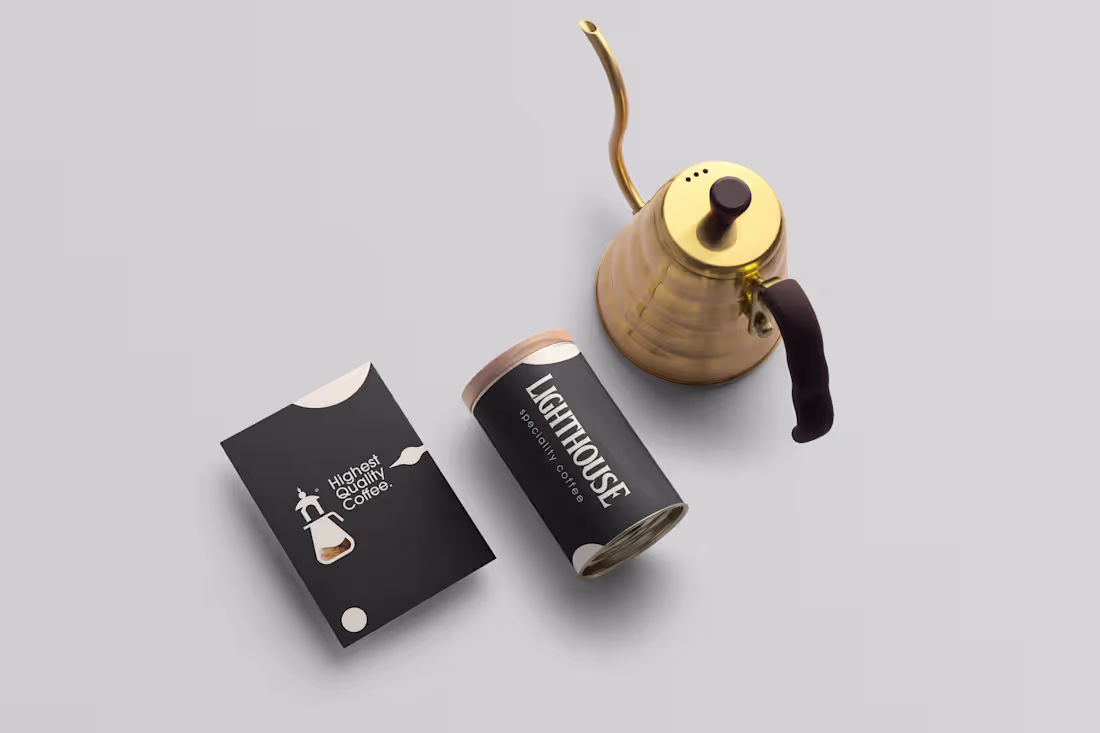
Lighthouse Speciality Coffee | Brand Identity
3
20
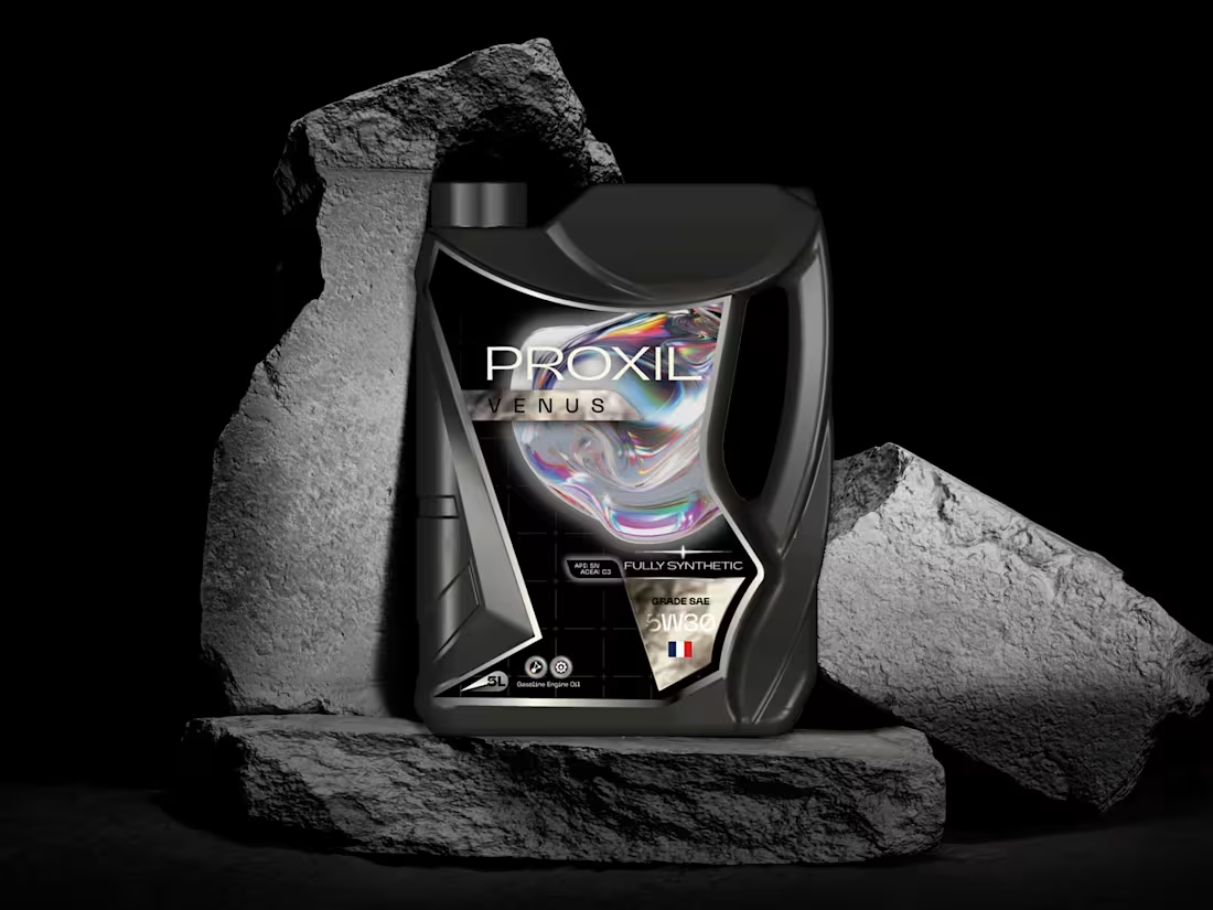
Proxil Engine Oil | Packaging Design
2
47
Font Builder Flora Winner 🥉
0
6
Futuristic Brand Identity | Snapstack Solutions
4
20
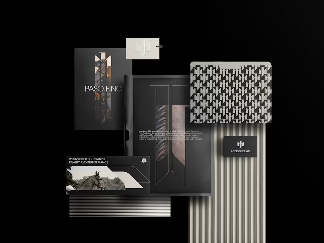
Brand Identity Design for Inversiones JM
4
63
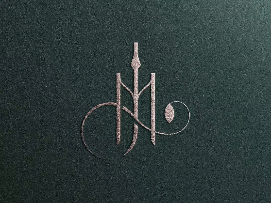
Inversiones JM - Horsing Investment | Brand Identity Design
9
54
I created a Two-in-One Brand Template as an extensive brand guidelines and strategy kit spanning 39 pages, divided into 9 chapters and 28 sub-categories.
Designed for Adobe Illustrator and InDesign, this template provides a comprehensive, dual-purpose solution covering all touchpoints where your customers encounter a brand, blending strategic insight with visual execution.
See complete guidelines here (https://contra.com/p/EbAQZEkB-brand-guidelines-strategy-kit-template?referralExperimentNid=DEFAULT_REFERRAL_PROGRAM&referrerUsername=filip_panov_4bzzswaq)
5
34
1.9K
Elemento | Brand Identity
23
152
79degrees | Brand Identity
3
23
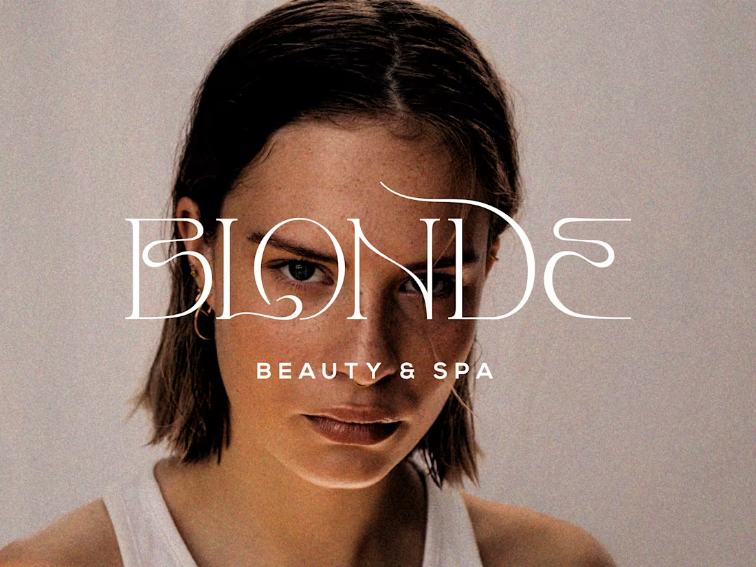
Blonde Beauty & Spa
13
140
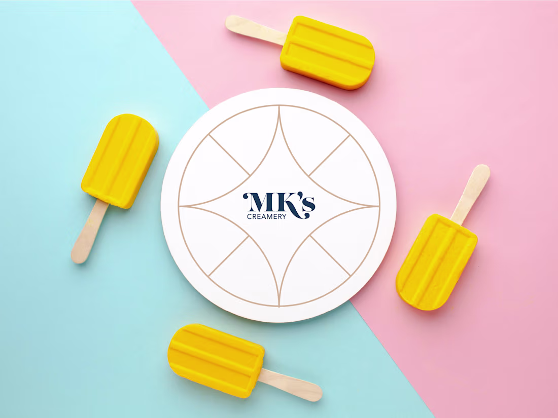
MK's Creamery | Packaging Design
2
13
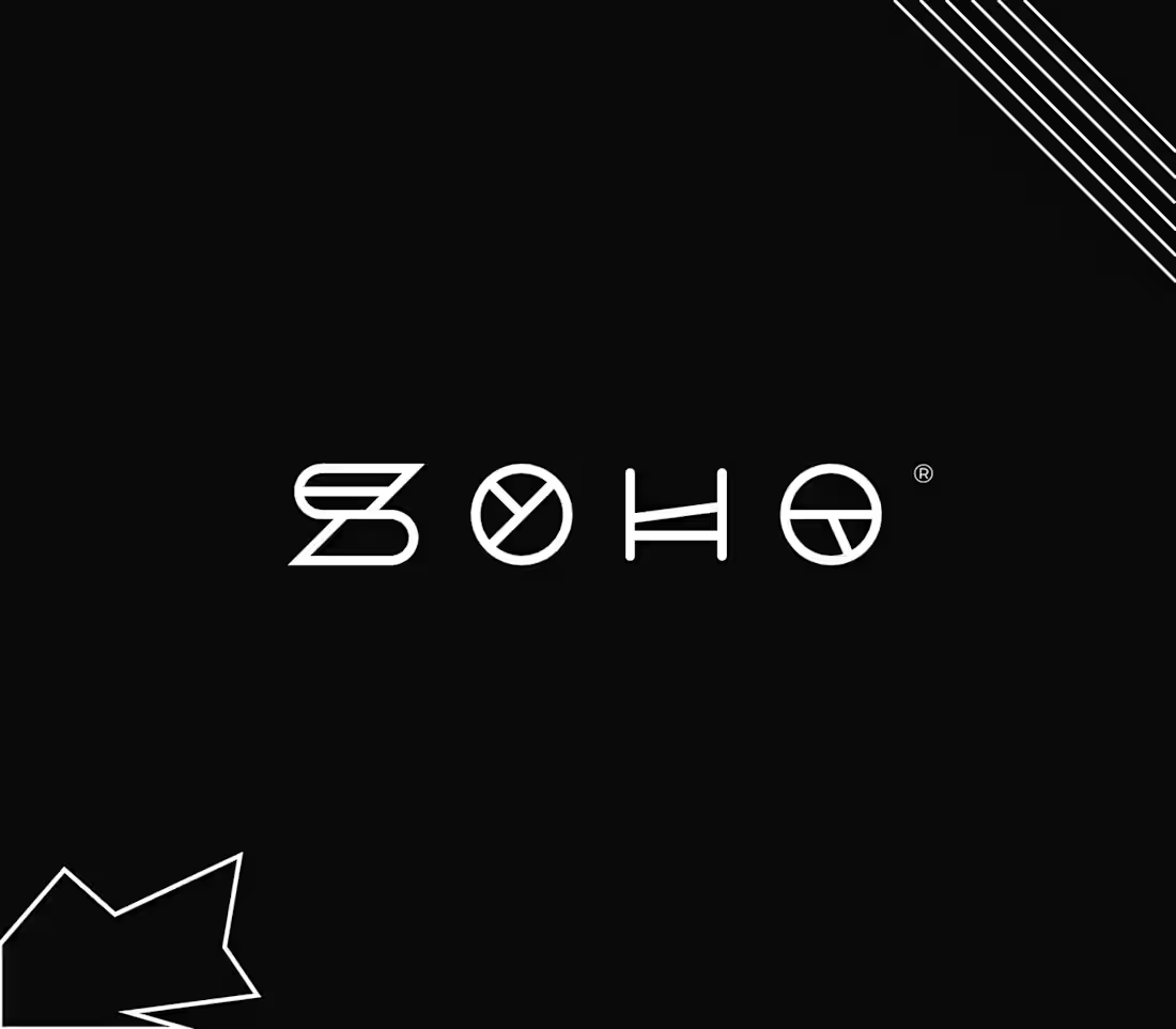
Soho | Brand Identity
1
17
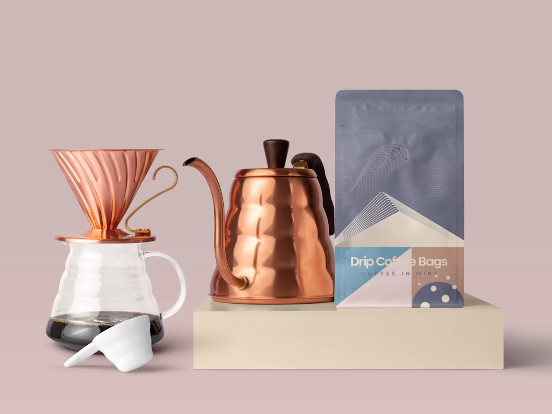
Roasting Room
1
9
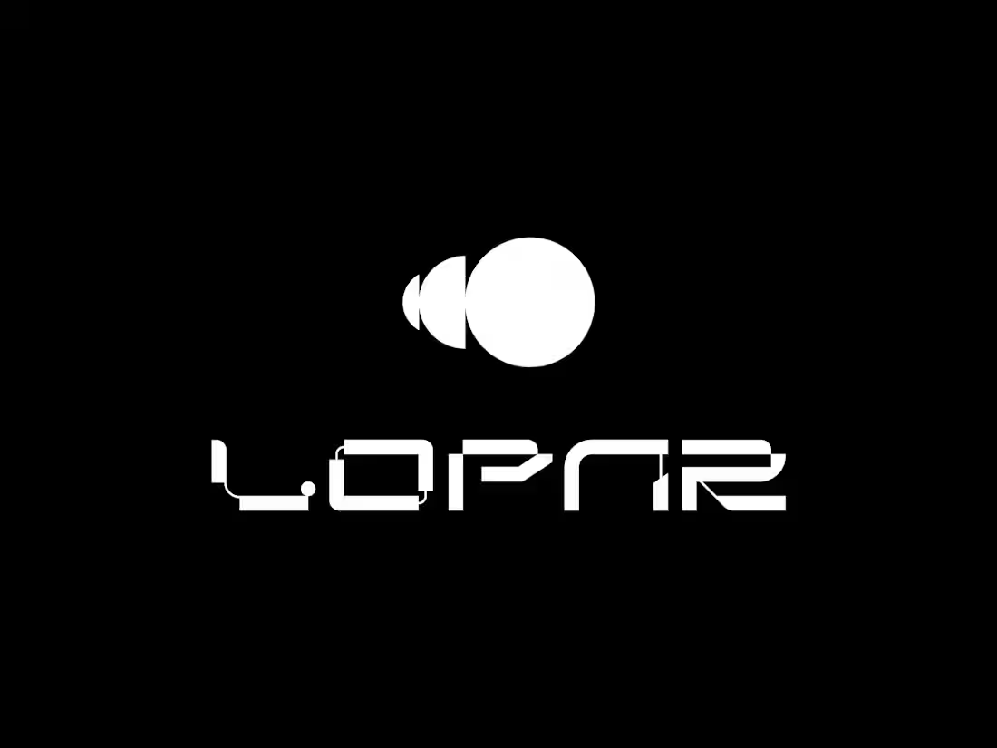
Lopar | Brand Identity
15
98