max
Filip Panov
I make founder brands premium, trusted & story-led
- $10k+
- Earned
- 12x
- Hired
- 5.00
- Rating
- 591
- Followers
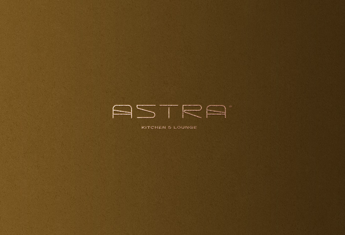
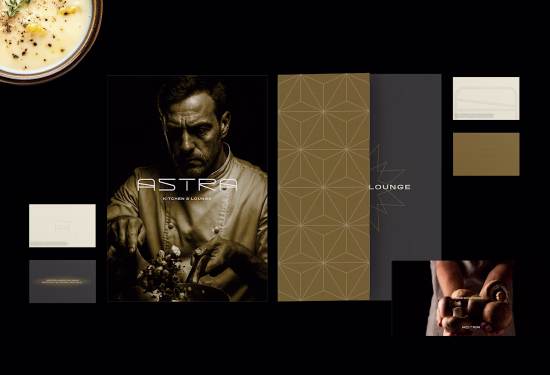
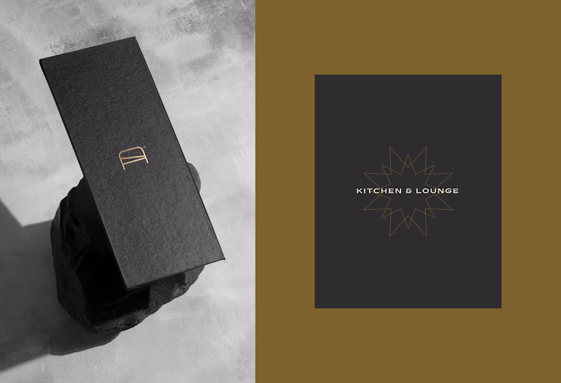
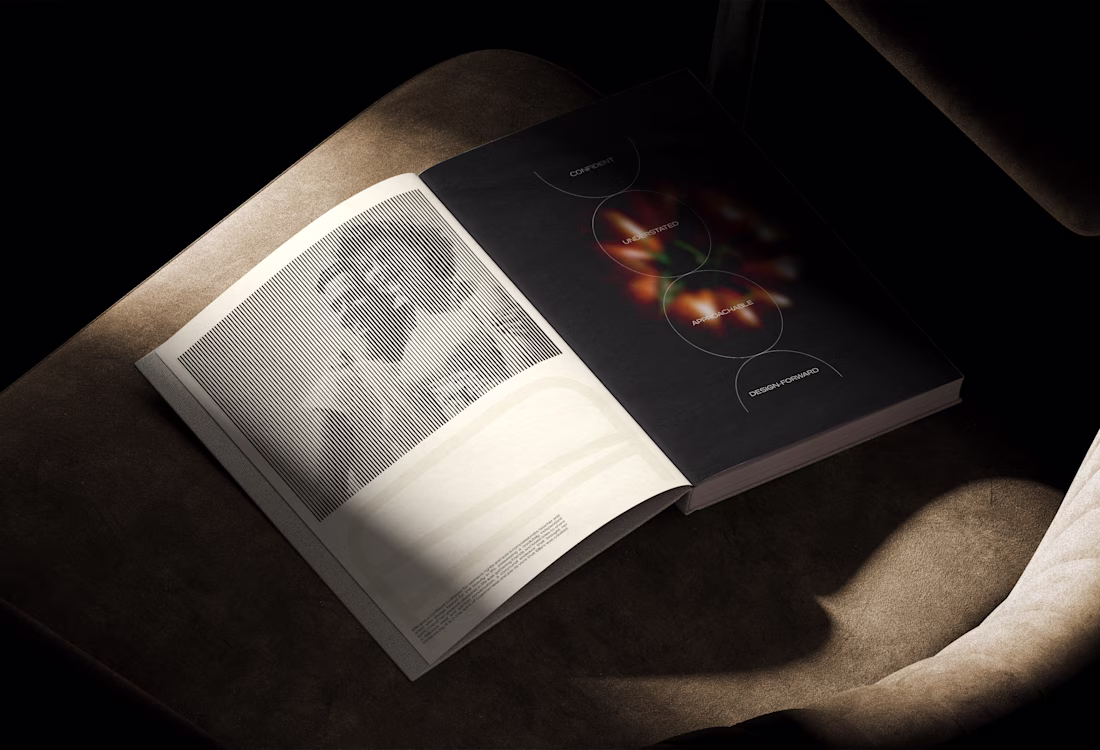
Astra Kitchen & Lounge | Brand Identity
Astra Kitchen & Lounge is a new restaurant concept offering a refined casual dining experience — consistent, design-forward, and welcoming. It’s an everyday destination that feels warm & elevated, blending clean aesthetics, rhythmic energy,...
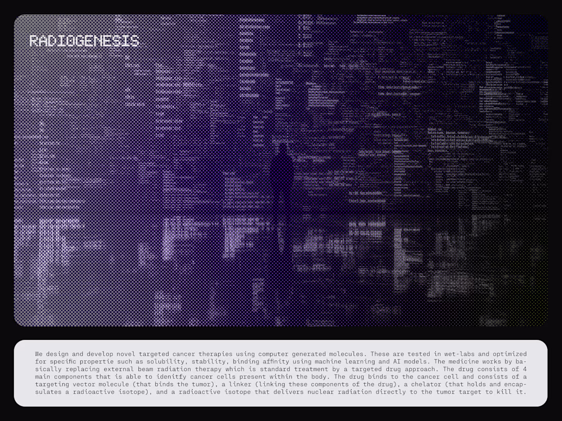
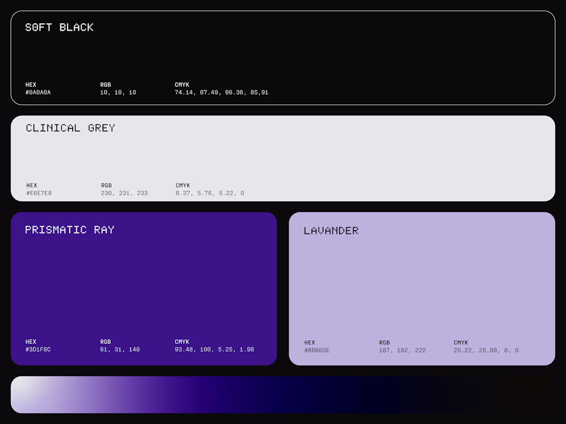
Visual Identity for Radiogenesis, a biotechnology company operating at the intersection of AI, computational science, and precision medicine, pioneering targeted cancer therapies through computer-generated molecules.
The visual identity reflects this fusion of biology and...

The biggest event once in four years is happening right now with enormous viewership counts.
As Contra features creatives from all around the world, I want to know where are YOU watching from? ⚽
You can also comment with an emoji of your country.
Bonus topic for the fans, who do you think is taking the trophy home? 🏆
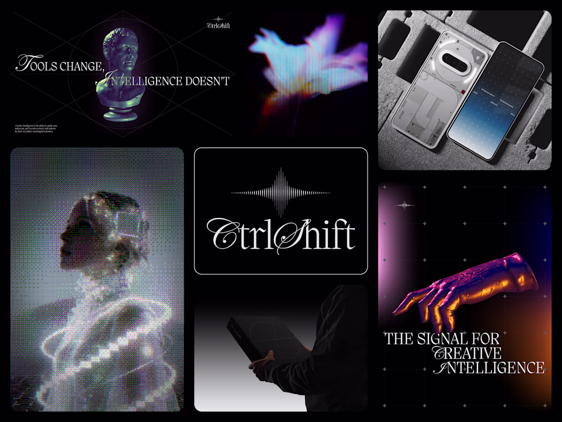
The concept that didnt make it through the selection process but majority of the brand language, imagery and the visual identity system were adopted and harmonized with the selected one to create one unity and expand the entire design system.
The logo features a modern,...
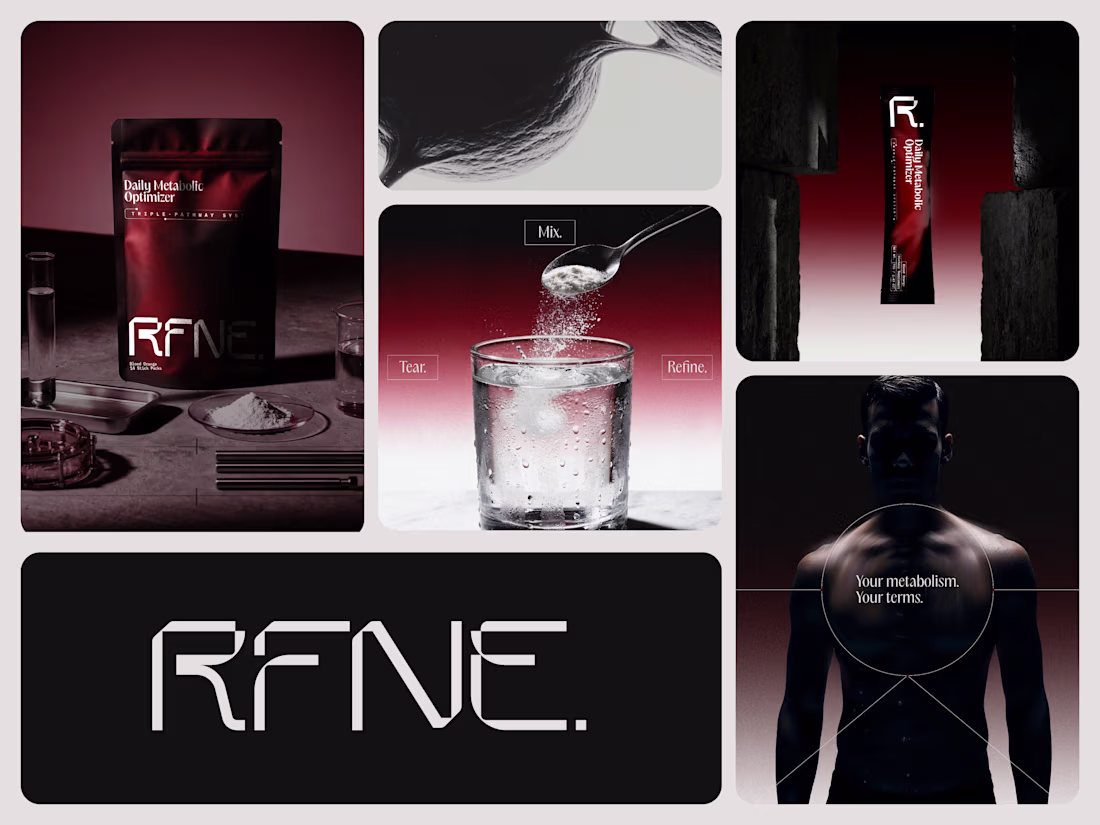
RFNE. | Branding & Packaging Design - Bento Summary
The visual system reflects RFNE’s commitment to clinical precision, system optimization, and efficacy over marketing. A restrained palette of matte black and warm grey, elevated by oxblood red accents, reinforces authority and...