Built with Unicorn Studio
Dyna Edyne | Visual Identity
Filip Panov
Verified
Dyna Edyne | Visual Identity
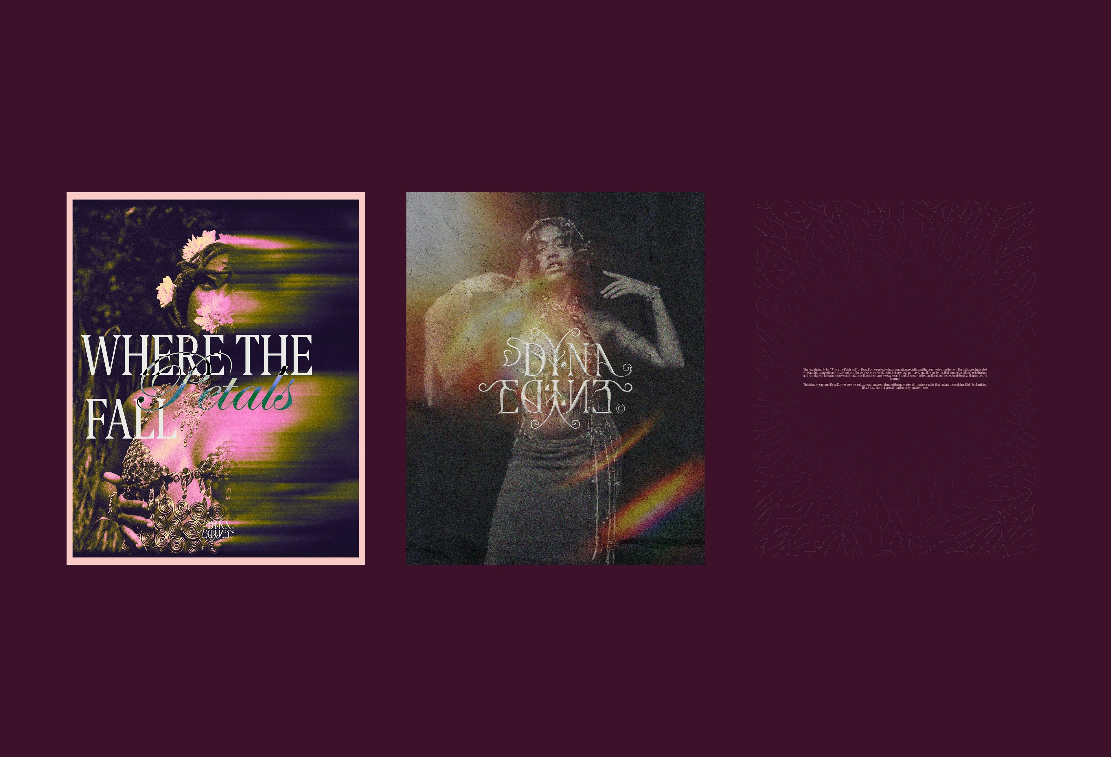
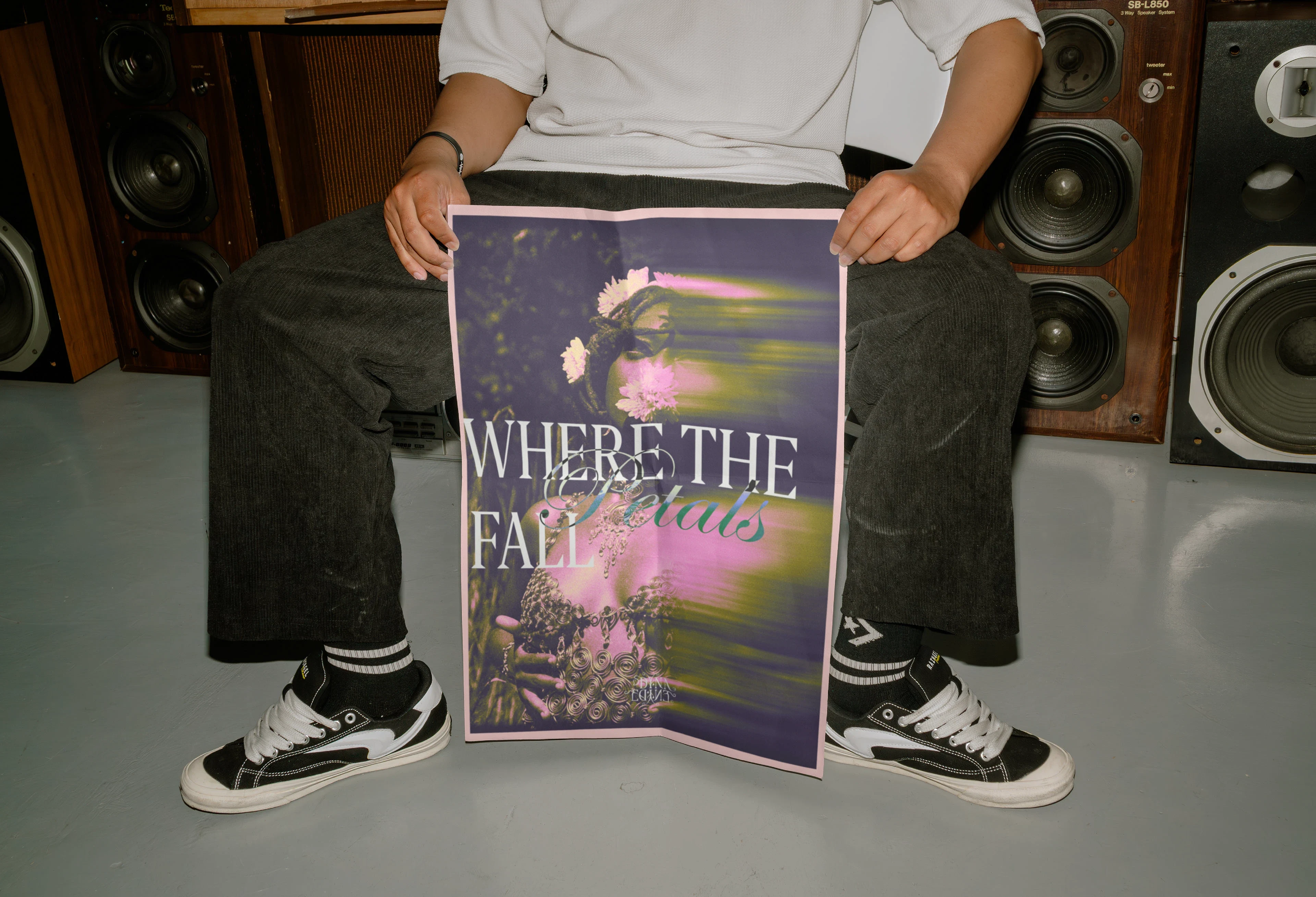
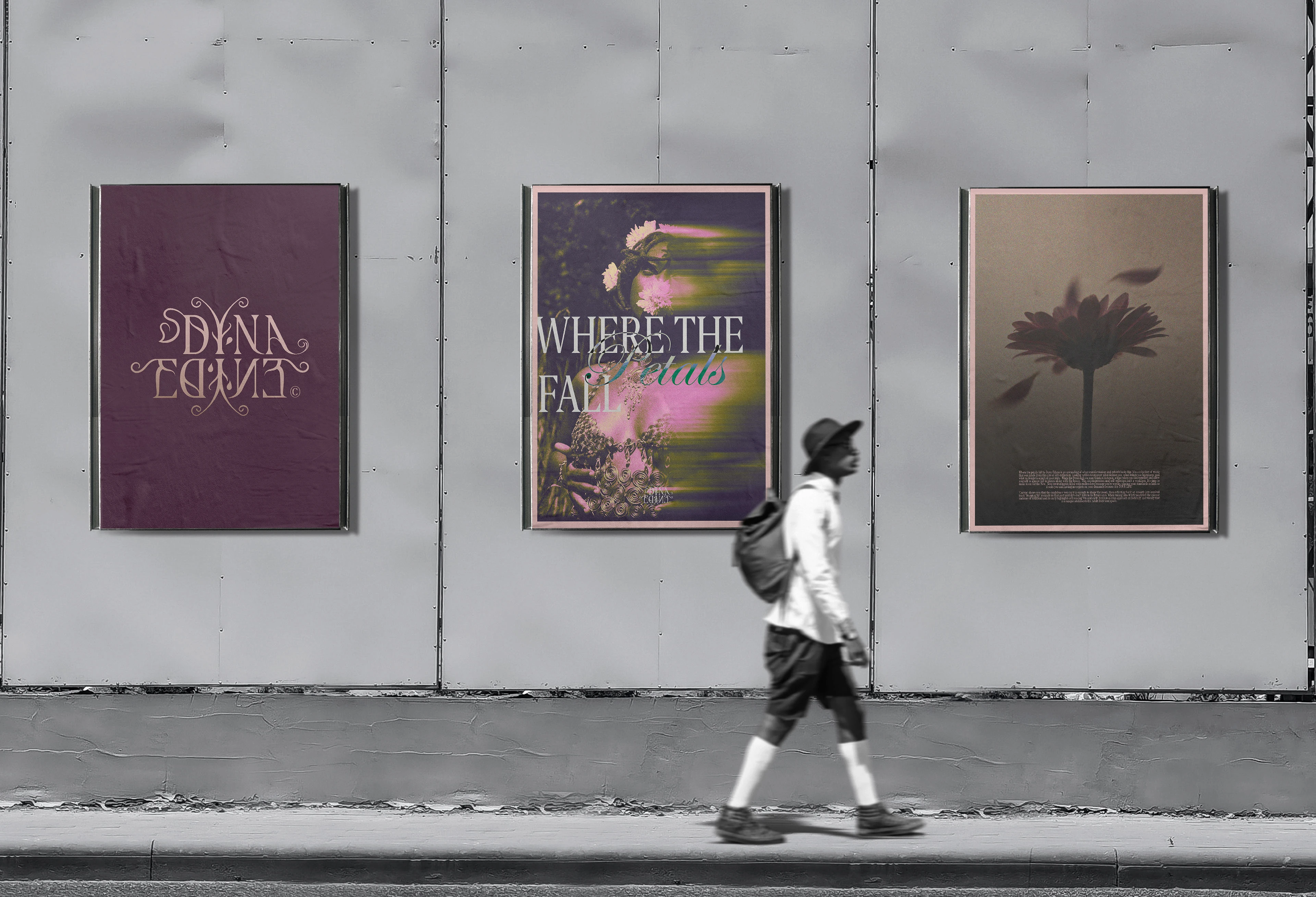
Where the petals fall by Dyna Edyne is an unraveling of what transformation and rebirth looks like. It’s a collection of music that was made from the core of self-reflection. Looking within to uncover what defines you, what brings you happiness, and what no longer is a part of your story. When the Petals fall you may think of Autumn, a time when you can regather and allow yourself to almost fall in pieces along with the leaves. This decompression and self-reflection isn’t a weakness. It's time to make room for the New. New environments filled with endless love because you’re worthy, placing your standards as high as it suits you and having no regrets on your demands because it is YOUR LIFE!
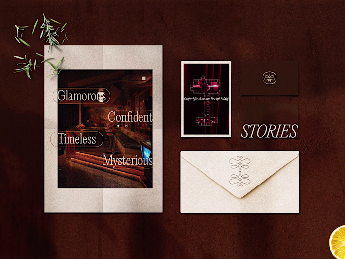
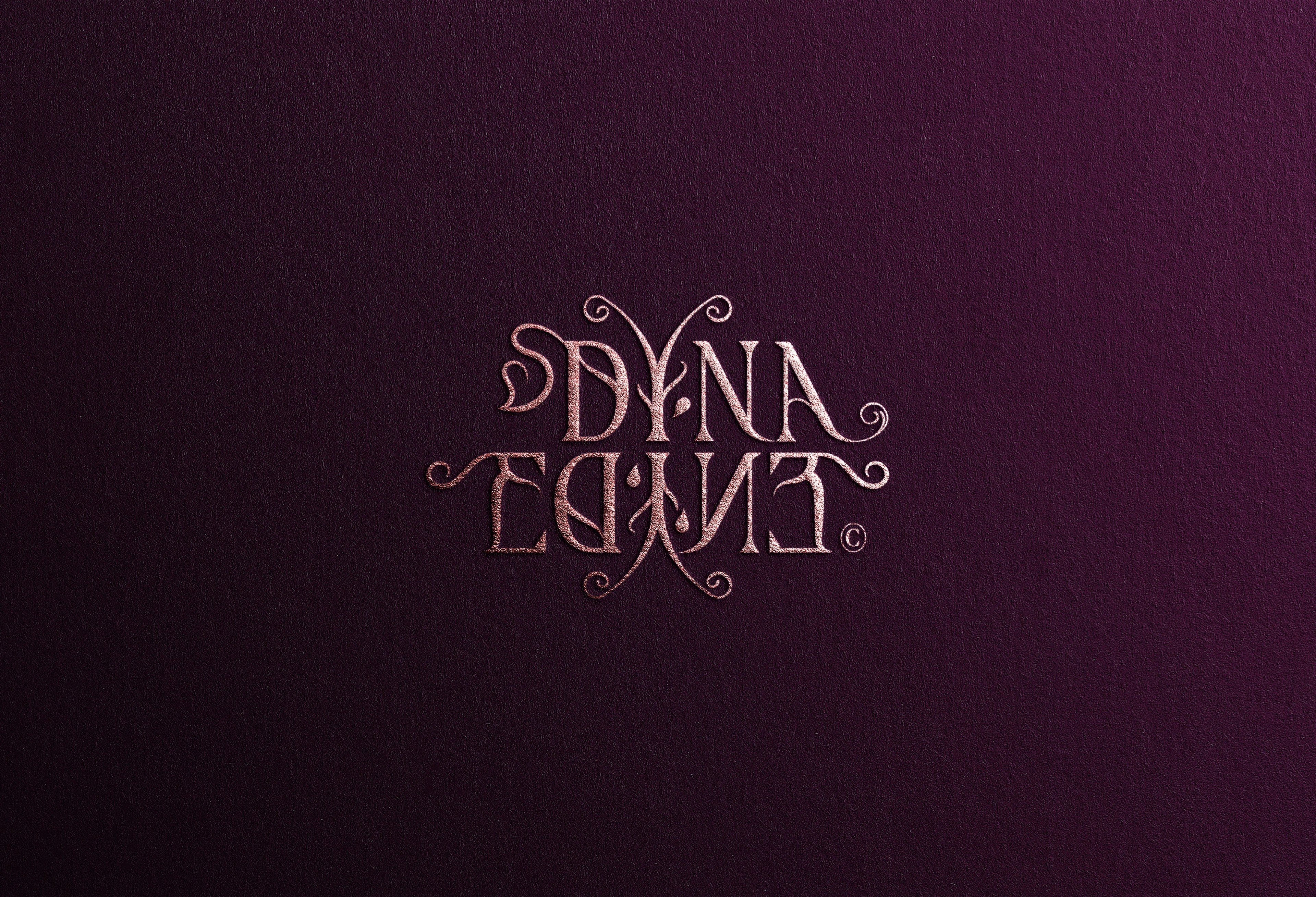
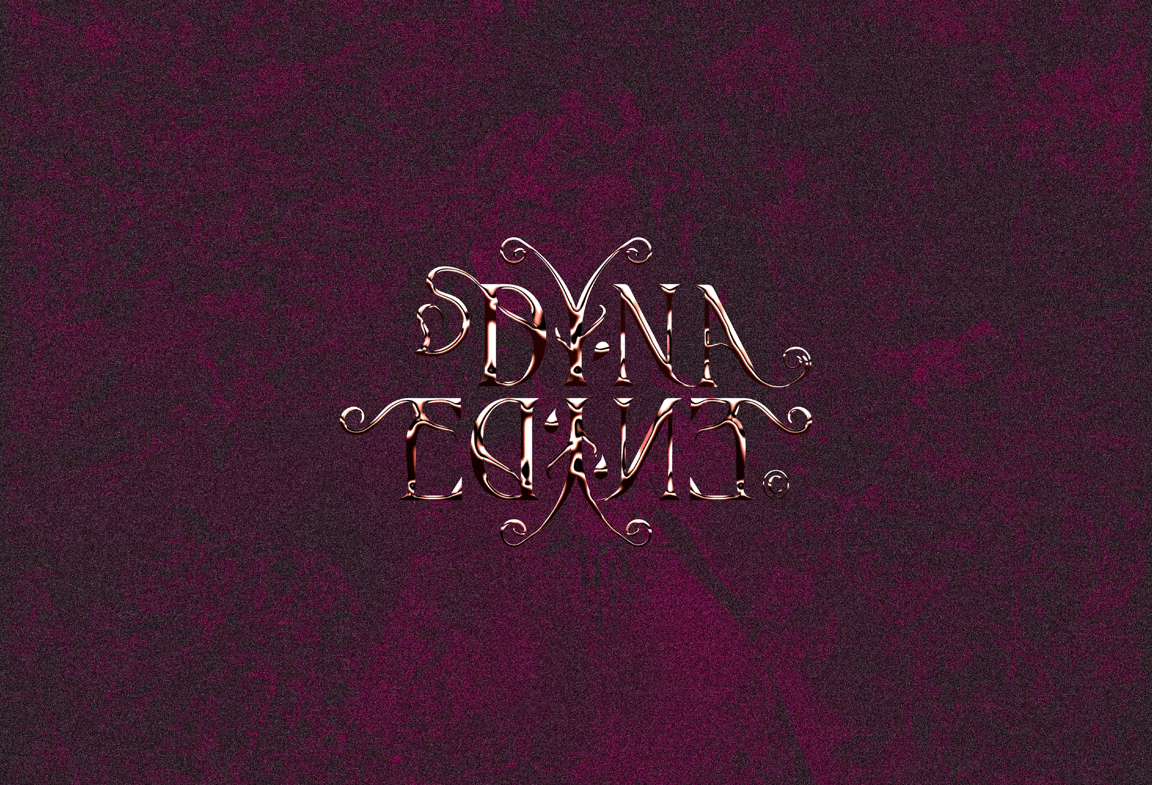
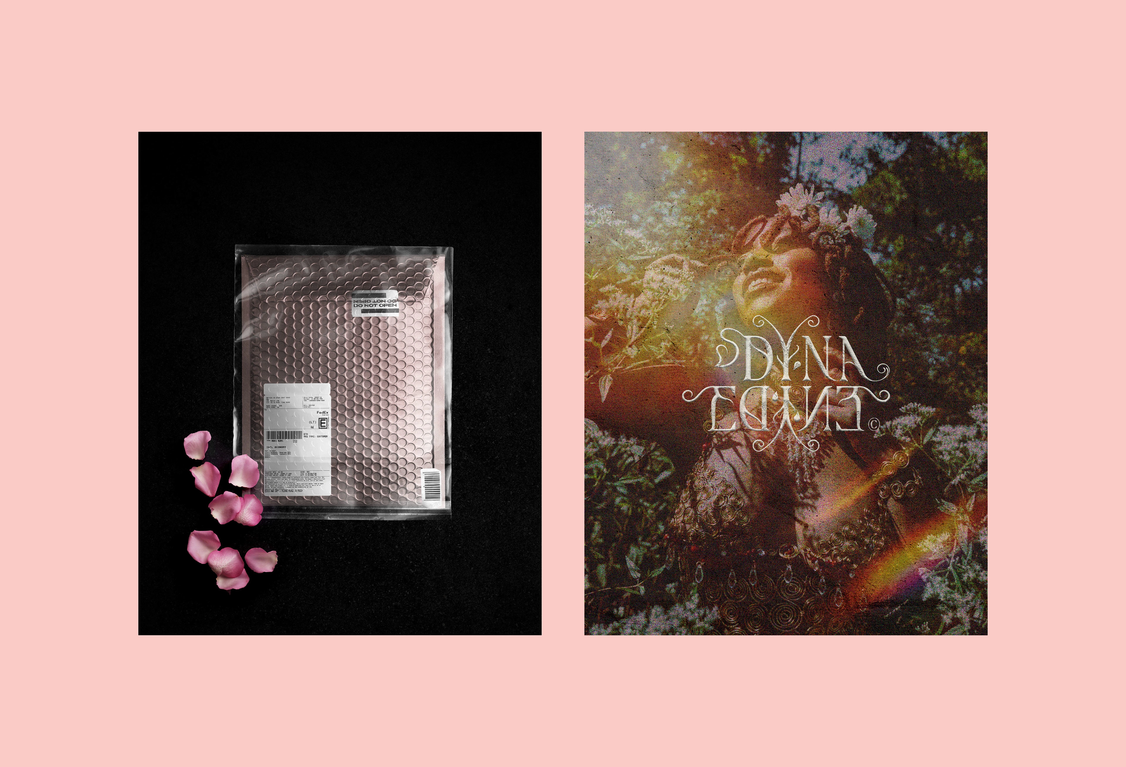
The visual identity for “Where the Petals Fall” by Dyna Edyne embodies transformation, rebirth, and the beauty of self-reflection. The logo, a sophisticated typographic composition, visually mirrors the concept of renewal, featuring inverted, mirrored, and flowing forms that symbolize falling, regathering, and rising anew. Its organic curves and naturistic flourishes convey elegance and soulful energy, reflecting the album’s emotional depth and introspective journey.
This identity captures Dyna Edyne’s essence, sultry, regal, and confident, with a quiet strength and sensuality that radiate through her R&B/Soul artistry. It’s a visual story of growth, authenticity, and self-love.


‘Canvas’ shows you that the confidence you carry is enough to shape the room, then reflecting back on smooth jazz inspired track ‘Stopping By’ reminds us that past mistakes don’t have to be future ones. When tuning into WTPF you’ll feel the essence and core of R&BSoul and its early highlights referencing 90s and early 2000s to a crisp approach melodically and vocally that is a unique addition to the Adult R&B Soul space.


Feel free to express your feedback.
Inquiries are open.
Branding Inquiries:
Client - Dyna Edyne
Brainstorm®
Like this project
Posted Jan 11, 2026
Visual identity design for a new music album rollout 'Where the Petals Fall.' The identity embodies transformation, rebirth, and the beauty of self reflection.
Likes
4
Views
57
Timeline
Nov 13, 2025 - Jun 18, 2026