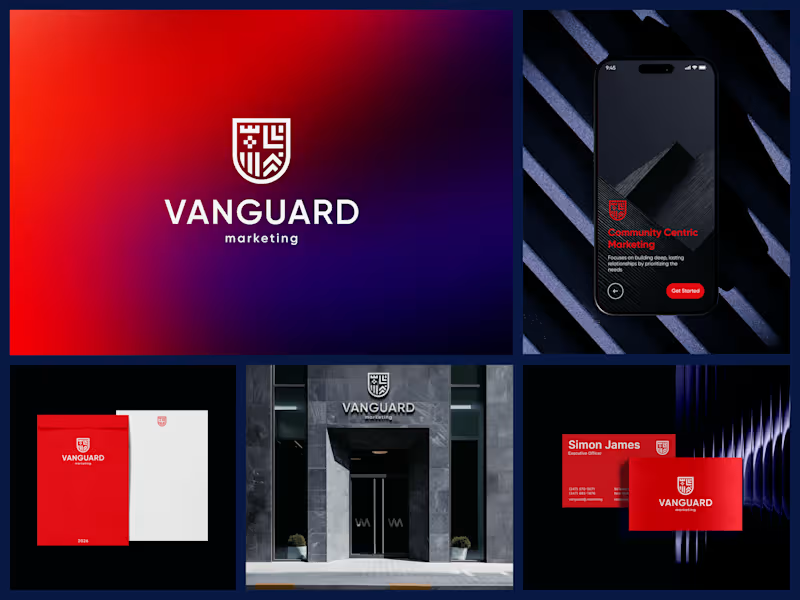
Freelancers using Logo DiffusionFreelancers using Logo DiffusionOfficial Seal & Identity System, County Health Entity
Scope: Replaced an outdated logo with a governed seal system built for institutional use.
Delivered: Full-color version, one-color variants (navy, gold, black, white), reversed version for dark backgrounds, usage guidelines, production-ready vector files (AI, EPS, SVG, PDF).
Result: Approved by the Executive Director. Now in active use across official correspondence, presentation materials, and branded apparel. Logo design :
Concept 1 — The Trim Tab
A minimalist sail-inspired mark representing a small, precise adjustment creating a larger change. It connects directly with the “trim tab” concept while communicating direction, movement, and leadership.
Concept 2 — Strategic Transformation
A refined monogram combining the “T” initials with an upward, flowing form. It represents leadership growth, structured thinking, and positive transformation while keeping the identity professional and executive-friendly.
Concept 3 — High-Leverage Direction
A clean circular symbol with an upward-pointing form, representing focus, alignment, and high-leverage action. The simple geometry gives it a modern consulting feel and makes it adaptable across a website, presentations, and professional materials.