
Websites, Stores & Funnels | Framer, Shopify, Kajabi,Webflow


Websites, Stores & Funnels | Framer, Shopify, Kajabi,Webflow
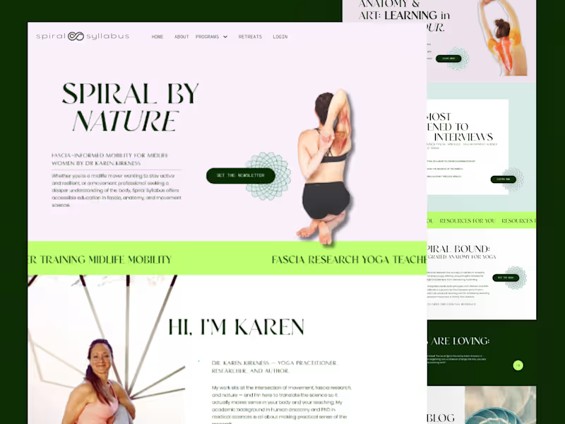



Framer, Webflow & Kajabi Developer | Funnels that convert

Framer, Webflow & Kajabi Developer | Funnels that convert


Efficiency + Essence.
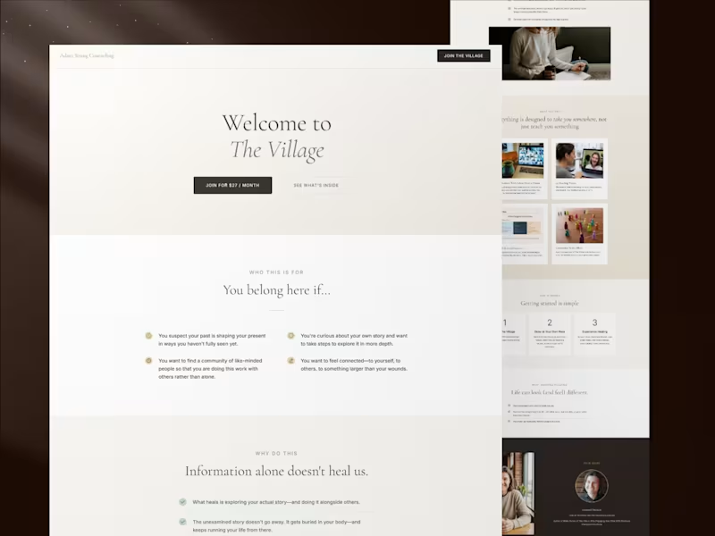
Huge thanks to Jan Jorgensen for the kind words! We worked together to synthesize her brand’s vision into a high-converting marketing funnel. I pride myself on not just doing the work, but truly 'getting' the project from day one.
Looking for a partner for your next digital marketing or project development sprint?
2
2
1.3K

"When you're building a business, you aren't just investing in technology, you're investing in people."
⠀
Nicole said this to me last week, and it stuck.
⠀
We've worked together on two of her brands:
⠀
North Star Incentives, moving from Squarespace to WordPress.
North Star Intentions, moving to Kajabi.
⠀
Two very different projects. Two very different platforms.
⠀
But looking back, the tech was the easy part.
⠀
What made it work was the trust. Being able to talk openly about what wasn't working, make decisions together, and fix things without anyone getting defensive.
⠀
That's rare, and I don't take it for granted.
⠀
Thank you, Nicole White (https://www.linkedin.com/in/nicoleameln/) e. For the kind words, and for being the kind of client who makes the work better.
3
4
251


Kajabi Expert | Growth Hacker | Marketer | Launch Strategist

Kajabi Expert | Growth Hacker | Marketer | Launch Strategist
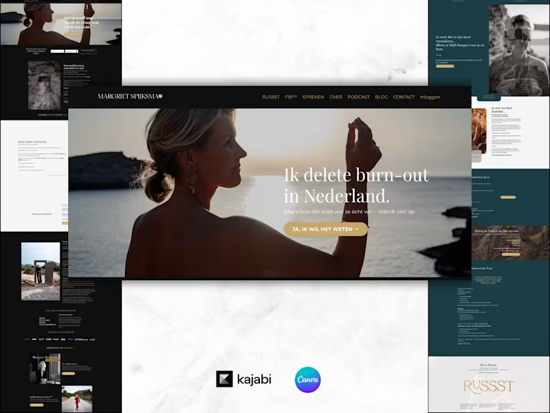
This project was a true transformation from start to finish.
What started as an existing Kajabi setup quickly turned into a complete rebrand.
Everything changed:
→ The website design
→ The course experience
→ The pricing structure
→ The email sequences
→ The fonts and branding
→ The overall customer journey
Projects like these remind me that Kajabi isn't just about setting up pages and automations. It's about creating an experience that reflects the business today, not the business it was years ago.
There's something incredibly rewarding about taking an outdated setup and turning it into a brand that feels fresh, aligned, and ready for growth.
The best part? Seeing all the individual pieces come together into one seamless experience for both the business owner and their students.
These are the kinds of projects I absolutely love working on.
3
7
1.1K


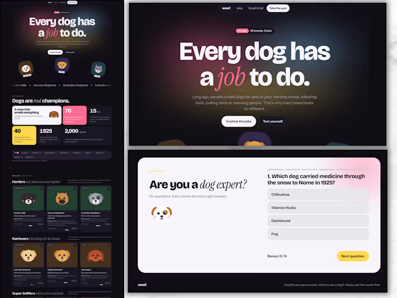
Dogs at Work: An Interactive Learning Page for Kids
Short description
A playful, modern learning page that teaches children about 25 dog breeds and the jobs they were bred for. It includes filters, a size line-up, favourites and a built-in quiz.
Overview
Dogs at Work is a self-initiated concept project. It explores how educational content can feel like a product people want to use, instead of a page they scroll past. The subject is simple and kid-friendly: why do dog breeds look so different? Each breed was shaped by the job it was bred for, from herding sheep to pulling sleds to rescuing people in the snow.
The challenge
Educational pages for kids often fall into one of two traps. Some are text-heavy and dull. Others are so busy that the learning gets lost. I wanted to prove that a learning page can be clean, modern and genuinely fun, while still teaching real facts in a clear structure.
My approach
I started with the content structure before the visuals. Instead of listing breeds alphabetically, I grouped them by job: herders, retrievers, super sniffers, guard dogs, sled dogs, diggers, rescuers, cuddlers and speedsters. That one decision turns a list of facts into a story kids can follow and remember.
For the design, I chose a modern, Framer-inspired look: bold oversized typography, bento-style blocks, a floating pill navigation and soft gradients. To keep it warm and child-friendly, I paired that clean system with illustrated dog faces, rounded cards and small moments of motion.
Key features
Filter by job: a segmented bar lets kids explore one type of work at a time.
Breed cards: each card shows where the breed comes from, what it does, a “Did you know?” fact and a shoulder-height ruler in centimetres.
Favourites: kids tap a heart to save the dogs they like most.
From small to tall: all 25 dogs side by side, sorted by height, from the Chihuahua to the Kangal.
By the numbers: a bento grid of memorable facts, such as the Greyhound’s top speed of almost 70 km/h.
Built-in quiz: six questions with instant feedback, a progress bar and a “bones” score that rewards every right answer.
Design decisions
Structure as learning: grouping by job gives every fact a reason to exist.
One bold moment per section: each section has a single focal point, so the page never feels cluttered.
Accessible by default: it is fully responsive from phone to desktop and supports light and dark mode. It is keyboard-friendly and respects reduced-motion settings.
Real units, real facts: heights and speeds use real measurements, so the page teaches, not just entertains.
What this project shows
This concept reflects how I approach course and learning experiences for my clients. The same principles apply to a course sales page, an interactive lead magnet or a lesson inside a course. Structure the content so it sticks, design it so people want to stay, and add small moments of interaction that make learning feel rewarding.
0
12

Kajabi Expert | Course Creation, Funnels, Marketing Strategy

Kajabi Expert | Course Creation, Funnels, Marketing Strategy



Kajabi Expert | 10+ Years Helping Kajabians Succeed
Kajabi Expert | 10+ Years Helping Kajabians Succeed


Kajabi Website & Sales Funnel Specialist | Top Kajabi Expert
Kajabi Website & Sales Funnel Specialist | Top Kajabi Expert


Strategic Website Partner for SaaS Startups & B2B Companies
Strategic Website Partner for SaaS Startups & B2B Companies

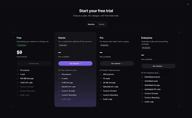

I’ve spent the last three months building this.
Deframer is finally here.
It started with the same conversation with clients: they wanted to leave Framer but felt stuck, since moving meant rebuilding their sites.
I felt it too. Pricing kept getting harder to justify, and the product experience felt worse.
Our template sales also took a hit after the marketplace and community changes.
Other template creators have been seeing their revenue dip too.
So I built Deframer.
Some exporters just package what the browser loads from your published URL.
Deframer writes a clean Next.js + TypeScript project, following Next.js best practices. Code you can read, maintain and run yourself.
It also optimizes for SEO, AEO and speed.
Paste your Framer URL, verify it’s yours, and convert. Your pages, components, layouts and motion come along.
Three months later, it’s ready for you to try.
https://deframer.co
(https://deframer.co)If you’ve been wanting to move off Framer, I’d love to hear how it works for you.
8
8
552



Vetted Kajabi Expert & Automations Specialist
Vetted Kajabi Expert & Automations Specialist


