Contra - A professional network for the jobs and skills of the future
Discover
Sign Up
Post a job
Sign Up
Log In
Filters
Projects
People
Filters
Featured
Web developers
Content creators
Graphic designers
Product designers
AI developers
Motion designers
Social media marketers
Animators
Video editors
Projects we love
Projects we love
Standout projects making waves around the web
View more
Message
111
Andrea DiNardo
max
The Compression Company: Landing Page Copy + Narrative
111
4.3K
Message
90
Tiago Rosado
pro
Mostly Sunny | Framer Development
90
3.7K
Message
155
Stacy · Heed Collective
pro
Brand Identity · Specialty Coffee Cosmetics
1
155
4.5K
Message
34
Jon Howell
Lyft Pink
34
886
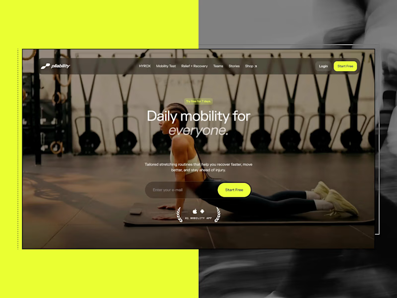
Web design projects using Framer
Framer
The best modern websites built on the leading web design tool, Framer
View more
Message
26
Nico — Brand & Web Design Studio
max
Stickier — A Brand Built to Scale Everywhere
26
1.8K
Framer is the leading tool for building websites, fast
Hire experts
Message
22
Iñaki Palacios Añaños
pro
Artica Capital — High-Performance Private Equity Website
22
830
Message
18
Vítrea Studio
max
Tadaima Website Development Project
18
401
AI projects
AI
New projects from the best AI creators
View more
$2.5K+ earned
Message
42
Oleksii Strichyk ✽
max
Mindprint Platform Rebrand & AI Content Experience
42
2.1K
Message
42
Daniel G Bright
max
SUPAHUMANS — The AI brand that refused to look like one
42
2K
Message
35
Sian V.
pro
nome.art • Artist Portfolio Website
1
35
1.2K
Message
22
Cara Ellis
max
Guerilla Marketing Shirt Artworks and Design for Conduct AI
22
789
Brand design projects
Brand design
Bold visual identities and branding systems created by top independent designers
View more
Message
36
Afton & Sebastian • Branding & Web Design
max
Agape Match | Branding + Kajabi Website
1
36
1.6K
Message
32
Filip Panov
max
Ctrl+Shift Brand Identity Project
32
586
Message
28
Loreta Lazarova
pro
Everbloom / Packaging Design / Supplements
28
1K
Message
25
Alec Minimalec
pro
Rebranding uBloom | Creative Agency
25
445
Video editor projects
Video editing
Creative video edits made using today’s best editing tools
View more
Message
26
Nikita Skopych
max
CatchBack Product Launch Explainer Video
26
1.5K
Message
24
Jen Lai
pro
Boop | TikTok Content and Strategy
24
885
Message
13
Diego Rotmistrovsky
max
Replit Summit Loop Video Project
13
315
Message
10
Janès Zabukovec
Video for neuroscientific research paper on Stereotypes
1
10
438
Standout projects
Standout projects
More projects we love that are making waves across the web
Message
3
Mykola Malyhin
pro
I created this explainer video for Athena to help coaches, scouts, and sports organizations understand how the platform brings mental performance data into the recruiting process. Traditional recruiting focuses on physical metrics, while psychological traits often remain invisible. The challenge was to explain a complex, science-based product in a way that felt simple, engaging, and trustworthy. For this project, I developed the visual storytelling, animated the product UI, designed motion graphics, and built a clean narrative that guides viewers from the problem to the solution. Abstract concepts such as mindset, behavioral analysis, and performance under pressure were translated into clear visuals that are easy to understand. The final video helps Athena demonstrate how teams can make smarter, data-driven recruiting decisions through measurable psychological insights. Perfect for product launches, investor presentations, landing pages, sales, and B2B marketing campaigns.
2
3
74
Message
2
DESH Group
pro
Monetra explores what a modern crypto platform could feel like when strong visuals meet a clear user journey. For this concept, we leaned into bold 3D elements, high-contrast typography, and a minimal interface that keeps the focus on what matters. Every section is designed to guide users naturally, making complex products feel approachable from the very first interaction. A clean landing page can shape how people perceive trust before they even connect their wallet. This concept was built around that idea, combining a futuristic aesthetic with an intuitive experience that feels familiar from the first scroll. What do you think of this direction? 👀
1
2
75
Message
18
Luke Maitland
Football Insider Branding ⚽️ Football Insider is one of the most widely recognised names in modern football media, with millions of followers across social platforms and a reputation built on breaking transfer news. As the brand expanded into a wider network of 19 sister brands, the need for a unified and scalable identity system became essential. Using Football Insider as the master brand, I developed a central concept that brings “The Insider” to life. This led to a distinctive icon built from the letterforms ‘F’ and ‘I’, forming a figure standing over a football and pointing towards the brand name. This created a bold, ownable mark designed for instant recognition across digital platforms. Buzzing to finally be sharing this 😄
24
18
430
Message
2
BL/S ®
Youfit is a fitness app designed for everyone from first-timers to dedicated athletes — and the UI reflects that range. The design blends modern aesthetics with a futuristic visual touch, creating an interface that feels motivating without being overwhelming. Personalized fitness and dietary plans adapt to each user's goals and evolving needs, supported by a layout that makes complex health data feel approachable and actionable. A steadfast companion for taking control of your health — built to grow with the user.
1
2
17
Message
9
Bearplus Fullstack Agency
The hero is the site's handshake, so it had to carry the whole idea in a few seconds. Rather than a static image with a headline over it, the hero responds to cursor and scroll input with subtle parallax and depth. The freight reads as something in motion rather than a photograph of something that moved. Restraint mattered here: enough life to signal that this site behaves differently, not so much that it turns into a demo reel and gets in the way of the message.
5
9
104
Message
14
Lee Allan
pro
CHARGE — Brand Concept Challenge The focus gum category is crowded with products that rely on functional claims, lifestyle clichés, or overly clinical branding. CHARGE needed a visual identity that immediately communicated energy, confidence, and momentum while feeling premium enough to compete on modern digital shelves. Idea Energy. Focus. Go. The concept treats focus as movement rather than concentration. Every graphic element—from bold typography and angular compositions to kinetic motion and athletic photography—reinforces the feeling of acceleration. Rather than telling people they’ll feel energized, the brand is designed to make them feel energized the moment they encounter it. Visual Language A bold, high-contrast design system built around oversized typography, dynamic geometric forms, clean white space, and vibrant product colors creates an instantly recognizable identity. Bright lifestyle photography captures moments of determination, speed, and achievement, while the colorful packaging becomes a hero element across every touchpoint. Motion System The motion language is driven by momentum. Type slides with purpose, products snap into frame, athletes move through fast cinematic cuts, and macro product moments add tactile detail. Every transition is quick, precise, and intentional—mirroring the instant boost associated with the product. Photography Instead of generic fitness imagery, the photography celebrates peak performance across multiple sports and disciplines. Powerful portraits, dynamic action, and vibrant outdoor environments create a feeling of optimism and forward motion while reflecting a diverse community of high performers. Outcome The result is a contemporary consumer brand that feels energetic, premium, and highly scalable. The identity extends seamlessly across packaging, social media, motion graphics, advertising, digital experiences, and retail—creating a cohesive brand system that is memorable both on shelf and on screen.
11
14
182
Message
24
Ulises Gabriel
Terra — Natural Deodorant Landing Page A premium short one page concept for a natural deodorant brand, designed around earthy textures, cinematic moss photography, and a refined editorial layout. I used deep forest greens, warm ivory tones, elegant serif typography, and immersive product imagery to give the brand a more elevated and luxurious presence. I'm still building it. Responsive layout for desktop and mobile, designed and built in Framer. #Framer #WebDesign #LandingPage #BrandDesign #EcommerceDesign #UIDesign #CreativeDirection #NaturalSkincare
23
24
268
Message
1
Mária Dovičovič Savkaničová
Breath sets the pace of every yoga practice, so I wanted this interaction to do the same. I wanted it to feel like taking a deep breath. Instead of presenting everything at once, the component reveals one moment at a time, guiding visitors through what a retreat holds for them. Animation isn’t there to impress. It’s there to set the rhythm. Built for my Namaste Studios (https://www.framer.com/community/marketplace/templates/namaste-studios/) Framer template. 🌿
1
56
Message
13
Ayberk Atılgan
Exploring concepts for an independent, concept campaign project. Tenth Muse (https://tenthmuselondon.com/) is a London-made, solid perfume brand. One of the vessels is called Matcha. I've started to explore a matching solid perfume balm called Soft Matcha.
6
13
212
Message
22
Emrah OZBAY
DONT MISS THIS ONE: I've spent the last few weeks building something I've wanted to finish for a while and add new skills to my pipeline while working on the project: a cinematic, terminal/HUD-style interface for a fictional tactical operations system, entirely in the browser. (I believe this might be a really good solution to run some type of motion projects during filmmaking time directly on the visible probs) Here are some details: Behind a simulated boot sequence (fake network handshakes, IP auth, animated logo reveal) sit four consoles: → STATICPEN: a satellite recon view with live target tracking that shifts from optical to thermal scan on inspection → SILENTPEN: a ground tactical console with four switchable sensor modes: Direct, Lidar, Heat Scan, Ghost → SEERPEN: the deep one. A real 3D globe (Cesium) rendering 26 live/static intelligence layers, conflict zones, ship traffic, flight tracking, GPS jamming, orbital satellites, paired with a live news feed and a local-LLM "analyst" that reads the map context and can act on it through chat → STRATUM: locked for now. Select it, and the system denies you clearance and logs the attempt. A dead end on purpose. Design-wise, the goal was to make it feel like a live system, not a mockup; every terminal readout, scan line, and boot log is actually animating in real time, not a static screenshot dressed up to look busy. Designed fully in Figma, first run and perfected on a local server and moved to GitHub with some changes to able to fit the webpage format. It was built with React 19, TypeScript, Vite, Tailwind v4, Cesium, and a small Express backend aggregating real news and live layer data. While I've FE skills, they were limited in most cases; I've tried a new MCP server system inside Figma, and with VSC and Claude, I was able to pull out my design, put more detailed meaning to it and run it fully with interactions. While I'm against the ML systems to some degree, my approach is to use that as a tool to solve my technical problems. And my design project became a fully functional project. I believe designers will evolve their mindset to create more valuable products with more extensive tool options. Let me know what do you think =) Full case study on Behance: https://lnkd.in/dNd_PRqu (https://lnkd.in/dNd_PRqu)Live demo: https://lnkd.in/d2cp9mcN
13
22
319
Message
16
Idris Lamina
pro
Veranda, a luxury residential concept landing page Veranda is a concept build I created for a fictional luxury residential brand. It is not client work or a real property. The images and hero motion were generated with AI as part of the creative process. I wanted to explore something that matters when building high-fidelity landing pages: after several rounds of changes, how do you make sure the final page still looks like the design that was approved? The site is built in Next.js with responsive layouts, self-hosted fonts, GSAP motion and an interactive walkthrough. I also built in a proper QA process around it, not just checking that the page loads and the buttons work. It compares 12 sections across five screen sizes against approved visual baselines. It flags visual drift, missing baselines and changes that have not been reviewed. I also tested interactions, accessibility, contrast, performance, browser behaviour and reduced-motion states. The main lesson for me was simple: a page can pass functional tests and still no longer be the page that was agreed.
15
16
333
Message
98
José Tovar
pro
I’ve been exploring motion and design for Gambo Café's hero: a danish pastry / colombian beans café in Copenhagen... and I ended up liking both concepts for completely different reasons. Now I genuinely can’t decide which direction feels stronger! Which one would you choose, 1 or 2? Feedback is always appreciated!
46
98
2.8K
Message
28
Caleb Huang
I’m creating an eSports Charity Event type graphics package for the Broadcast Challenge. Here’s a bit of a work in progress!
2
28
1.1K
Message
3
Fernando Corallo Fernandez -REFROC-
Gambaru is a specialty coffee shop located along Route 40 in Bariloche, Argentina. The goal was to create a name and visual identity inspired by Japanese culture, emphasizing craftsmanship, dedication, and the human touch behind high-quality products. The project aimed to move away from minimalism and embrace the expressive, chaotic nature of Japanese graphic culture, with a one-month timeline aligned with the construction and launch of the food truck.
3
187
Message
23
Dane Kowachek
pro
I've been building Studio Kowa (https://www.linkedin.com/company/studio-kowa/) from the inside out with a new mark, a refined color and type system, and a studio direction that actually reflects where I want this project to go. I've been building this idea on the side for a while now, while freelancing for different clients over the years. The focus is on helping founders and cultural clients put their first step forward through clean, energetic design and brand systems. I'm directing AI with a strict point of view and using it to move faster while also flagging poor results. I will be sharing more on the studio this week as well as a new website built in Framer!
9
23
493
Message
12
Milan Bundalo
pro
Meet Solinova (https://webflow.com/templates/html/solinova-website-template), a playful Webflow portfolio template created for designers and creatives who want their work to stand out. Bold typography, vibrant colors, expressive layouts, smooth interactions, and CMS-powered projects, designed in Figma and brought to life in Webflow. Figma file included with template. 🎉
5
12
275
Explore projects