
pro
Abdul Rehman
Minimalist Brand Designer | Logo & Brand Identity.
- $1k+
- Earned
- 3x
- Hired
- 5.00
- Rating
- 70
- Followers

One of my favorite identity projects from last year.
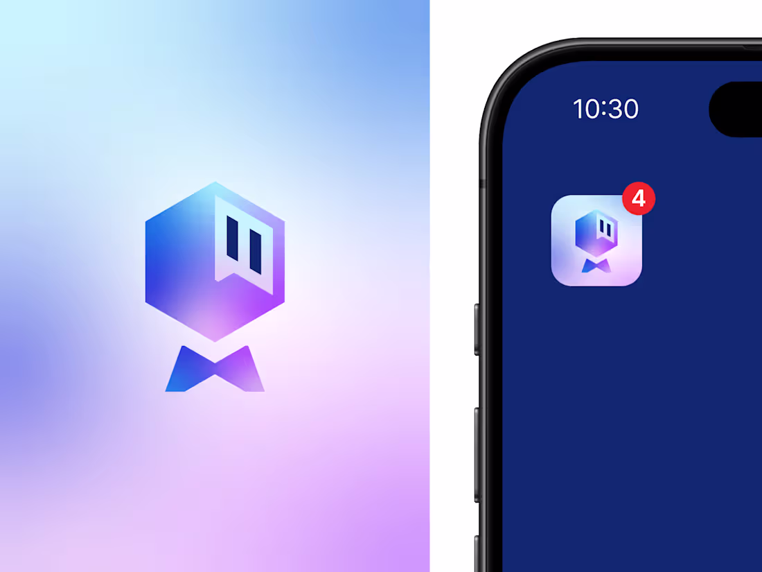
Saylo is a messaging app concept designed around the idea of simple, meaningful communication. The logomark combines the letter S with a chat bubble and three message dots, creating a clean, memorable symbol that instantly connects with the brand's purpose.
The accompanying pattern extends the identity, adding a playful yet modern visual system that works across digital and brand applications.
Looking back, it's still one of those projects I'd happily build again.
What's the first thing you noticed in the mark: the "S" or the chat bubble? 💬
1
7
132
A few days ago, I was exploring logo concepts for a client, and this was one of the directions I created.
It never made it to the final presentation because it wasn't aligned with what the client was looking for. Even so, it's still one of my favorite concepts I've designed recently.
Sometimes the ideas that don't get chosen end up teaching you the most.
Curious to hear your thoughts. What do you think?
4
192
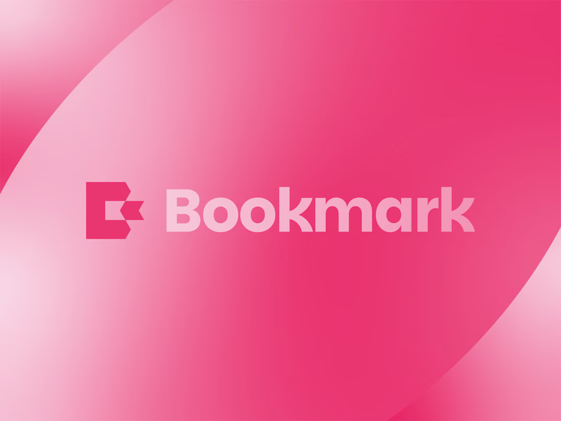
Bookmark - Letter B Logo Design.
What you think about this logo concept?
2
181
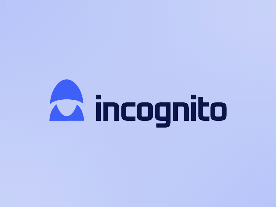
incognito VPN Logo Design.
A hooded silhouette crafted to represent secure, private, and anonymous online experiences.
What you think about this concept?
1
175
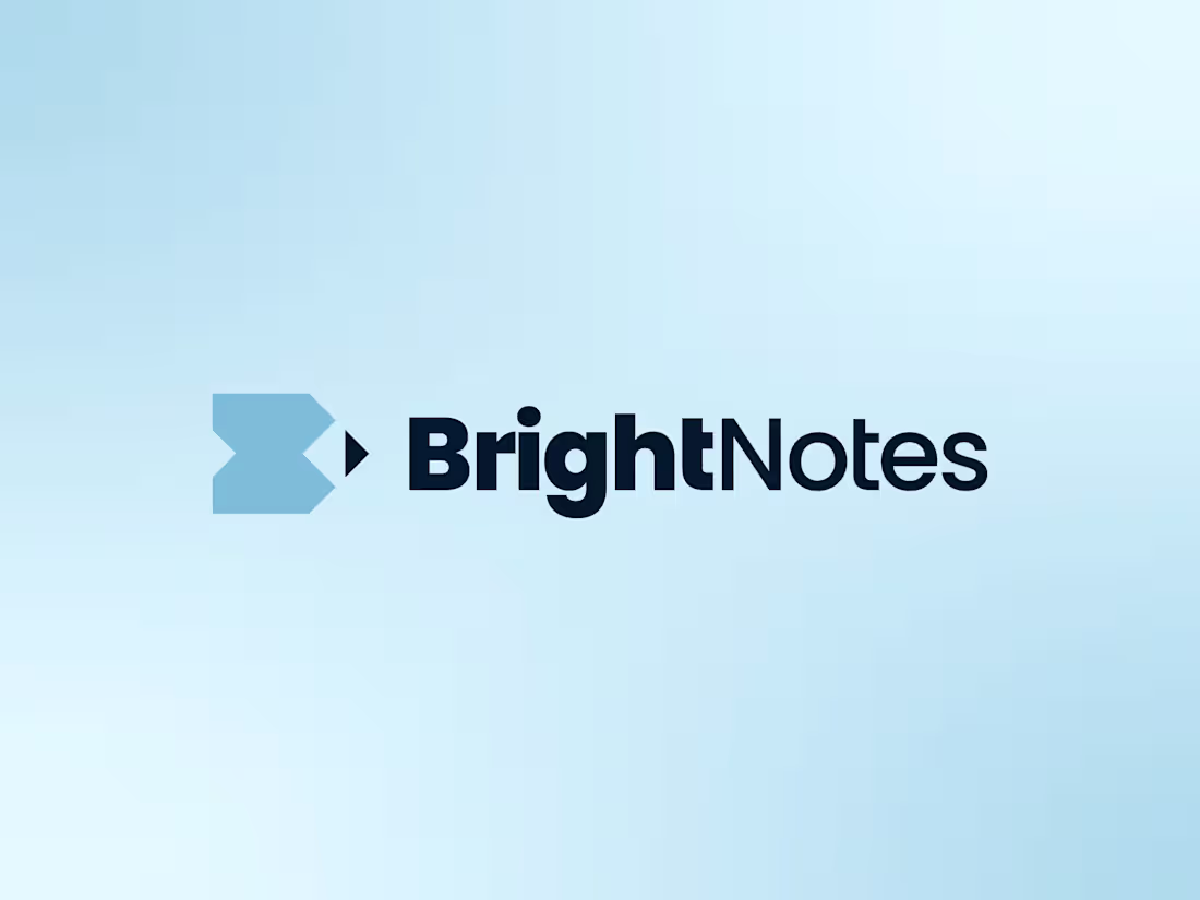
BrightNotes - Letter B Pencil Logo Design.
10
7
358
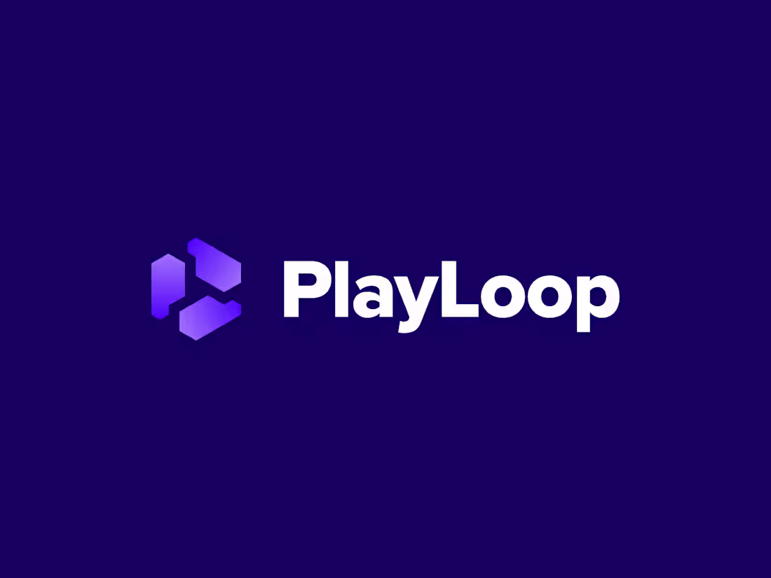
PlayLoop Logo Design.
5
9
291
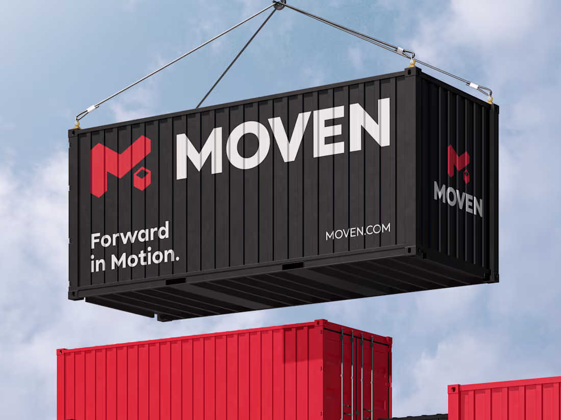
Moven Brand Identity Design
1
5
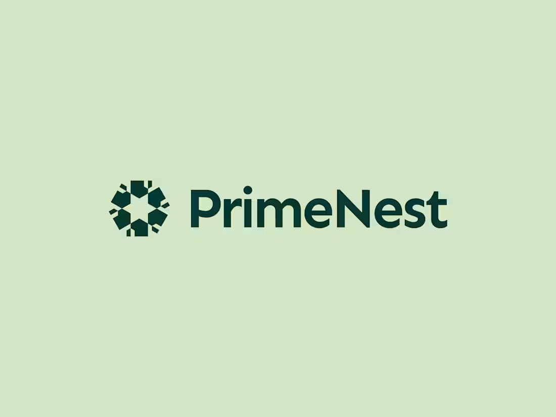
PrimeNest Real Estate Logo Design.
1
274
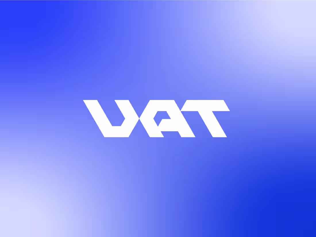
UAT Lettermark Exploration ✨
I designed these UAT lettermark concepts for a client in the auto transportation industry. Unfortunately, none of them were selected, but I still love how they turned out and felt they deserved a place in my portfolio.
Not every concept makes it to the finish line, and that's okay. Sometimes great ideas simply take a different path.
Which one is your favorite? I'd love to hear your thoughts. 👇
1
261
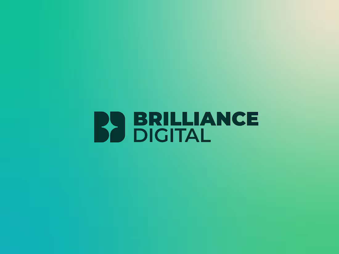
Logo design for Brilliance Digital, a brand built around excellence, innovation, and a bright future.
The logomark combines the letters B and D, with a star placed at the center to symbolize brilliance, achievement, and the spark of new possibilities.
0
234
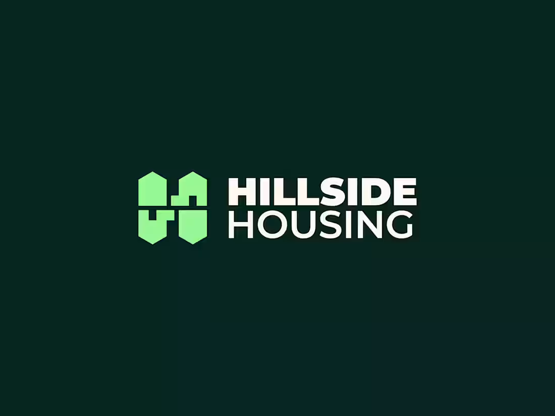
Hillside Housing Logo Design.
0
227
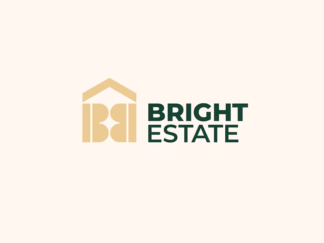
Logo design for Bright Estate, a premium real estate company focused on helping clients find homes with confidence and clarity.
The logomark combines the letter B, a 4-pointed star, and a house icon into one clean symbol. The star represents guidance and bright opportunities, while the house reflects trust, comfort, and the foundation of every home journey.
Designed with a modern and timeless approach to create a memorable identity that feels both professional and welcoming.
1
262
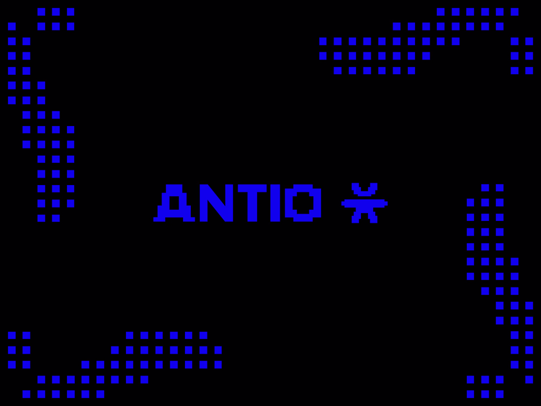
Exploring a visual identity for ANTIO, a cybersecurity company built around protection in the digital world.
The logomark is inspired by an open-arm silhouette, symbolizing security, trust, and a constant readiness to protect. The pixel-based system extends that idea into the digital space, creating a visual language that feels native to technology while remaining human at its core.
I tested the identity on both light and dark backgrounds, and now I'm curious:
Which version feels stronger to you?
⚫ Black background
⚪ White background
I'd love to hear which one better reflects a modern cybersecurity brand and why.
0
408
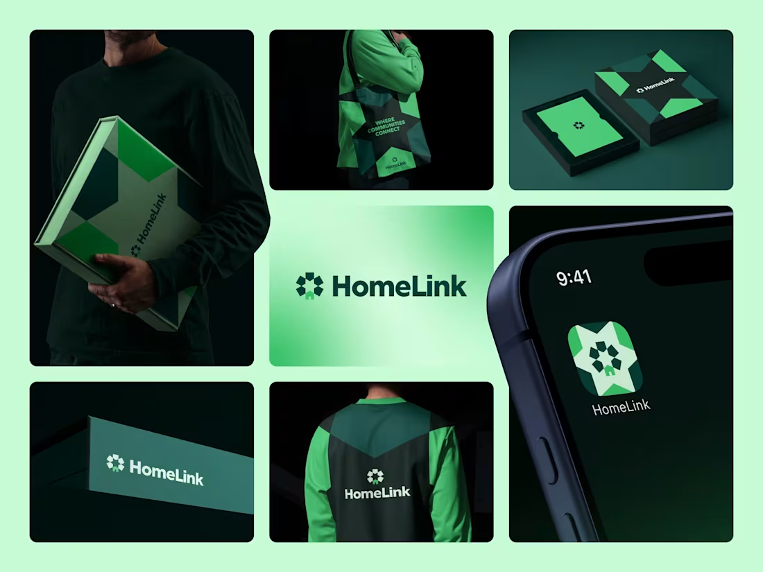
Bringing the HomeLink Brand to Life
I'd love to hear your thoughts.
4
1
412
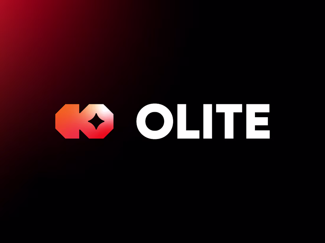
Olite Logo & Brand Identity Design
0
3
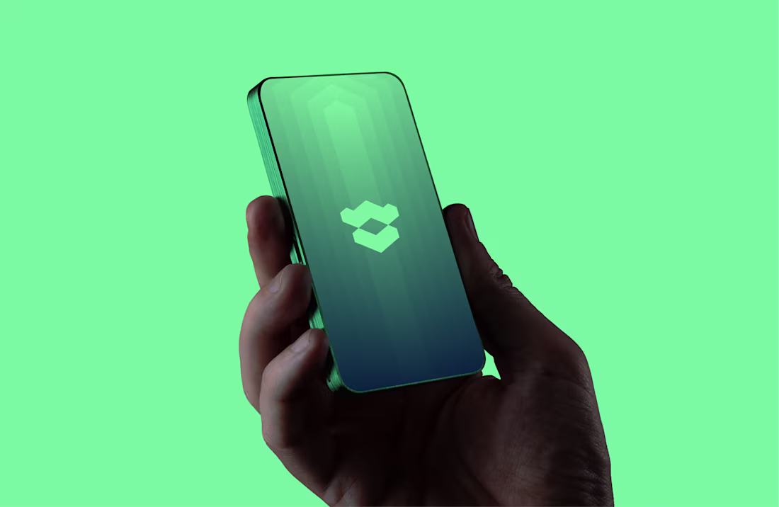
Tovra AI Logo & Brand Identity Design
0
8
Exploring geometry with this one. I merged W and V into a single symmetrical mark using sharp angles and interlocking shapes.
I wanted it to feel bold, clean, and instantly recognizable, even at small sizes. The solid structure gives it strength, while the cutout keeps it light and dynamic.
Would love to know what you see first, the W, the V, or just a symbol on its own?
1
571
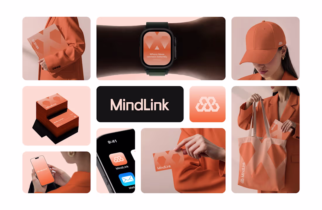
Logo & Brand Identity for an AI Collaboration Platform
1
9
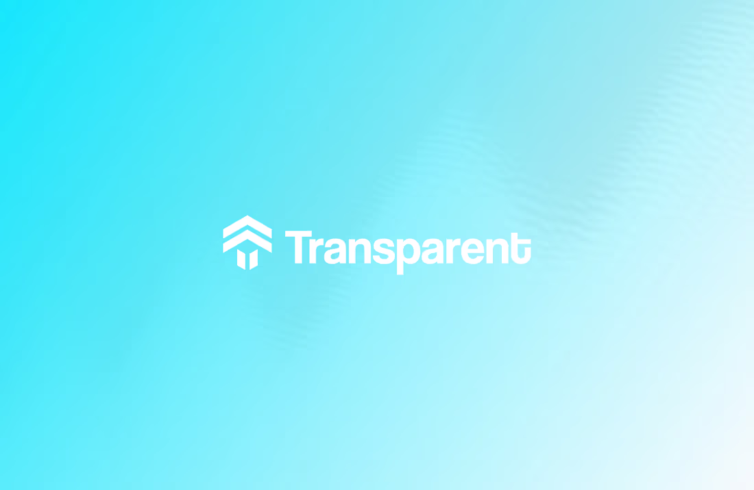
Rejected logo concept for Transparent
I recently worked with Transparent, a backend technology company building powerful, easy to use APIs that connect business systems and enable seamless data exchange.
This concept took a clean, technical approach. I used angle brackets to shape the letter T, referencing backend code, and added a subtle arrow form to represent growth and progress.
The client chose Concept 2, and we wrapped up the project smoothly with no revisions on the final delivery, which is always a win.
Not every concept gets selected, but every concept moves the project forward.
Would love to hear your thoughts.
2
1
565
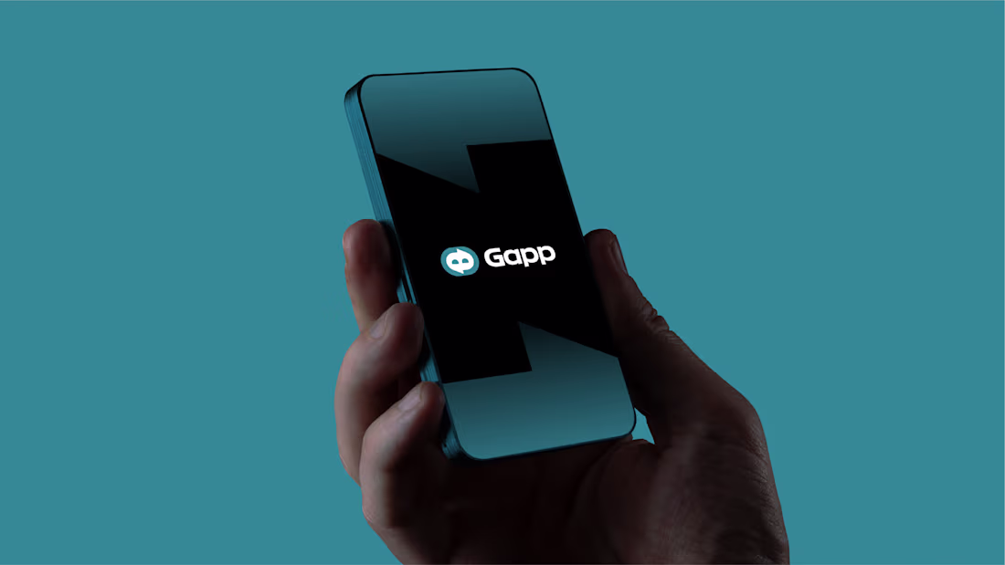
Gapp – Logo & Brand Identity for a Messaging App
0
7
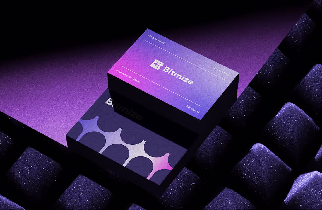
Bitmize – Brand Identity for an AI Blogging Platform
2
8
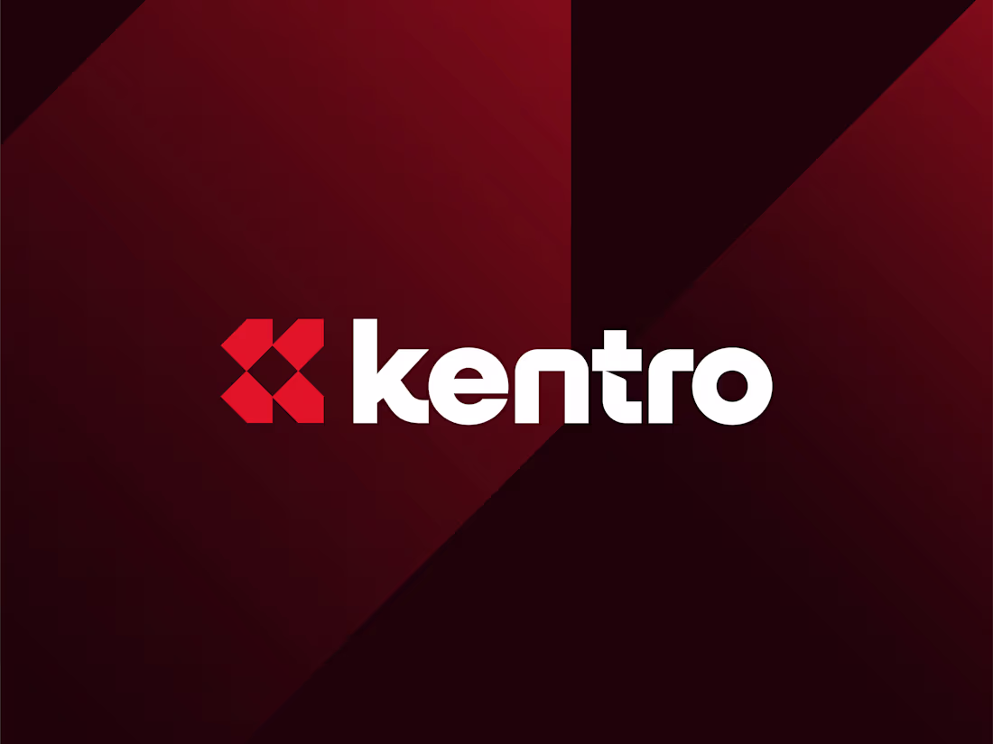
Kentro
0
352
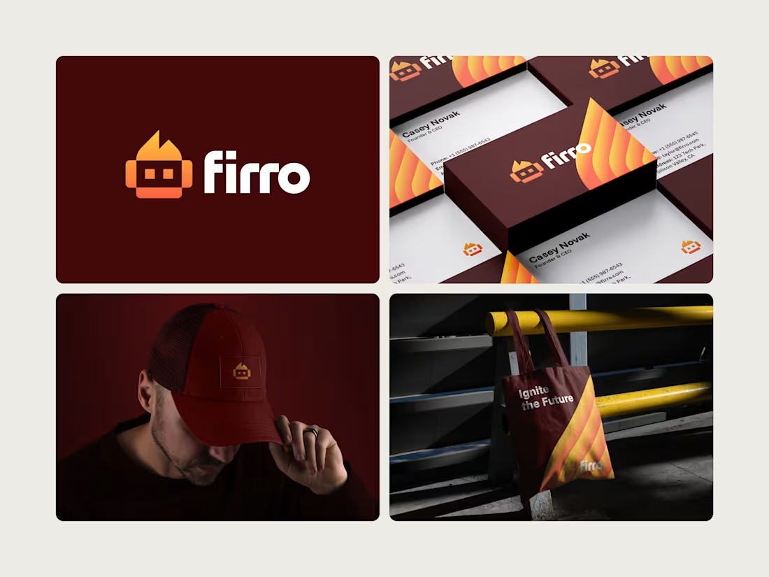
Designed this logo last year for Firro.
The name comes from fire and robot, which shaped the logomark. A simple symbol that feels energetic, a little bold, and tech-driven without trying too hard. Once everything came together across the brand pieces, it all just clicked.
Still really like how this one turned out.
What do you think?
Click for full project. (https://www.behance.net/gallery/238002871/Firro-Robot-and-Fire-Logo)
2
1
484
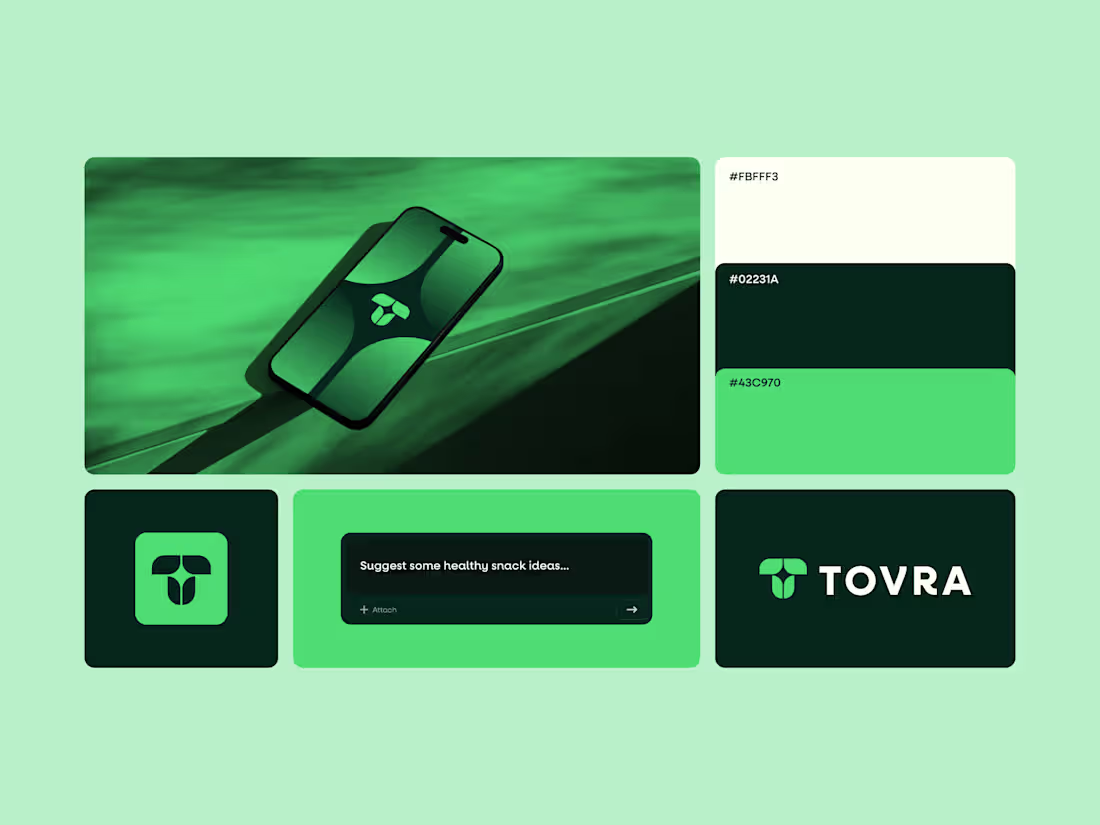
A little sneak peek 👀
Currently working on the brand identity for Tovra.
An AI-driven brand focused on health-conscious people.
Full project coming soon. Hopefully publishing on my Behance (https://www.behance.net/abdrehmandesign) within a week.
3
3
495
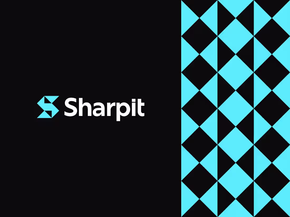
Minimalist at its core, designed to stay strong and sharp without losing its character.
Logo design for Sharpit, with a logomark built from the letter S using sharp, geometric forms.
Curious to hear your thoughts.
2
3
452
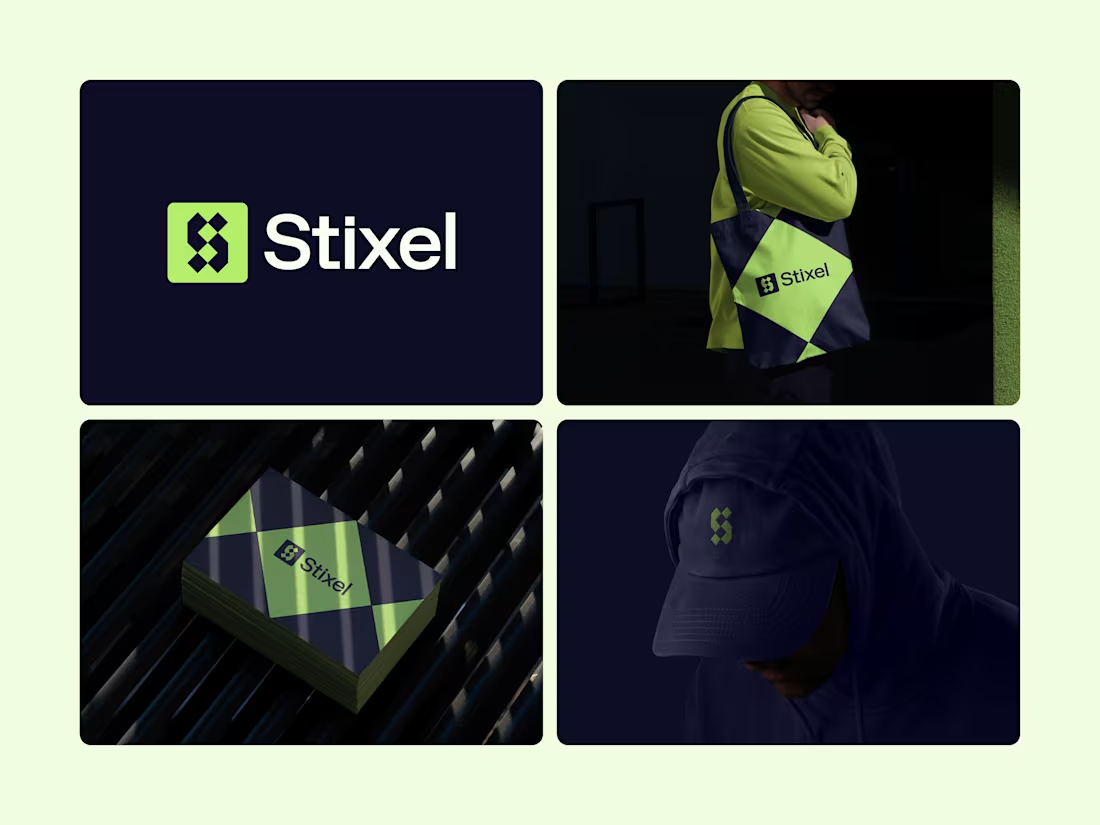
Recently explored how far a simple idea can go when applied consistently.
The Stixel logomark blends the letter S with pixel elements to reflect a modern, digital-first brand. Minimal at its core, but flexible enough to live across merch, print, and everyday use without losing character.
Curious to hear your thoughts.
Does the mark feel distinctive and scalable to you?
Click to See (https://www.behance.net/gallery/241991361/Stixel)
13
23
578
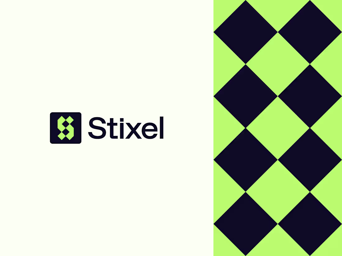
Designed this logo last year, and it’s been nice seeing it get a strong response on Behance recently.😊
Stixel is built around the letter S, formed using pixel-inspired geometry to create a sharp, modern logomark. The idea was to keep it minimal but structured, with a strong digital feel that stays clear and recognizable at any size.
Looking back, it’s interesting how some concepts age better than expected.
What do you notice first, the symbol or the color choice?
See Here (https://www.behance.net/gallery/241991361/Stixel)
3
339
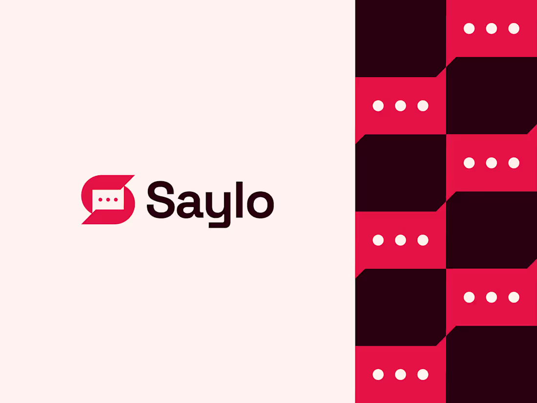
Designed this logo last year for a fictional chat app called Saylo. The name mixes “Say” and “Hello,” so the whole idea was simple, warm conversations.
I built the mark around an S + chat bubble to show messaging at a glance without feeling too techy or cold.
Curious how it lands with you. Does the concept read well? What would you tweak? 🗣️
3
2
357
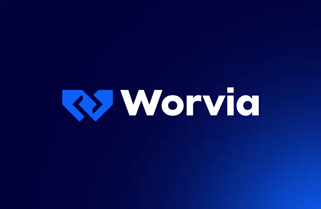
Worvia – Brand Identity for a Web Agency
1
5
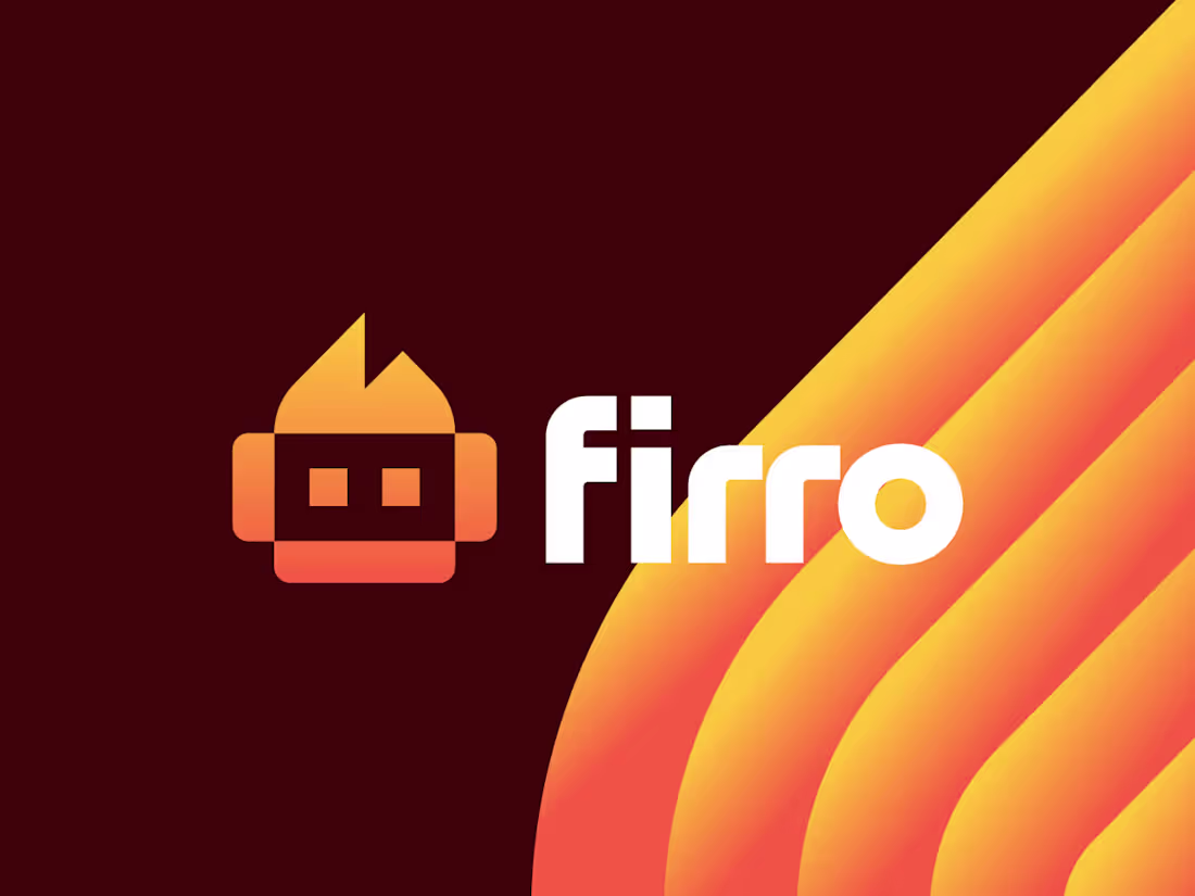
Firro Brand Identity – AI & Robotics
1
3