The network for creativity
Join 1.25M professional creatives like you
Connect with clients, get discovered, and run your business 100% commission-free
Creatives on Contra have earned over $150M and we are just getting started
Back to feedPost

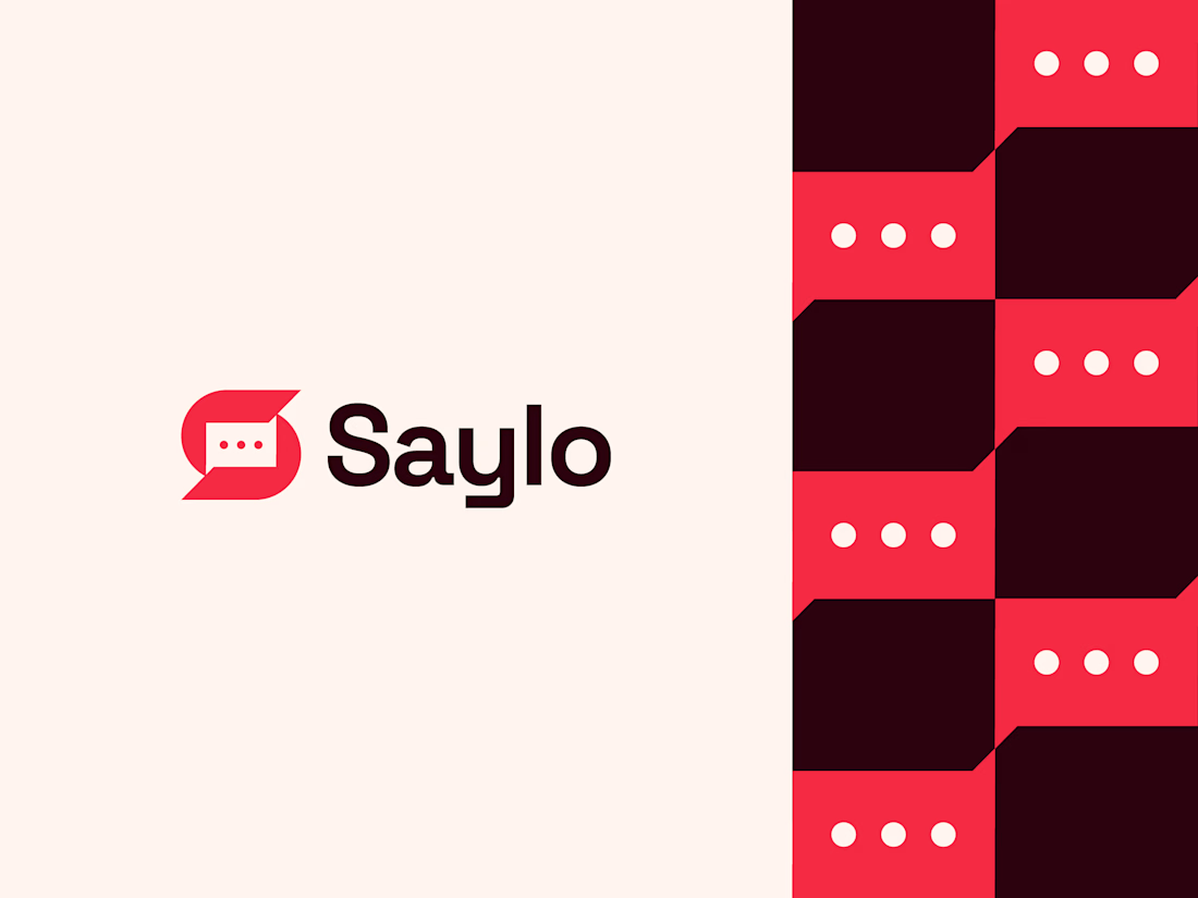
One of my favorite identity projects from last year.
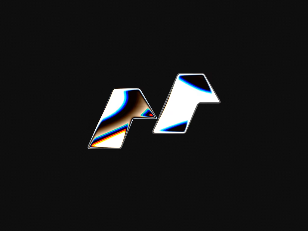
Saylo is a messaging app concept designed around the idea of simple, meaningful communication. The logomark combines the letter S with a chat bubble and three message dots, creating a clean, memorable symbol that instantly connects with the brand's purpose.
The accompanying pattern extends the identity, adding a playful yet modern visual system that works across digital and brand applications.
Looking back, it's still one of those projects I'd happily build again.
What's the first thing you noticed in the mark: the "S" or the chat bubble? 💬


Saylo has a calm confidence to it, the kind of identity that trusts the product to carry the weight instead of shouting. The restraint reads as premium. Was the round wordmark a deliberate counter to how sharp most messaging-app logos try to look?
The network for creativity
Join 1.25M professional creatives like you
Connect with clients, get discovered, and run your business 100% commission-free
Creatives on Contra have earned over $150M and we are just getting started
Trending
retrofuturism
Share your favorite designs from the past exploring the distant future. Or your own take on the aesthetic 🚀
halftone
Dots. Texture. Grain. Let's see your designs using the halftone technique.

Midjourney
Creatives are showing off what they're making with Midjourney.
colorgrade
Video editors sound off: How do you enhance the mood of your video in color grading?





Related posts

MOONIQ — Visual Identity System
Mooniq is a leading digital marketing agency specialized in social media, blockchain, and Web2 consulting. Its new identity reflects a bold and futuristic vision, inspired by exploration and constant innovation. A system built to express ambition, trust, and elegance, positioning Mooniq as a guide for brands reaching new heights.
The brand required an identity that could embody its innovative spirit, strategic mindset, and futuristic vision.
This visual identity was designed to capture Mooniq’s essence: a forward-thinking agency inspired by the concepts of exploration, technology, and limitless growth. Every element of the system —from the logo to the typographic and chromatic choices— was created to establish a sophisticated and aspirational brand presence.
2025© - Jv® Studio. — Enmanuel Jimenez V. All rights reserved.
Featured project in Graphic Design / Branding & Stock by Behance
You can view the entire project here: Contra


eally ambitious, well done.

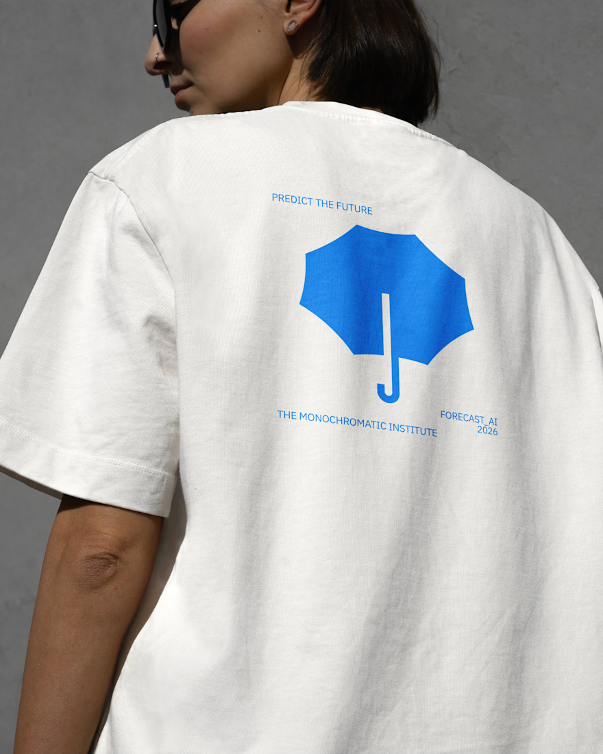
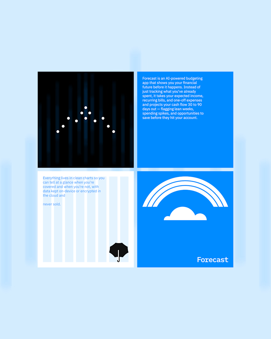
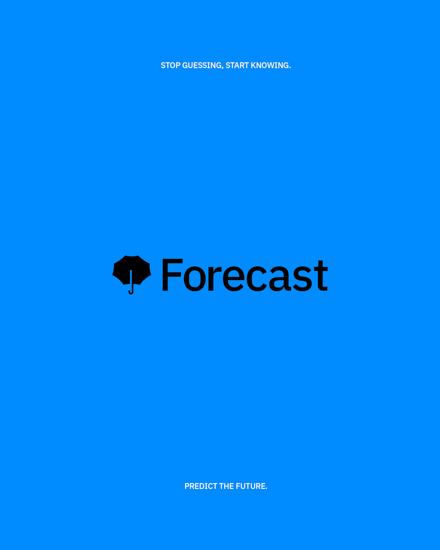
A rejected concept for Forecast AI — a budgeting app that predicts your future spending habits rather than just tracking your past ones. We based this concept around an umbrella, drawing parallels between the uncertainty of weather and the preemptive protection it provides.


Love how simple yet powerful this design is.

Working on Morga Logo Animation in Figma. It's amazing that we can control effects and motion.


Super cool work!