Moven Brand Identity Design
Abdul Rehman
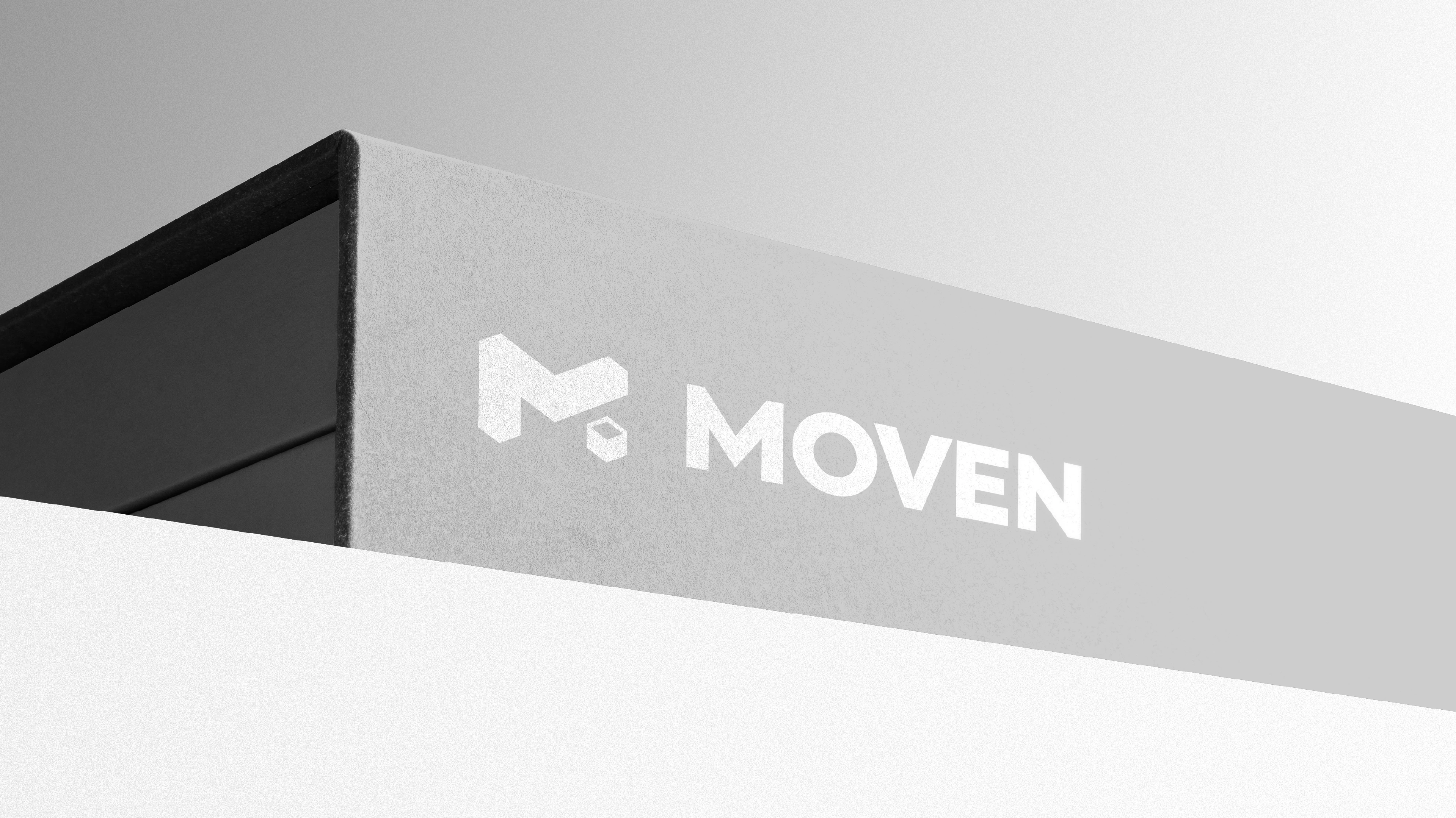
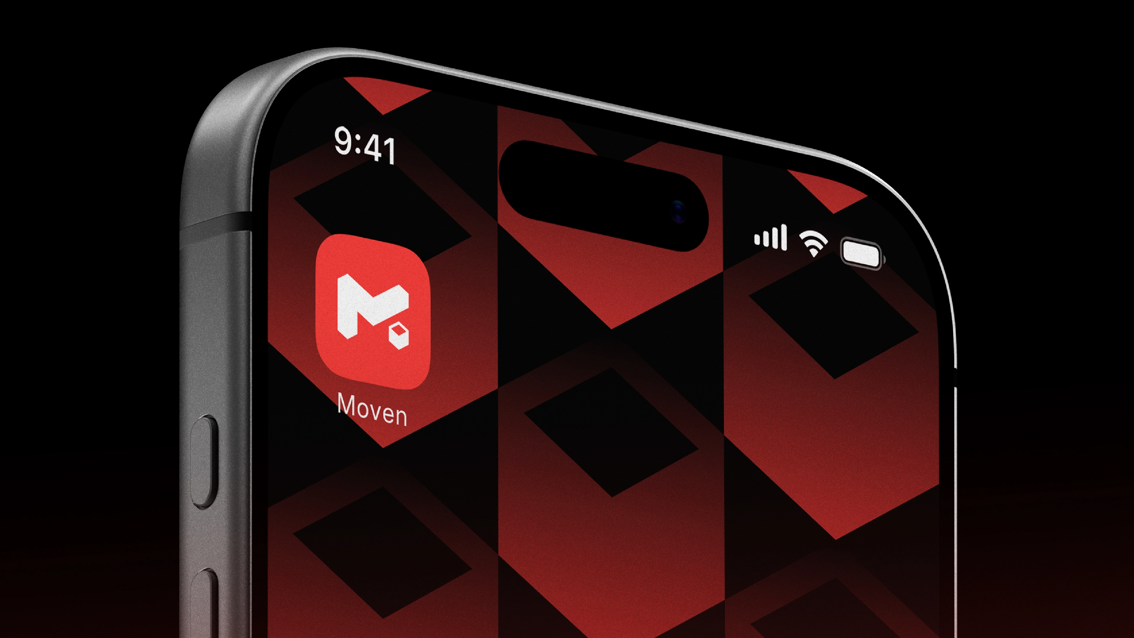
.Moven® Logo & Brand Identity.
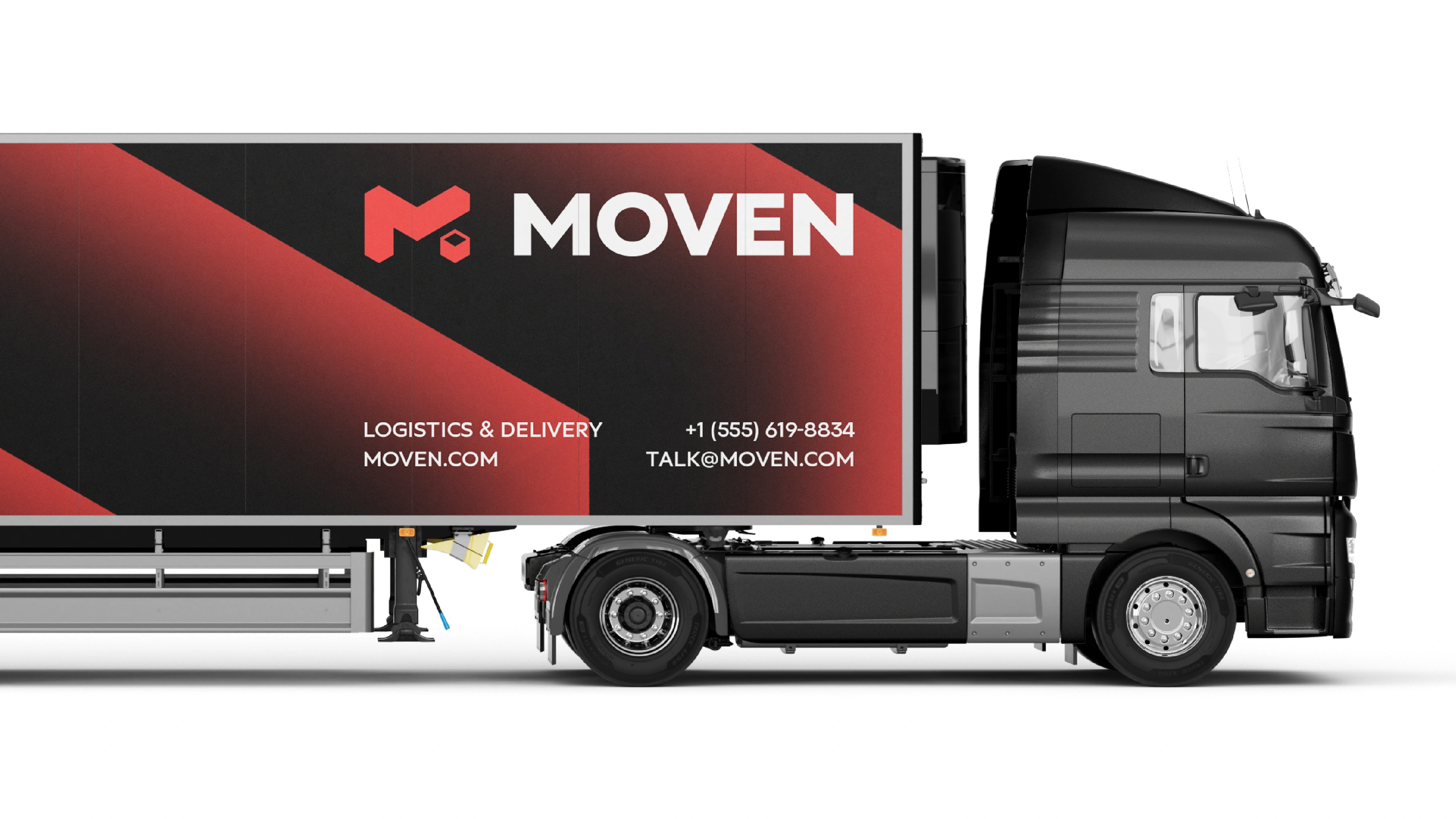
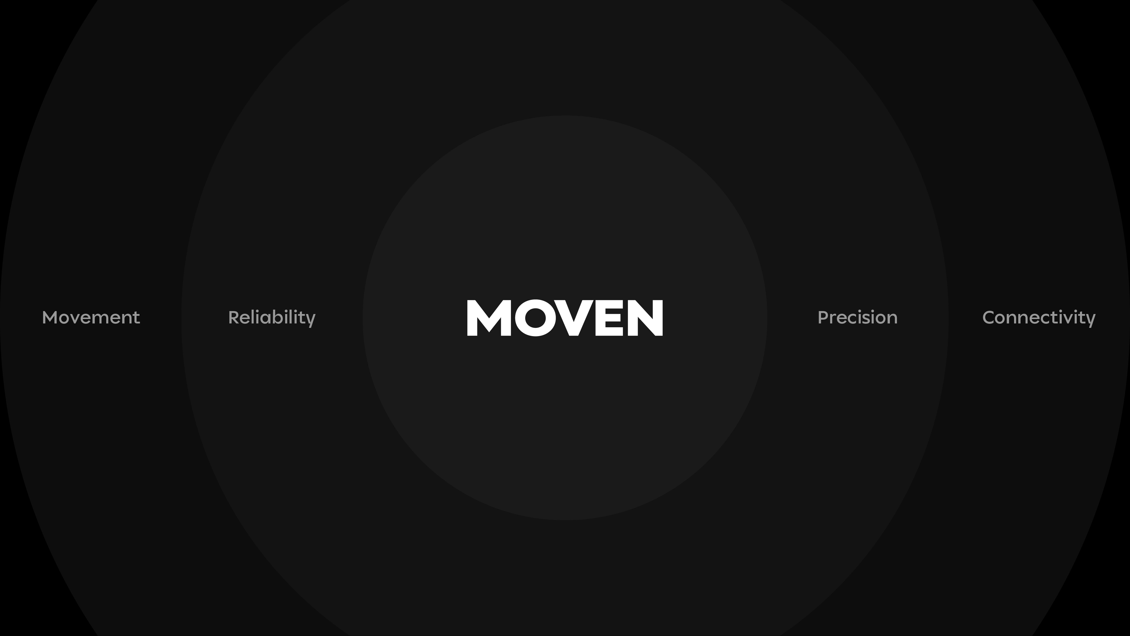
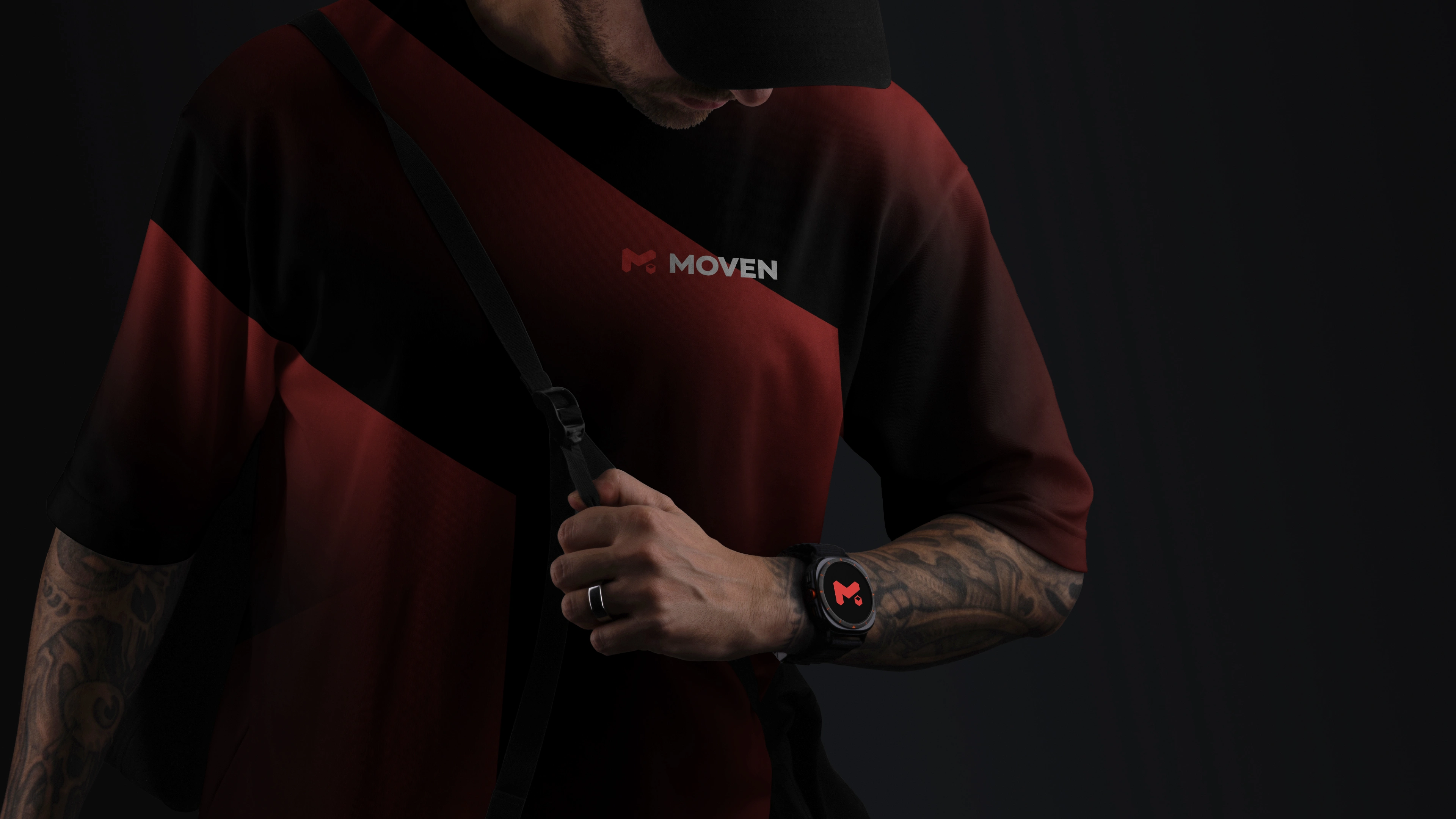
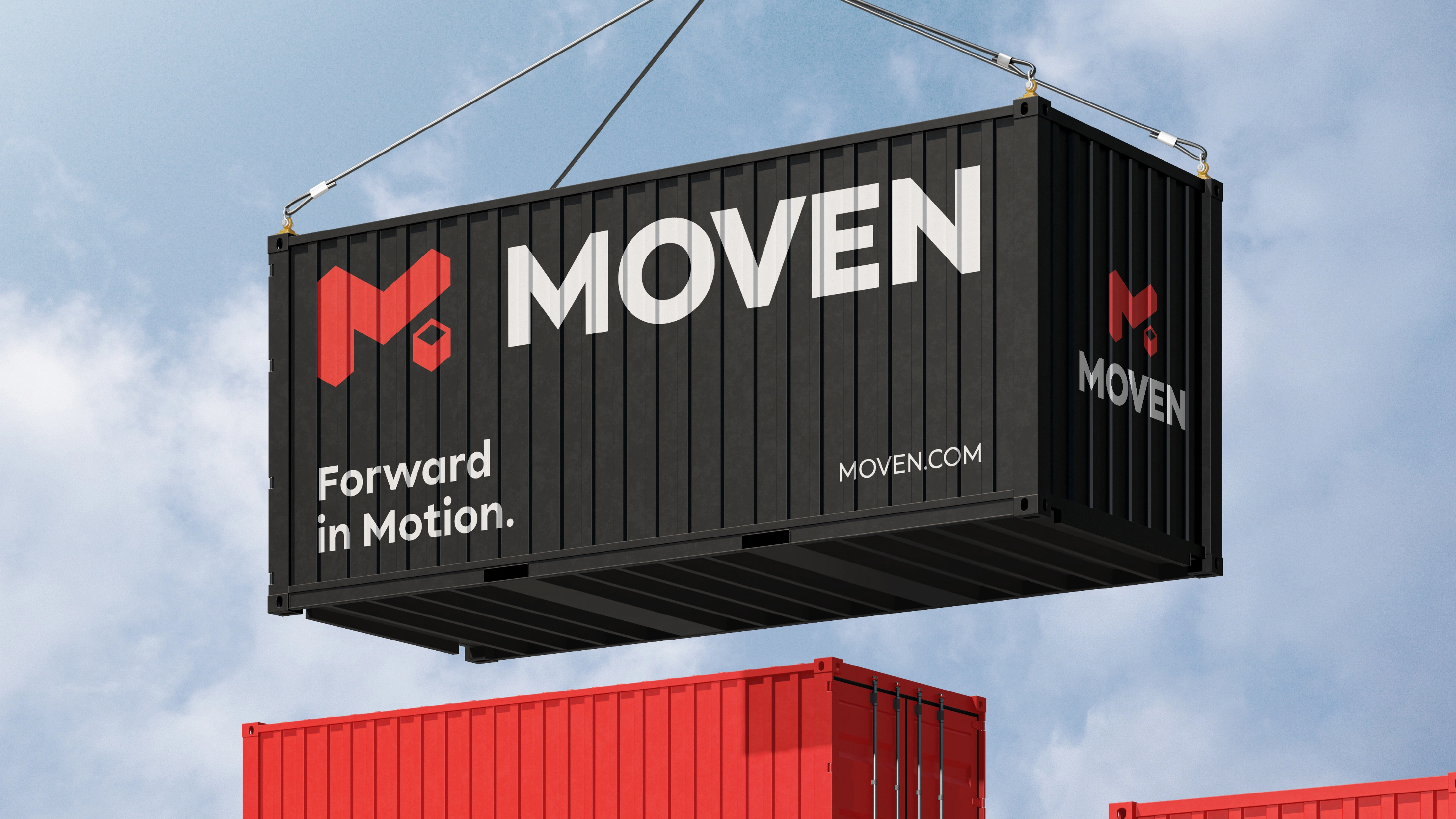
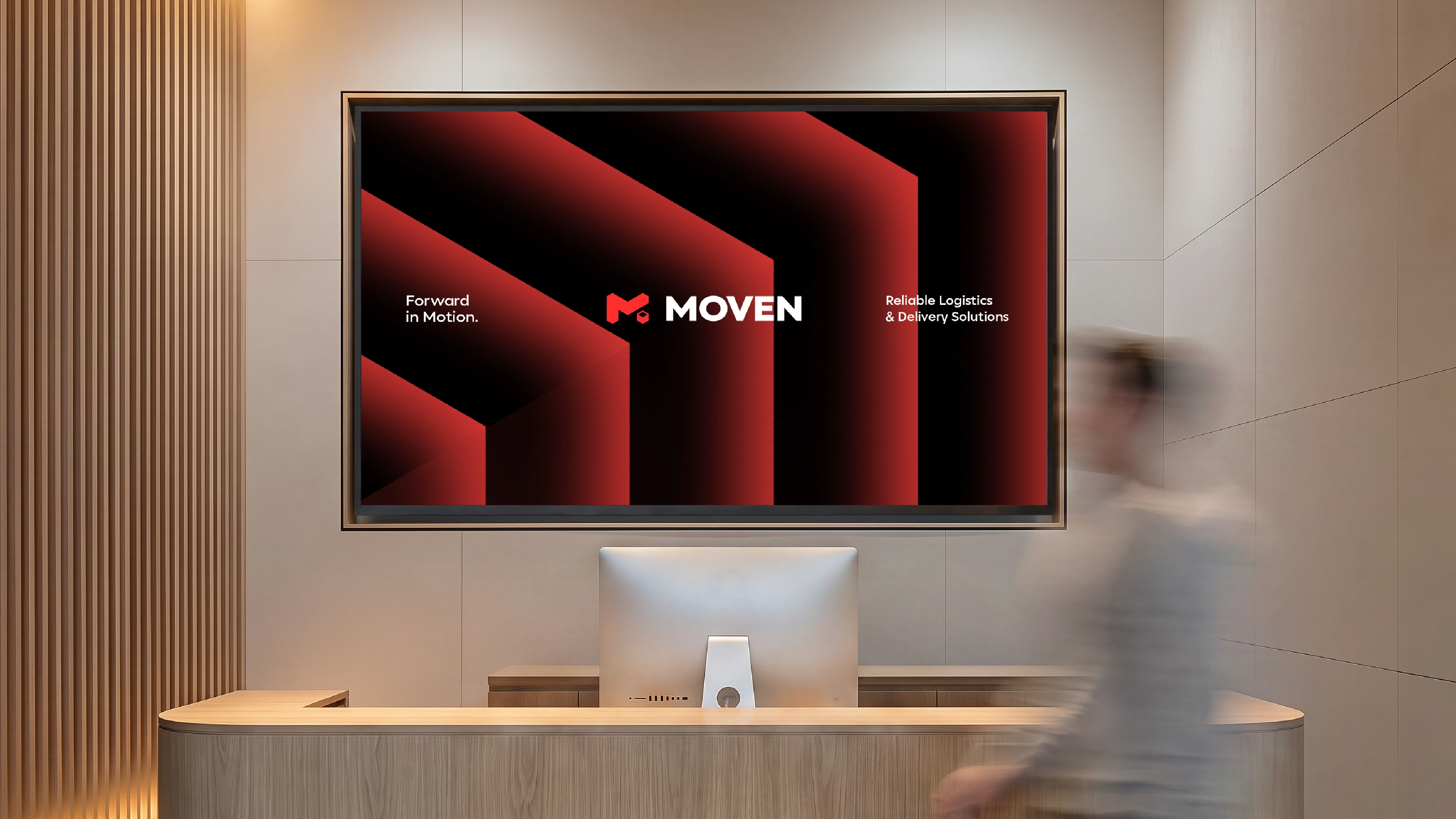
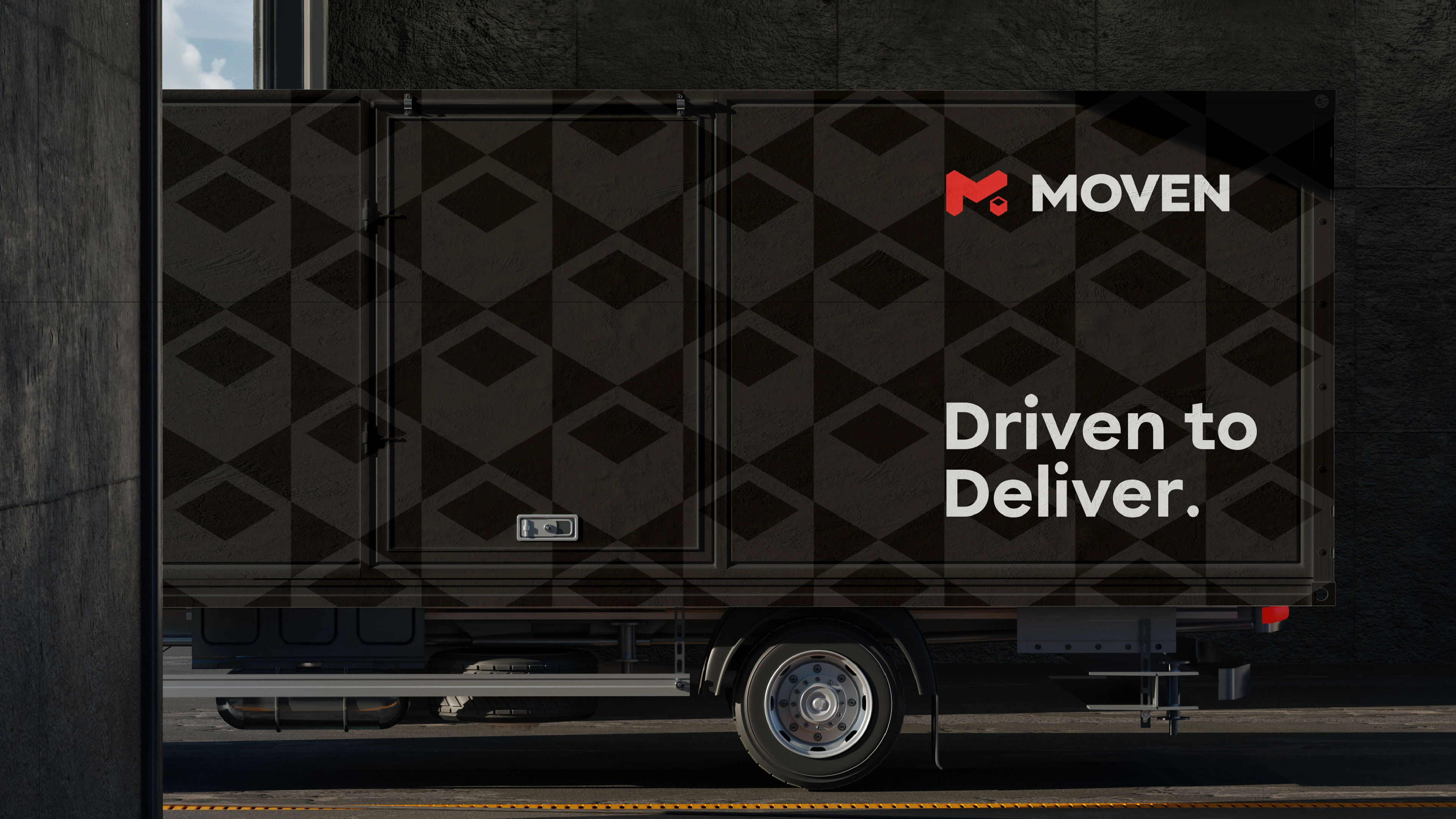
Moven is a modern logistics company dedicated to delivering reliable, efficient, and seamless transportation solutions for businesses of all sizes. Built around the idea of continuous movement, the brand reflects speed, precision, and trust, ensuring every shipment reaches its destination with confidence.
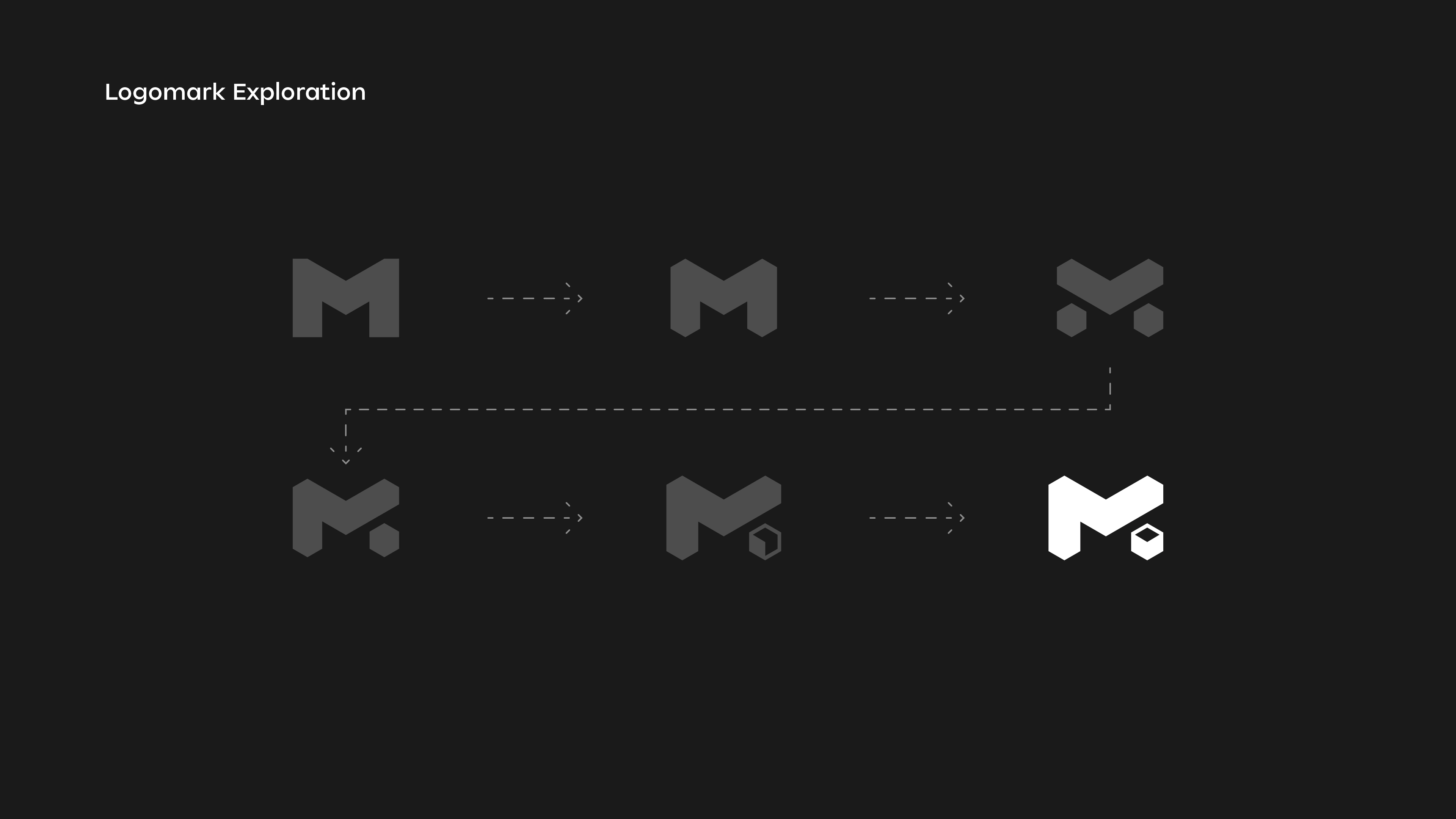
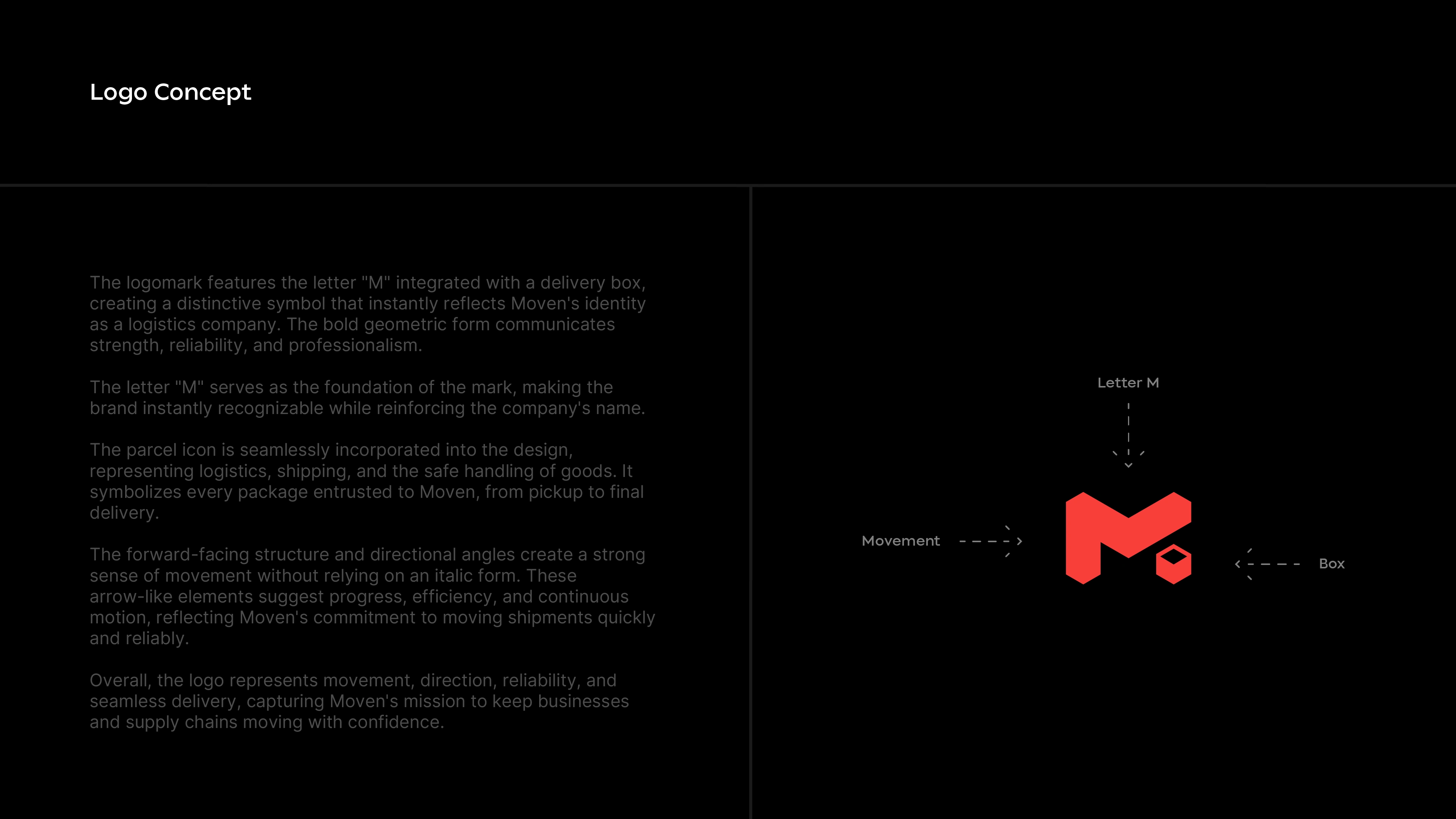
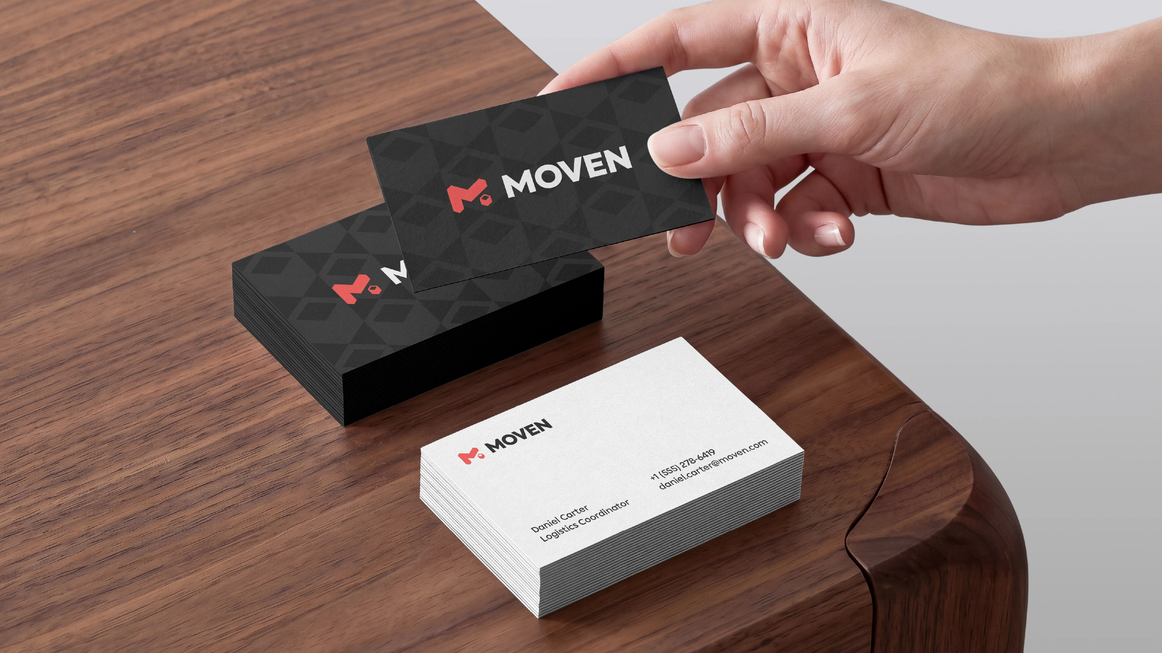
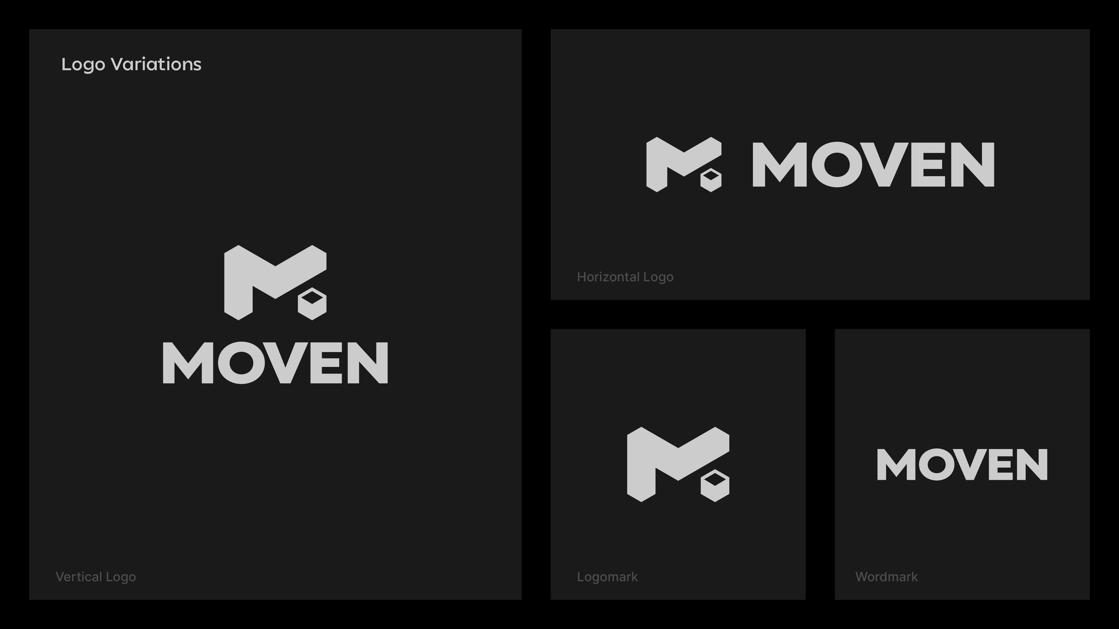
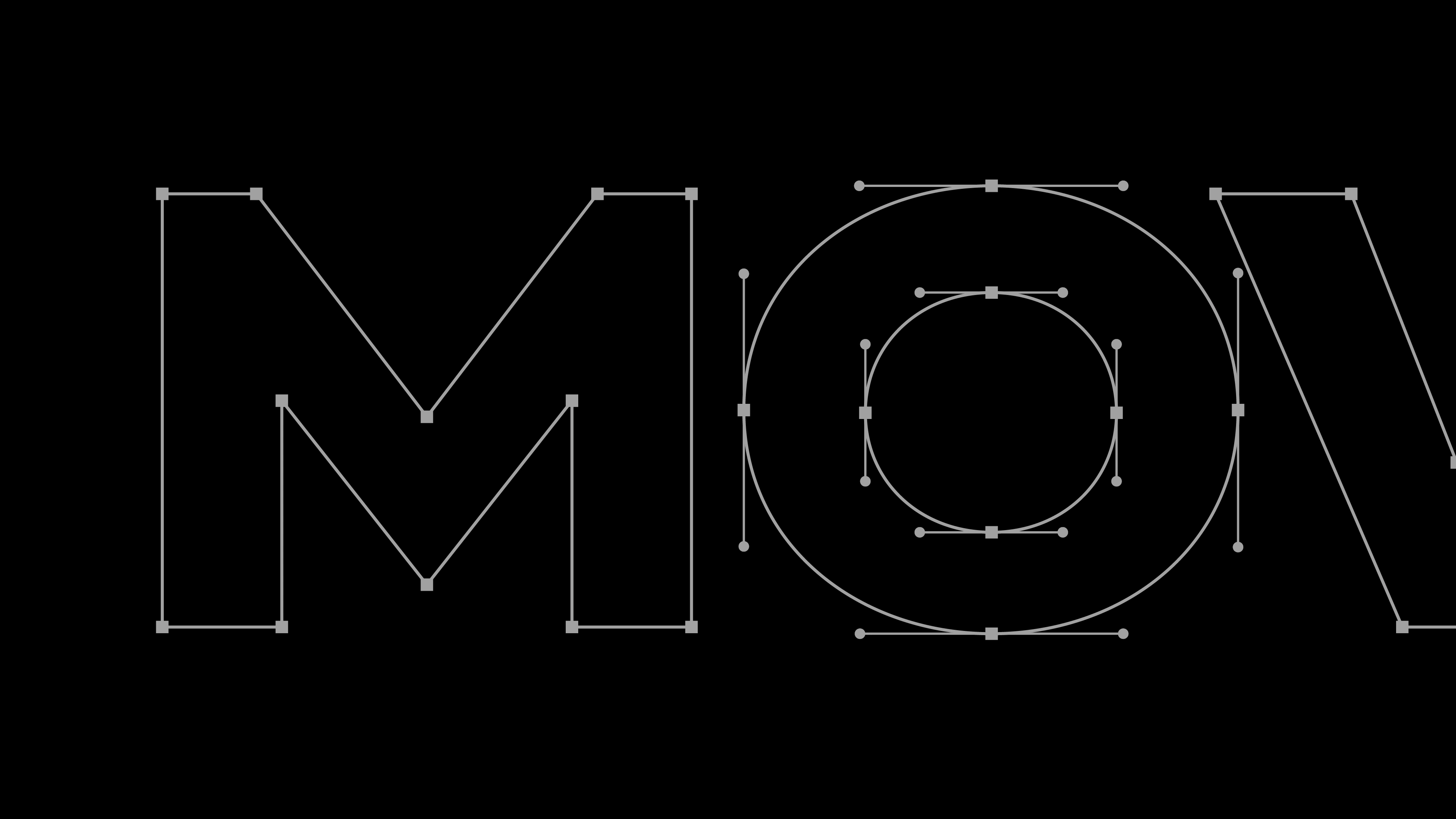
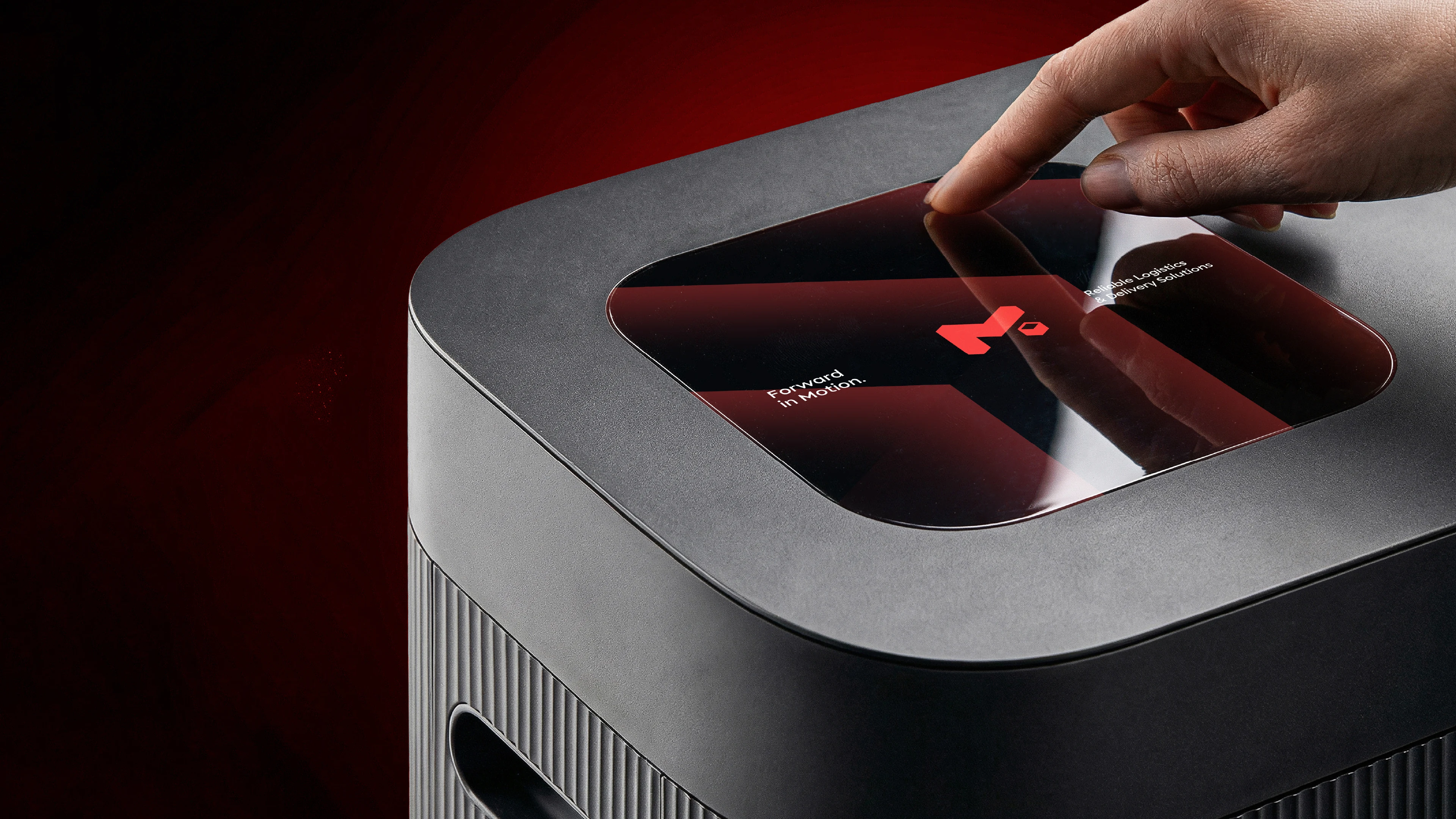
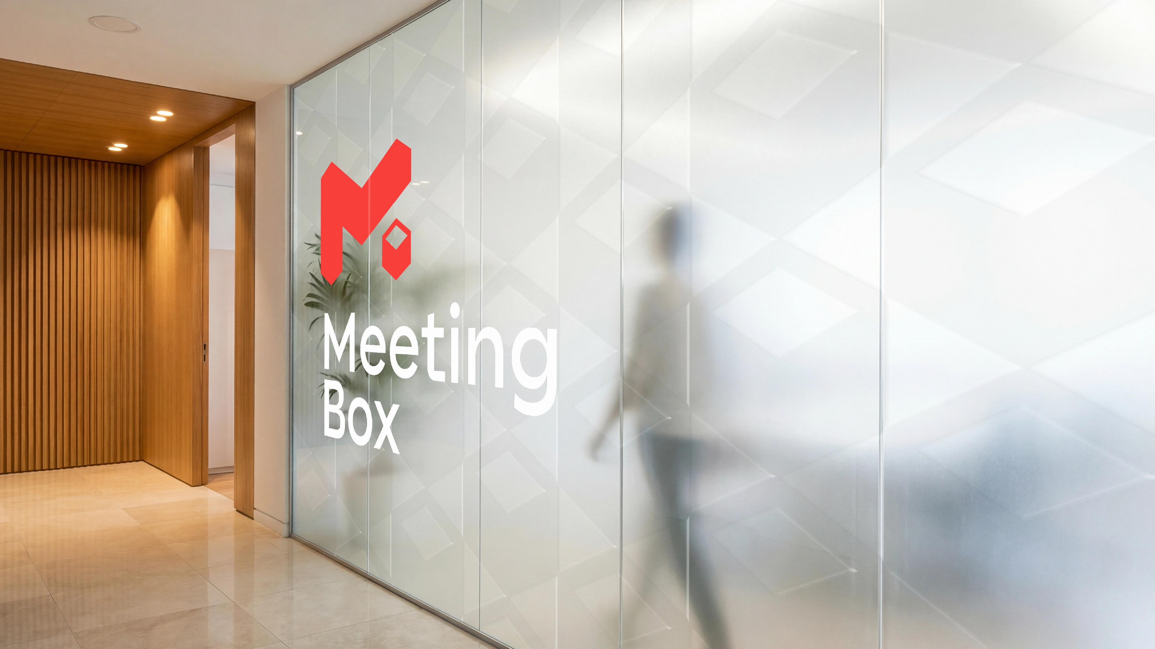
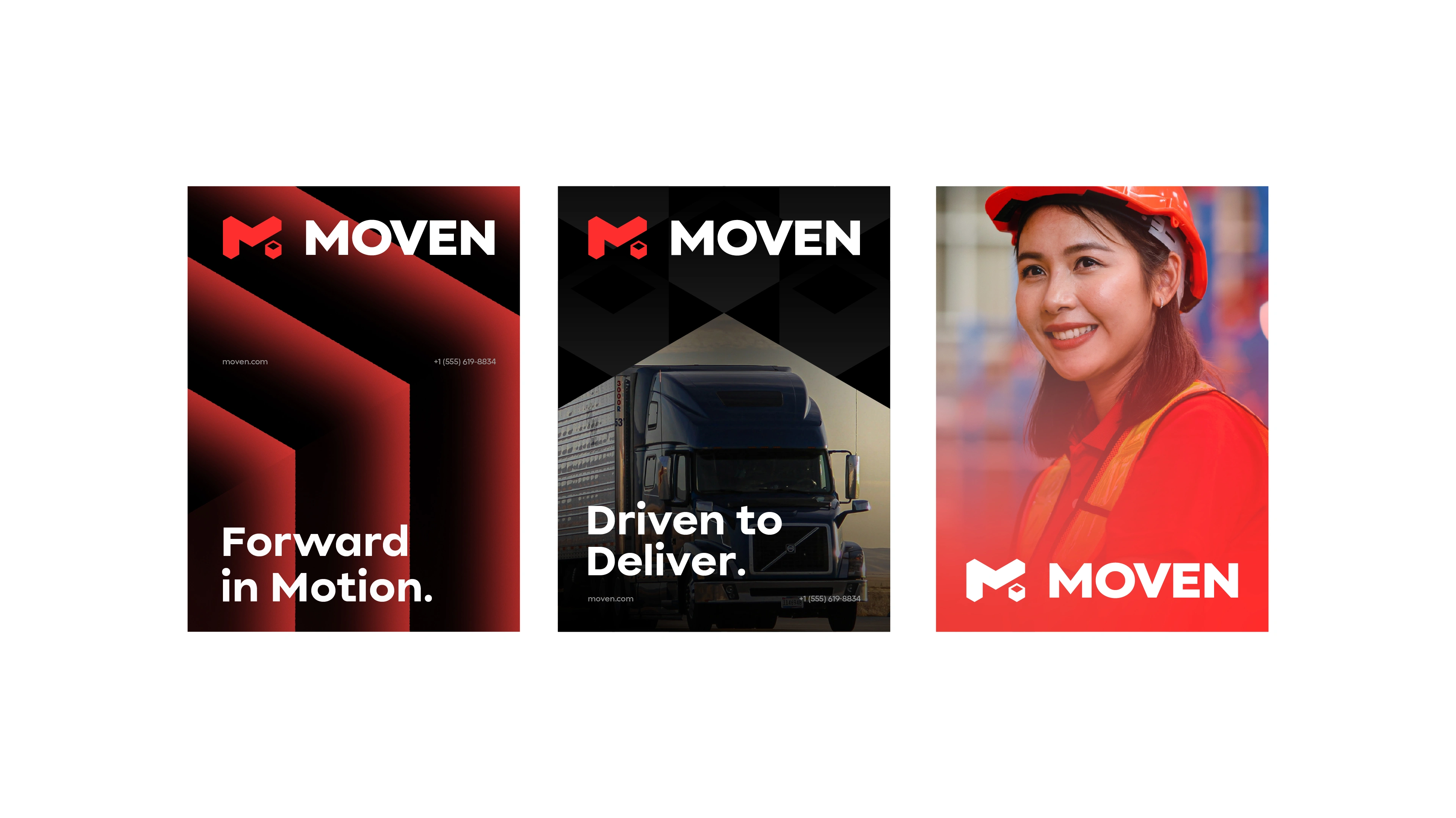
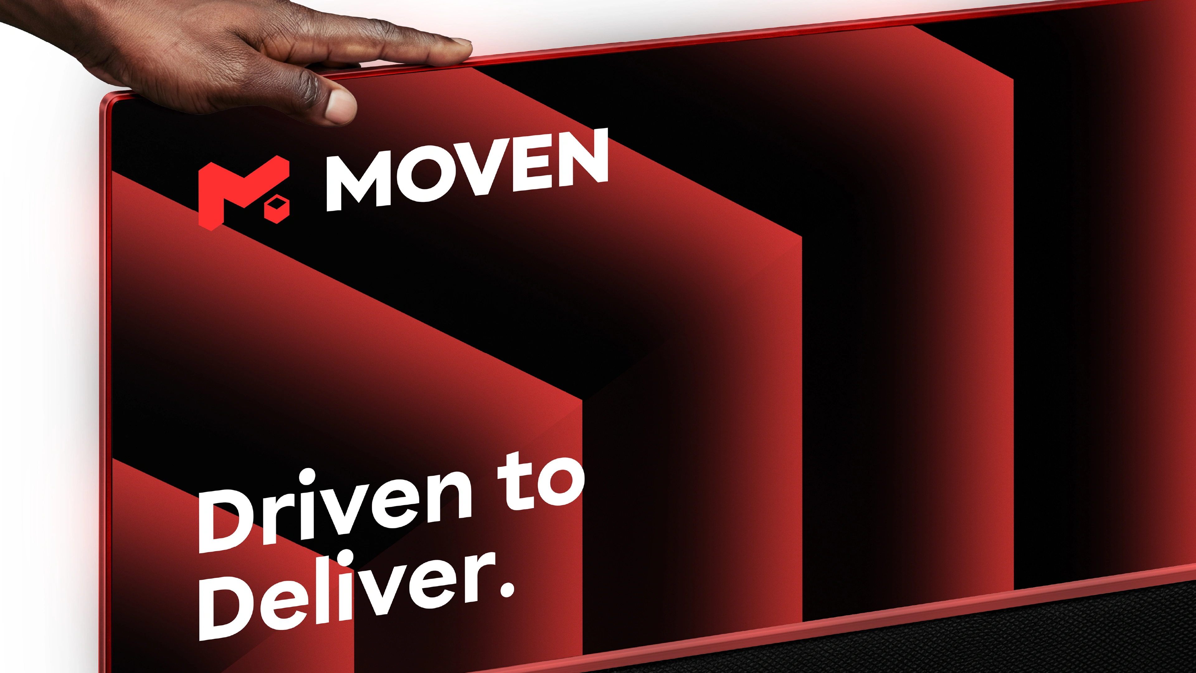
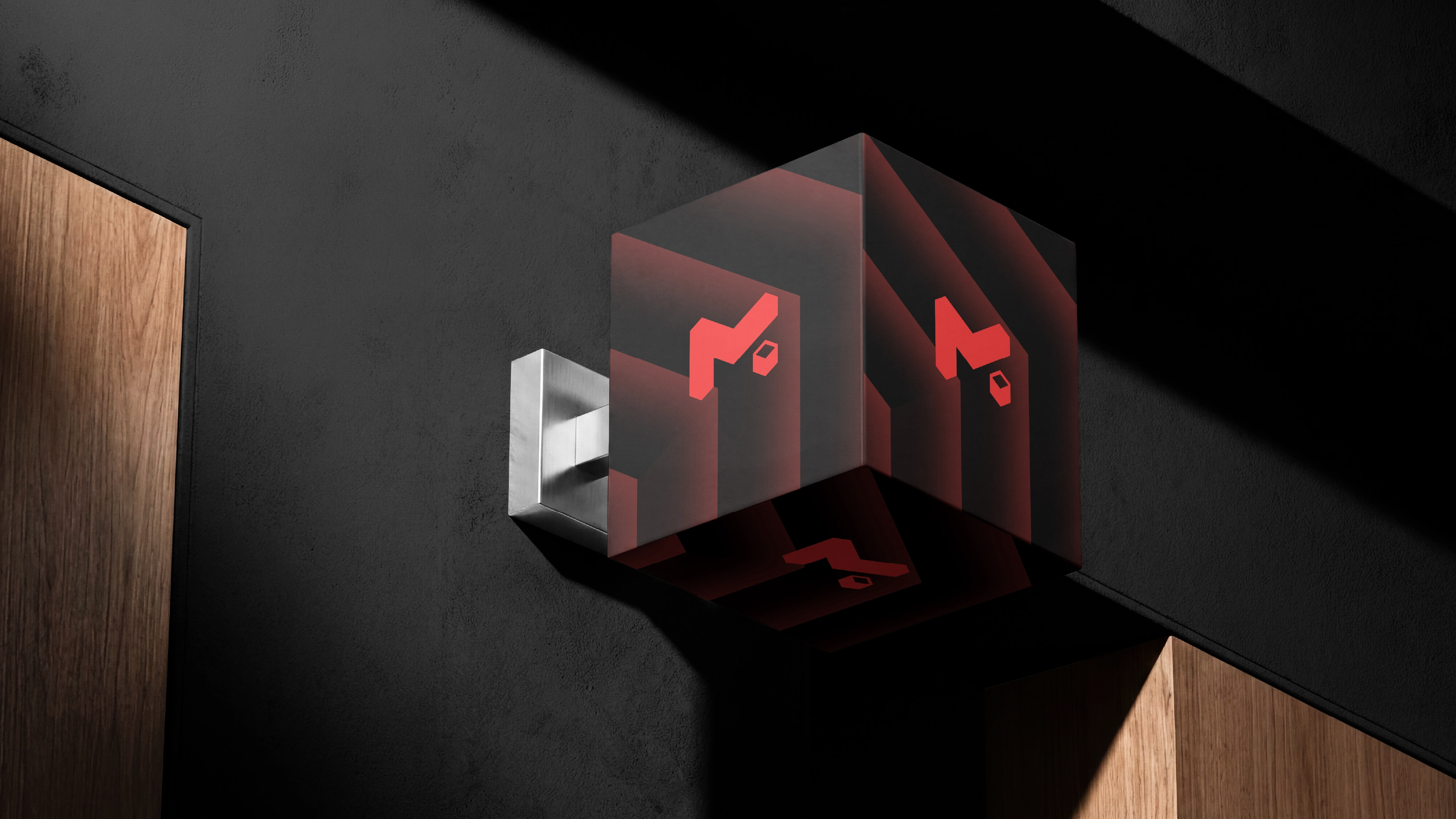
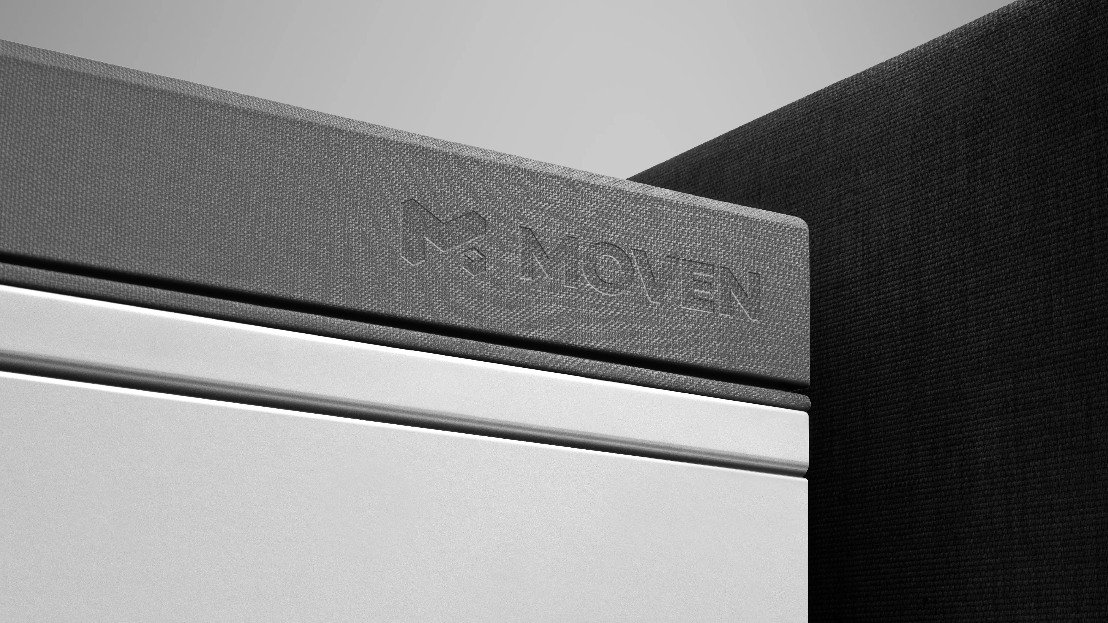
The visual identity is inspired by the journey of a parcel. The custom logomark combines the letter "M" with a delivery box, while integrated directional elements create a sense of forward movement and progress. Rather than relying on an italic form, the logo communicates motion through its geometry, resulting in a bold, memorable identity that represents efficiency, connectivity, and dependable logistics.
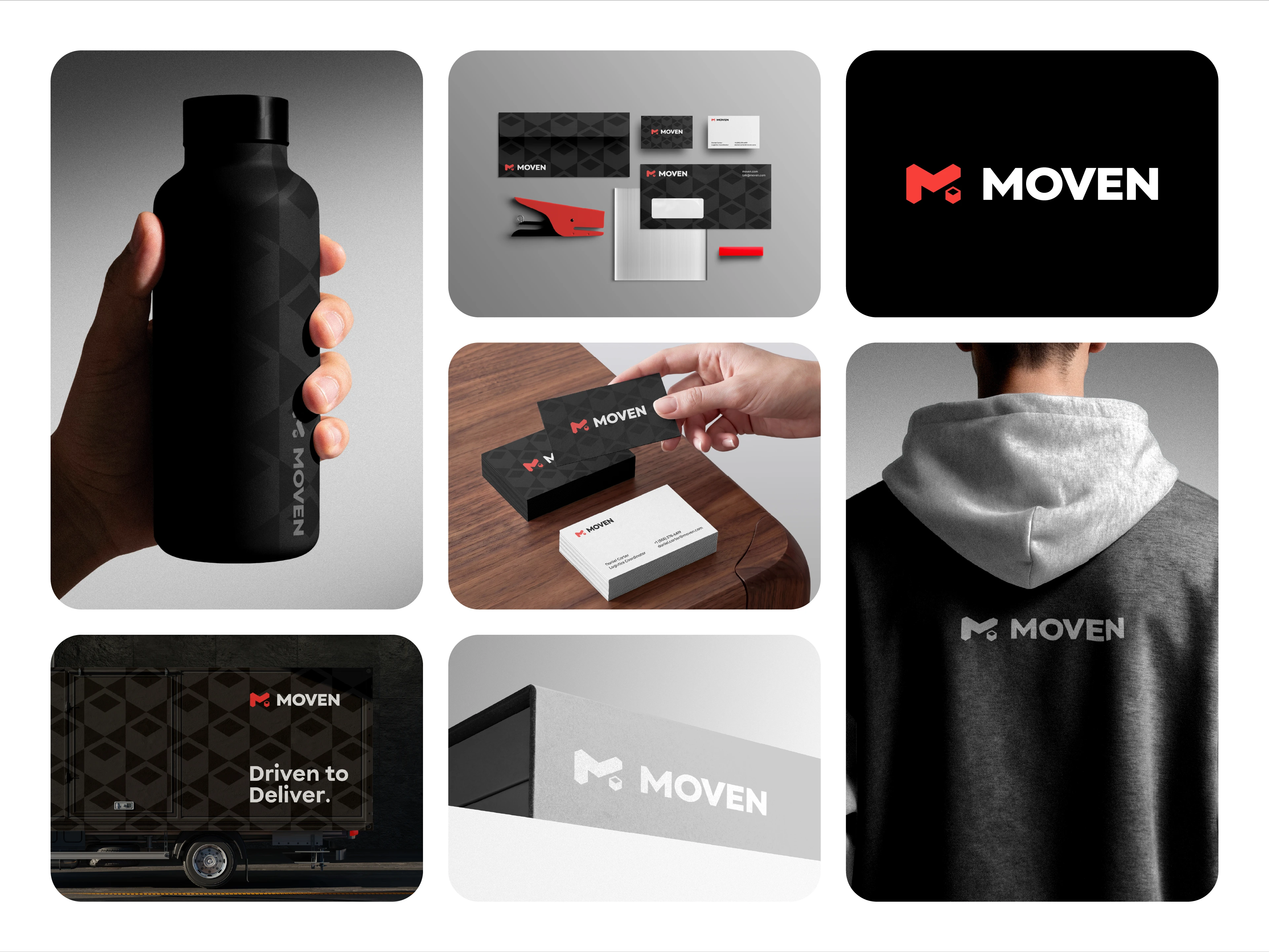
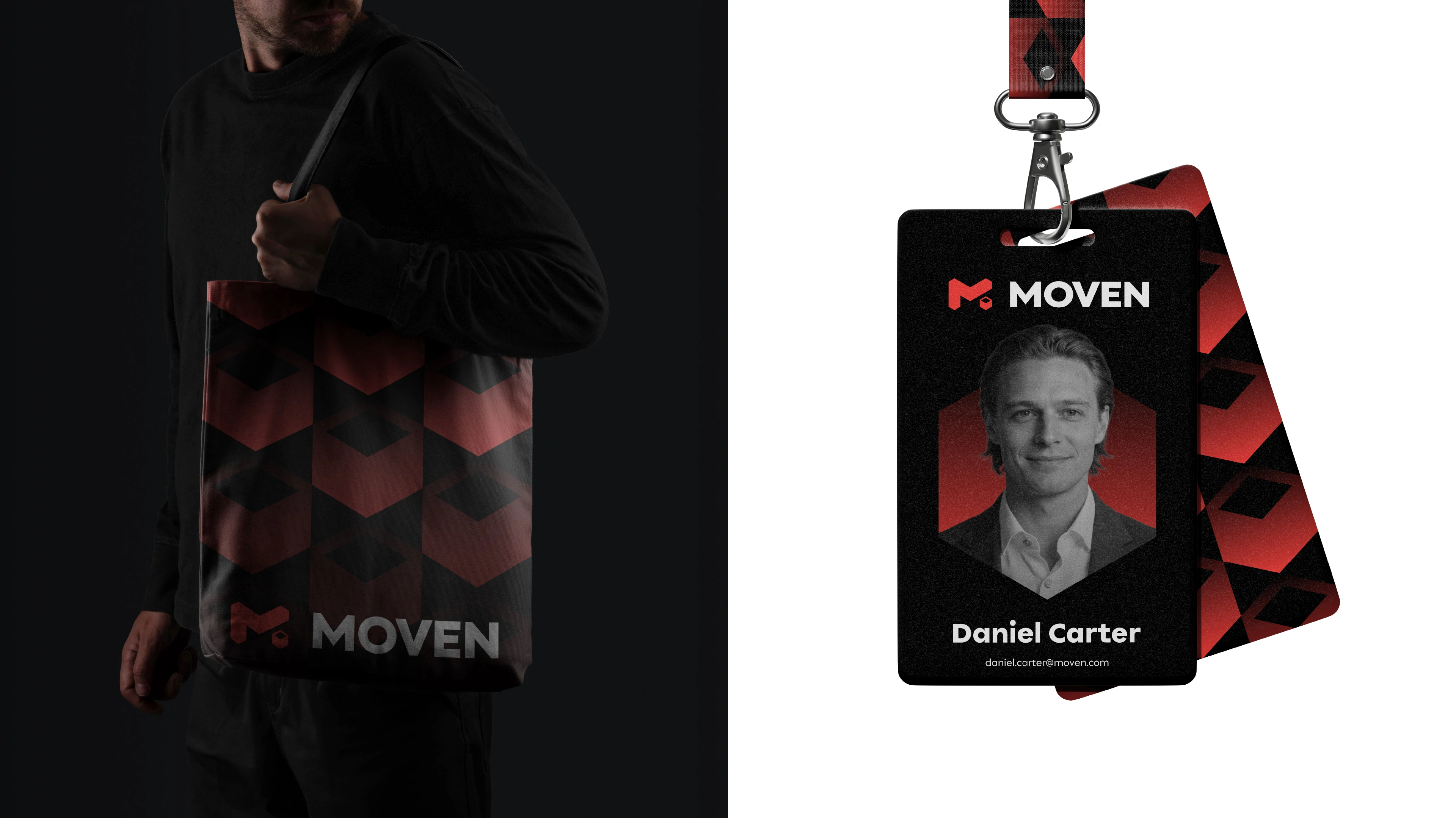
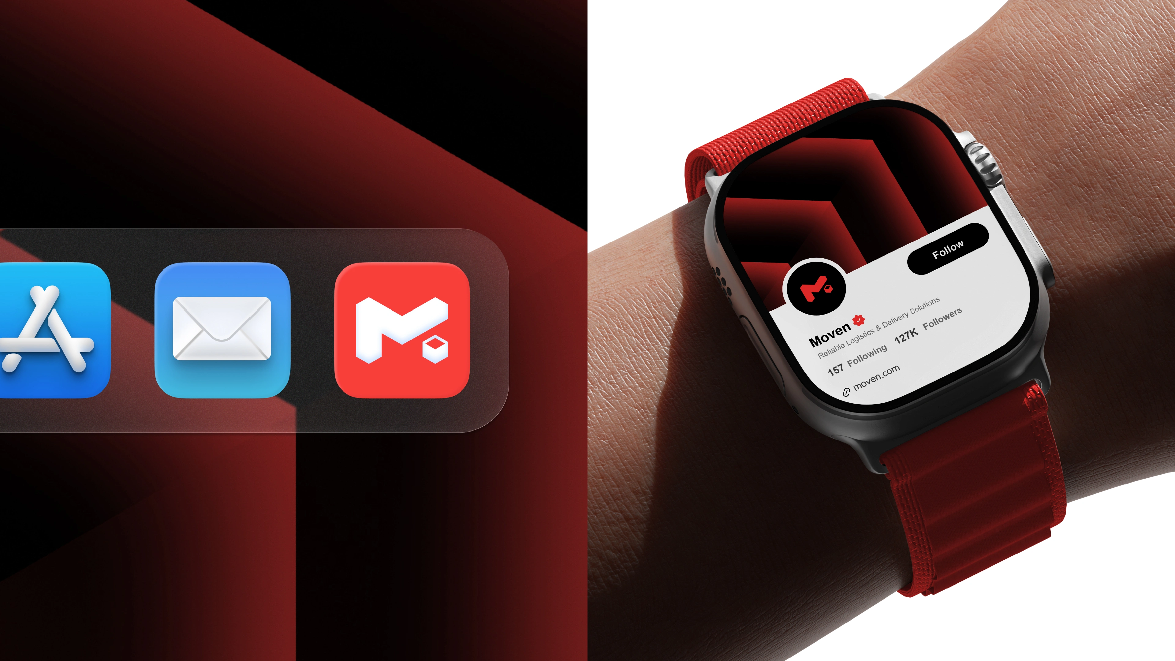
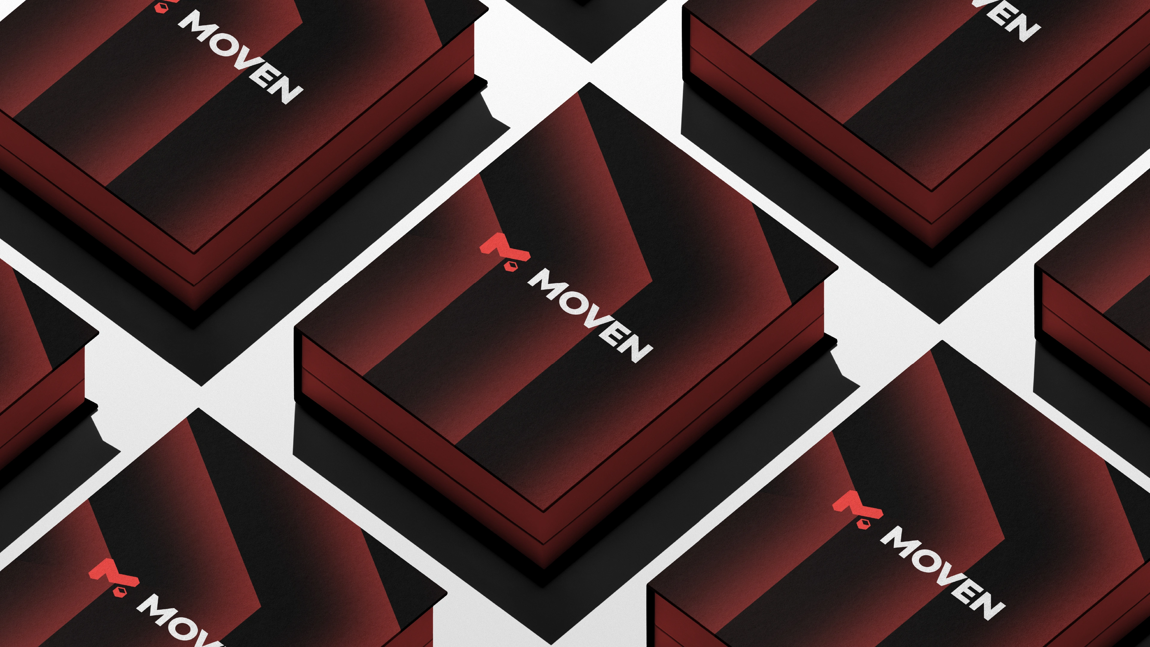
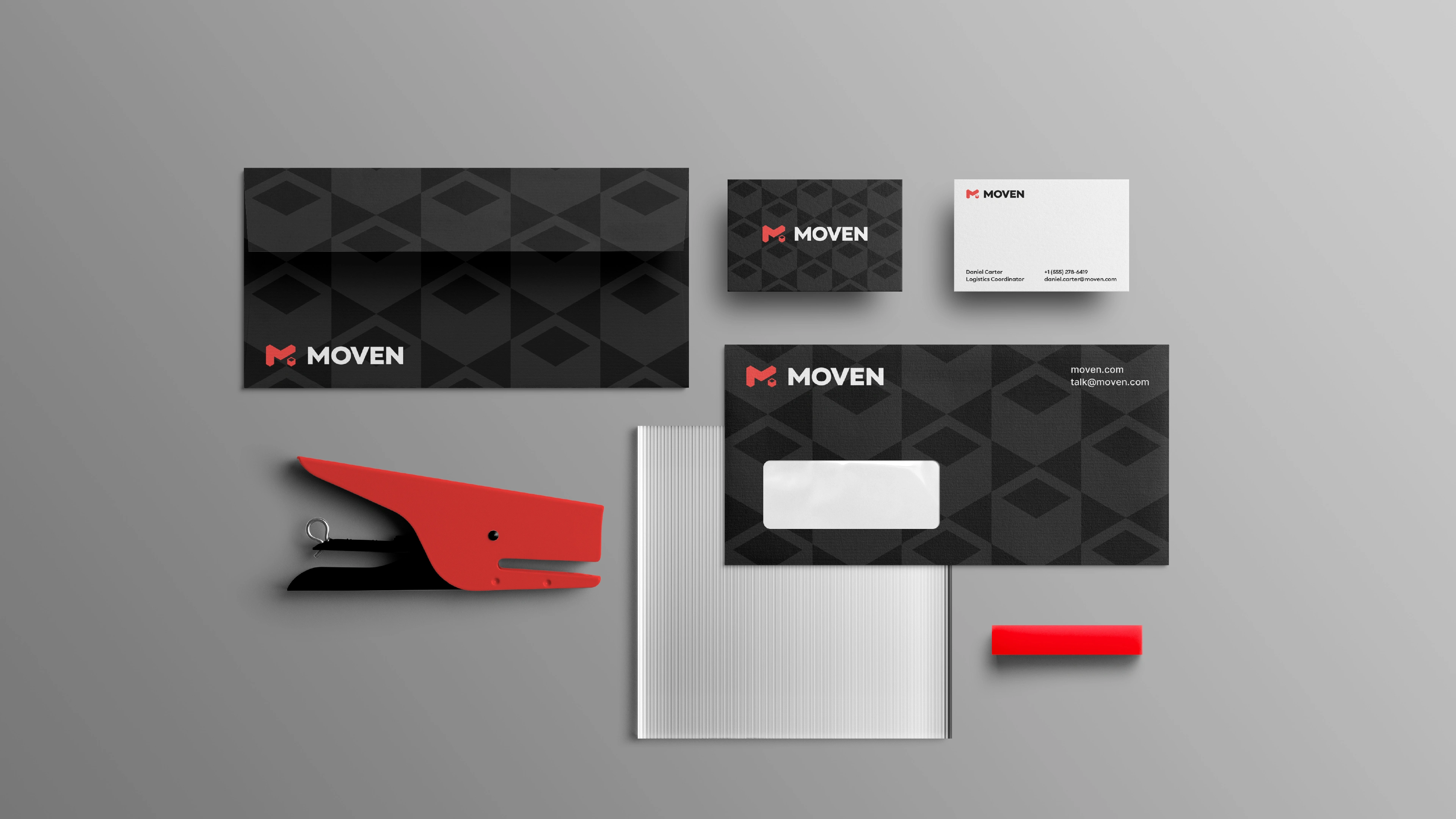
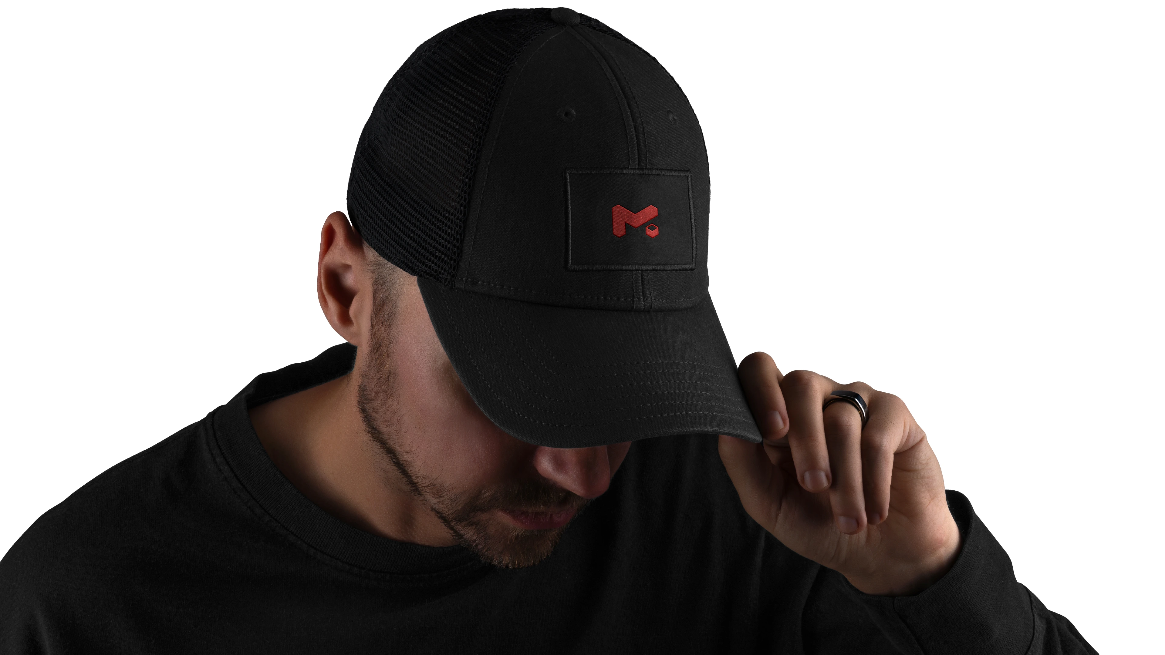
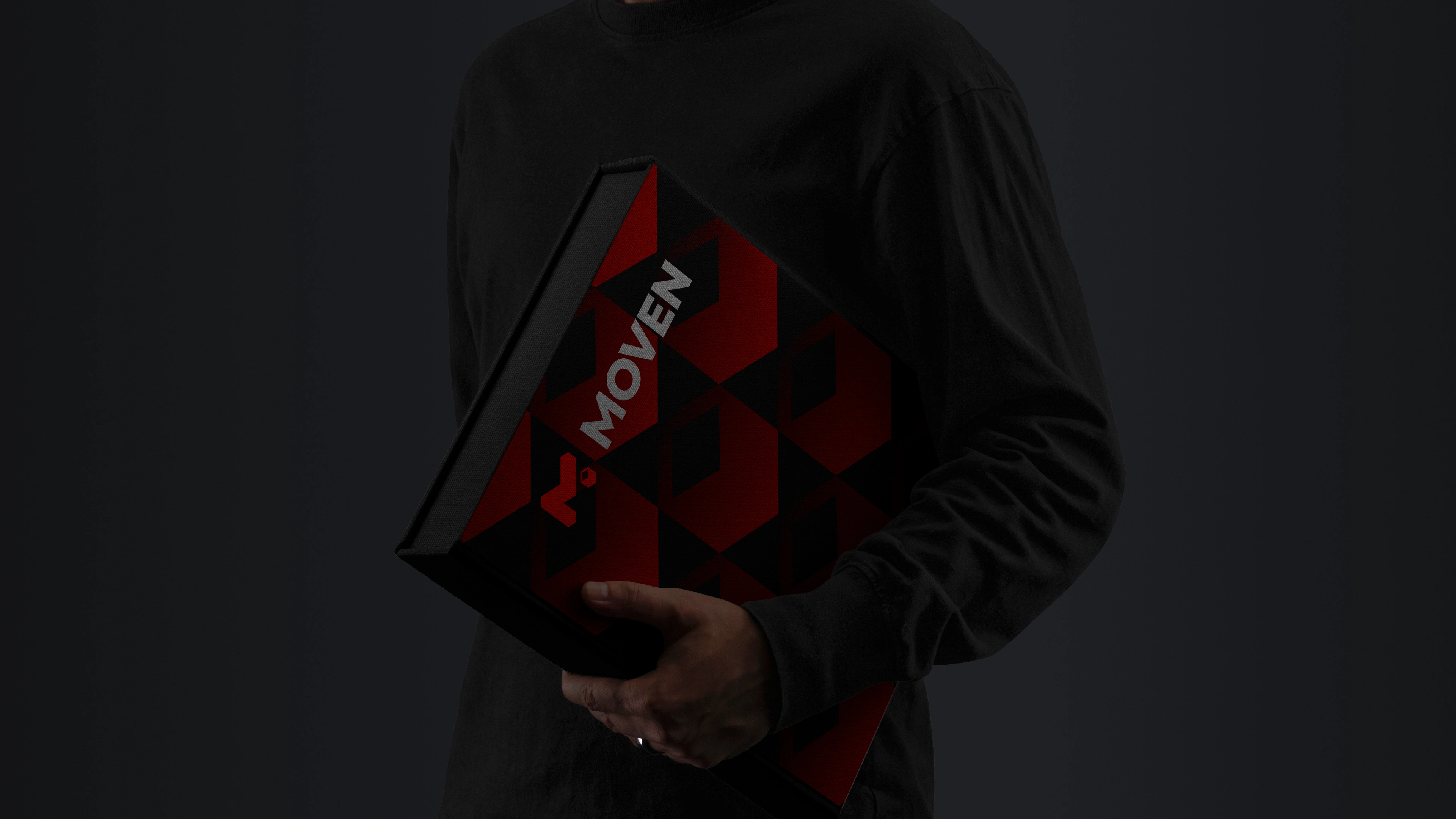
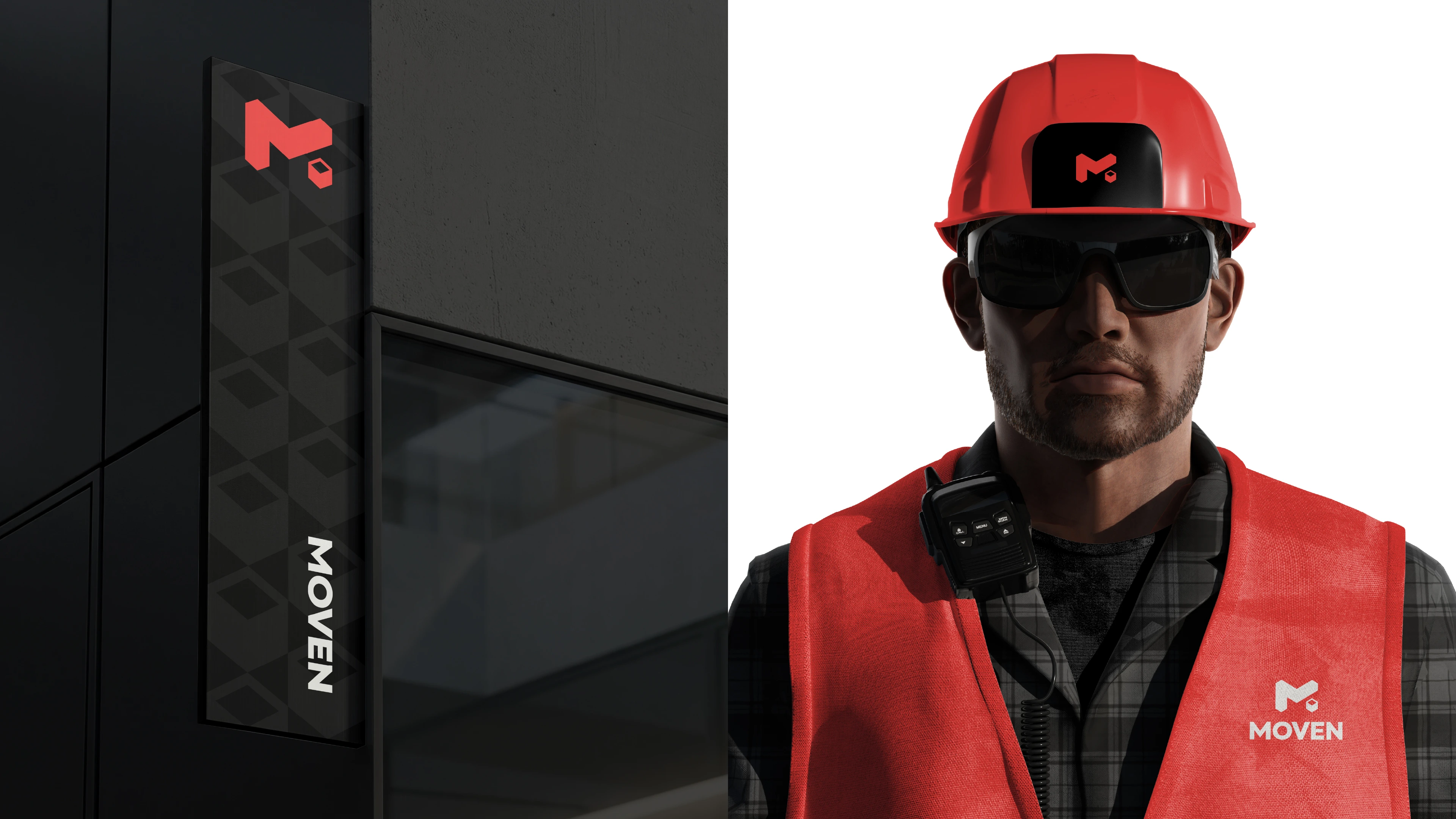
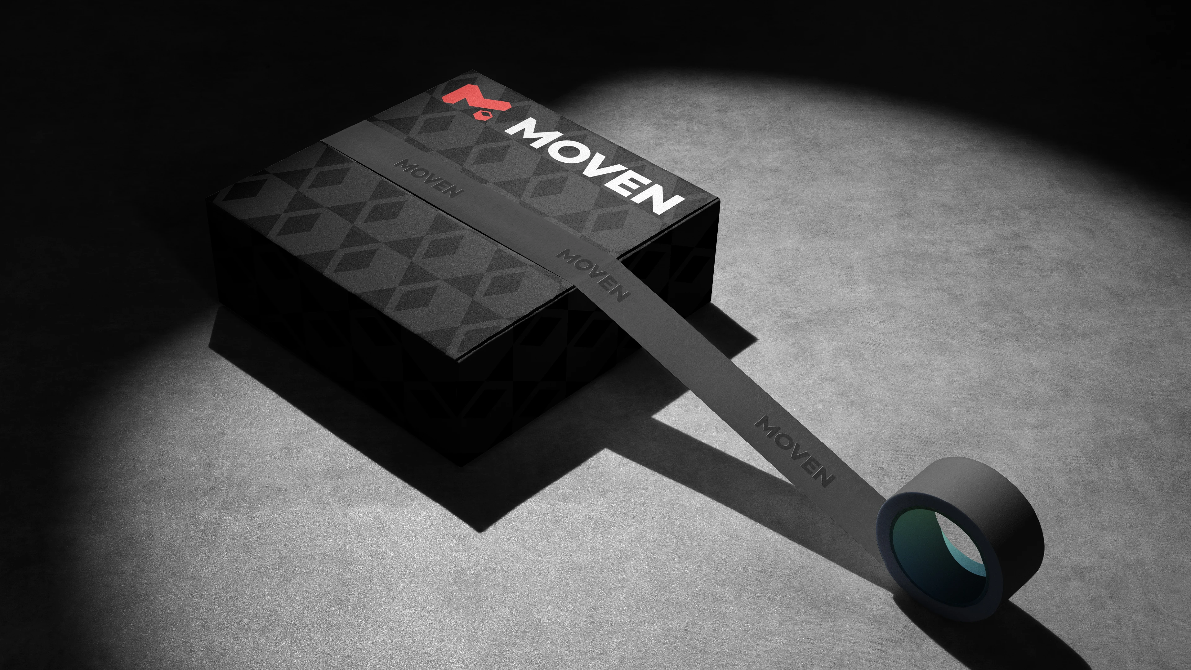
The brand system extends beyond the logo, creating a consistent visual language across digital and physical touchpoints. A vibrant red reinforces energy and movement, while clean typography and functional graphics ensure clarity, professionalism, and recognition in every application.
Deliverables
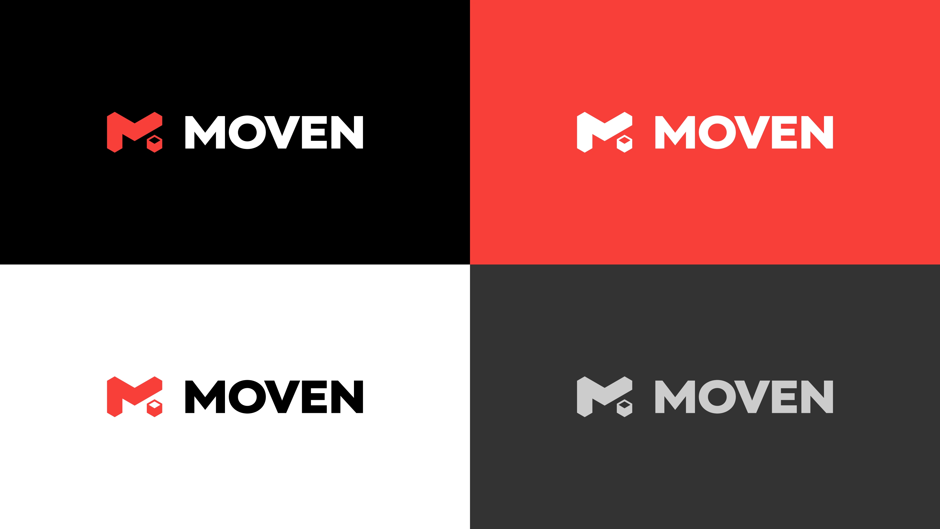
Logo Design
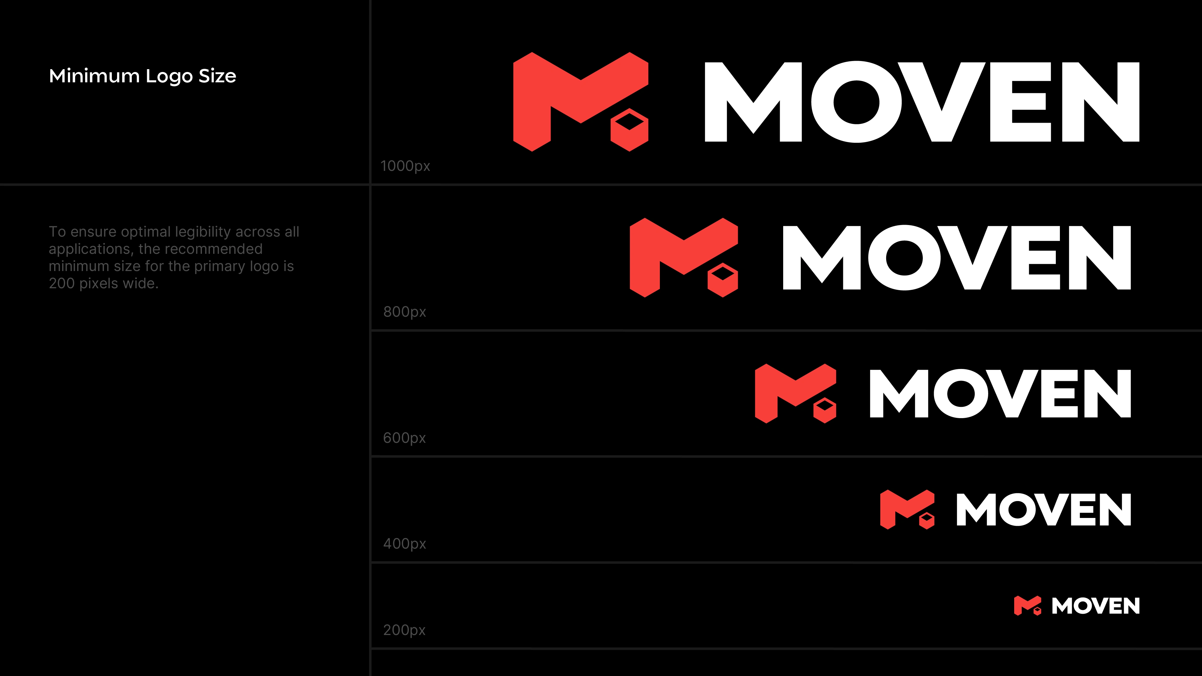
Logo Variations
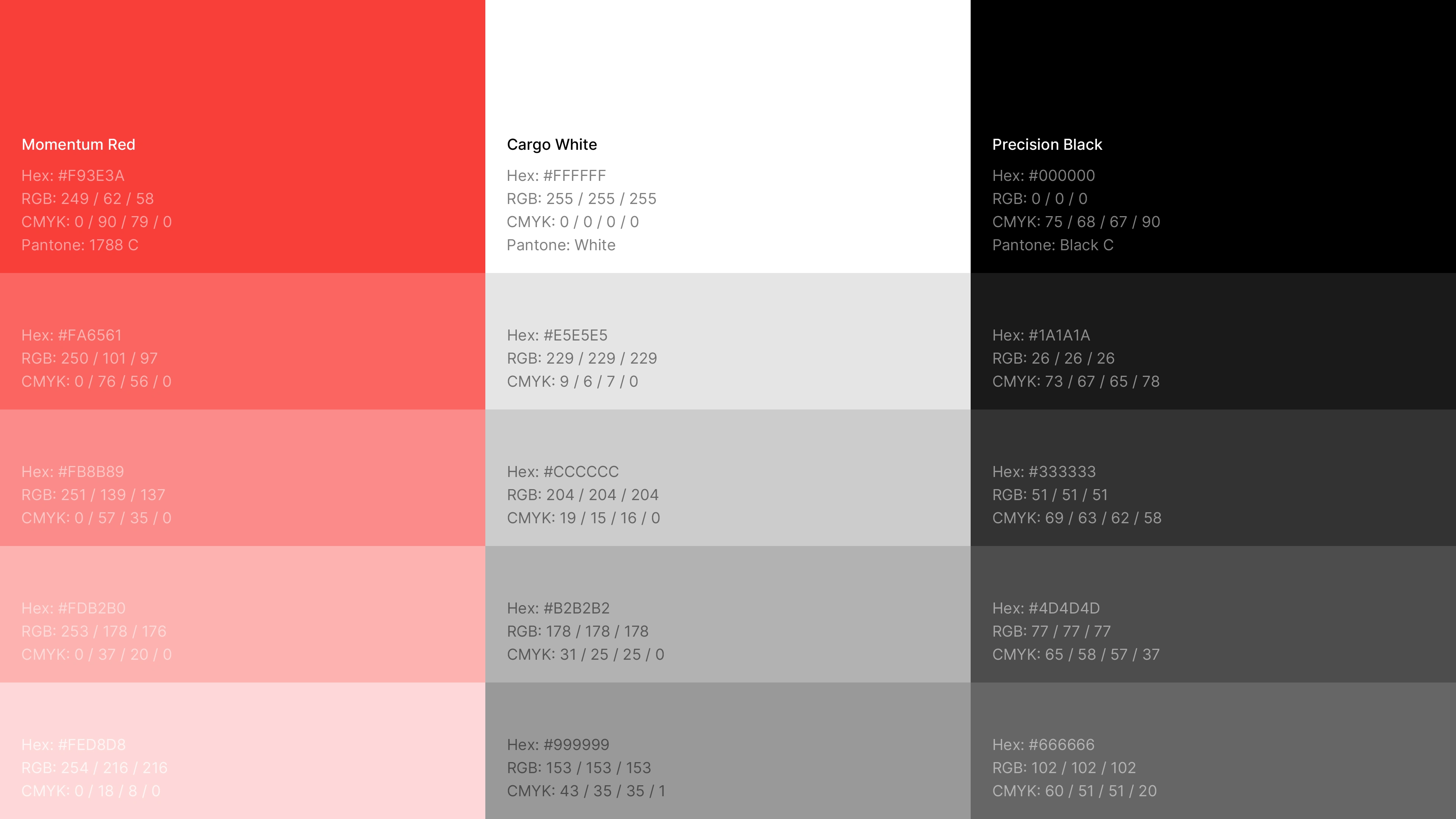
Brand Color System
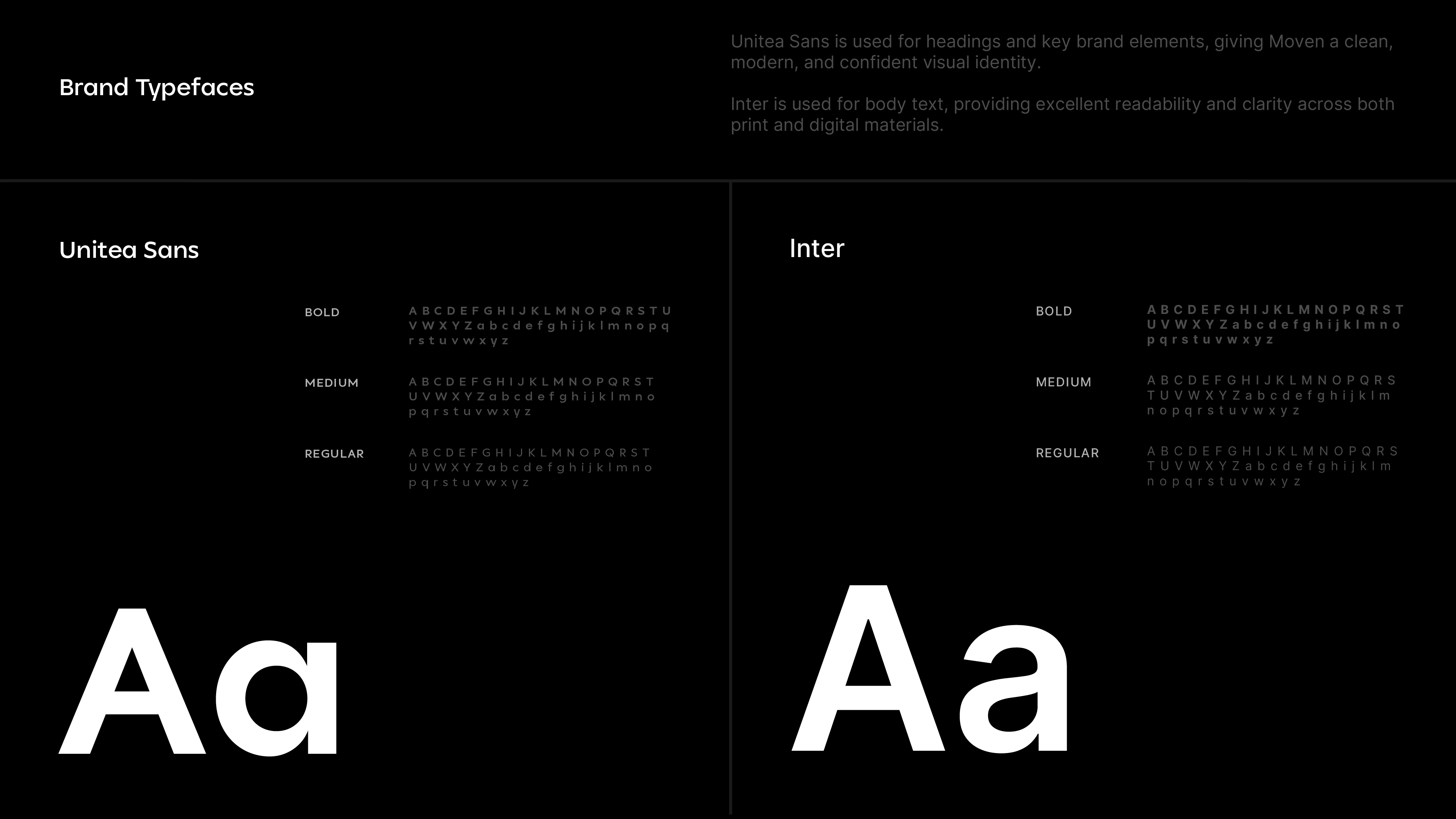
Typography Guidelines
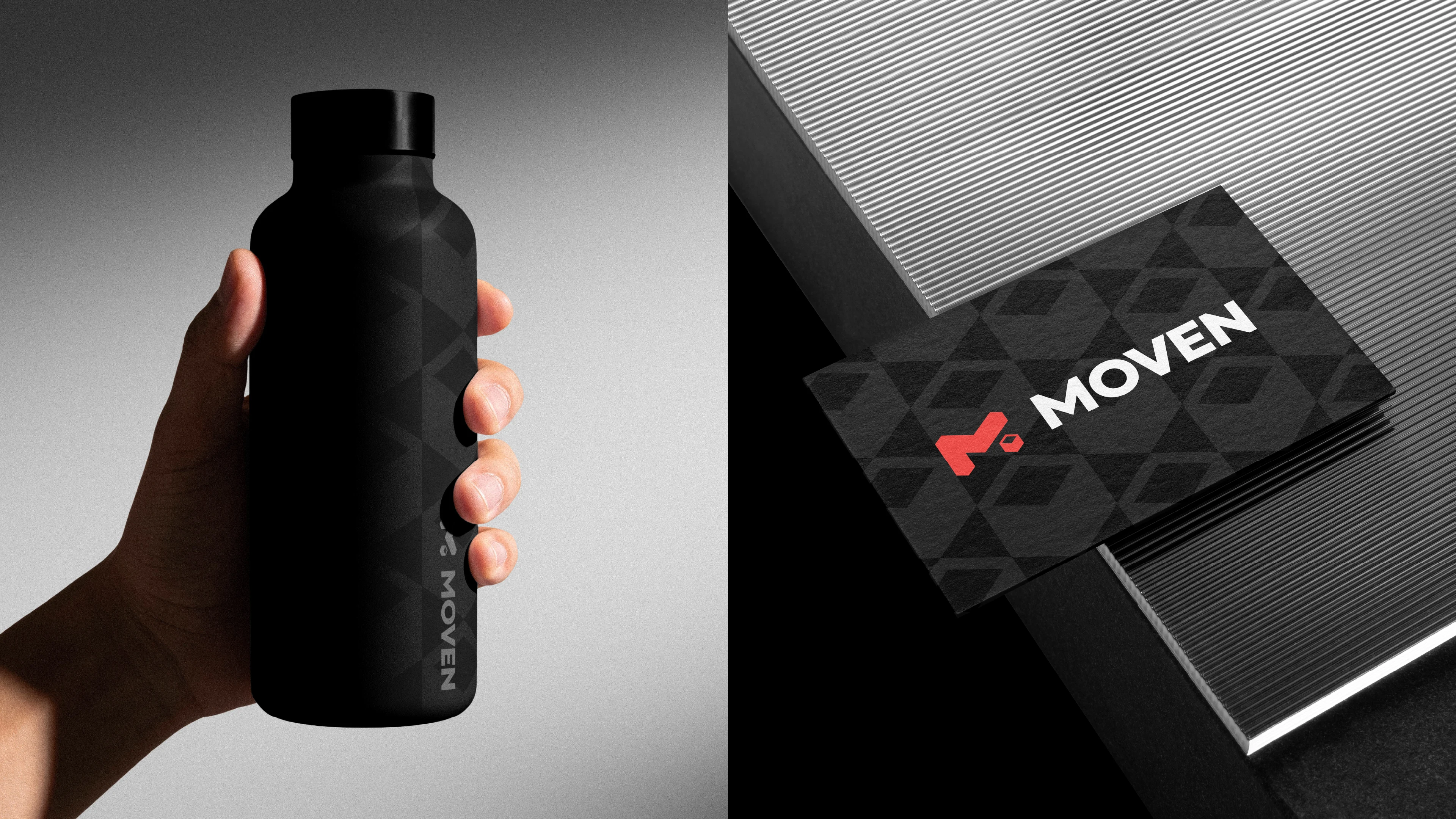
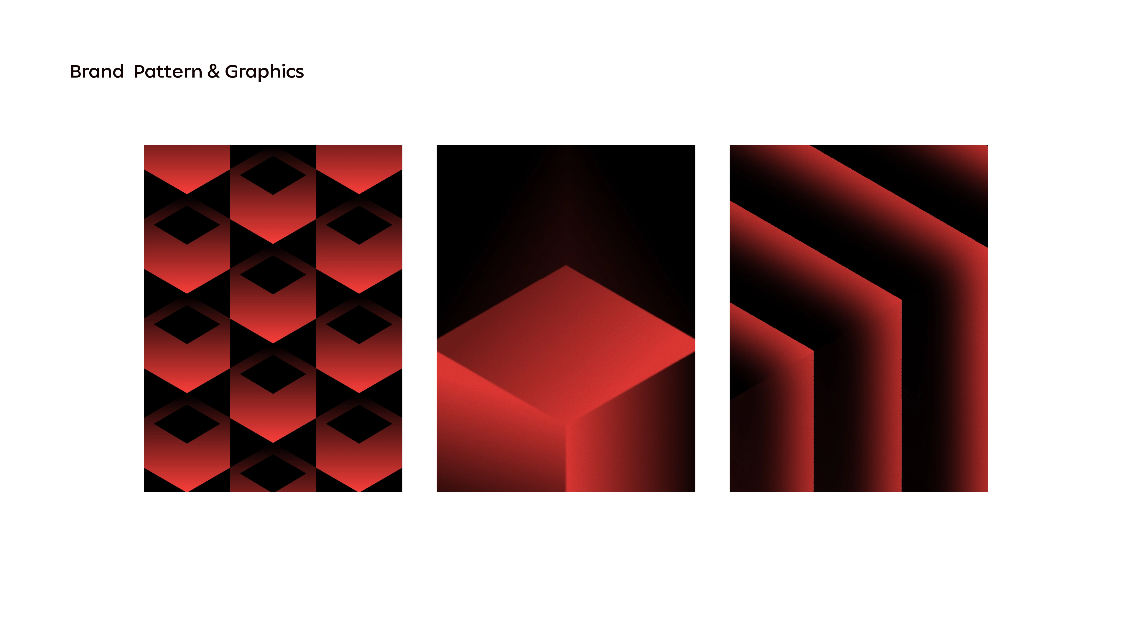
Brand Pattern
Social Media Templates
Business Card
Letterhead
Envelope
Employee ID Card
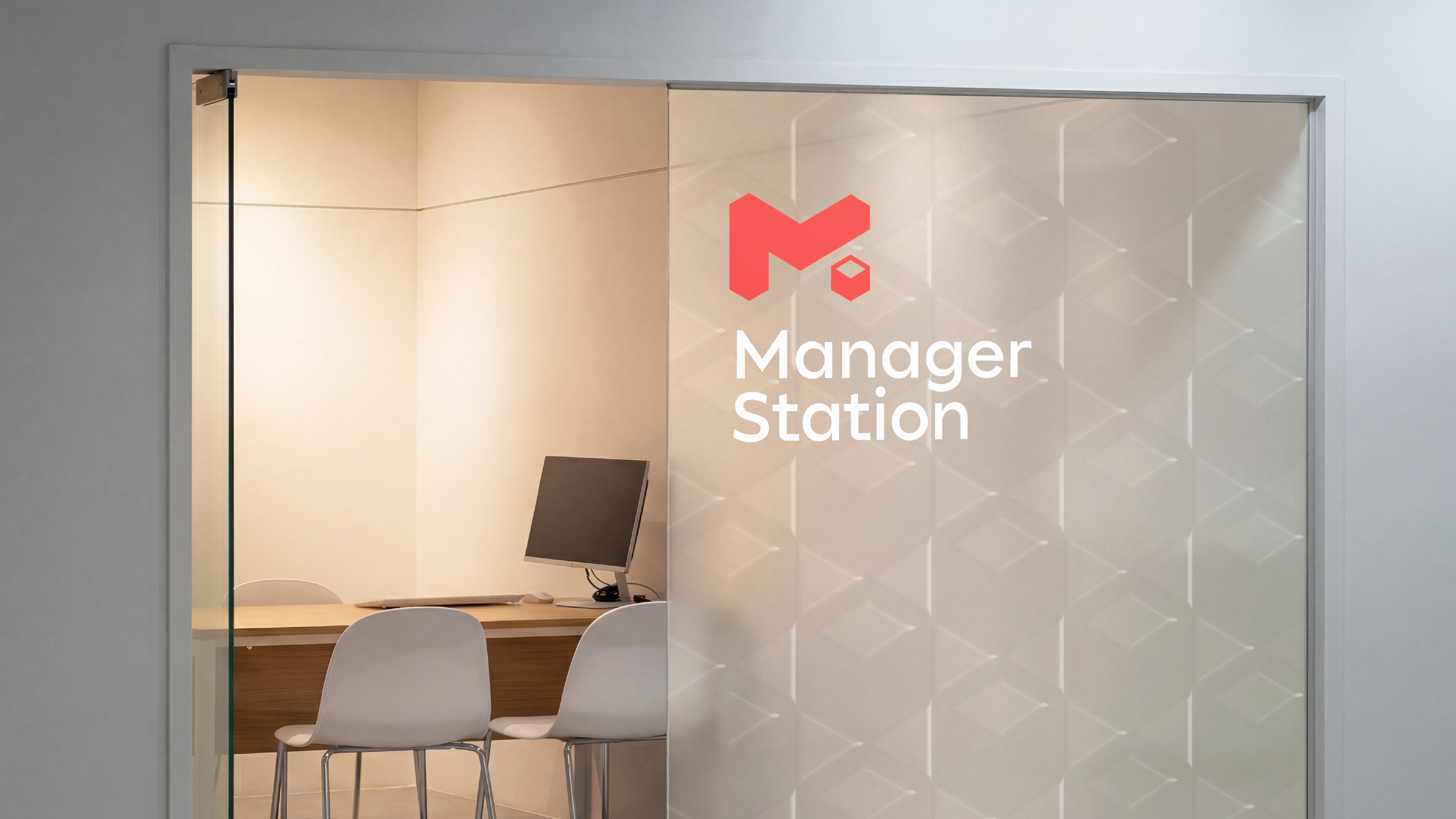
Office Signage System
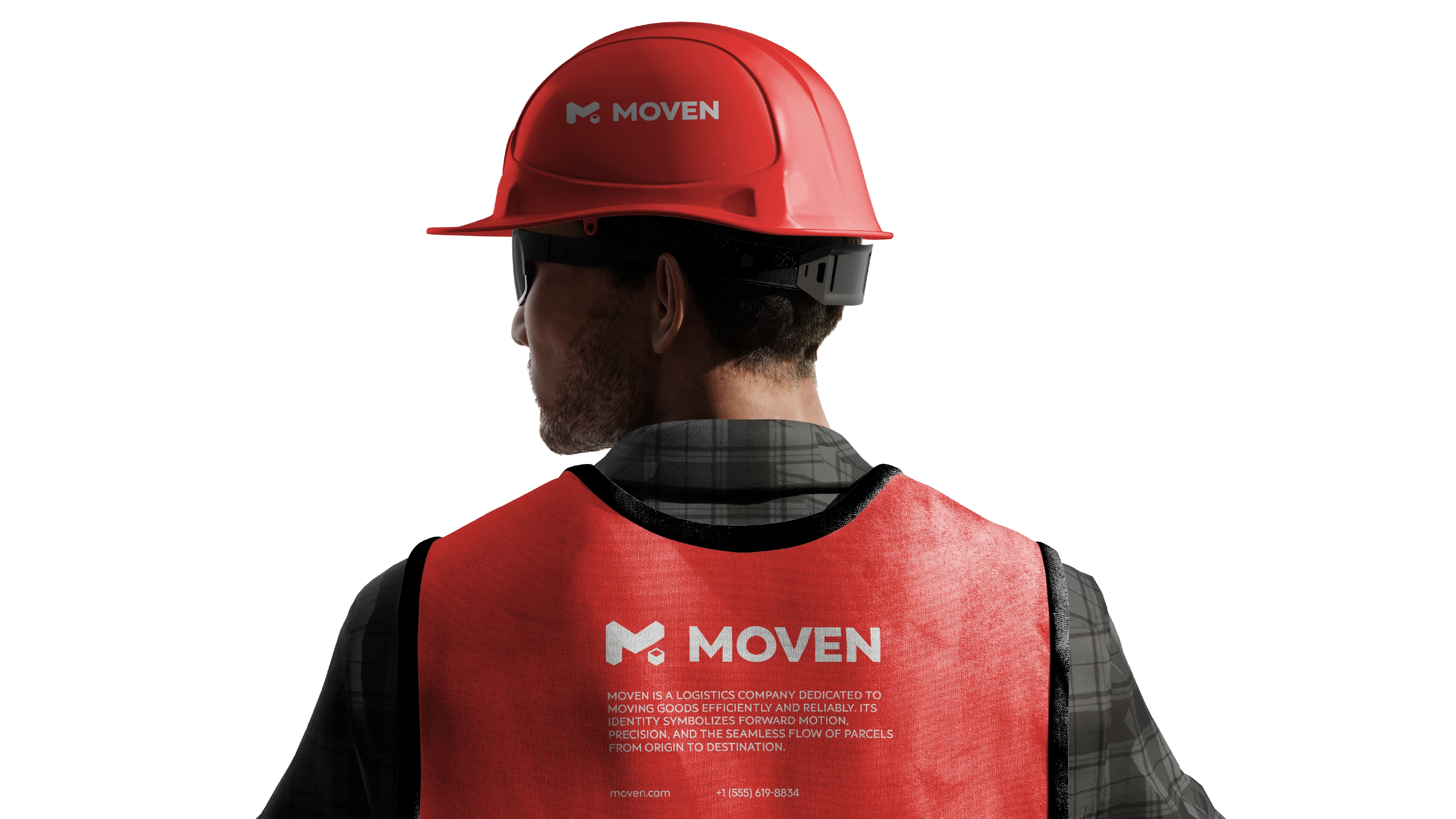
Safety Vest Mockups
Brand Guidelines Document

Have a project in mind? Let's discuss it.
Just drop me a message.
Like this project
Posted Jun 30, 2026
Created Moven's logo and brand identity, accompanied by a detailed case study covering the logo design, brand guidelines, and a complete visual identity system.
Likes
0
Views
0
Timeline
Jun 2, 2026 - Jun 25, 2026
Clients
Moven