The network for creativity
Join 1.25M professional creatives like you
Connect with clients, get discovered, and run your business 100% commission-free
Creatives on Contra have earned over $150M and we are just getting started
Back to feedPost
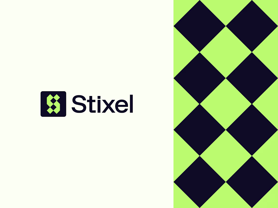
Designed this logo last year, and it’s been nice seeing it get a strong response on Behance recently.😊
Stixel is built around the letter S, formed using pixel-inspired geometry to create a sharp, modern logomark. The idea was to keep it minimal but structured, with a strong digital feel that stays clear and recognizable at any size.
Looking back, it’s interesting how some concepts age better than expected.
What do you notice first, the symbol or the color choice?
Brand DesignGraphic DesignLogo DesignAdobe PhotoshopAdobe Illustratorbrandinglogobrandidentitydesign
The network for creativity
Join 1.25M professional creatives like you
Connect with clients, get discovered, and run your business 100% commission-free
Creatives on Contra have earned over $150M and we are just getting started
Related posts
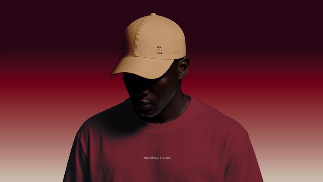
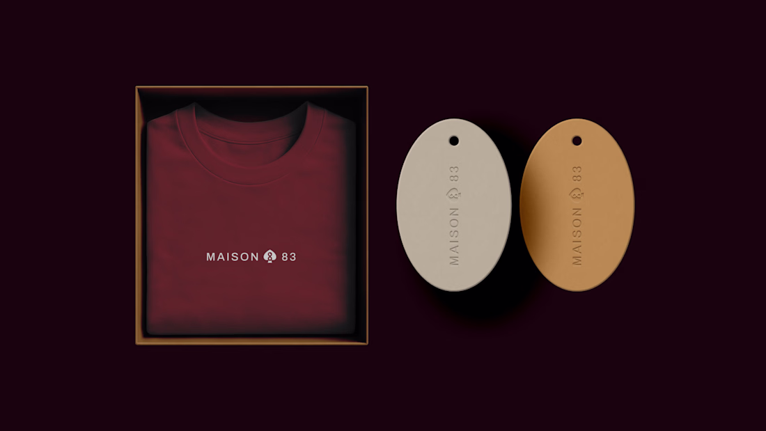
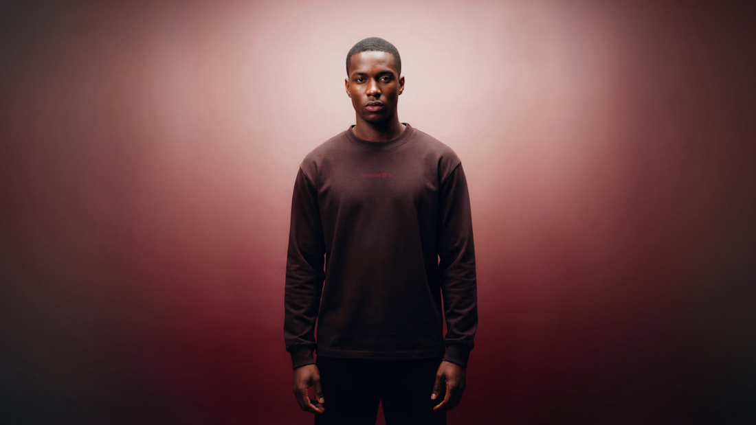
Maison 83 is a fashion and cultural brand built around ownership as identity.
The direction moves away from trends and into something more intentional, with a focus on symbolism, texture, and pieces that feel considered and lasting.
Great choice of colours...
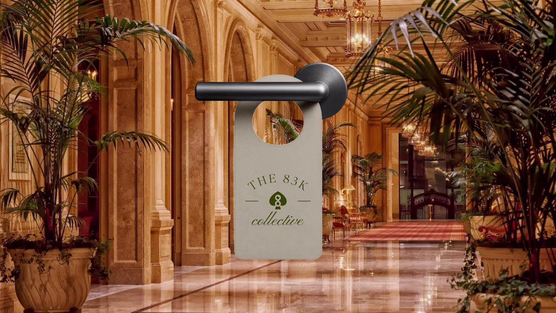
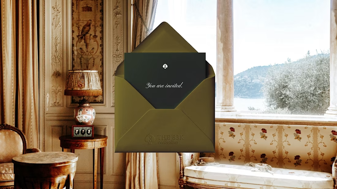
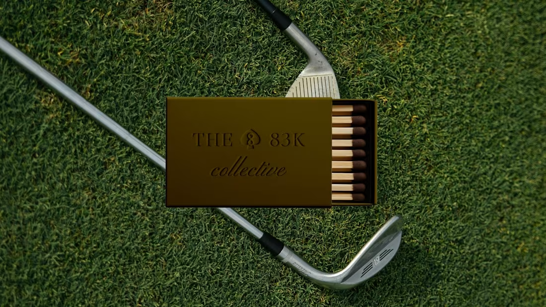
The 83K Collective is a membership-based community connecting operators, investors, and aspiring owners. The identity was designed to feel structured but welcoming, capturing a sense of belonging while maintaining a level of selectivity.
Check out the full case study here
The designs is luxury! Love your work
This looks clean and well thought out. How long did it take you to bring everything together?
Trending
Claude
Claude has entered the design space. How are you using Claude Design?
Contra University
Learn from expert creatives how to earn more using next-gen AI tools.
creativeaiflow
Creative AI workflows are evolving. What tools do you use, and what are their strengths and weaknesses?
portfolioreview
The best portfolios tell a story, not just show a grid. Share yours for feedback.
freelancerlife
Freelancer life is wins, pivots, and everything in between. What’s yours right now?