
pro
Oleh Urazovskyi 🇺🇦
Building Brands Through Thoughtful Logo Design
- 25
- Followers


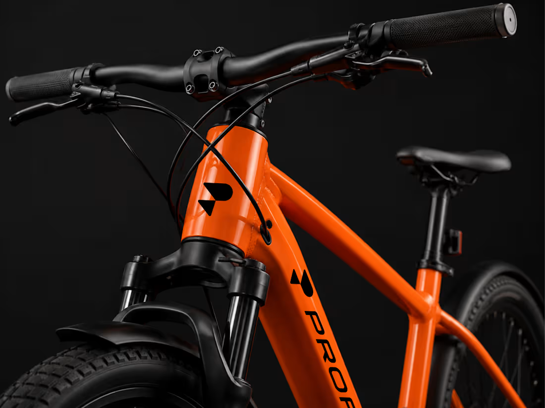
Profit Logo & Brand Identity
A complete visual identity developed for Profit, a modern electric bike brand focused on performance, precision, and forward movement.
The project includes a distinctive logo and symbol, a bold orange, black, and white color system, custom typography, and clear guidelines for consistent brand application. The identity was extended across digital and physical touchpoints, including social media, business cards, and product branding.
The visual language combines strong geometric forms, high-contrast layouts, and dynamic product imagery to create a confident, technical, and contemporary presence that reflects the brand’s focus on modern cycling.
4
20
1K
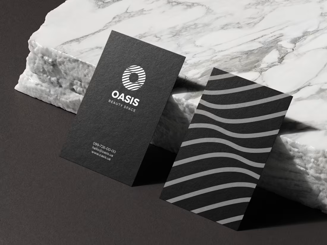
Oasis | Logo and Brand Identity Design
1
4
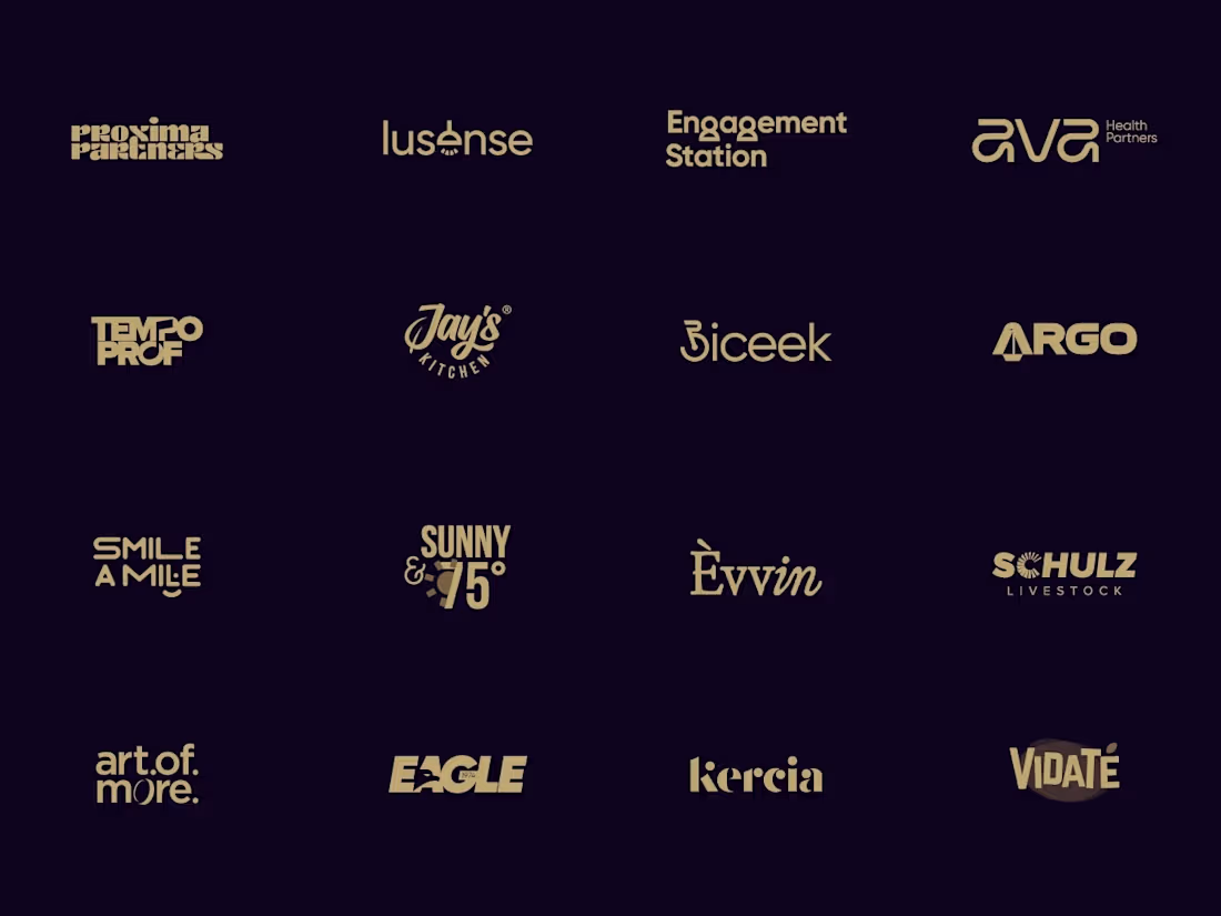
Wordmarks are all about the details. Here’s a collection of custom lettering and typography explorations for brands across different industries. Which one is your favorite?
Check it out (https://contra.com/p/sqoXQLvg-wordmarks-logofolio-vol-11)
2
4
435

Which symbol suits a Swiss wellness centre better? 🗳️
Two concepts for Swiss Wellness Centre.
A: a mountain reflected in calm water. The Alps and tranquility in one shape.
B: balanced stacked wellness stones forming a cross. A nod to the Swiss flag and to the idea of balance.
Vote and tell me why in the comments 👇
5
412