Oleh Urazovskyi 🇺🇦
Logo & Brand Identity Designer
- 22
- Followers


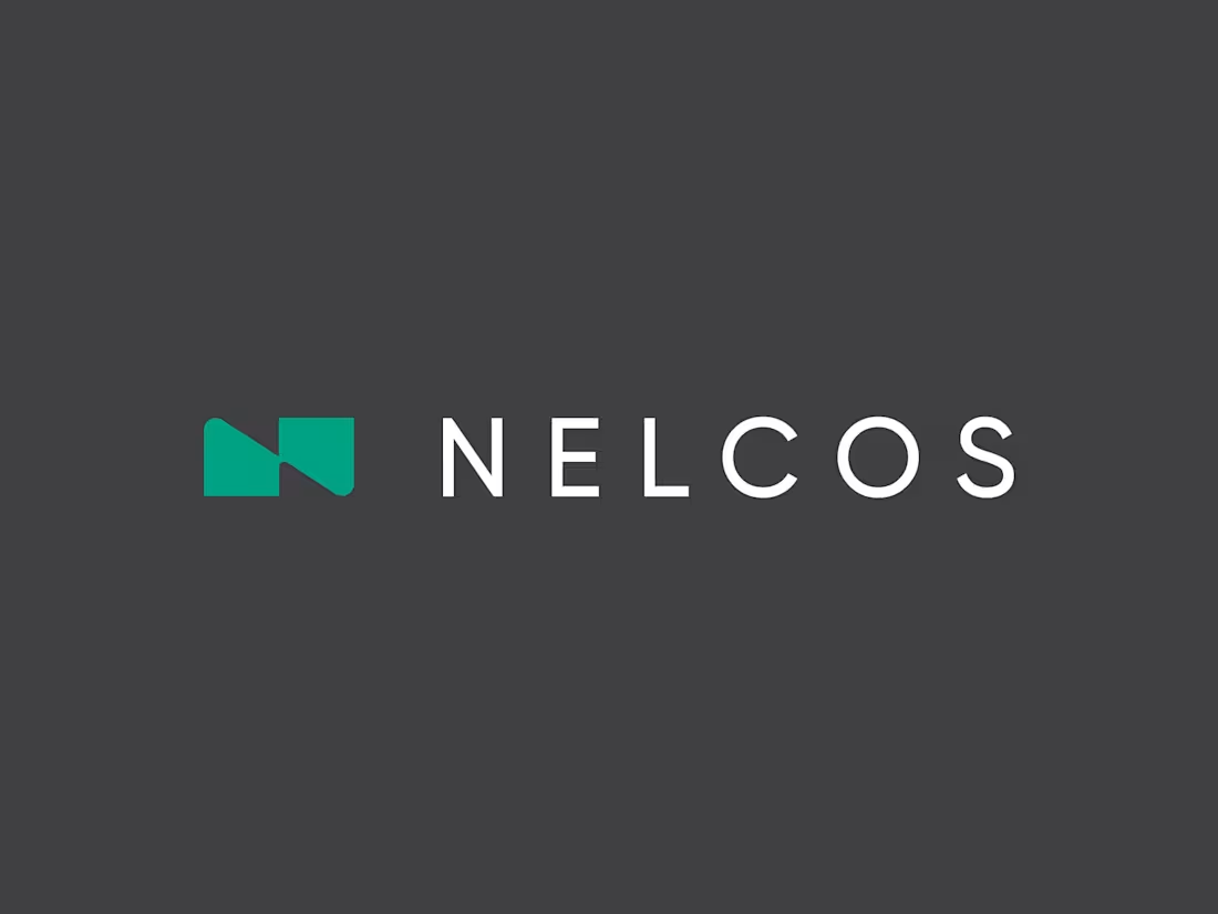
Which N works better? 🗳️
Worked on a logo for Nelcos, a Canadian company that refinishes interiors with architectural film instead of replacing them.
The idea: an unrolled roll of film that turns into the letter N.
The green is there to highlight eco-friendliness: less demolition, less waste.
Two directions for the symbol:
A: rectangular, compact
B: hexagonal, more dynamic
Vote and tell me why in the comments 👇
14
12
360
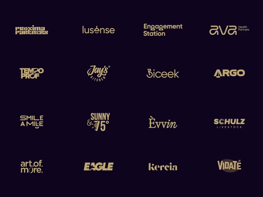
Wordmarks are all about the details. Here’s a collection of custom lettering and typography explorations for brands across different industries. Which one is your favorite?
Check it out (https://contra.com/p/sqoXQLvg-wordmarks-logofolio-vol-11)
2
4
262
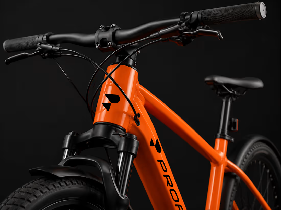
Profit Logo & Brand Identity
A complete visual identity developed for Profit, a modern electric bike brand focused on performance, precision, and forward movement.
The project includes a distinctive logo and symbol, a bold orange, black, and white color system, custom typography, and clear guidelines for consistent brand application. The identity was extended across digital and physical touchpoints, including social media, business cards, and product branding.
The visual language combines strong geometric forms, high-contrast layouts, and dynamic product imagery to create a confident, technical, and contemporary presence that reflects the brand’s focus on modern cycling.
4
20
889
A few of my favorite logo projects in one place.
I enjoy creating simple, memorable identities built on geometry, typography, and strong visual systems: logos that work just as well on packaging, signage, and digital products as they do in a brand guideline.
If you’re building a new brand or thinking about a rebrand, I’d love to help.
Need a logo? Feel free to reach out.
6
18
937