Oleh Urazovskyi 🇺🇦
Logo & Brand Identity Designer
- 22
- Followers


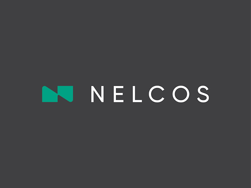
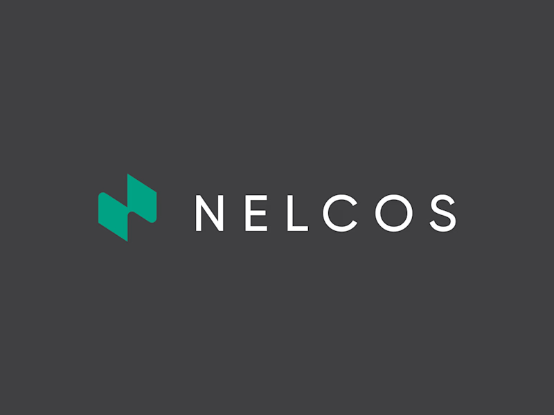
Which N works better? 🗳️
Worked on a logo for Nelcos, a Canadian company that refinishes interiors with architectural film instead of replacing them.
The idea: an unrolled roll of film that turns into the letter N.
The green is there to highlight eco-friendliness: less...
logodesignlogodesignerbrandidentityLogo DesignBrand DesignGraphic DesignAdobe IllustratorAdobe Photoshop


6 voted
43%
8 voted
57%
14 votes
Closed
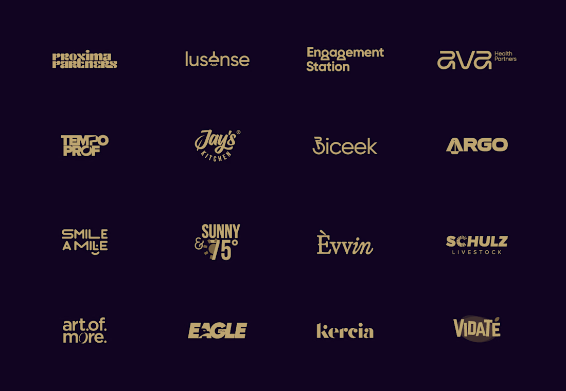
Wordmarks are all about the details. Here’s a collection of custom lettering and typography explorations for brands across different industries. Which one is your favorite?

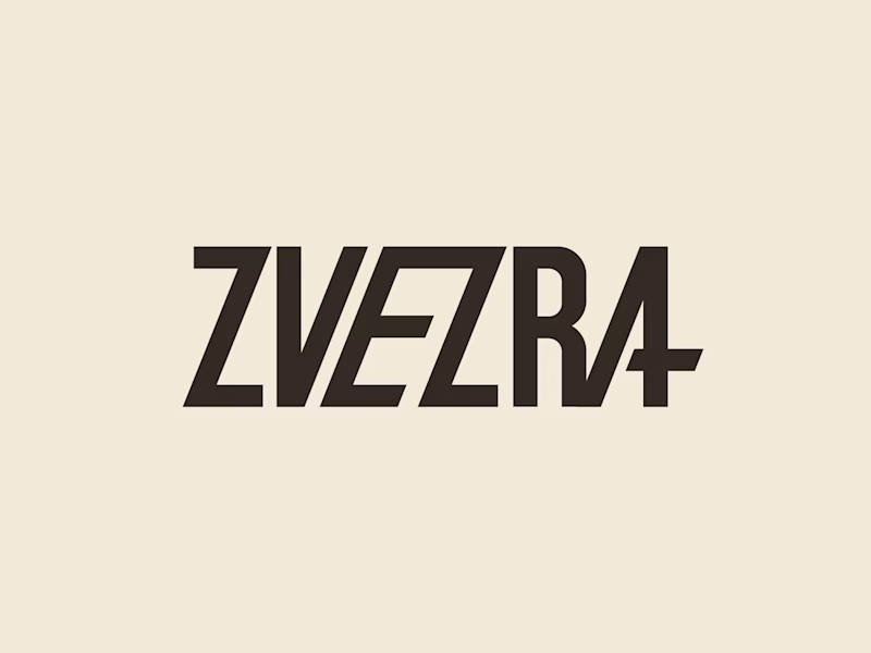
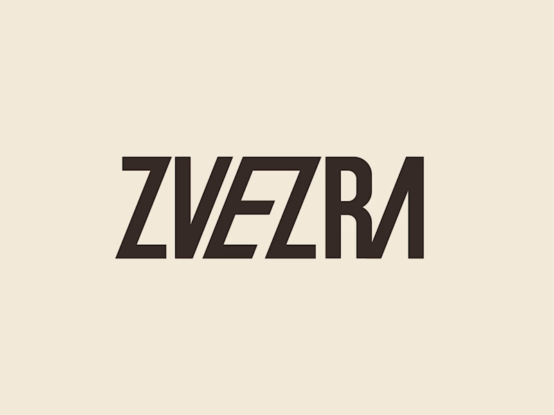
Which ZVEZRA logo direction do you prefer? 👀
I’ve been exploring two variations of the wordmark. Both follow the same visual direction, but each has its own character.
Vote below!
I’d love to hear your thoughts! 👇
39 voted
53%
34 voted
47%
73 votes
Closed
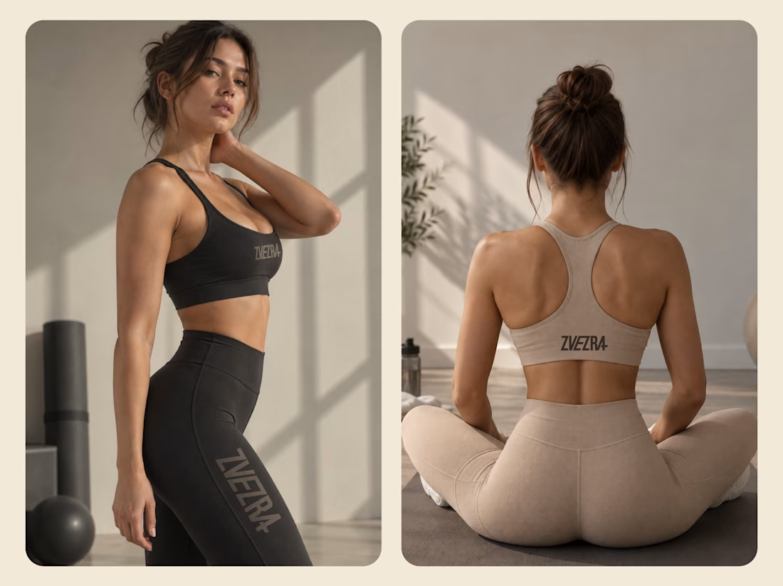
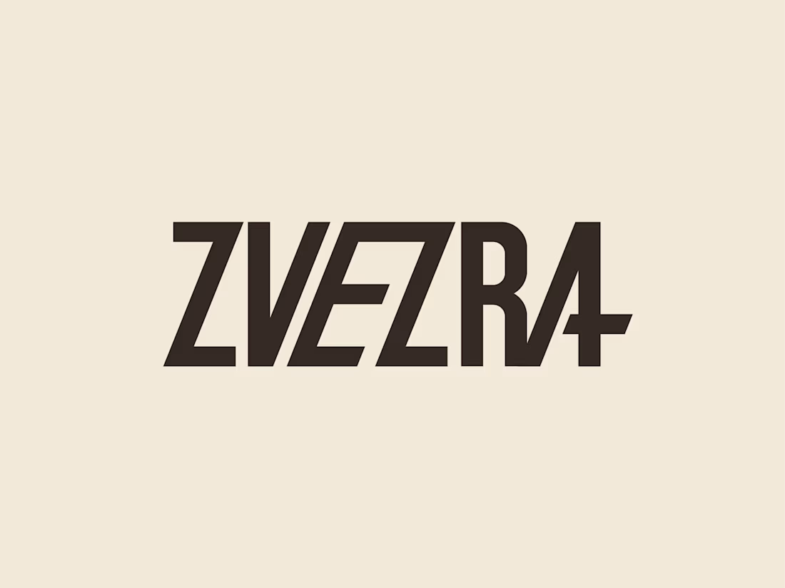
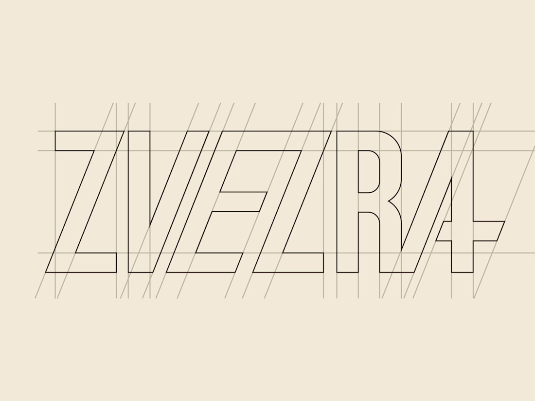
A custom wordmark created for ZVEZRA, a premium Pilates and movement-wear brand. The identity combines clean geometric construction with a refined, fashion-forward aesthetic, creating a distinctive mark that feels confident, modern, and feminine.
The custom letterforms were drawn...
UserBird is a SaaS analytics platform designed to help marketing teams better understand user behavior through website analytics, session recordings, and usability insights. The goal of this project was to create a modern and scalable visual identity that feels intelligent,...