pro
Abdul Rehman
Minimalist Brand Designer | Logo & Brand Identity.
- $1k+
- Earned
- 3x
- Hired
- 5.00
- Rating
- 70
- Followers
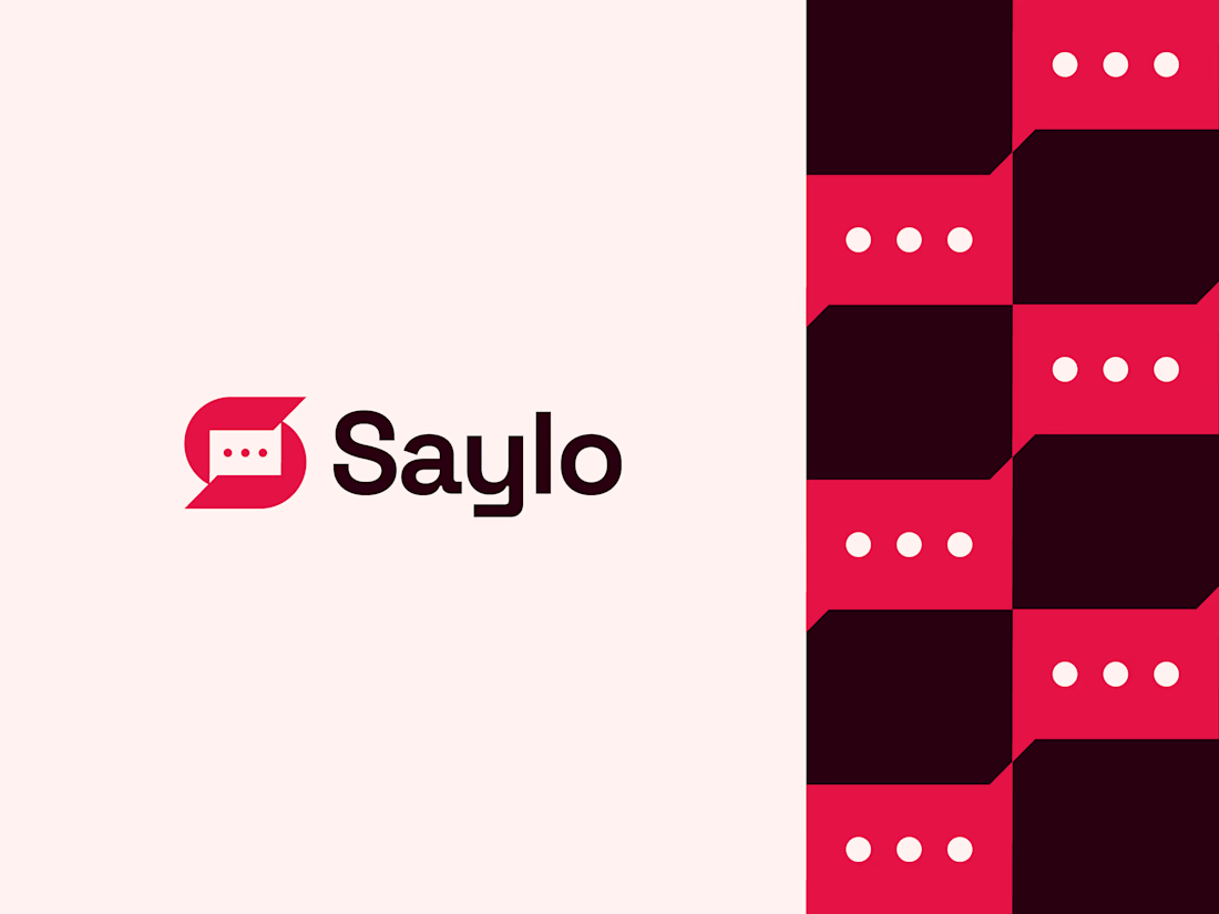
One of my favorite identity projects from last year.
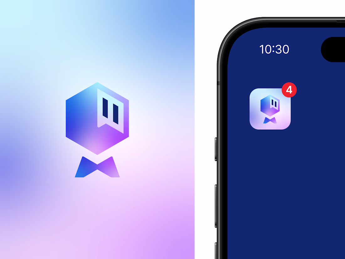
Saylo is a messaging app concept designed around the idea of simple, meaningful communication. The logomark combines the letter S with a chat bubble and three message dots, creating a clean, memorable symbol that instantly...
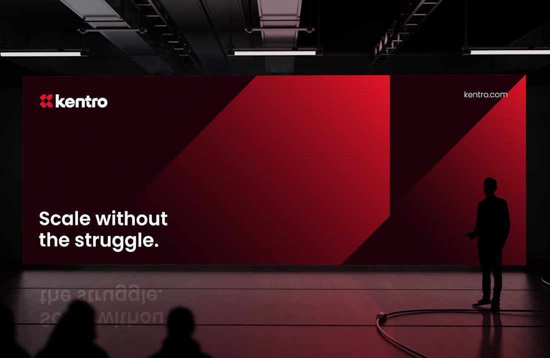
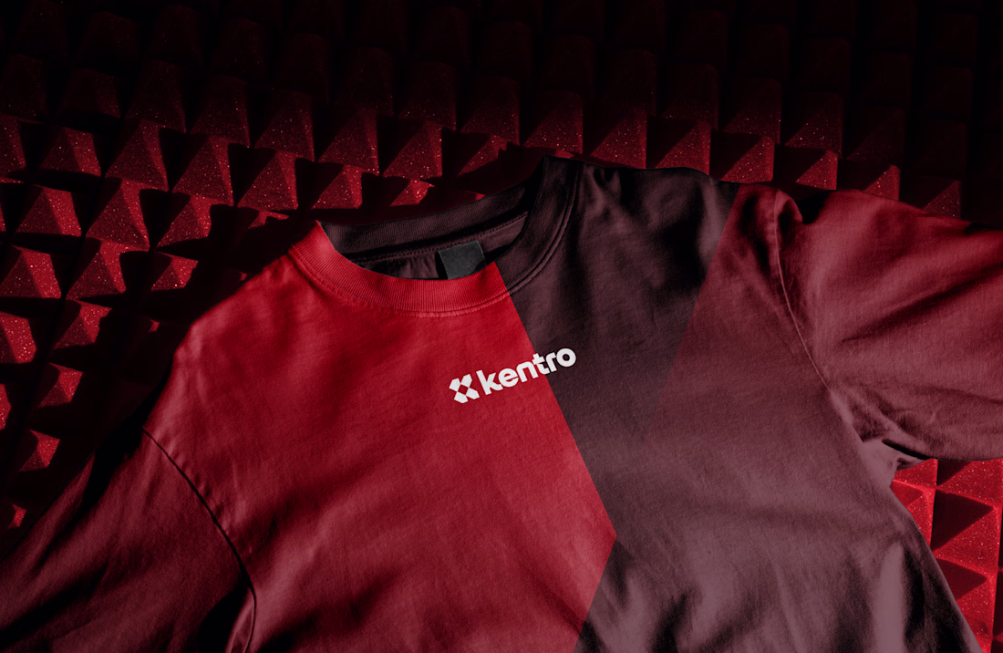
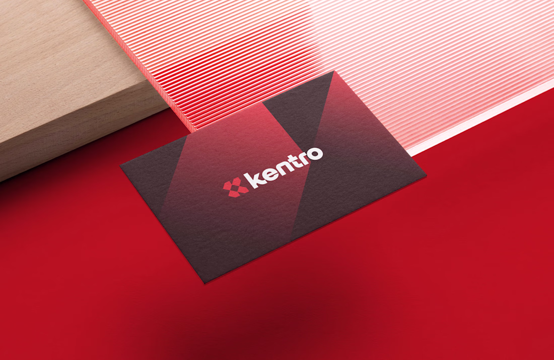
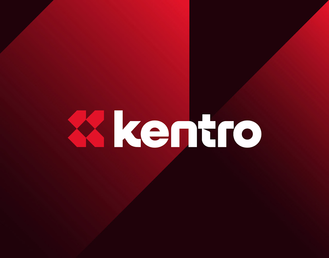
Kentro — Unlock growth with intelligent automation.
The logomark combines the letter K with forward-facing arrows, creating a clean geometric symbol that represents growth, progress, and continuous acceleration. The goal was to build an identity that feels modern, intelligent,...
A few days ago, I was exploring logo concepts for a client, and this was one of the directions I created.
It never made it to the final presentation because it wasn't aligned with what the client was looking for. Even so, it's still one of my favorite concepts I've designed...
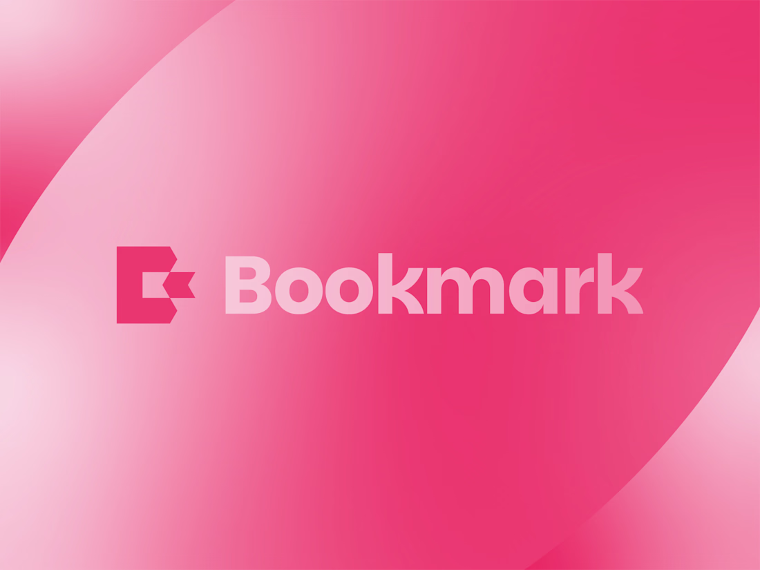
Bookmark - Letter B Logo Design.
What you think about this logo concept?
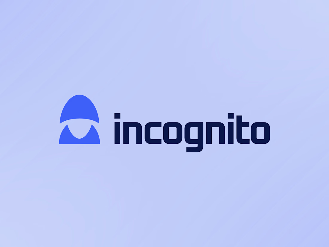
incognito VPN Logo Design.
A hooded silhouette crafted to represent secure, private, and anonymous online experiences.
What you think about this concept?