pro
Abdul Rehman
Minimalist Brand Designer | Logo & Brand Identity.
- $1k+
- Earned
- 3x
- Hired
- 5.00
- Rating
- 70
- Followers
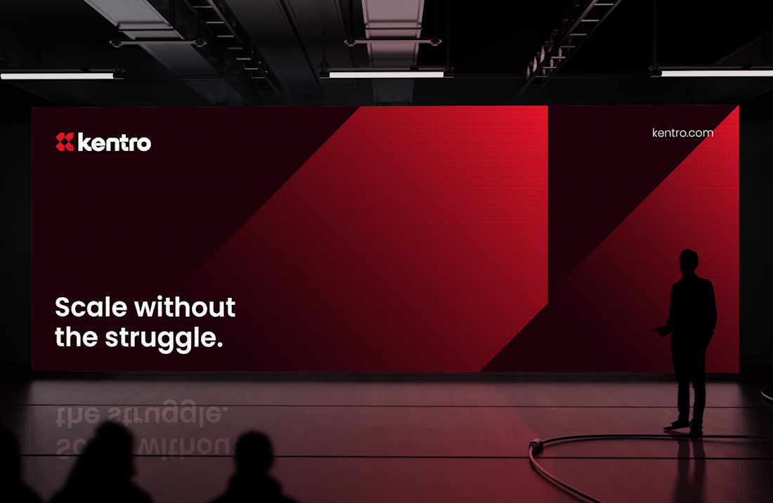
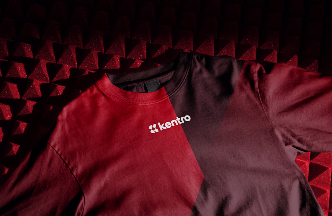
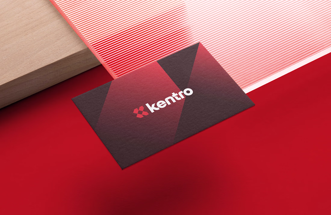
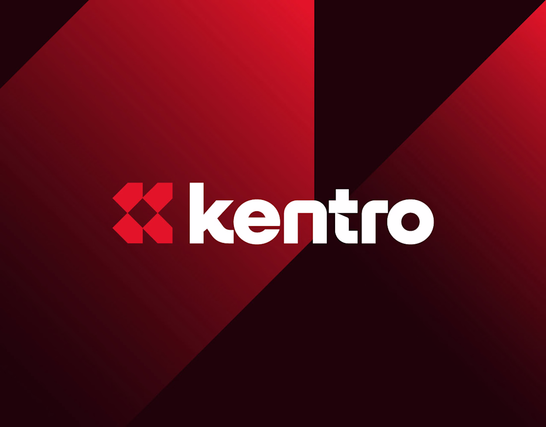
Kentro — Unlock growth with intelligent automation.
The logomark combines the letter K with forward-facing arrows, creating a clean geometric symbol that represents growth, progress, and continuous acceleration. The goal was to build an identity that feels modern, intelligent,...
One of my favorite identity projects from last year.
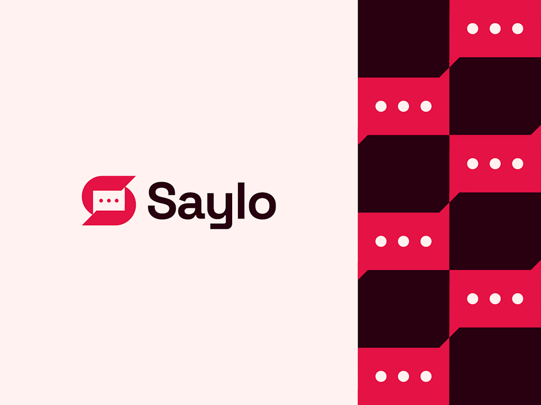
Saylo is a messaging app concept designed around the idea of simple, meaningful communication. The logomark combines the letter S with a chat bubble and three message dots, creating a clean, memorable symbol that instantly...
A few days ago, I was exploring logo concepts for a client, and this was one of the directions I created.
It never made it to the final presentation because it wasn't aligned with what the client was looking for. Even so, it's still one of my favorite concepts I've designed...
BrightNotes - Letter B Pencil Logo Design.
Bookmark - Letter B Logo Design.
What you think about this logo concept?