pro
Abdul Rehman
I build brands that say everything without saying too much.
- $1k+
- Earned
- 3x
- Hired
- 5.00
- Rating
- 38
- Followers
Tovra AI Logo & Brand Identity Design
0
2
The background portrait video comes from lummi.ai (http://lummi.ai) and it completely transformed the feel of this logo concept. What started as a logo became a living, breathing identity.
I recently started using Lummi for AI image and video generation, and it's genuinely one of the best tools I've added to my workflow. Beautiful assets, instant downloads, and it pushes your creative work to another level.
Branding isn't just visual. It's feeling. And this one feels right.
0
109
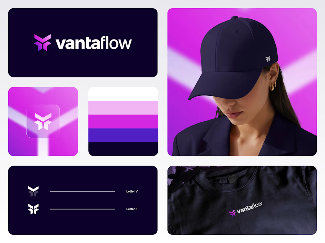
vantaflow logo & brand identity!
2
203
Dream AI Logo Design
2
3
270
Exploring geometry with this one. I merged W and V into a single symmetrical mark using sharp angles and interlocking shapes.
I wanted it to feel bold, clean, and instantly recognizable, even at small sizes. The solid structure gives it strength, while the cutout keeps it light and dynamic.
Would love to know what you see first, the W, the V, or just a symbol on its own?
1
222
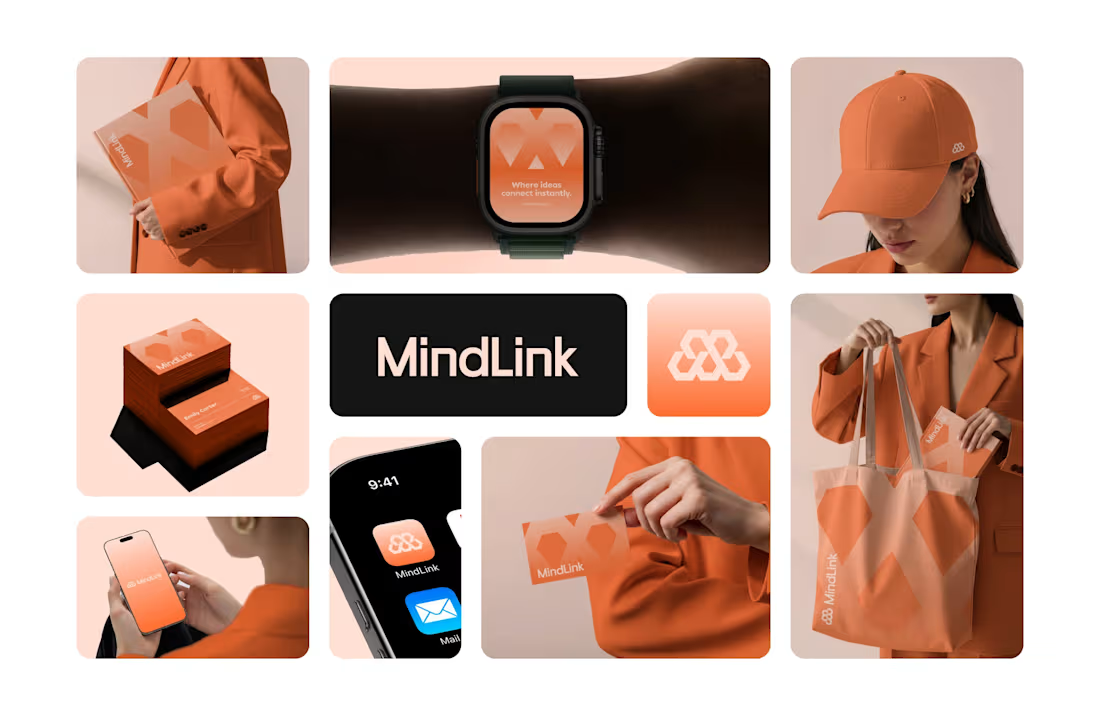
MindLink AI - Logo and Brand identity.
0
0
Rejected logo concept for Transparent
I recently worked with Transparent, a backend technology company building powerful, easy to use APIs that connect business systems and enable seamless data exchange.
This concept took a clean, technical approach. I used angle brackets to shape the letter T, referencing backend code, and added a subtle arrow form to represent growth and progress.
The client chose Concept 2, and we wrapped up the project smoothly with no revisions on the final delivery, which is always a win.
Not every concept gets selected, but every concept moves the project forward.
Would love to hear your thoughts.
2
1
263
Gapp logo Design
0
0
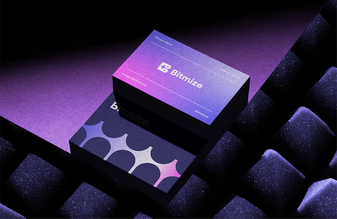
Bitmize AI Logo and Brand identity.
1
2
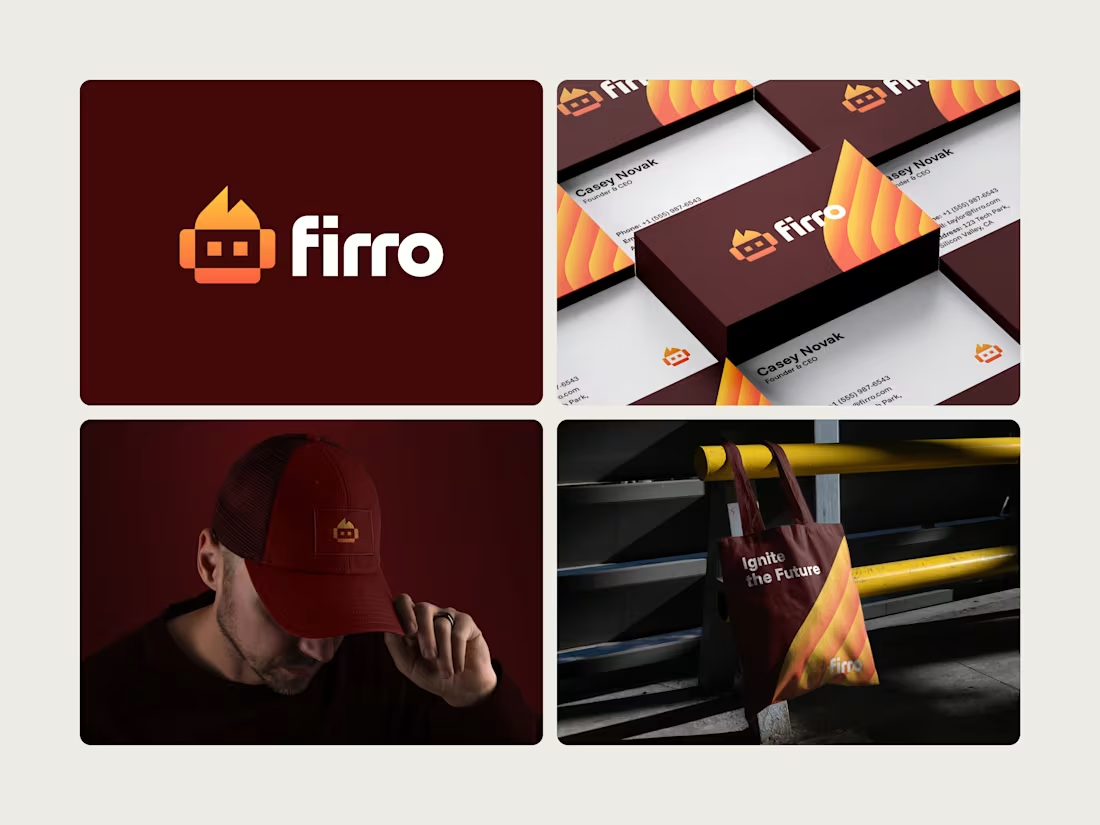
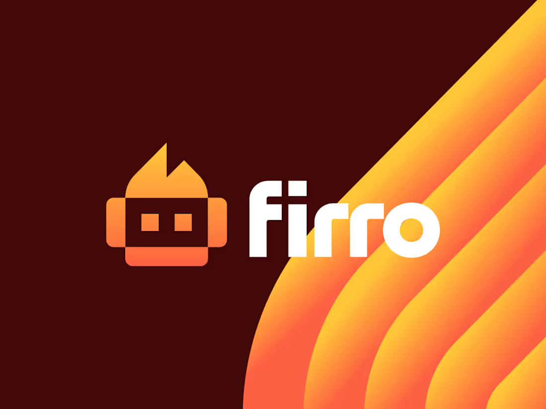
Designed this logo last year for Firro.
The name comes from fire and robot, which shaped the logomark. A simple symbol that feels energetic, a little bold, and tech-driven without trying too hard. Once everything came together across the brand pieces, it all just clicked.
Still really like how this one turned out.
What do you think?
Click for full project. (https://www.behance.net/gallery/238002871/Firro-Robot-and-Fire-Logo)
2
1
289
A little sneak peek 👀
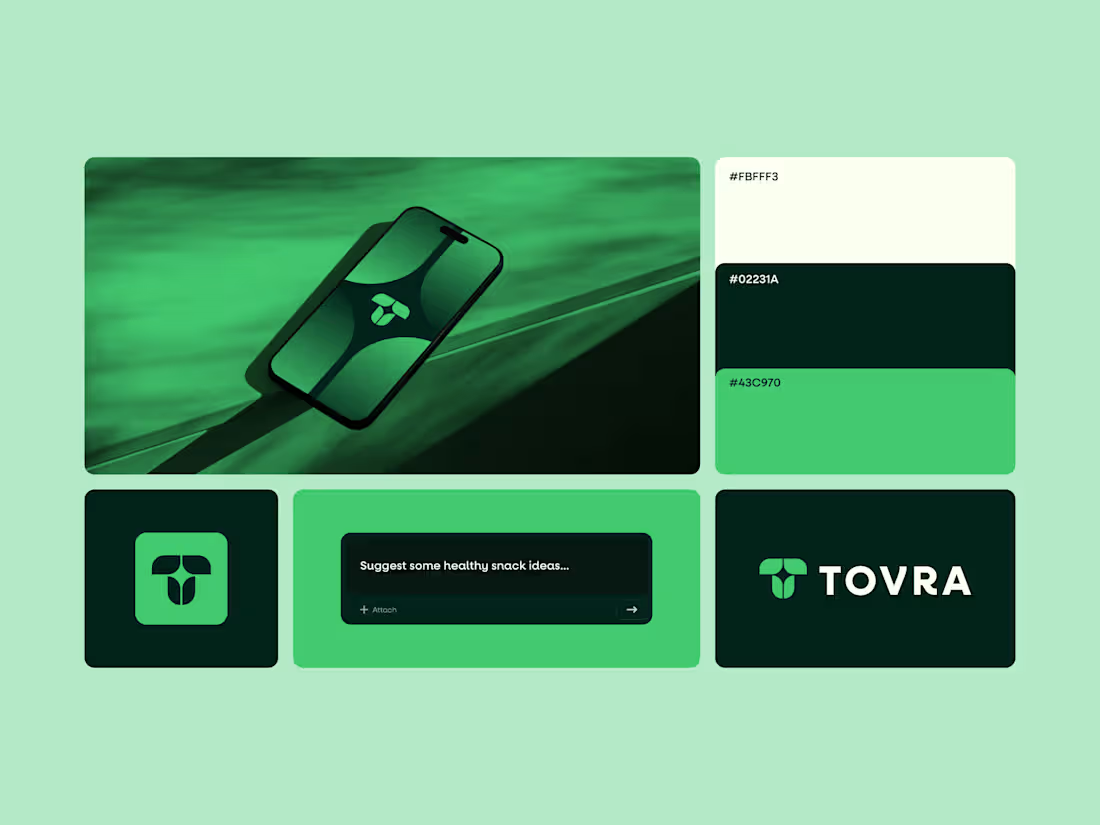
Currently working on the brand identity for Tovra.
An AI-driven brand focused on health-conscious people.
Full project coming soon. Hopefully publishing on my Behance (https://www.behance.net/abdrehmandesign) within a week.
3
2
300
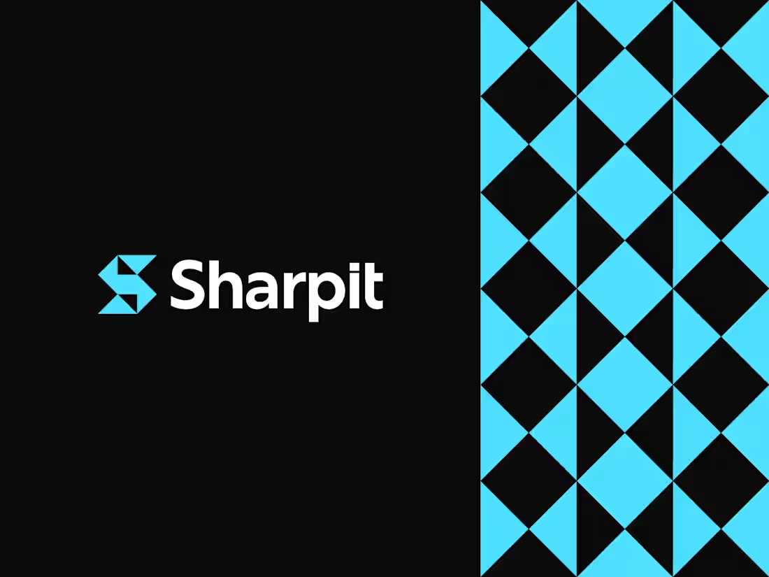
Minimalist at its core, designed to stay strong and sharp without losing its character.
Logo design for Sharpit, with a logomark built from the letter S using sharp, geometric forms.
Curious to hear your thoughts.
2
3
291
Recently explored how far a simple idea can go when applied consistently.
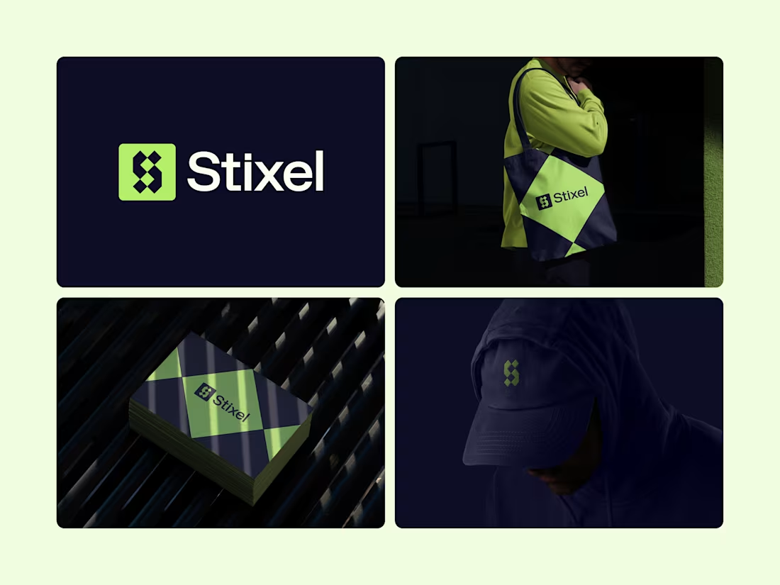
The Stixel logomark blends the letter S with pixel elements to reflect a modern, digital-first brand. Minimal at its core, but flexible enough to live across merch, print, and everyday use without losing character.
Curious to hear your thoughts.
Does the mark feel distinctive and scalable to you?
Click to See (https://www.behance.net/gallery/241991361/Stixel)
13
23
407
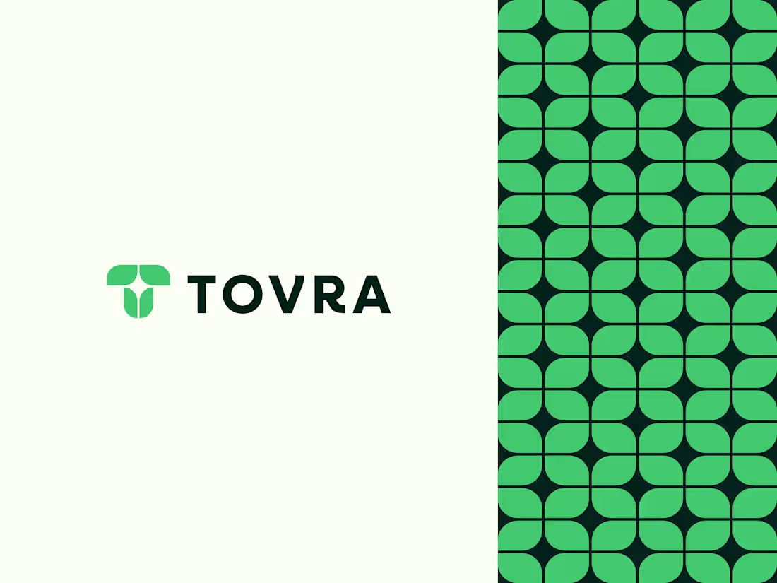
Recently designed this logo for Tovra.
The mark blends the letter T with leaves and a subtle star, aiming for a calm, organic feel that still feels modern.
Really enjoyed exploring the pattern system around it.
Curious to hear your thoughts. What stands out to you?
2
1
256
Exploring a logo concept where an angle bracket meets the letter W.
Kept it minimal and clean:. Curious to hear your thoughts.
See full project here. (https://www.behance.net/gallery/232634995/Worvia-Modern-Web-Development-Brand-Identity)
2
2
235
Designed this logo last year, and it’s been nice seeing it get a strong response on Behance recently.😊
Stixel is built around the letter S, formed using pixel-inspired geometry to create a sharp, modern logomark. The idea was to keep it minimal but structured, with a strong digital feel that stays clear and recognizable at any size.
Looking back, it’s interesting how some concepts age better than expected.
What do you notice first, the symbol or the color choice?
See Here (https://www.behance.net/gallery/241991361/Stixel)
3
211
Designed this logo last year for a fictional chat app called Saylo. The name mixes “Say” and “Hello,” so the whole idea was simple, warm conversations.
I built the mark around an S + chat bubble to show messaging at a glance without feeling too techy or cold.
Curious how it lands with you. Does the concept read well? What would you tweak? 🗣️
3
2
226
Worvia – Modern Web Development Logo & Brand Identity
1
1
Firro - Logo and brand identity design.
1
1
Kentro – Unlock growth with intelligent automation. Logo and identity design
2
190
