The network for creativity
Join 1.25M professional creatives like you
Connect with clients, get discovered, and run your business 100% commission-free
Creatives on Contra have earned over $150M and we are just getting started
Back to feedPost

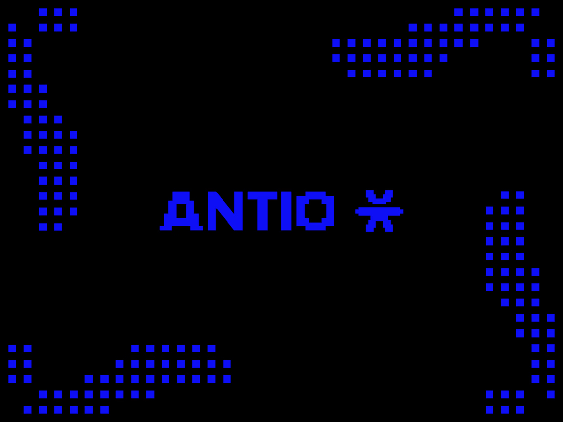
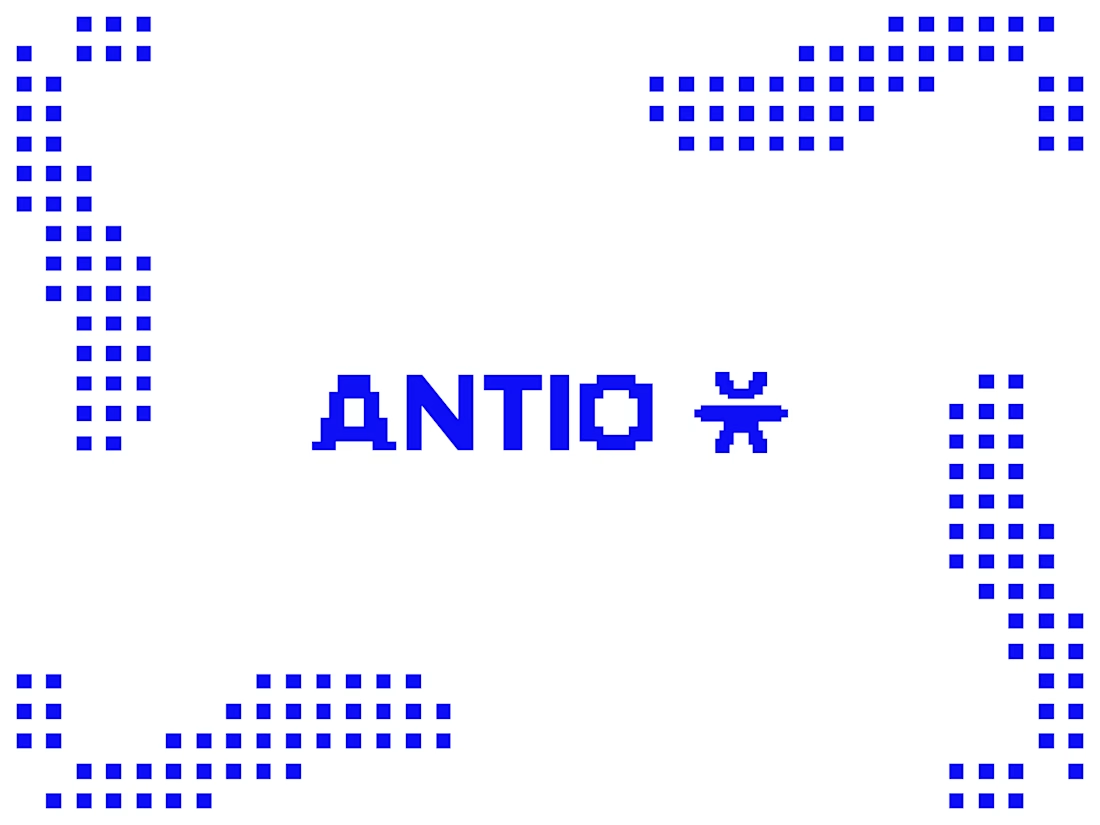
Exploring a visual identity for ANTIO, a cybersecurity company built around protection in the digital world.
The logomark is inspired by an open-arm silhouette, symbolizing security, trust, and a constant readiness to protect. The pixel-based system extends that idea into the digital space, creating a visual language that feels native to technology while remaining human at its core.
I tested the identity on both light and dark backgrounds, and now I'm curious:
Which version feels stronger to you?
⚫ Black background
⚪ White background
I'd love to hear which one better reflects a modern cybersecurity brand and why.


The network for creativity
Join 1.25M professional creatives like you
Connect with clients, get discovered, and run your business 100% commission-free
Creatives on Contra have earned over $150M and we are just getting started
Trending

Claude
Claude has entered the design space. How are you using it?

Contra University
Learn from expert creatives how to earn more using next-gen AI tools.
Brand Design
The best brand designers are on Contra. Scroll to see what's trending in brand design. What are you building?
creativeaiflow
Creative AI workflows are evolving. What tools do you use, and what are their strengths and weaknesses?
freelancerlife
Freelancer life is wins, pivots, and everything in between. What’s yours right now?


Related posts

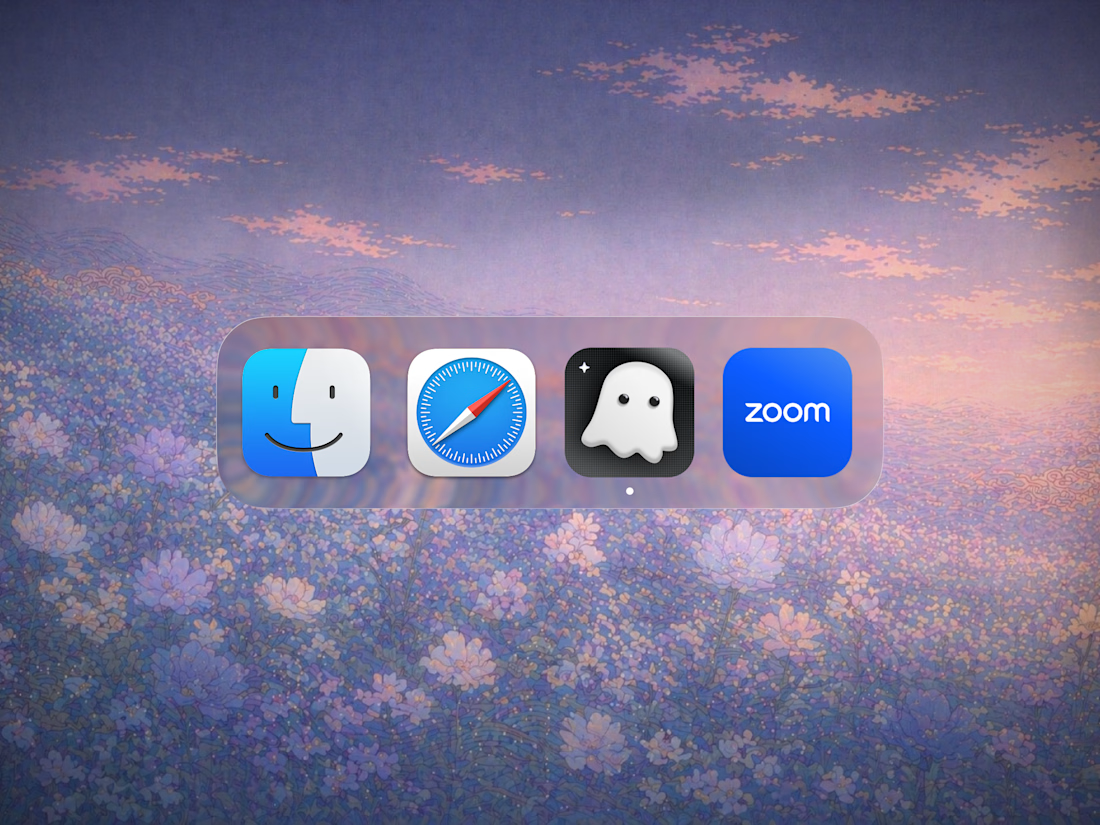
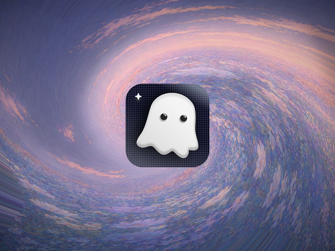
App icon design for Wraith AI


A few of my favorite logo projects in one place.
I enjoy creating simple, memorable identities built on geometry, typography, and strong visual systems: logos that work just as well on packaging, signage, and digital products as they do in a brand guideline.
If you’re building a new brand or thinking about a rebrand, I’d love to help.
Need a logo? Feel free to reach out.

TOP 🙌

The Lucra Brandbook
The brandbook is the least glamorous deliverable and the most important one.
It's the document that makes every future decision faster, the one a new hire, a freelancer, or an internal marketing team can open and immediately know how the brand should look, sound, and behave. Good brand work isn't just a nice logo. It's a system someone else can run without you in the room.
A look inside a recent brandbook.
PoW - https://contra.com/studioduo
Let's talk about your brand identity and Website design needs
Schedule a 15min Discovery call here https://cal.com/digitalforus/15min?overlayCalendar=true

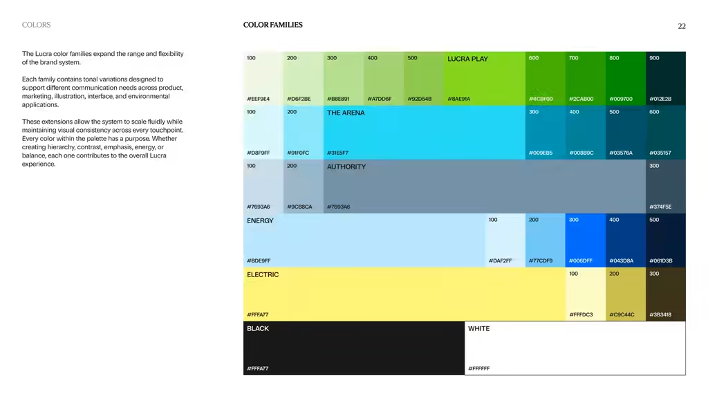

Love the Colors!