The network for creativity
Join 1.25M professional creatives like you
Connect with clients, get discovered, and run your business 100% commission-free
Creatives on Contra have earned over $150M and we are just getting started
Back to feedPost

Winder is a bold brand identity built around a geometric W-inspired symbol, combining sharp angles and forward movement to represent progress, speed, and direction.
The identity uses a striking red and deep burgundy palette, supported by clean typography and a consistent visual system across brand guidelines, digital applications, and product mockups.
Progress in Motion.




Great logo it feels it really has an identity 🎉🎉
Thank you
Pardon ❤️

Love the clean composition and color palette! 🔥
Thank you

Thank you

The forward-leaning W reads clearly even at the tiny size on the bike display. Nice small-scale test.
Thank you

In the one-colour versions on the bottom row the cuts between the slices still read cleanly. For the tiny scooter display, did you open up those gaps at all, or does the mark scale down exactly as drawn?
Thanks! I actually kept the mark exactly as drawn, including the gaps between the slices. I haven’t made any adjustments specifically for the tiny scooter display, but it still holds up cleanly at that size.

Strong logo identity and great colour consistency! 👏✨
Thank you

The concept behind this logo is really clever. 👏
Thank You Morium.

Nice work!
Thank You Bella!

Great work
Thank You Man!

Powerful reddish look!
Yup! Thank You Man!


The slanted cuts in that W mark carry the motion idea so well, and it still holds up glowing on the scooter display
Thank you, man! Really appreciate that. Keep inspiring and teaching! 🙌

The mark reads as a W and as forward motion at the same time, and the red and deep burgundy palette keeps it serious. The handlebar mockup is a smart touch, it shows the symbol working at the smallest size.
Thank you, man! Really appreciate you noticing those details. Glad the motion and the small-size application came through!

this is RAD !
Thank You Saadia!

Superb
Thank You Saeed!
All pleasure is mine


Awesome work👏🔥🔥
Thank You!

Top notch 🔥
Thank You Aneke!

Wonderful project, like it
Thank You Man!

Thank you, man! Really appreciate that. Glad you liked how everything came together!


well executed design!
Thank You!

That Winder symbol is seriously cool. Simple, bold, and memorable. 🔥
Thank You Shubhang!

COOL LOGO
Thank You Gargi

Looking nice, what was the thought process for this brand mark ?
Thank you! The idea was to create something that represents growth, sharpness, and a modern feel while keeping it simple. The mark combines an arrow with the letter “W,” tying the concept back to the brand in a subtle way.

Great logo
Thank You Jos!

The logo feels professional and intentional just keep the good work going
Thank You, Adeyemi!

Great logo, I love it 🔥
Thank You Mahnoor!

nice
Thank You!

loved the logo, loved the color palette, loved the mockups, loved it all
Thank You!

The best brands feel inevitable once you see them. This one does.
Thank You, MeansAlot!

Very nice work, man!
Thanks Man!

What a great logo
Thanks Man!
The network for creativity
Join 1.25M professional creatives like you
Connect with clients, get discovered, and run your business 100% commission-free
Creatives on Contra have earned over $150M and we are just getting started











Related posts

more visuals from my latest project — mori matcha 🍵
explored minimal Japanese packaging with earthy greens and calm typography.
focusing on premium ceramic cups and clean can design.
#branddesign #packagingdesign #visualidentity #brandstrategy #matcha #minimaldesign #japanesedesign #figma #mockup #branding
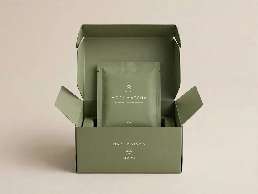
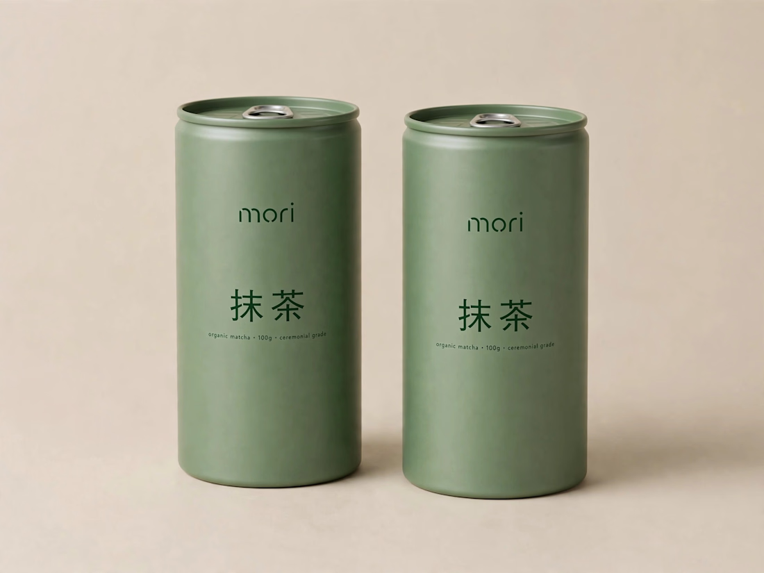
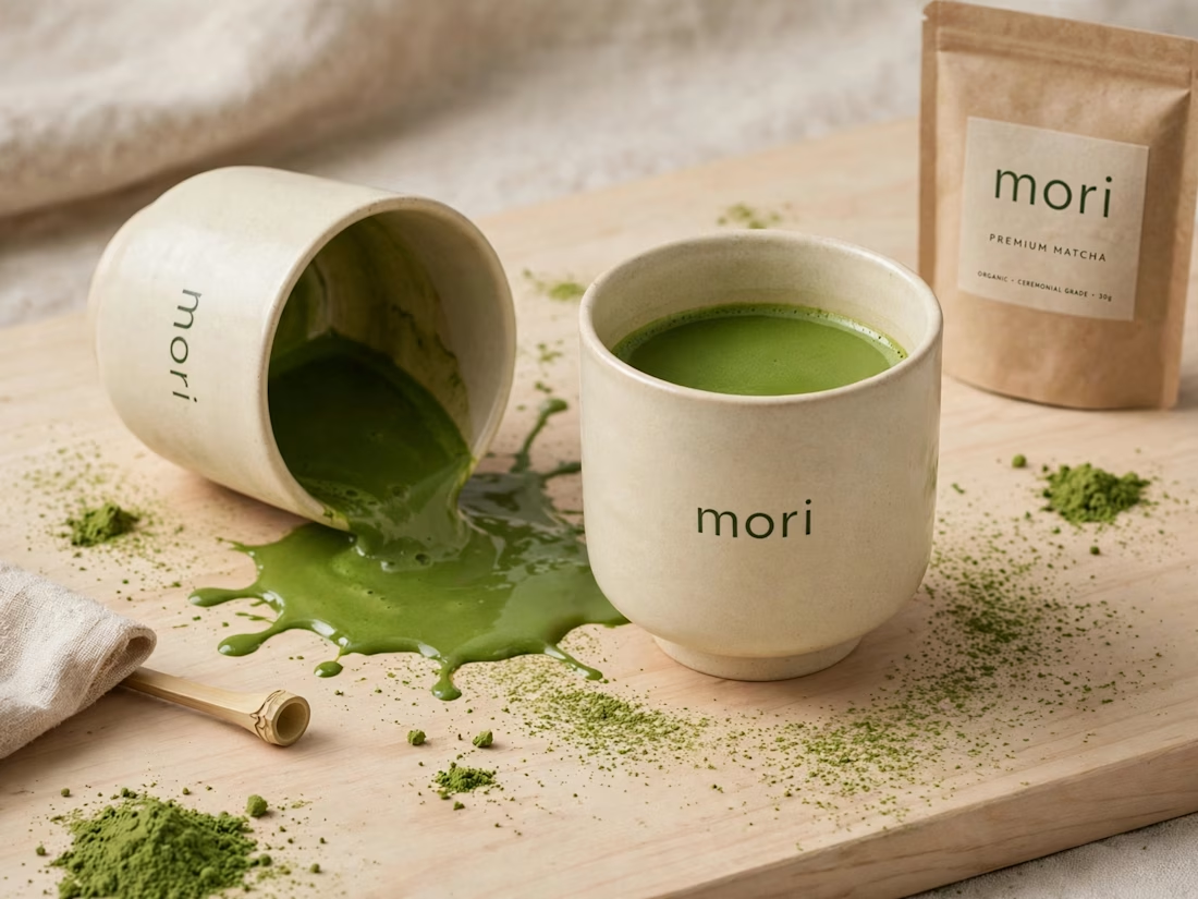
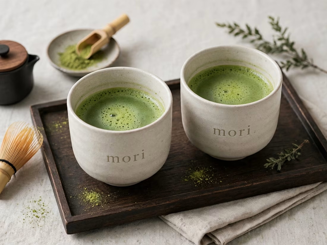


An existing brand identity showcased across a new campaign. This was one of my favourite projects ever!
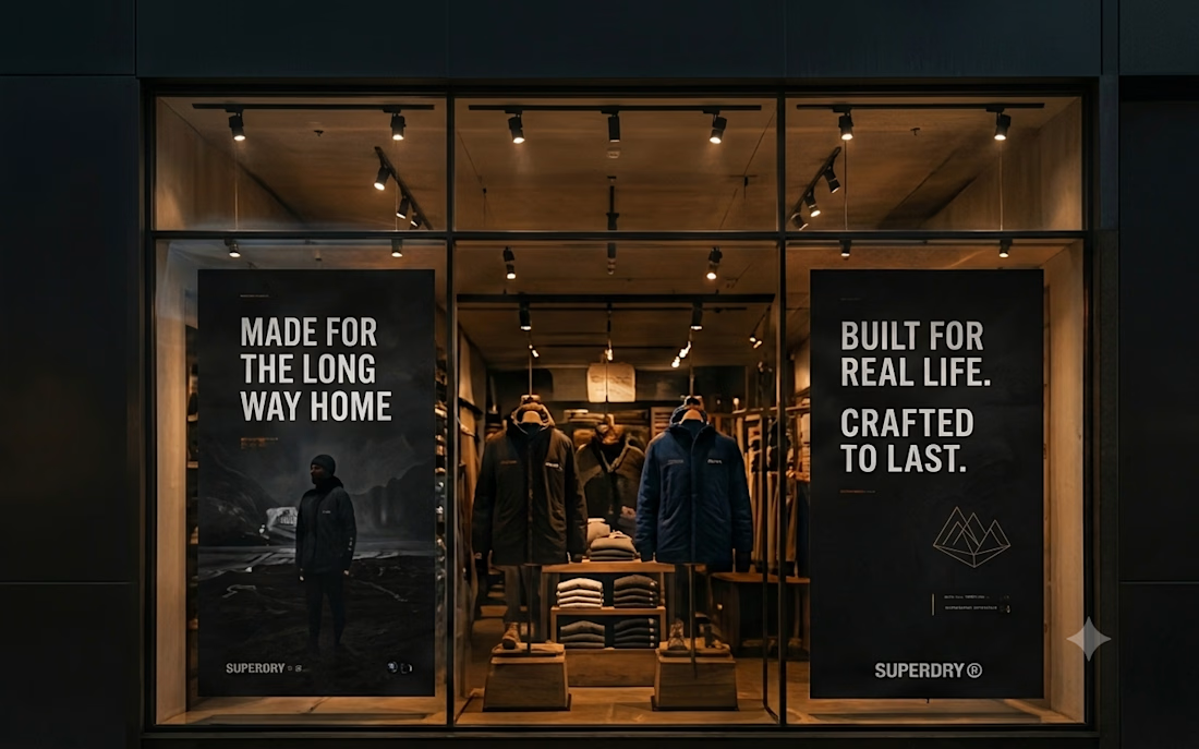
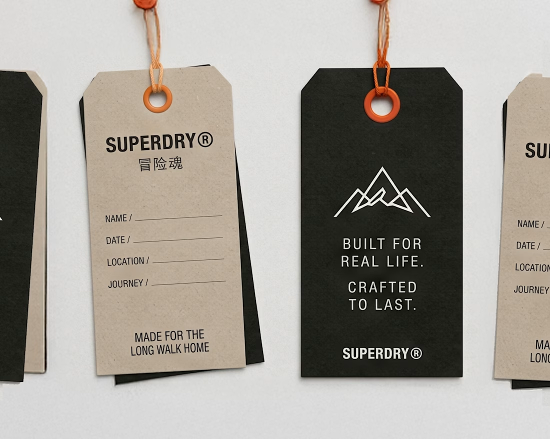
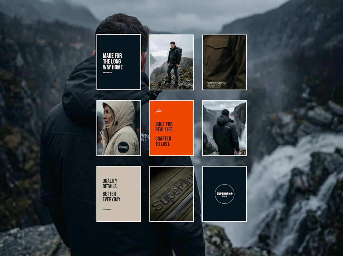
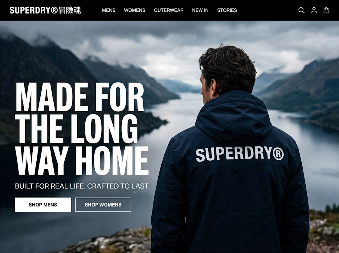
Great brand identity design specially bottom right and bottom left designs ❤️❤️
Great job Seadhna🔥🔥

Most early-stage brands play it safe and disappear after a while. For Drylendar, I did the opposite.
3 weeks from brief to full identity: logo, illustration system, app visuals, collectible cards and even merch.
AI makes things cheaper. Personality makes brands memorable.
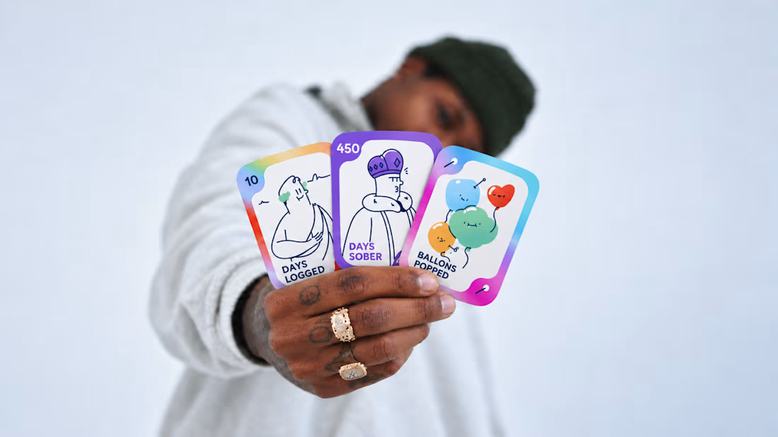
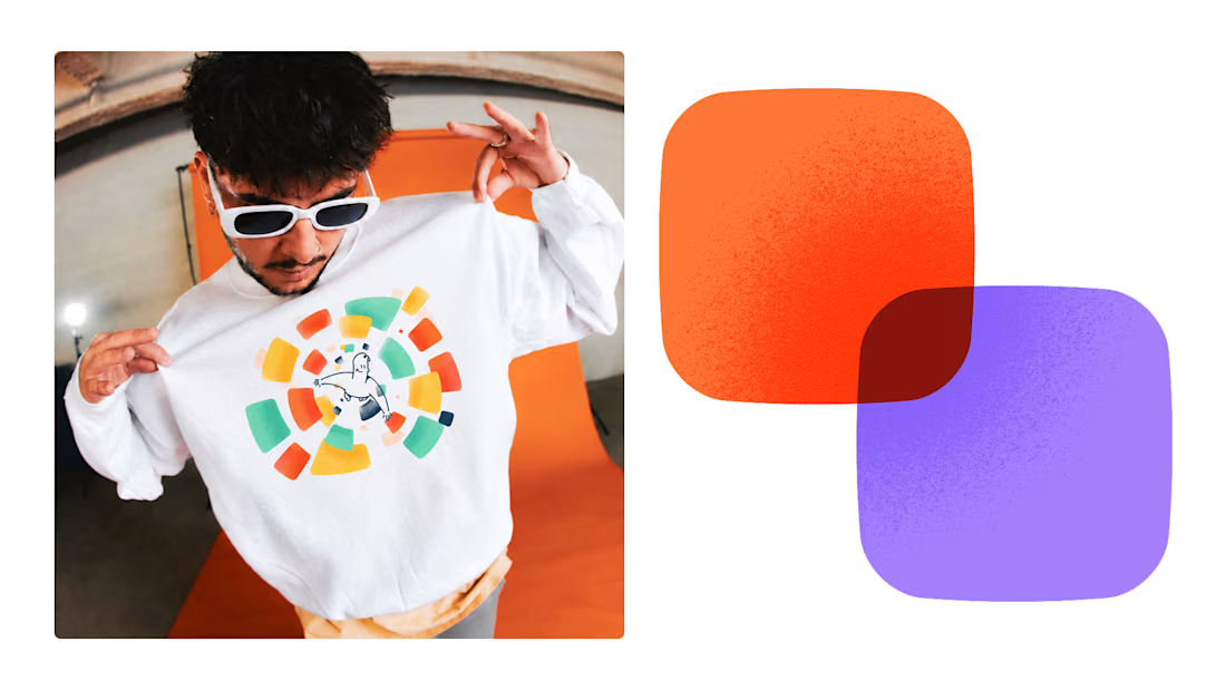
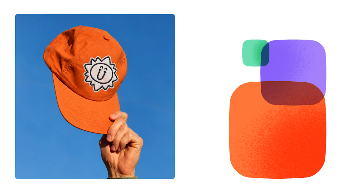
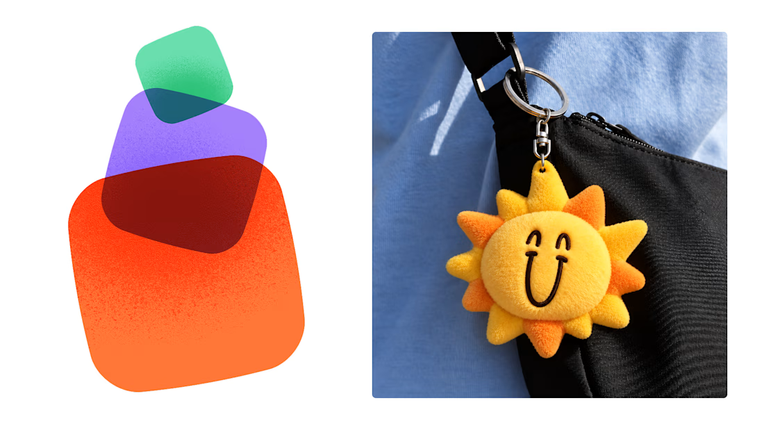

This is exactly what branding should be! 🔥 3 weeks for full identity, merch, cards - you really built personality, not just a logo. Love the Drylendar vibe. AI makes it cheap, but this makes it memorable - so true!