The network for creativity
Join 1.25M professional creatives like you
Connect with clients, get discovered, and run your business 100% commission-free
Creatives on Contra have earned over $150M and we are just getting started
Back to feedPost
Taste Test

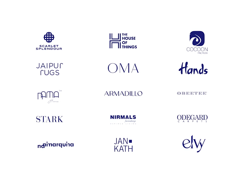
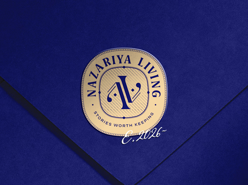
A little look at how Nazariya Living stands apart from its category.
On one side, familiar visual conventions. On the other, an identity with its own character, rooted in stories worth keeping.
We chose not to blend in. :)
Which side catches your eye?


7 votes
Ends in 17h

Amazing work man🔥

That gold seal stands out.

That deep navy with the gold seal really pulls away from the sea of thin black logos. Side 01 feels like it has a story behind it.

Side 02 catches my eye. The gold seal on deep navy has real character and stands apart from the familiar grid on the other side — it feels like a keepsake mark, which fits the stories worth keeping idea. One thing to check is whether the seal still reads clearly at small sizes...

That side with all the competitor logos in one grid is the slide I'd steal for a client presentation. Nothing explains "why this direction" faster than showing the sea of sameness first. The navy seal wins easily after that.
The network for creativity
Join 1.25M professional creatives like you
Connect with clients, get discovered, and run your business 100% commission-free
Creatives on Contra have earned over $150M and we are just getting started



Related posts

I created 2 concepts for the same tagline "Shaping Skylines", for a vertical construction company. Both of these are scroll triggered, which one you prefer? I'm biased towards the skewed option.
I'm giving a free component copy for both of them:
Zoom in: https://framer.link/CQNgUkU
Skewed: https://framer.link/XTmQcBK
Check them out and if you'd like, use them in your upcoming project!
29 voted
64%
16 voted
36%
45 votes
Closed

Flawless

What if sending money felt a little more like giving a gift?
For Nova, I explored a banking app that brings payments, cards, and a bit of personality together. You can check your balance, browse recent transactions, send or request money, top up, and pay bills.
My favorite part is the digital postcard feature. Before sending a transfer, you can add a little illustrated card—a heart, a birthday greeting, or a playful character. A simple way to make birthday money or a thank-you feel more personal.
I carried that same 3D character into onboarding, pairing it with bold red gradients and large, clear payment details. There’s room for play, while the recipient and amount stay easy to check.
Would you add a postcard to a transfer? I’d love to know what occasion you’d use it for.






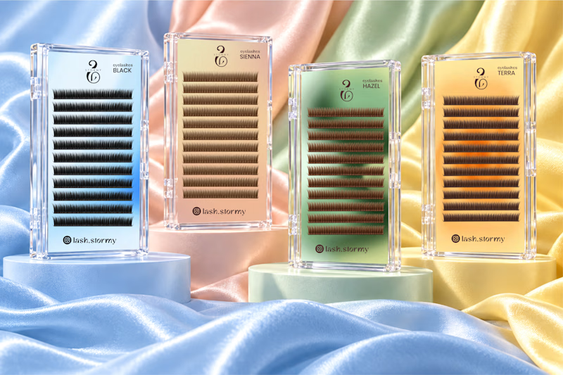
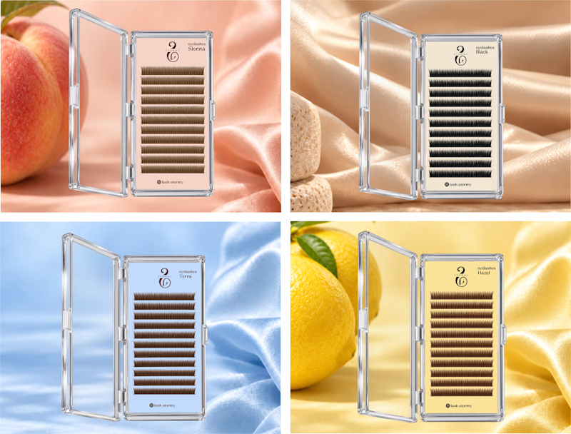
Two packaging directions for STORMY, currently in progress ✨
Exploring soft pastels and richer color finishes for the lash collection.
Which would you choose A or B?
I’d love to hear why.
3 voted
50%
3 voted
50%
6 votes
Closed

Option 1. Seeing the whole lash range together feels more like a proper collection.