The network for creativity
Join 1.25M professional creatives like you
Connect with clients, get discovered, and run your business 100% commission-free
Creatives on Contra have earned over $150M and we are just getting started
Back to feedPost
More visuals from the rejected brand direction I shared earlier.
Really good to see this direction resonating with so many of you. It was one of our favourite explorations to build, from the narrative behind it to the visual world that brought it to life.
Great work doesn’t always make the final cut, and sometimes the reason has little to do with the quality of the direction.
Curious why this one was rejected? I’ve shared the story in the first comment✨


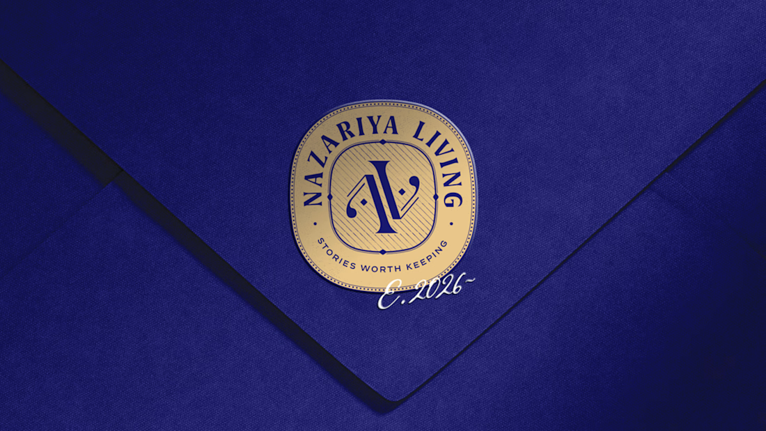
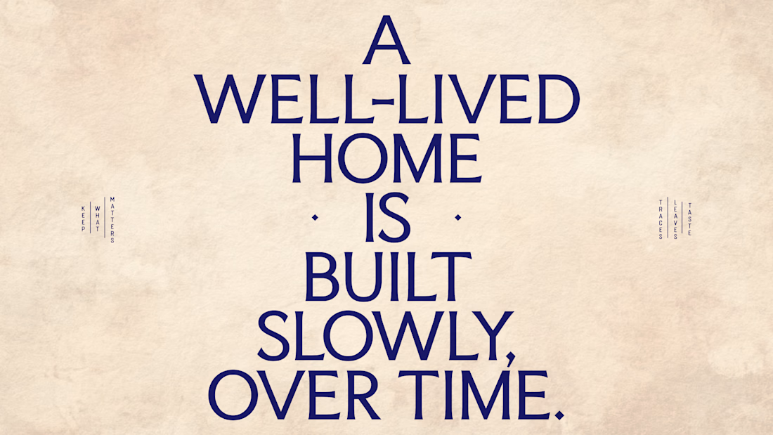
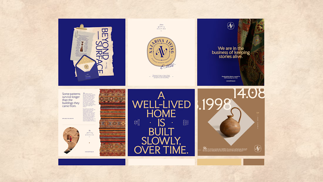
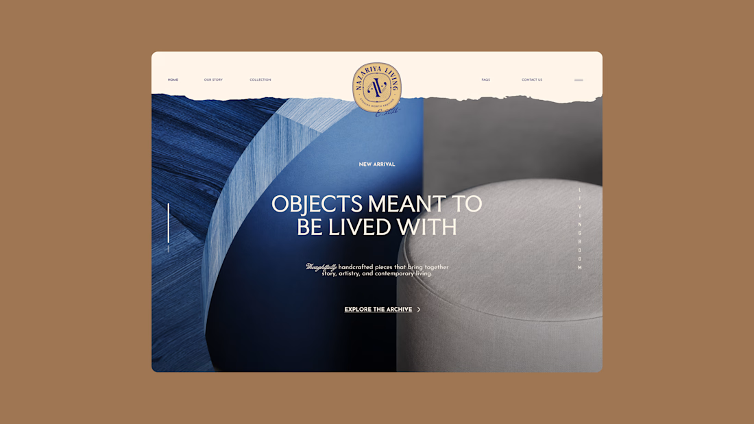

Nazariya Living is a premium carpet and home décor brand shaped by craftsmanship, culture and the stories objects carry into our homes.
This direction brought that idea to life through a seal-inspired logo, archival textures, unexpected colours and editorial typography, creating...


The rejected direction still feels incredibly resolved—especially the seal-inspired mark and editorial type system. The way that story carries through the full set is excellent.

Creative
The network for creativity
Join 1.25M professional creatives like you
Connect with clients, get discovered, and run your business 100% commission-free
Creatives on Contra have earned over $150M and we are just getting started
Trending
retrofuturism
Share your favorite designs from the past exploring the distant future. Or your own take on the aesthetic 🚀
halftone
Dots. Texture. Grain. Let's see your designs using the halftone technique.

Midjourney
Creatives are showing off what they're making with Midjourney.
colorgrade
Video editors sound off: How do you enhance the mood of your video in color grading?
Related posts

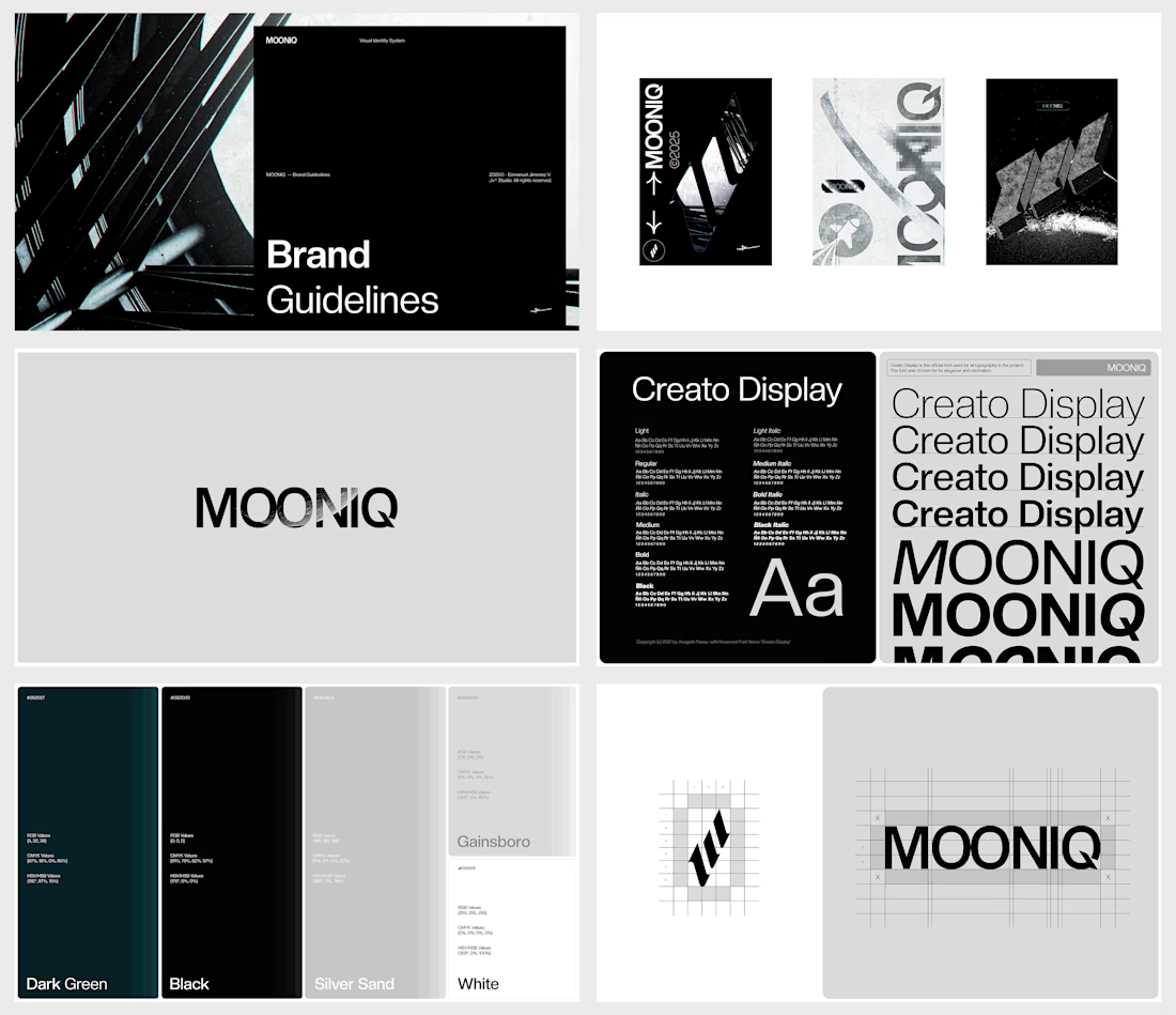
What happens when a digital agency stops looking like every other digital agency?
For MOONIQ, the answer was a visual identity built around exploration, ambition, and limitless growth.
MOONIQ is a digital marketing agency specializing in social media, blockchain, and Web2 consulting. The challenge was to create a brand that could communicate its futuristic vision without sacrificing sophistication, trust, or strategic clarity.
The identity was developed as a complete visual system — from the logo and typography to the color palette and supporting applications — creating a distinctive presence designed to position MOONIQ as a guide for brands reaching new heights.
A bold identity for a brand built to move forward.
Featured twice on Behance — Branding & Stock.
Building a brand that deserves to be remembered? Let’s talk.


Pretty cool! Is this website live ?

I designed this logo when I had just started learning graphic design. A few weeks ago, my client reached out wanting a rebrand because the business has grown and the old identity no longer reflects where the brand is headed.
Trifecta has evolved from a post-op recovery brand into a more elevated aesthetic concierge experience, so I wanted the new identity to feel more refined, feminine, and luxurious while still keeping a connection to the original brand.
This was such a good reminder that design should grow with the business, not just look good.
Which one do you prefer: the original logo or the rebrand?
2 voted
33%
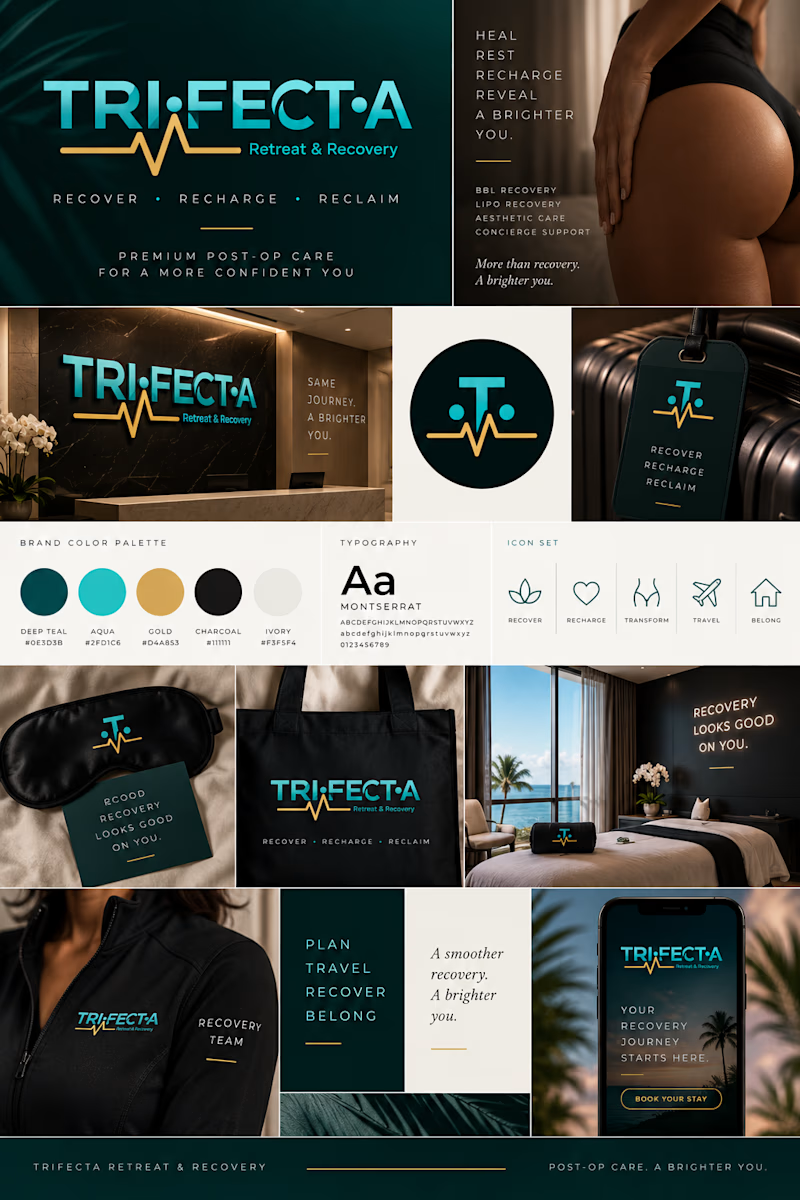
4 voted
67%
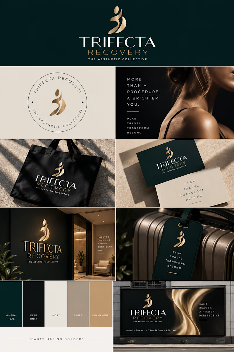
6 votes
Closed

Rebranding your own early work must hit differently than doing it for someone else's business. Are you expecting the redesign to run away with the poll, or does the original still have people rooting for it out of nostalgia?

Real-time interactive orb built for a smart home landing page concept. Cursor-based movement, hover-triggered status panel, tuned lighting to match warm golden-hour ambient scene. No baked animation everything driven by live interaction.


So cool man. Love the animation