The network for creativity
Join 1.25M professional creatives like you
Connect with clients, get discovered, and run your business 100% commission-free
Creatives on Contra have earned over $150M and we are just getting started
Back to feedPost
OpenHaus Visual Identity pt. 2
OpenHaus is a vibrant house music festival, made for anyone and everyone.
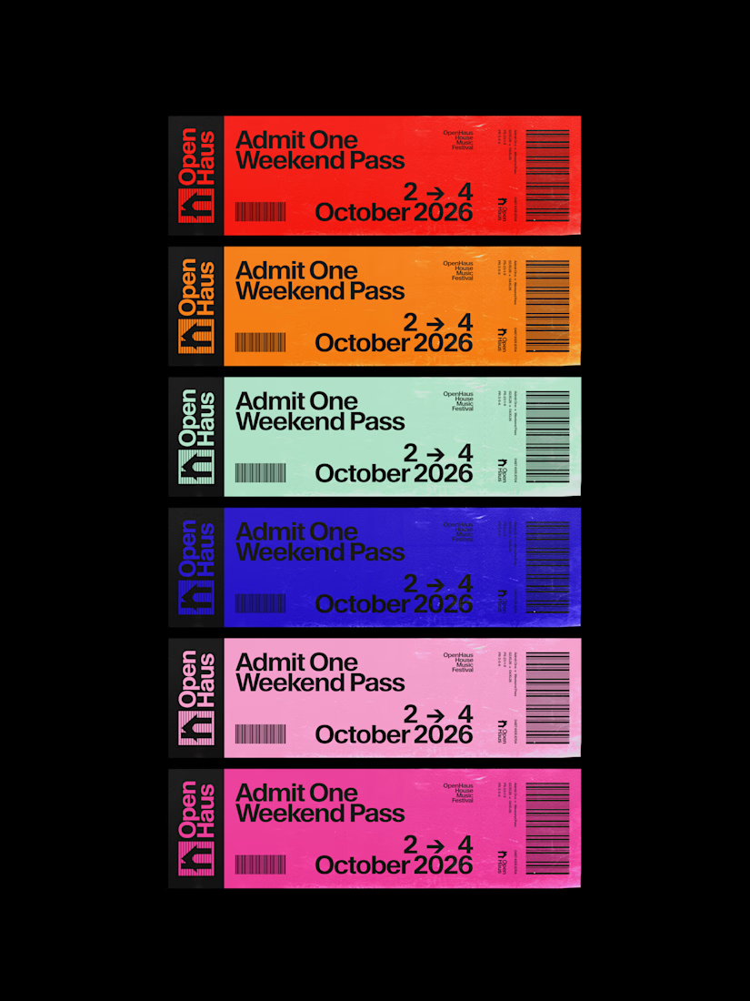
The visual identity leans into bold, saturated color paired with bold typography and structured, grid-based layouts. It feels colorful and inviting on the surface, but stays grounded by a level of restraint that gives it a more considered feel.
The logomark combines a lowercase "h" with a triangle, forming the silhouette of a house, a small, playful nod to the genre and the name itself.
View the full project here:
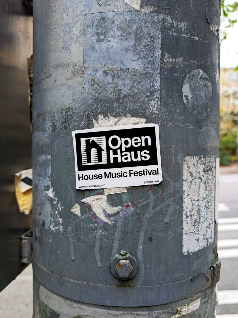

The lowercase "h" + triangle logomark is a clean, readable nod that still reads at festival scale — pairing that kind of restrained mark with saturated color and a grid means the identity can stretch across posters, merch, and wayfinding without getting busy. Curious whether you...

This feels visually intriguing.

I love this project 😍

Thank you! ❤️❤️

The little house made from the h and a triangle is a clever logomark. Those tickets look good too.


Love this!
The network for creativity
Join 1.25M professional creatives like you
Connect with clients, get discovered, and run your business 100% commission-free
Creatives on Contra have earned over $150M and we are just getting started
Related posts

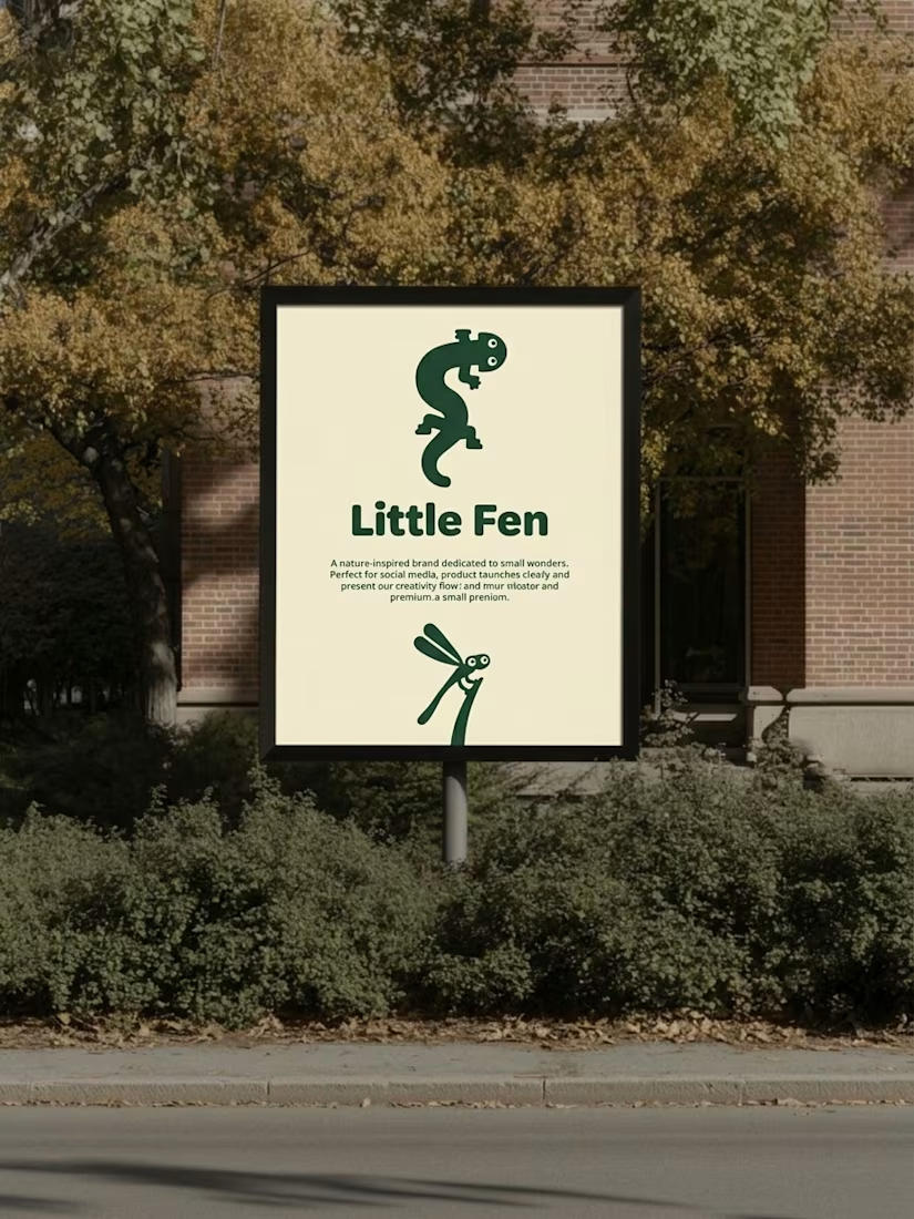
Kids don’t read brand guidelines. They poke things.
So every creature in Little Fen has eyes. On the site, they follow you.
Case study is live.


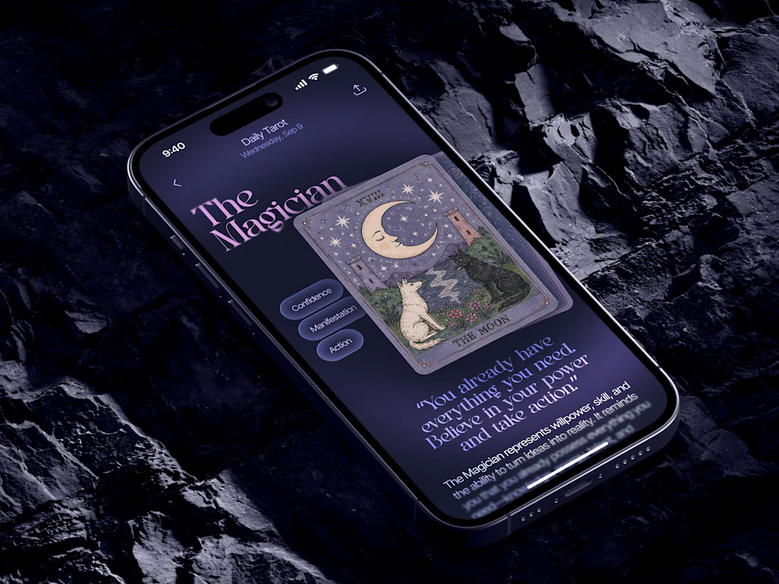
Just in time for Halloween! 🎃🔮 Excited to share this mystical tarot reading app concept, inspired by a little spooky season magic. Would love to hear your thoughts! ✨


Excellent work!

New on Contra, not new to design.
I draw logos by hand, then build everything around them: the brand, the website, the store. Lately I also make product films and ads with AI.
Recent work: an RY monogram and site for a Koreatown law firm, a winged W for a defense firm, and my family's golf eyewear brand, from the mascot to Shopify.
Starting a brand, or have one that doesn't feel like you yet? Show me what you're building.
The logo-led system reads tight because the wordmark sits clean in the negative space instead of fighting the emblem — when a brand has that kind of restraint, the Shopify store usually carries the same hierarchy into the product grid and checkout without inventing new rules....