The network for creativity
Join 1.25M professional creatives like you
Connect with clients, get discovered, and run your business 100% commission-free
Creatives on Contra have earned over $150M and we are just getting started
Back to feedPost
Introducing OpenHaus, a vibrant house music festival, made for anyone and everyone.
The visual identity leans into bold, saturated color paired with bold typography and structured, grid-based layouts. It feels colorful and inviting on the surface, but stays grounded by a level of restraint that gives it a more considered feel.
The logomark combines a lowercase "h" with a triangle, forming the silhouette of a house, a small, playful nod to the genre and the name itself.
View the full project here:
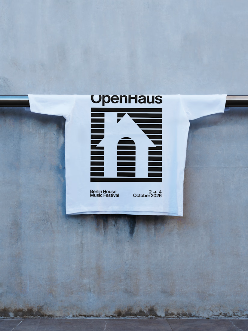
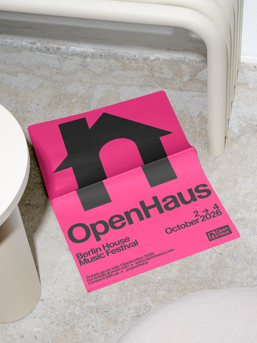
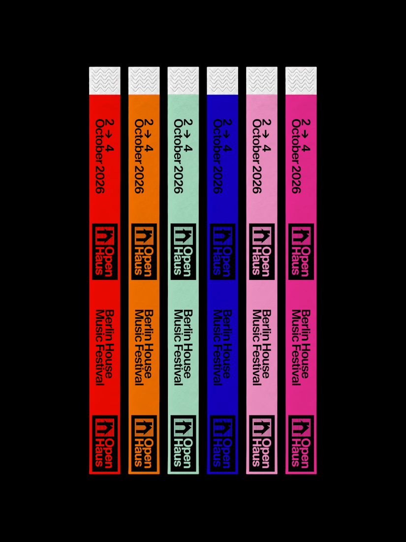

The lowercase h doubling as a house silhouette reads instantly, and it still holds up as a single-colour print on the tee. Did the grid come first and the mark get fitted to it, or the other way around?

Great color palette and logo design 🎉🎉

Thank you! 💓
Pardon Nadia❤️

The house-shaped h is a thoughtful connection between the name and the music genre. I also like seeing the mark work in one colour on the T-shirt—it gives the identity a practical life beyond the poster.

Great work, Nadia! It's always tricky balancing vibrant festival visuals with layout restraint, but you nailed the system for OpenHaus. Checking out the full project now! 🙌
🫶🏻🫶🏻

Thank you! 💓

The lowercase h doubling as a little house is a clever mark for a house music festival. The saturated colors keep it fun without feeling messy.


Strong identities begin with a clear vision.

Nice!

Wow

I really love how the lowercase "h" and triangle come together to form the house symbol. Such a clever and simple concept!
The network for creativity
Join 1.25M professional creatives like you
Connect with clients, get discovered, and run your business 100% commission-free
Creatives on Contra have earned over $150M and we are just getting started
Related posts

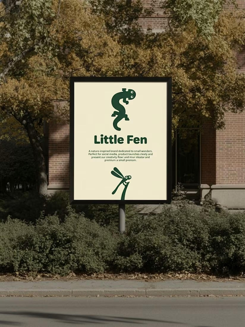
Kids don’t read brand guidelines. They poke things.
So every creature in Little Fen has eyes. On the site, they follow you.
Case study is live.


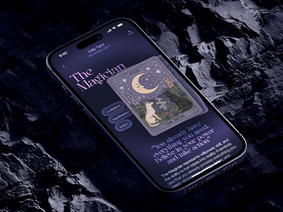
Just in time for Halloween! 🎃🔮 Excited to share this mystical tarot reading app concept, inspired by a little spooky season magic. Would love to hear your thoughts! ✨


Excellent work!


Really nice one, Max!