The network for creativity
Join 1.25M professional creatives like you
Connect with clients, get discovered, and run your business 100% commission-free
Creatives on Contra have earned over $150M and we are just getting started
Back to feedPost

Just wrapped up a new case study for SuperMatics, a California-based tech company combining physics and AI to discover new superconducting materials.
The challenge was to create an identity that felt credible in the scientific world without looking like another typical AI startup.
Lots of exploration went into the geometric symbol, typography, and colour system, with a mix of technical precision and a more playful side across the applications.
Really enjoyed bringing this one together. Would love to hear what you think!
Full case study here 👇

Nice this looks

Love the cleanliness in this🔥

Cool brief!

Great concept and a very strong visual direction.
The network for creativity
Join 1.25M professional creatives like you
Connect with clients, get discovered, and run your business 100% commission-free
Creatives on Contra have earned over $150M and we are just getting started






Related posts
A fresh identity for Flankman, a US-based industrial intelligence company.
The idea was to bring together two different worlds: the credibility of traditional finance and the character of contemporary editorial design.
Really enjoyed exploring this one and giving a traditionally corporate industry a more distinctive visual personality.
Brand identity by Katlan.co ©

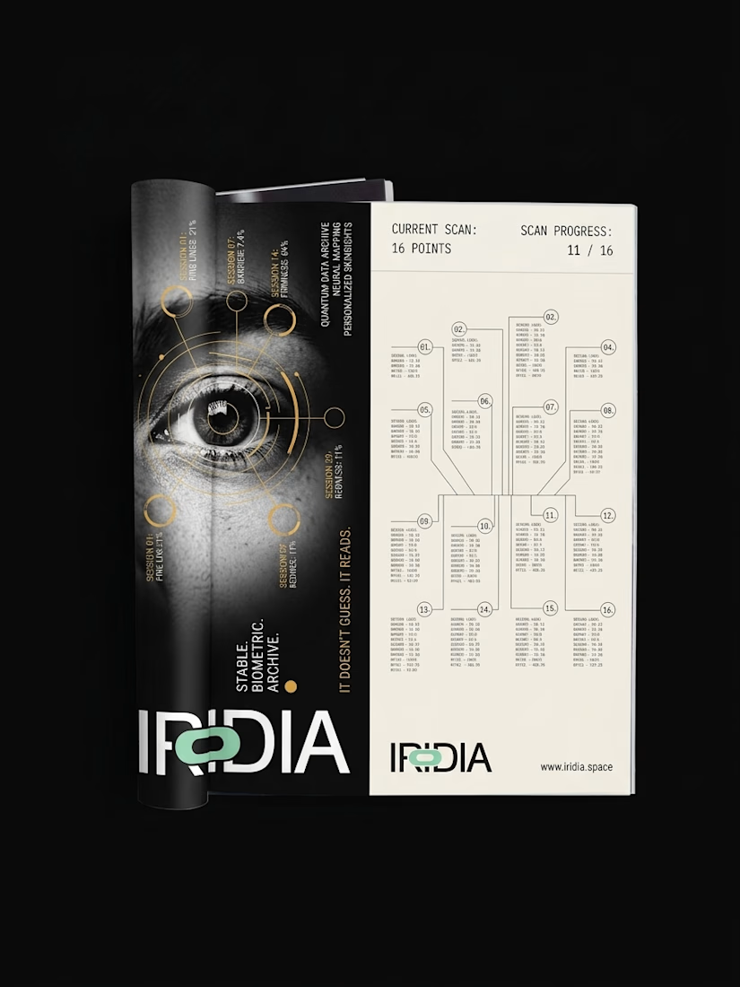
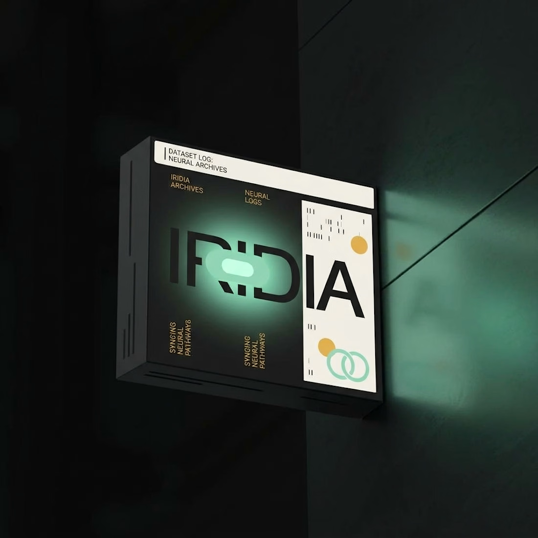
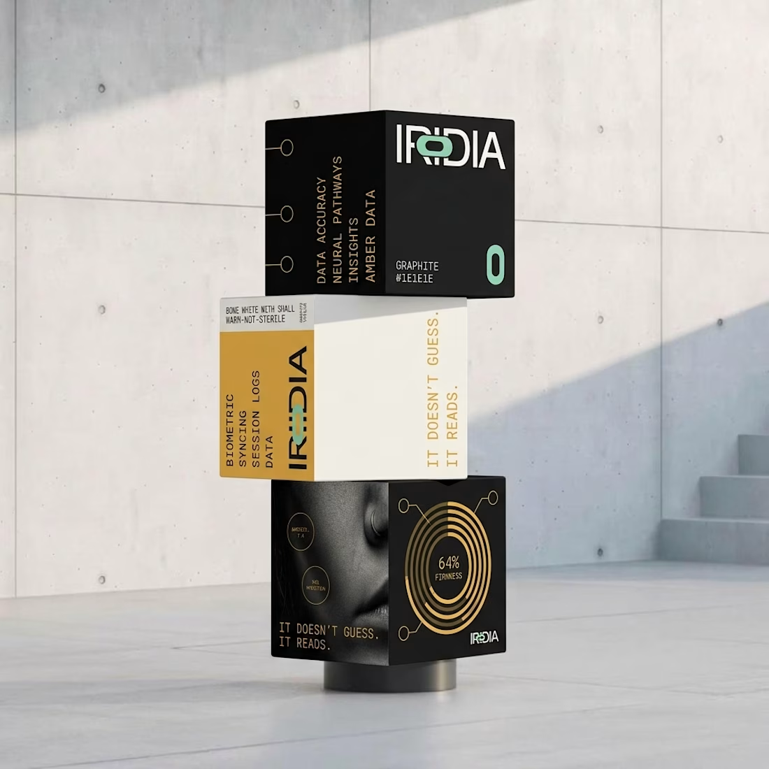
What happens when you pull one forgotten brand out of a folder full of them?
Iridia sat half finished next to the rest.
I locked the references and pushed it all the way to 10 campaigns, OOH, product and packaging.

A 23-second reel of recent FANCY work: fintech landing pages, crypto cards, mobile app screens and 3D hero animation.


