
LOGLINE
A brand nobody asked for, pulled out of a folder of unfinished ones. I locked the references, gave an AI skin reader a voice that states findings instead of selling them, and took it from three images to a full campaign system.
THE BRIEF
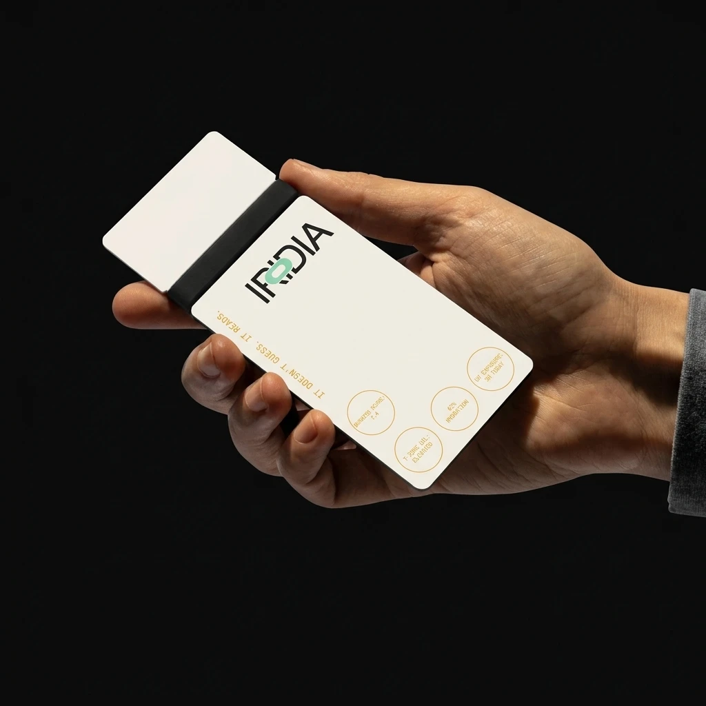
Nobody commissioned Iridia. It started as one of many brands I keep in a folder at different stages: a name here, a palette there, a few posters that never went anywhere. This one had three reference images and a strong feeling, and nothing else holding it together.
The product I invented is an AI skin and facial analysis tool. It maps the face, reads skin data, and returns suggestions based on the person’s actual structure. The audience is adults who are tired of filters, before and after photos, and wellness language dressed in pastel gradients. They distrust anything that flatters them and respond to anything that shows its evidence.
The real problem was tonal. A tool that reads your face can go cold and clinical, or it can go soft and performative. I needed it precise enough to be believed and close enough to the skin that it still felt personal.
WHAT I DID
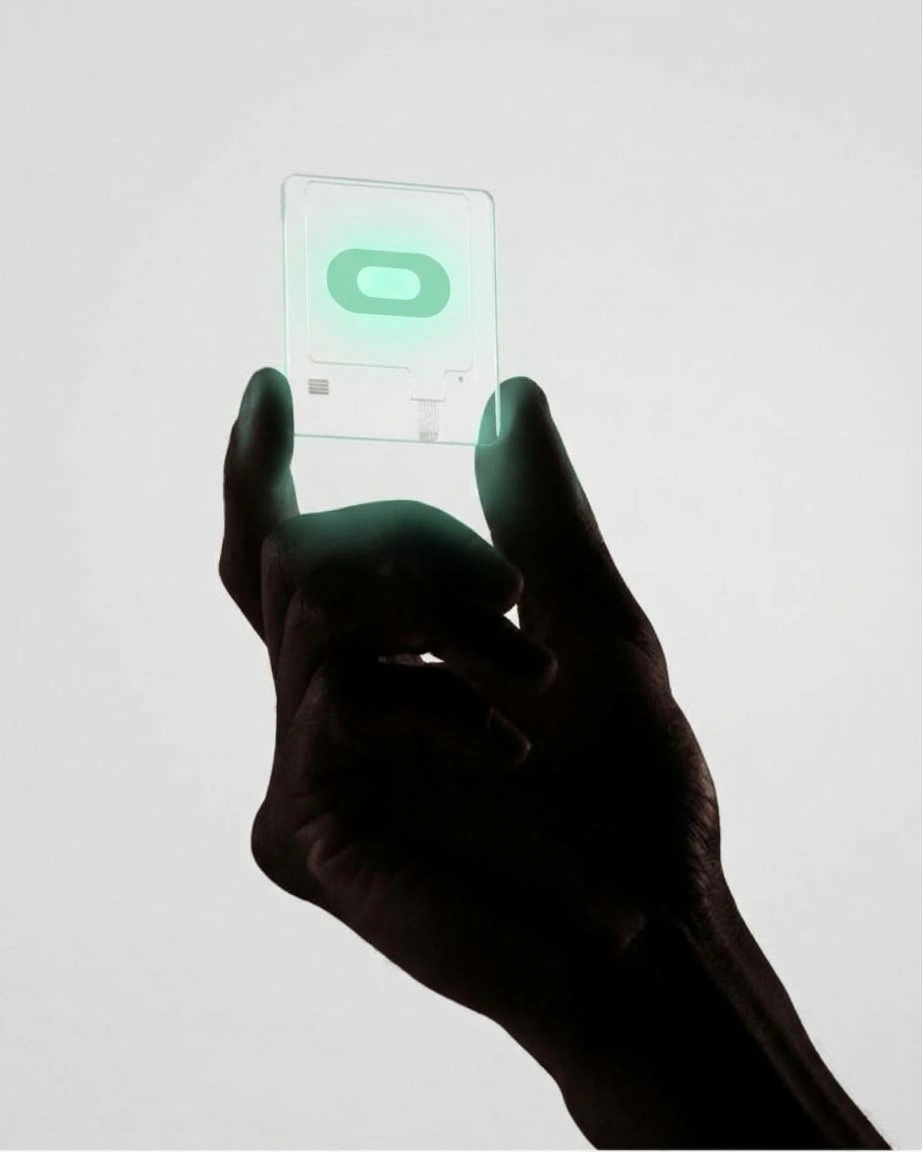
I handled naming, brand strategy, identity, color and type systems, campaign concepts, out-of-home, product interface and packaging touchpoints. Self-initiated, no client.
THE APPROACH
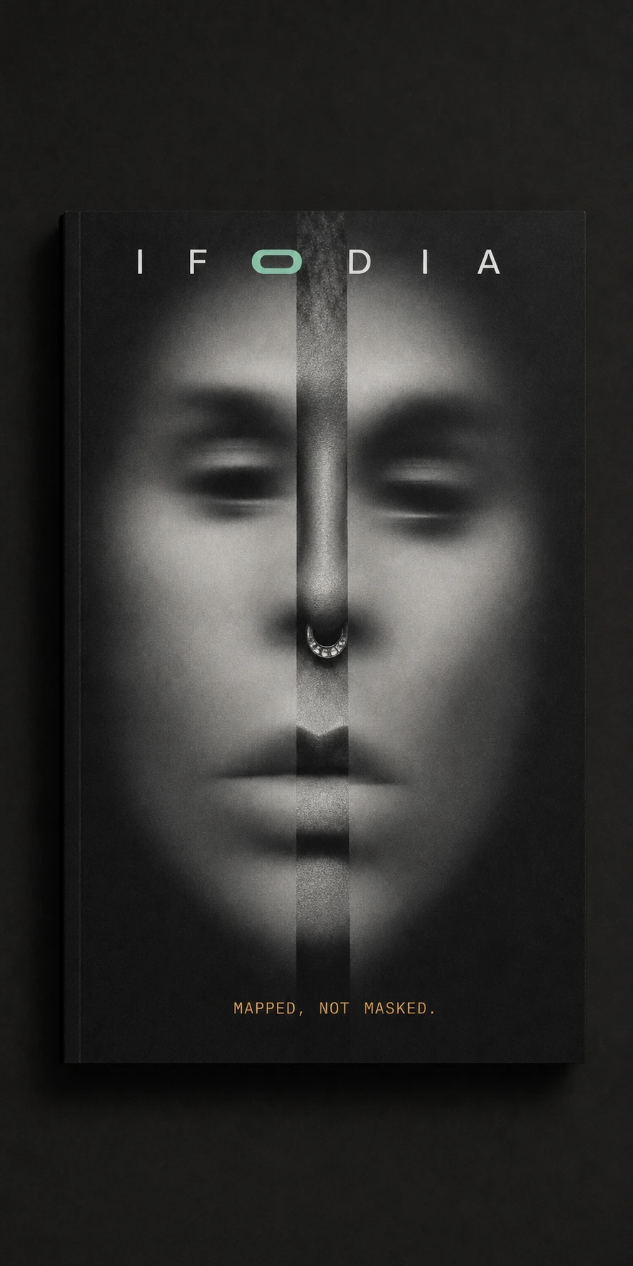
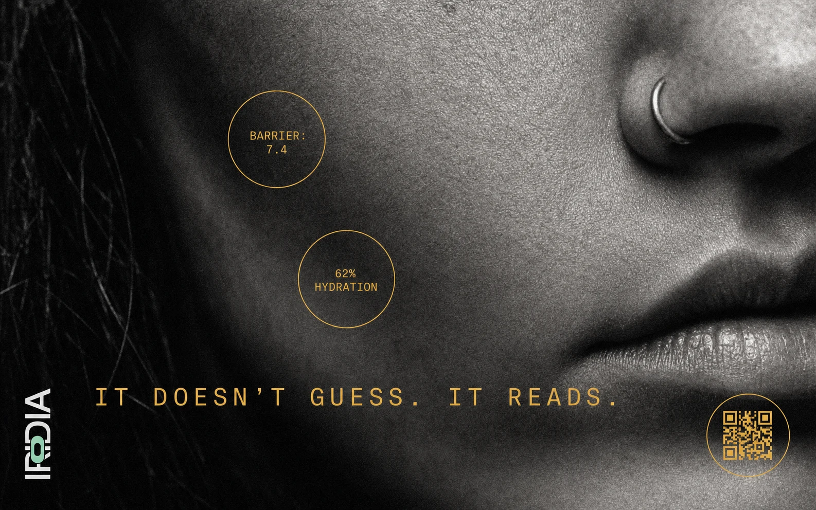
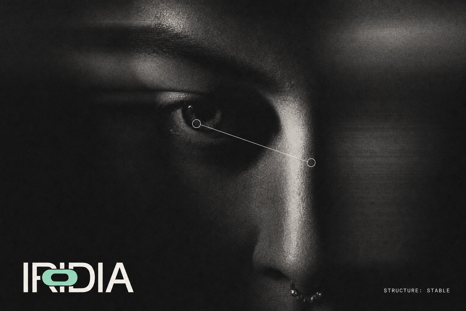
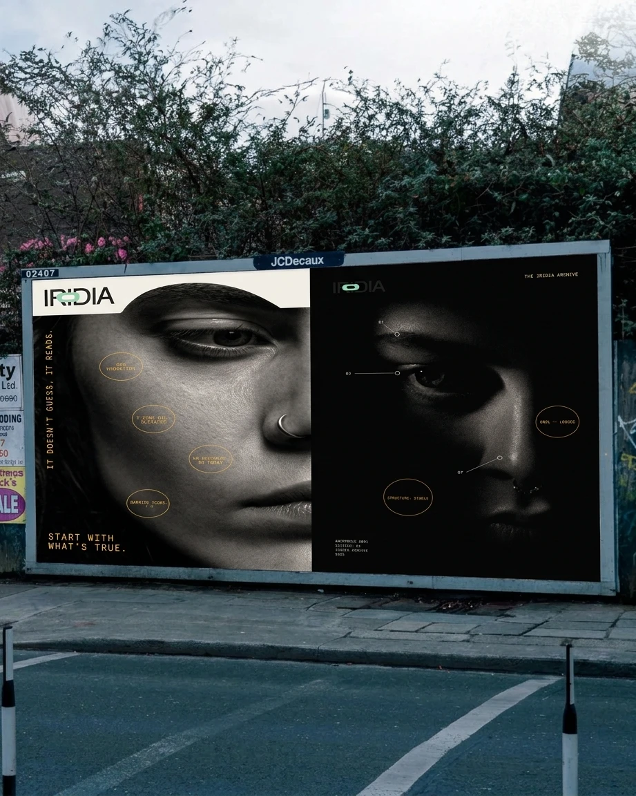
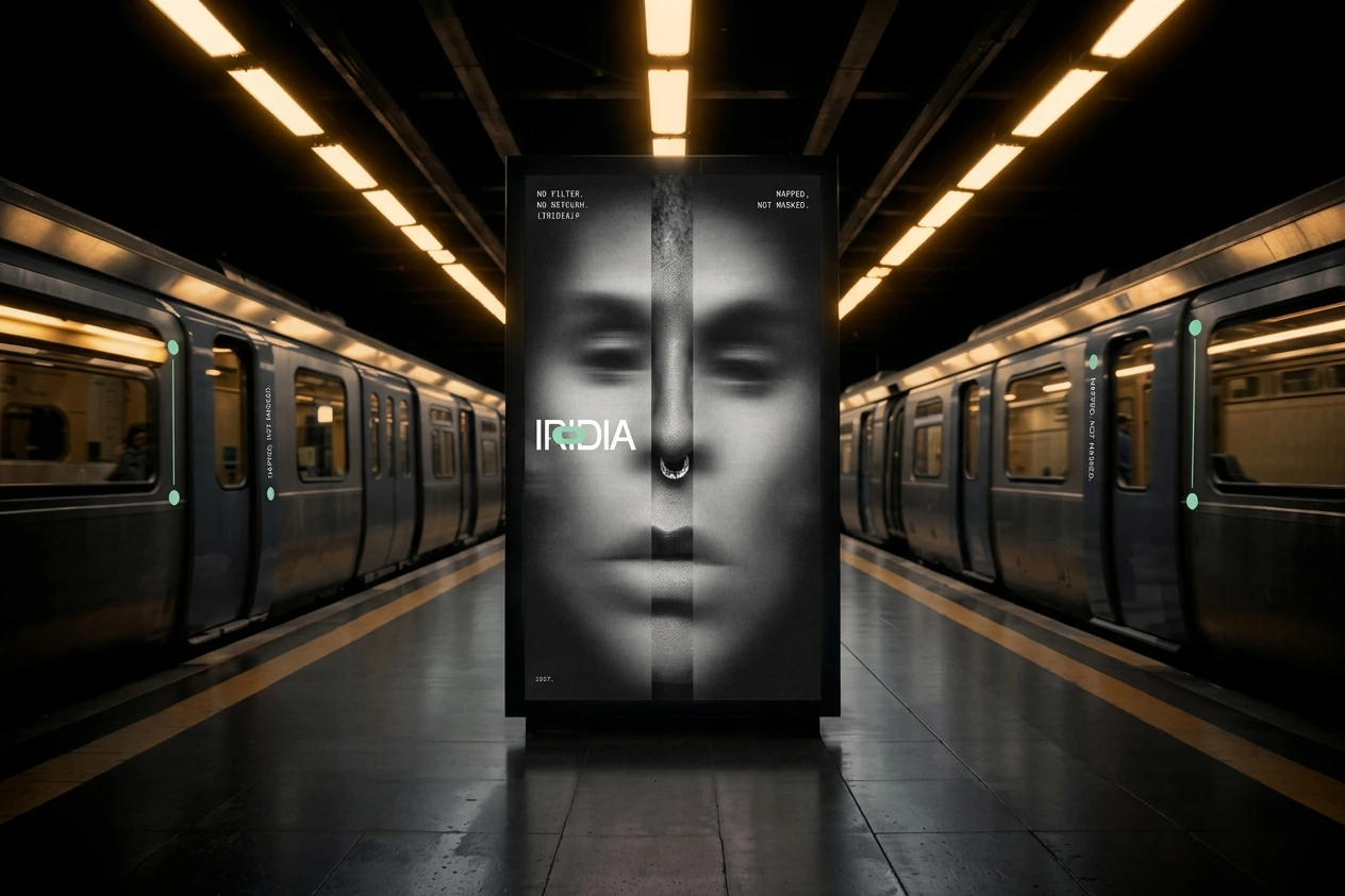
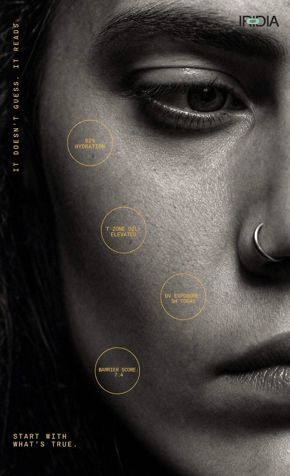
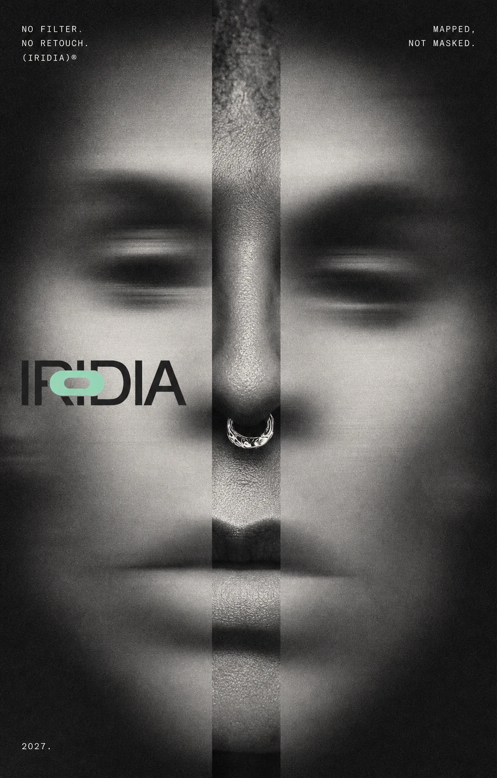
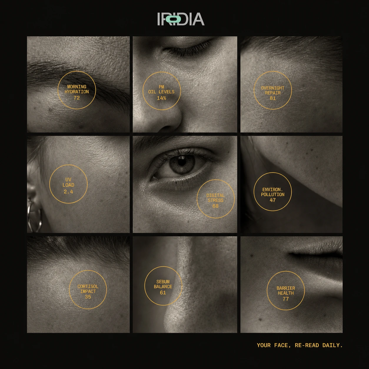
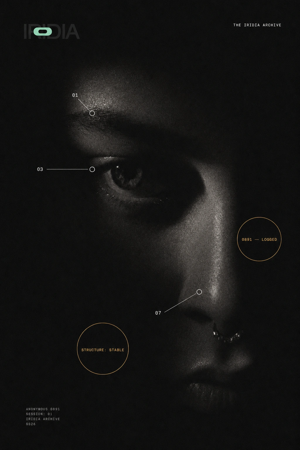
The first decision was a constraint. The references had a specific language: circular data callouts on macro skin, a numbered facial landmark map, and a grainy portrait split by one sharp vertical strip. I decided those compositions would not change. Everything else could move, but the visual system was locked from the first hour.
That constraint is what brought the project back to life. A folder of unfinished brands usually stalls because every decision is still open. Locking the aesthetic turned the work into a sequence of small answers. My first ten directions varied only the name, the world around the images, and the palette. When I reframed the product as AI-powered facial analysis, I cut literal names like MAP.FACE and PLOT.FACE because they described the function and said nothing about how it should feel. Iridia, rooted in the iris, sounded like a company and a lens at the same time.
The honest pivot came later. My written spec called for a Skin Tan accent and an amber of
#D9A441. When I sampled the finished visuals, neither held. The work had introduced a mint capsule in the logo that the spec never mentioned, the amber had settled near #E2AE4A, and the photography ran monochrome with no tan at all. I rewrote the palette from the work instead of forcing the work back to the spec.What made it click was a rule about restraint. Amber appears only where data is being shown. Mint appears only in the logo. Everything else is black, bone, grey and grain.
THE WORK
LOGO
A heavy grotesque wordmark with a mint capsule (
#91D7B7) sitting between the R and the D. It reads as an eye aperture and as a status light, and it detaches as a standalone mark for the product, the box lid and the app icon.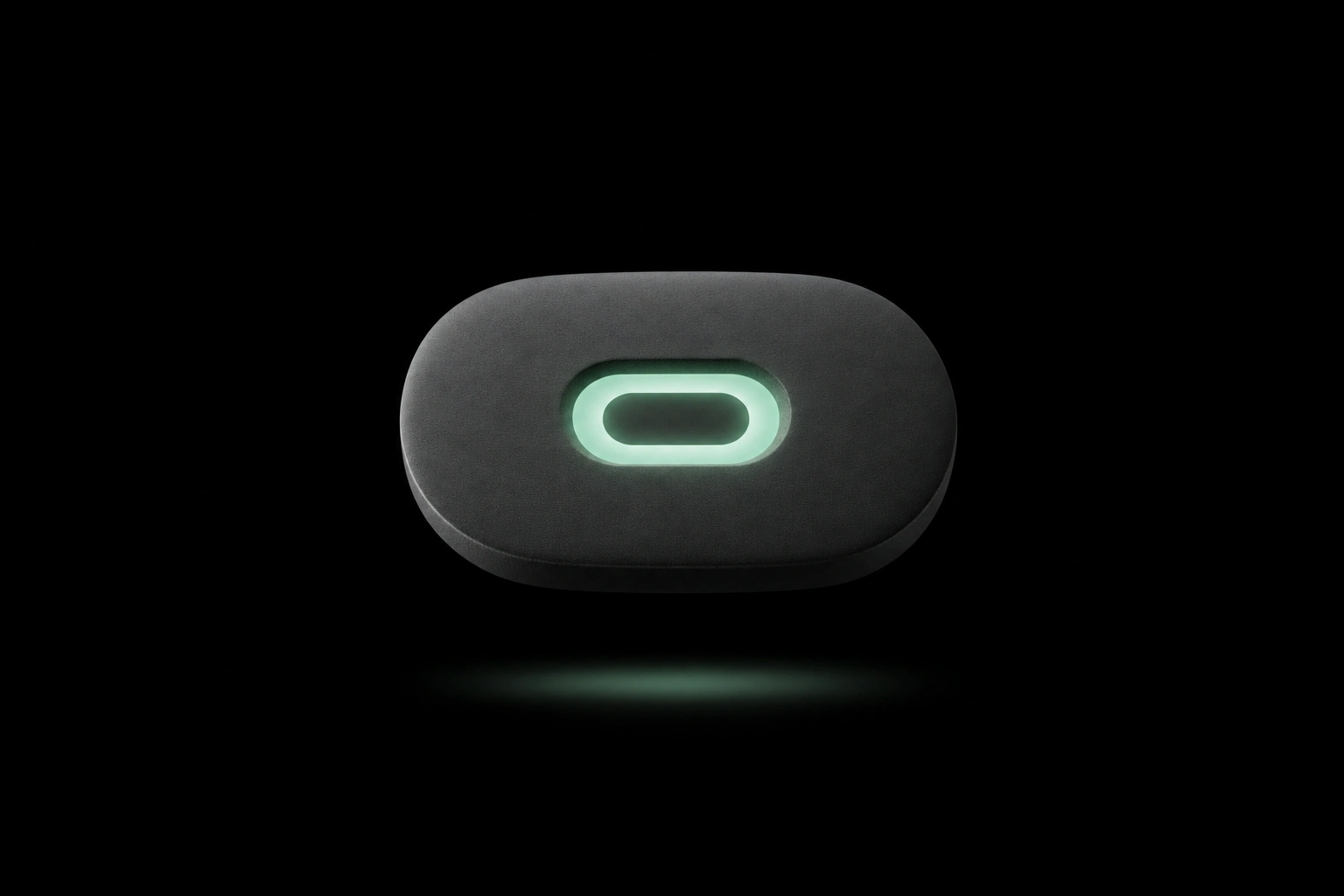
COLOR SYSTEM
Iris Black
#0A0A0A as the dominant ground. Bone White #F2EEE6 as the one warm light surface. Amber Data #E2AE4A for metrics and callouts only. Mint #91D7B7 for the logo only. Graphite #1E1E1E for the wordmark on light. The photography supplies the greys, from #B2AEAA highlights down to #3E3E3E shadows.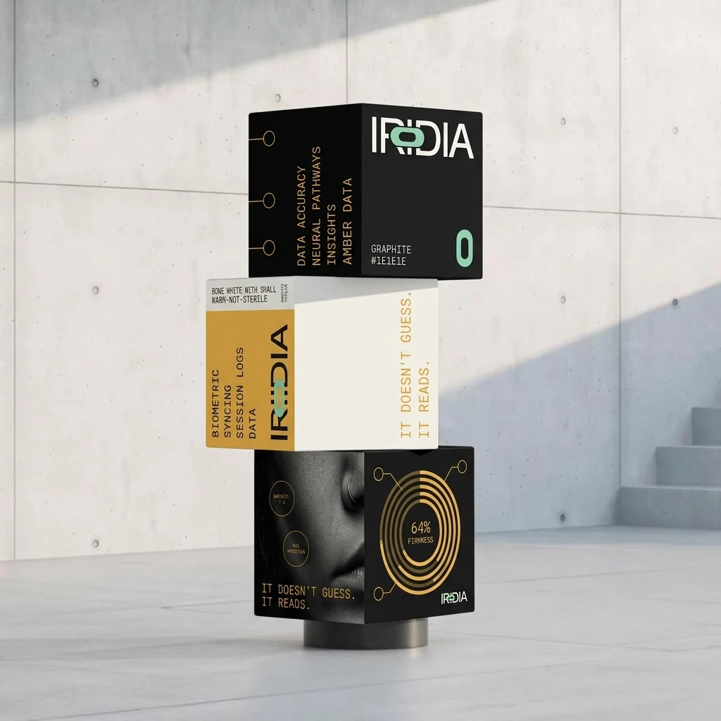
TYPOGRAPHY
Three roles. A heavy grotesque for the wordmark and headlines, a monospace in tracked caps for every number and label, and a quiet humanist sans for longer copy. Display sets the mood, mono delivers the facts, body explains. Never more than those three on one surface.
PHOTOGRAPHY AND DATA DEVICE
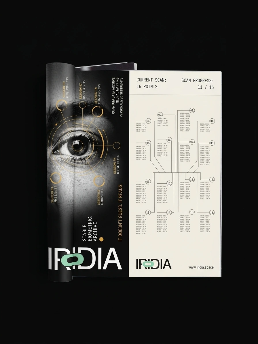
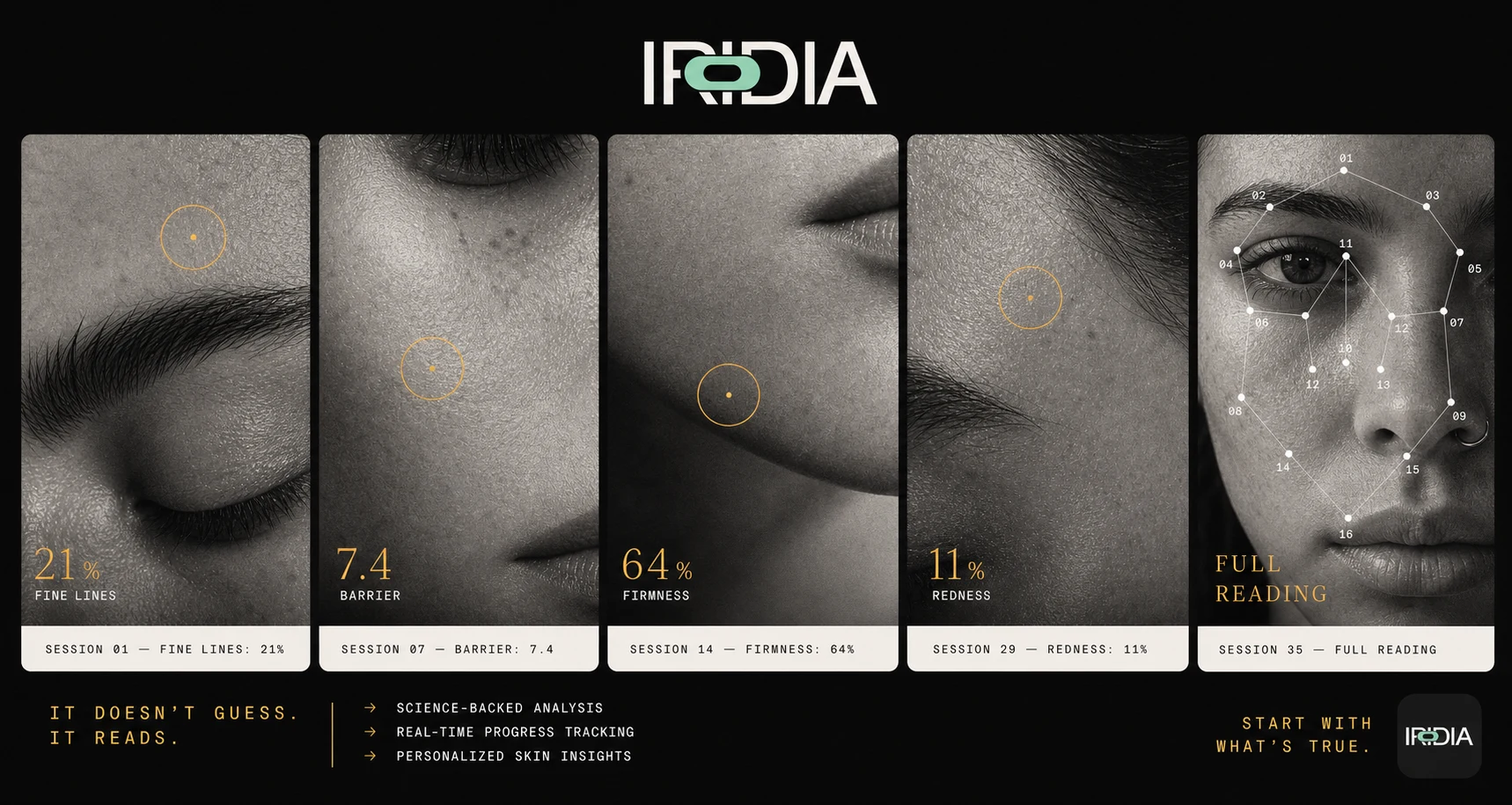
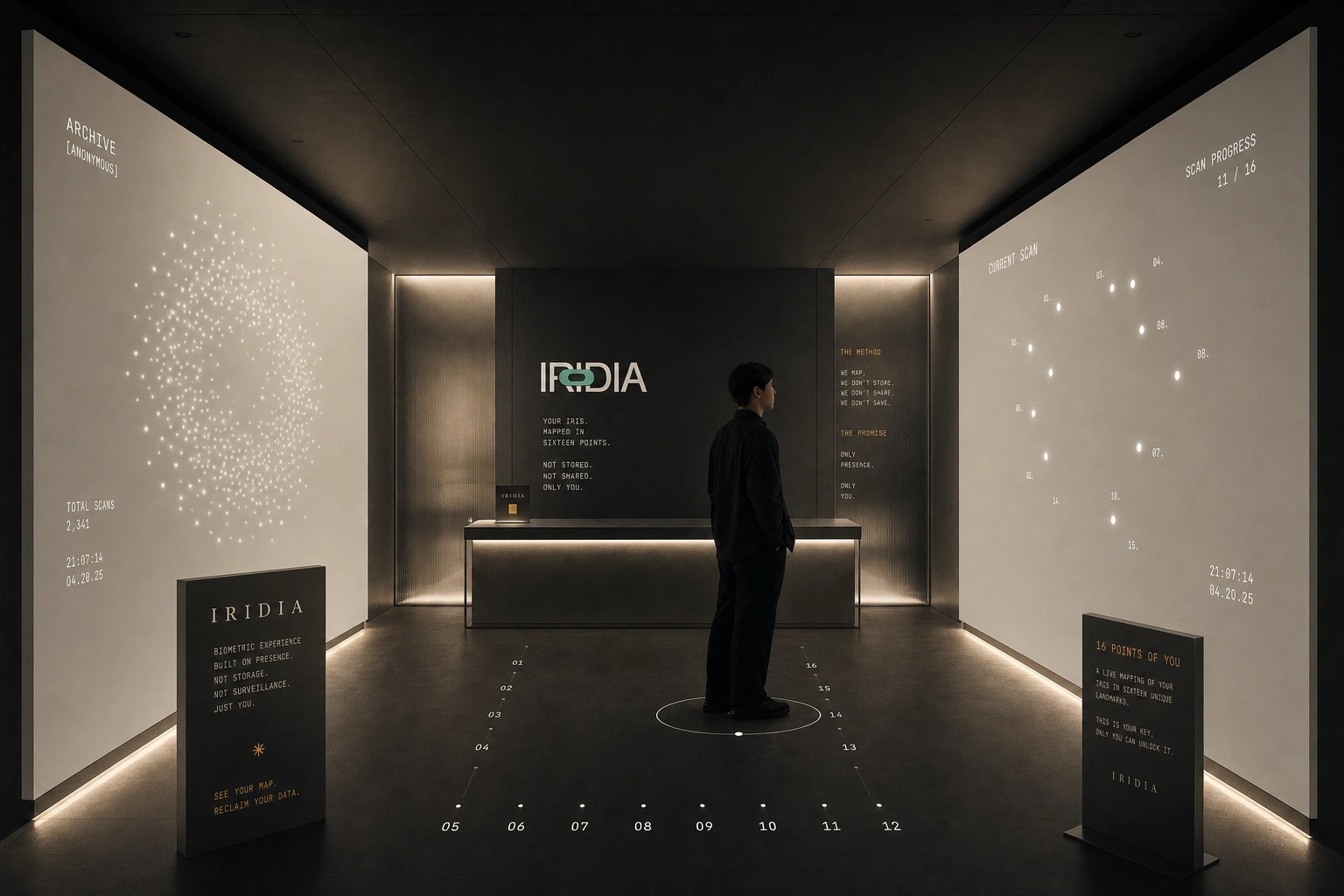
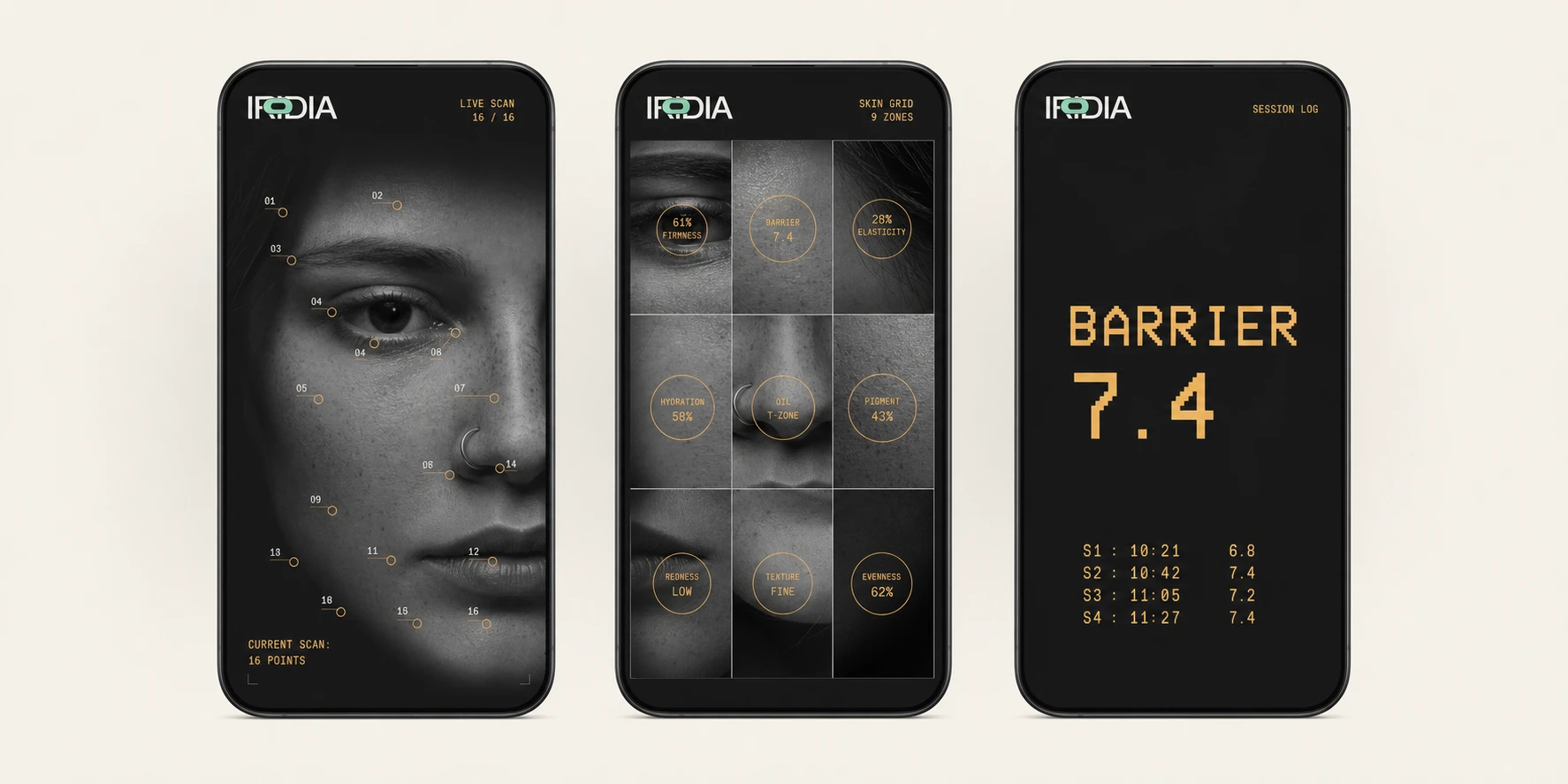
Macro skin, heavy grain, one directional light source, zero retouching. The signature is the callout: a thin amber ring, a monospace label, one metric per ring. The 16-point landmark grid handles the scan moment, with the line “Every face is a coordinate set.”
CAMPAIGNS
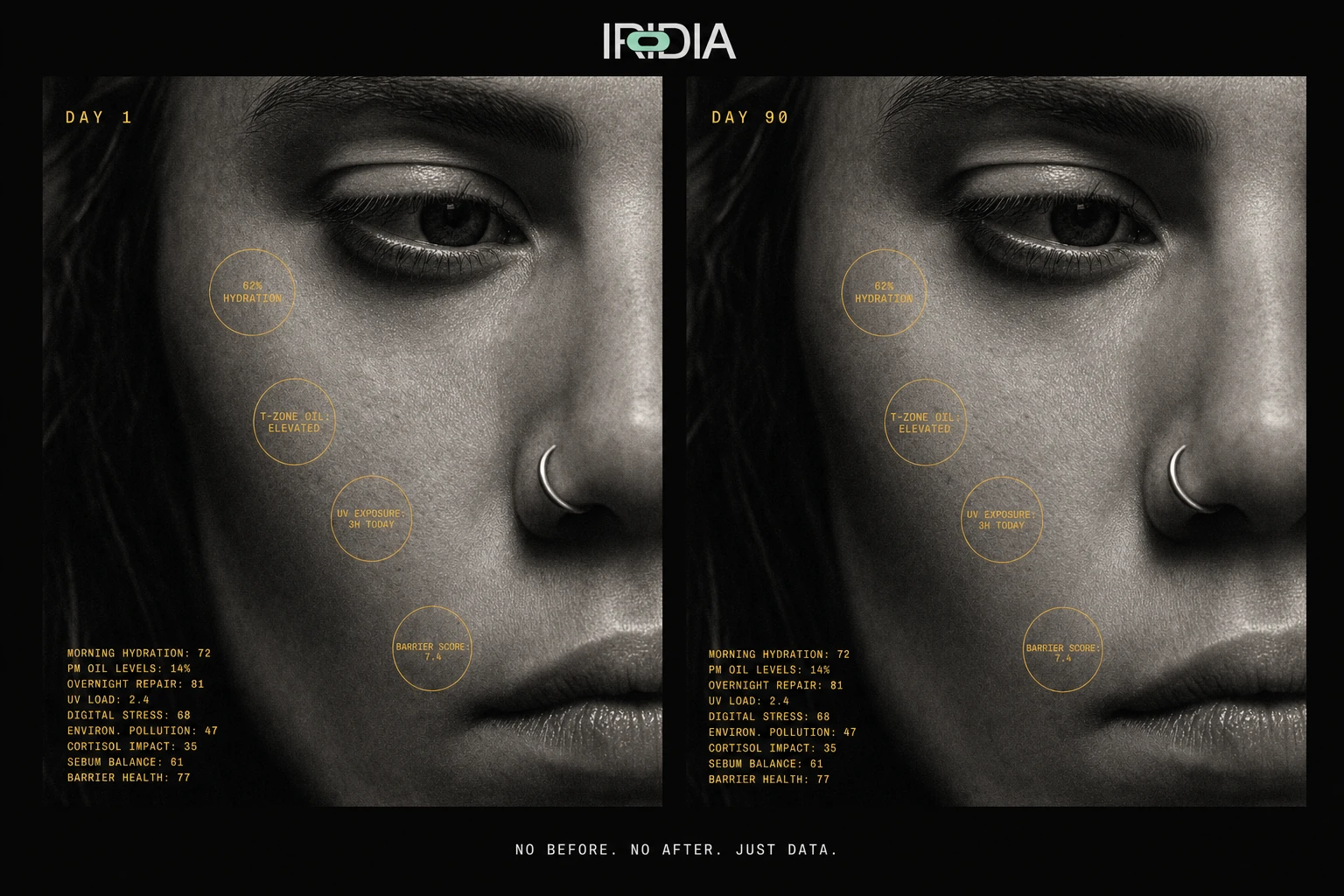
Ten concepts, each anchored to one of the three reference compositions: READ (launch), THE SCAN (onboarding), UNRETOUCHED (manifesto), DAILY READING (retention), THE ARCHIVE (editorial), ZERO GUESSWORK (metro), STRUCTURE: STABLE (billboard), THE READING ROOM (retail), BEFORE / AFTER: NEITHER (anti-comparison diptych) and SESSION LOG (app store). The voice stays in short declaratives: “It doesn’t guess. It reads.” “No before. No after. Just data.”
PRODUCT AND TOUCHPOINTS
A palm-sized graphite scanner with a single mint aperture. A three-screen app set: live scan, nine-zone skin grid, and a session log with one large amber metric. A pharmacy light panel, a split-portrait cover, and a Bone White reading card beside a matte black box carrying only the mint capsule.
THE RESULT
There is no client, no launch and no metric. What exists is a complete brand system that held across fifteen applications, from a metro panel to a retail room to a product box, without losing its two rules about amber and mint.
The result I care about is harder to measure. A brand that sat unfinished is now complete enough to show, and the folder has a method for the rest: lock the references, name the tension, and let the work correct the spec.
CREDITS
Designer: Révolté (solo freelance designer), revolte.design
Project: Iridia
Year: 2026
Scope: Naming, brand strategy, identity, color and type systems, campaign concepts, out-of-home, product interface, packaging touchpoints
Industry: AI skincare and facial analysis
See more at revolte.design
0 likes · 4 views · Nov 14, 2026
Iridia: an AI skin reader pulled out of a folder of shelved brands. Locked references, one data device, fifteen applications