KON: Loud on the Inside - Brand Identity Project & Website

Révolté


KON: LOUD ON THE INSIDE
LOGLINE
What does hip hop look like when it is sewn instead of shouted? KON is my answer: a denim label where the only loud thing is a blue sketch of two hands, and everything else is patient.
THE BRIEF
KON is a denim label I built from zero. No client, no founder to argue with, which turned out to be the harder brief. With nobody to say no, every decision had to defend itself.

I wrote the contradiction in on purpose. Hip hop is a culture of statements: tags on walls, crates on shoulders, circles of people trading bars. Japanese denim is a culture of restraint: shuttle looms, indigo vats, a label hidden in the pocket bag where only the owner finds it. Mix them carelessly and you get one of two failures. Either the logo shouts and the cloth looks cheap, or the cloth whispers and the culture disappears.
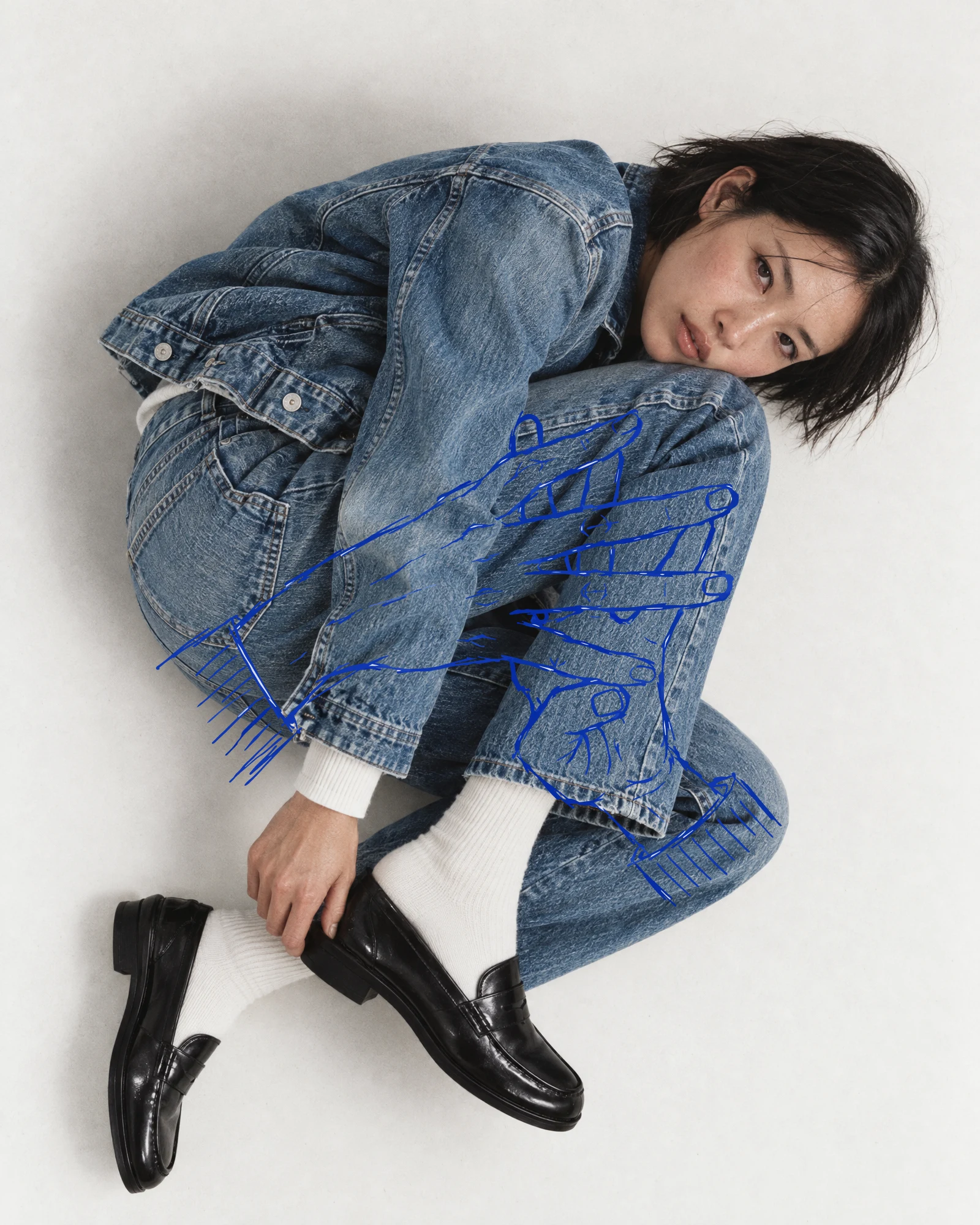
The scope was the whole brand: identity, campaign imagery, a website concept, label details and a soundtrack. The starting material was one doodle. Two hands, fingers interlaced, about to crack, in a single blue line.
THE APPROACH
My first instinct was volume. Big hands across the chest, graffiti energy, a logo you could read from across a street. It lasted one afternoon. Every time the drawing got louder, the denim next to it got quieter, and denim is the product.
The second instinct was the opposite: go blank and let white space do the talking. It looked expensive and said nothing. The hands, the only part of the project with a pulse, had nowhere to live.
The name unlocked it. Kon is the deep blue you only get by dipping cloth in indigo again and again, each pass darker than the last. The brand did not need a mood. It needed a count. I numbered the stops 00 to 06, and let that count run through everything: the palette steps from undyed cotton to deep indigo, every look is named for how many dips it took, every caption carries a number.
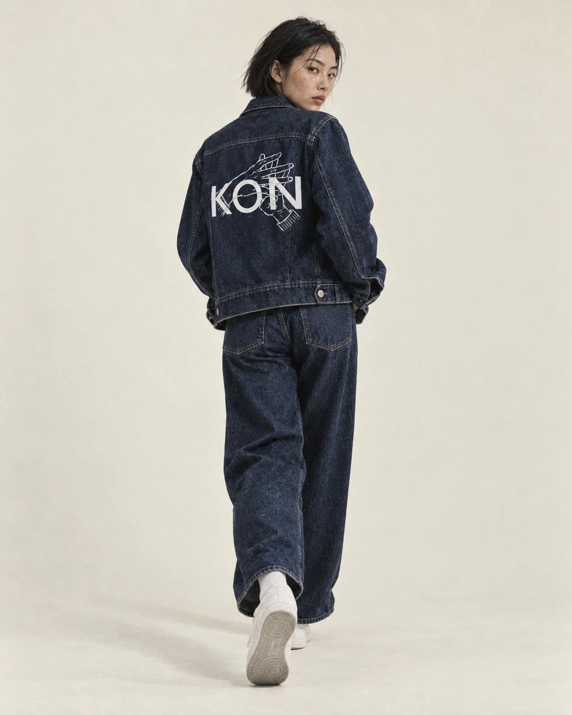
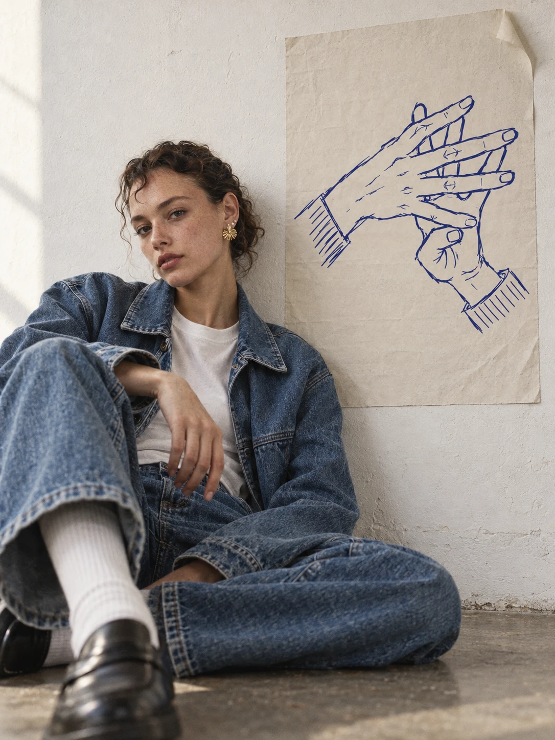
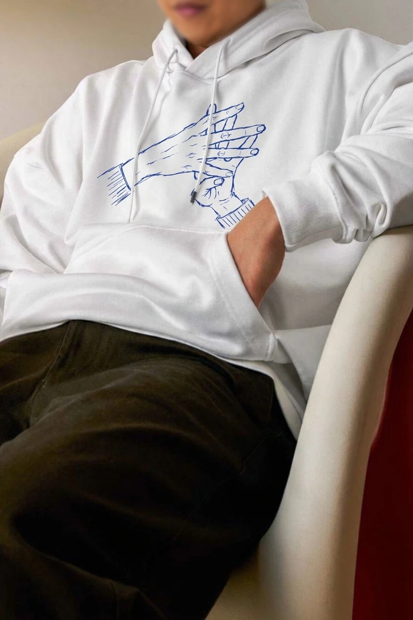
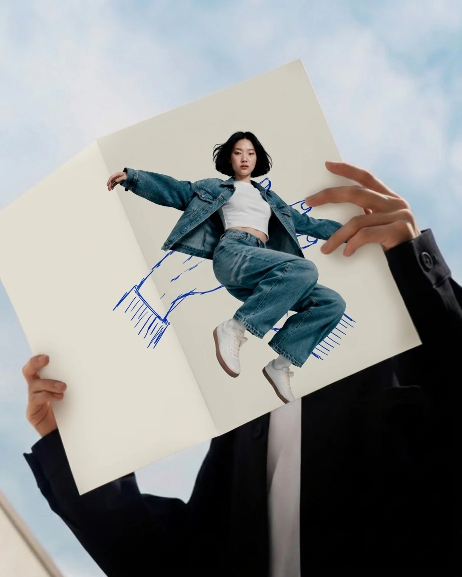
That gave me one rule that settled every argument after it: nothing loud on the front of the cloth. The hands can be as loud as they like, but only around the garment, drawn over photographs like a note in a margin, or inside it, on a label. I tested the drawing on skin as well, because a mark that holds on a shoulder will hold on a woven tag.
THE WORK
LOGO
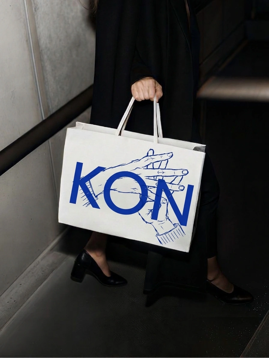
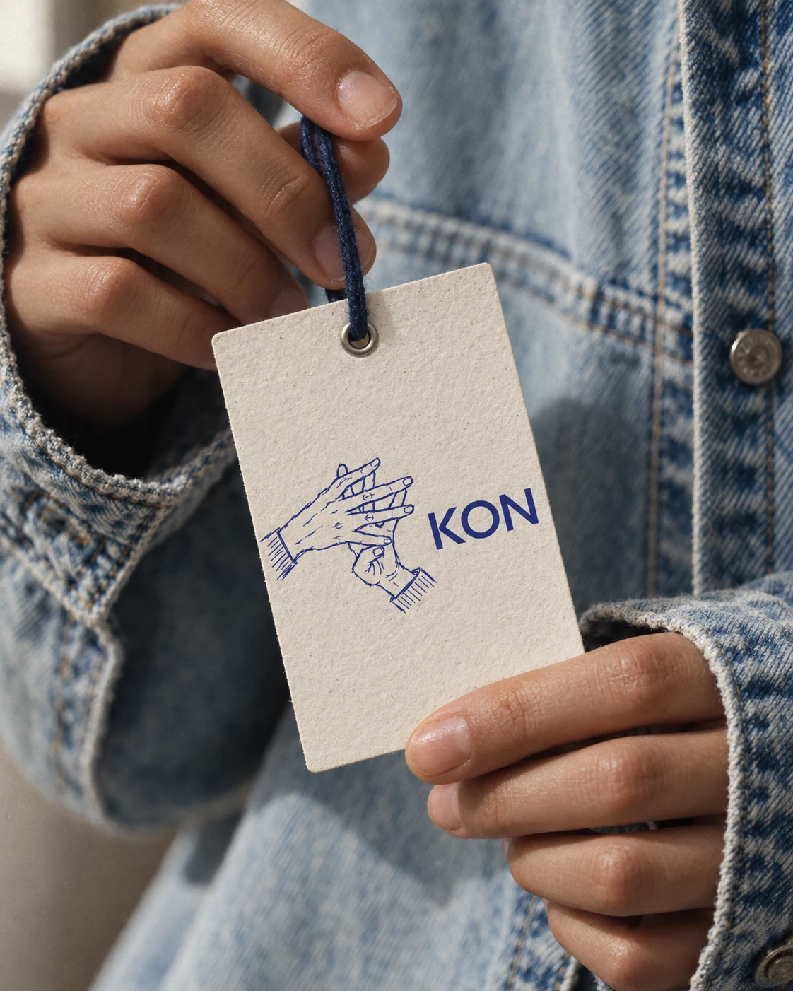
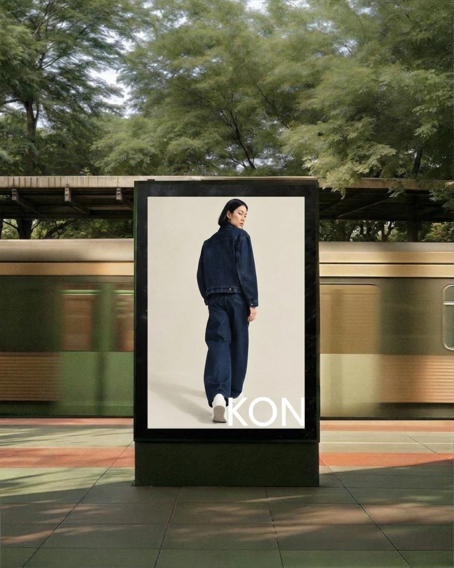
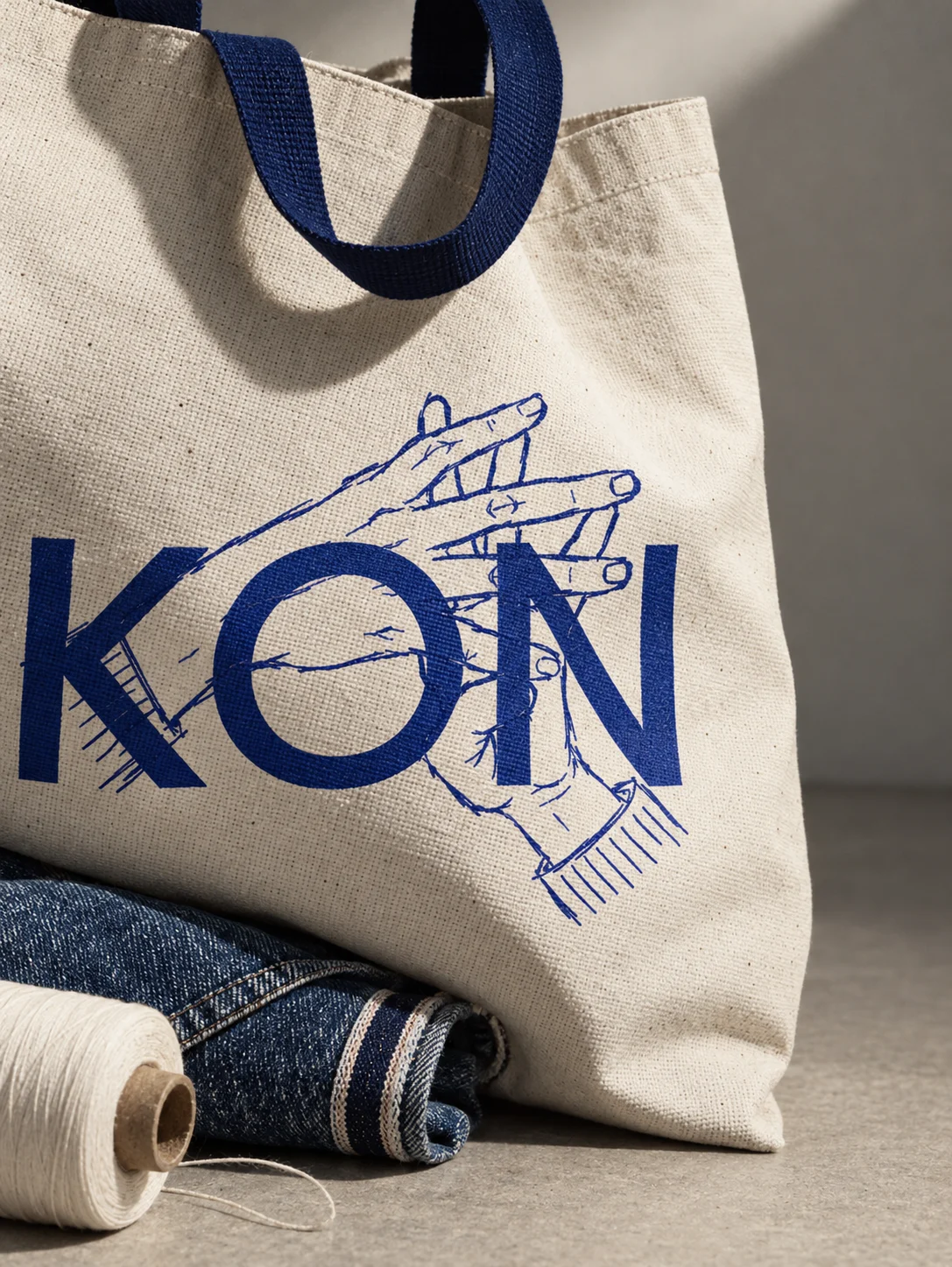
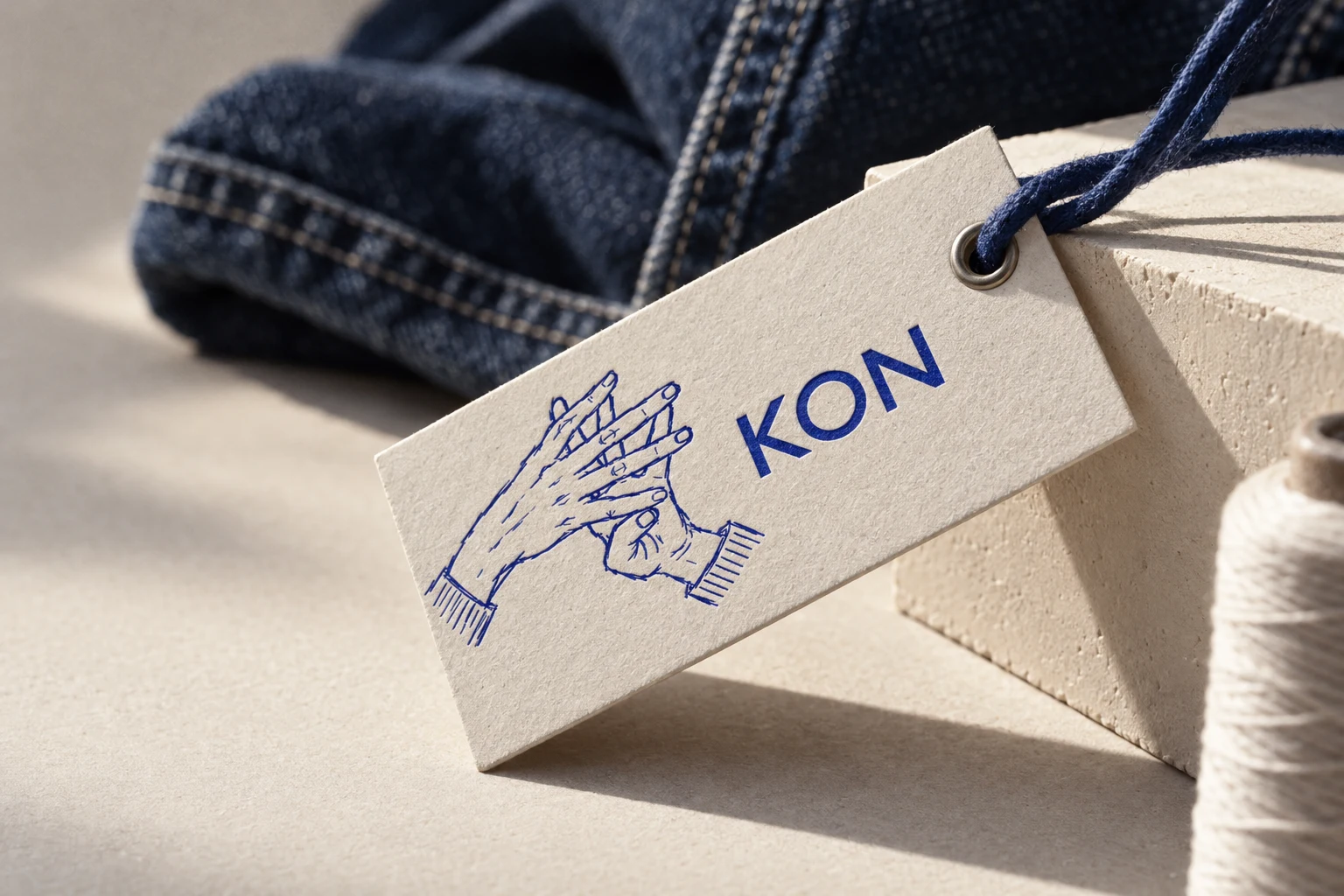
Two parts that refuse to merge. A geometric sans wordmark with a round O, set plainly, and the hands sketch, kept rough on purpose. They combine four ways: wordmark alone for hardware and small labels, hands alone for stamps and prints, side by side as the signature, and hands over the wordmark for large statements. I drew the sketch at four line weights, from fine ballpoint to heavy marker, and kept two in play: the fine one for paper and screens, the heavy one for anything that has to survive distance, like a poster or a shoulder.
COLOR
Five values, each with one job. Indigo
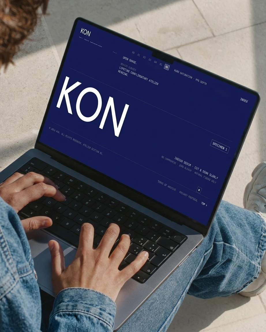
#1F36A8 for the mark and accents. Deep Indigo #121A55 for ink and the darkest dip. Undyed Cotton #EFE9DC as the page. Stitch White #FFFFFF for type on dark. Persimmon #E8592B for one detail per layout, like the orange tag on a pair of jeans, never a fill.
TYPE
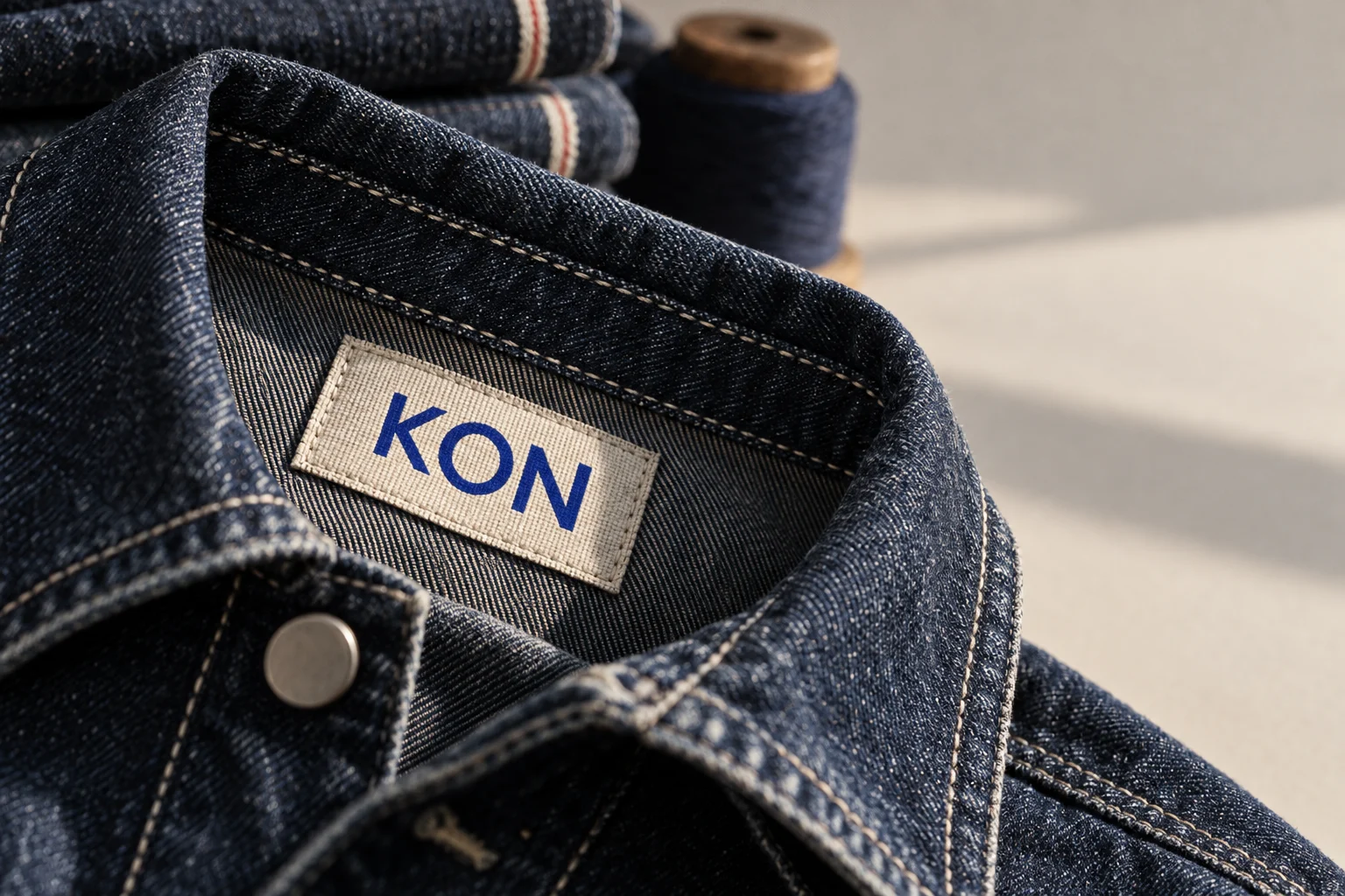
Jost for words and DM Mono for facts, set the way a care label sets them: weights, temperatures, batch numbers. The geometric round O of Jost echoes the wordmark, so the page reads as one voice.
CAMPAIGN
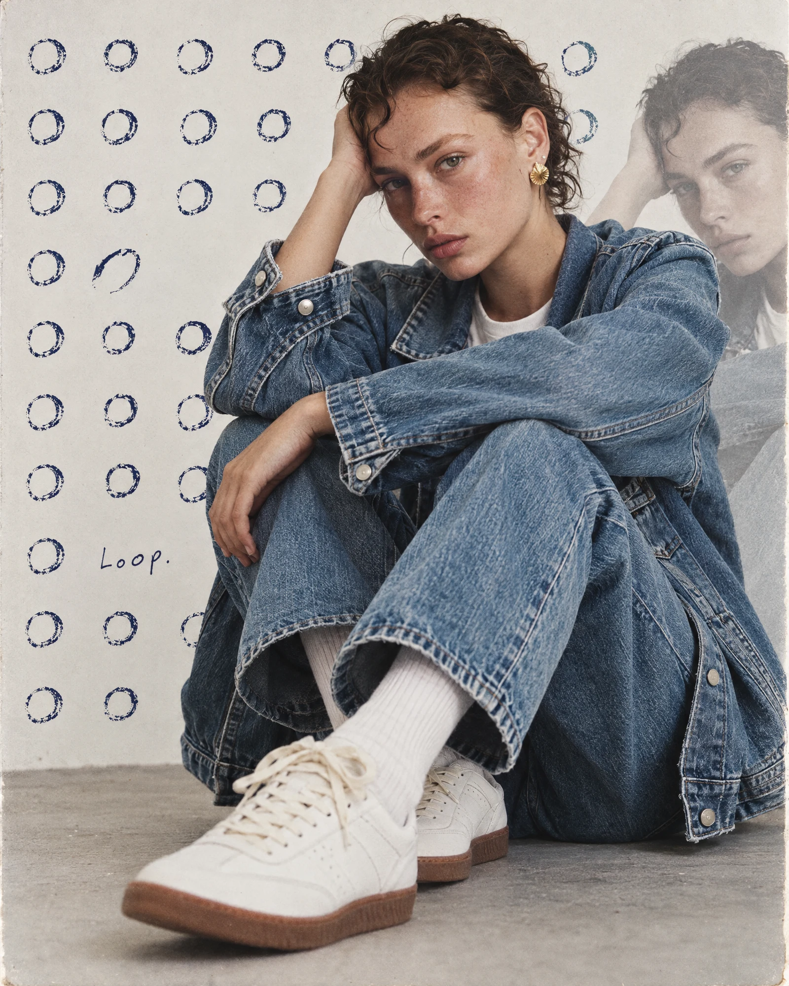
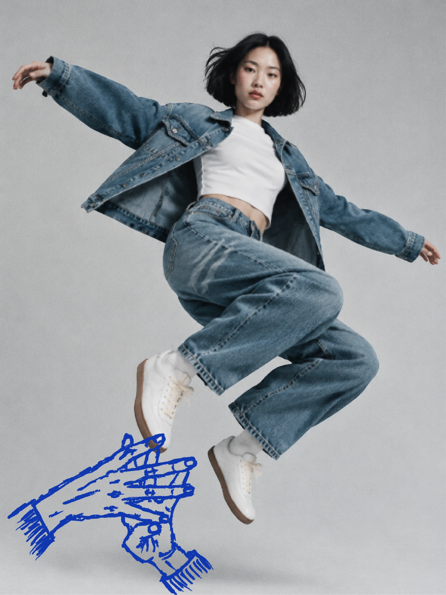
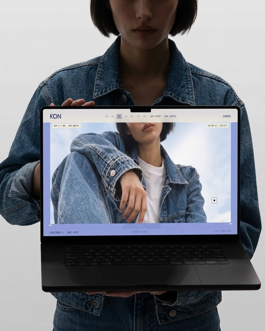
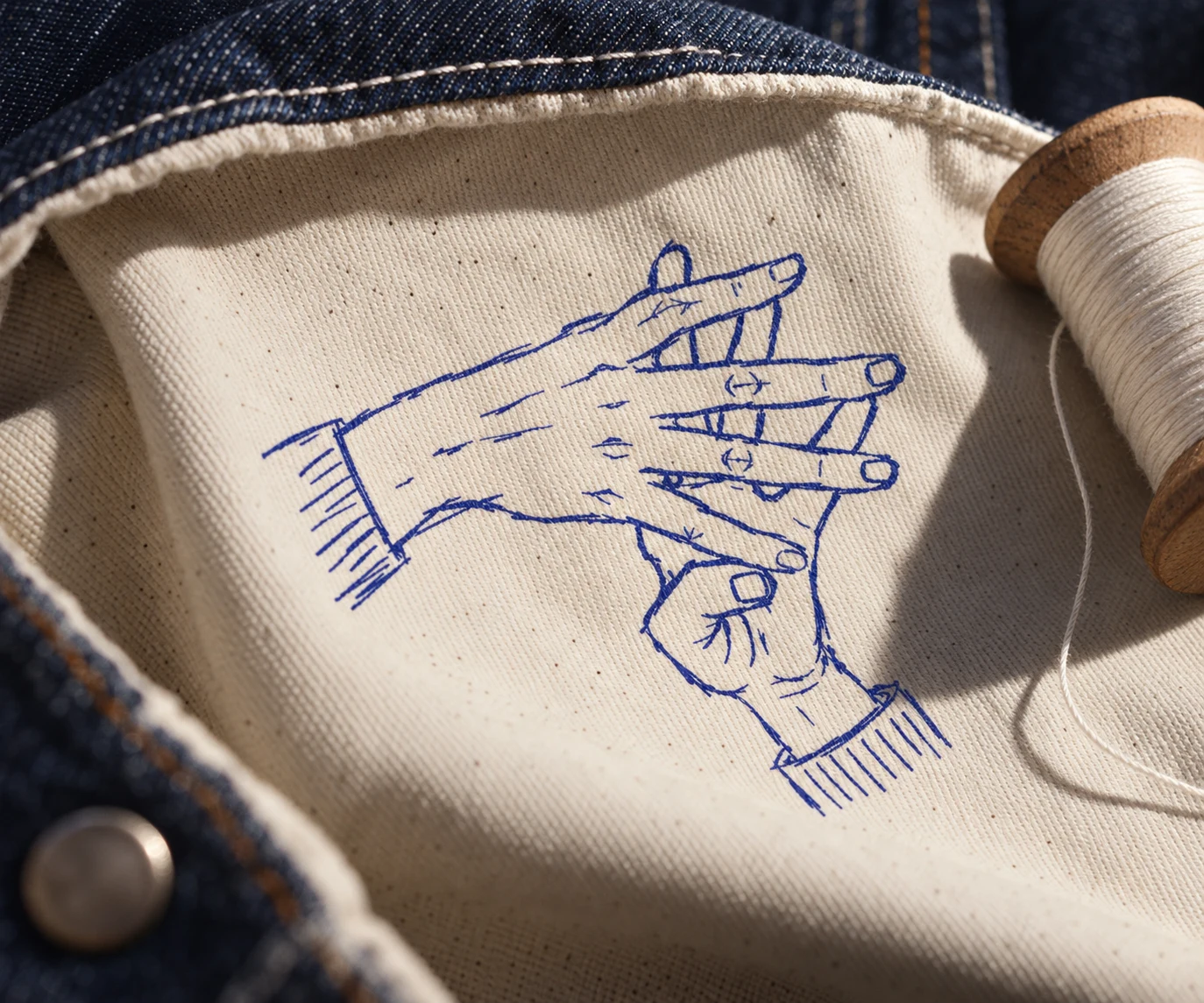
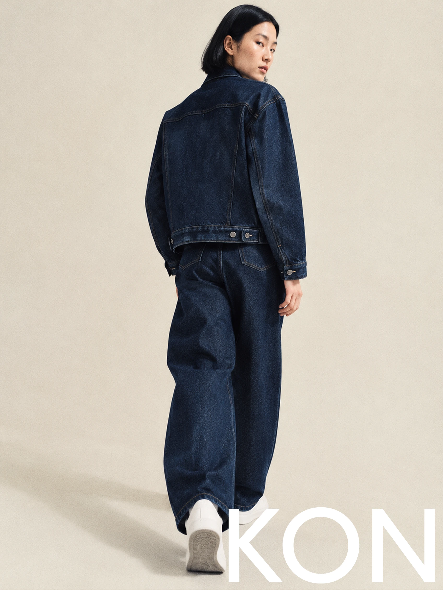
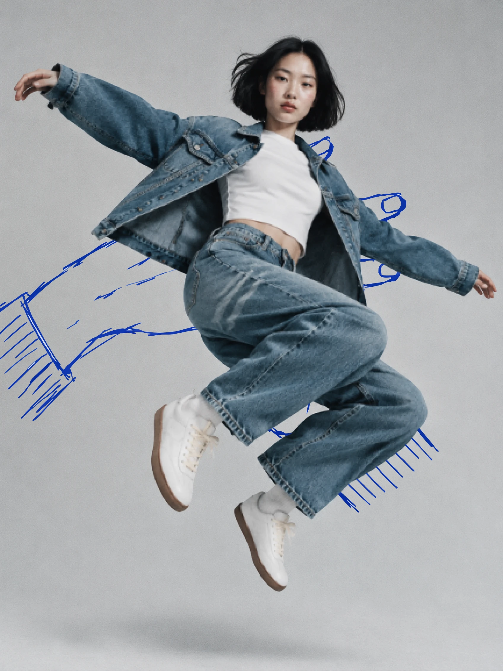
Tonal denim from bleached pale to raw dark, shot at floor level and from below, on cream paper, grey seamless and open sky, with the film grain left alone. The cast is Asian and street-cast in spirit, no gloss. The hands are placed where the body is doing something: under a jumping figure’s feet like they are about to catch the landing, across a folded knee, on a raw collar so the cuff hatching reads as a stitched edge. Handwritten notes, “Dipped six times.” and “Cut twice. Sewn once.”, ride a looping blue line like a pattern maker’s marks.
LABELS AND DETAILS
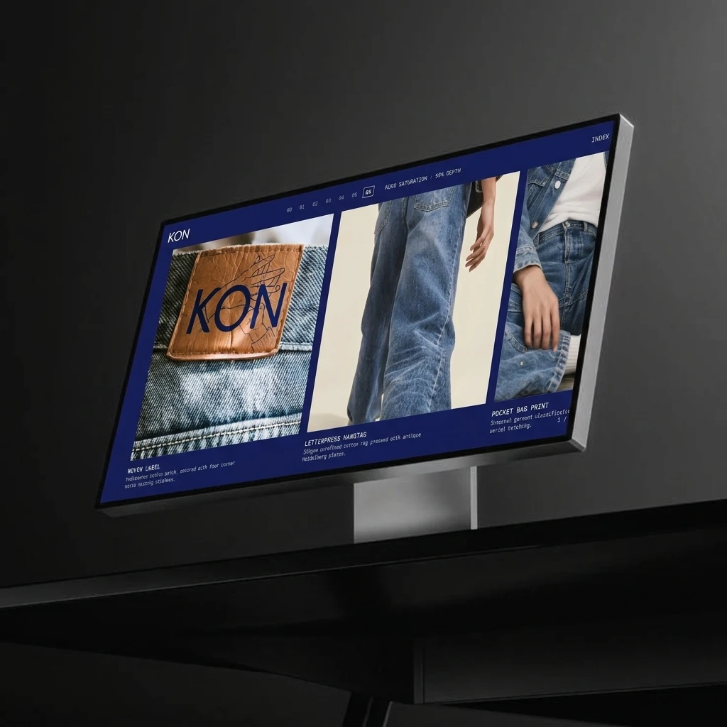
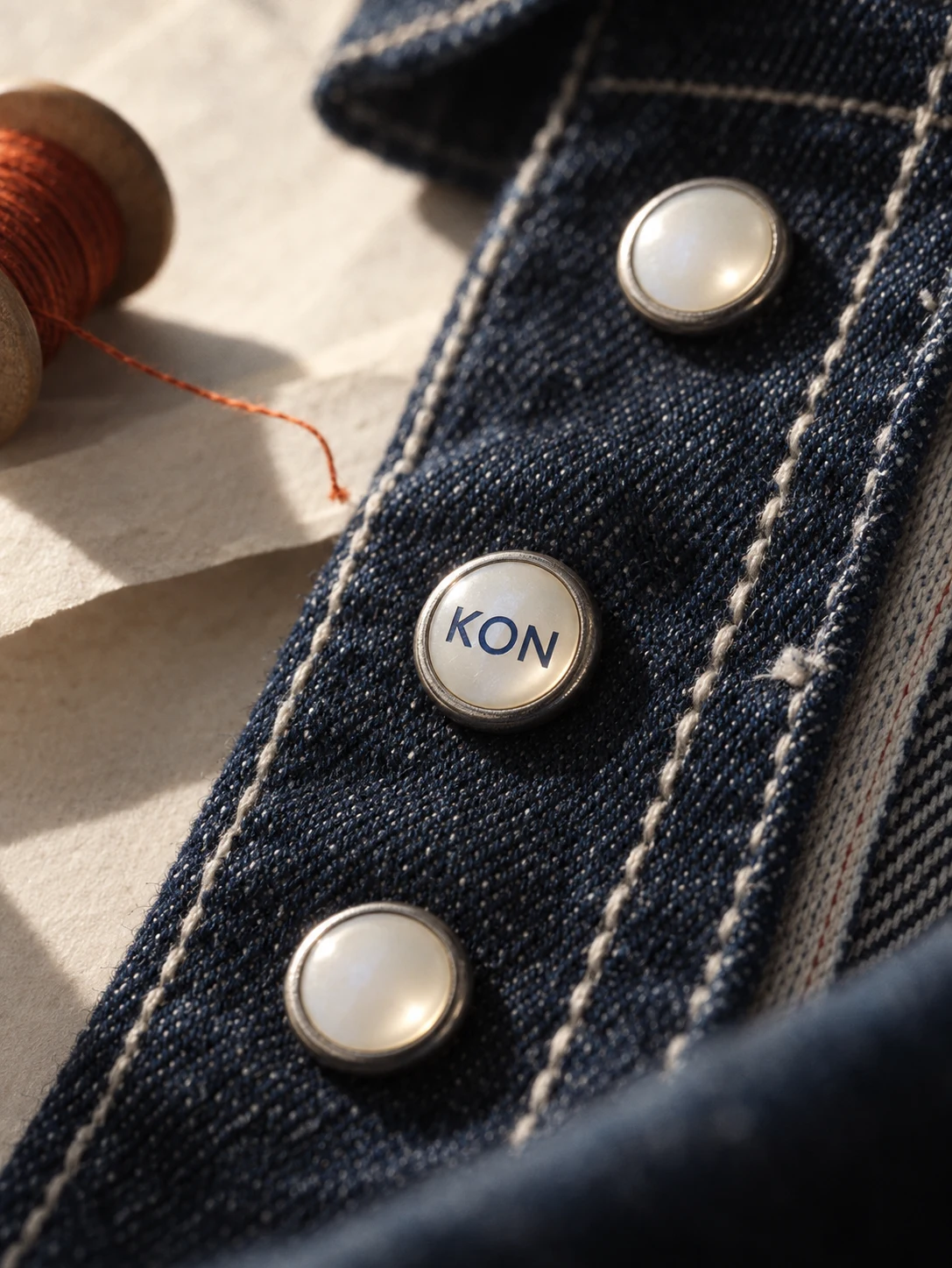
The loudest thing in a KON garment sits inside it: a leather back patch, a woven label, a letterpress hangtag, a printed pocket bag. I shot each in extreme close-up, because the brand lives in those few centimetres.
WEB
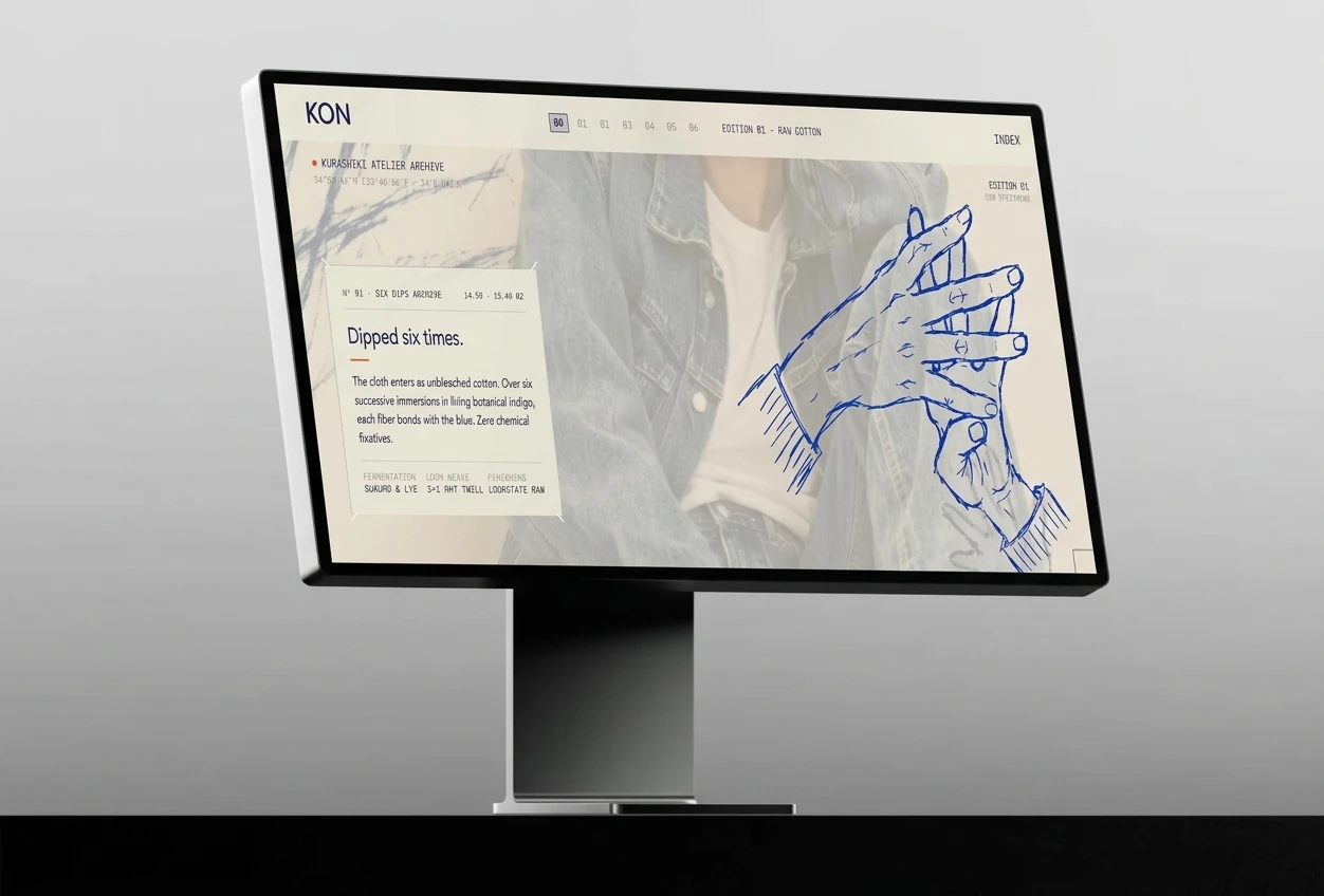
The site is a dip index. Seven stops, 00 to 06, sit in the header like a measuring scale, and the page changes with them. The background deepens from cotton to deep indigo, each stop gets a color name and a depth percentage (Sky Mist, 28%), and captions carry denim weight and vat temperature in monospace. It reads like a specimen archive, not a shop.
SOUND
A brand built on a count needs a beat. The soundtrack is a slow boom-bap track at 88 BPM called “Dipped Six Times”, with loom shuttle clicks standing in for hi-hats. A seamless loop runs under the site, and the sonic logo is two seconds: one shuttle clack, one soft piano note.
THE RESULT
KON is a complete system: identity, campaign, a website concept, label details and a sound, all driven by one counting rule. What I am surest of is that the mark holds in two places that usually fight each other. At poster scale and on skin, the hands shout. Inside the collar, they whisper. Same drawing, different volume.



The project stands at Edition 01. The system is built and the visuals are made. Next is turning the dip index into a live site and cutting the first drop.
CREDITS
Studio: Révolté, revolte.design
Project: KON
Year: 2026
Scope: Brand Identity, Logo, Campaign Art Direction, Web Design, Label Details, Sound
Industry: Fashion, Denim




See more at revolte.design
Like this project
Posted Nov 2, 2026
KON is a denim label where the only loud thing is a blue sketch of two hands. Six dips of indigo, one rule: nothing shouts on the cloth
Likes
0
Views
2
Timeline
Oct 6, 2026 - Nov 2, 2026