Built with Lovart
UNDERSTUDY Visual Identity Project

Révolté


UNDERSTUDY: An identity for the second cast
Overview
UNDERSTUDY is a fictional independent theatre for new work about doubles, stand-ins and the people waiting in the wings. The challenge was to give the second cast the first impression. The result is a visual system built around one gesture: a circle cut through a face.
The idea: look twice
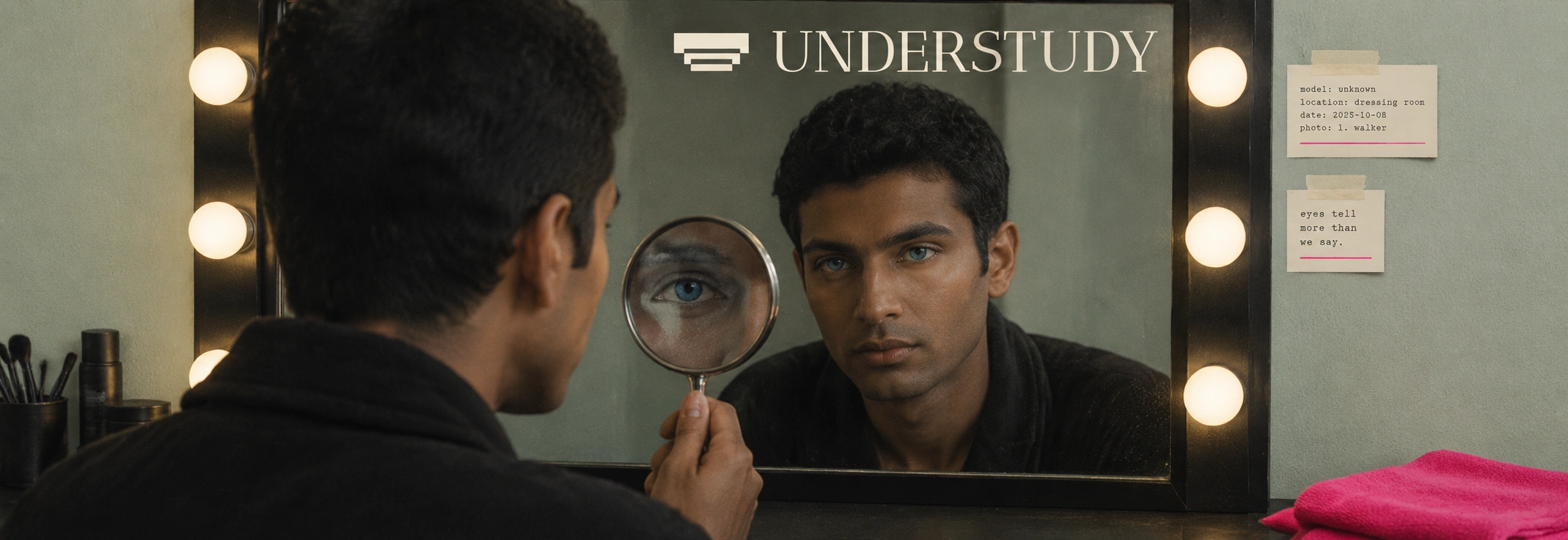
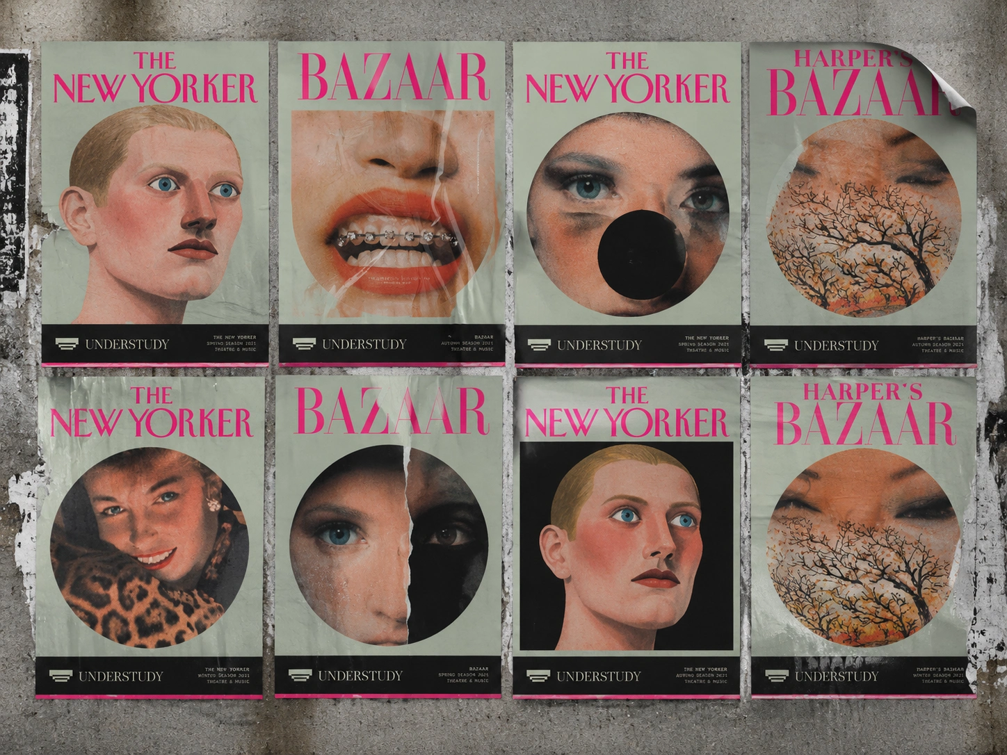
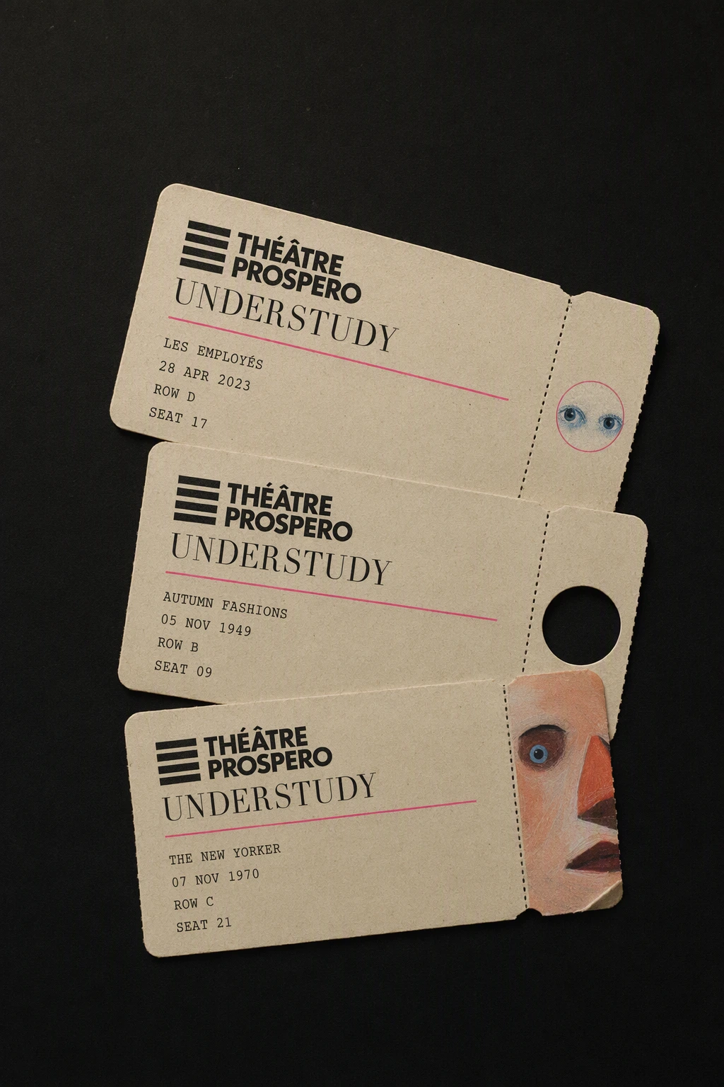
Every image has one thing wrong with it on purpose. Faces are cropped too close, a second eye appears on a forehead, and a cheek has been cut out and pasted back slightly off. The effect is quiet and uncanny rather than loud, and it sets the tone for everything else.
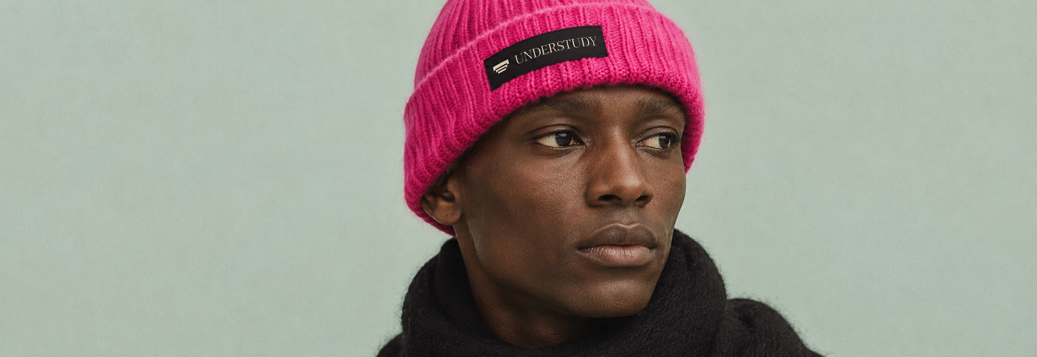
The circle
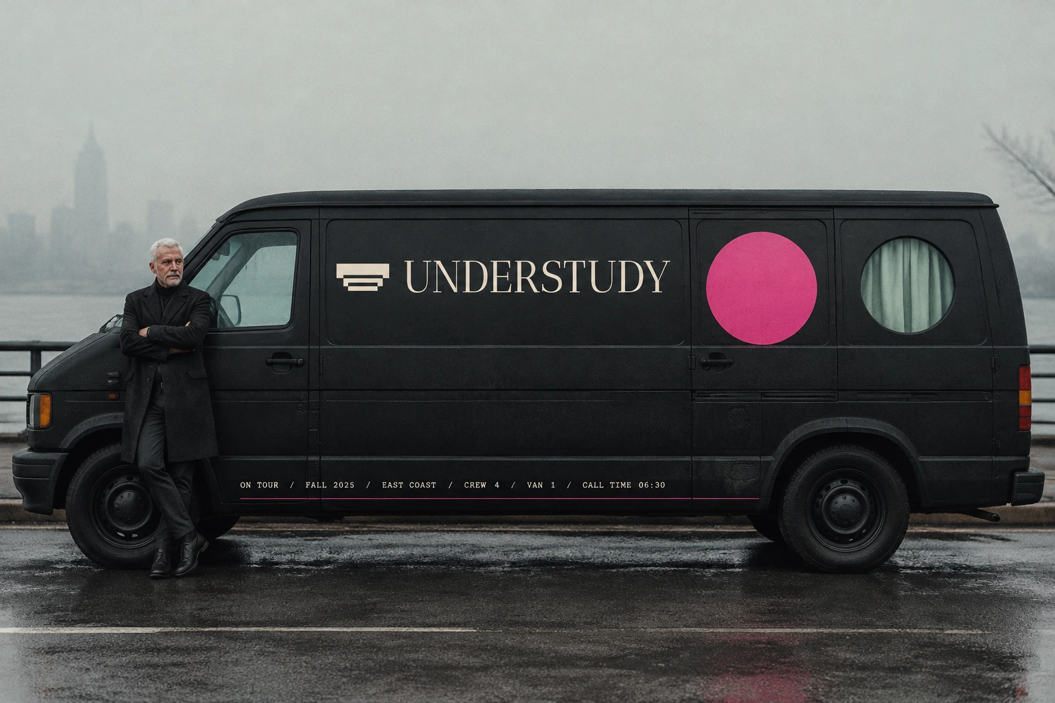
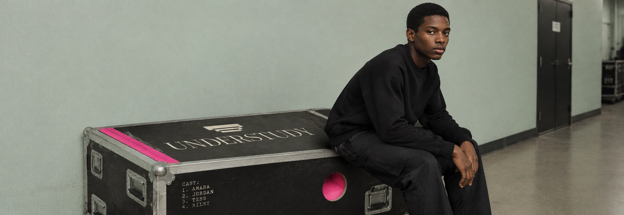
The die-cut circle does three jobs. It shows a doubled eye (the double), a displaced crop of skin (the stand-in), or a solid black void (the lead who didn’t show). It is also the only curve in the system. Every rectangle, strip and button has a sharp corner, so the circle always reads as a deliberate opening. The same shape returns as the hole in a tote, the glaze window on a mug, the porthole in a touring van, the round window in the theatre facade and the hatch in the box office glass.
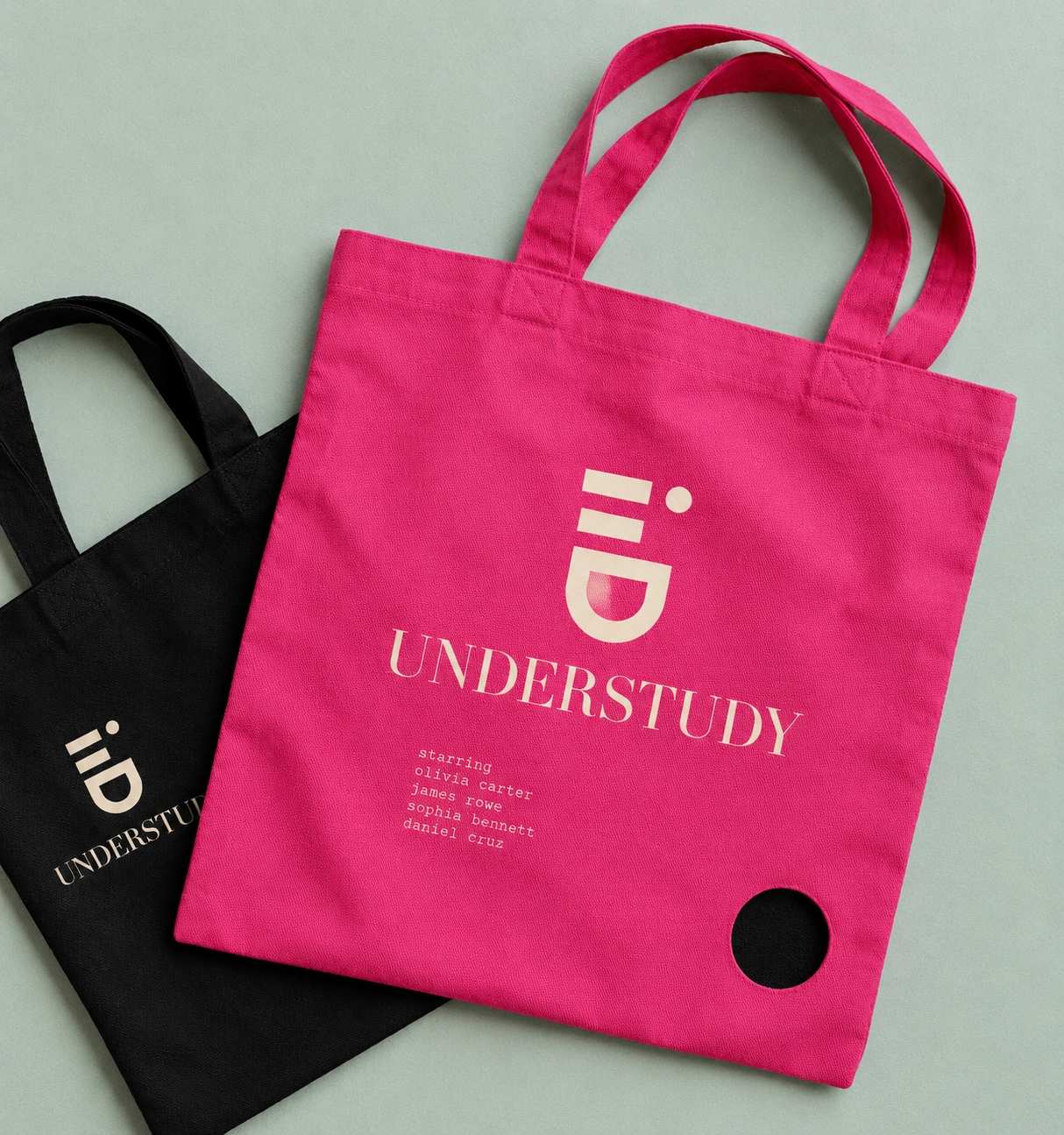
Colour
Pale sage is the wall. Backstage black is everything behind it. Hot pink is rationed to one large element per view, so it works like a spotlight. Cream is reserved for type on black, because on sage it disappears. Text on pink is always black. Skin peach and eye blue stay inside the photography, and blue is saved for the double.
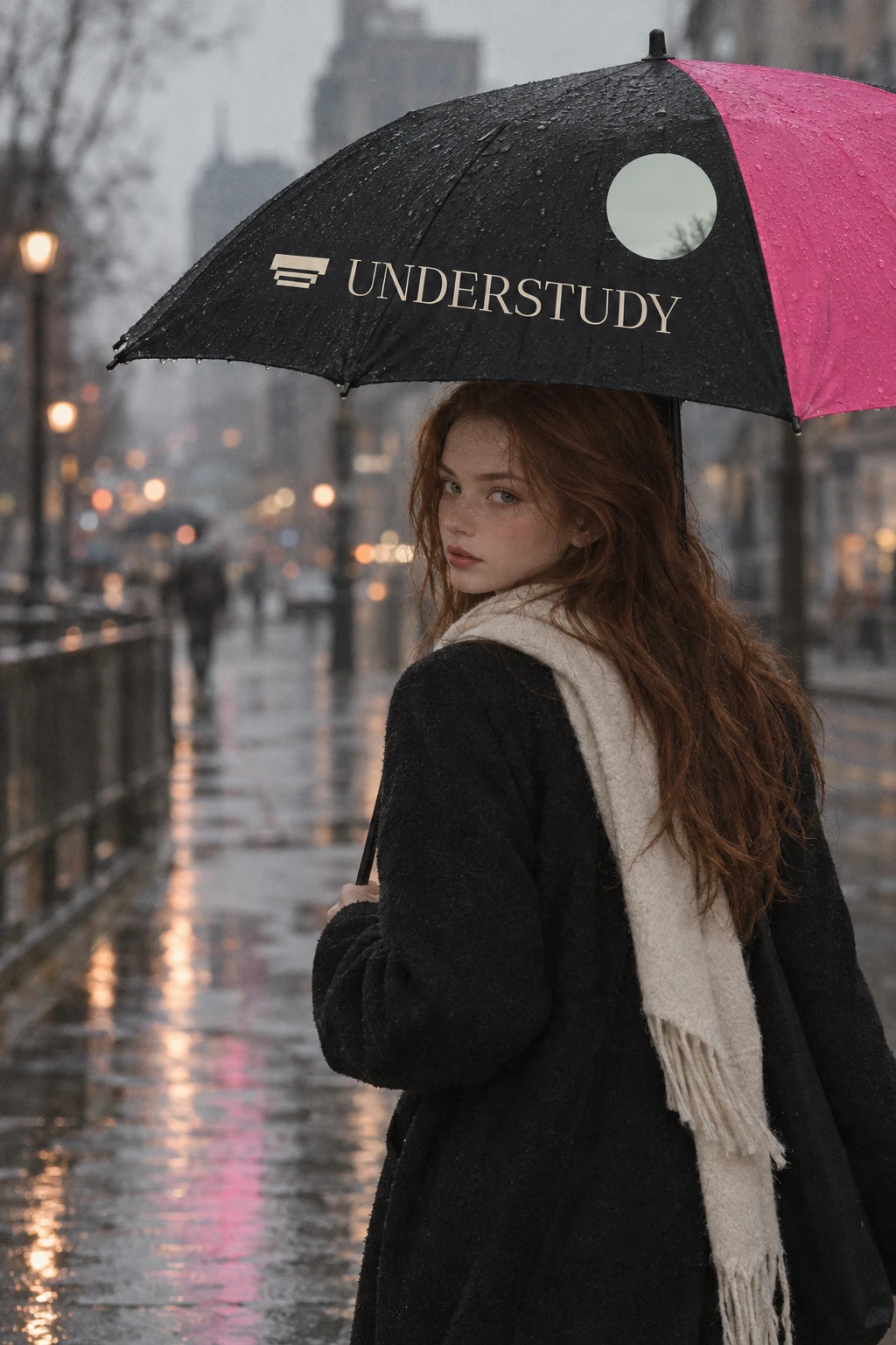
Type
Antic Didone, set in capitals and tracked tight, crowds the top edge of every poster like a magazine masthead that has learned to behave as a logo. Courier Prime carries the credits in a typewriter voice. The cast list is treated as texture: bold names, regular roles, one justified block that reads as grey-pink static from across a room and as a precise credit up close. Only three sizes appear on any layout, huge, body and tiny, with nothing in the middle.
Logomark
Three stacked bars narrow toward the bottom, like stage steps or a lowered curtain. It sits beside the wordmark as a fixed lockup, usually in cream on a black strip, so it never competes with the face.
Photography
Flat, soft frontal light, visible grain and a muted matte grade. The models are calm and unsmiling, and their gaze always lands just past the lens.
Applications
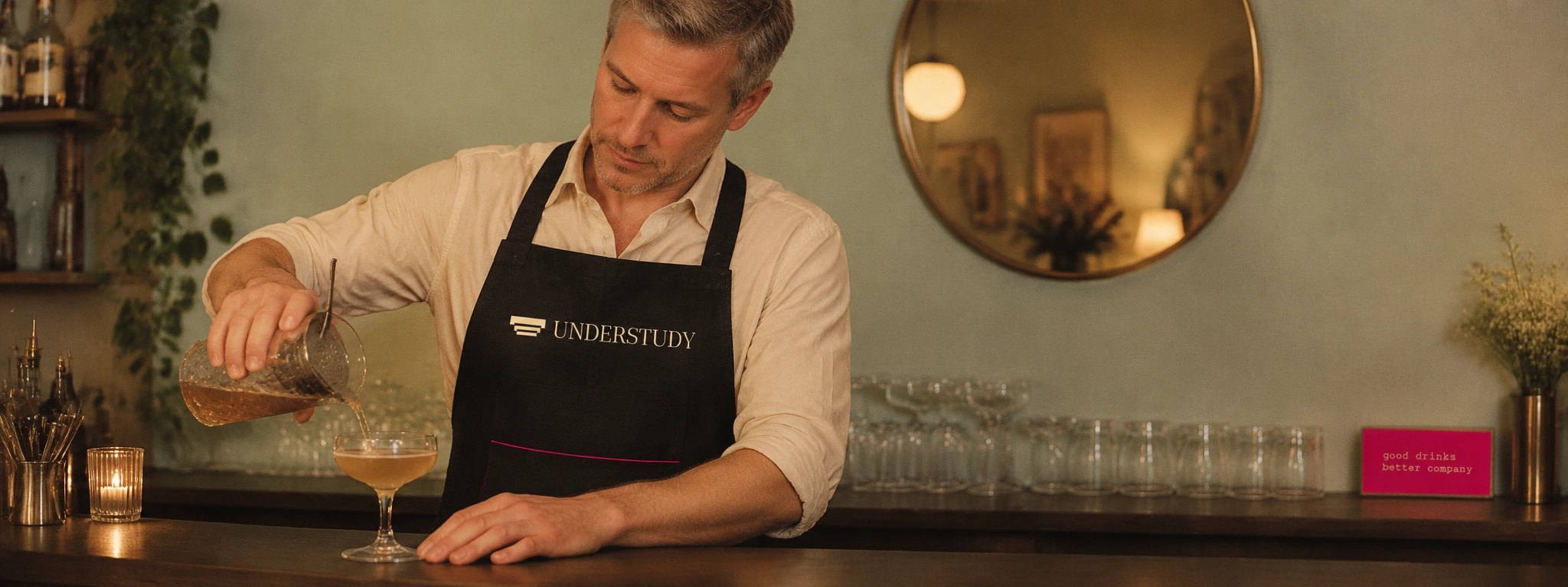
The system runs through posters, wheatpasted walls, a bus shelter and the theatre facade. It also covers merchandise (tote, mug, beanie, crew jacket, bar apron, umbrella) and backstage details such as the flight case, costume rail, tags, dressing room mirror and box office hatch. It holds from a line of credits on a ticket to a sign above a door.
In motion
The app and website extend the same rules. Circles open and close as navigation, titles rise through masks, and credits type across the screen. There is no rotation and there are no particles. The tone stays deadpan, with no exclamation marks, and the tagline is “Ready when someone isn’t.”
Takeaway
A brand for the people in the wings shouldn’t shout. It should open a small round window and let you look twice.

Révolté
Project: UNDERSTUDY
Year: 2026
Scope: Brand Identity, Logo, Typography, Colour System, Art Direction, Campaign Imagery, Merchandise, Signage, App Direction, Website Direction, Motion
Industry: Independent Theatre
See more at revolte.design
Like this project
Posted Oct 20, 2026
UNDERSTUDY is a visual identity for an independent theatre about doubles and stand-ins. Hot pink Didone titles, pale sage walls and circles cut through faces
Likes
0
Views
0
Timeline
Sep 30, 2026 - Oct 20, 2026