Built with Lovart
Still Life Service Brand Identity & Website

Révolté


STILL LIFE SERVICE: One Strange Object, Already Arranged
LOGLINE
A subscription that mails one strange, staged object a month. It needed an identity as physical as the thing in the box, so I inflated the lettering until it filled the frame.
THE BRIEF
Still Life Service sends one odd object a month: an inflatable flower, a phone shaped like a shell, a porcelain hand holding a lemon. It arrives staged on a tray, with a card that says why it exists.
The tension was a quiet one. Subscription boxes share a house style: hype, neon, unboxing. Gallery shops share another: gold, hush, price-forward. This brand had to belong to neither. The objects are absurd, and the brand takes them seriously. Deadpan is the whole tone.
I took on the whole identity: logotype, logomark, color, type, packaging, merchandise, campaign imagery and the website. The hard part was a fixed mark that had to survive a new object every month.
THE APPROACH
I started from what was moving on Cosmos, not from the platform’s own look. Hand-painted signs came back as a reaction to flat ads. Pre-aged objects read as authentic. Odd, sculptural things earned shelf space. They all said the same thing: in a feed of frictionless images, people want something with weight. I picked this idea from ten because it was the only one where the identity had to stay still while the content changed every thirty days.
My first logotype brief was a soft display serif with a little wobble. It was polite. Then I put the Time Out San Francisco “Inflatable” cover next to it and the serif looked timid. A word doesn’t have to be soft. It can be inflated: fat stems, near-closed counters, letters fused at pinched seams like balloons pressed together. That became the rule.
The second pivot was color. I had specced orange letters with pale highlights. The version that worked inverted it: peach bodies on a burnt orange ground. The outline does the shouting, and the letters stay edible.
Everything after that followed one constraint. Inflation is the only visual idea. If a surface couldn’t look like it might go flat, it didn’t belong.
THE WORK
LOGOTYPE
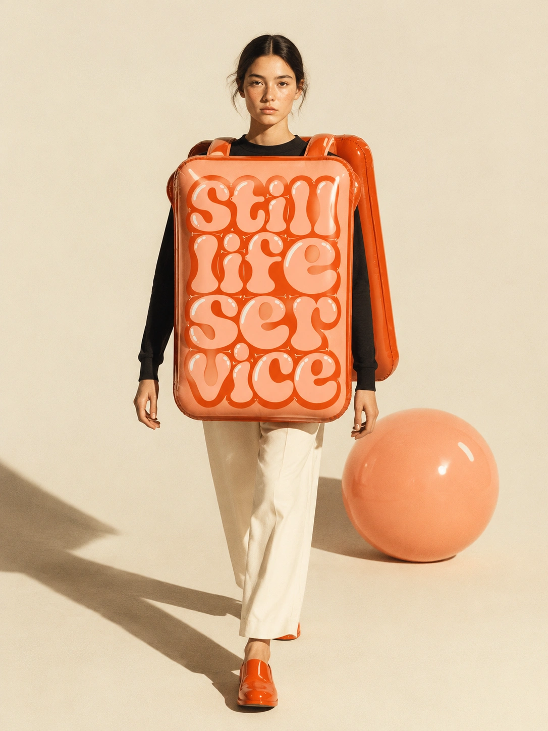
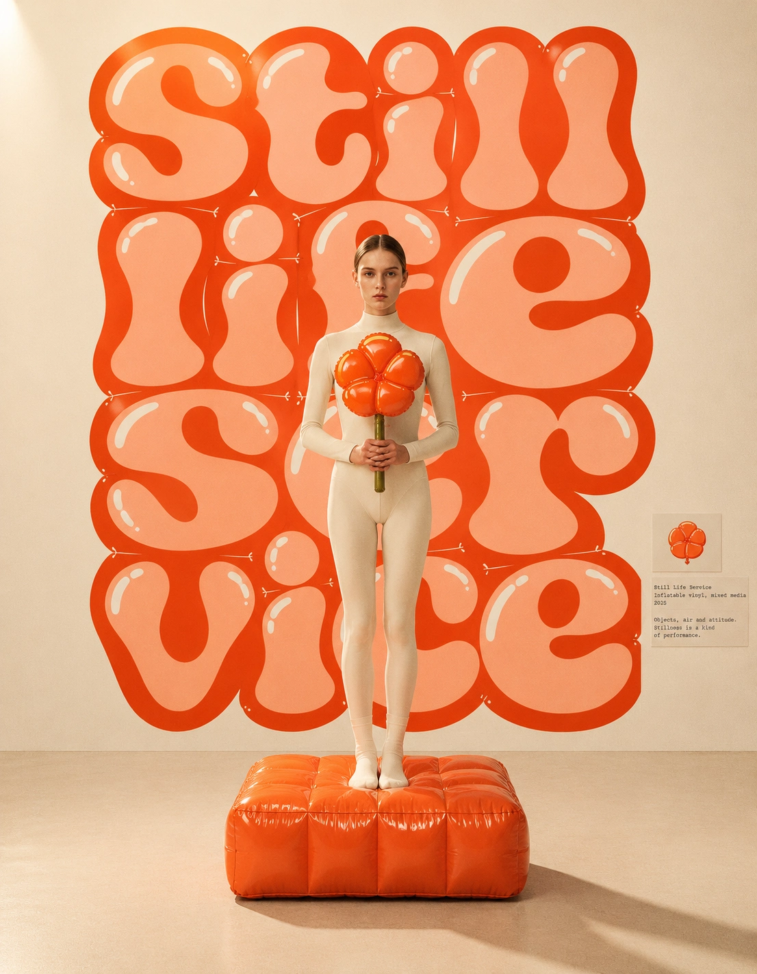
Four lowercase rows: still / life / ser / vice. I broke the word so every row lands at nearly the same width, and the block fills a portrait rectangle edge to edge. Letters fuse along thin cream seams, with glossy streaks on every form and small ticks where the vinyl pinches. Peach
#FFB08F bodies on a Burnt Orange #E04410 ground. The “ser / vice” split is deliberate: it reads as a pun and still reads as the name.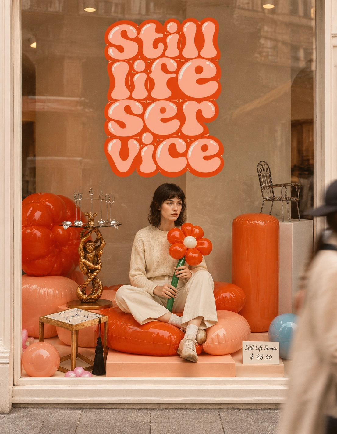
LOGOMARK
A five-petal balloon flower with a pinched, knotted center and a valve at the bottom. The valve is the signature, because it proves the shape was filled with air. Gel Orange
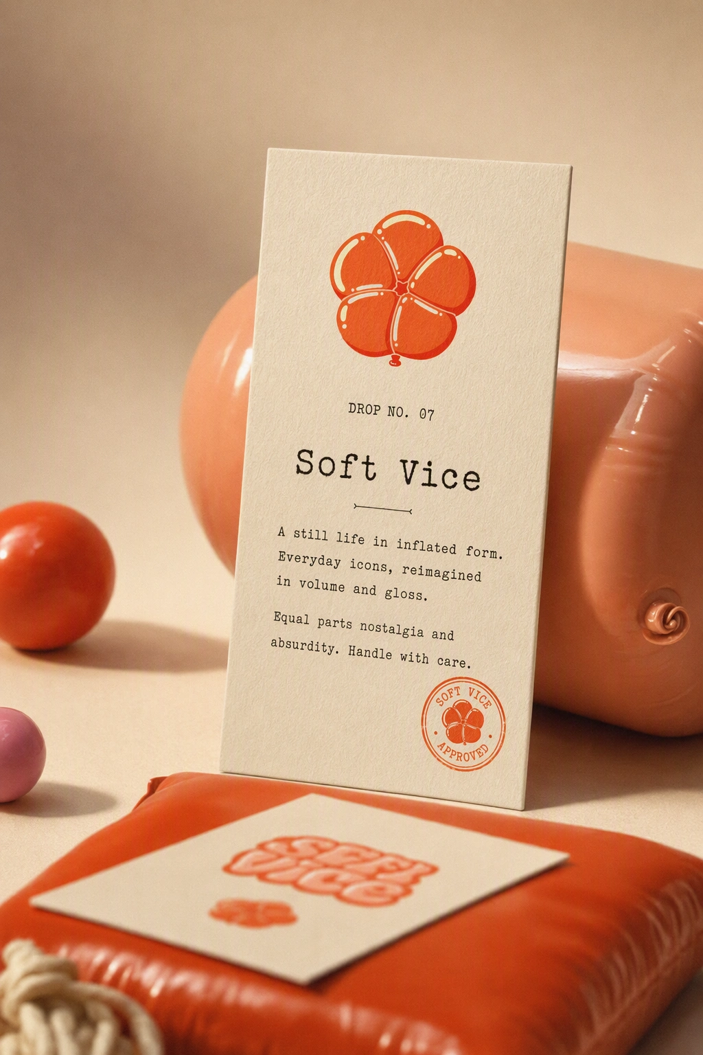
#FF5A1F body, Hot Shadow #FB1D00 on the shaded sides, Pale Highlight #FEFDCC for the gloss.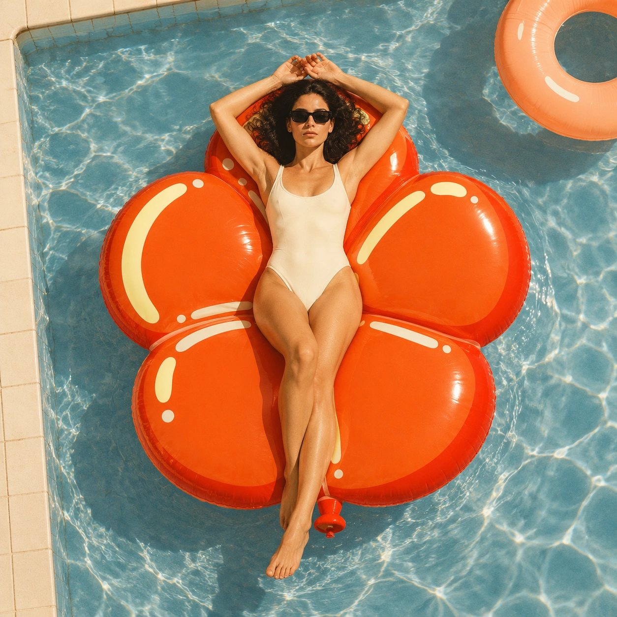
COLOR SYSTEM
Paper Cream
#F1EADB carries about 65% of any layout and Studio Ink #1B1815 carries the type. Gel Orange is the only loud color and appears once per composition. Each monthly drop gets one accent, Inflatable Pink #F26BA6 or Shell Blue #7FB6D9, and the two never share a frame.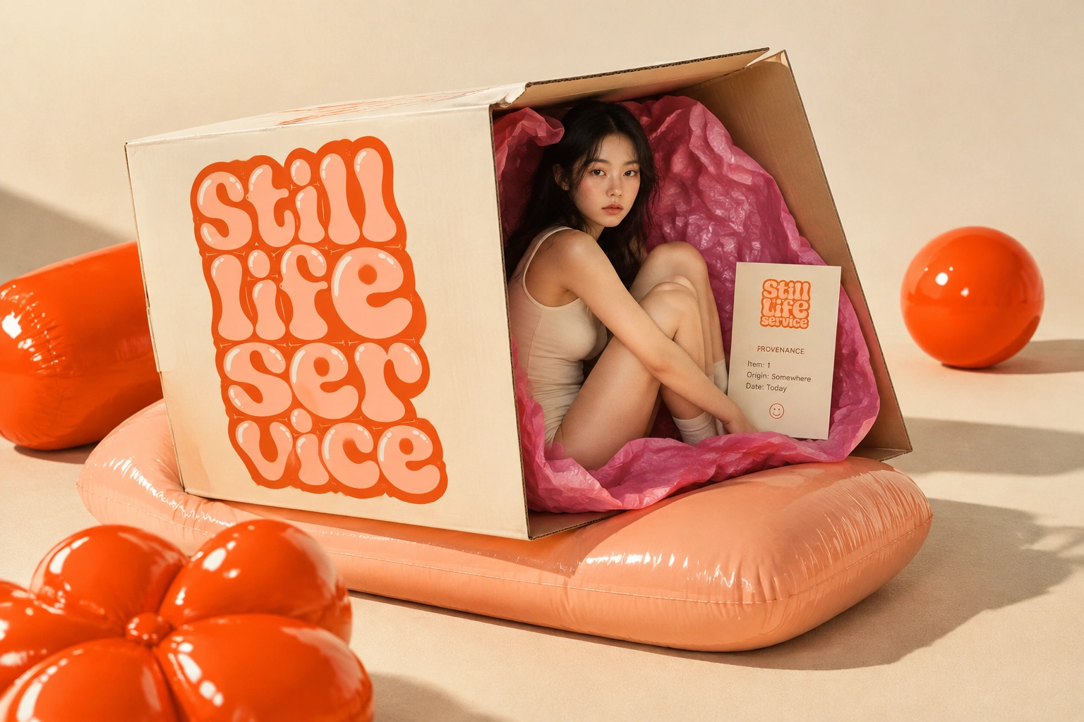
TYPE SYSTEM
The logotype is the only truly inflated lettering. Everything around it stays quiet: a soft serif for headlines, a sans for body copy and a typewriter mono for catalogue numbers and drop labels.
PACKAGING AND PRINT
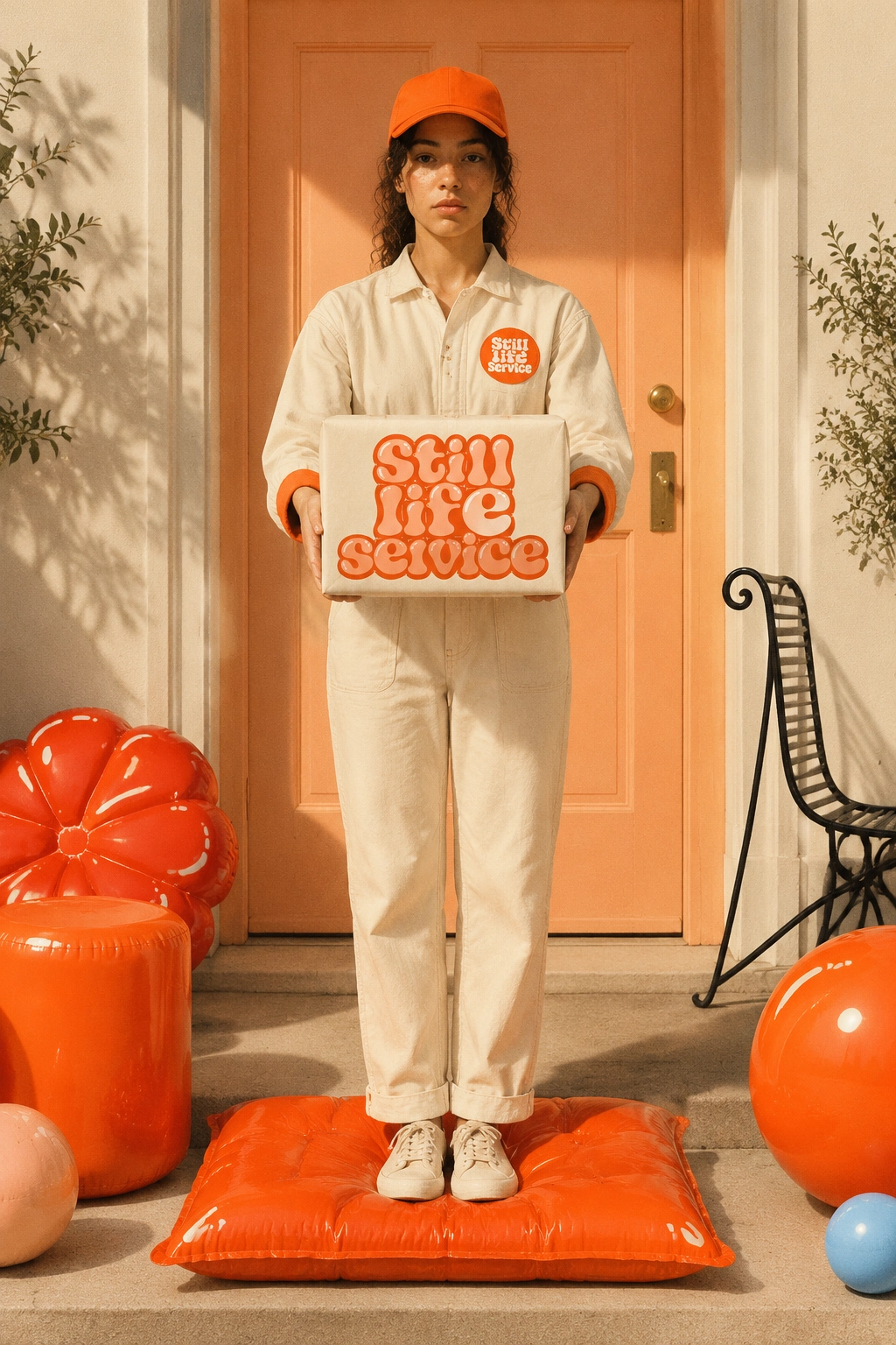
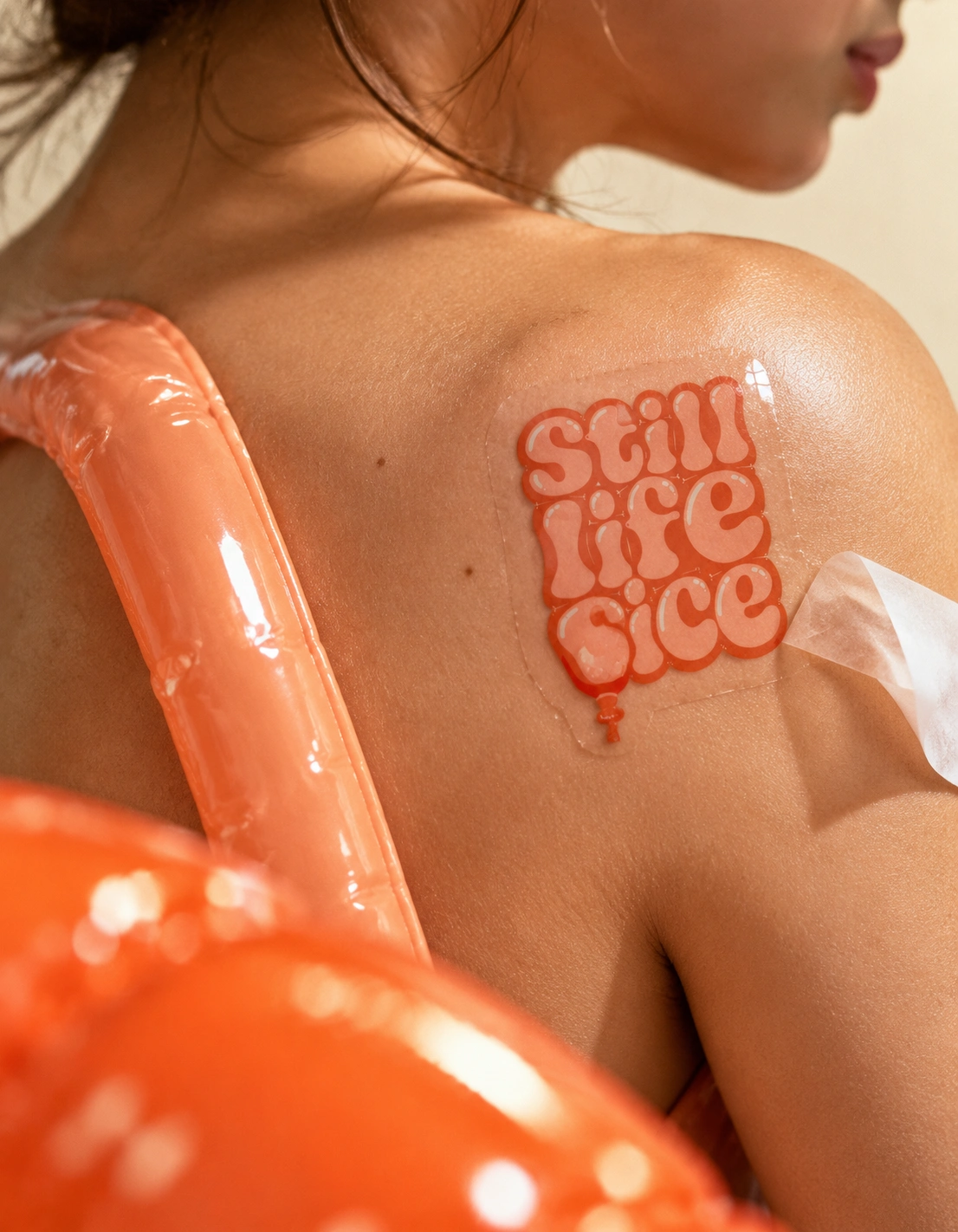
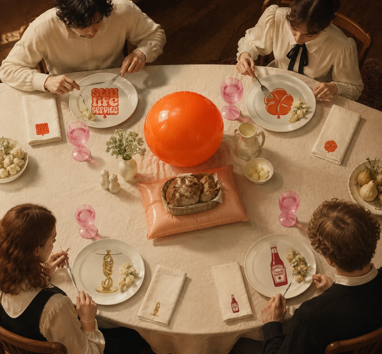
A cream card box with the logotype across the lid, pink tissue inside, a provenance card in typewriter type, die-cut logomark stickers and a round seal. The box is the first still life: opened, it is already arranged.
MERCHANDISE
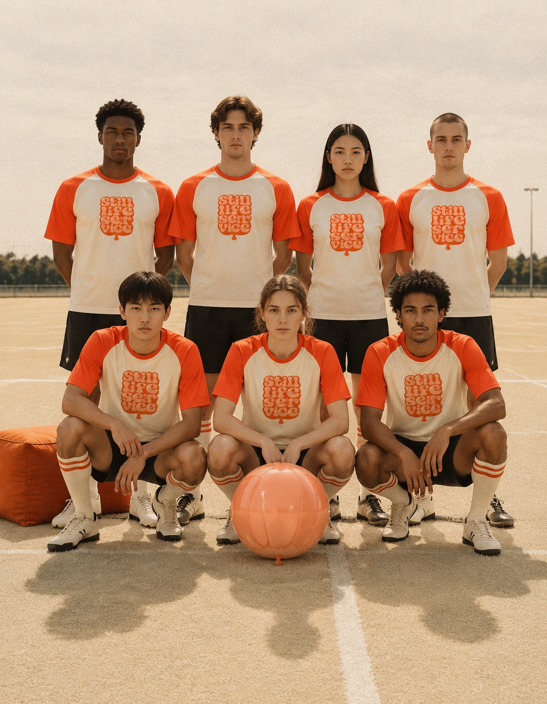
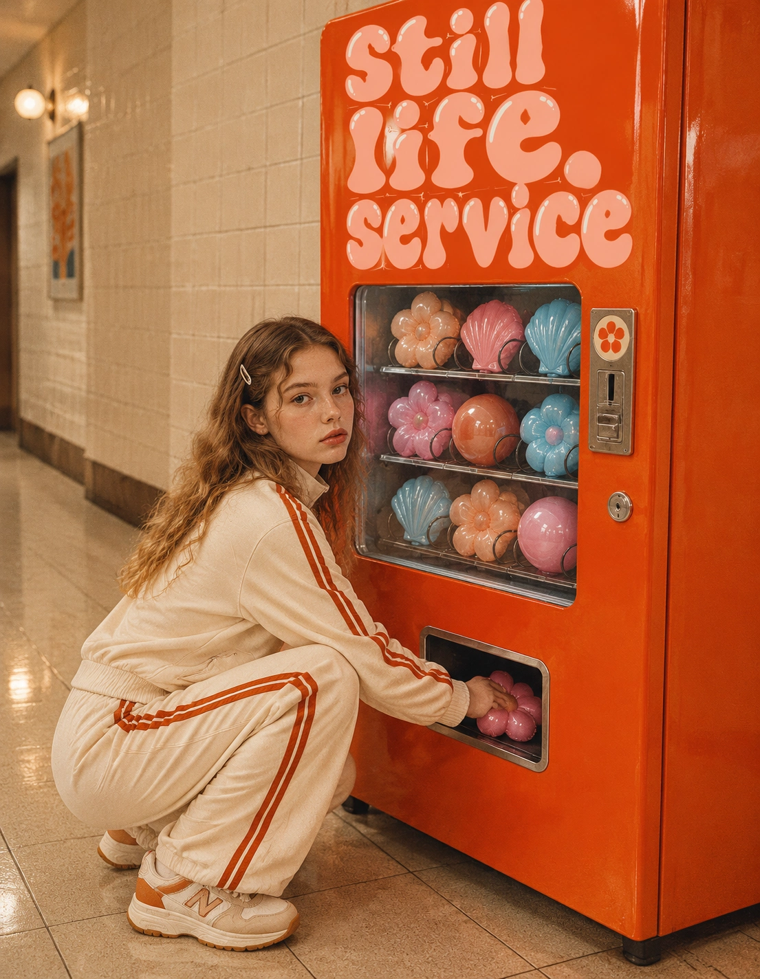
A puffer jacket whose quilting seams cut across the logotype, a tote, a jersey with the logomark as a crest, an inflated sandwich board and glossy vinyl rings.
CAMPAIGN IMAGERY
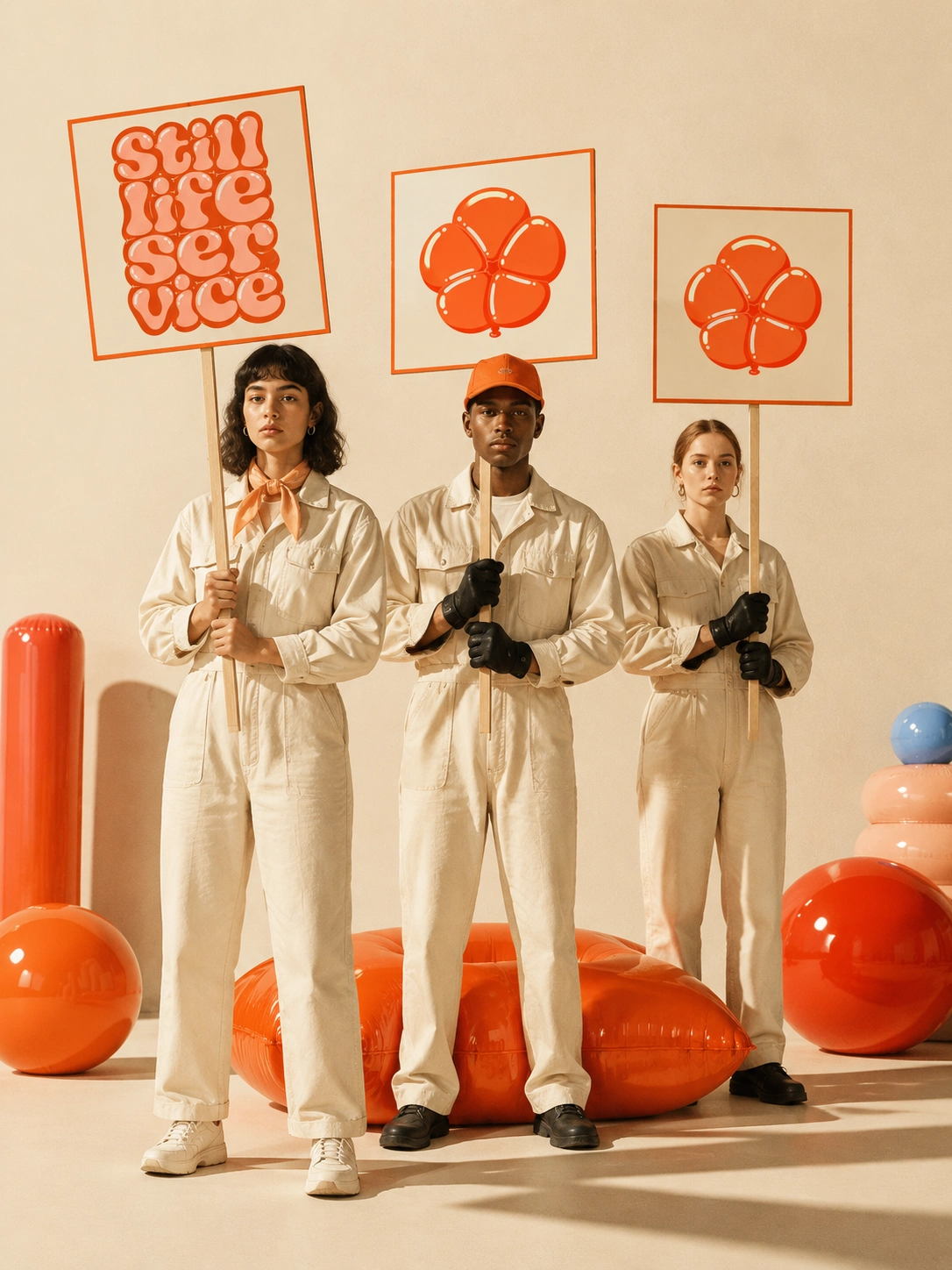
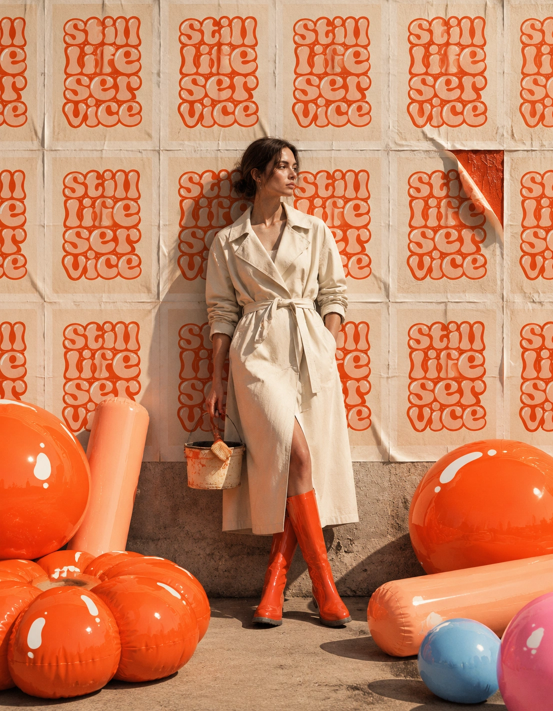
Twenty scenes, staged like still-life paintings with deadpan people in them. A gallery wall lettered in the logotype. A shop window with a person as the display. A pool float shaped like the logomark. A wheatpaste wall of repeated logotypes. A silent march of placards. A person curled in the box like the month’s object. Every prop is an inflated form.
THE WEBSITE
A single scroll site live here. The logotype wipes in, the hero images open from rounded clips as if they were filling with air, and the copy sits only in reserved empty space.
THE RESULT
One identity holds across a box, a jacket, a doorstep, a pool and a screen. From across a room it reads as a wall of balloons. Up close it reads as a label on a box. Whatever the month’s object is, the system stays put. That was the test, and it holds.
CREDITS / PROJECT INFO
Révolté, revolte.design
Project: Still Life Service
Year: 2026
Scope: Brand Identity, Logotype, Packaging, Merchandise, Campaign Imagery, Web Experience
Industry: Subscription Objects / Retail
See more at revolte.design
Like this project
Posted Oct 18, 2026
One strange object a month, staged and mailed with a story. Lettering inflated until it fills the frame, from the box to the jacket to the doorstep
Likes
0
Views
6
Timeline
Oct 7, 2026 - Oct 18, 2026