Built with Lovart
Brand Identity and Interactive Site for Latency

Révolté


LATENCY — The Beat Before the Answer
LOGLINE
Every AI product treats the wait as a flaw to hide. I built a studio identity that treats it as the structure holding the whole interaction together.
THE BRIEF
Latency is a studio that designs interfaces for AI copilots, agents and chat products. I picked the niche before I picked a look. The research was blunt: one-off site builds are crowded, while the structured work is not. That work is the handoffs, approvals and fallback states where a person has to trust a machine, and very few senior designers have real reps in it.
The visual side of that category is a monoculture: near-black backgrounds, neon gradients, glitch type. A studio selling trust and legibility can't look like it's selling a sci-fi film, so the first rule was light. The harder problem sat inside the subject. Latency designs an absence, the gap between a question and an answer. You can't draw an absence without drawing a spinner, and a spinner is an apology.
I took on all of it: identity, logo, color and type systems, a campaign set, a design system poster and an interactive site.
THE APPROACH
My first instinct was to make waiting beautiful. Breathing gradients, heartbeat waveforms, light trails, a variable font that pulses while it thinks. The first moodboard was all pulse and glow. Then I saw what it was: decoration. A prettier spinner still says sorry for the delay.
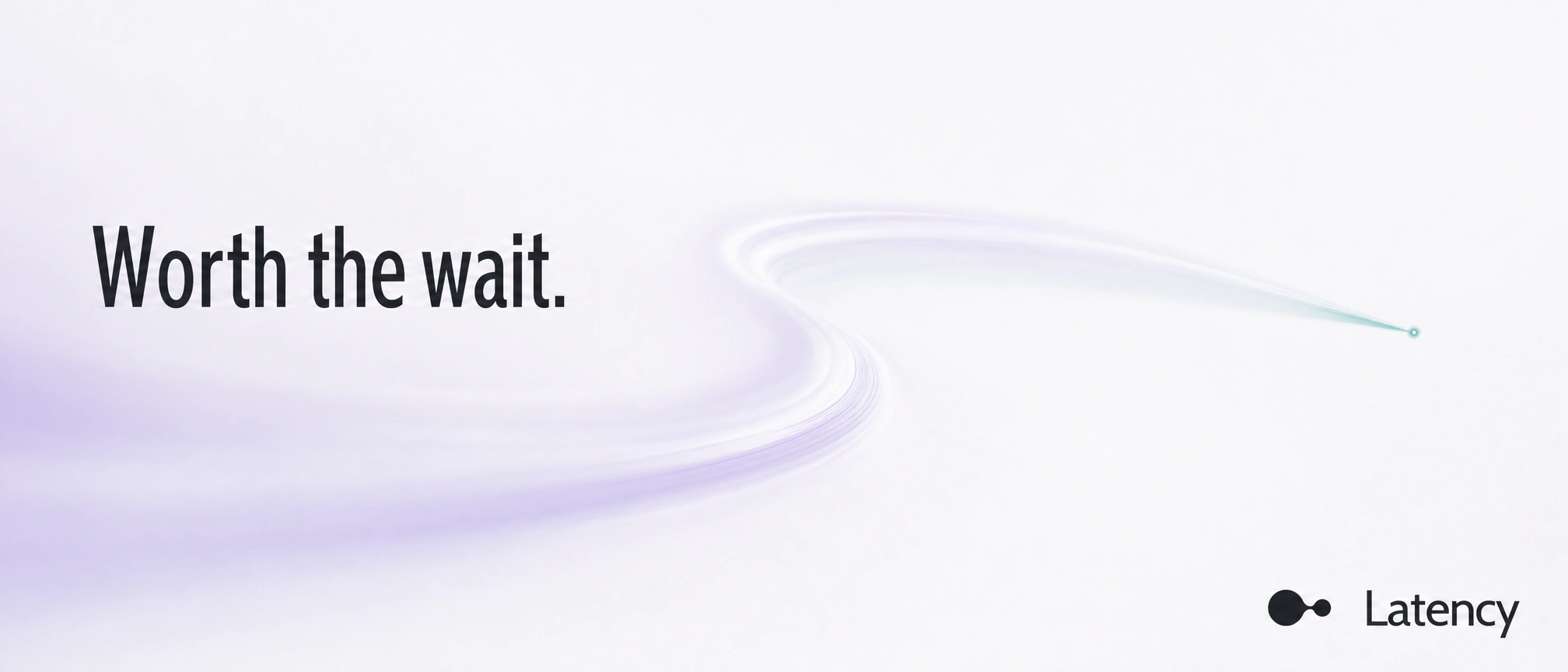
The unlock was Ma, the Japanese idea of the interval that gives shape to the whole: the rest between notes, the empty field in an ink painting. It changed my question from "how does the pause look" to "what does the pause do". Without it, elements choke each other. That gave me rules I could enforce. Nothing sits dead center (fukinsei). Pulse White covers 70 percent or more of any layout. Lavender appears only while something is genuinely in motion. Teal appears only at the instant of resolution. Rules made saying no cheap.
My first campaign pass was glass and caustics. It shone, and shine is the vocabulary of the dark AI category I was avoiding. I rebuilt the set flat, then let dimension back in only where a surface had to hold light. The final set runs in two registers: flat for what is read at speed, ambient and dimensional for what is studied.
THE WORK
LOGO
Two nodes, one large and one small, joined by a tapered bridge. The bridge is the pause drawn as a shape: a connection narrow enough to feel like a held breath. The wordmark is Cabin Condensed in mixed case. I chose a humanist condensed over a geometric grotesque because every AI startup already owns the geometric one. The lockup is a fixed asset. Only its color changes: Deep Base on light, Pulse White on dark.
COLOR
Four tokens, each with one job. Pulse White
#F7F8FA is the ma itself. Thinking Lavender #C9C2E8 means something is in motion, and it never appears as ambient decoration or it stops meaning anything. Resolved Teal #4FA8A0 appears only when a state resolves, then recedes like a struck note. Deep Base #20232B is the ink, used in the smallest amount that carries the text.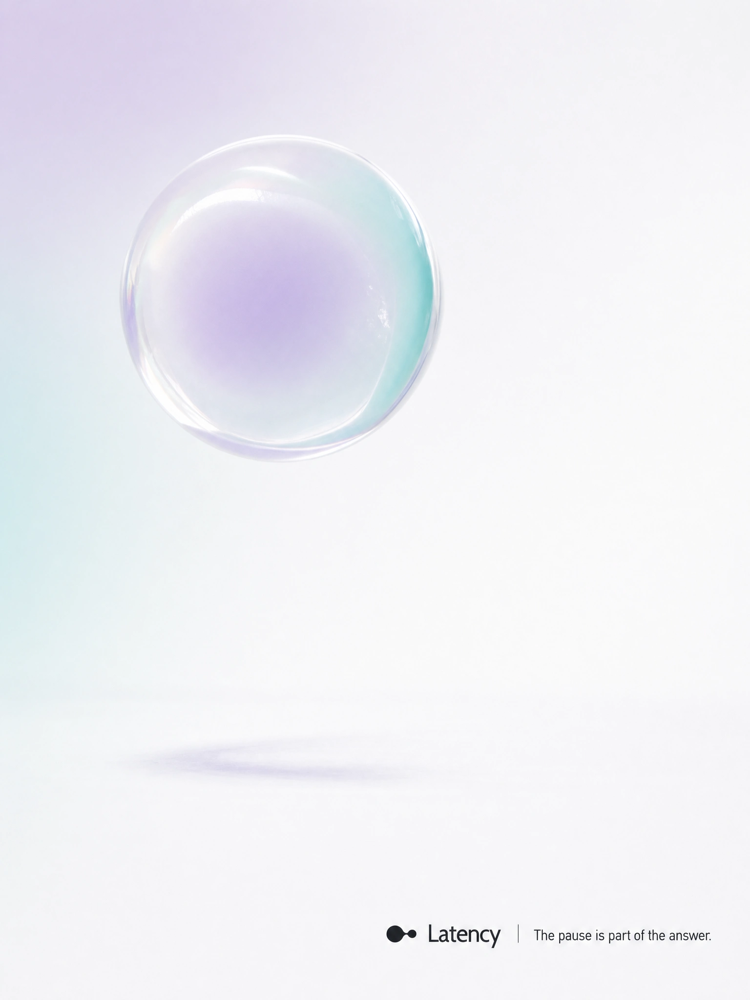
TYPOGRAPHY
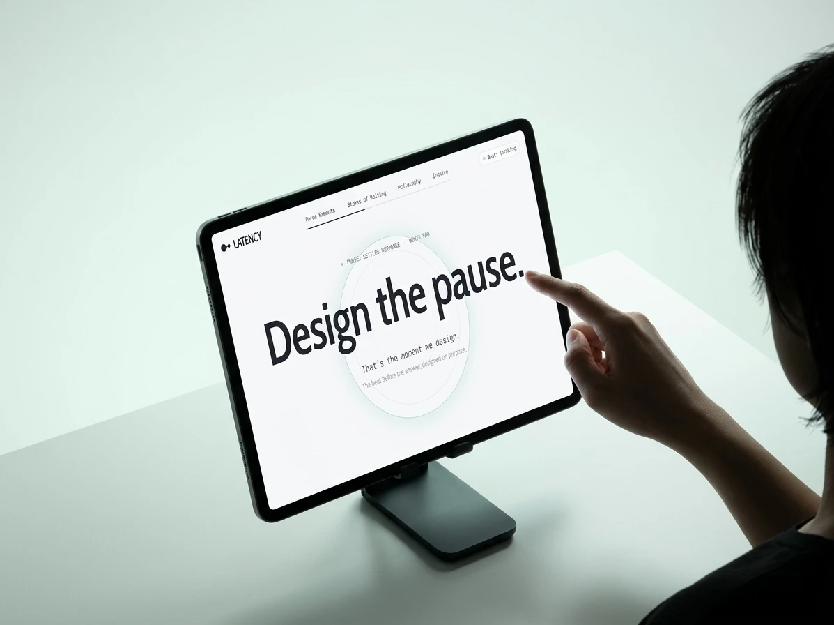
Cabin Condensed carries the wordmark and campaign headlines, set tight. A variable-weight sans runs the site, where weight is the animation. The hero headline breathes while the interface thinks and locks the moment the response settles. A monospace handles system voice and shows the live state (PHASE: SETTLED RESPONSE, WGHT: 500), so the interface is always allowed to say what it's doing.
CAMPAIGN
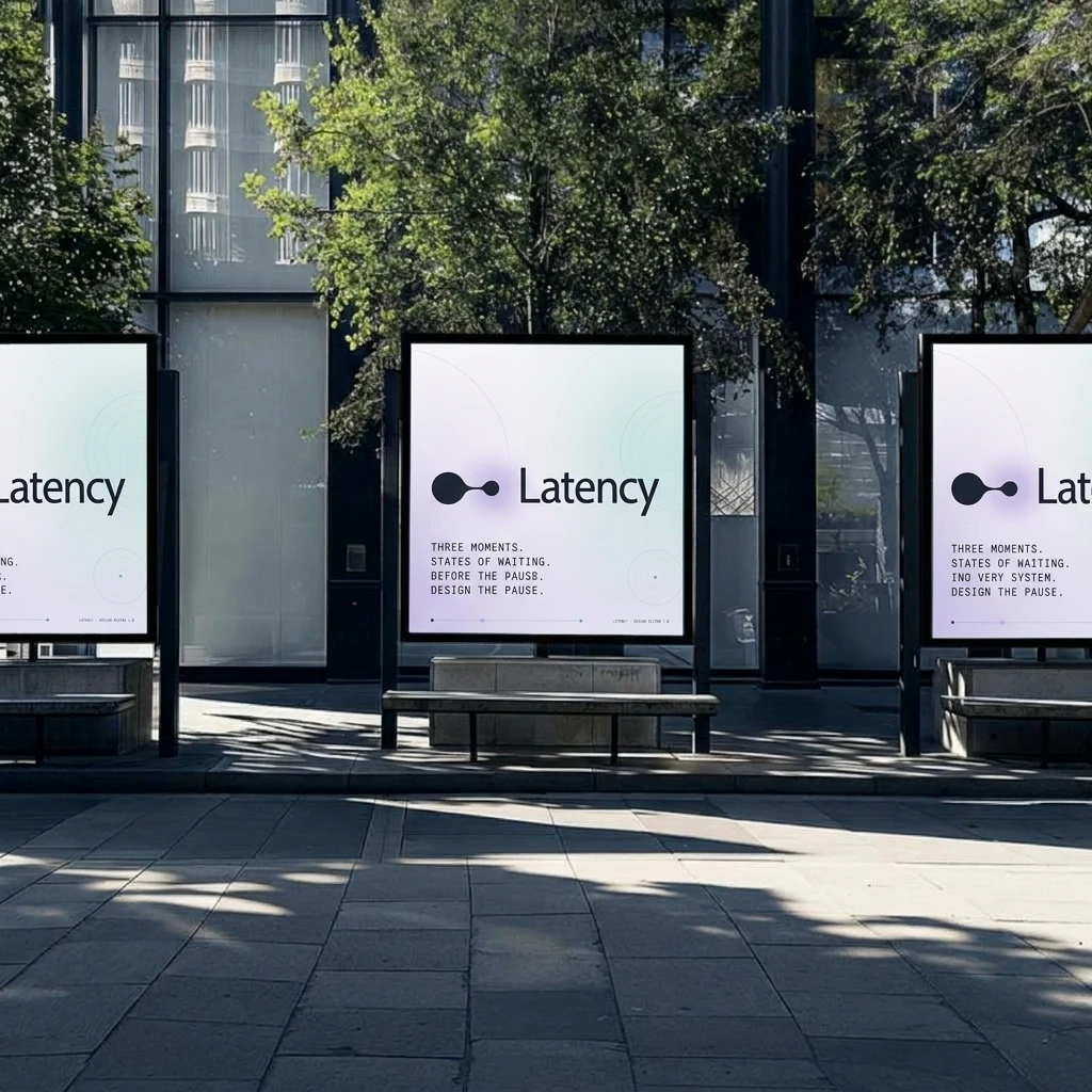
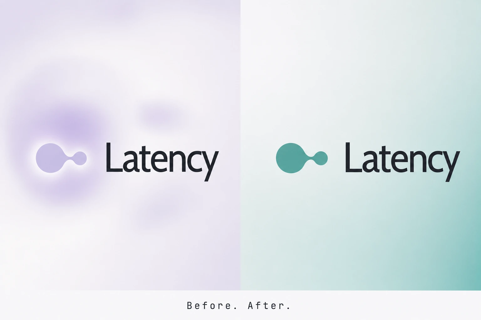
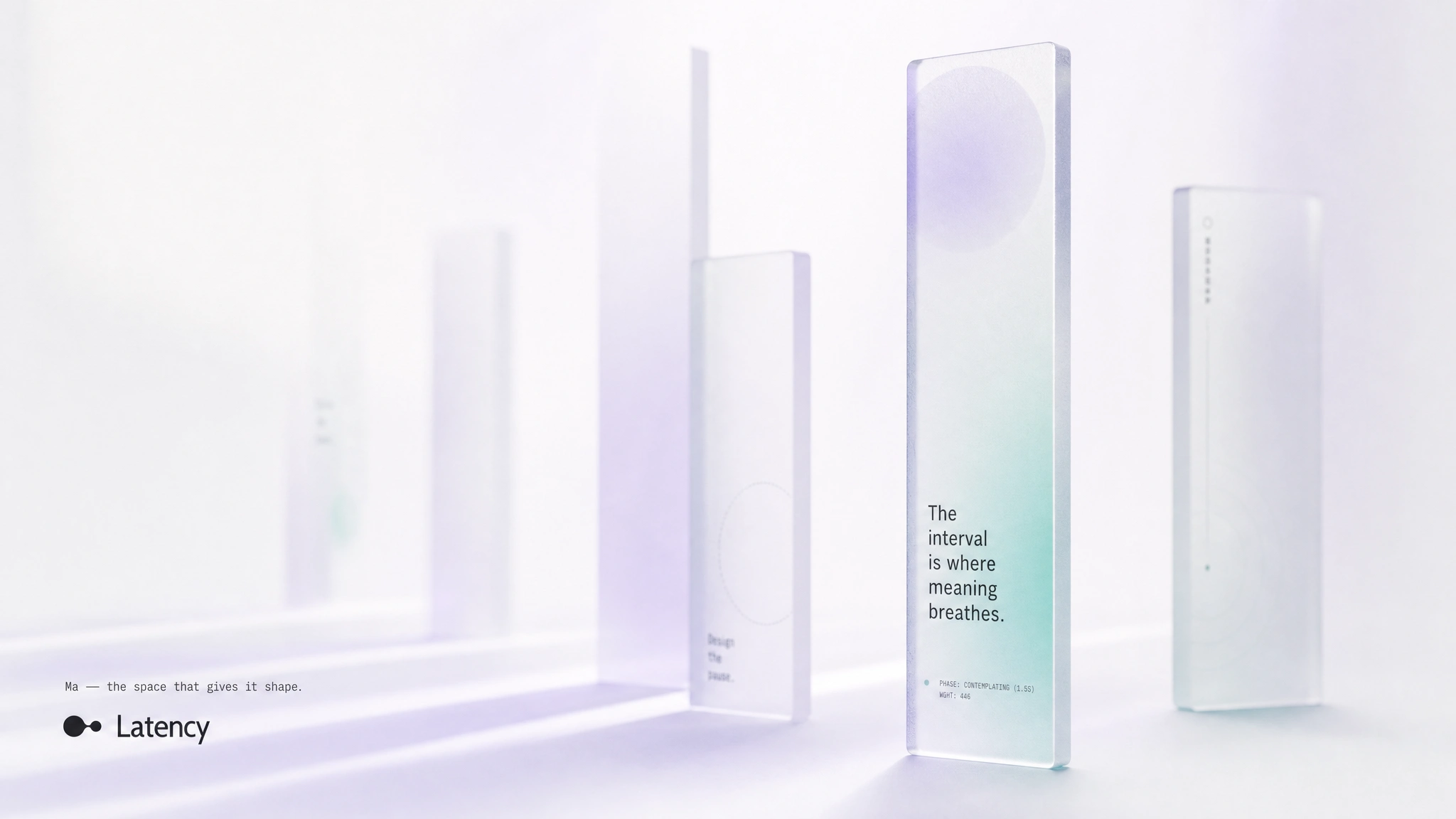
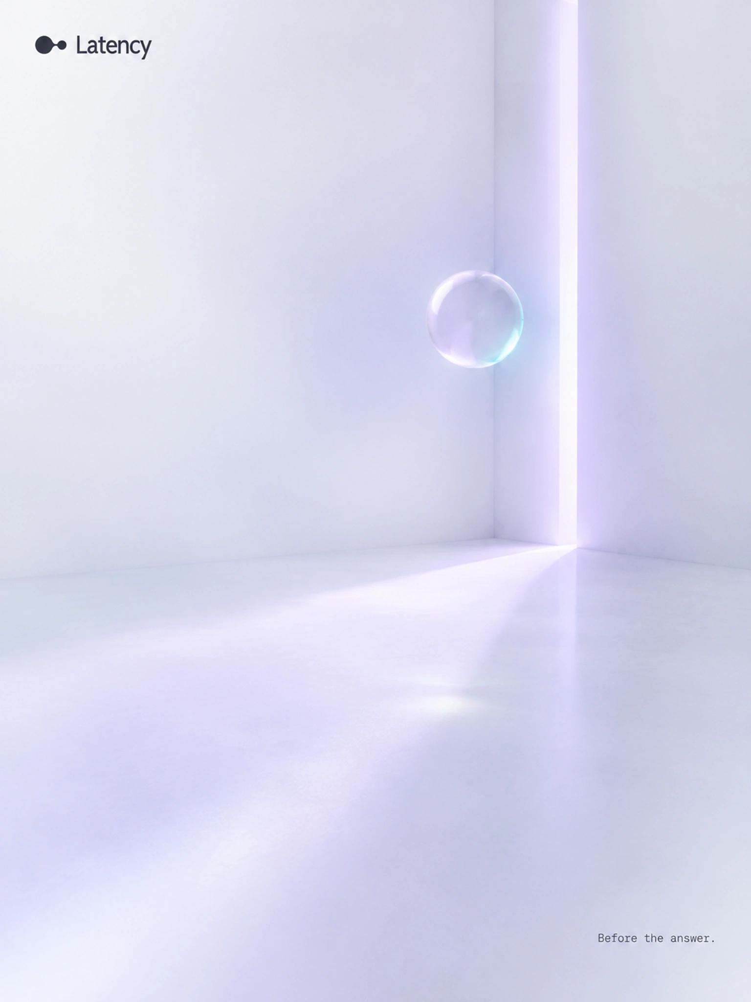
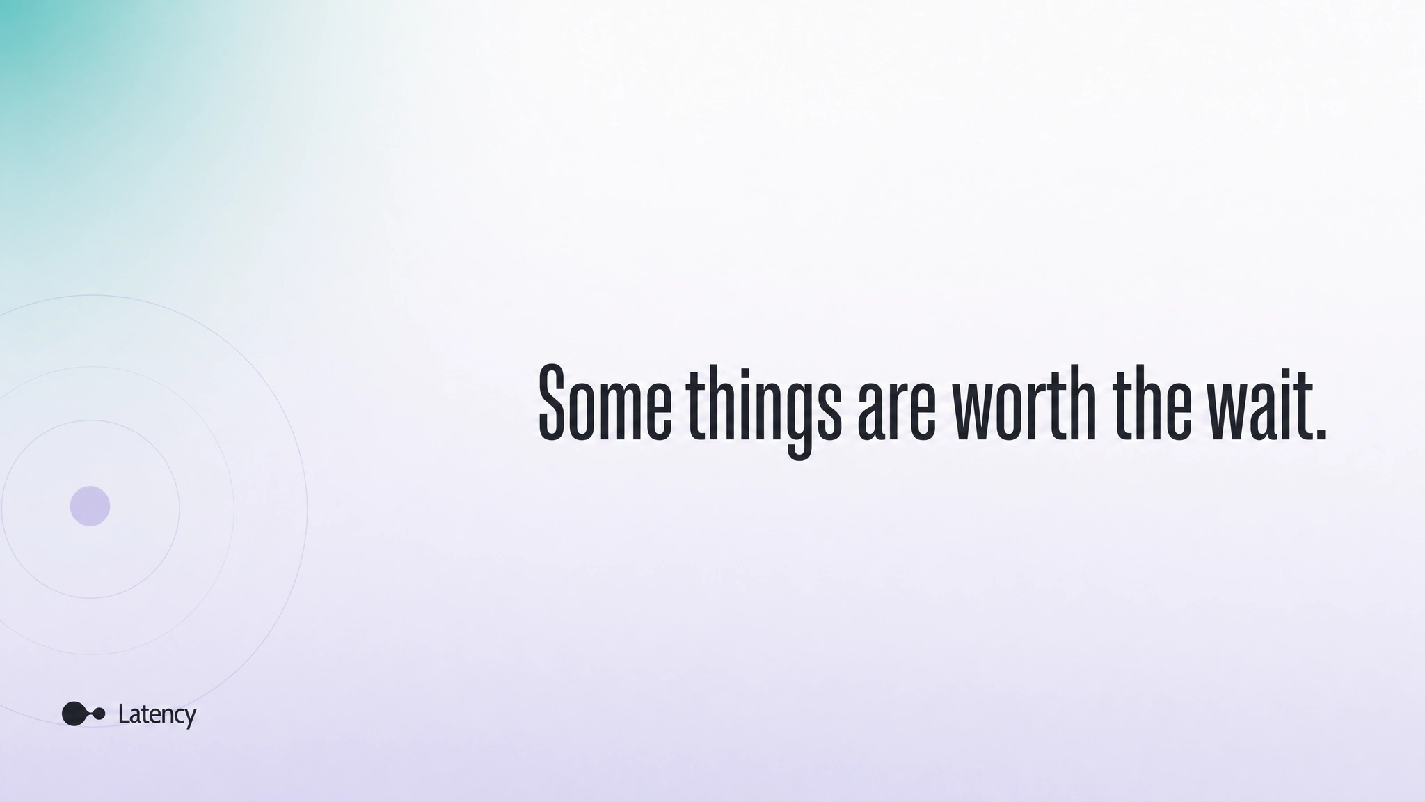
Fourteen visuals. Three street shelters in a row. A subway billboard with its right two thirds left empty on purpose. A long-exposure trail that ends in a single teal point. Frosted slabs spaced wider than they are thick. An empty room with one slit of lavender light. A Before/After diptych where the only change is the connector turning from lavender to teal. Every surface gets one sentence: "Design the pause." "Some things are worth the wait." "Before the answer." "Designed on purpose."
INTERACTIVE SITE
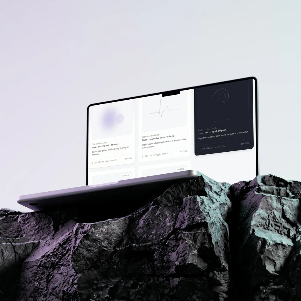
I built it so the brand behaves instead of describing itself. The headline breathes, the gradient follows the cursor in real time, and a tap re-triggers the pause beat. Three Moments cards demonstrate the hardest states in AI UX: Handoff ("The exchange of intent."), Approval ("The reflective gate.") and Fallback ("Dignity in the unknown."). The Fallback card carries its own rule in the interface: no red alerts. A States of Waiting grid replaces the spinner with a breathing orb, a heartbeat waveform and a light-trail spiral, each labeled with its real state, like "awaiting model response".
THE RESULT
The system shipped complete: identity, campaign set, a Design System 1.0 poster and a working site where the idea is the interaction. It's a self-initiated studio brand, so there's no client quote and no analytics to report. What I can say is how it holds up against the test I set at the start: nothing in it fills a silence it doesn't have to. The wordmark sits alone in a gradient. The billboard says one sentence and leaves the rest of the wall empty. That restraint was harder to ship than any effect, and it's why the pause reads as a position instead of a gap.
PROJECT INFO
Studio: Révolté — revolte.design
Project: Latency
Year: 2026
Scope: Brand Identity, Logo, Color System, Typography System, Campaign Visuals, Web Design, Motion
Industry: AI Product Design / Interface Design

See more at revolte.design
Like this project
Posted Oct 15, 2026
Latency designs the pause before an AI answers. Identity, interactive site and campaign built on Ma, the space between
Likes
0
Views
2
Timeline
Sep 30, 2026 - Oct 15, 2026

