Loopin Brand Identity and App/website Design System

Révolté


LOOPIN — The Meeting That Fits in a Thumb
LOGLINE
A standup tool whose whole promise is less meeting, which meant the brand had to feel like an absence. I built it around one gesture, slide to stand up, and kept everything else quiet around it.
THE BRIEF
Loopin is an async standup product for distributed teams. Instead of a 9am video call, everyone posts three lines on their own time and the team gets one digest at 7am. That's the whole product, and it's also the whole problem.
Work tools tend to look one of two ways: urgent (badges, red dots, countdowns) or friendly (flat vector people holding oversized checkmarks). Loopin sells the opposite of both. It removes a meeting. A brand for something that removes things can't shout, and it can't turn into a meditation app either. The buyer is an engineering lead who wants fewer calendar invites, not a journey.
I took the full stack: identity, color and type, photography direction, out-of-home, merchandise, app screens and the marketing site. The hard part was tone. Calm is easy to fake and hard to make specific.
THE APPROACH
My first instinct was my house style: black ground, cream serif, one warm accent. The first mark was a double-o with a looping line threaded through it and a diamond at the end of the stroke, like a thrown string. I dropped it. It had too much illustrated detail to survive at favicon size, and the black ground made Loopin feel like a night tool when the entire pitch is morning.
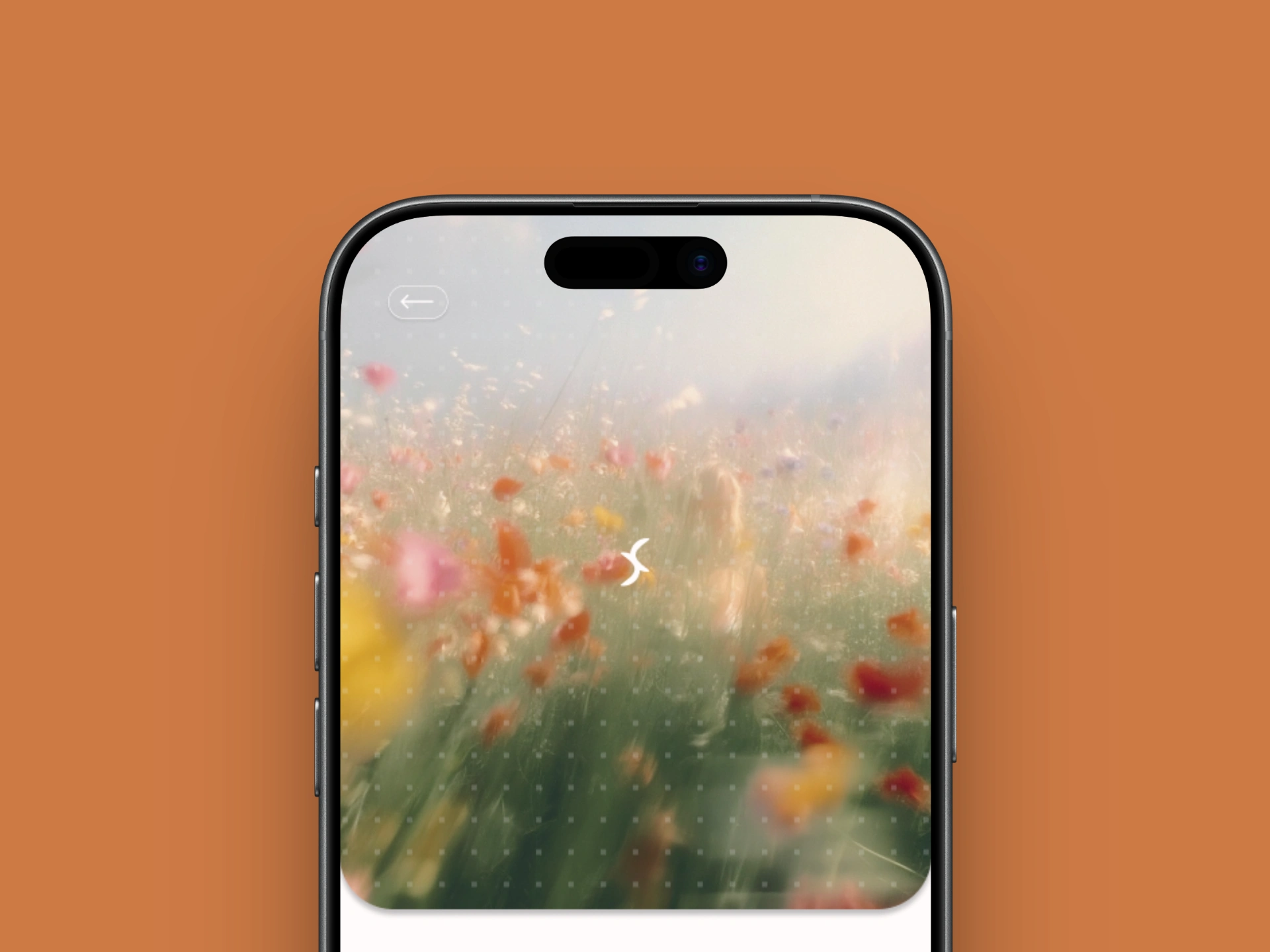
The unlock was the photography. Once I built references around real early light (a field at first light, a wet street with the sun low in the lens, a blurred figure in tall grass), the palette followed the light instead of my habits. Black became a shadow tone. Amber stopped being a 5% accent and became the voice of the brand.
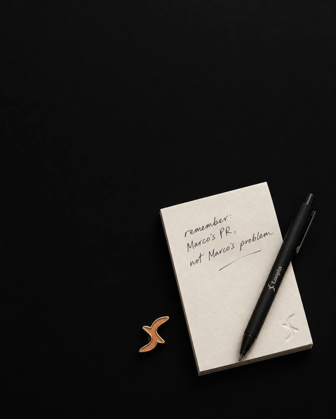
The mark came from the same subtraction. I cut the double-o and the diamond and kept one stroke: a crescent that folds back through itself, closing a loop without ever becoming a circle. I tested it inside the logotype, replacing the o, and standing alone. Alone, it holds up in an app grid and doesn't read as glasses or an infinity sign. Beside the word it has more presence, so the side-by-side lockup became the primary.
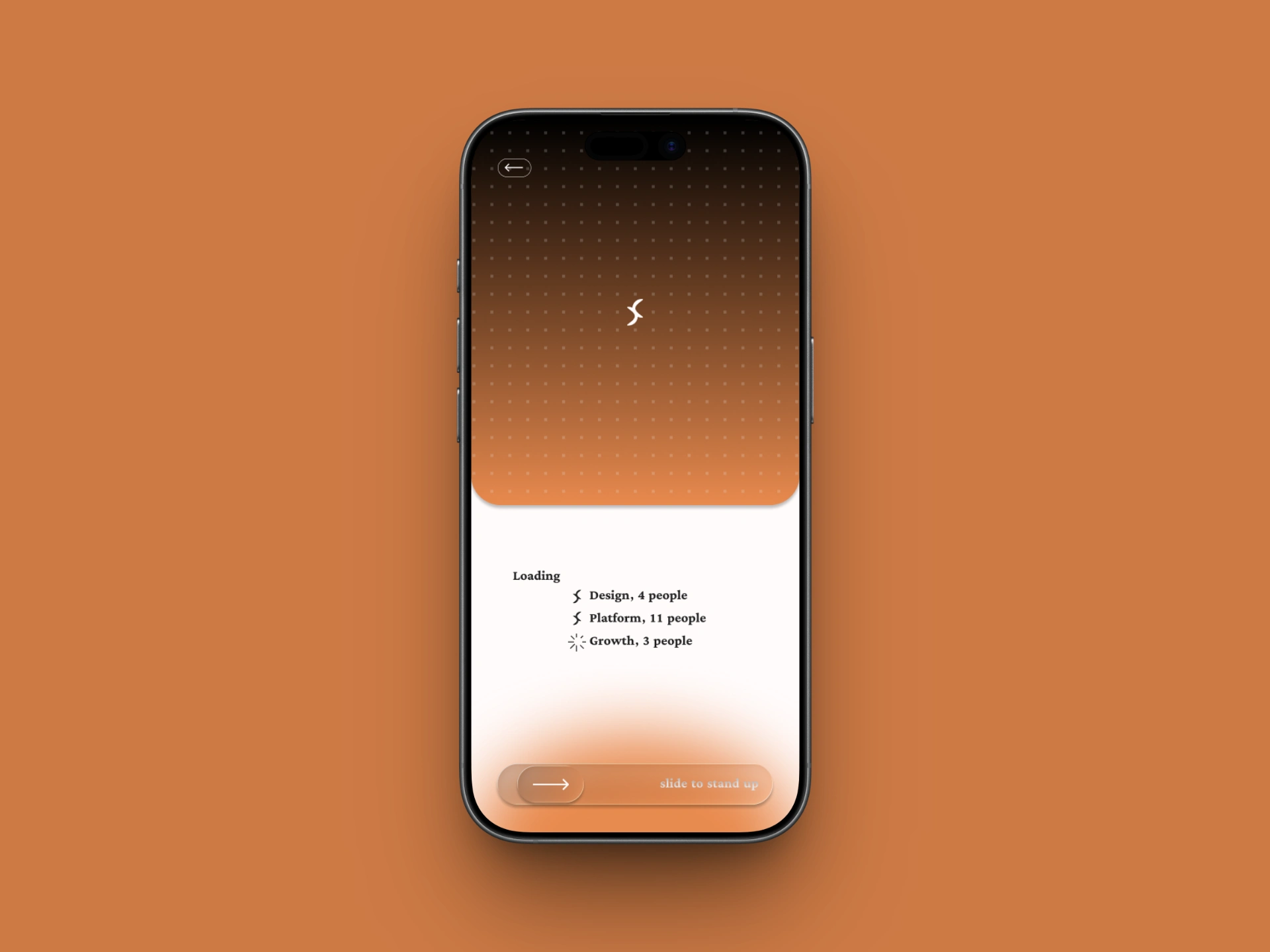
The last decision was about interaction. A standup app lives or dies on its daily action, so I made it physical: slide to stand up. It borrows the lock-screen gesture and turns a meeting into a two-second move of the thumb.
THE WORK
LOGO
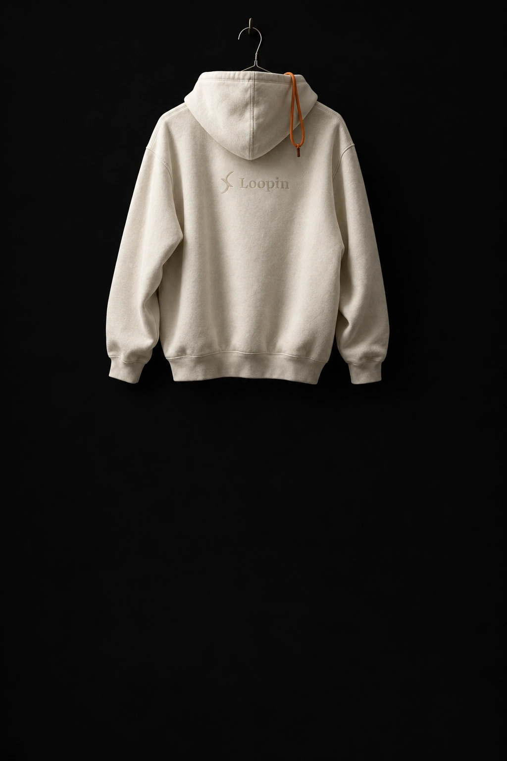
One crescent stroke, closed on itself, drawn as a single form with a thick-to-thin taper. It sits left of the Loopin wordmark in the primary lockup and works alone as the app mark and as a small texture dropped into photography. In the app it doubles as the loading glyph: team rows resolve one by one, and a spinner swaps to the mark as each team finishes.
COLOR SYSTEM
Cream paper
#FBF3E9 carries content. A peach gradient from #F2A878 to #FBE4CE carries hero moments, always vertical, never flat. Loop amber #DE7C3E is the voice: logotype, headlines, live states. Warm black #2A1F18 is a shadow, never a ground. The ratio is roughly 50/30/15/5, and there is no fifth color.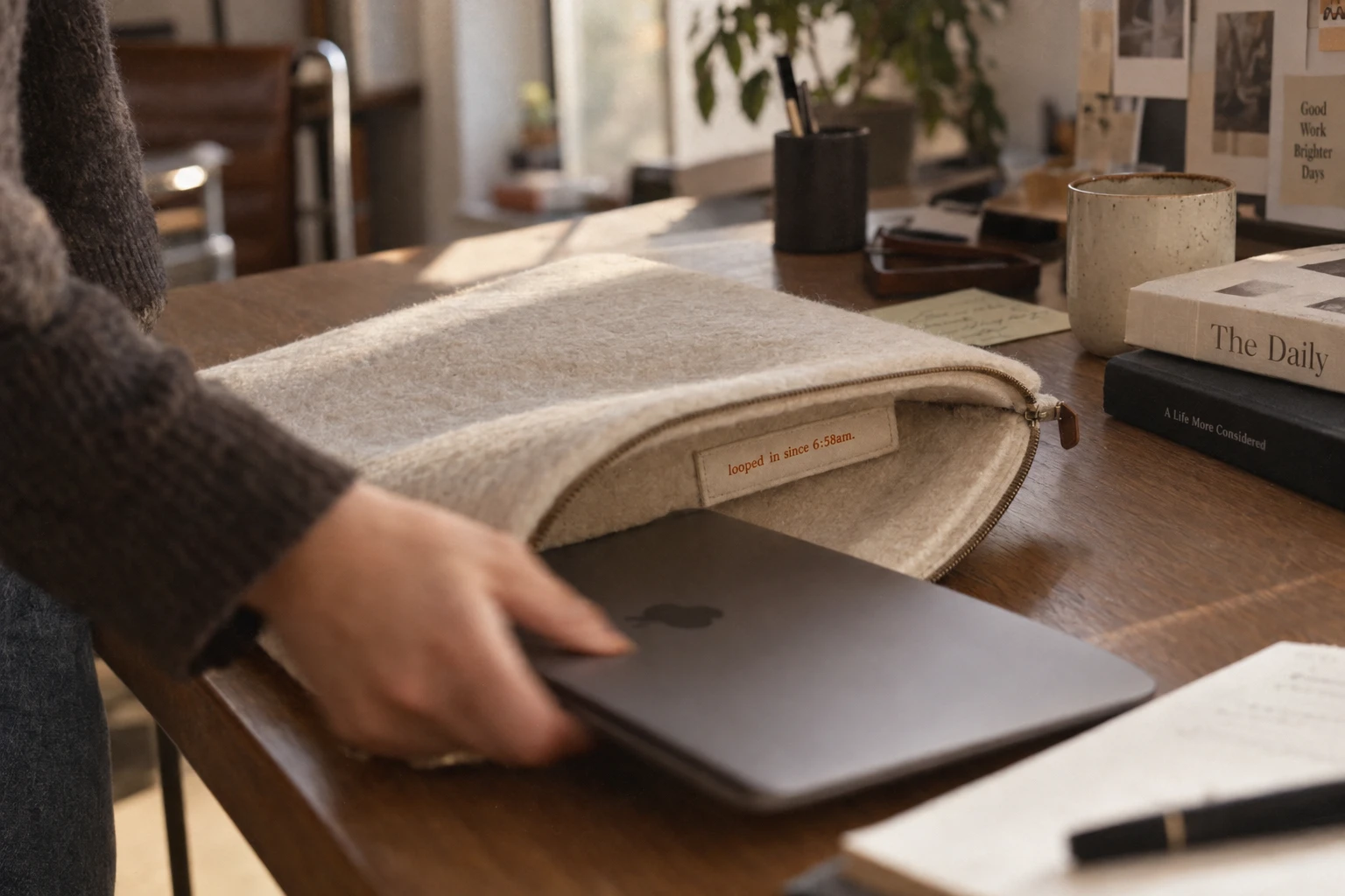
TYPOGRAPHY
Idiqlat has three weights, 200, 300 and 400, and no bold. I treated that as a rule: hierarchy comes from size, color and spacing, and weight is never faked. Dense information sits in a quiet sans so the serif never has to do a job it wasn't built for.
PHOTOGRAPHY DIRECTION
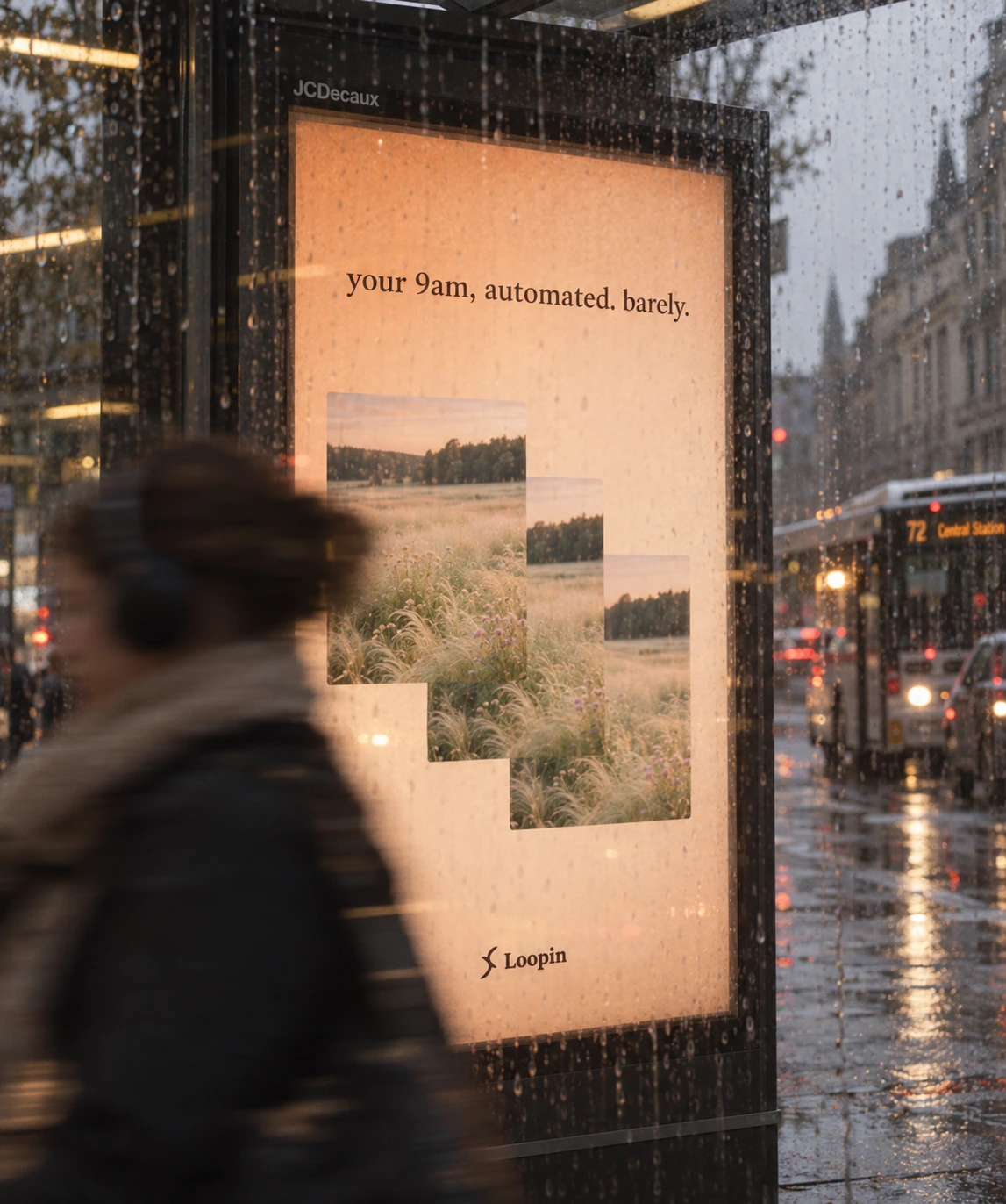
A 35mm film register: warm, slightly desaturated, visible grain, low directional light, nothing symmetrical. Subjects are quiet: empty fields, rain on pavement, window light on a desk, steam, a long shadow. No logos, no interface, and enough empty space for a headline to sit on the image.
OUT-OF-HOME
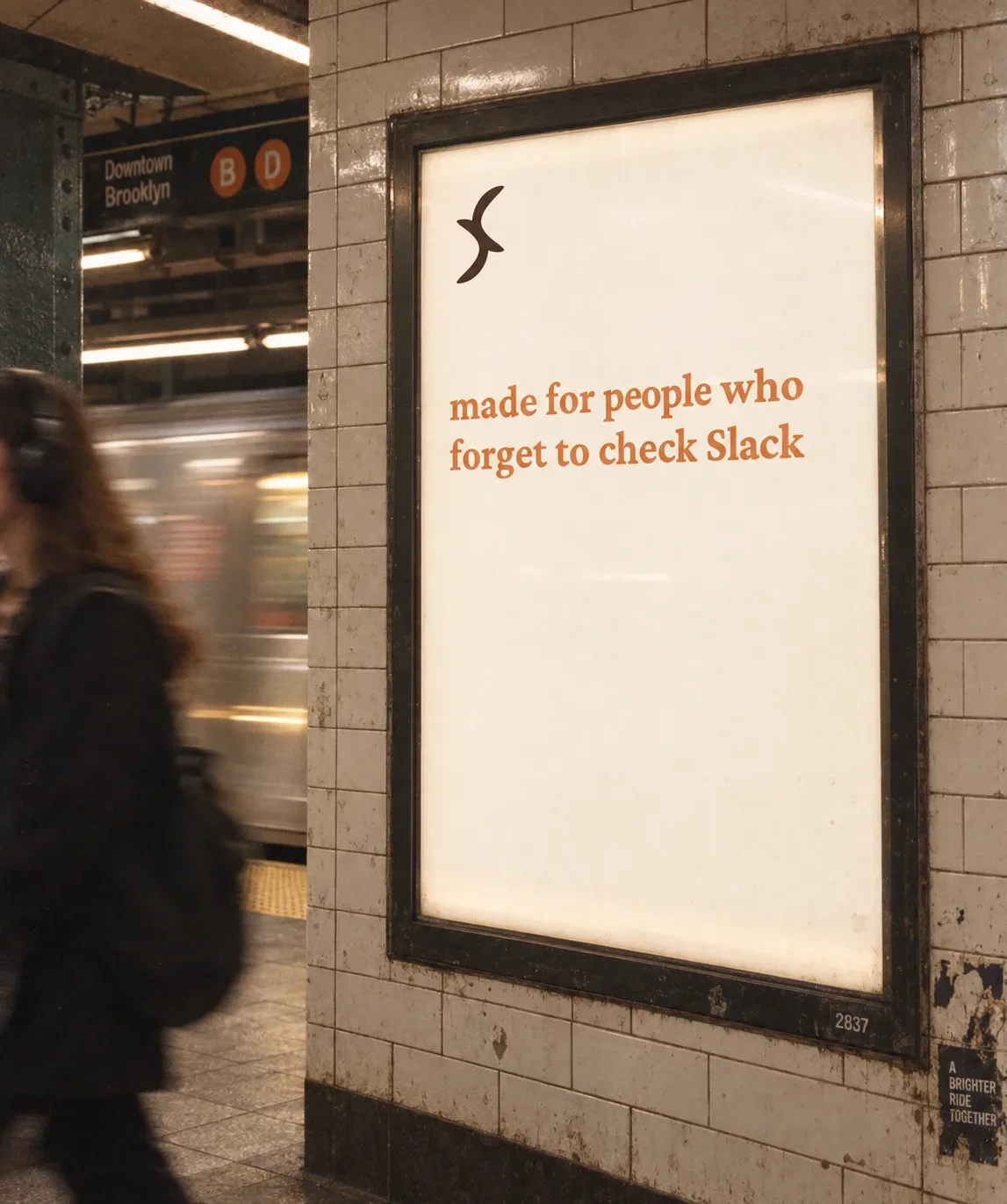
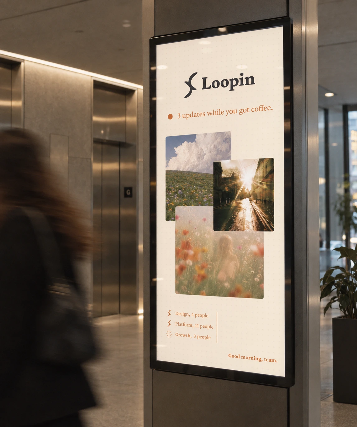
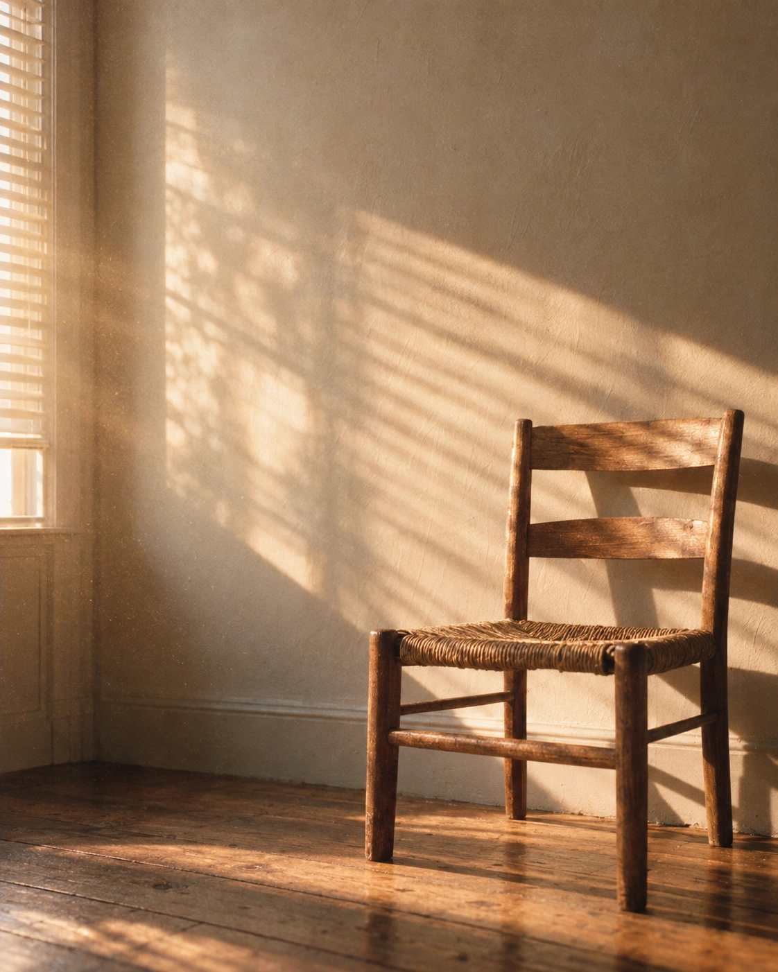
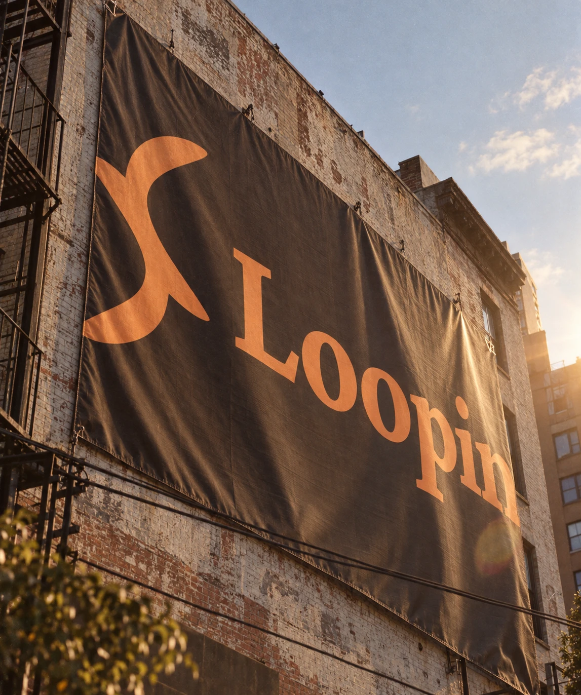
Four placements, each with one line and a lot of air. A metro platform poster says "made for people who forget to check Slack". A rain-streaked bus shelter says "your 9am, automated. barely." A building-side banner crops the wordmark huge in amber on warm black. An office lobby screen says "3 updates while you got coffee."
MERCH
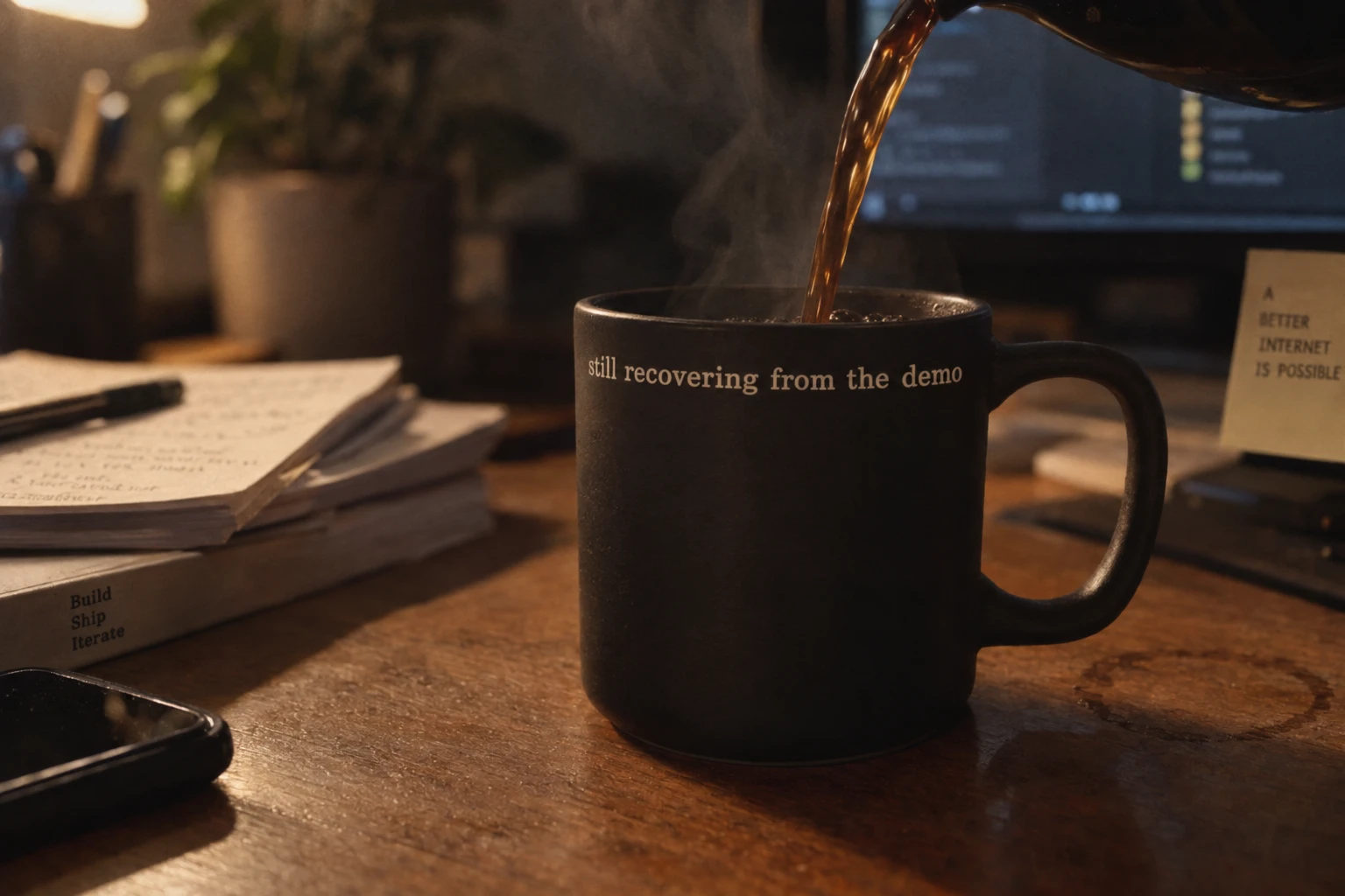
Five desk objects, each with one line of micro-copy. A steel flask: "hydrate like your standup depends on it". A ceramic mug: "still recovering from the demo". A felt laptop sleeve: "looped in since 6:58am." A lanyard and badge: "access: async, always". A desk mat printed with a loose diagram of three words: async, live, looped.
APP
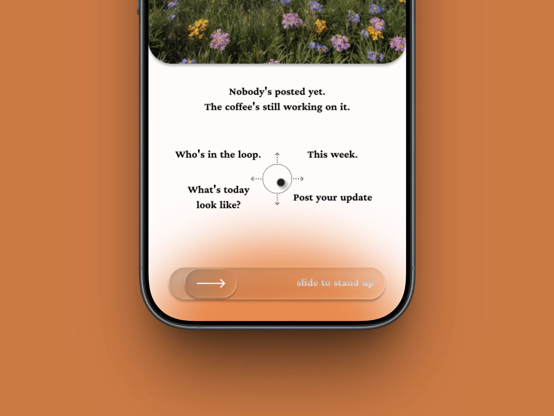
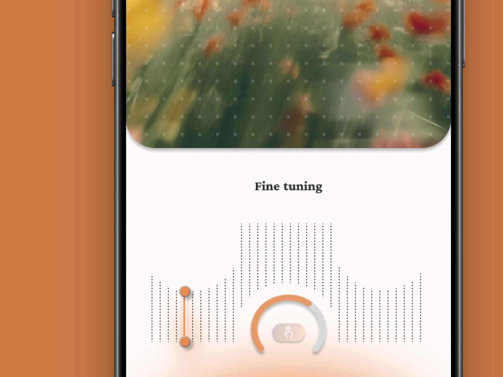
Five screens at iPhone 16/17 Pro Max proportions. The top half is a window: a gradient, then a dot grid, then film photography, with heavily rounded bottom corners. Everything you touch lives below on near-white. The slide-to-stand-up track sits at the bottom over an amber glow. The home state has a four-way compass with four destinations: Who's in the loop, This week, What's today look like, Post your update. The last screen, Fine tuning, uses a dotted waveform, a range slider and a dial.
WEBSITE
One long page structured as a morning. It opens at 7:00 AM on a field at first light and walks through the cost of a live standup. It includes a standup-tax calculator (8 people, 20 minutes, $85 an hour comes out at $57,120 and 672 hours a year), a simulator that composes a three-line update and renders the 7am digest, the five app screens, a timezone digest, pricing and a manifesto. Motion is scroll-led and slow. The testimonials and figures on the page are concept copy, not customer data.
THE RESULT
The system holds across identity, campaign, product and web: one mark, one palette, one film-photography register and one gesture, from a bus shelter to a thumb. The same amber that carries a building-side banner shrinks to a live dot in the app, and the brand stays recognizably itself at both scales.
There are no client numbers here, and I'm not going to make any up. What shipped is a complete, working system and a site you can scroll through at 7am.
PROJECT INFO
Révolté — revolte.design
Project: Loopin
Year: 2026
Scope: Brand Identity, Logo, Color and Type System, Photography Direction, Out-of-Home, Merchandise, Mobile App Design, Web Design
Industry: B2B SaaS / Team Productivity
See more at revolte.design
Like this project
Posted Oct 8, 2026
Loopin replaces the 9am standup with one calm 7am update. Brand identity, film-grain campaign, merch, app screens and a scroll-led site
Likes
0
Views
3
Timeline
Sep 16, 2026 - Oct 8, 2026

