Built with Lovart
Oddly Good Brand Identity Design & Web design

Révolté


ODDLY GOOD — Still Life, Still Good
LOGLINE
A snack brand for vegetables the supermarket rejects. Every pack is a Flemish oil painting you could swear you could touch.
THE BRIEF
I started with a premise I couldn’t shake: a huge share of perfectly good vegetables never leaves the field because of the shape it grew in. A forked carrot tastes exactly like a straight one. It just looks like itself.
The tension was that food-waste brands almost all look the same. Kraft paper, chalk lettering, cartoon vegetables, a green leaf somewhere. They lecture. I wanted the opposite: a brand that treats the wonkiest vegetable as a subject worth a portrait, and says so with a straight face.
I took on everything. Naming direction, identity, packaging, out-of-home, retail, merch, social and web.
THE APPROACH
I opened ten brand ideas and Oddly good was the one I kept returning to. Then I pushed it through ten visual directions: peel-back stickers, museum specimens, op-art warps, paper theatre. They all worked as ideas. Only one made the flaw feel valuable instead of cute: Flemish still life.
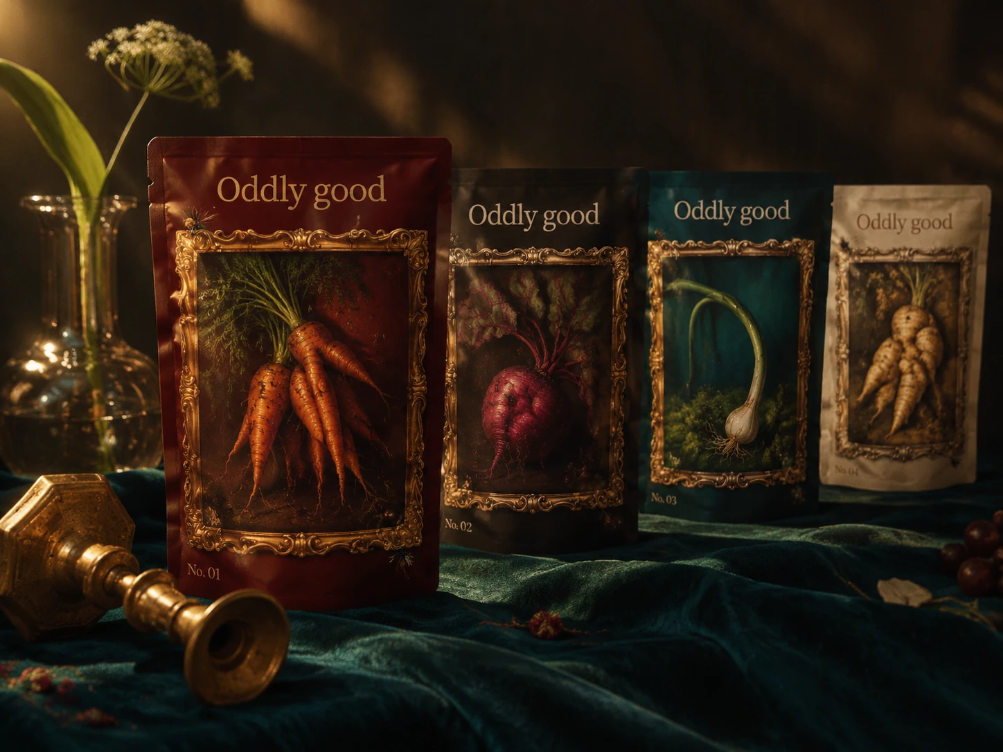
The reference set decided it. A hand crossing the picture plane into a black frame. A fly sitting on a loaf in a 16th-century oyster painting. A museum catalogue number in the corner. A bent spring onion shown with the dignity of a portrait. Old masters used tiny living details to prove a painting was real, and that is exactly what imperfect produce does.
My first logo was a bouncy brush script. I dropped it. It read friendly and handmade, which is the farmers’ market look I was trying to leave, and it would have looked like a sticker laid over an oil painting. I moved to Cactus Classical Serif at -3% tracking, kept lowercase “good” for warmth, and moved the wonk out of the letters and into the details: the fly, the dewdrop, the curl of peel.
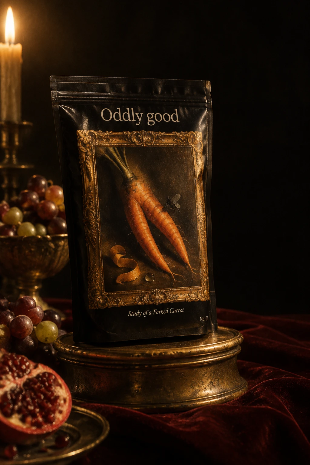
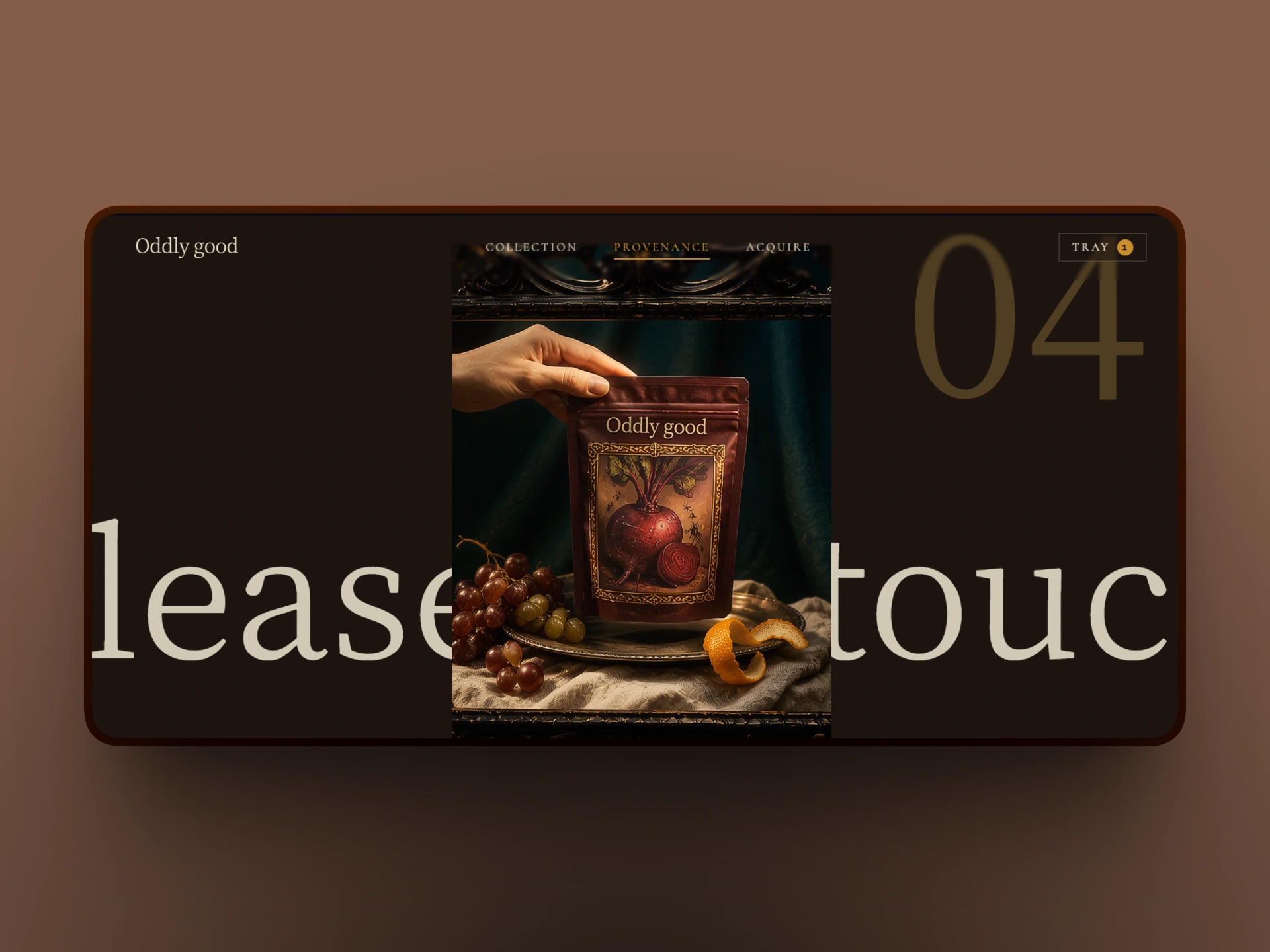
One idea runs through everything: the pack is the painting, and the painting has a frame you can reach past.
THE WORK
Logo
Cactus Classical Serif, single weight, -3% tracking, mixed case. Pewter Cream #E8DFC8 on dark grounds, Varnish Black #1B1410 on cream. It sits like a plaque and never moves.

Color and type
Grounds stay dark: Varnish Black, Oxblood #3A0B0B, Velvet Teal #1F4A44. Candle Ochre #C9922E and Tarnished Brass #8A6A2F are reserved for frames and gilt. Pewter Cream is the only text color on dark. No bright white, no flat saturated color. Labels use a tracked small-caps serif, and no sans-serif appears on the front of any pack.
Packaging
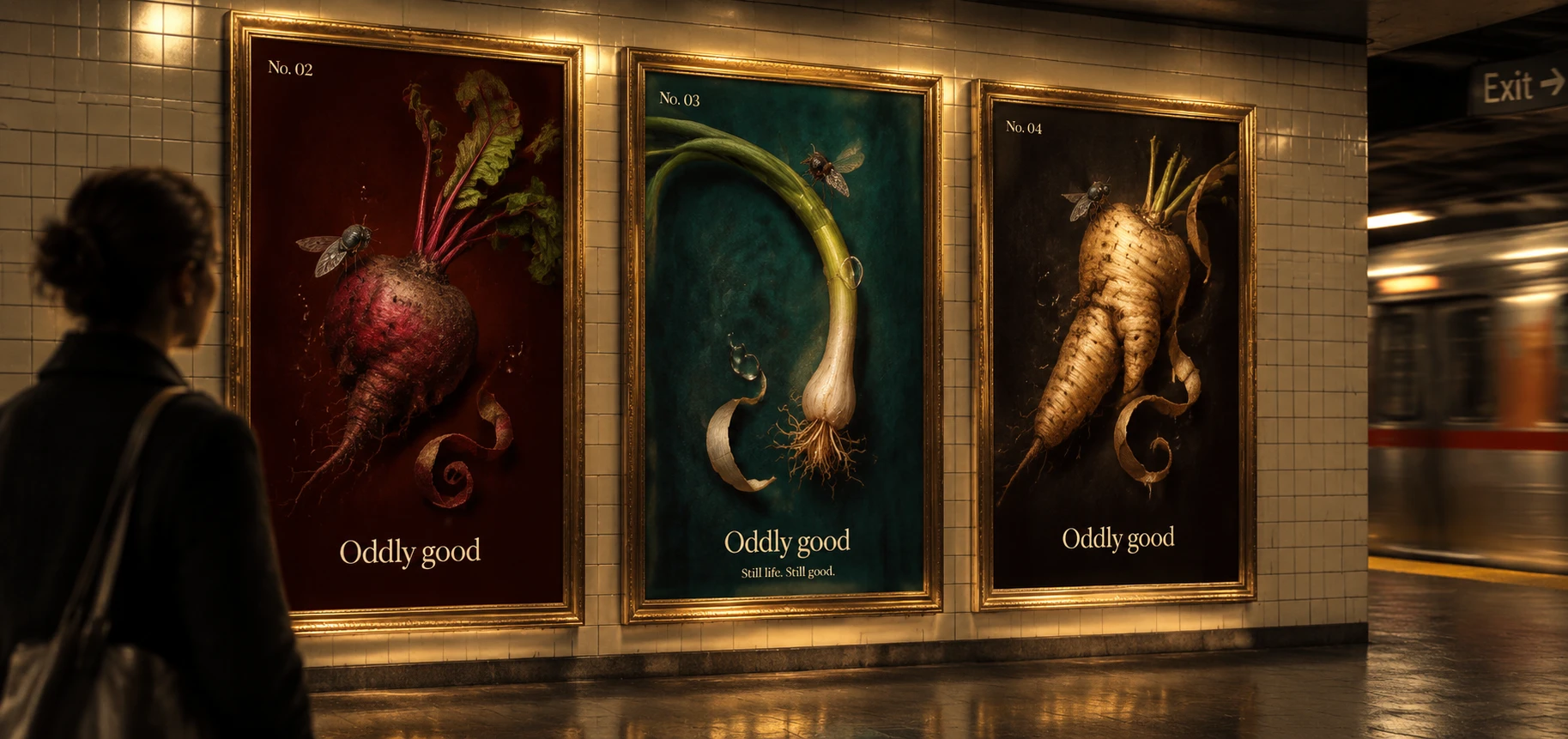
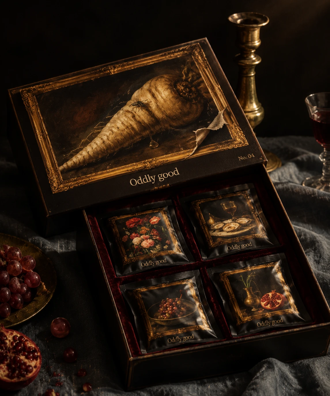
Four studies, each with its own ground: Forked Carrot on Oxblood, Lopsided Beet on Varnish Black, Bent Spring Onion on Velvet Teal, Knobbly Parsnip on Pewter Cream. Each has a gilt frame, a painted fly, a dewdrop and a catalogue number that doubles as the batch code.
Out-of-home
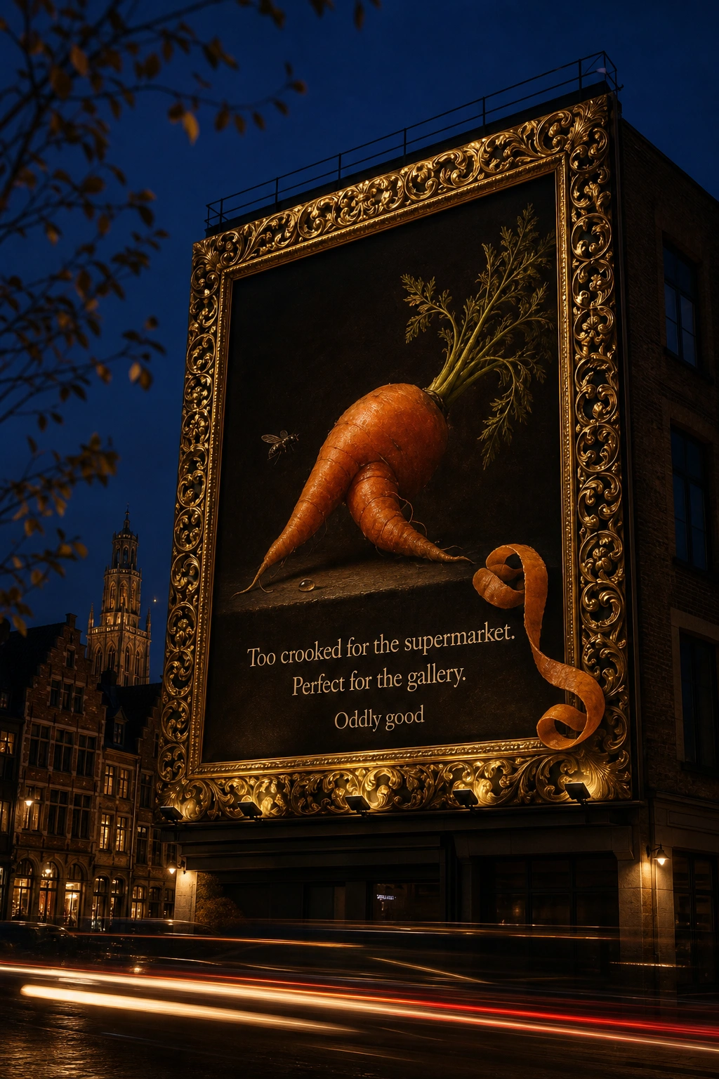
A rooftop billboard where a curl of carrot peel breaks out of the frame and hangs over the real edge. A metro triptych where three posters read as one gallery wall.
Retail and merch
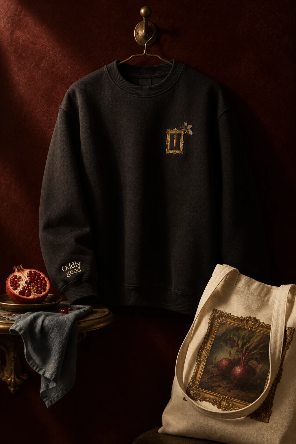
A pop-up stand framed like a painting, with a brass label that says “Please do touch.” A black sweatshirt carrying a tiny embroidered frame, a stitched fly and the logo on the cuff.
Social and web
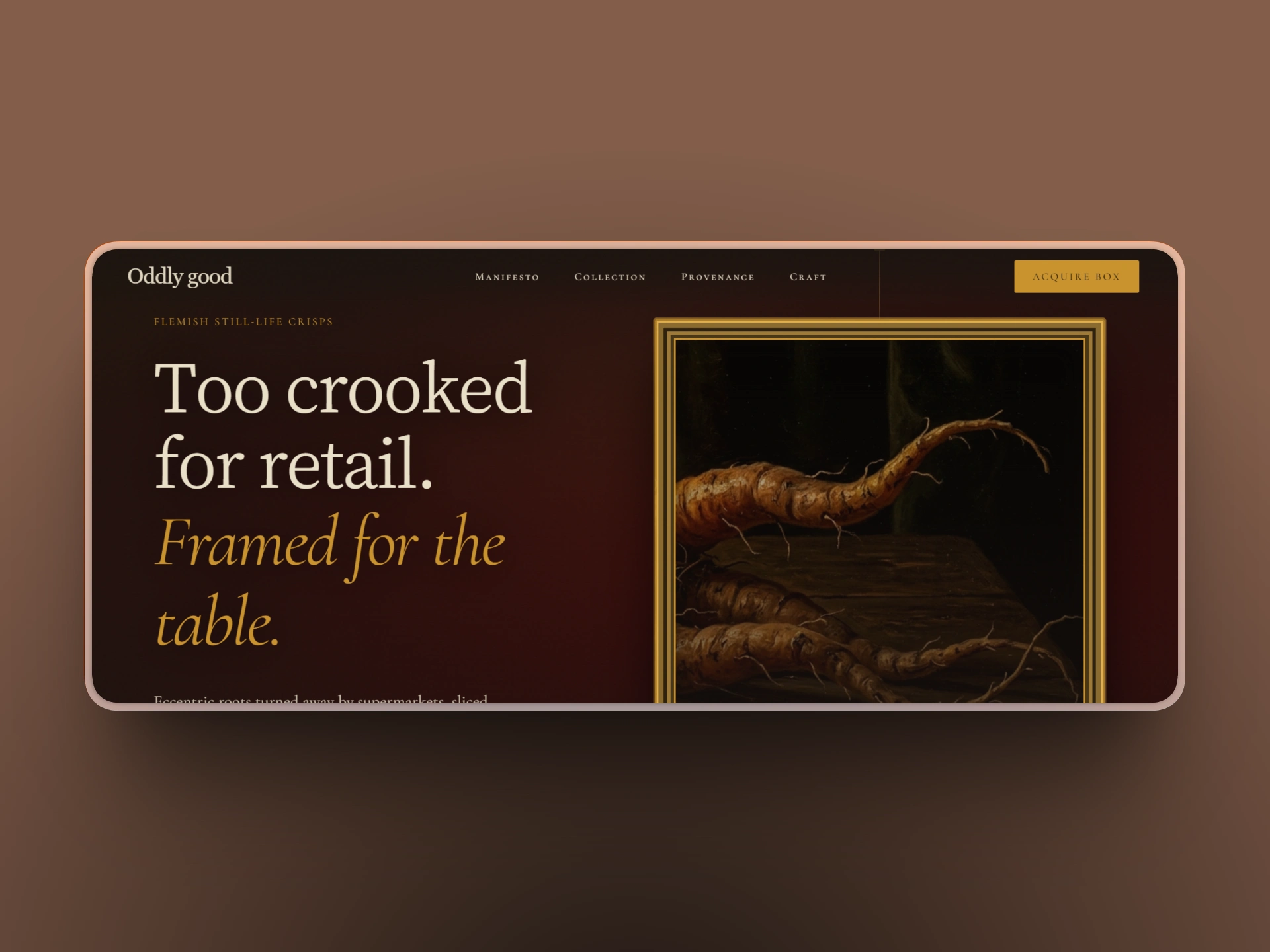
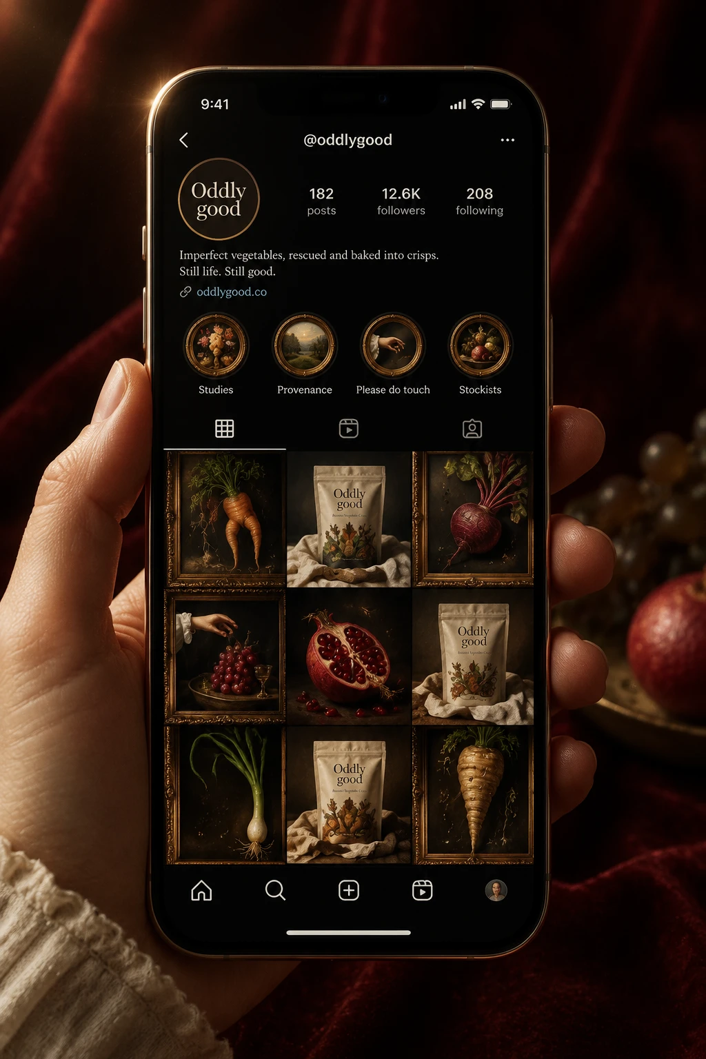
An Instagram grid that reads as a gallery wall. A site (live here) that opens on “Too crooked for retail. Framed for the table.”
THE RESULT
The system holds from a 40g pouch to a rooftop board without changing its logic: dark ground, gilt frame, one living detail, one catalogue number. The humor stays in the details, and the craft stays sincere.
I wasn’t going for a parody of museum language. The brand never mentions waste once on the front of a pack, and it still lands the point. The vegetable is the hero, and the supermarket’s loss is the gallery’s gain.
PROJECT INFO
Révolté, revolte.design
Project: Oddly good
Year: 2026
Scope: Brand Identity, Logo, Packaging, Out-of-Home, Retail, Apparel, Social, Web
Industry: Food and Snacks
See more at revolte.design
Like this project
Posted Oct 12, 2026
Oddly good turns rejected vegetables into Flemish oil paintings: gilt frames, painted flies, and packs that fool the eye. The flaw is the masterpiece
Likes
0
Views
7
Timeline
Oct 2, 2026 - Oct 12, 2026

