VECTIS Brand Identity and Web Deployment

Révolté


vectis — Proof Carved in Stone
A zero-knowledge privacy protocol that treats identity the way a cathedral treats its effigies: carved into permanence, name worn off the stone. I built the whole system around one idea — verification without exposure — and let the visual language enact it literally, one dithered pixel at a time.
THE BRIEF
VECTIS came to me as an open brief with one instruction: build something in the register of dithered, halftone editorial portraiture — dark, grainy, unmistakably analog despite being entirely digital. No product spec, no locked positioning. Just an aesthetic and a sector: Web3.
The tension was immediate. Web3 privacy tech has a look, and it's not this one — neon gradients, glowing mesh backgrounds, holographic sheen, the visual vocabulary of a trading terminal. I had a reference set that looked like scanned museum busts. Those two worlds don't meet anywhere in the category's existing visual language.
What I took on was making the mismatch the point instead of a problem.
THE APPROACH
My first instinct was to read the dither imagery as surveillance aesthetic — redacted documents, CCTV grain, the "1984" playbook privacy brands lean on by default. It technically worked. It also put VECTIS in the same visual conversation as every other zk-privacy pitch deck, just with better grain.
The unlock came from the brief itself: medieval statuary, not surveillance footage. A statue doesn't hide information — it's carved permanently, publicly, and the name attached to it is simply gone, worn away by time rather than redacted by force. That's a completely different emotional register from "your data is being hidden from you." It's "your identity has been treated with the same permanence and reverence as a monument, and the personal detail was never load-bearing to begin with."
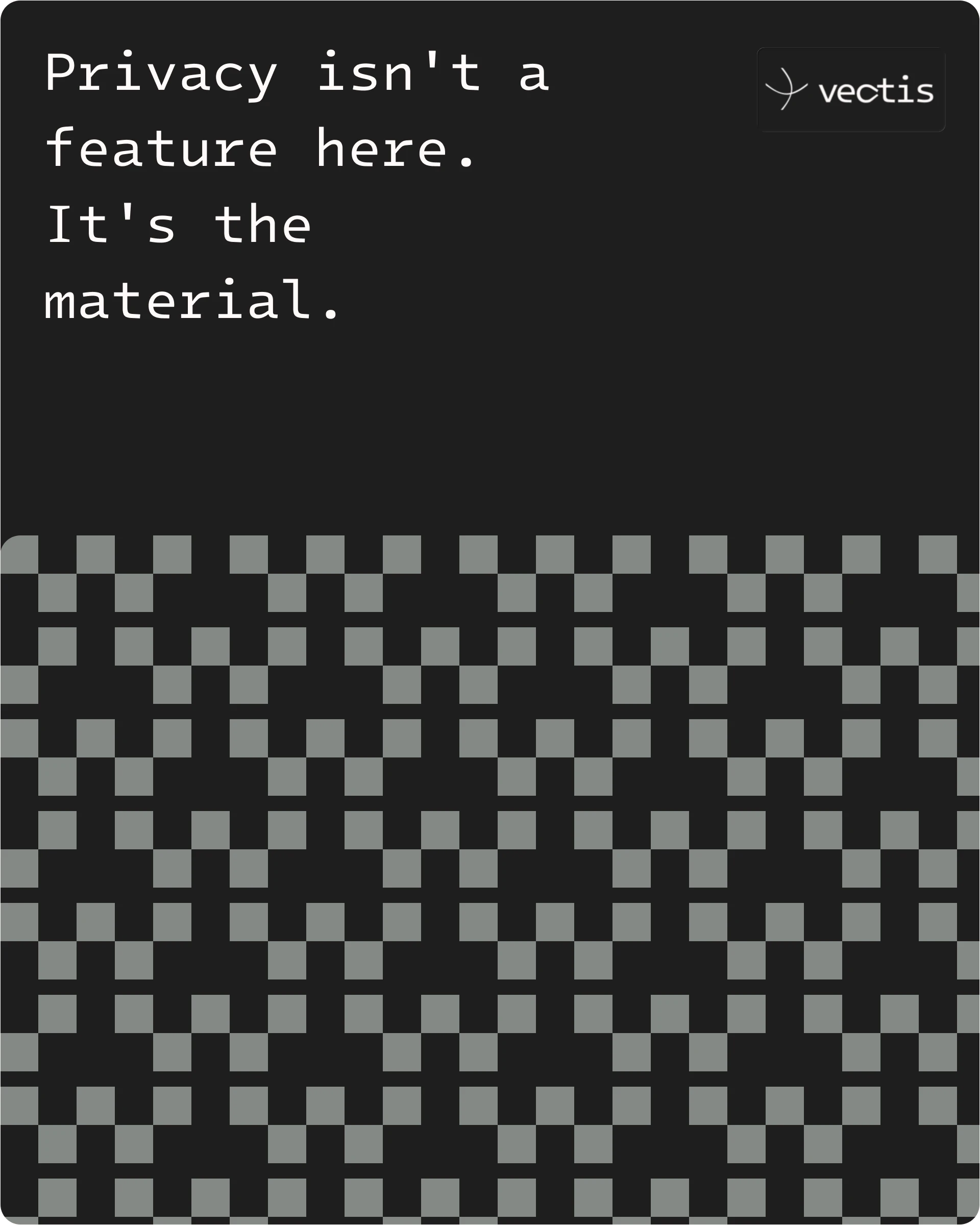
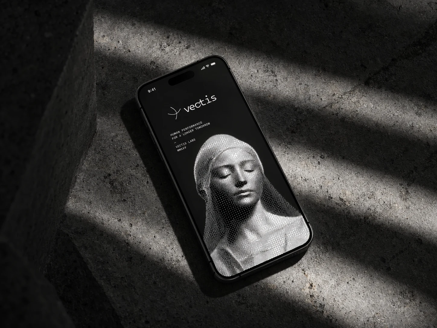
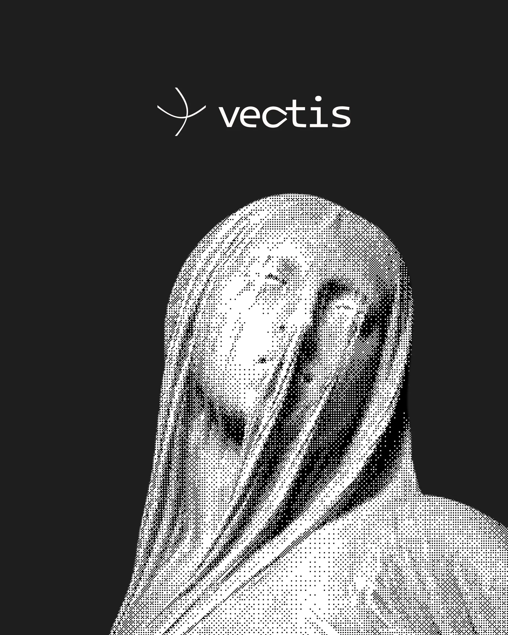
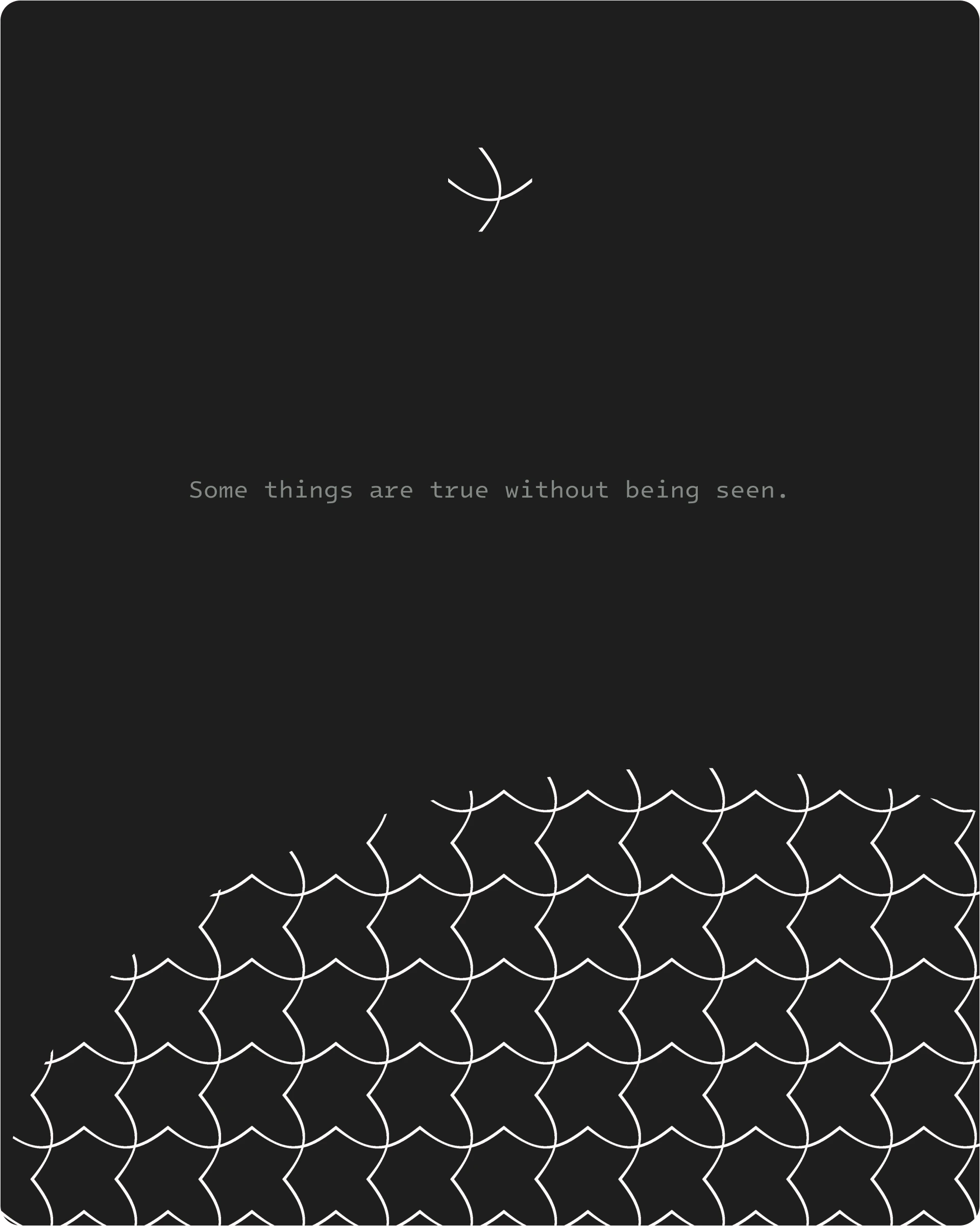
Once that reframe held, everything else followed one rule: nothing is remembered, everything is kept. The dither pattern stopped being noise-as-obfuscation and became noise-as-material — literally the texture of stone. I split it into two disciplined families and never let them cross: fine-grain true Bayer dither exclusively on anything depicting a face or figure, and a looser, larger-cell regular pattern for any decorative background or divider. One is identity being obscured. The other is data being structured. Conflating them would have collapsed the whole metaphor into decoration.
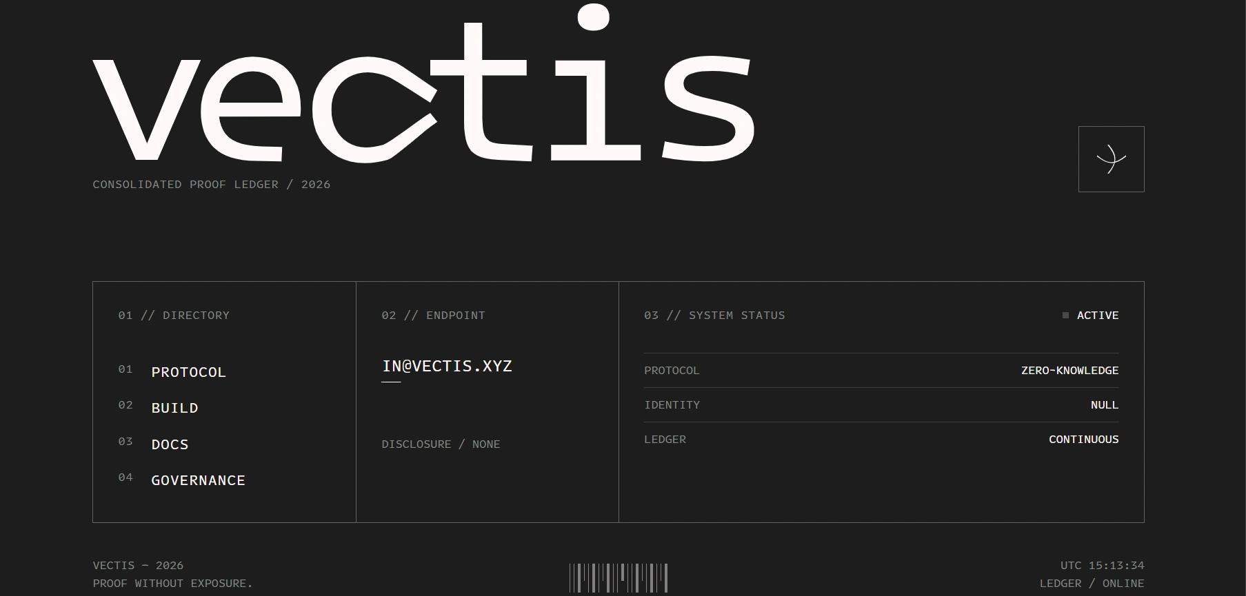
Color followed the same restraint. Three values — Ink, Bone, Ash — confirmed early and never expanded. No accent color anywhere in the system, including CTAs and hover states, because in a category built on glowing gradients, the absence of one is the most confident visual statement I could make.
THE WORK
VISUAL SYSTEM
Three-color palette (
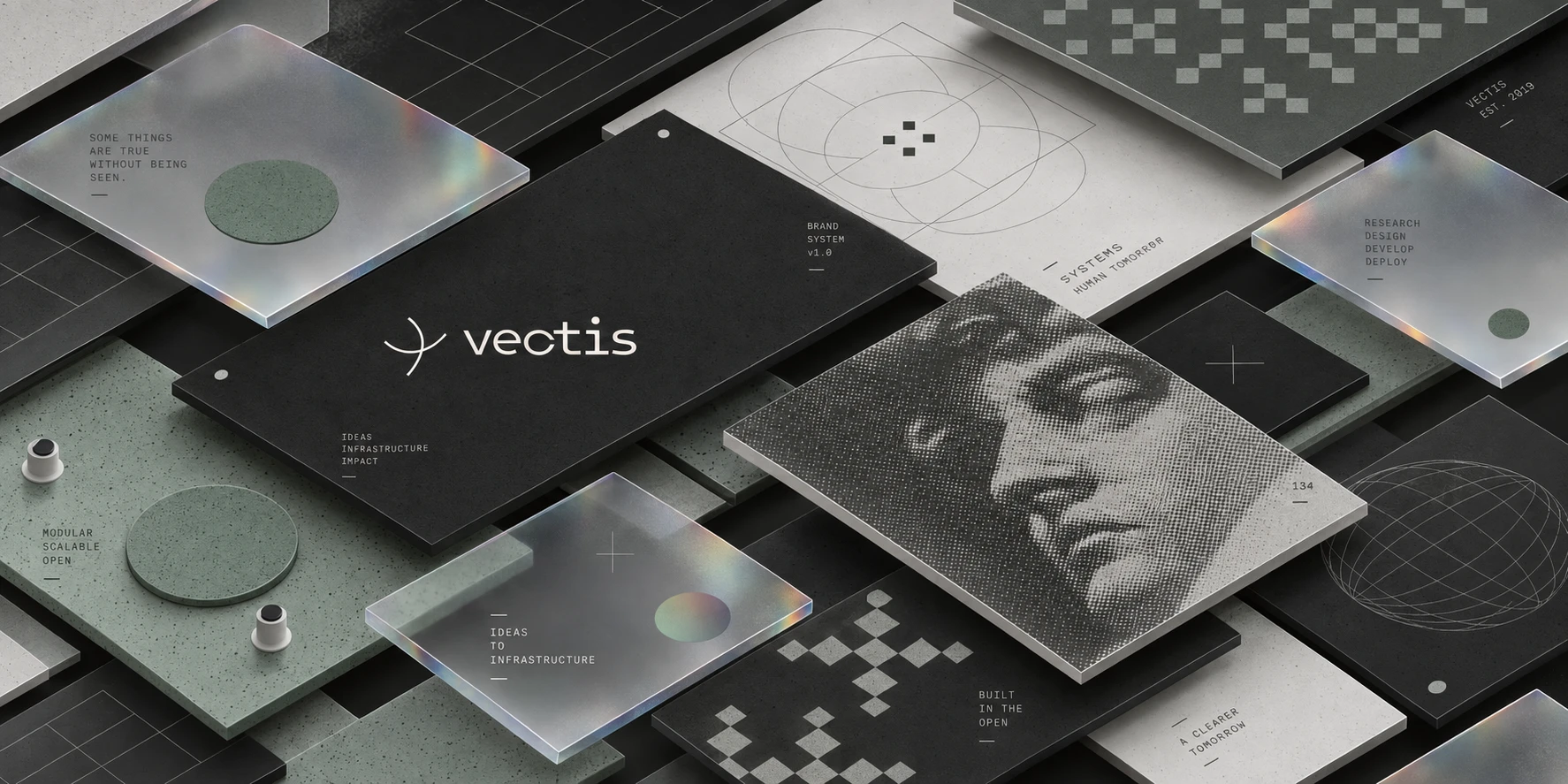
#1E1E1E, #FFFAFA, #838984) split into two registers — Void (Ink-dominant, for marketing/hero surfaces) and Dusk (Ash-gradient, for documentation/product surfaces) — so the same three colors serve two completely different reading contexts without introducing a fourth hue. Intel One Mono runs system-wide, no secondary typeface, chosen for sitting exactly between "terminal output" and "carved inscription."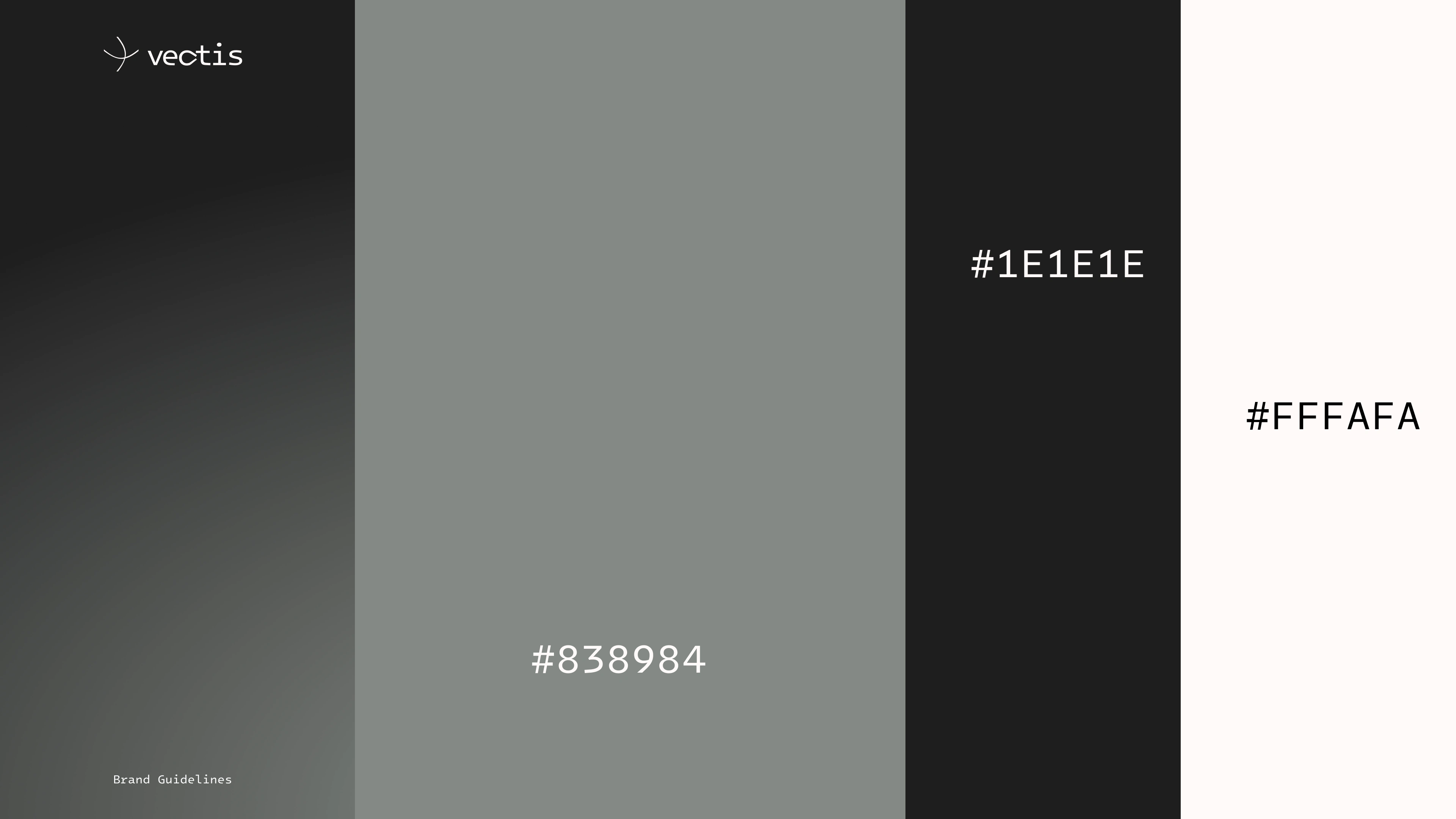
LOGO & IDENTITY
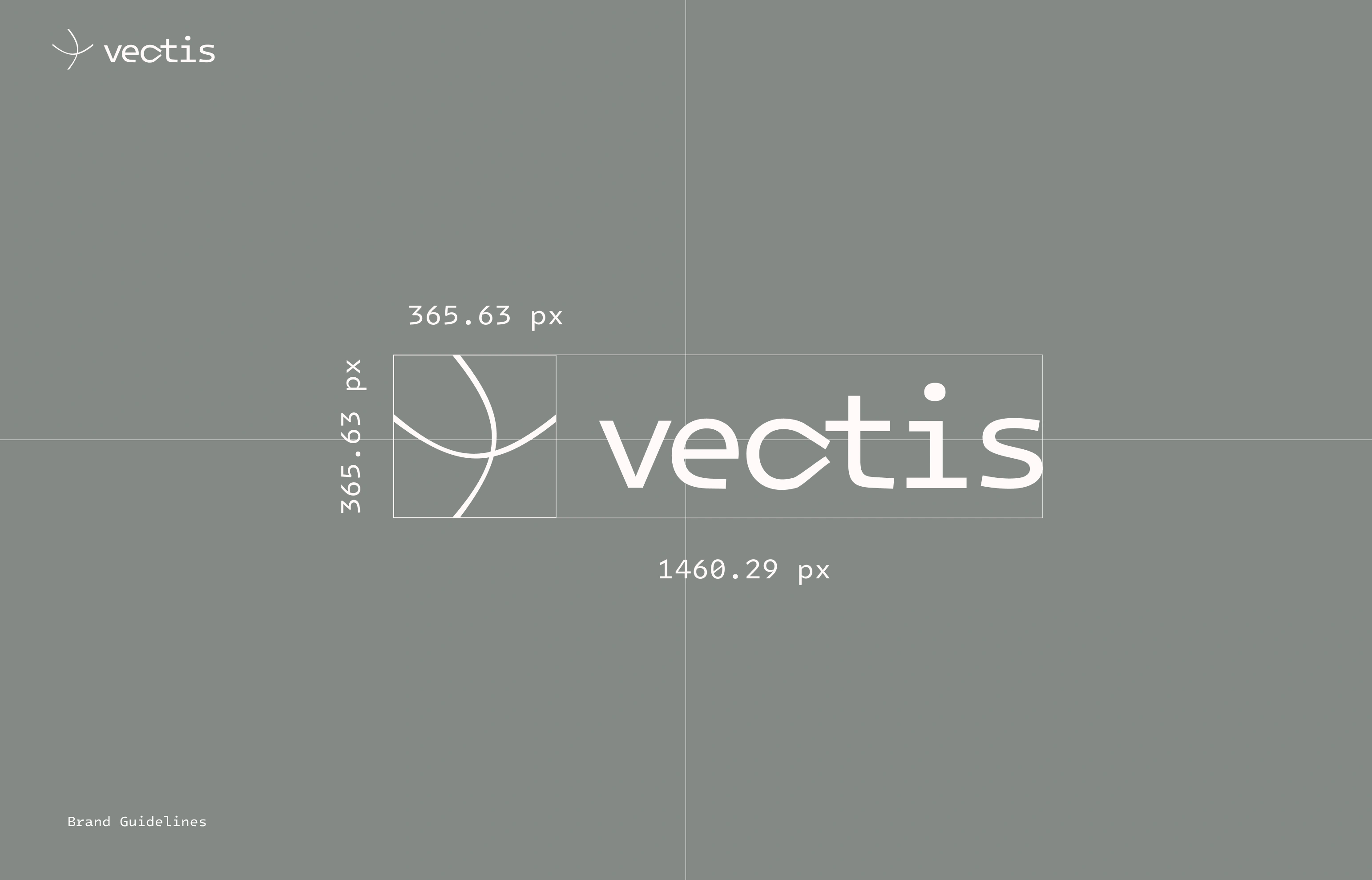
A single curved-line abstract mark paired with a lowercase wordmark, floating with no container by default. Badge treatment reserved strictly for low-contrast placements — a legibility rule, not a style choice, which keeps the mark reading as confident rather than defensive.
COPY SYSTEM
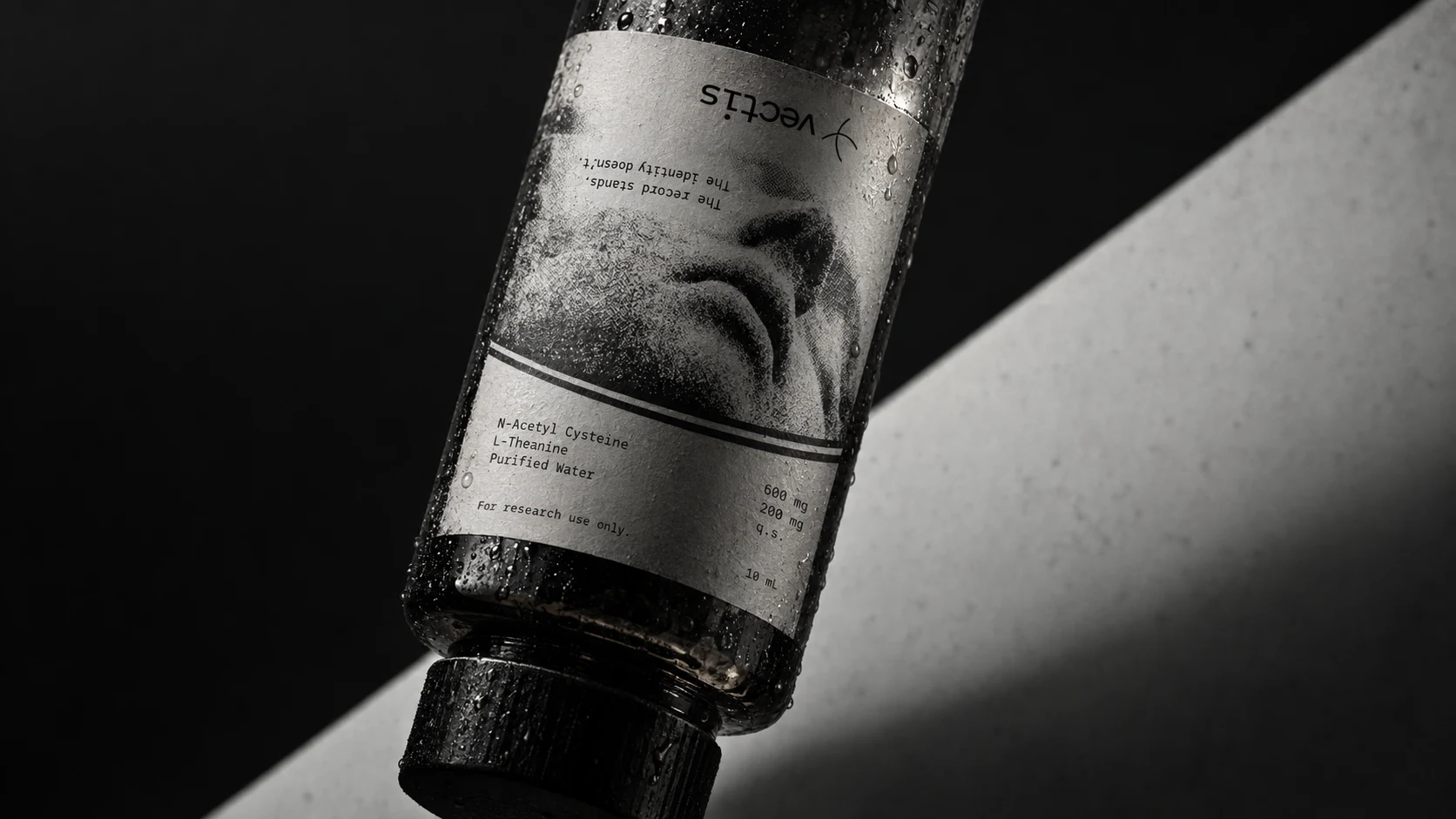
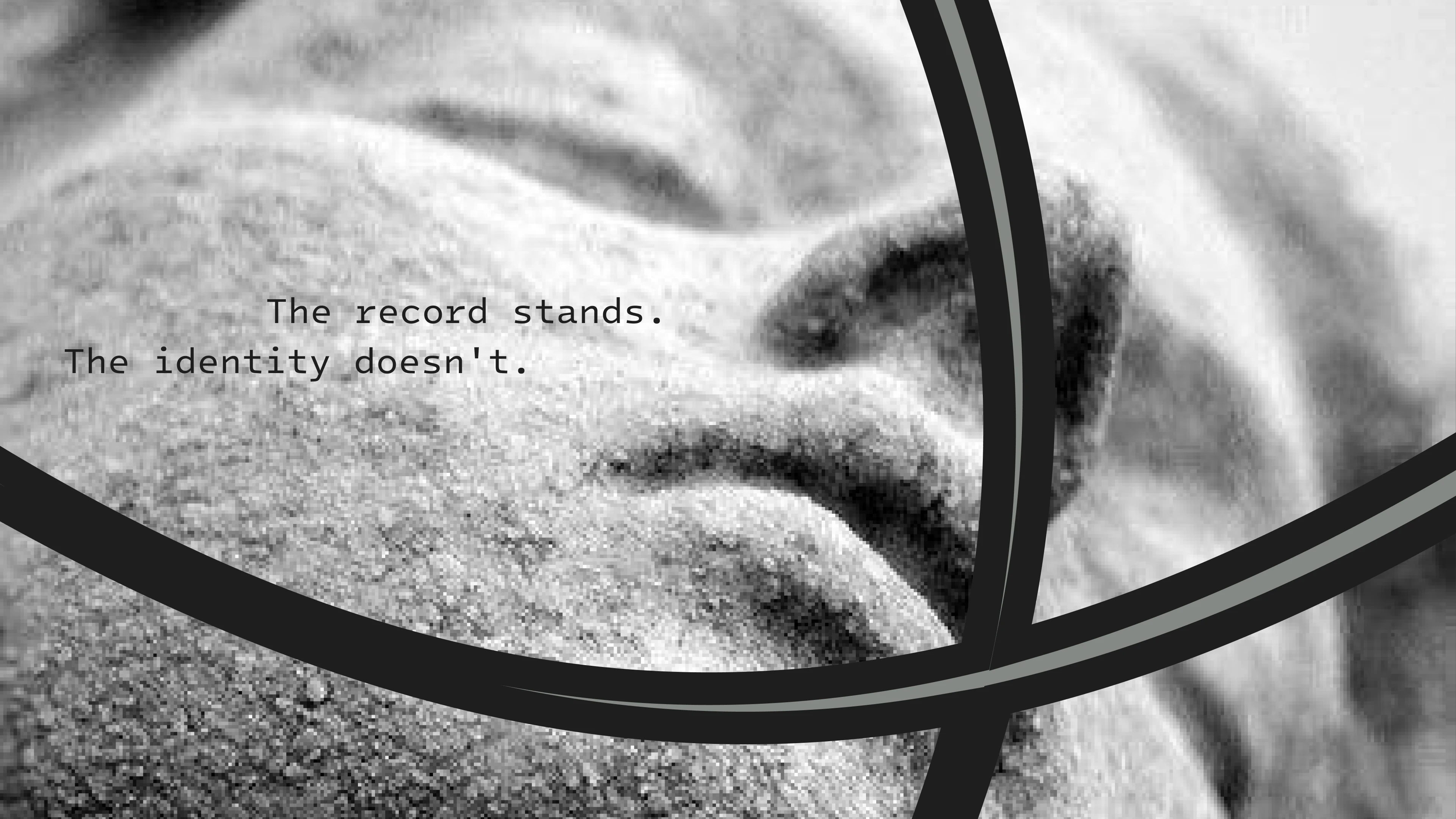
A full voice-and-copy suite — taglines, hero headlines, value-prop copy, UI microcopy, poster statements — all built around present-tense declaratives with zero hedge words. "Nothing is remembered. Everything is kept." became the closing line across every surface it touches, marketing copy through to footer.
WEB DESIGN / DEVELOPMENT
Live here
Three distinct build specs across two AI coding agents, deliberately non-redundant: two Framer AI variants — one a continuous scroll-scrubbed dither reveal, one a ceremonial pinned-chapter sequence — and one Lovable build organized around a cursor-reactive shader field instead of a scroll narrative, plus a live simulated proof ticker and a horizontal-scroll statue gallery. Same brand DNA, three structurally distinct executions, shipped and published live for direct comparison.
MOCKUPS & PHOTOGRAPHY DIRECTION
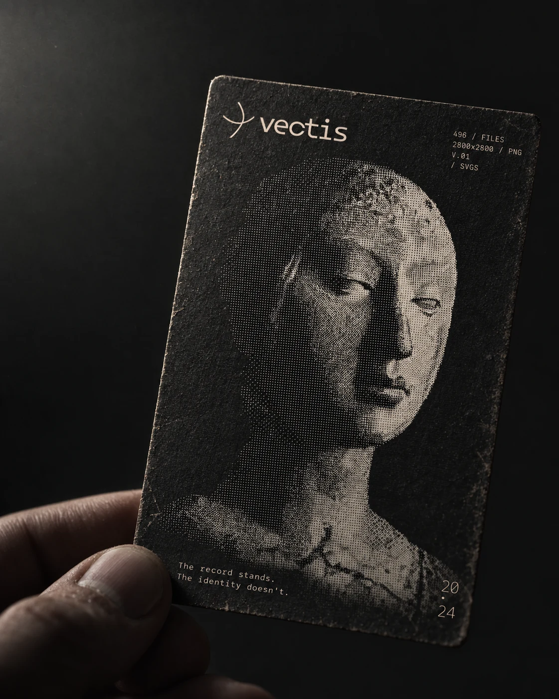
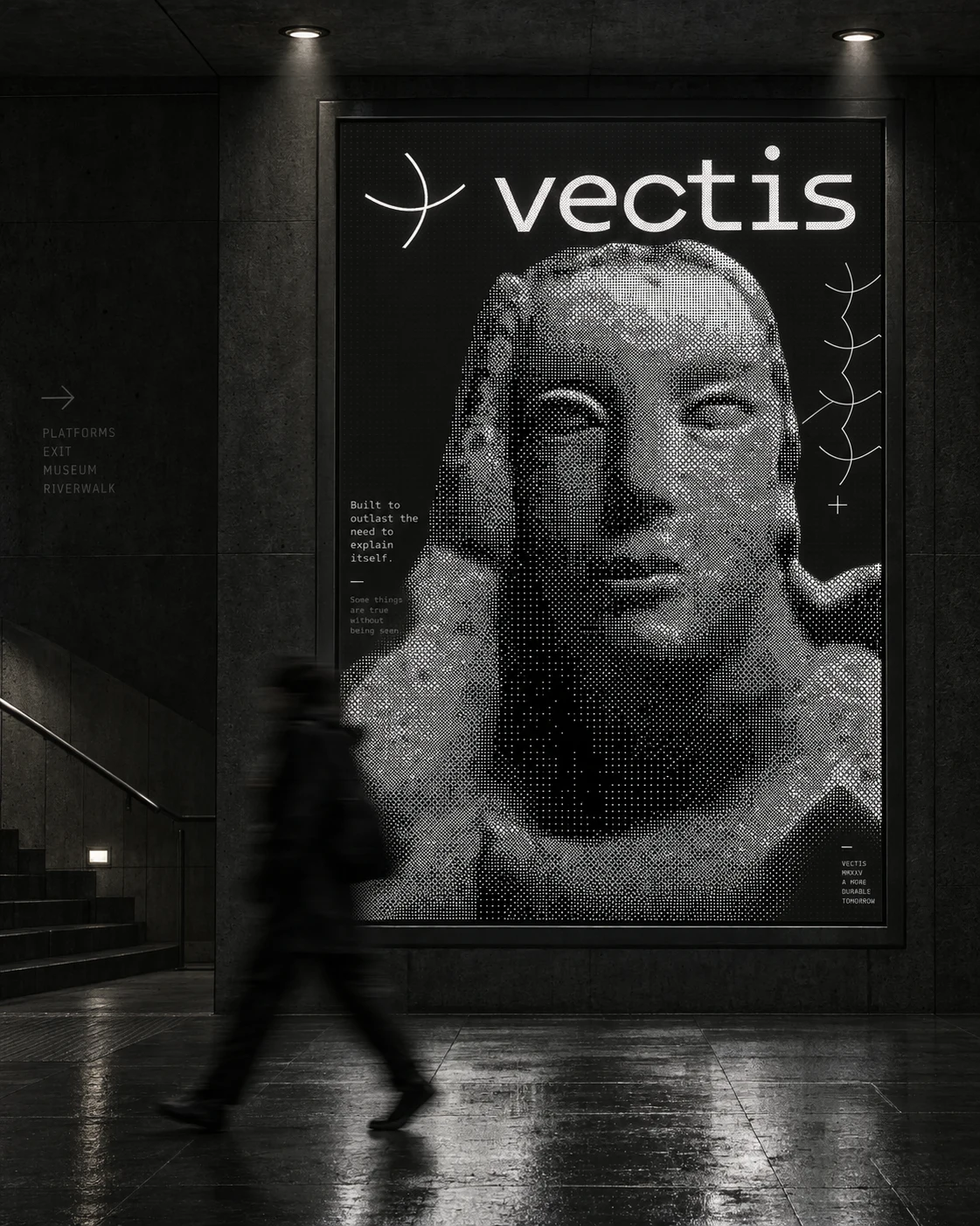
A master mockup prompt establishing consistent lighting (single unseen source, near-black ambient falloff), material language (matte, aged, never glossy), and logo-handling rules (mark stays fixed and untouched, environment does the work) across five studio-quality mockup types — held card, phone screen, environmental billboard, isometric brand-system grid, and inverted-light product bottle.
THE RESULT
Two working sites are live — one built on Framer, one on Lovable — running the same brand system through genuinely different technical and creative approaches, from a scroll-driven narrative to a live cursor-reactive instrument. The visual system holds across every format it's been asked to run in: mobile screens, subway billboards, printed cards, isometric renders, product labels. The three-color, two-family-dither discipline never needed an exception.
Révolté — revolte.design
Project: vectis
Year: 2026
Scope: Brand Identity, Visual System, Copywriting, Web Design/Development, Mockup Direction
Industry: Web3 / Privacy Infrastructure
See more at revolte.design
Like this project
Posted Sep 21, 2026
A zk-privacy protocol rendered as carved stone — three colors, one dither rule, and two live sites built to prove the system holds
Likes
0
Views
1
Timeline
Aug 25, 2026 - Sep 21, 2026


