Built with Lovart
RESPAWN ARENA Brand Identity

Révolté


RESPAWN ARENA — A Building That Plays Too
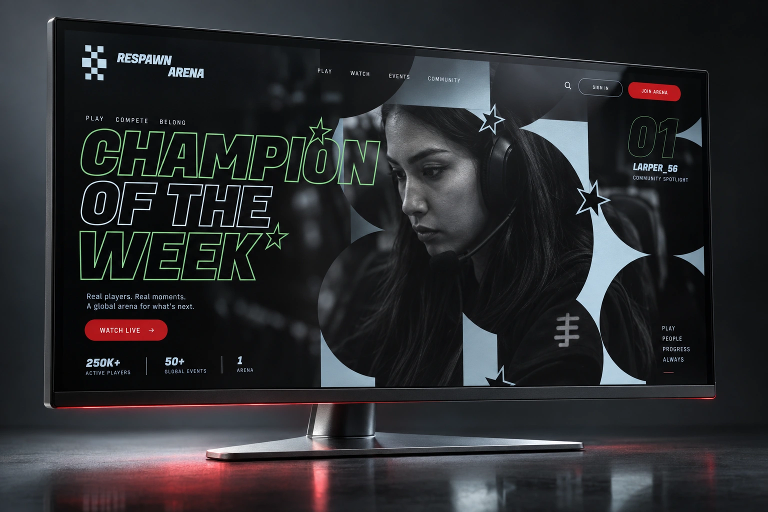
Esports outgrew the gaming café years ago. The venues never caught up. I built RESPAWN ARENA to close that gap — a brand for a physical competitive-gaming stadium that borrows its entire visual language from broadcast sports, not from gaming culture.
THE BRIEF
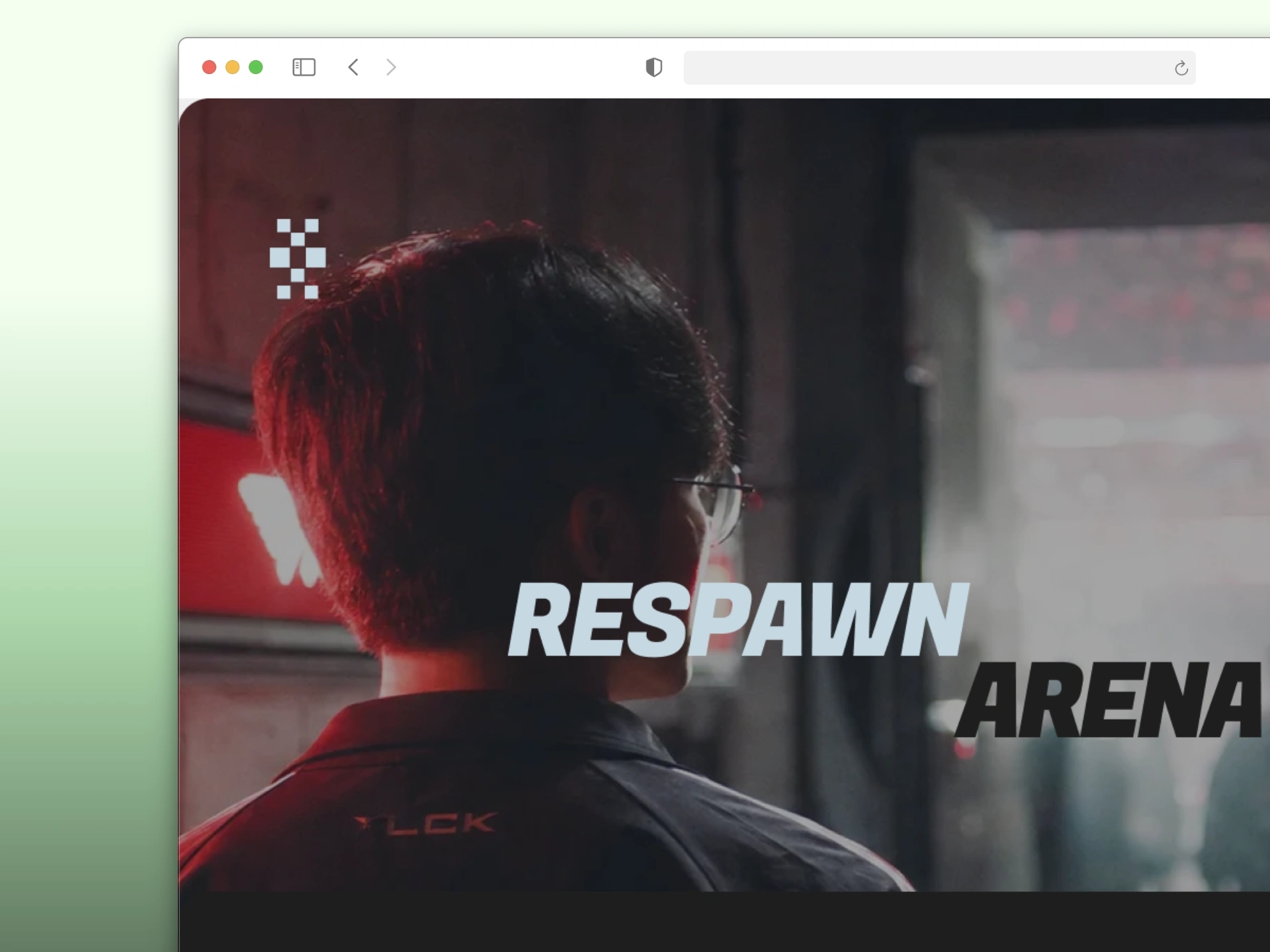
RESPAWN ARENA started as a question I kept circling back to: why does every esports venue still look like a LAN party scaled up — RGB strips, neon gradients, glitch-art logos — when the sport itself has outgrown that aesthetic completely? Competitive gaming now fills real stadiums with real broadcast crews. The branding never followed.
I set the brief for myself: treat this like a sports league commissioned it, not a gaming company. No mascots. No pixel nostalgia. A building, not an app skin.
The hard part wasn't the concept — it was discipline. Esports branding has a visual vocabulary everyone defaults to, and staying out of it meant rejecting almost every instinct that would read as "gamer" first.
THE APPROACH
My first instinct was to build the identity around a mascot or team crest — the traditional sports-franchise move. I killed it fast. A crest implies a team; RESPAWN ARENA isn't a team, it's the building every team passes through. The identity needed to belong to the venue, not a roster.
What unlocked it was treating the scoreboard as the source of the entire type system, not just a UI element. Once I committed to that — tabular numerals doing double duty as both data and wordmark logic — everything else followed: the checkered-flag mark, the broadcast-caption body copy, the signage-grid layout discipline.
Color was the second constraint. I limited the palette to near-monochrome — black, white, steel grey — with exactly two signal colors, Scoreboard Red and Circuit Green, reserved for live-state information only. That's a direct lift from how a real scoreboard behaves: it doesn't light up what isn't active.
I also ran a full critique pass on my own first web build and caught myself drifting — a script typeface had crept into the final CTA, a jagged illustrative mask had snuck into the Specs section. Both broke the system's own rule: nothing ornamental, nothing borrowed from a softer brand. I flagged and corrected both before locking the direction.
THE WORK
BRAND IDENTITY
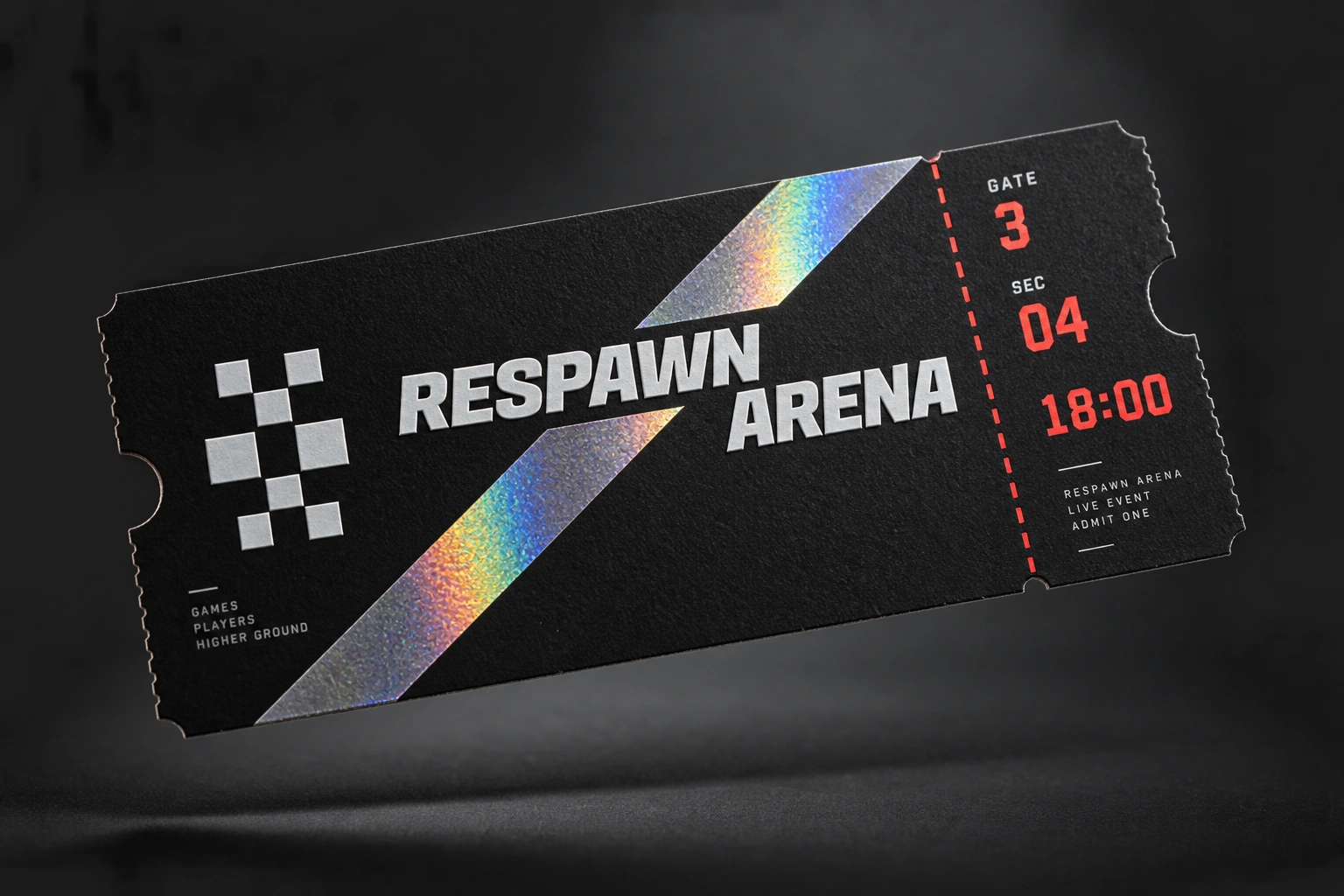
Checkered-flag glyph paired with a stacked RESPAWN / ARENA wordmark set in a heavy grotesque, all-caps, tight tracking. The mark is fixed and undistorted across every surface — ticket, badge, signage — never reinterpreted as a texture or decorative element.
TYPOGRAPHY SYSTEM
A tabular, scoreboard-style numeral face carries the wordmark and every live data point (scores, gate numbers, timers). A heavy-weight grotesque handles headlines. A clean broadcast-caption sans runs the body copy and wayfinding labels — three faces total, each with one job.
COLOR SYSTEM
Arena Black
#0A0A0C and Broadcast White #F5F5F5 carry roughly 80% of every surface. Scoreboard Red #E8332B and Circuit Green #39FF88 are reserved strictly for live/active states — win confirmations, in-play indicators, signal moments. Steel Grey #8A8D93 handles structural and inactive elements.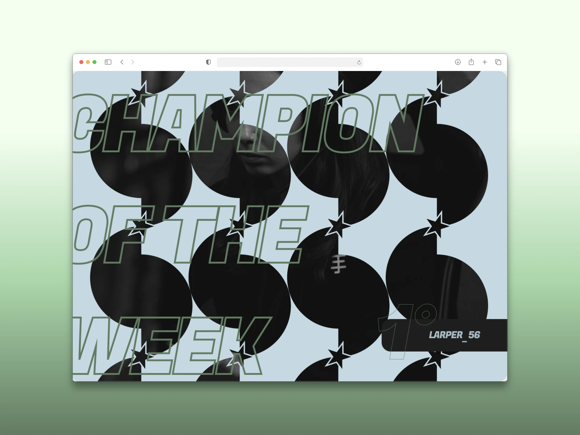
WEB DESIGN
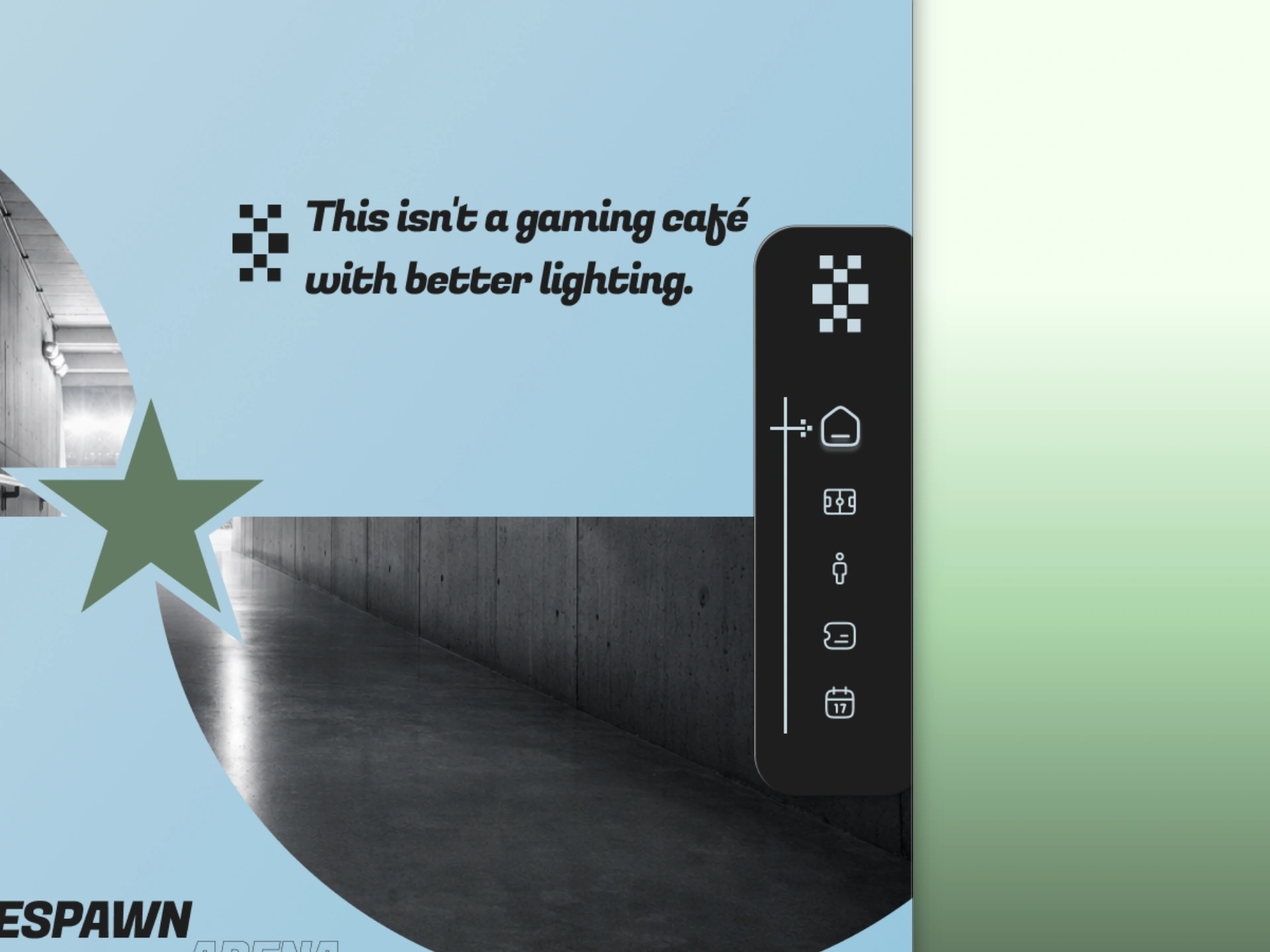
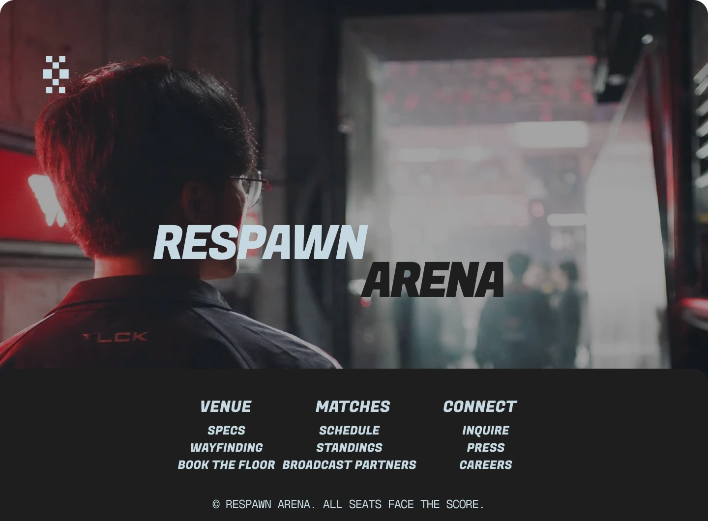
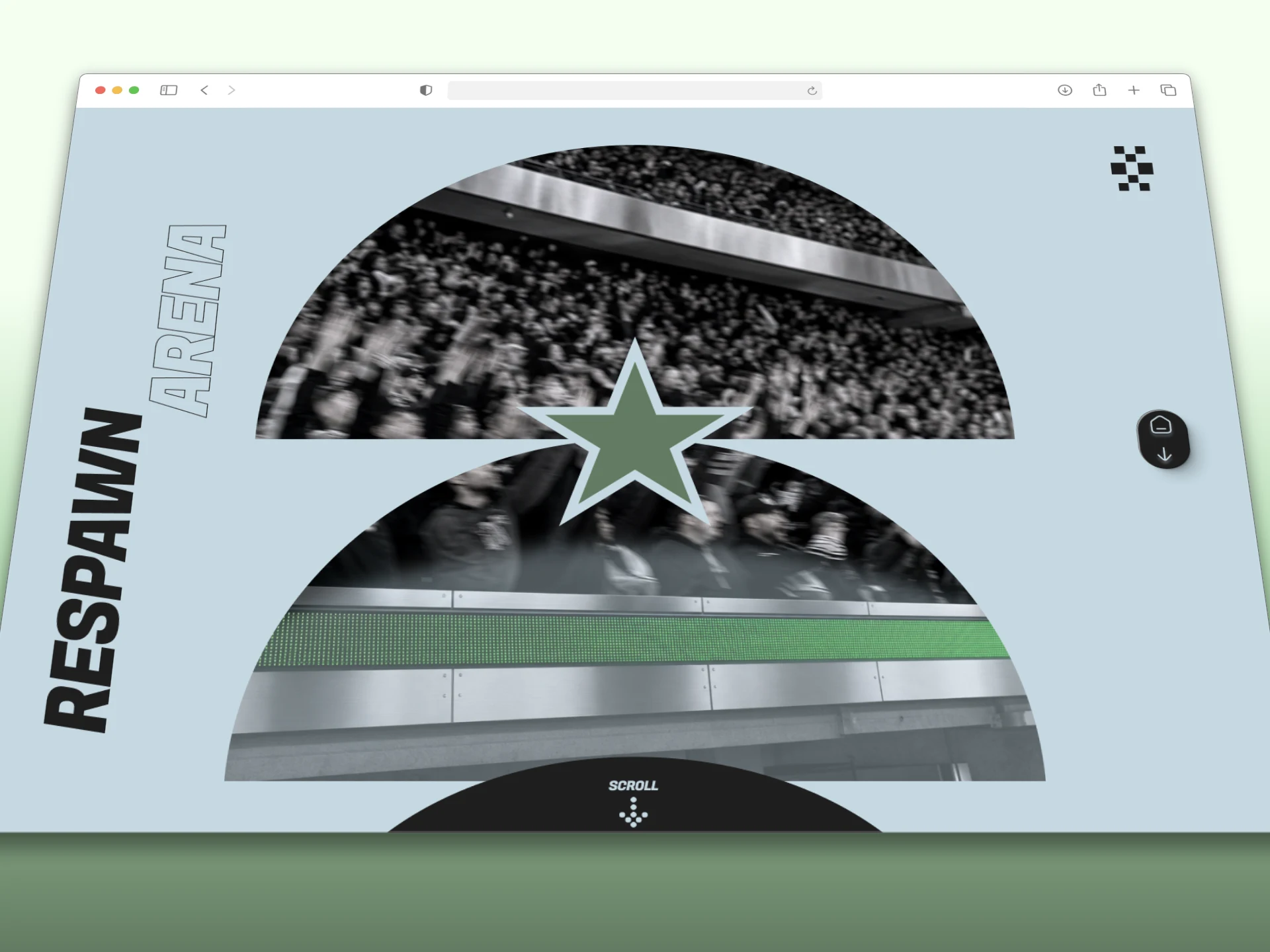
A full scroll site built around a broadcast-lens visual motif — circular arc crops standing in for jumbotron framing, a dot-grid data panel for the specs module, a marquee band for pacing, and a hard diagonal split for the venue's wayfinding section. Copy throughout reads like stadium signage and broadcast lower-thirds — short, numeric, declarative.
CAMPAIGN ART DIRECTION
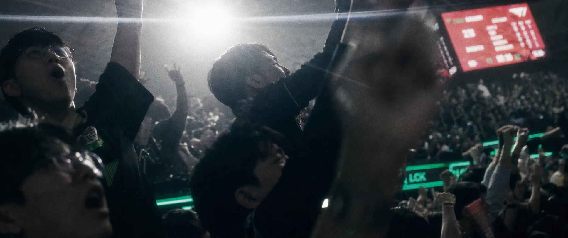
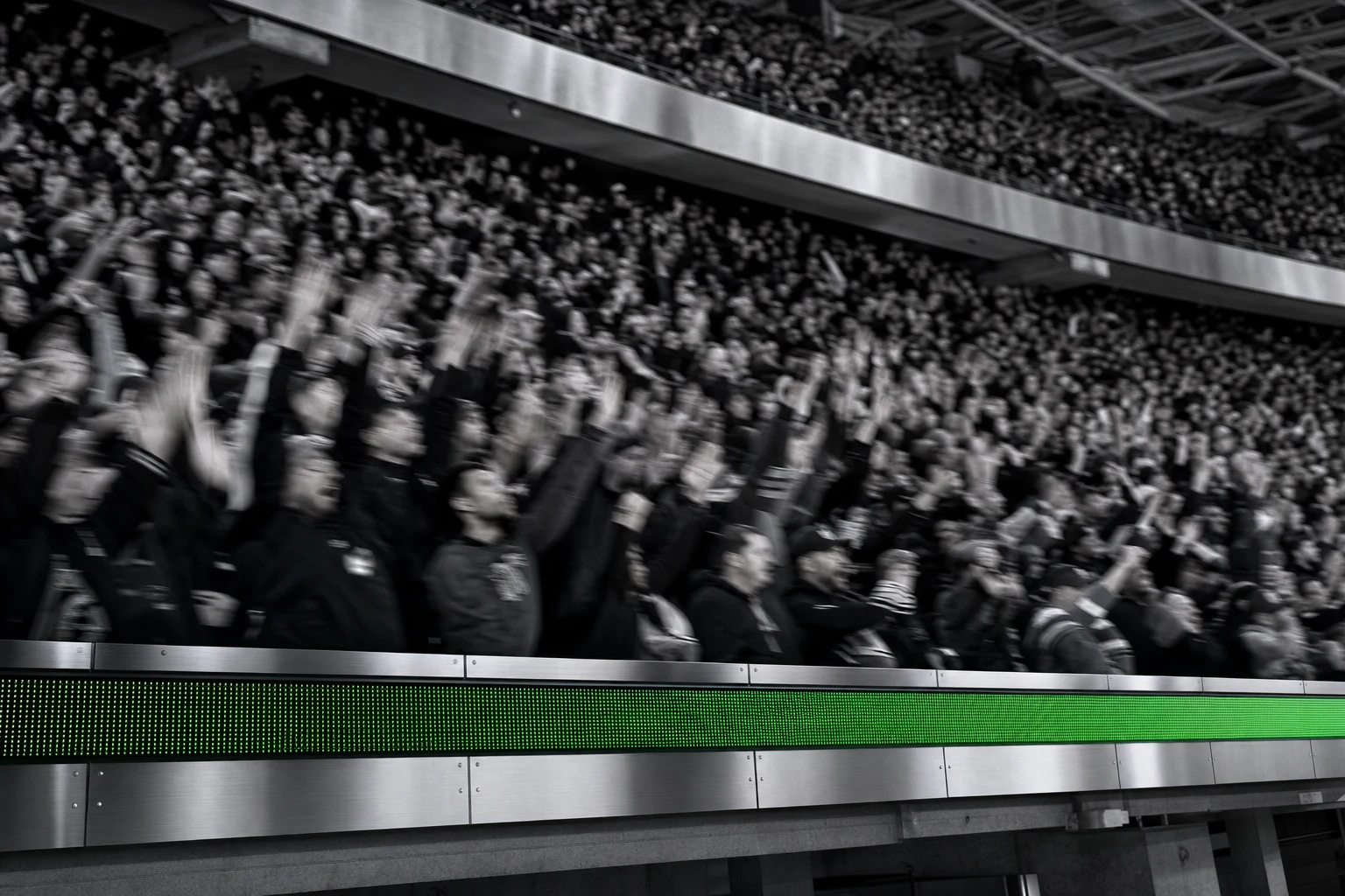
A cinematic anamorphic realism register — 2.39:1 framing, hard practical light sources only (scoreboard red, circuit green, cold broadcast white), heavy film grain, no soft fill. Shots are caught, not posed: tunnel walkouts, crowd reactions, bench-side close-ups — built to feel like broadcast stills, not marketing photography.
PHYSICAL SYSTEM
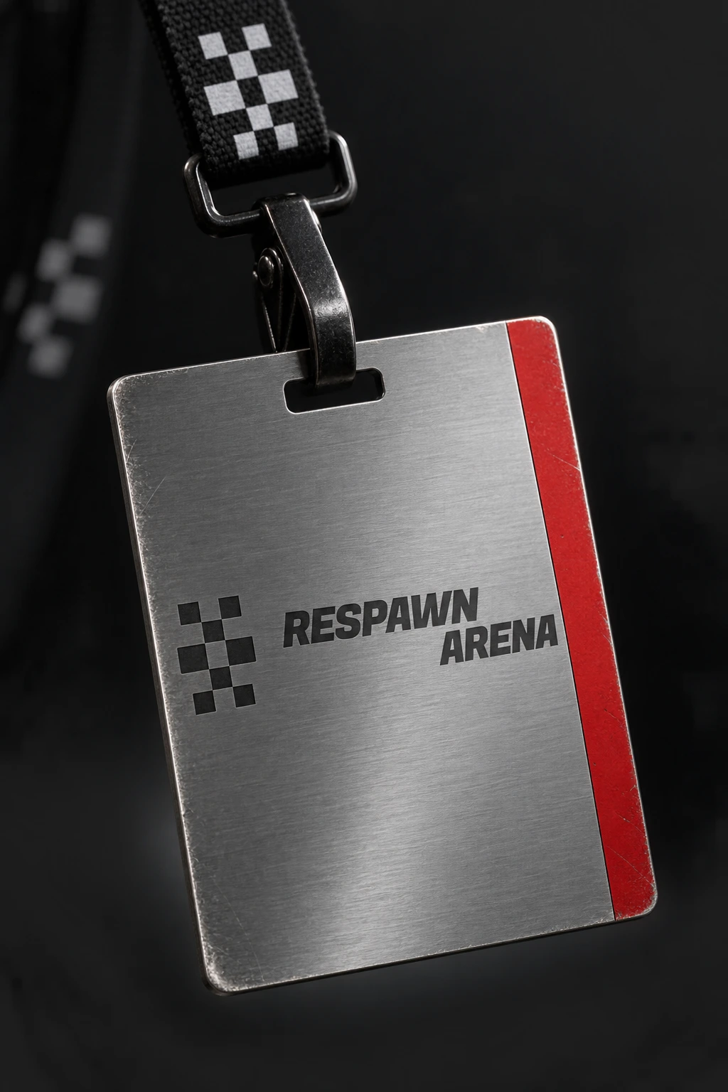
A holographic event ticket with a true diffraction foil strip and embossed wordmark. A brushed-steel credential badge with laser-etched branding and a single enamel red accent. Both rendered as hyperrealistic studio product shots — Blender/Octane-grade materials, physically accurate light response, the mark placed flat and correct on every surface.
THE RESULT
RESPAWN ARENA is still in build — the web system, campaign photography direction, and physical product line are locked; full production and launch are next. What's already proven out is the core bet: that an esports venue branded like a real stadium, not a gaming peripheral, reads as more credible, not less exciting. The restraint is the differentiator.
Studio: Révolté — revolte.design
Project: RESPAWN ARENA
Year: 2026
Scope: Brand Identity, Web Design, Campaign Art Direction
Industry: Esports / Sports Venue
See more at revolte.design
Like this project
Posted Oct 2, 2026
A stadium-grade identity for competitive gaming, built from scoreboard logic instead of gamer clichés — broadcast, not RGB
Likes
0
Views
18
Timeline
Sep 17, 2026 - Oct 2, 2026

