Built with Lovart
Dockhand Brand Identity and Website

Révolté


DOCKHAND — Freight Language for the Last Mile
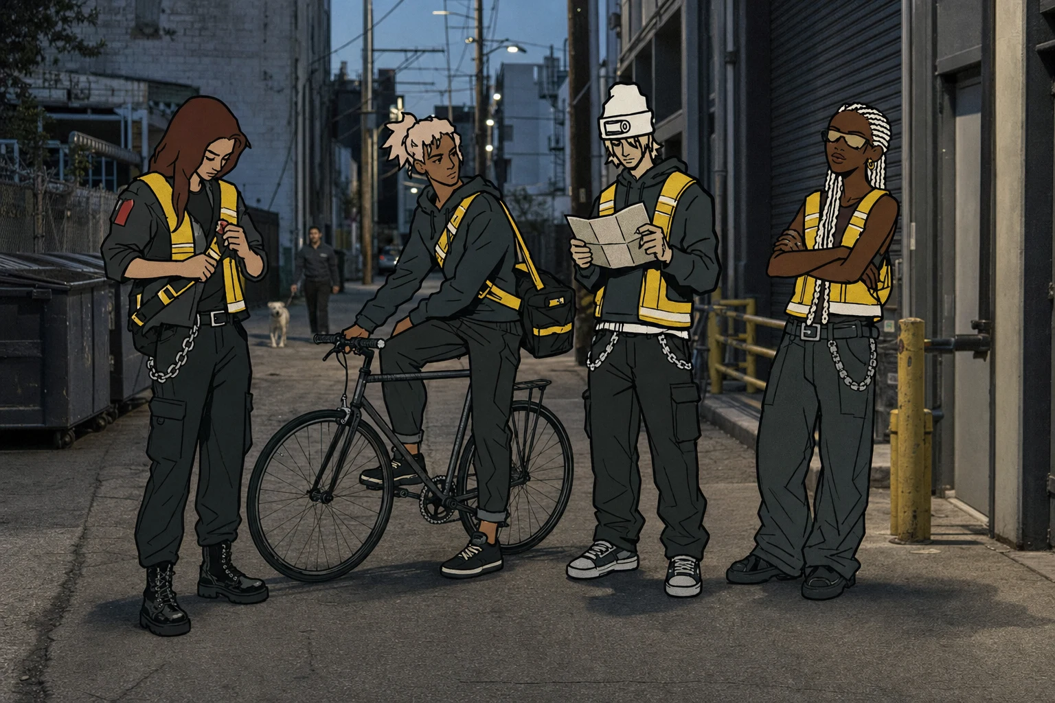
A courier brand that refuses to be invisible. Instead of stock photos of anonymous riders, I built Dockhand around a drawn cast — cel-shaded couriers stamped directly onto real, unglamorous city photography — and then took it all the way to a working site.
THE BRIEF
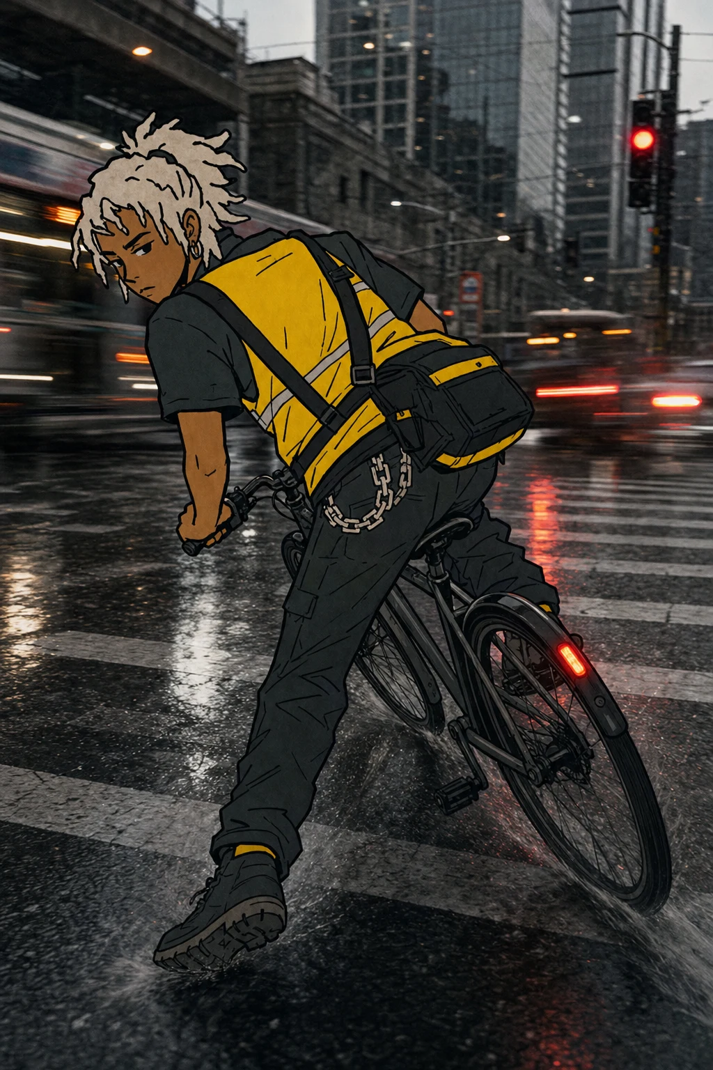
This one started with a rejection of a category, not a client brief. I wanted a courier and small-freight brand that had nothing to do with app gloss — no gradient icons, no "seamless delivery" language, none of the soft optimism that logistics startups default to.
The real gap I saw: every courier brand treats its riders as interchangeable labor — a fleet, a headcount, a stock photo. I wanted the opposite. I wanted a brand where the riders are the identity. Not mascots. Not brand ambassadors. Just drawn, specific, recognizable people doing a physical job in a real city.
The tension I set for myself: build a visual system anchored in illustration without it reading as cute, mascot-y, or streetwear-coded. It had to feel like equipment, not merchandise — and it had to survive the jump from mockups to an actual browser.
THE APPROACH
My first instinct was to treat the illustration and the photography as two separate registers — clean vector riders on top of clean photo backdrops. That read as a sticker, not a world. I locked the inking logic first: thick, deliberately uneven black outlines, flat color fills, zero gradient, anywhere, on anything.
The color system followed the same instinct. Hi-vis yellow isn't a brand color here — it's the one loud thing allowed in a desaturated, diesel-grey world. Route Red got demoted to a hazard-stamp accent early — it read as decorative the moment I let it spread.
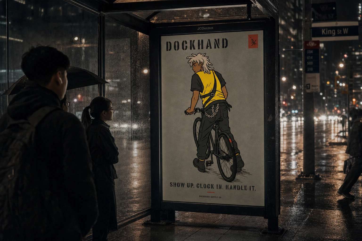
Once the core identity and campaign system held, the real test was pushing it into out-of-home and then into a live build. OOH forced a discipline the studio mockups didn't: the work had to survive sitting next to real graffiti, real wheatpaste, real transit signage, and still read as itself. That's where the tagline came in — "Show up. Clock in. Handle it." — three flat, declarative beats that match the stencil type rather than reaching for a slogan.
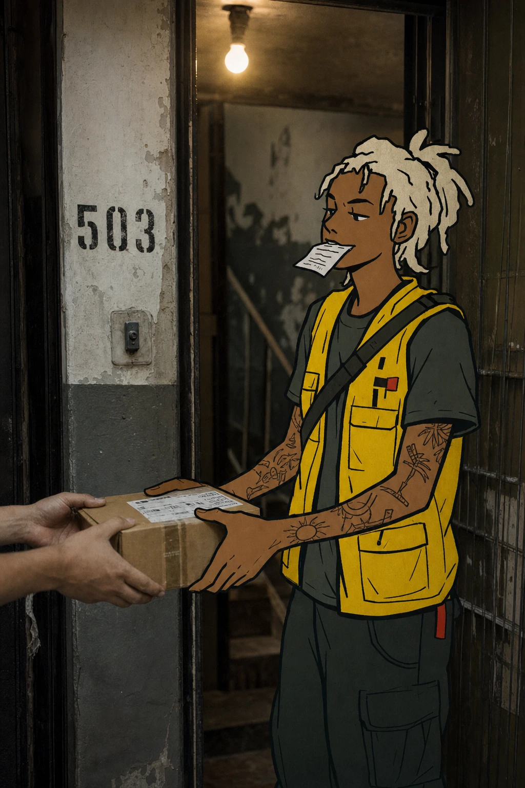
The site build was the final proof. The diagonal clip-path mask system I speced — stencil-blade angle, no rotation, no particles — had to actually run against real video of the campaign scenes, not just describe them. Naming the crew as real people with route numbers (Mala K., Route 04; Deniz A., Route 11) was the last piece that clicked: it turns "riders as identity" from a design principle into something a visitor actually reads and remembers.
THE WORK
Brand Identity / Visual System
A dual-register system: flat cel-shaded illustration (Asphalt Black
#17181A outlines, no gradients) composited onto real, desaturated urban photography. Safety Yellow #F0C419 and Route Red #C23B2E are the only saturated colors permitted in any application.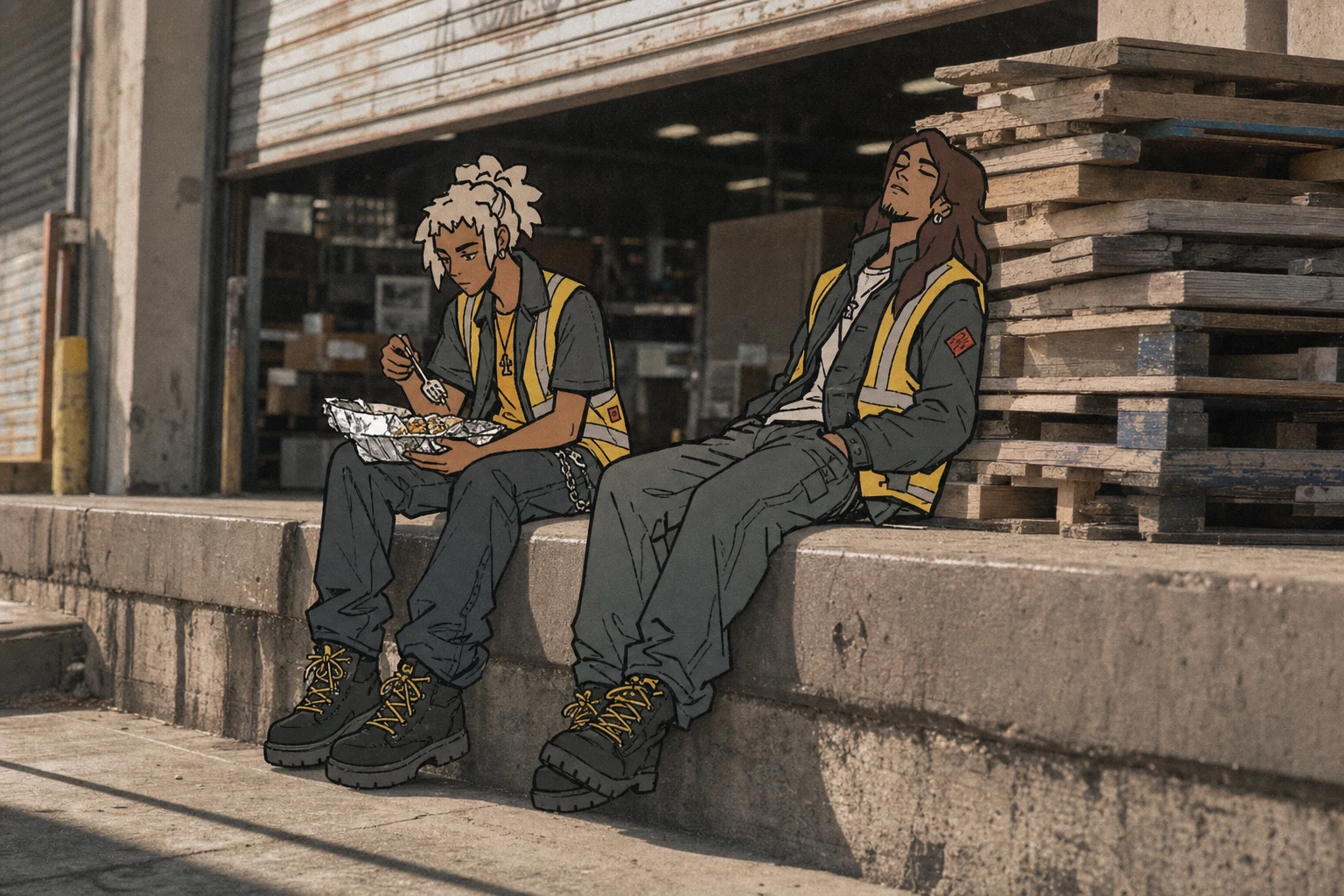
Logo
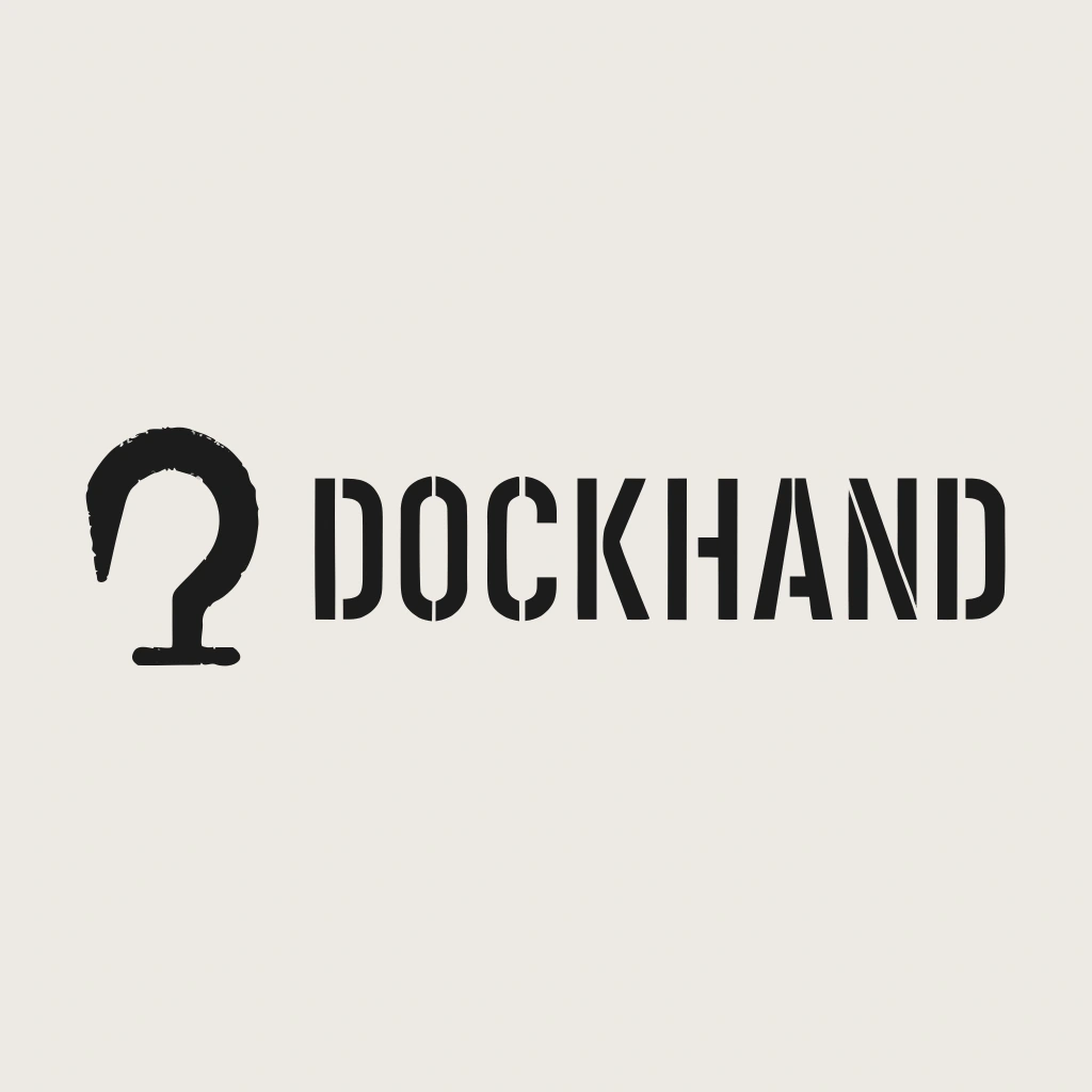
A freight-hook logomark that doubles as a "D," hand-inked with an uneven, stamped edge. Paired with a stencil wordmark — all-caps, consistent bottom-left stencil gaps.
Campaign System
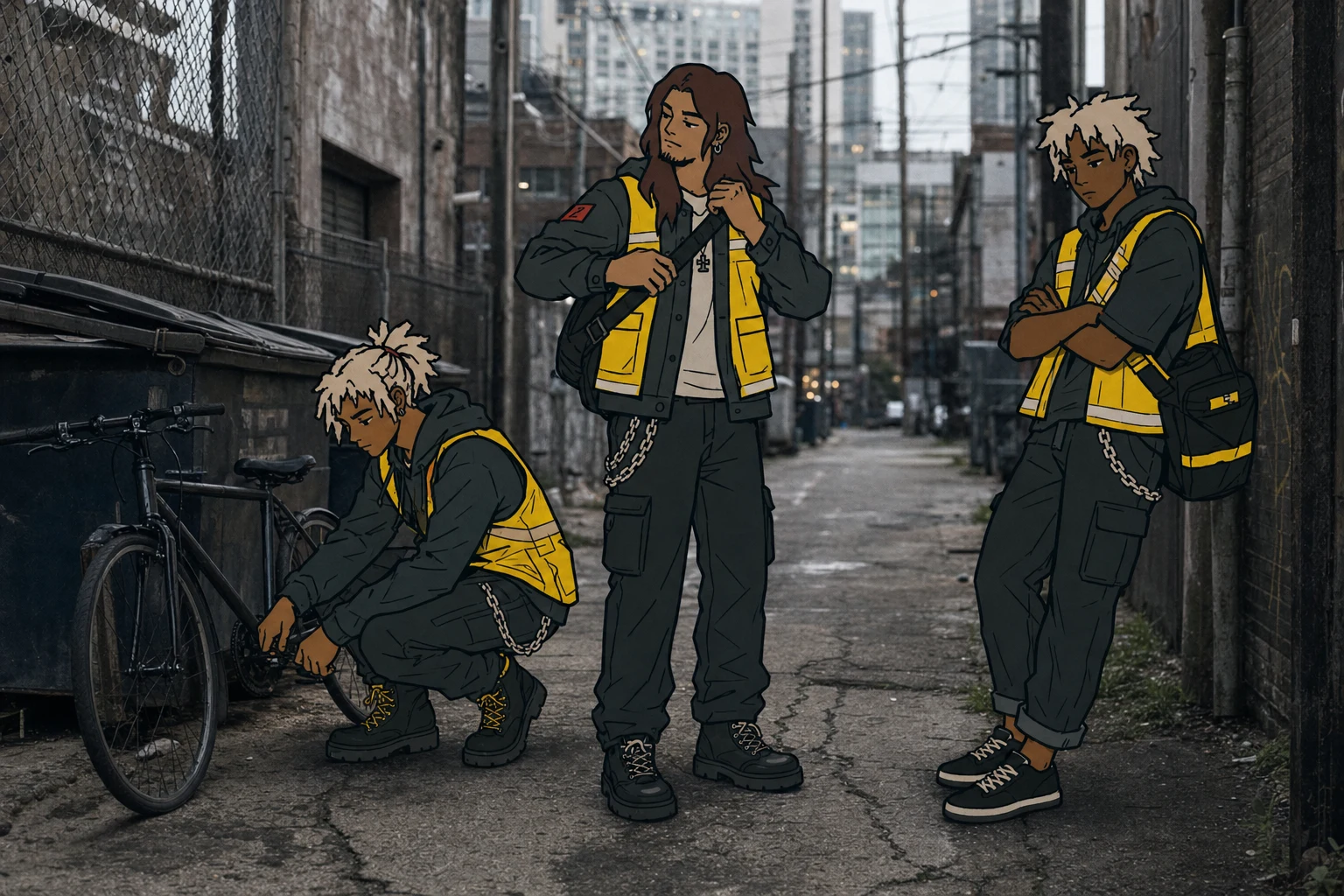
Fifteen illustrated-rider visuals total across both batches — traffic weaves, dock breaks, doorway handoffs, night rain, freight-yard dusk shots, and a deliberately mixed cast — each holding the two-saturated-color rule per frame.
Out-of-Home System
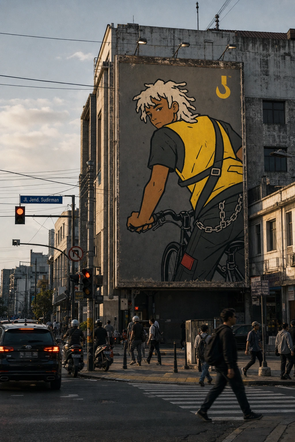
Five placements translating the identity into real street media: a torn wheatpaste poster, a backlit night bus shelter ad carrying the "Show up. Clock in. Handle it." line, a multi-sheet underpass wild-posting with a Japanese-market variant, a building-scale billboard, and a die-cut sticker cluster weathered into real street furniture.
Mockups
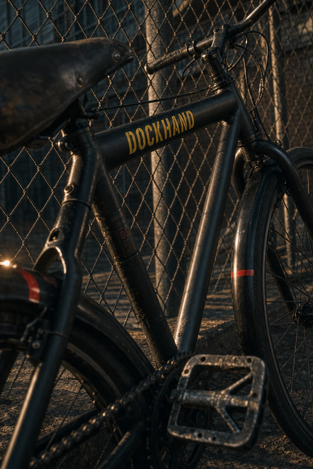
Five object mockups treating the brand's own materials as studio props — a vest on a freight hook, a pannier bag on pallets, bike decals, dock-door signage, a branded crate stack.
Motion System / Website
A full GSAP/Framer Motion build live at dock-blade-reveal.lovable.app — diagonal clip-path reveals timed to real campaign footage, a named crew roster, service tiers tagged like dispatch codes, and a stat-led hero that argues the brand's positioning before a single line of copy explains it.
THE RESULT
This round took Dockhand from a locked identity to a functioning site carrying real video, a named crew, and live service tiers — with an OOH system proving the visual language holds up in the noisiest possible context, next to real graffiti and real transit ads. The throughline across every deliverable, from a sticker on a utility box to the site's hero section, is still the same no-gradient inking rule set at the very start. That's the whole argument of this case study: one constraint, held without exception, is what let a hoodie print, a bus shelter ad, and a scroll-triggered video mask all read as one brand.
Révolté — revolte.design
Project: Dockhand
Year: 2026
Scope: Brand Identity, Logo Design, Campaign Art Direction, OOH Design, Mockup Direction, Motion Design, Web Design
Industry: Logistics / Urban Delivery (speculative)
Live: dock-blade-reveal.lovable.app
See more at revolte.design
Like this project
Posted Sep 8, 2026
Courier brand where the riders are the identity — hand-stamped illustration, real streets, now a working site with real names on the roster
Likes
1
Views
18
Timeline
Aug 13, 2026 - Sep 8, 2026