Built with Lovart
Bloomfield Wellness Brand Design

Révolté


Bloomfield
The Brief
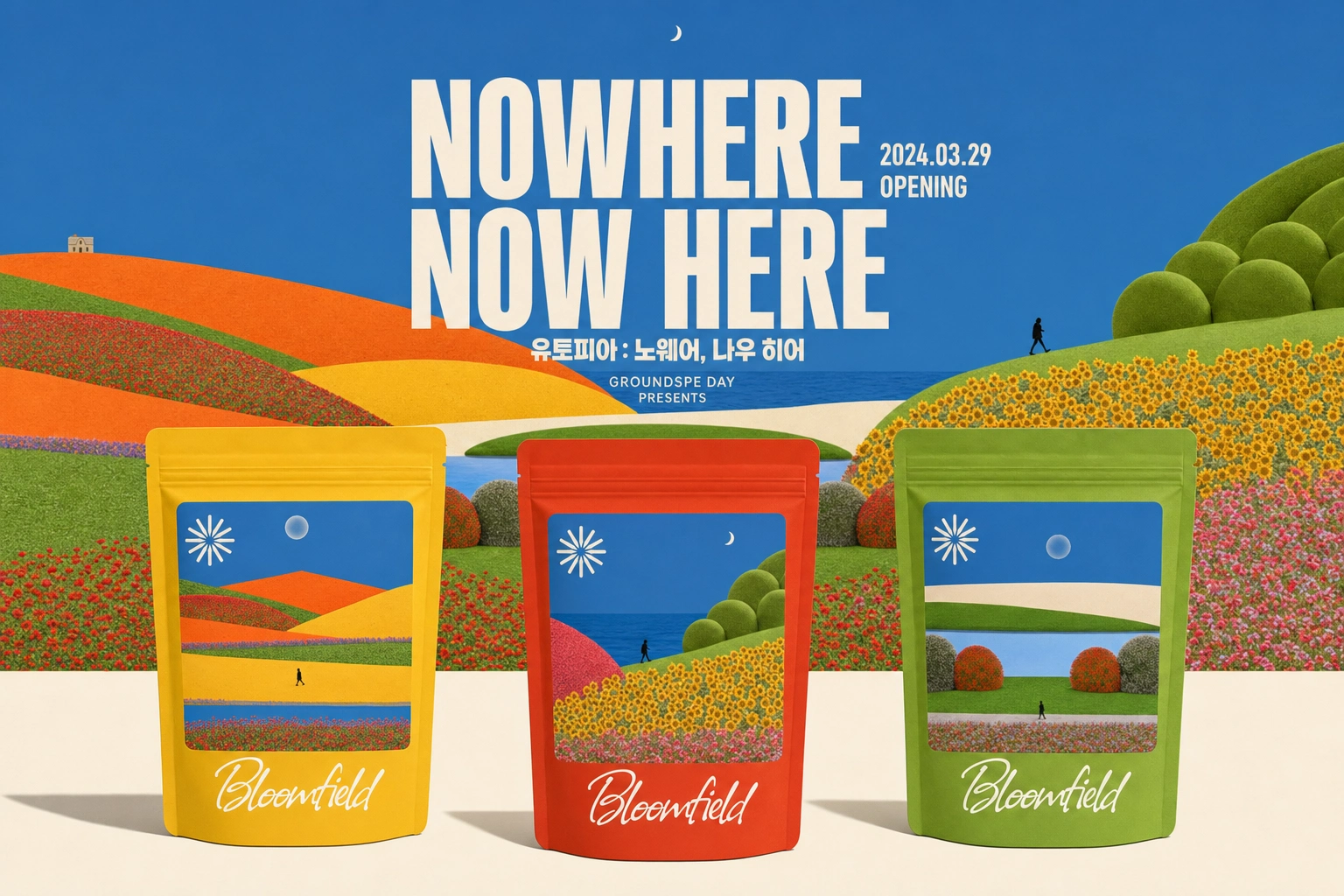
An exploration of what a wellness brand looks like when its visual world is built entirely from the tells of AI-generated imagery — tiled assets, seamed color transitions, inconsistent shadows, scale that never quite resolves — while every piece of copy stays completely sincere. The concept: sell "feeling good" the way a field of flowers sells feeling good, no philosophy required, except the field was never real to begin with.
Positioning Statement
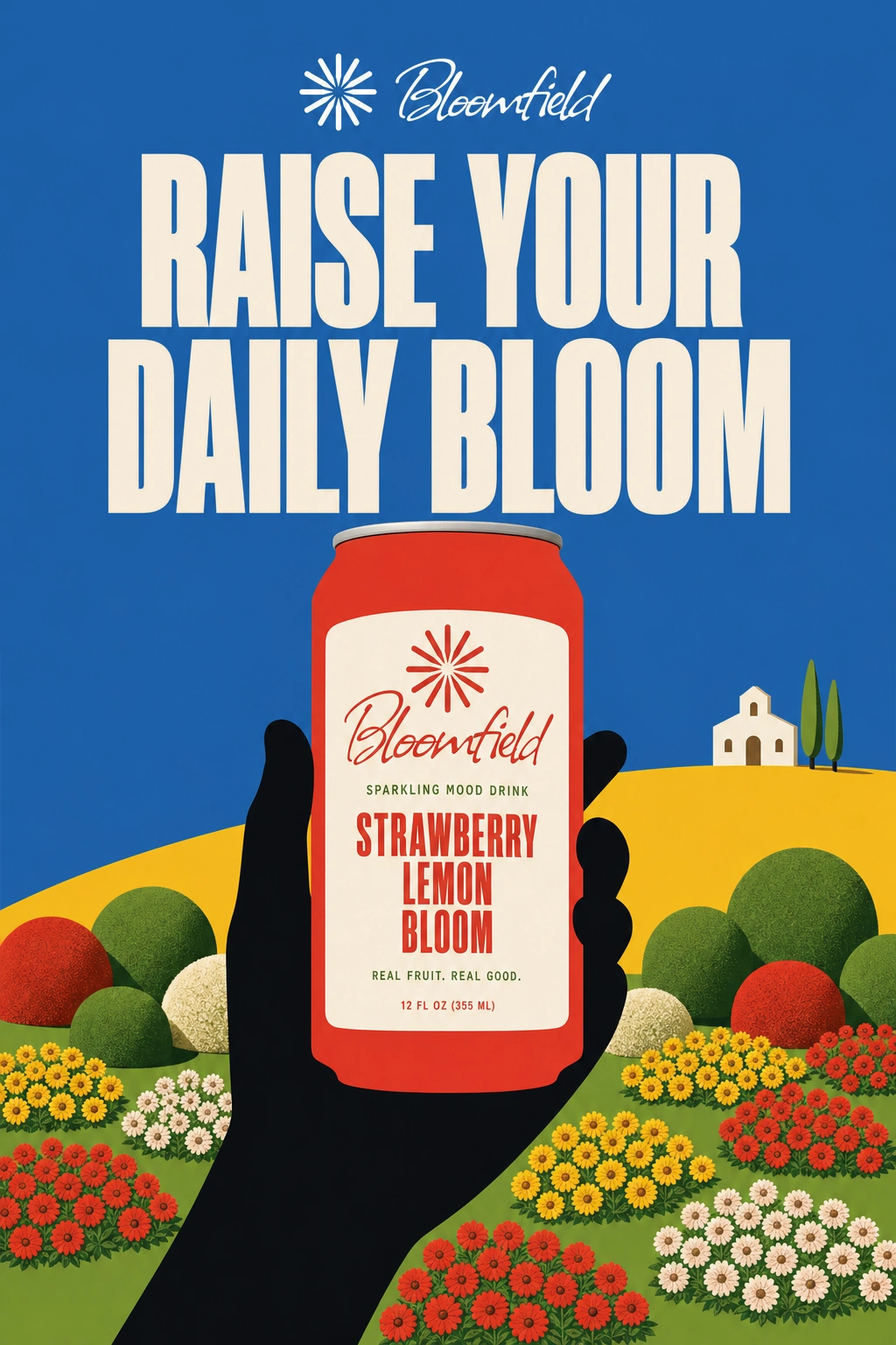
Bloomfield is what "feeling good" looks like when it's been generated instead of grown — a wellness brand for people who know the dopamine hit is manufactured and want it anyway. It sells mood the way a stock-photo meadow sells vacation: too saturated, too symmetrical, stitched together at the seams if you look close enough. The joke is the point. The joy is real anyway.
Personality
Uncannily cheerful — enthusiasm written by something that has only read about happiness.
Suspiciously seamless — everything tiles a little too perfectly.
Confidently wrong — gets scale, shadow, and perspective almost right, and commits fully.
Sincere underneath the bit — the wellness claims are never ironic, even when the imagery is.
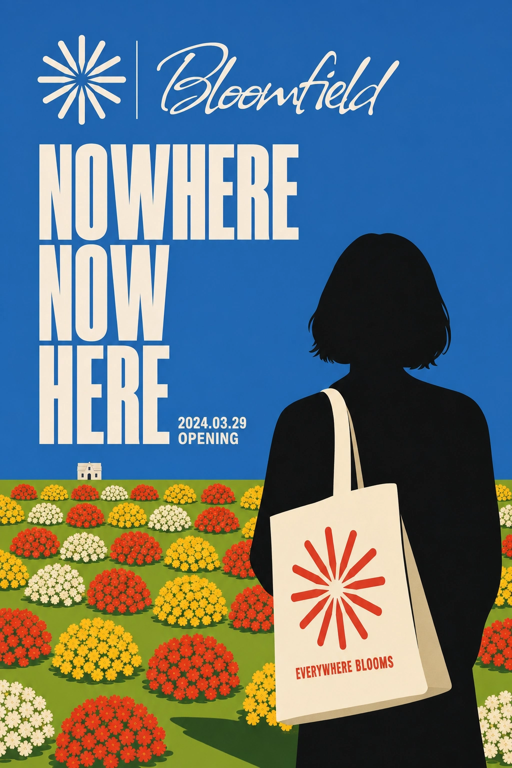
Repetitively lush — the same few flower assets copy-pasted across a field, treated as a design language.
Deadpan — never winks at the joke in copy. The visuals carry the irony; the language stays plainly earnest.
Visual System
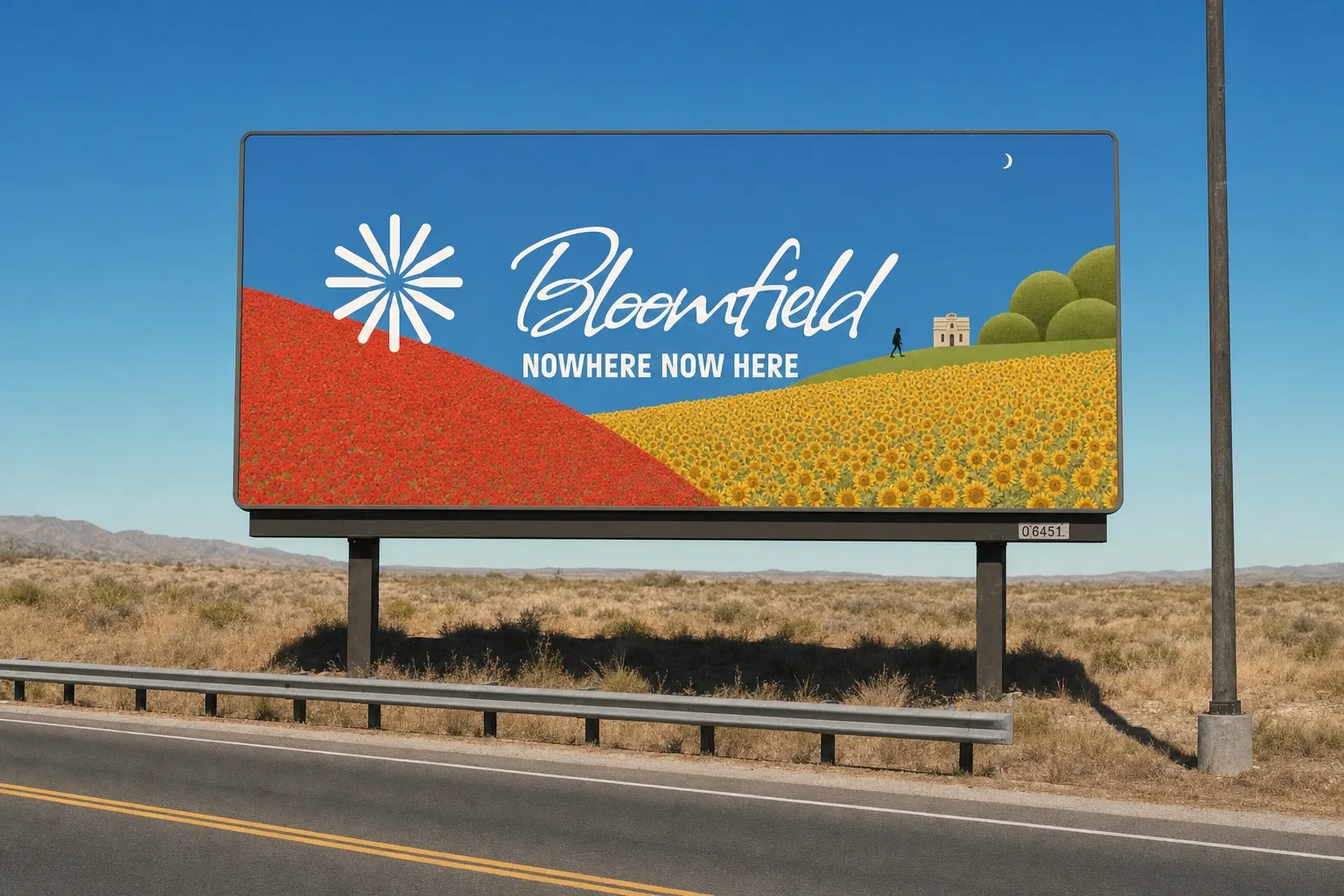
Flat, blocked color with no atmospheric falloff — a hill 2 miles away is exactly as saturated as one 20 feet away
Hard, clean seams at every color transition instead of natural gradients
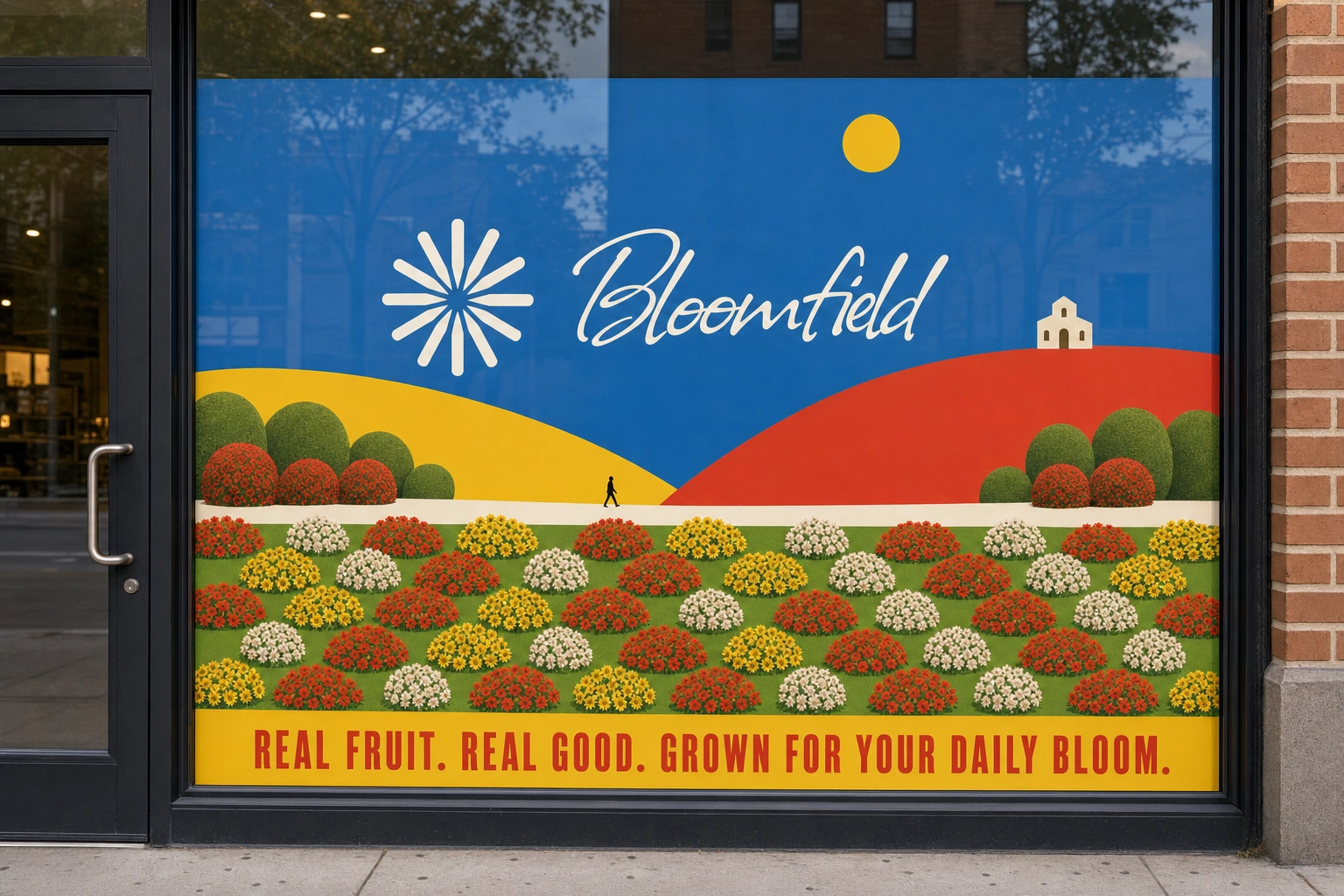
Repeated flower/topiary clusters, tiled openly rather than hidden
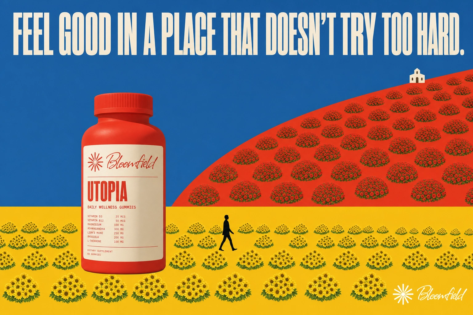
Scale relationships that never quite resolve — tiny figures against oversized blooms and products
Shadows that disagree with each other across a single scene
Logo treated as a fixed, pixel-perfect asset — never reinterpreted across applications
Typography
Primary: Allison script — loose, human, hand-written in form, but built from hard-edged vector strokes with zero organic wobble. Carries the wordmark and voice-of-brand moments.
Secondary: Bold condensed sans, all caps — carries campaign headlines and taglines, in the same blunt poster hierarchy established early in the project.
Tertiary: Simple mono — ingredient lists, specs, legal copy. Kept completely clean, the one channel in the system with no defect, so it reads as the "real" layer against the synthetic one.
Color
Sunflower Yellow
#F2C230 — primary, dominant field colorPoppy Red
#E14B3B — secondary, hero color for product/CTASky Cobalt
#3C6FB0 — background/sky, always flat, never gradientMeadow Green
#7A9E3F — ground plane, topiary, "grown" elementsCream
#FBF3E4 — negative space, packaging base, label groundLogo
A radial sunburst mark paired with the Allison-script "Bloomfield" wordmark, in pure white or brand color depending on application. Reproduced pixel-perfect across every asset — never reinterpreted, always treated as a fixed placed element rather than something the system redraws.
Applications
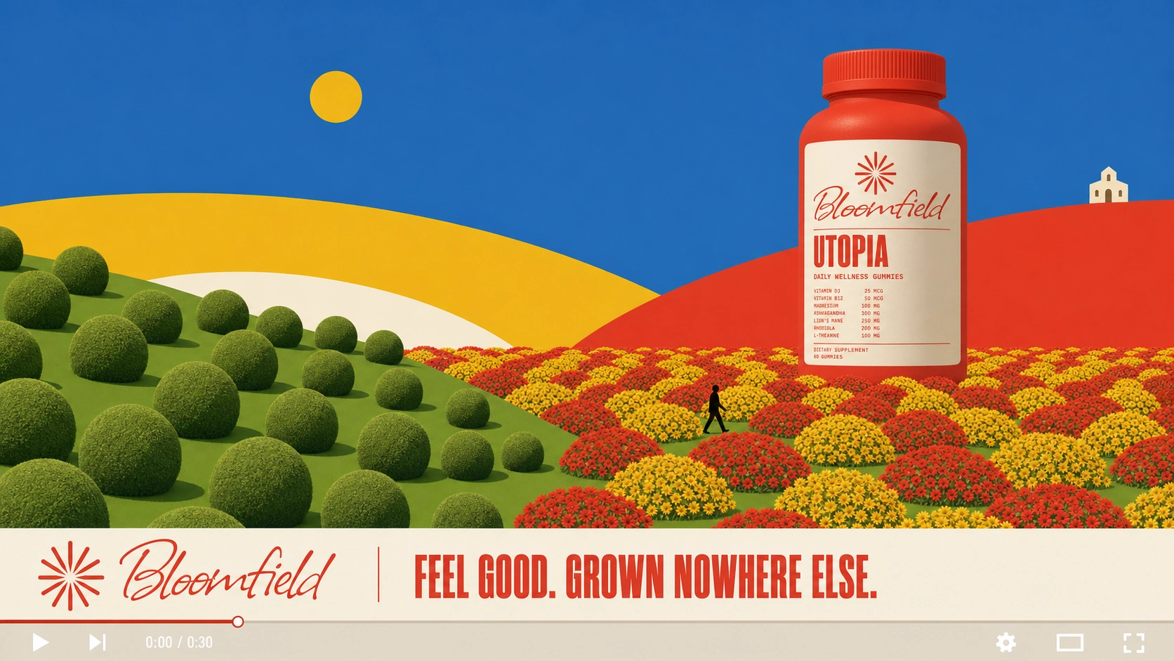
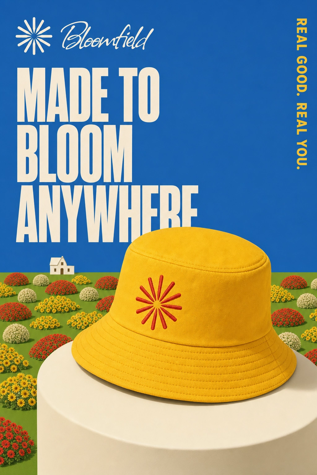
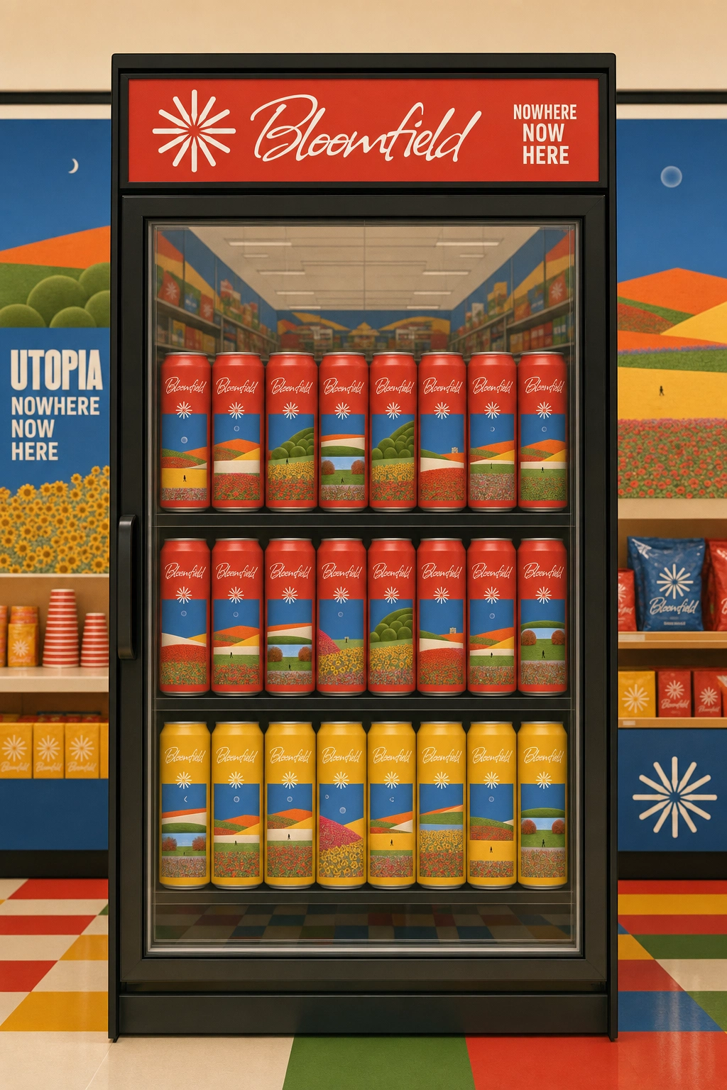
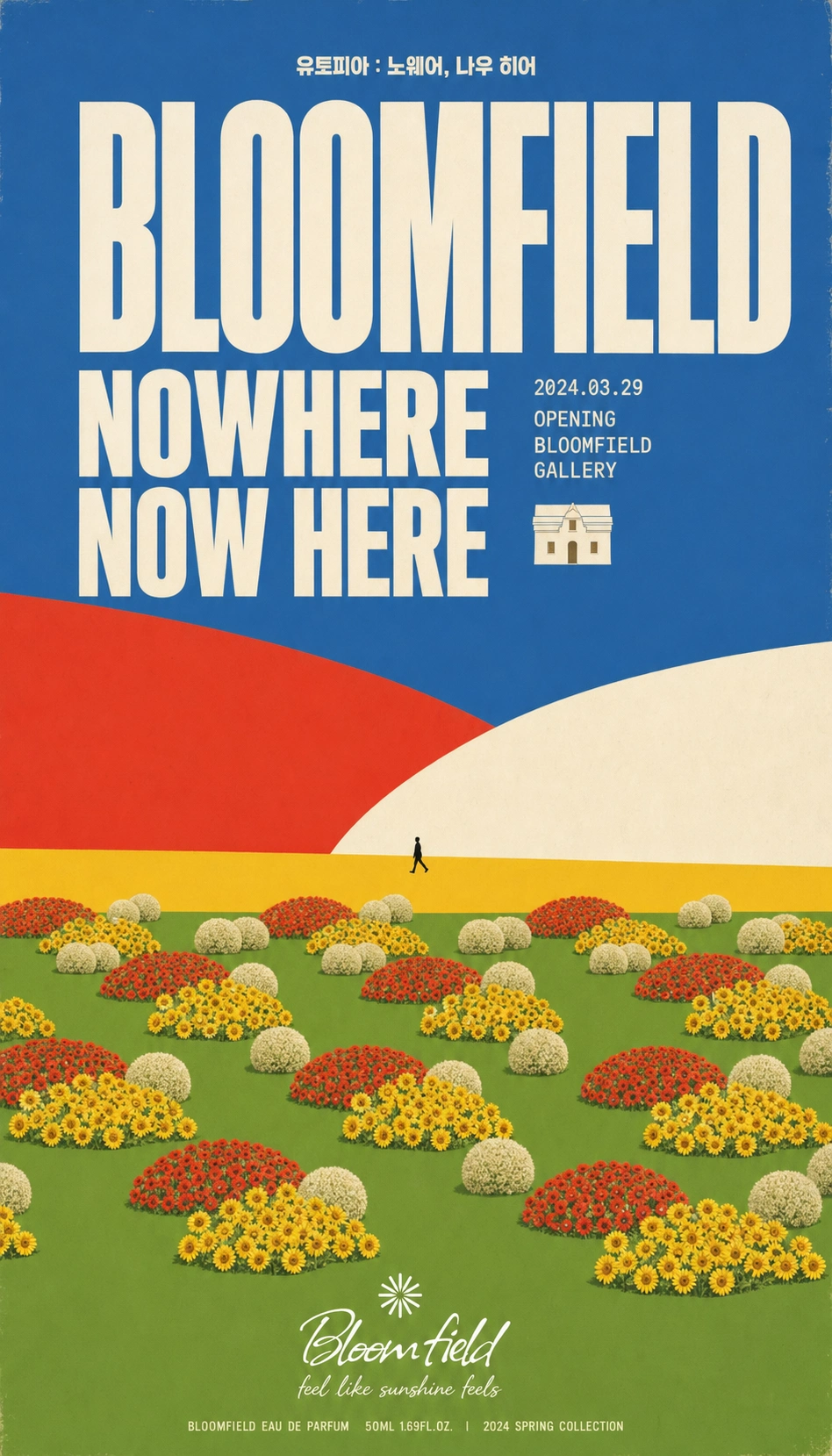
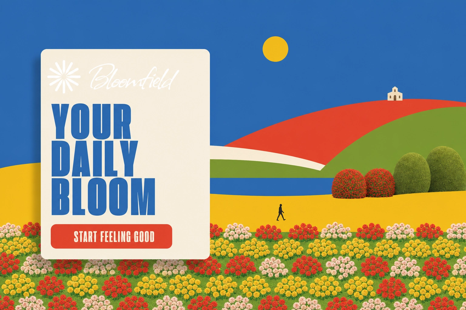
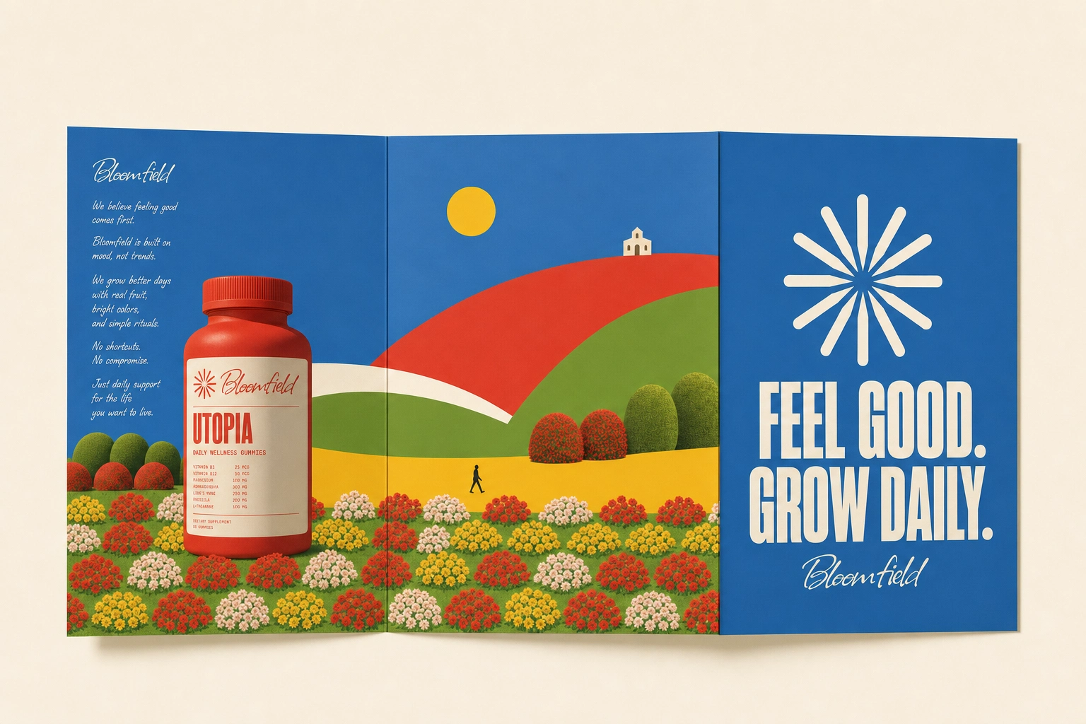
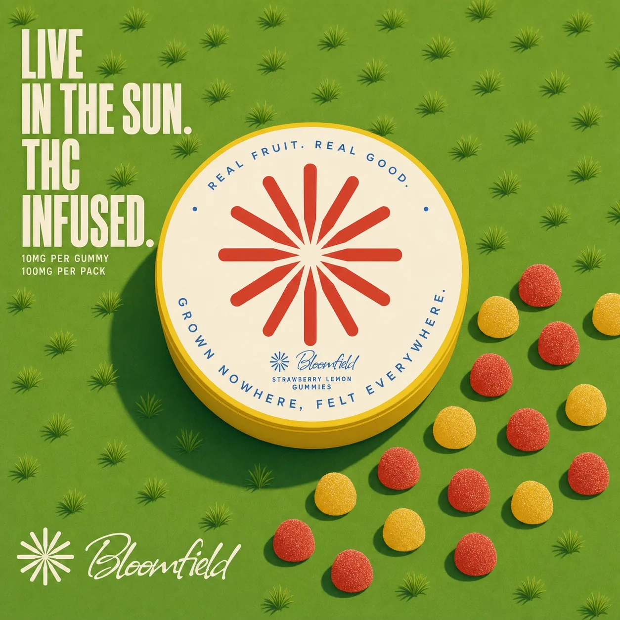
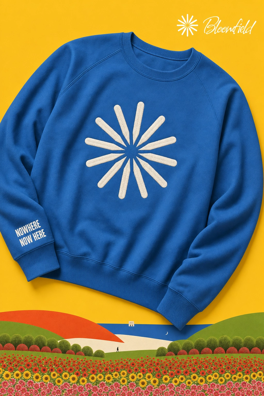
25 mockups produced across the system: full product packaging (bottles, tins, cans, pouches, canisters, sachets), apparel (crewnecks, tees, bucket hats, caps, totes), environmental and retail (billboard, storefront window, vending machine, retail cooler, elevator wrap, airport panel), and campaign media (metro OOH poster, Instagram assets, app/website hero screen, motion still, editorial photography, brochure spread).
Every application carries exactly one deliberate inconsistency — a seam, a scale mismatch, a disagreeing shadow — applied as a rule rather than left to chance, so the "defect" reads as a decision across the full system rather than a one-off flaw.
Outcome
A complete, coherent brand world built on a single conceptual bit, sustained without ever breaking character — the copy never acknowledges the joke, and the joke never breaks the copy.
Project Type: Fictional brand case study
Industry: Mood / wellness (supplements, functional drinks, mood tools)
Like this project
Posted Aug 26, 2026
Bloomfield is a fictional wellness brand built from the visual tells of AI-generated imagery, presented with total sincerity.
Likes
0
Views
20
Timeline
Aug 2, 2026 - Aug 26, 2026