Built with Lovart
MIST: A Disruptive Fragrance Brand Identity

Révolté


MIST — Luxury That Refuses to Perform
LOGLINE
A fragrance brand that had no interest in looking expensive. I built MIST around the opposite instinct: strip every maison cue — the crest, the foil, the French flourish — and let restraint do the convincing.
THE BRIEF
MIST started as a single provocation: what if a perfume brand looked like it came straight off a production line, not out of a Parisian atelier. No name attached to a founder. No heritage story. Just an object, a batch number, and a refusal to explain itself.
The tension was immediate. Niche fragrance already leans minimal — Helmut Lang, Celine, Henry Rose all work in restrained registers. Landing somewhere new inside that crowded, well-referenced space meant I couldn't just turn the dial down further on elegance. I needed a different vocabulary entirely.
What I took on was the full system: naming logic, label architecture, campaign world, and a rollout of fifteen-plus distinct visual directions, from studio product shots to subway takeovers to forensic, human-absent still lifes.
THE APPROACH
My first instinct was pure industrial minimalism — raw kraft, stamped type, warehouse light. It held up, but on its own it read closer to a coffee bag than a fragrance. Industrial alone wasn't luxury, it was just undressed.
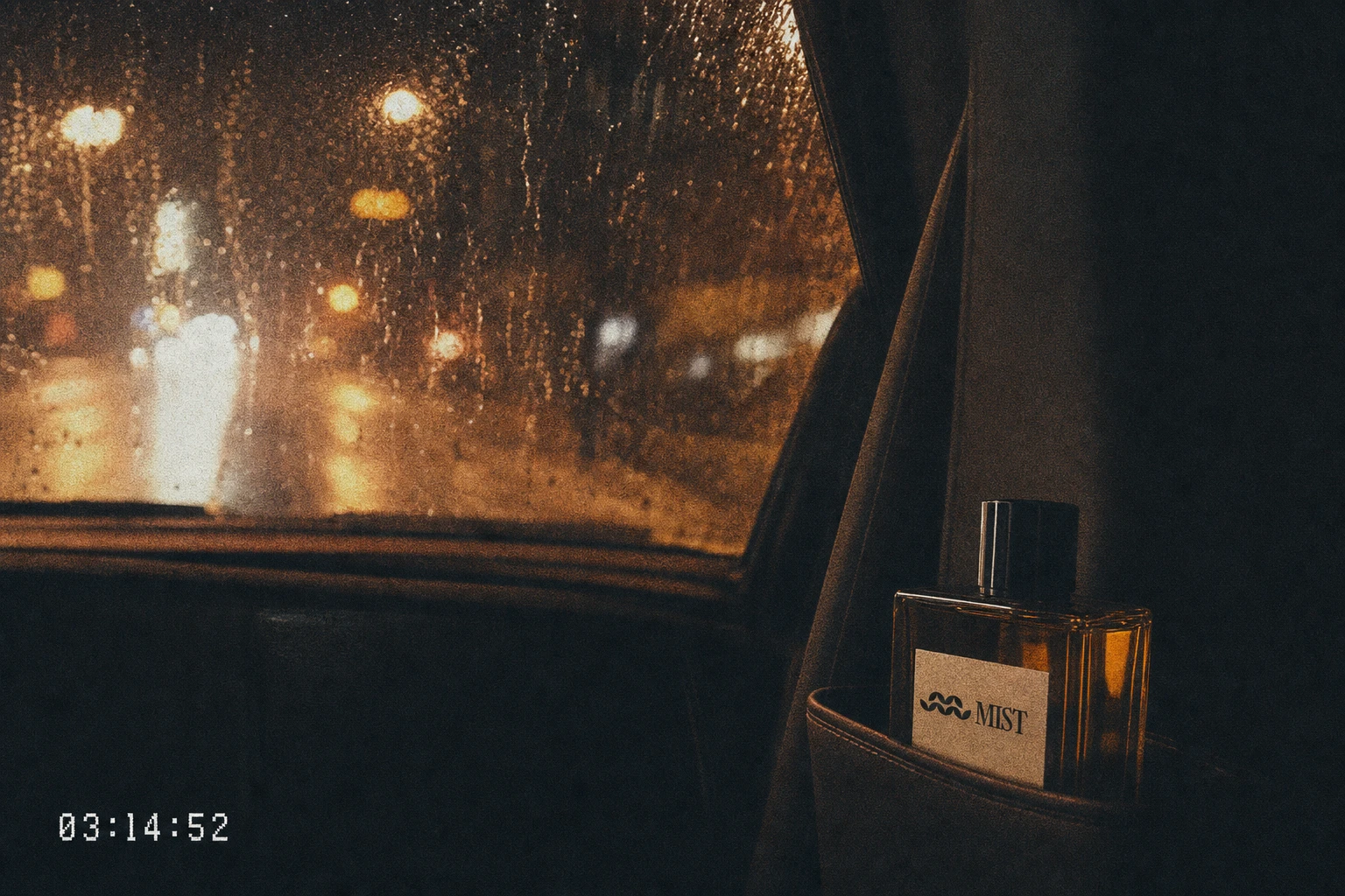
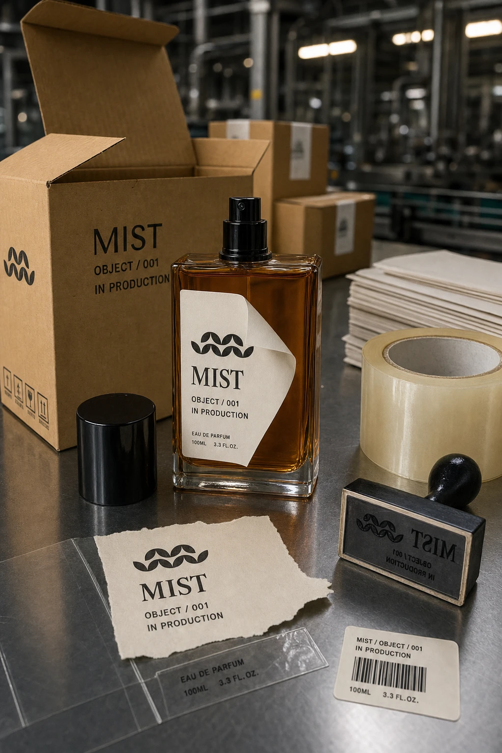
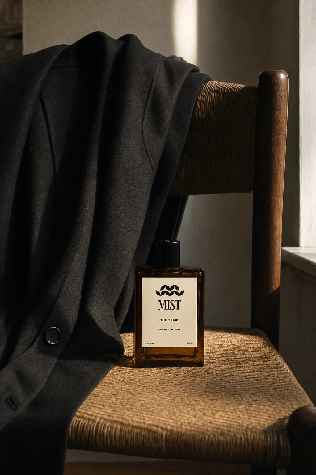
The unlock came from inverting the ratio. Instead of building the brand from grunge and adding polish, I locked a 70/20/10 rule: 70% precision, 20% raw industrial material, 10% intentional imperfection. The Girassol wordmark stays untouched and pristine in every single execution — no distortion, no effect — while everything around it (tape, stamps, dust, condensation, torn kraft) is allowed to be rough. That contrast became the entire brand argument: the world can be imperfect, MIST doesn't need to be.
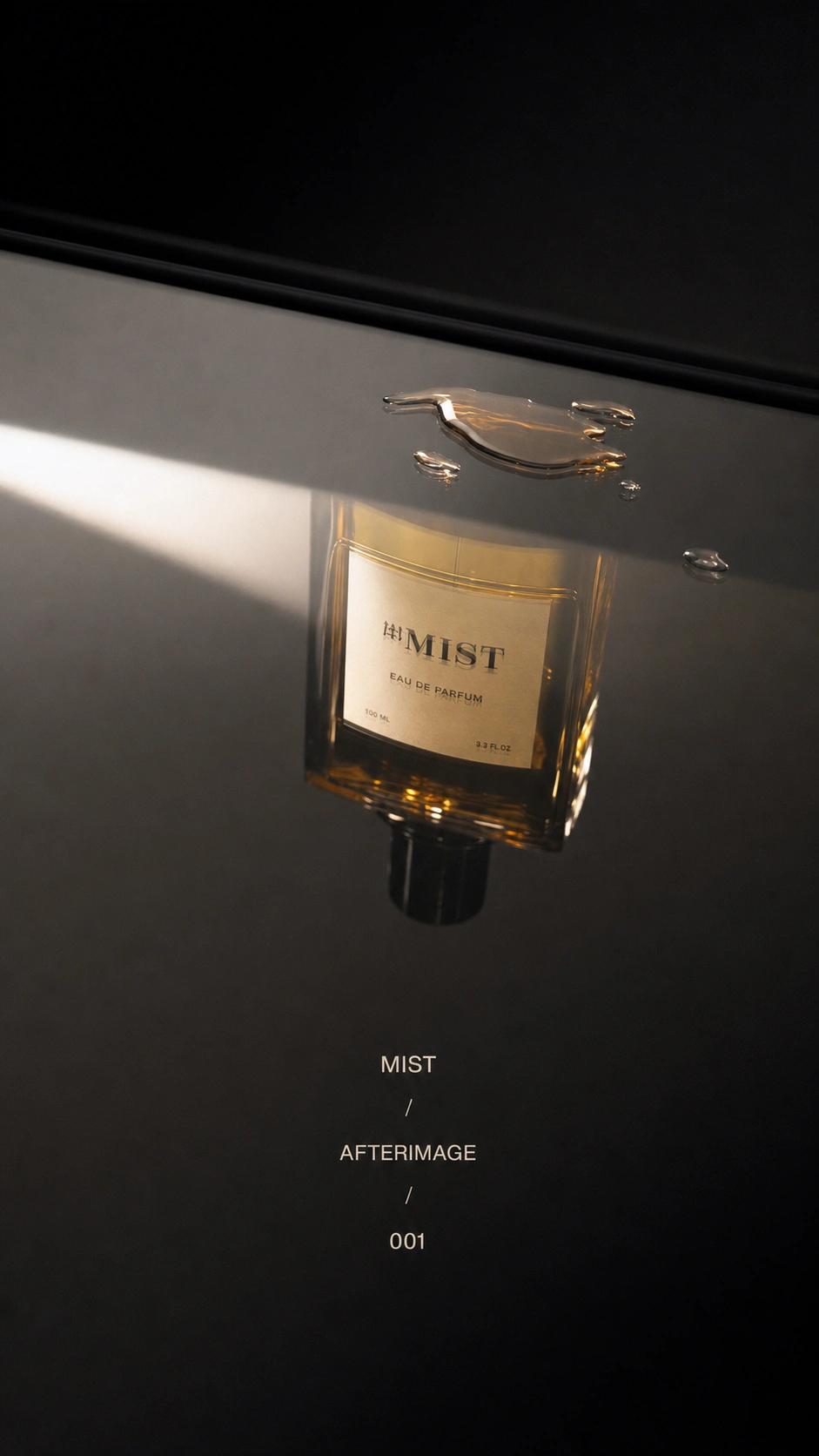
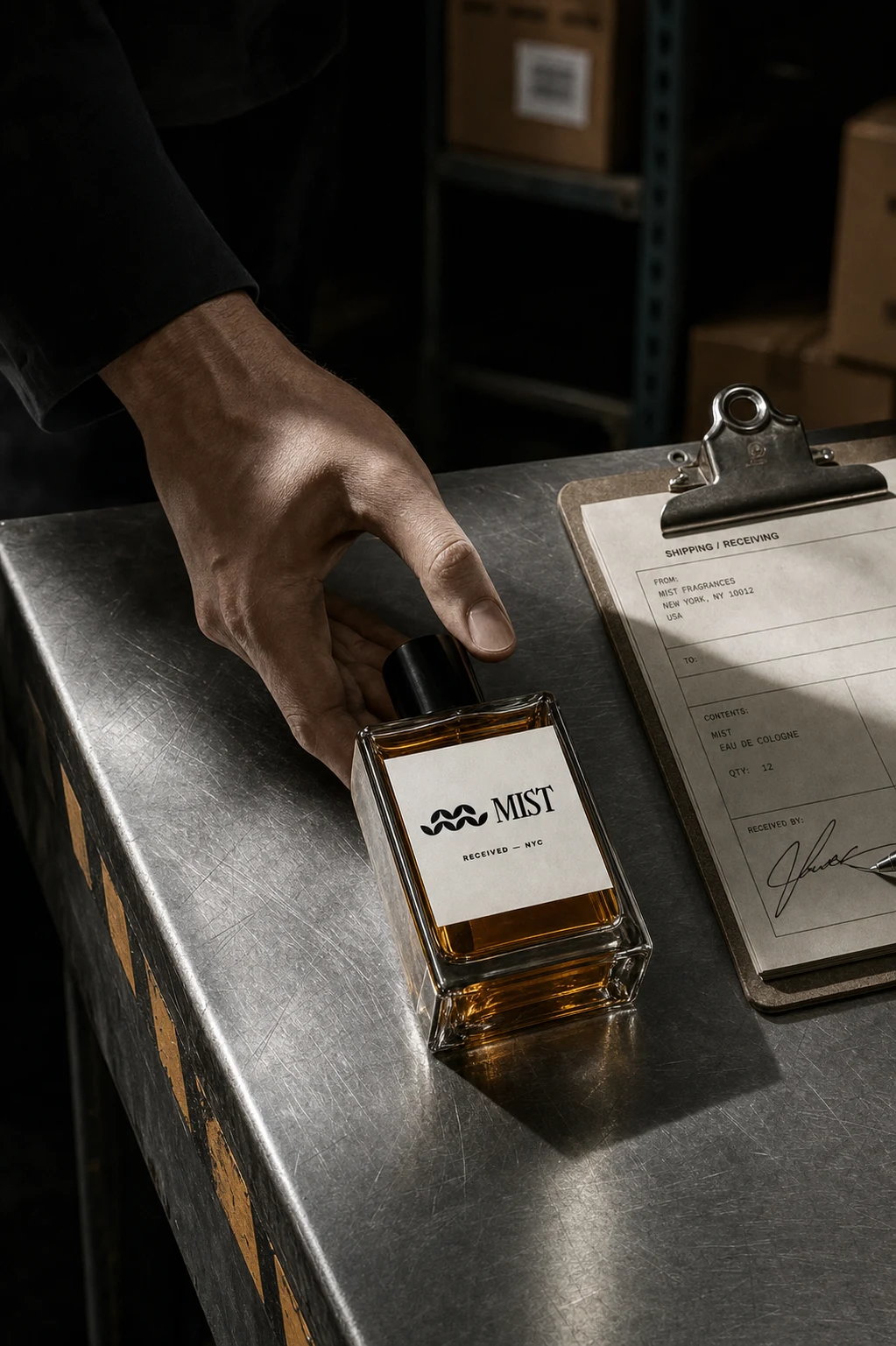
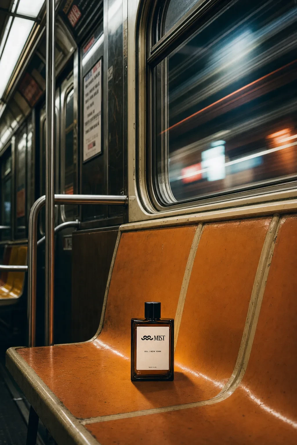
From there I split the campaign into two registers that talk to each other. One is documentary — factory floors, loading docks, customs forms, platform scales — treating the bottle like cargo with a declared weight, not an object of desire. The other is absence-driven — condensation, reflections, a dust ring on a dresser, an empty subway seat — where the bottle either just left the frame or hasn't entered it yet. AFTERIMAGE, built entirely on reflections and traces, became the strongest of these because it gave MIST something most fragrance brands skip: a recognizable conceptual signature rather than just a mood.
I stress-tested the whole system against the actual reference stack — Helmut Lang's studio product photography especially — and pulled the work further from those cues wherever it sat too close: leaning harder into tape, stamps, and transit environments that none of the references use.
THE WORK
BRAND IDENTITY / VISUAL SYSTEM
Built around a single non-negotiable rule: the Girassol MIST wordmark is never modified, cropped awkwardly, or treated as a design element — it's a fixed placed asset in every frame, regardless of how distressed the surrounding materials get.
LOGOMARK
A small woven-wave mark used as a certification stamp, not a logo pattern — applied to boxes, tape, tags, and documents the way a factory stamp would be, never repeated decoratively.
COLOR SYSTEM
Kraft Brown
#8B6F4E, Warehouse Grey #B9B7B2, Stamp Black #1C1C1C, and Safety Amber #D98A25 — used sparingly, with amber reserved almost entirely for the liquid itself and small warning-style marks.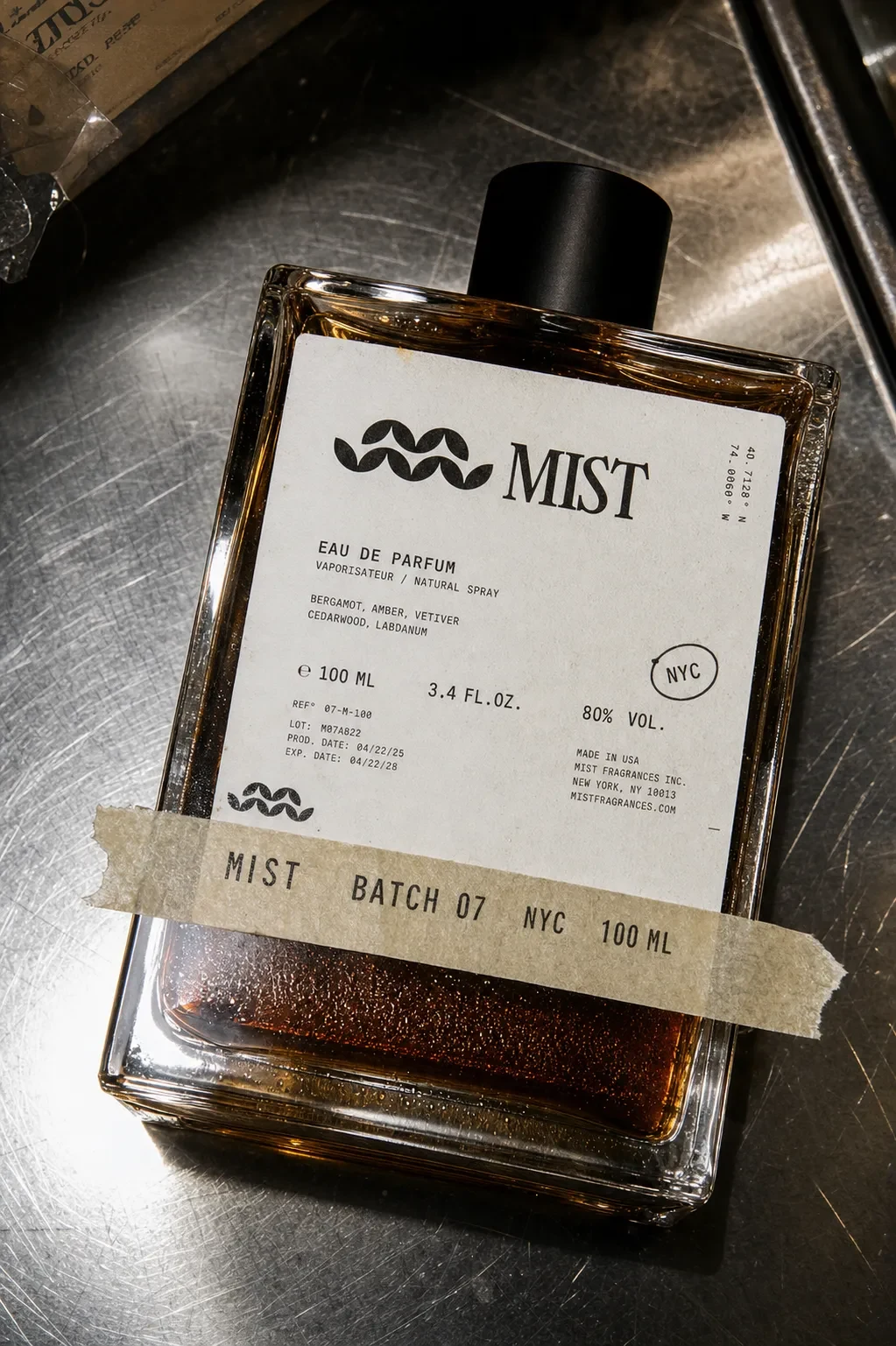
PACKAGING
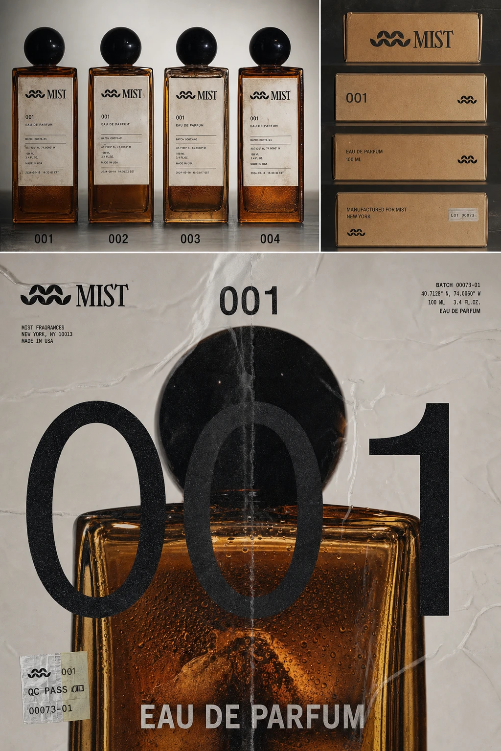
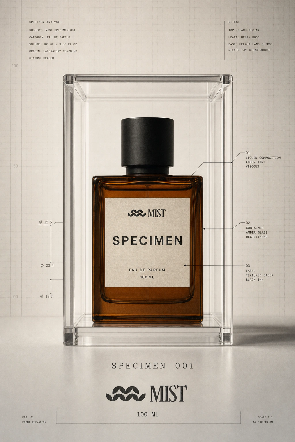
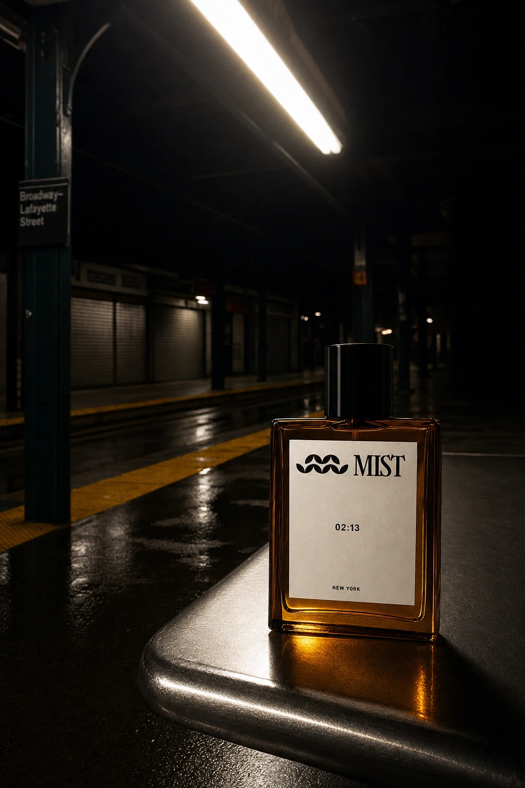
Heavy rectangular amber glass, black cylindrical cap, bone-white uncoated label with a deliberately raw or lifted edge. Secondary system includes kraft shipping boxes, customs-style declaration forms, and archival drawer presentation — each surface carries batch numbers, coordinates, and timestamps instead of conventional fragrance copy.
CAMPAIGN SYSTEM
Fifteen-plus distinct directions spanning studio product photography (The Factory Portrait, Amber/Steel, Production/No.001), procedural/documentary registers (Weight and Measure, Chain of Custody, The Handoff), and absence-based conceptual work (The Mist Trace, Afterimage, Material Memory).
OOH
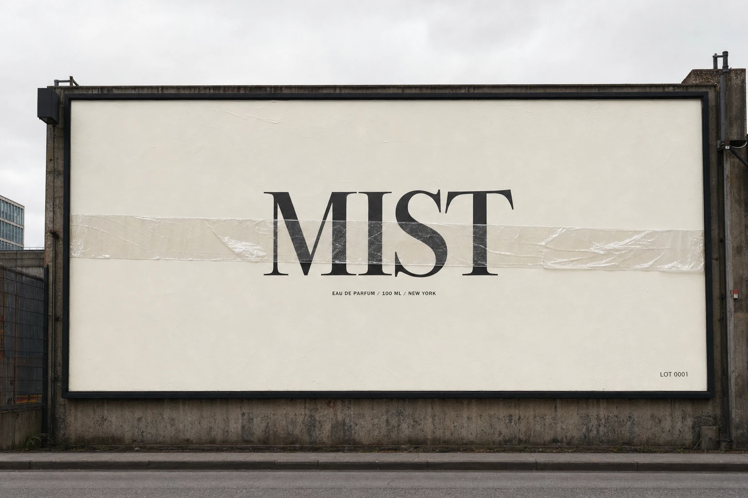
A billboard campaign built on restraint rather than image — "NO IMAGE" shows only the wordmark under a strip of real industrial tape, legible from ten meters, discovered up close. The In Transit and After the Lights directions extend the system into subway platforms and late-night urban environments without ever resorting to full-wall logo saturation.
THE RESULT
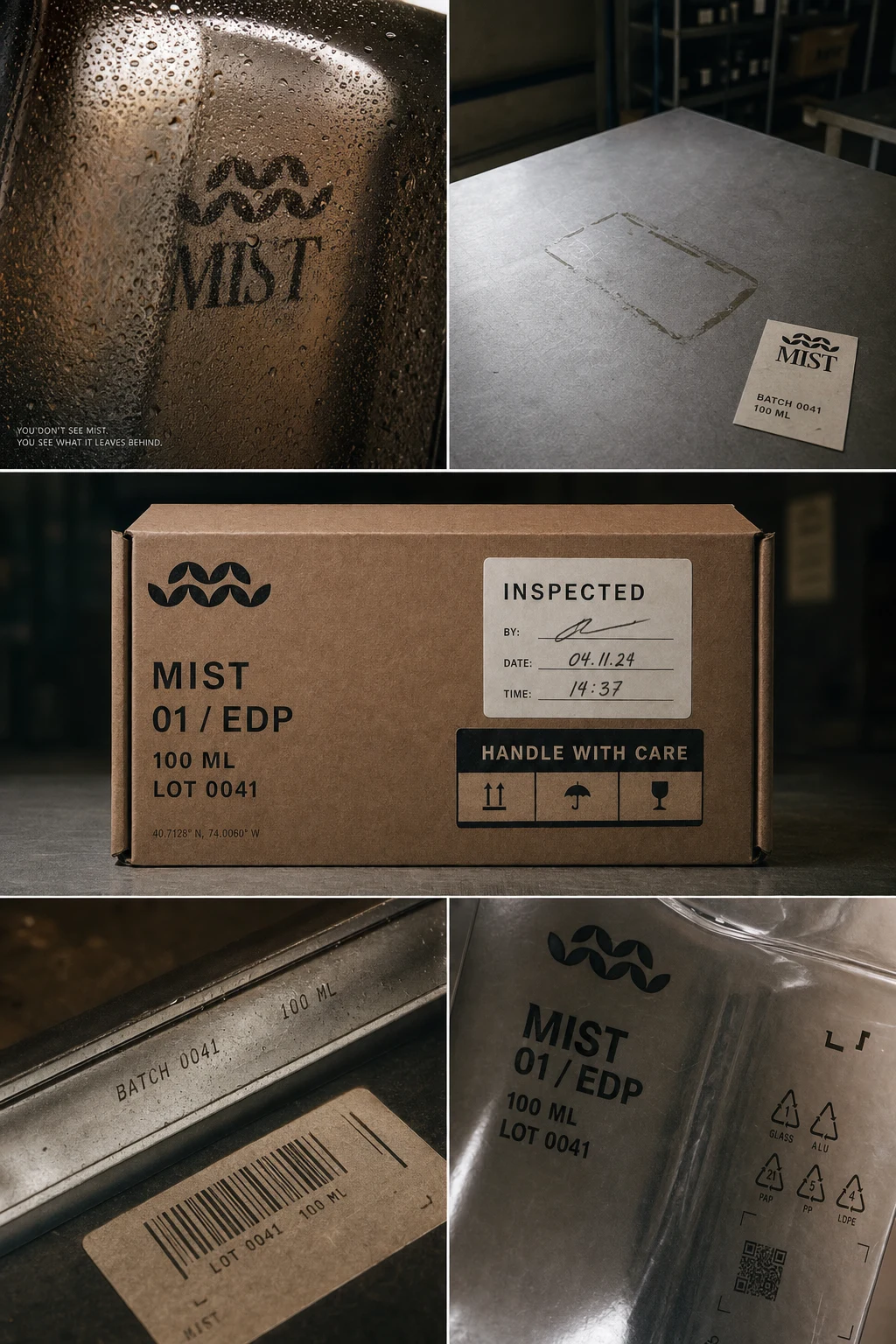
MIST landed as a full speculative system — identity, packaging, and a fifteen-plus-piece campaign library — with enough internal logic to keep expanding without repeating itself. The strongest through-line, AFTERIMAGE's absence-and-reflection language, gives the brand a signature move that's distinct from every reference it started from. Where the work still lives closest to its influences (studio product shots in the Helmut Lang register) is flagged and intentional, not accidental — the brand's real differentiation lives in the industrial-documentation and transit-based executions, which none of the reference brands touch.
Révolté — revolte.design
Project: MIST
Year: 2026
Scope: Brand Identity, Packaging Design, Campaign Direction, Art Direction
Industry: Fragrance / Niche Perfumery
See more at revolte.design
Like this project
Posted Aug 23, 2026
A fragrance brand built from shipping tape and customs forms instead of crests and gold foil — luxury that refuses to perform
Likes
0
Views
31
Timeline
Aug 6, 2026 - Aug 23, 2026