Built with Lovart
Ovum: Skincare as Specimen Conceptualization

Révolté


OVUM — A Private Collection, Not a Product Line
LOGLINE
A fictional beauty brand built on a single idea: skincare treated like a specimen you inherit, not a product you buy. I started in illustration and ended in film photography, and the brand got more confident every time I let go of an idea I'd been precious about.
THE BRIEF
Ovum started as a thought experiment, not a client brief — beauty/wellness, fictional, one directive: build something that didn't look like it came out of a moodboard everyone's already seen. No industry conventions to honor, no legacy brand to respect. Just a starting image — hand-painted specimen eggs, arranged like a naturalist's plate — and a mandate to make it real.
The tension I gave myself was specificity versus cliché. Beauty branding has a well-worn playbook: sage green, serif logo, dropper bottle, done. I wanted the naturalist reference to actually mean something structurally, not just supply a palette.
What I took on was the full identity — logo, color system, and enough campaign work to prove the concept could carry a real product line, not just a single hero image.
THE APPROACH
I started literal. The first logo pass leaned hard into museum-plate language — engraved ovals, wax seals, brass drawer labels. It read like a taxidermy shop, not a skincare brand. Technically accurate to the reference, emotionally cold.
The client push — and my own instinct — was to stop illustrating the metaphor and start living inside it. That's when the logo shifted to a hand-drawn, chunky italic wordmark with genuinely irregular letterforms — not a typeface pretending to be handmade, something that reads as a single confident gesture. That mark is the only piece of the identity that didn't evolve; everything else adjusted around it.
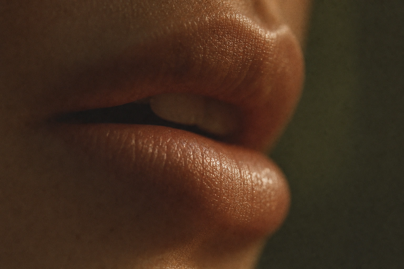
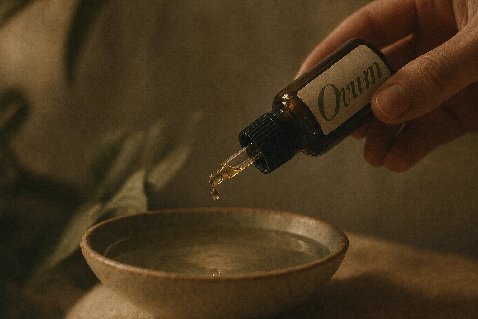
The bigger pivot happened in the campaign work. I built five batches of visuals in the original painted-illustration language — specimen clusters, engraved plates, spiral arrangements — technically correct but stylistically thin. It photographed like packaging, not like a campaign. When the direction shifted to cinematic 35mm film photography — macro skin, honey-gold liquid caught mid-pour, candlelight, a towel-wrapped portrait shot like a24 cinema still — the brand actually arrived. The naturalist idea didn't disappear; it just stopped being illustrated and started being felt, through texture, grain, and restraint.
The throughline that survived both phases: precision over decoration. Every prop, every crop, every liquid pour earns its place because it says something about rarity and ritual — nothing is there to fill space.
THE WORK
LOGO
A hand-lettered italic wordmark, all lowercase except the initial cap, rendered in a single confident olive-green (
#5C6242) stroke with deliberately uneven letterforms — the crossbar weight and terminal shapes vary letter to letter, which is what keeps it from reading as a licensed script typeface. No accompanying icon; the wordmark carries the full identity alone, which forced every other surface to work harder.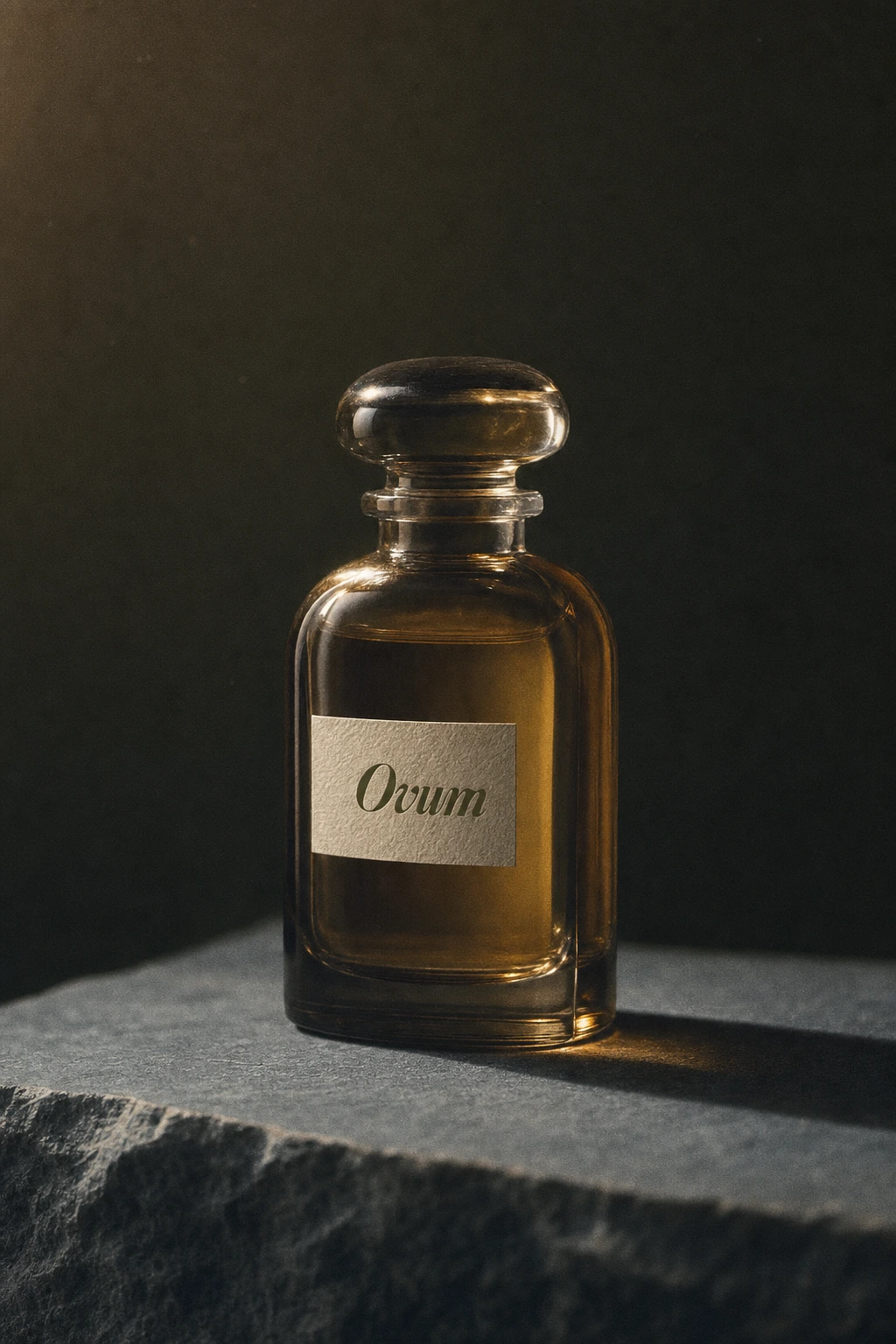
COLOR SYSTEM
Five colors, no more: Bone
#E8DFC8 as the dominant neutral, Ink Olive #5C6242 for the wordmark and dark surfaces, Rust Speckle #8B4A3A as the only warm accent, Aged Parchment #D9CBA3 for secondary paper tones, Slate Blue-Grey #5E6E73 for cool contrast and shadow. The restriction is the point — five colors used consistently across two completely different photographic languages (illustrated and cinematic) is what kept the brand legible through the pivot.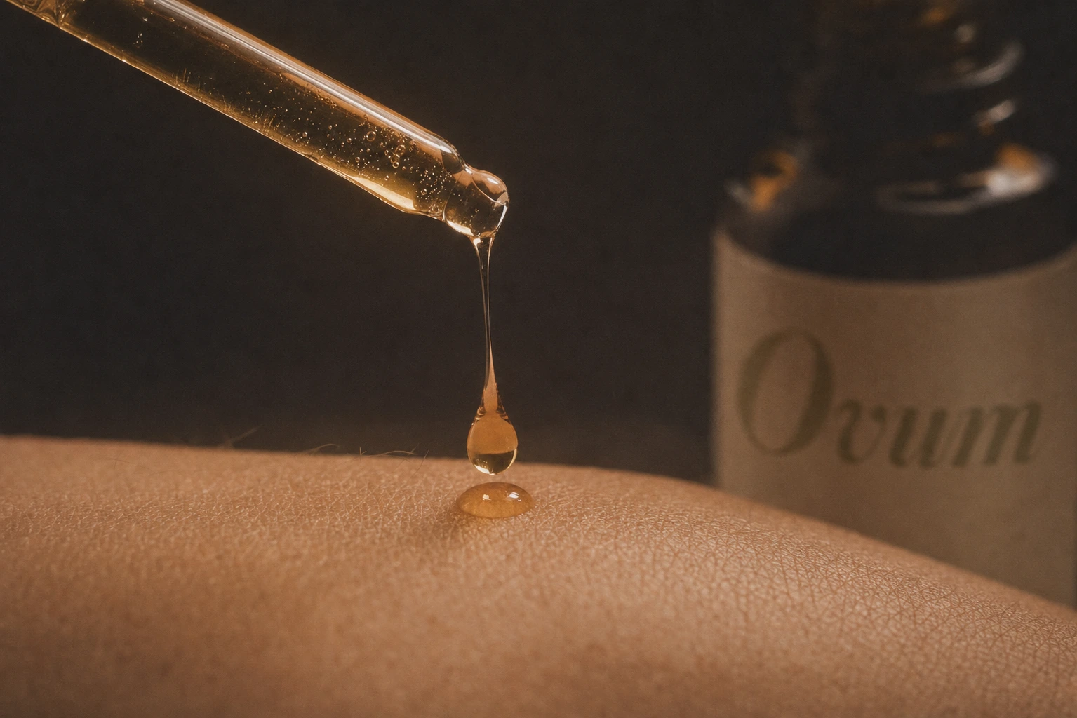
CAMPAIGN PHOTOGRAPHY — CINEMATIC DIRECTION
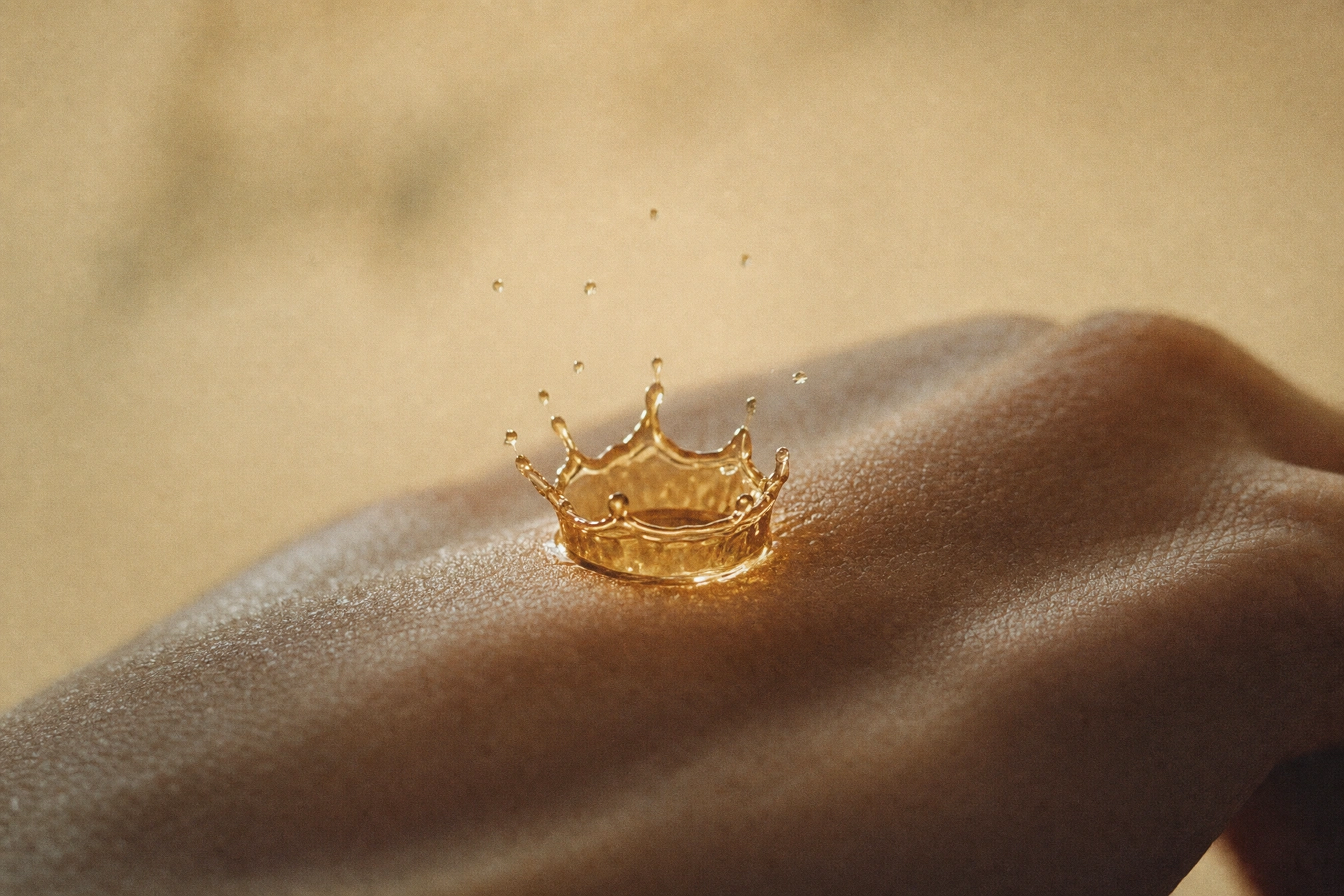
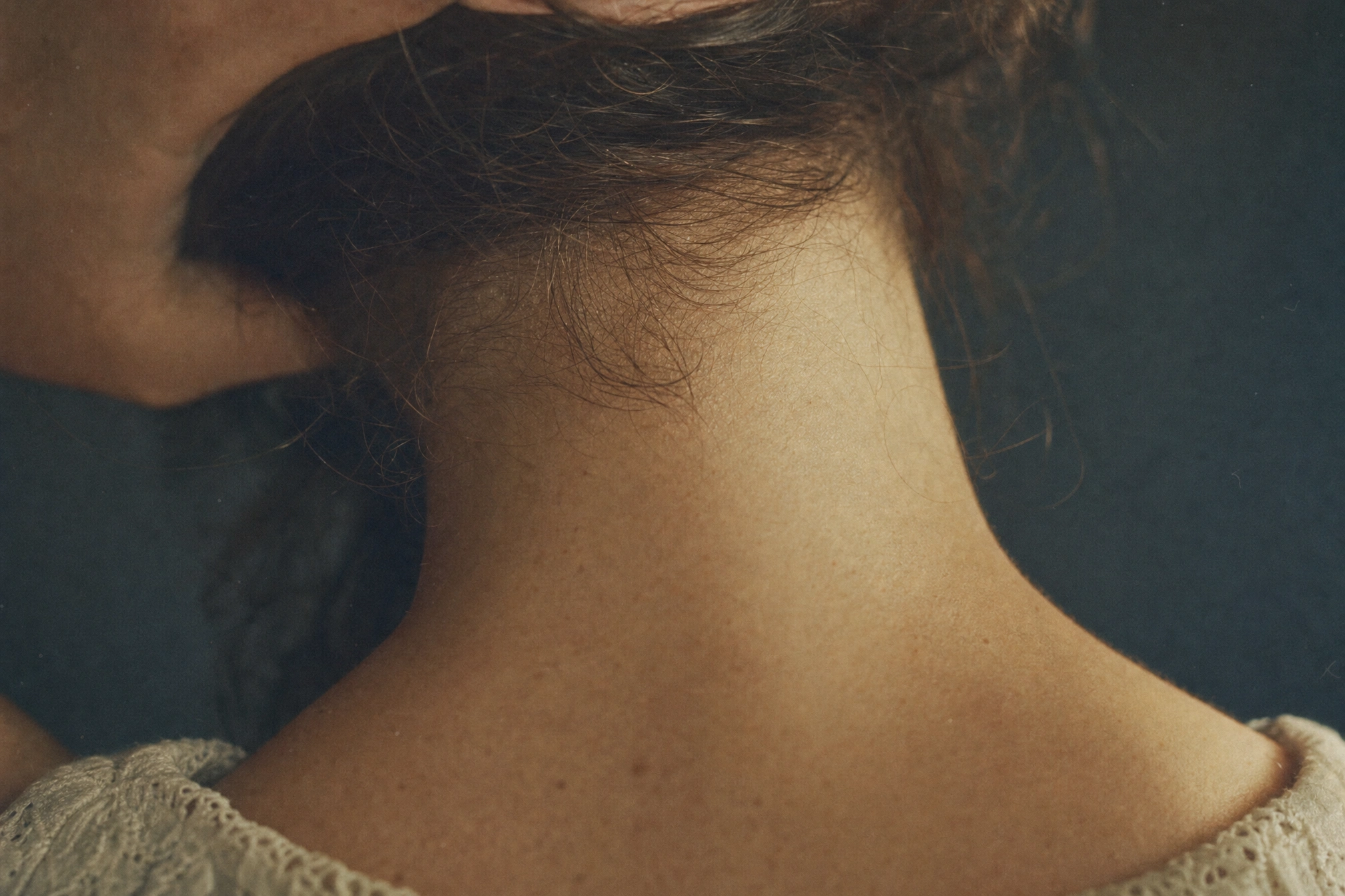
Twenty-five visual concepts split across illustrated specimen-plate work and, ultimately, a cinematic 35mm film direction: shallow depth of field, visible grain, low-contrast warm grading. The strongest work lives in the macro register — an oil ribbon suspended mid-pour, a droplet crowning on skin, fingertips at a jawline — images that never show a full face or a full product, forcing the viewer to fill in intimacy rather than being handed it.
PACKAGING
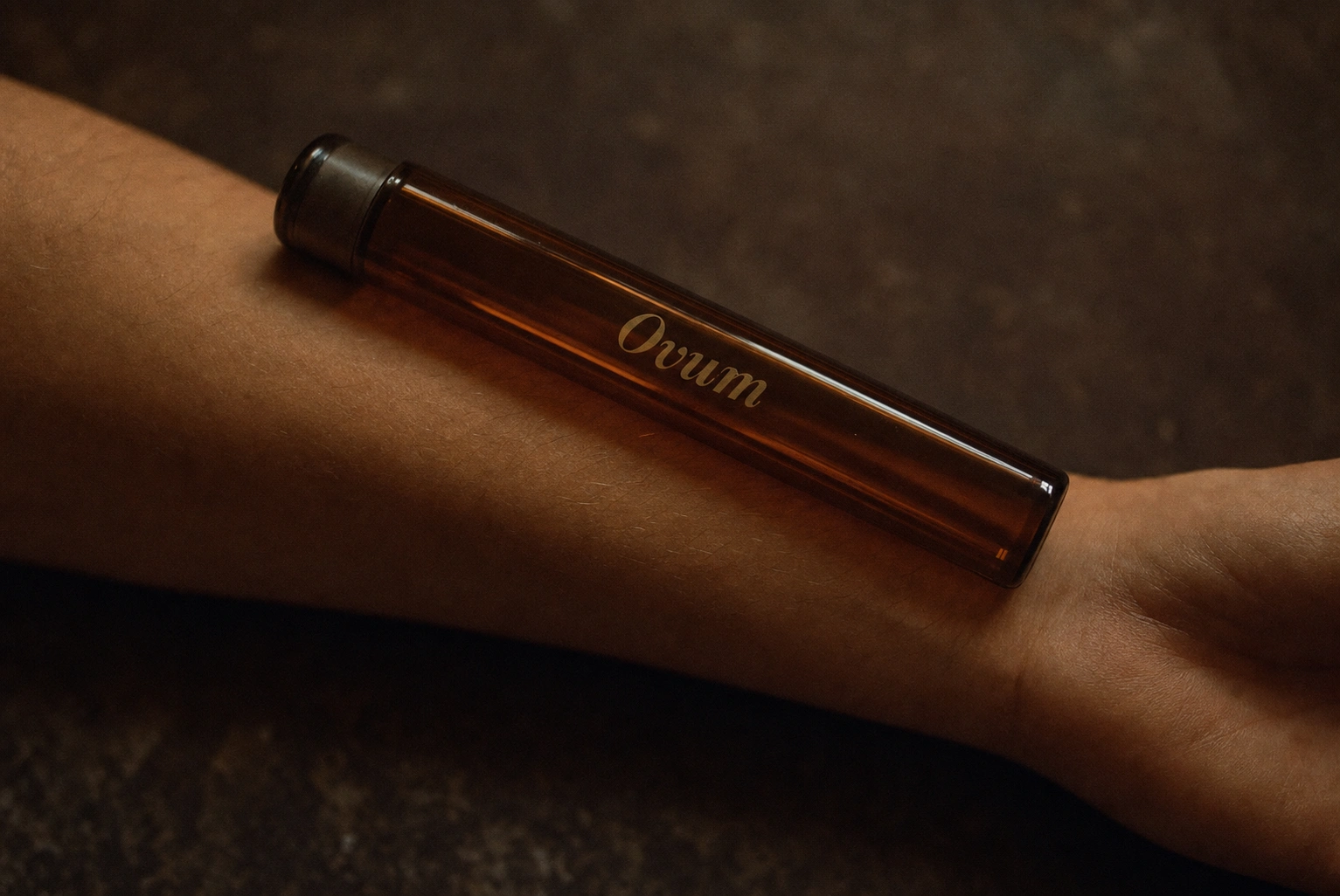
Two packaging registers, both photographed in the same cinematic language. The elevated version: an embossed Bone outer box with an Ink Olive velvet-lined interior tray, Rust Speckle tissue paper, and a corner-stamped wordmark — unboxing shot as a slow reveal, not a product photo. The rustic version: kraft-brown boxes and amber apothecary bottles with a plain paper label, styled beside dried botanicals — the same brand, deliberately rougher, proving the identity survives a shift in material cost.
THE RESULT
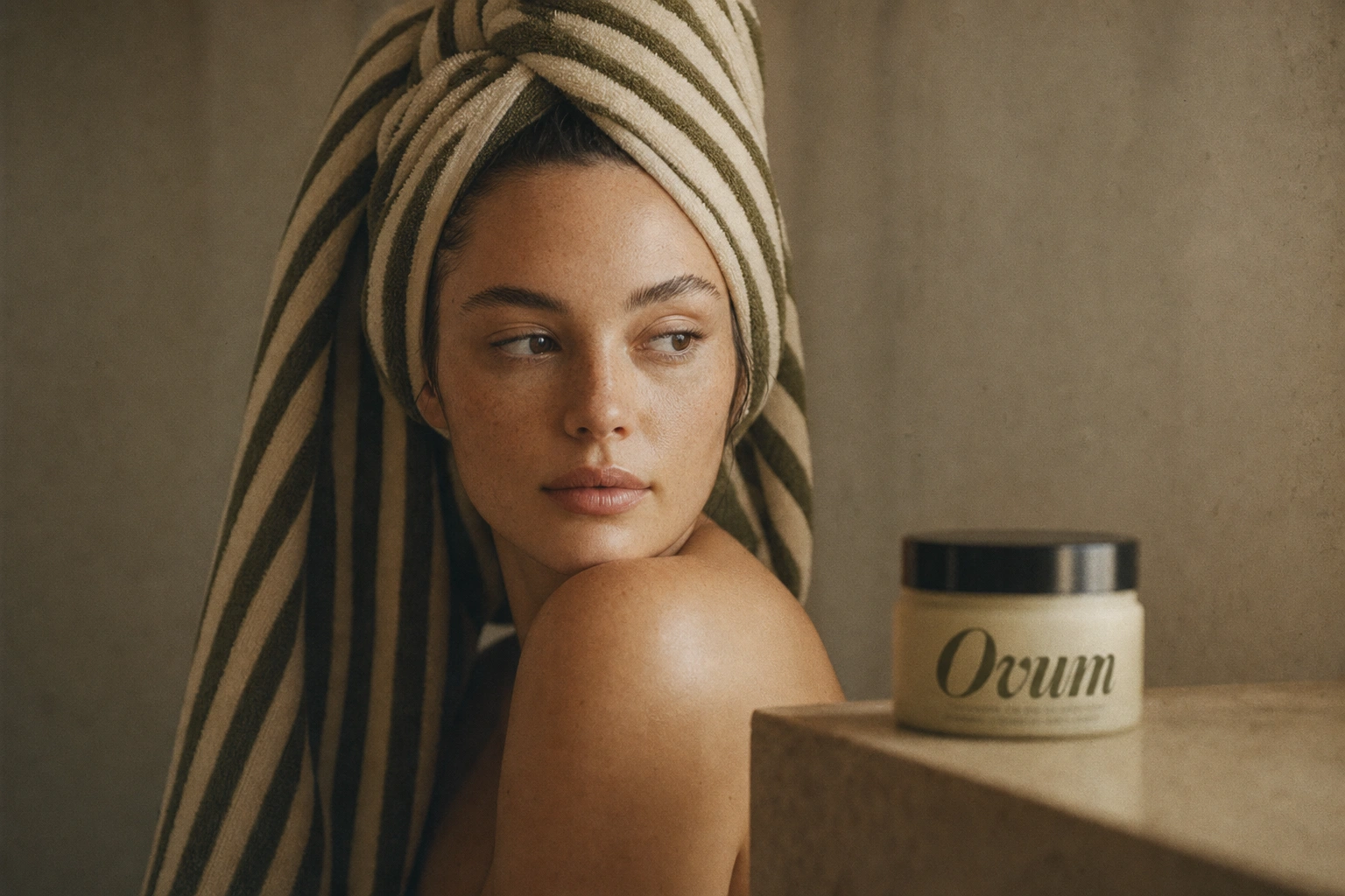
Ovum doesn't exist as a shipped product — this is speculative work — but the exercise proved something I wanted to test: a strong verbal concept (skincare as specimen, not product) can survive a complete visual reinvention if the color system and wordmark stay disciplined. The brand looks like two different photographers shot it. It reads like one brand anyway.
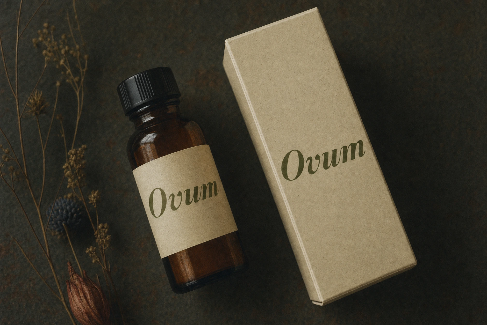
Révolté — revolte.design
Project: Ovum
Year: 2026
Scope: Brand Identity, Logo Design, Campaign Photography Direction, Packaging Concept
Industry: Beauty & Wellness
Like this project
Posted Aug 7, 2026
Ovum treats skincare like inherited specimens, not products — one wordmark held a full identity through a total visual reinvention
Likes
0
Views
24
Timeline
Jul 20, 2026 - Aug 7, 2026

