Built with Lovart
nième génération: Design & Identity

Révolté


nième génération — a brand built on the idea that nothing arrives clean anymore
A streetwear system where every garment reads as evidence of a document copied one generation too many — degraded, hand-marked, still legible, still worth keeping.
THE BRIEF
There was no client here. I set myself a harder brief: build a brand where the degradation isn't a filter, it's the argument. Every streetwear label chasing a "vintage" or "archival" look treats distressing as a finish applied at the end. I wanted a brand where the wear was the design method from the first decision, not the last one.
The tension I was chasing: how do you make something that looks like it's been copied and recopied until it's barely holding its shape, without it reading as sloppy or accidental. It had to feel controlled. A system, not a mess.
THE APPROACH
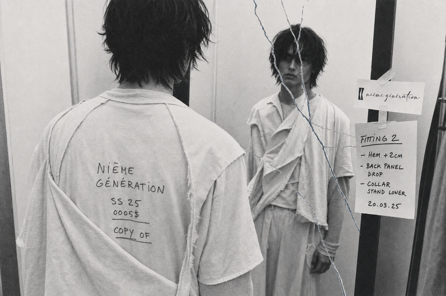
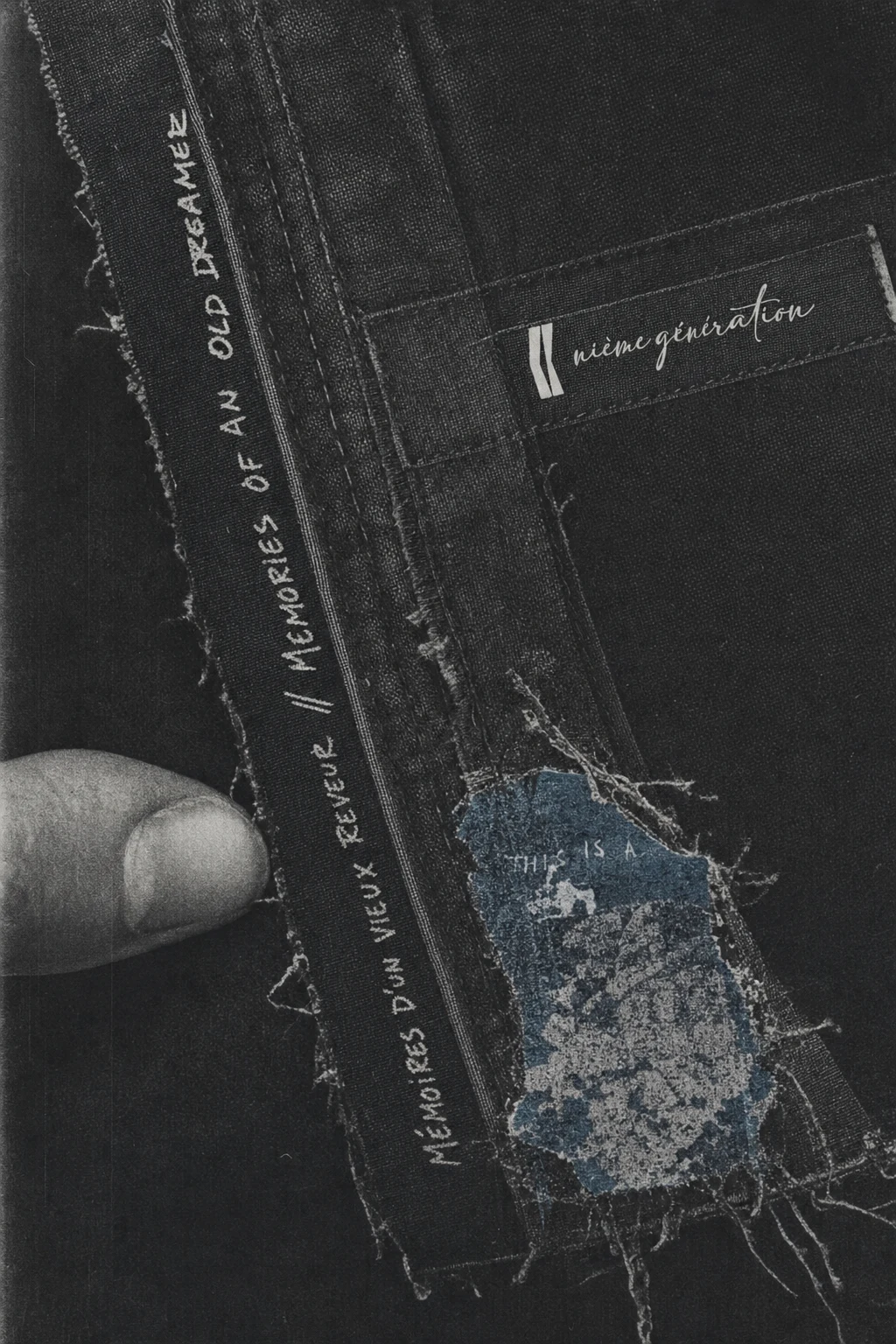
I started from a technique, not a mood board — hand-scrawled bilingual marker text and torn, taped paper transfers on distressed denim. My first instinct was to treat that as a graphic style I could apply to any garment. That didn't hold up. It read as decoration, another brand borrowing a texture.
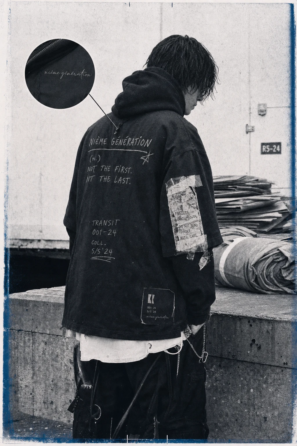
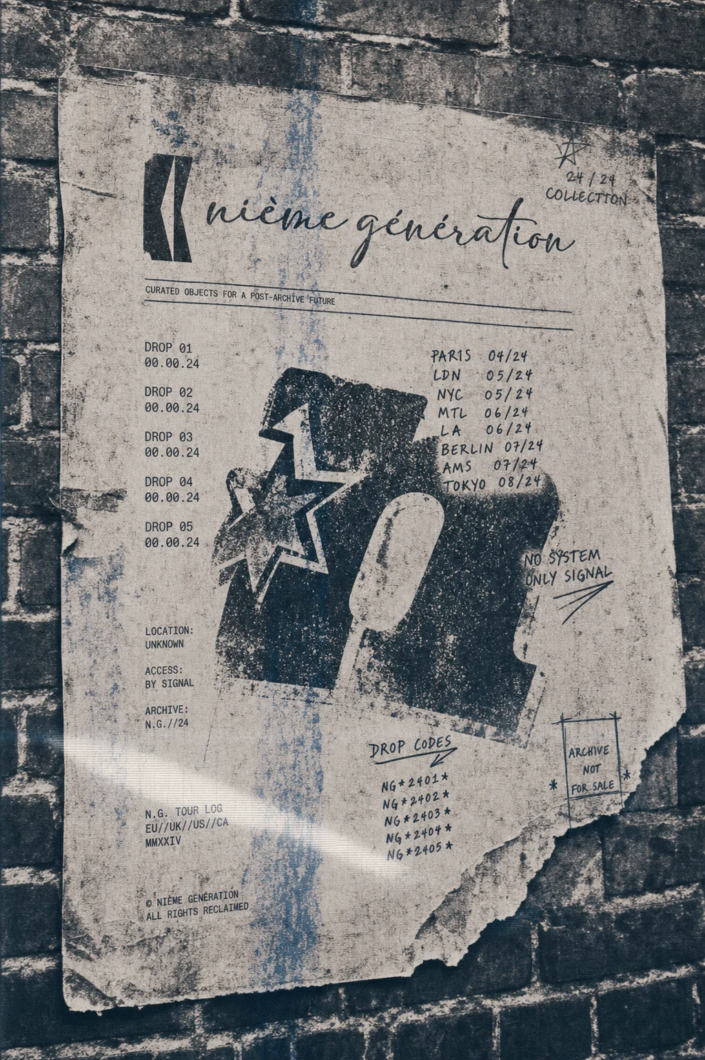
What unlocked it was reframing the whole brand around the mechanics of a photocopier, not the look of one. A photocopy of a photocopy loses information in a specific, physical way — toner bleed, registration drift, a ghost color bleeding through from the pass before. Once I locked that as the generative rule, everything else followed: a strict two-tone palette (ink black, bone white) with one degraded accent color standing in for the ghost bleed, a script logotype that reads as "the original," and a technical monospace label type that reads as "the copy's caption."
I rejected a full color system early — more color meant more decoration, and decoration was the thing I was trying to avoid. The constraint was the brief.
THE WORK
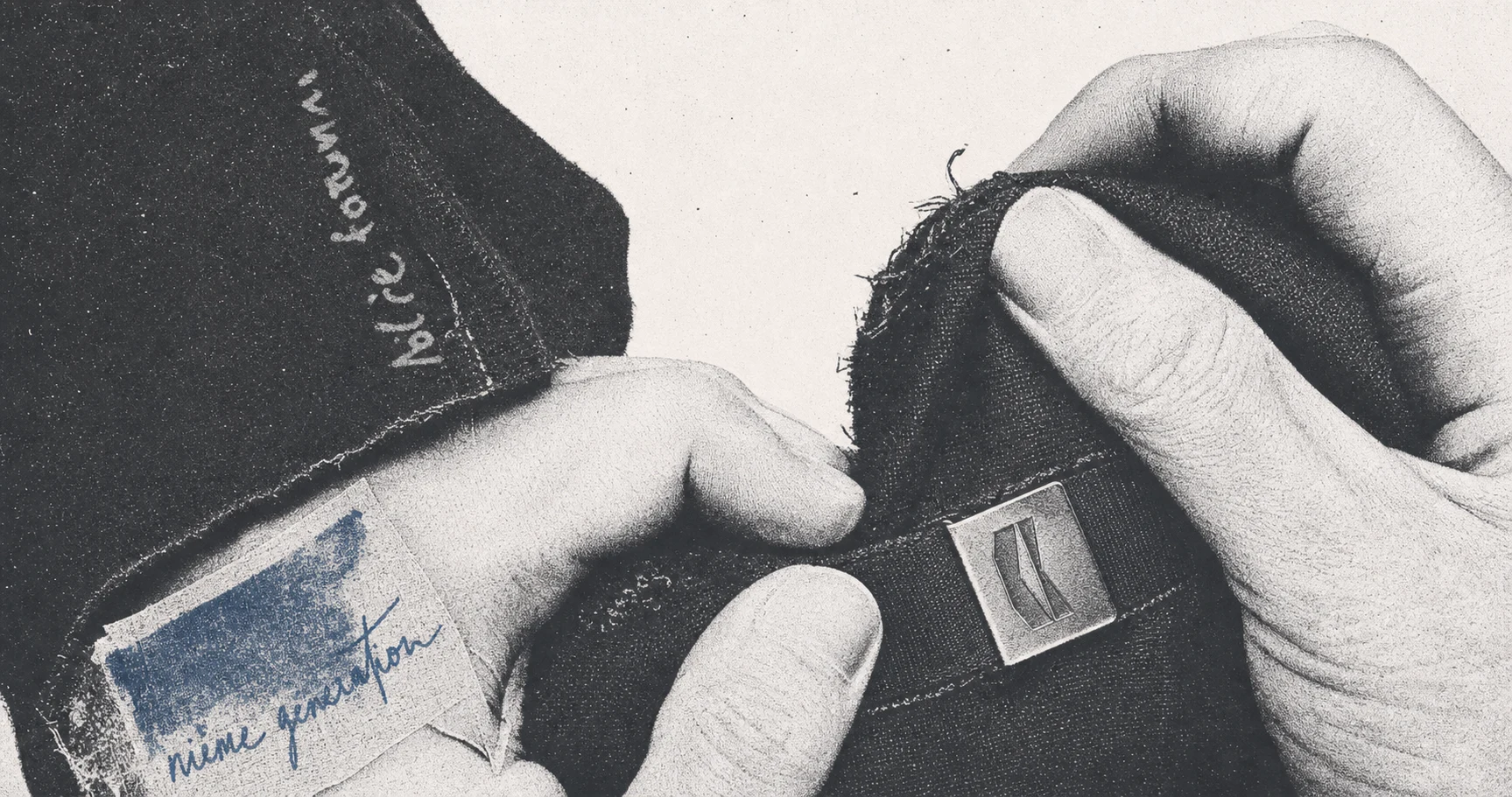
BRAND IDENTITY / VISUAL SYSTEM
Built around a single physical metaphor — the document that's survived too many passes through the machine. The interference-bracket logomark (two skewed parallel bars) functions like a registration mark, never a decorative flourish, and appears consistently small and functional across every touchpoint.
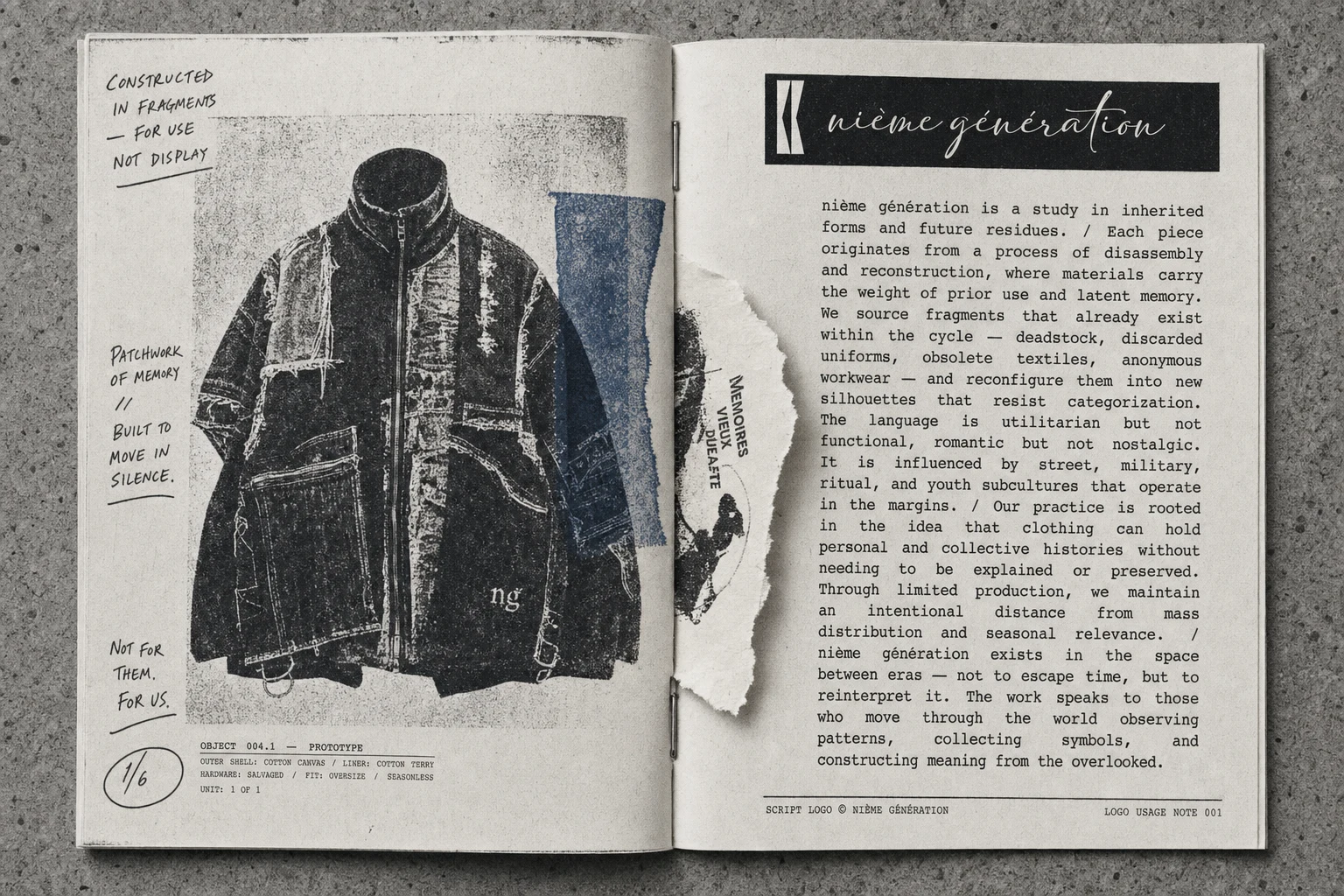
LOGO
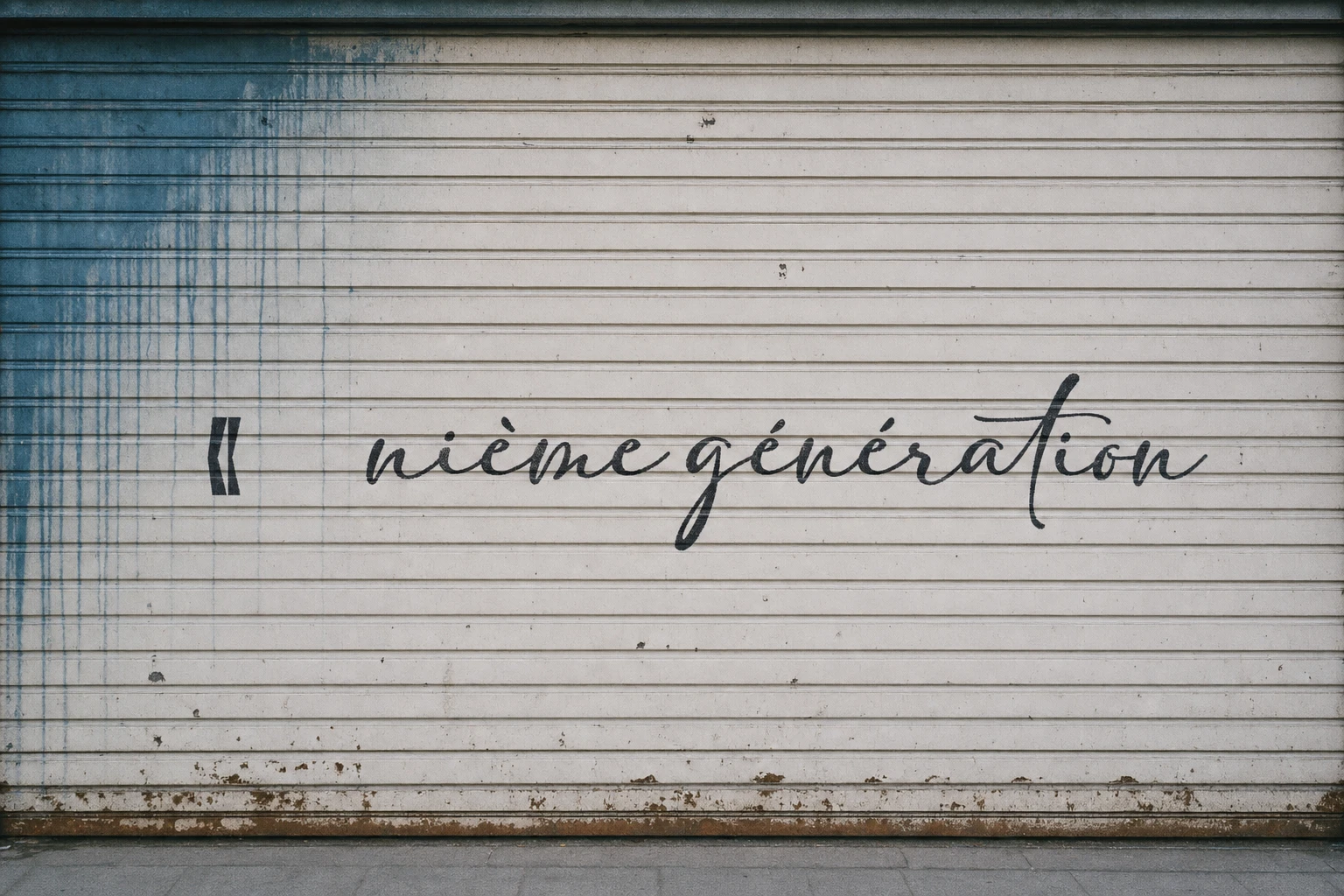
The wordmark is set in Adelia, a script face, positioned as "the original signature" against the technical monospace type used everywhere else — the tension between the two typefaces is the brand's entire typographic argument.
COLOR SYSTEM
Ink black
#1E1E1E and bone white #F5F1F0 as the fixed two-tone base, with xerox-blue #3D5A73 reserved strictly for degraded bleed-through moments — never used as a UI or decorative color, only as evidence of a copy gone wrong.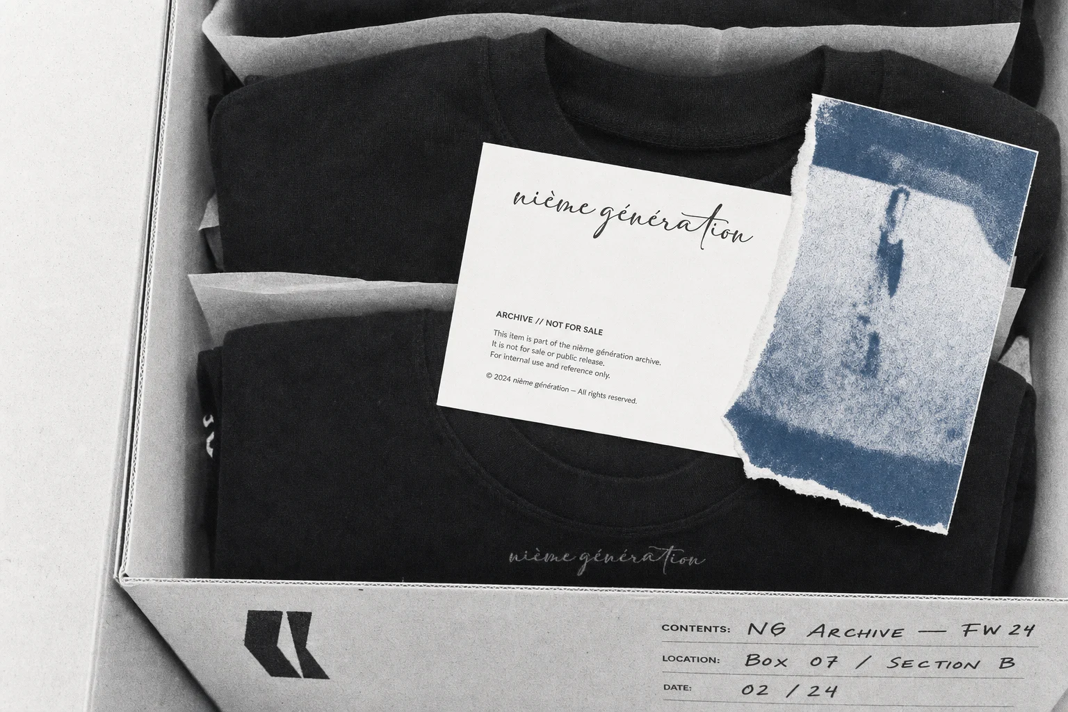
CAMPAIGN PHOTOGRAPHY
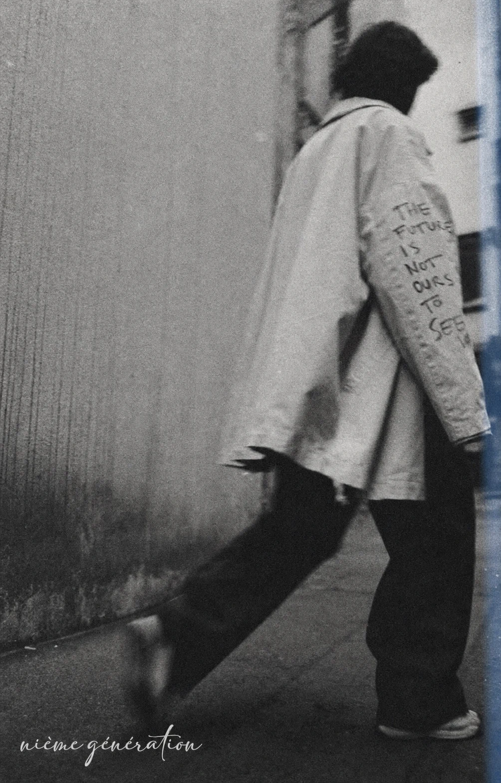
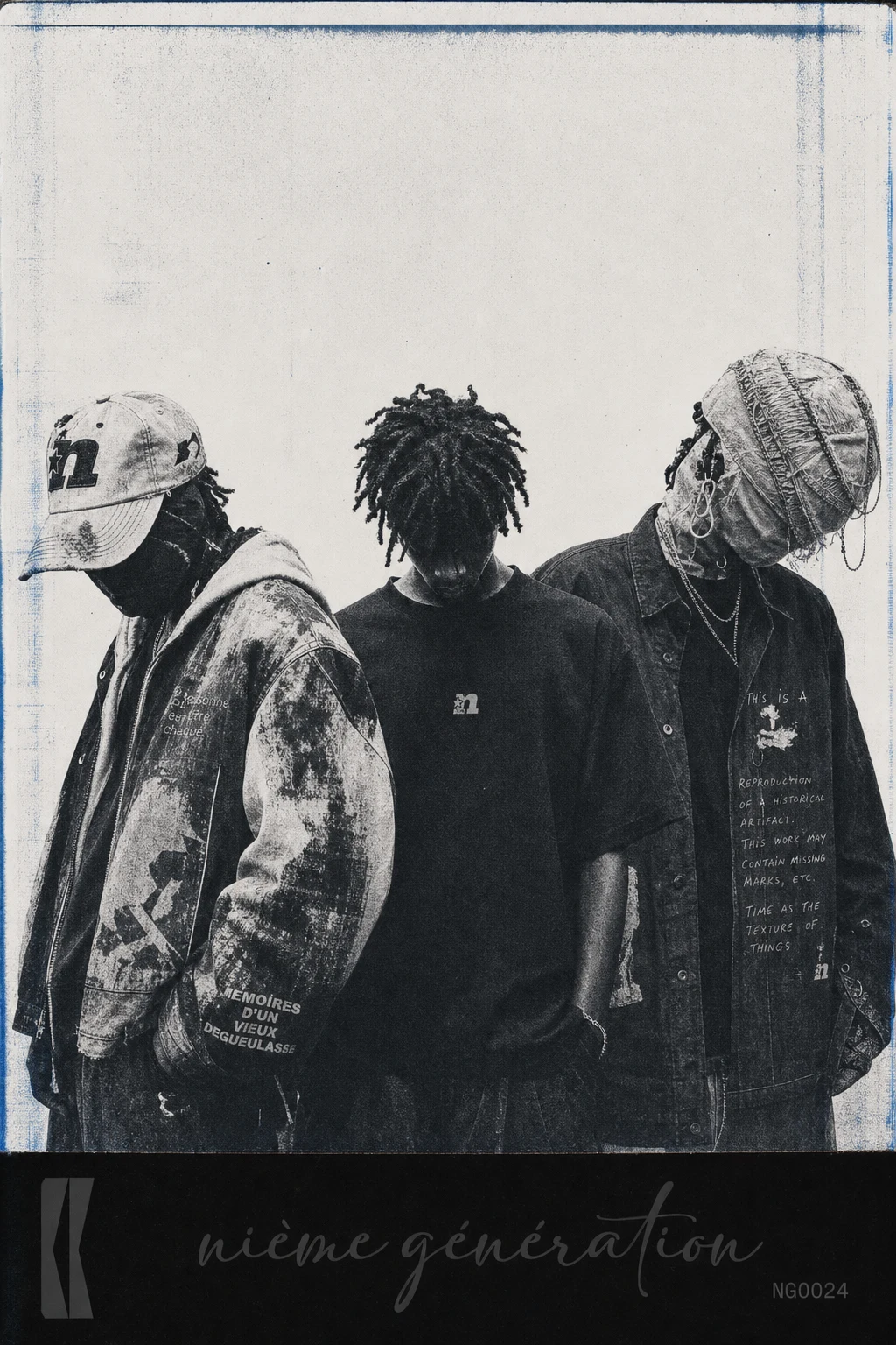
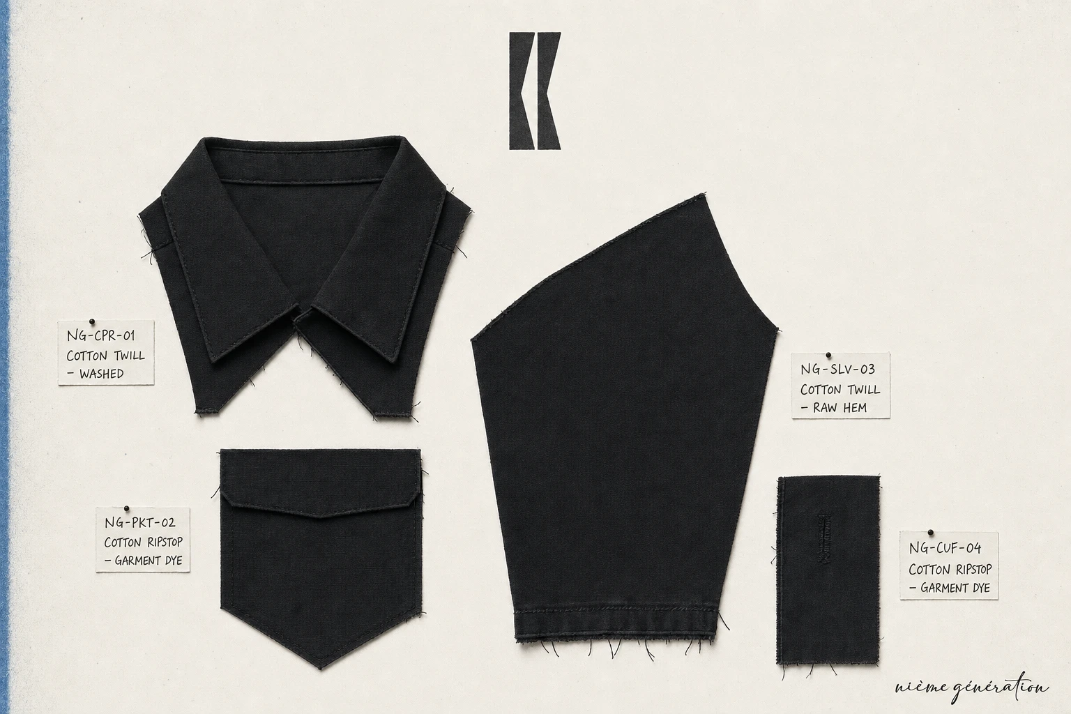
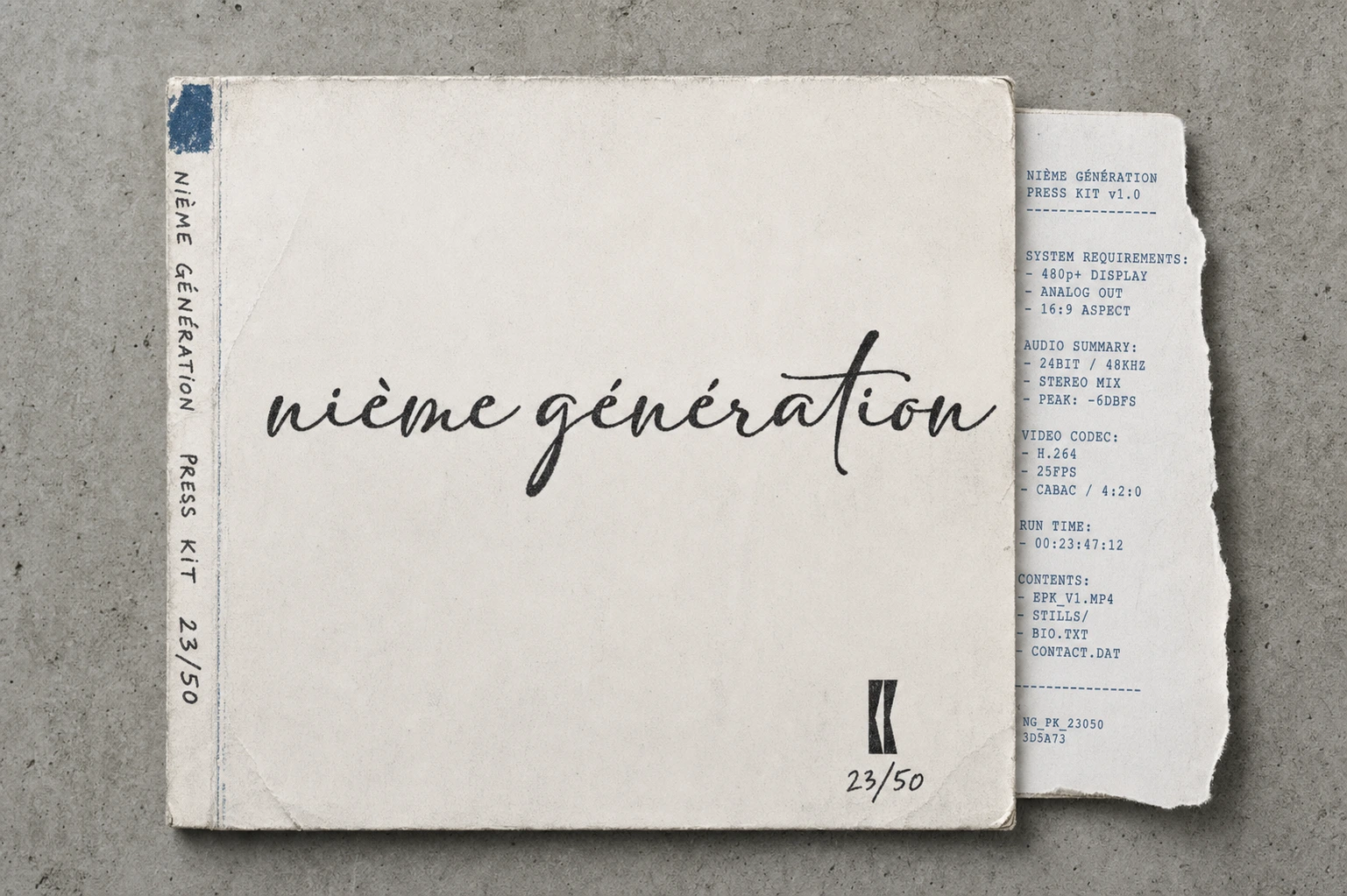
An 18-image system spanning editorial portraiture, garment and hardware macro detail, environmental signage (a wheatpasted poster, a hand-stenciled shutter gate), and branded objects (a press-kit-style vinyl sleeve, a zine spread, a canvas tote, woven hangtags) — every frame shot flat and clinical, like documentation rather than fashion editorial, with visible toner bleed and registration drift built into the photographic language itself, not added after.
WEB DESIGN
Specced a landing page built on the same physical logic — a scanning bar sweeps the hero into view on load, section reveals use clip-path line-sweeps rather than fades, and the campaign carousel is a GSAP ScrollTrigger-pinned horizontal scroll using blend-mode cross-dissolves so images print over each other mid-transition, the way two photocopies would overlap. Framer Motion handles component-level micro-interactions layered on top of the GSAP-driven scroll timeline. No rotation, no particle effects, anywhere in the system — the constraint held all the way through.
THE RESULT
The system is built out — full campaign asset library, locked color and type logic, and a complete technical spec for the site build. What's left is production: building the actual site against the spec, and moving into a first physical or digital drop. The brand already does the thing I set out to prove — degradation as a design method reads as more controlled, not less, than a clean system would have.
Révolté — revolte.design
Project: nième génération
Year: 2026
Scope: Brand Identity, Campaign Photography Direction, Web Design Specification
Industry: Streetwear / Fashion
Like this project
Posted Aug 5, 2026
A streetwear system built on photocopier logic — degradation as design method, not decoration, from logomark to motion spec
Likes
3
Views
12
Timeline
Jul 6, 2026 - Aug 5, 2026

