Built with Lovart
NO 1/4: Pirate-Inspired Crypto Branding

Révolté


NO 1/4 — Piracy Without the Theater
LOGLINE
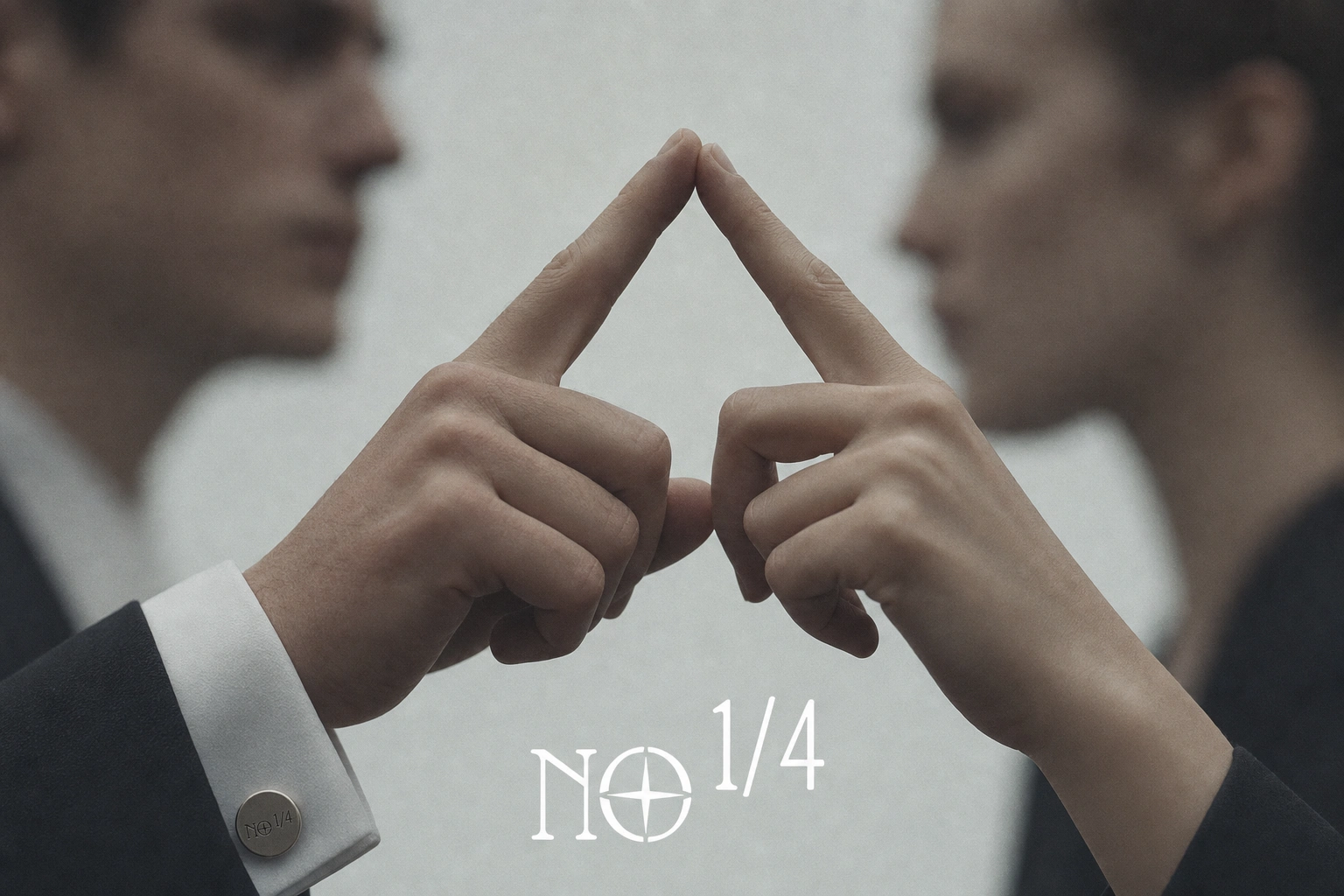
A crypto brand built on the pirate code, but not the pirate costume. I spent two full creative directions figuring out that what actually reads as dangerous isn't the boarding action — it's the stillness right before it.
THE BRIEF
I came into this with a reference deck of Black Sails stills — raked masts, boarding-action chaos, backlit smoke on a chaotic deck. The brief was crypto, high-risk trading, degen-facing. No institutional polish, no fintech blue-and-white. The pitch practically wrote itself: black flags, cutlasses, no mercy.
The tension showed up fast. Pirate branding has a costume problem. Skulls, eye patches, "arrr" — the entire vocabulary is one bad decision away from theme-park kitsch. A trading brand asking people to put real money behind conviction can't lean on a mascot, no matter how good the reference photography looks.
What I took on was bigger than a logo. It was proving "pirate" could carry the weight of a serious financial product without borrowing a single cliché from the genre it was quoting.
THE APPROACH
The first direction — internally called No Quarter — went all-in on boarding-action energy. Black flags, cutlass edges, smoke-filled decks. I built the whole palette around it: Flag Black, Storm Grey, Blade Silver, Blood Red. It worked as mood. It didn't work as restraint.
The problem was motion. Boarding-action photography is inherently loud — bodies mid-swing, smoke drifting, chaos as the organizing principle. But a trading brand's real emotional register isn't chaos. It's the second before the decision — the calm, terrifying stillness of committing capital.
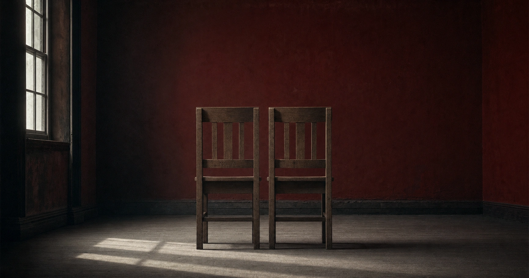
The unlock came from a second reference set entirely outside the pirate genre — mirrored figures, extreme close crops, doubled gesture, stripped oxblood-red interiors. None of it nautical. All of it psychological. I rebuilt the entire campaign system around that stillness instead, keeping the wardrobe — tailored black coats, structured white collars, one deliberately theatrical ruffled-collar outlier — as the only thread back to the original pirate premise. Period-military rather than swashbuckling. Uncanny rather than violent.
The logic running through the final system: piracy isn't a costume, it's a posture. No quarter given, no mercy asked — expressed through composure, not combat. And once that was the rule, the crypto layer stopped needing screens and charts to feel financial. A locked chest, a set of scales, a torn ledger page did more work than any dashboard mockup could.
THE WORK
LOGO
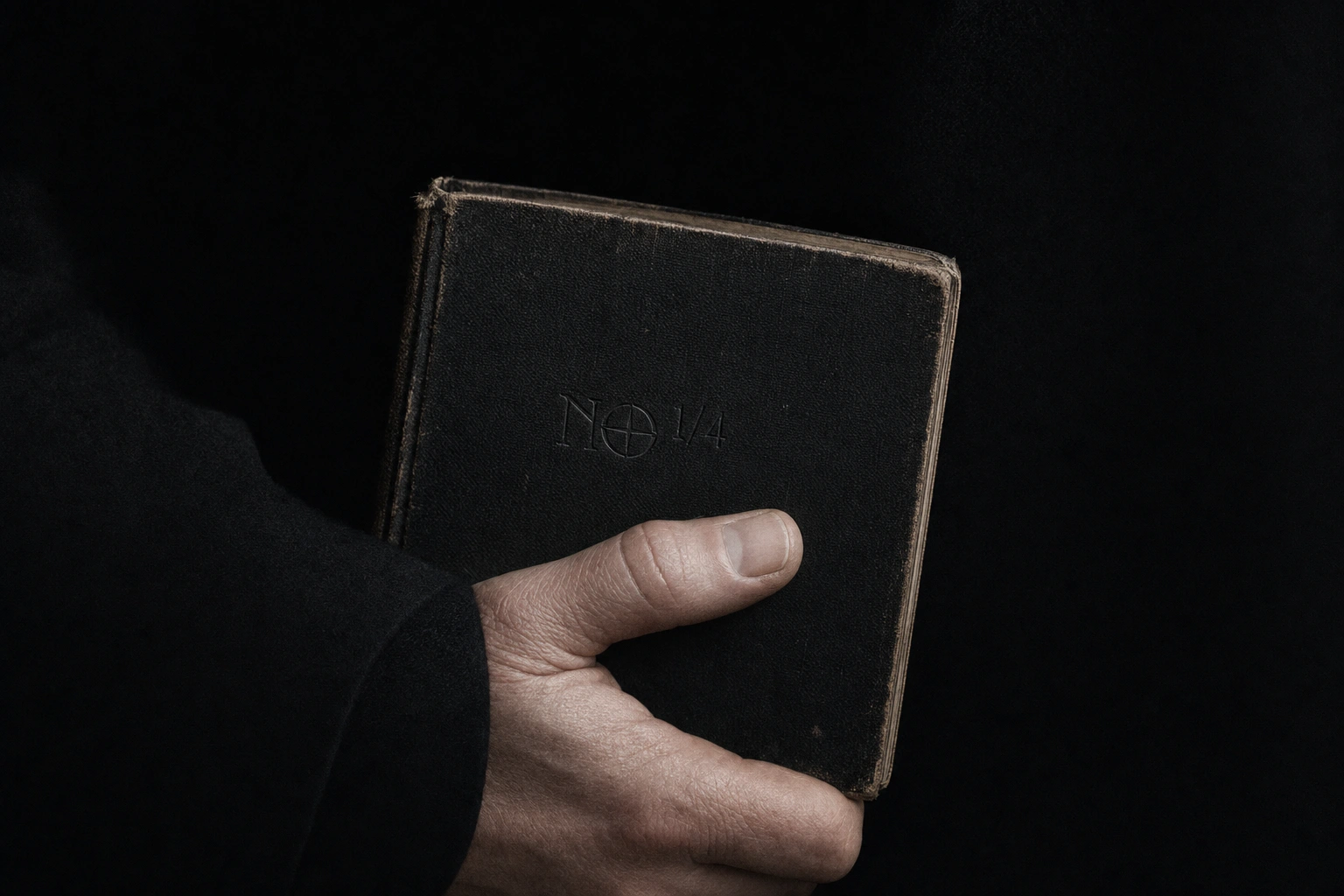
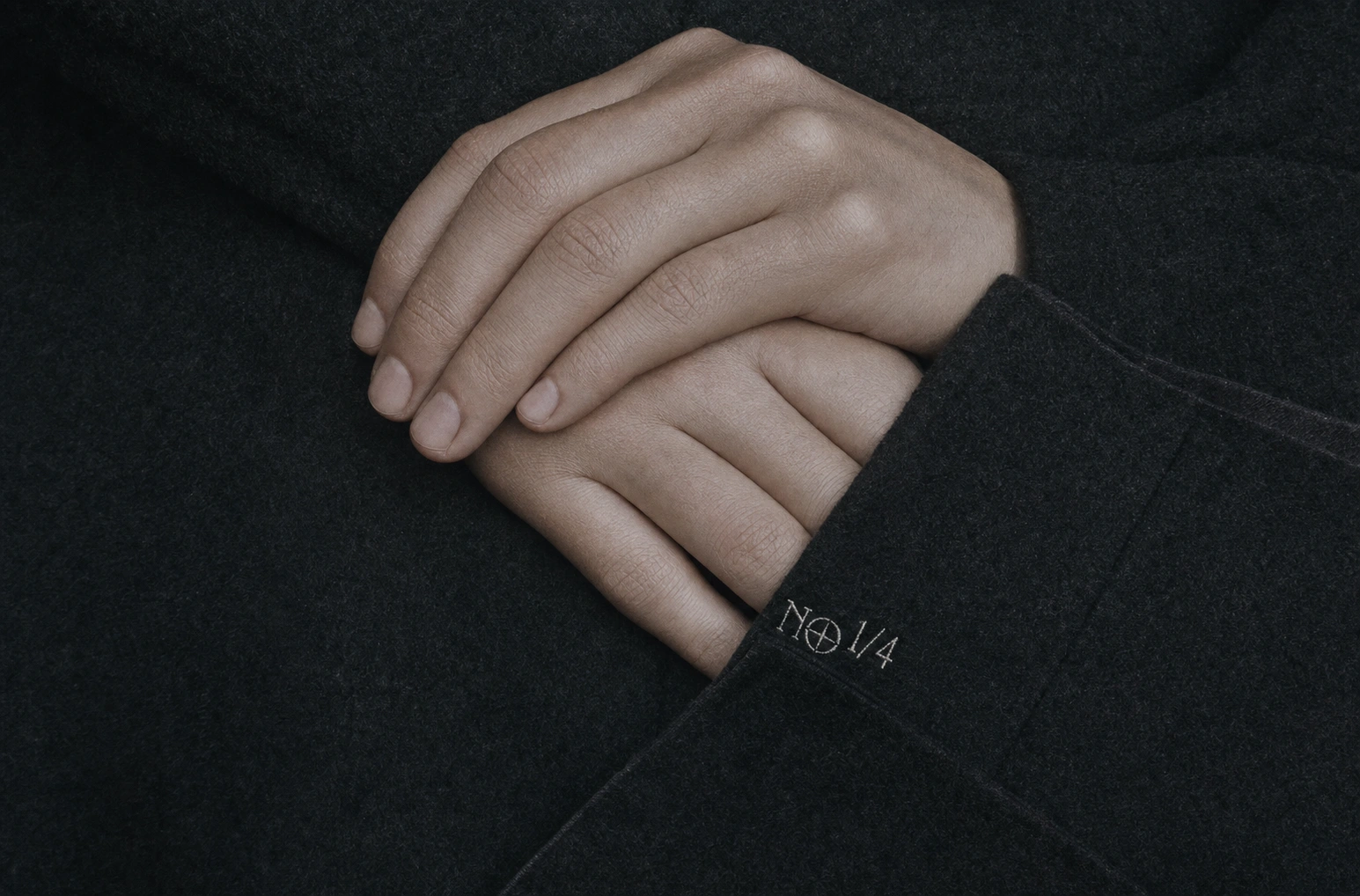
The wordmark reads "NO" with a compass-rose star built into the counter of the O, paired with "1/4" set in a matching condensed grotesque italic — a direct pun on "No Quarter" that also reads as a fraction stamped on a manifest or coin. Reproduced pixel-perfect across all fifteen applications, never redrawn or reinterpreted.
COLOR SYSTEM
Flag Black
#0A0A0A carries every background — the brand is dark-mode-native by design. Storm Grey #4A4E52 handles secondary surfaces and ambient tone. Blade Silver #C7CBD1 is the primary highlight — skin, metal, engraved edges. Blood Red #8B1E1E and Ember Amber #B4712E appear only where the scene would naturally hold that color — a wax seal, a coin's patina, a dying ember — never a flat accent block.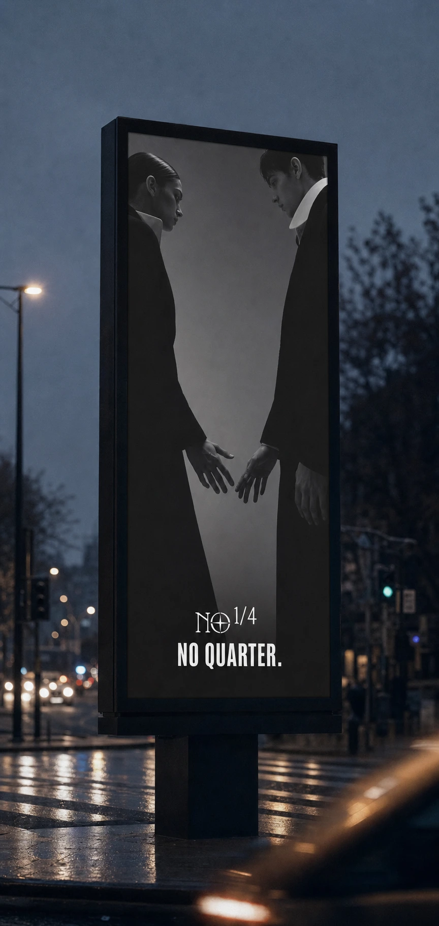
CAMPAIGN PHOTOGRAPHY
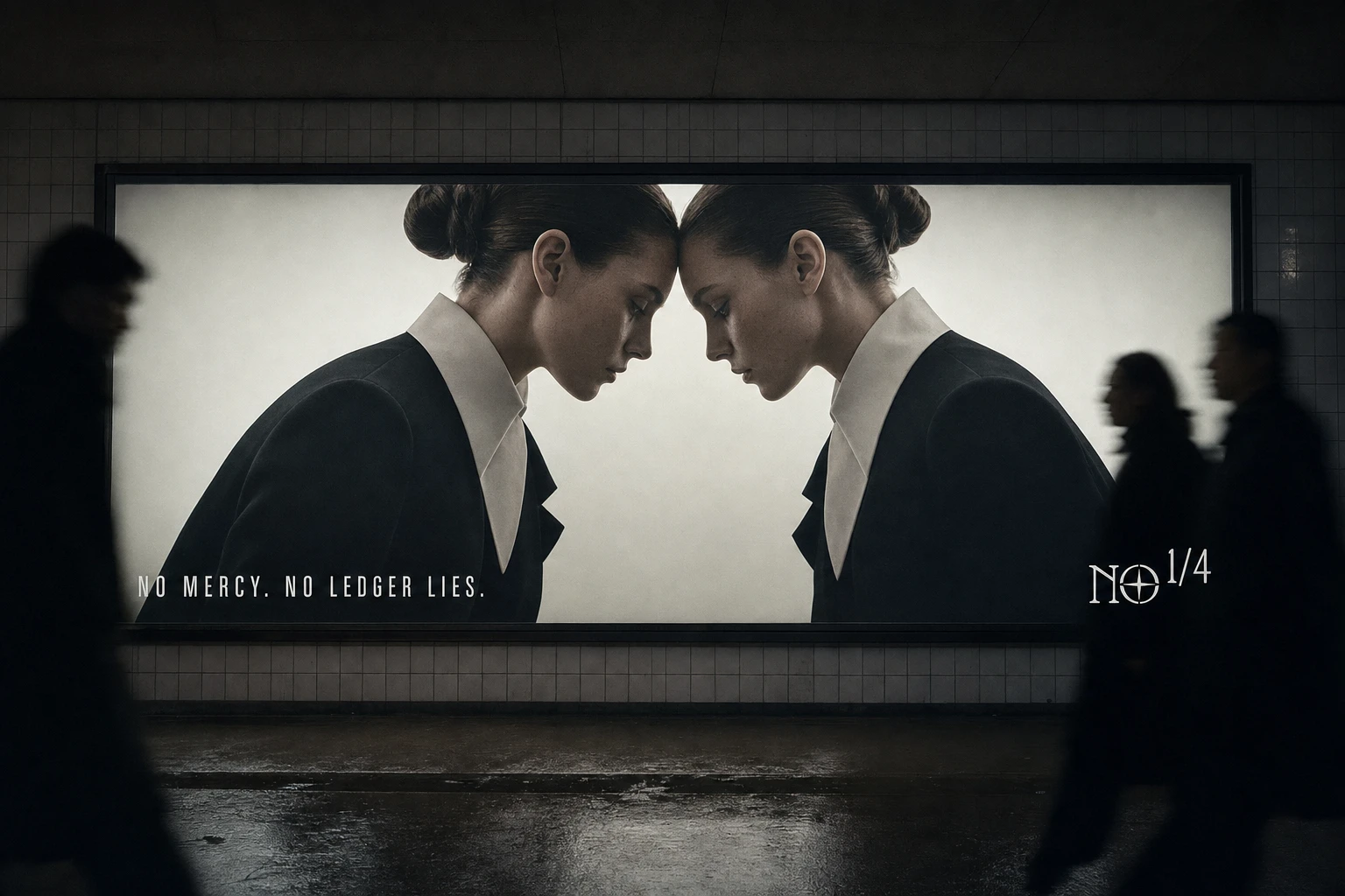
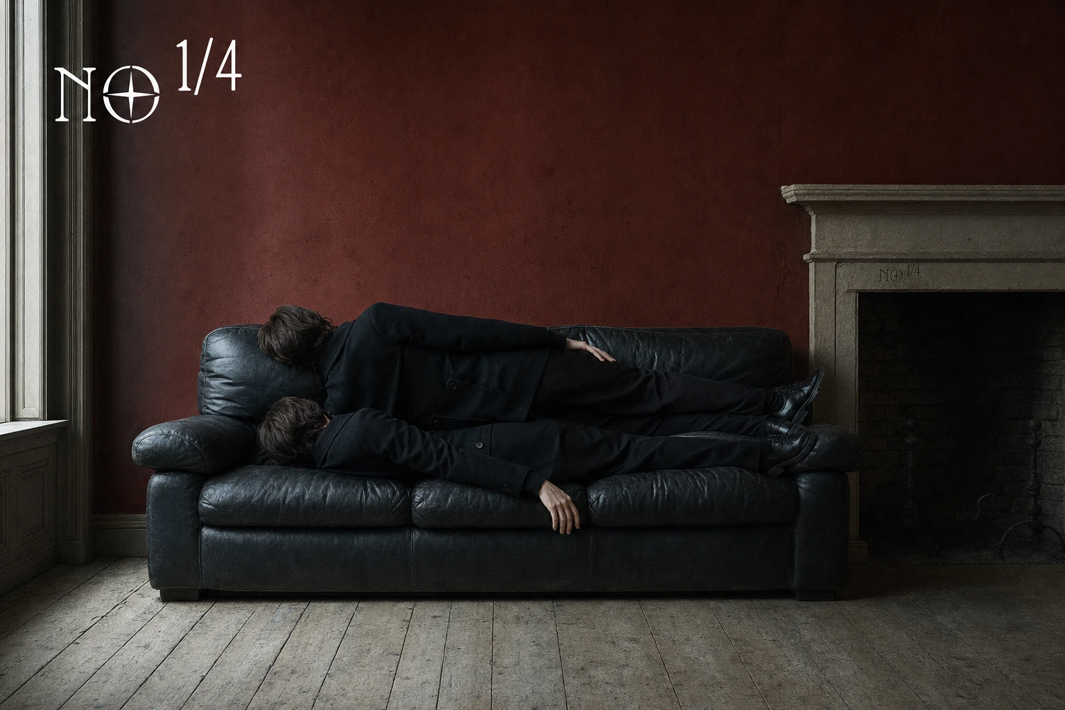
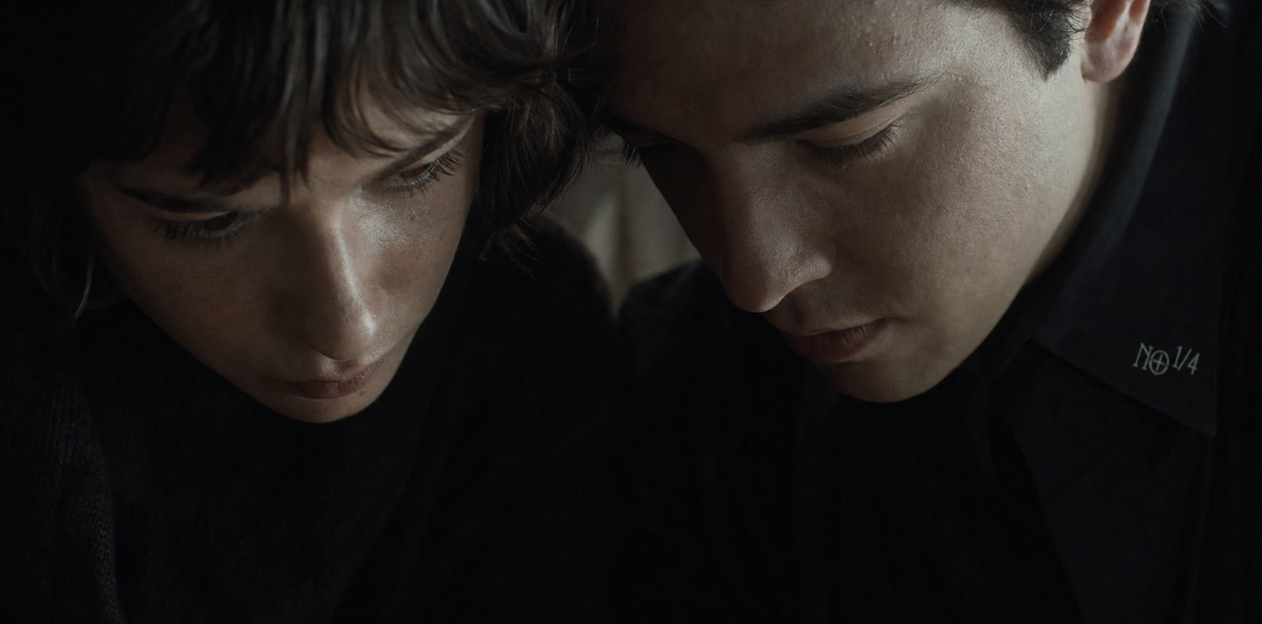
Ten frames make up the full campaign set, shot on a 35mm-grain, art-house register. The narrative half — Mirror, Reflection, Threshold, Reclined, Turned Away, The Pair, Proximity, Study — leans on mirrored pairs and doubled gesture: two profiles meeting nose to nose in ruffled collars, two figures collapsed across a black leather sofa, two hands forming a triangle between blurred faces. The object half — The Ledger, Coin in Hand, Two Hands Two Coins, Poured Coin, Locked Chest, Weighing, Held Ledger, The Split — pulls the crypto layer into the same stillness through tactile, weathered props: a split silver coin on raw wood, a brass scale mid-balance, a padlocked chest. The logo never repeats its placement logic twice across the set — stitched into a collar, engraved on a coin face, pinned to a lapel, carved into a stair rail, embossed on leather — which keeps a rigid five-color system from ever reading as templated.
OOH & DIGITAL
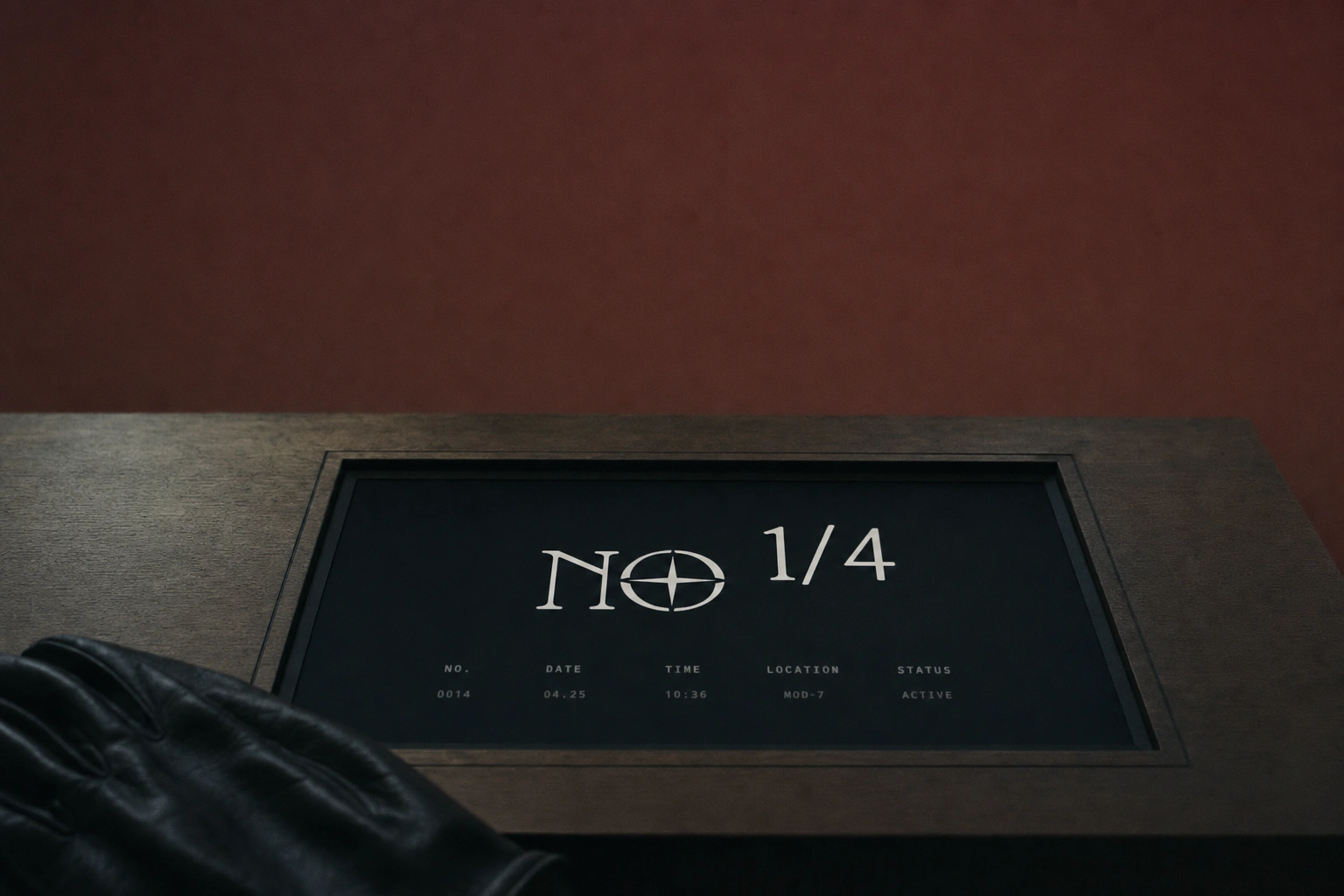
Every out-of-home placement treats the ad surface itself as a photographed object — a backlit transit billboard in a wet underpass, a peeling wall poster on real brick, a roadside LED panel at dusk, a rain-slicked bus shelter panel at night. A single phone mockup carries the brand into product context, the app splash screen using the identical logo lockup and tagline logic. Taglines live inside the creative itself, set in the brand's condensed grotesque: "NO MERCY. NO LEDGER LIES.", "TAKEN, NOT GIVEN.", "NOTHING GIVEN.", "BOARD OR BE BOARDED." Short, declarative, no exclamation points — ship's orders, not marketing copy.
THE RESULT
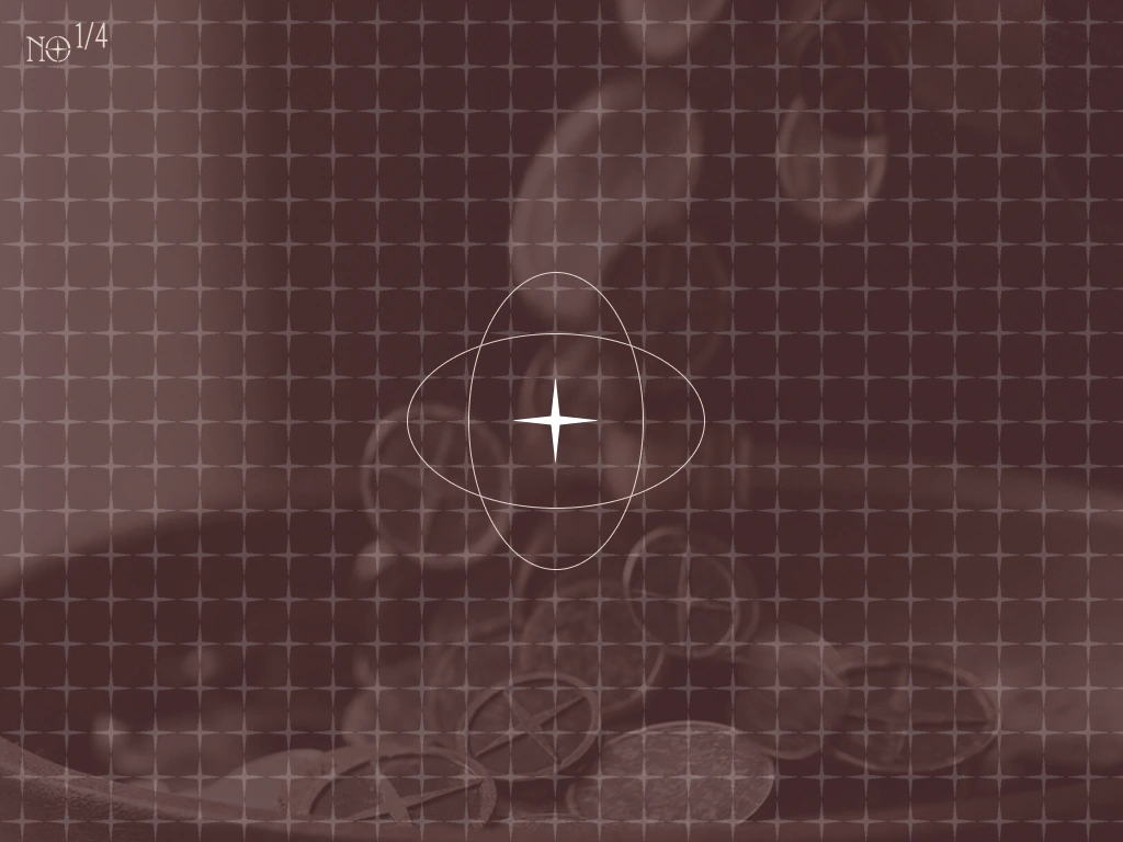
Fifteen pieces shipped across two batches — ten campaign visuals, four OOH placements, one digital mockup — all reproducing the same logo lockup with zero deviation and a five-color system disciplined enough to survive backlit undergrounds, monochrome close crops, and full-color campaign photography without ever breaking into decoration. The pivot from boarding-action chaos to mirrored stillness turned out to be the whole point: a pirate brand that never once needed a sword in frame to feel dangerous.
The system is scoped to extend next into apparel and product photography, following the same still-life logic already proven in the coin and ledger work.
Studio: Révolté — revolte.design
Project: NO 1/4 (No Quarter)
Year: 2026
Scope: Brand Identity, Logo Design, Campaign Photography Direction, OOH, Digital
Industry: Crypto / Trading
Like this project
Posted Aug 3, 2026
A crypto brand that traded pirate cosplay for pirate composure — fifteen pieces, one gesture, zero swords in frame
Likes
0
Views
25
Timeline
Jul 25, 2026 - Aug 3, 2026

