Built with Lovart
XEROX RIOT - A Punk-Inspired Brand Identity System

Révolté


XEROX RIOT — A Brand Built to Look Like It Survived Something
LOGLINE
I wanted a brand that looked like it had been photocopied, torn, taped back together, and stapled to a wall a hundred times before anyone ever saw it. XEROX RIOT is what happens when a ransom note becomes a visual identity system.
THE BRIEF
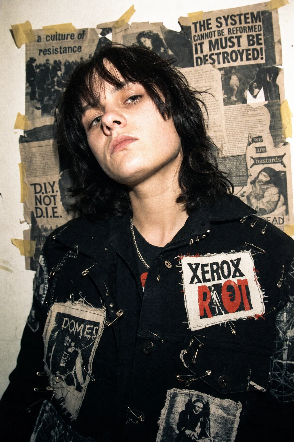
I didn't have a client for this one. I had an itch: every "punk" brand I'd seen treated the aesthetic as a mood board — safety pins here, a distressed font there — without ever committing to the mechanics of how that look actually gets made. Photocopiers degrade. Tape yellows. Paper tears unevenly. I wanted a system that respected the physical process behind the aesthetic, not just its surface texture.
The tension I set for myself was structural, not stylistic: how do you build a coherent, scalable identity system out of something that's supposed to look assembled by hand, in a hurry, without a ruler? Most "DIY" brands collapse the moment you put them on a landing page, because the chaos was never systemized — it was just messy. I wanted mine to hold up on a billboard and on a business card without looking like two different brands.
THE APPROACH
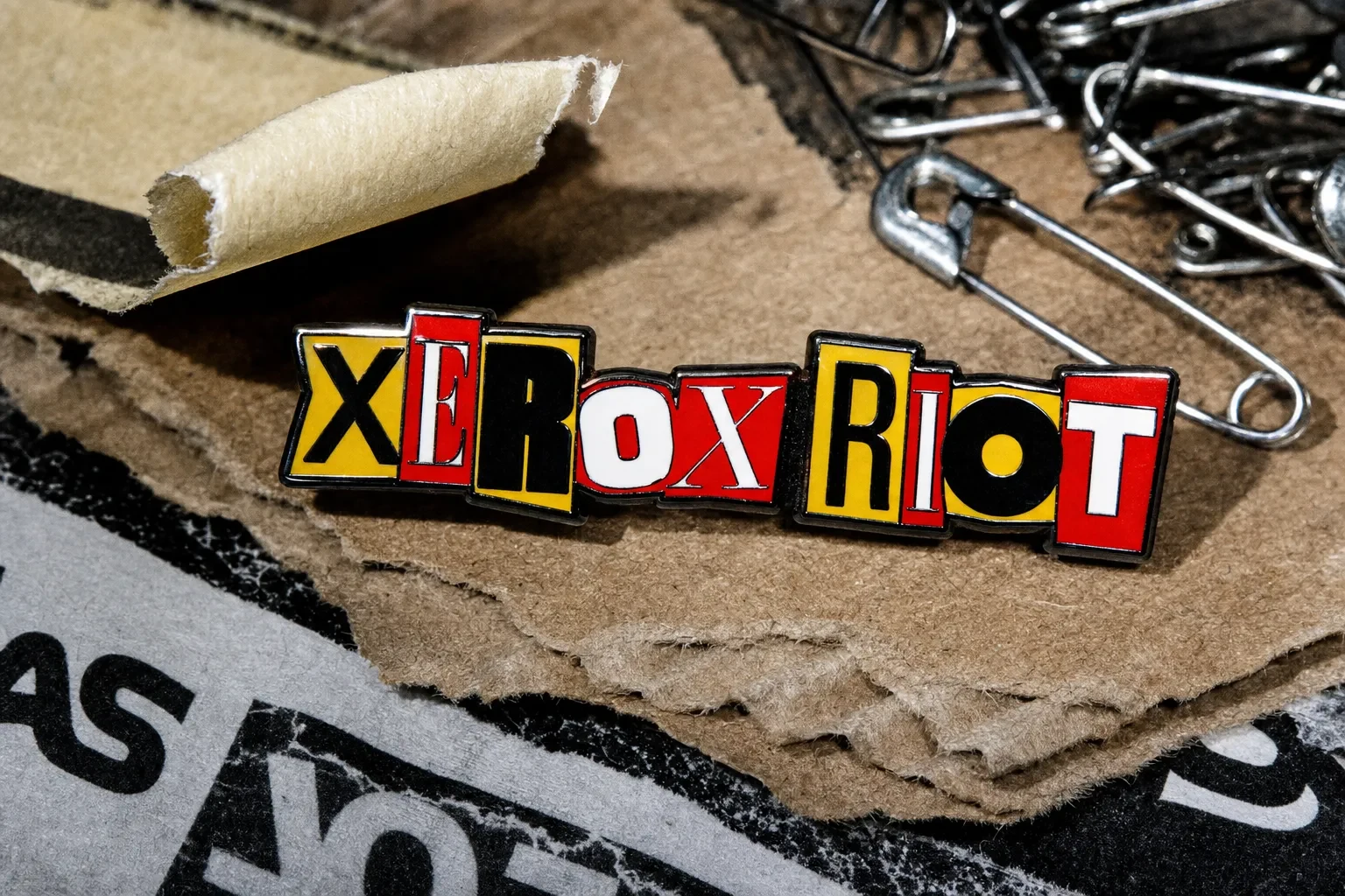
My first instinct was to build one "hero" ransom-note wordmark and use it everywhere, unchanged. That failed fast — a mark built from eight mismatched typefaces reads as a logo at business-card scale, but it turns to noise at billboard scale, where the individual letter mismatches stop feeling intentional and start feeling like a rendering error.
The unlock was treating the ransom-note construction as a rule, not a fixed asset. Every letter in the wordmark comes from a different typeface, sized between 80-130% of the average, rotated -4° to 6°, with tracking that never quite lines up — but the rule for how much variance is allowed stays constant across every application. That's the geometric logic underneath the chaos: bounded randomness. The system looks lawless because no two letters match, but it's actually one of the most rule-bound identities I've built, because that boundedness is what keeps twenty different mockups feeling like one brand.
Color did the same job typography did. I limited the palette to four colors — black, red, yellow, grey — and never let a fifth color enter the system, even in photography. That constraint is what stops the "torn paper and masking tape" motif from sliding into generic grunge. Every surface, every prop, every lighting choice in the campaign photography answers to those four colors and nothing else.
THE WORK
LOGO
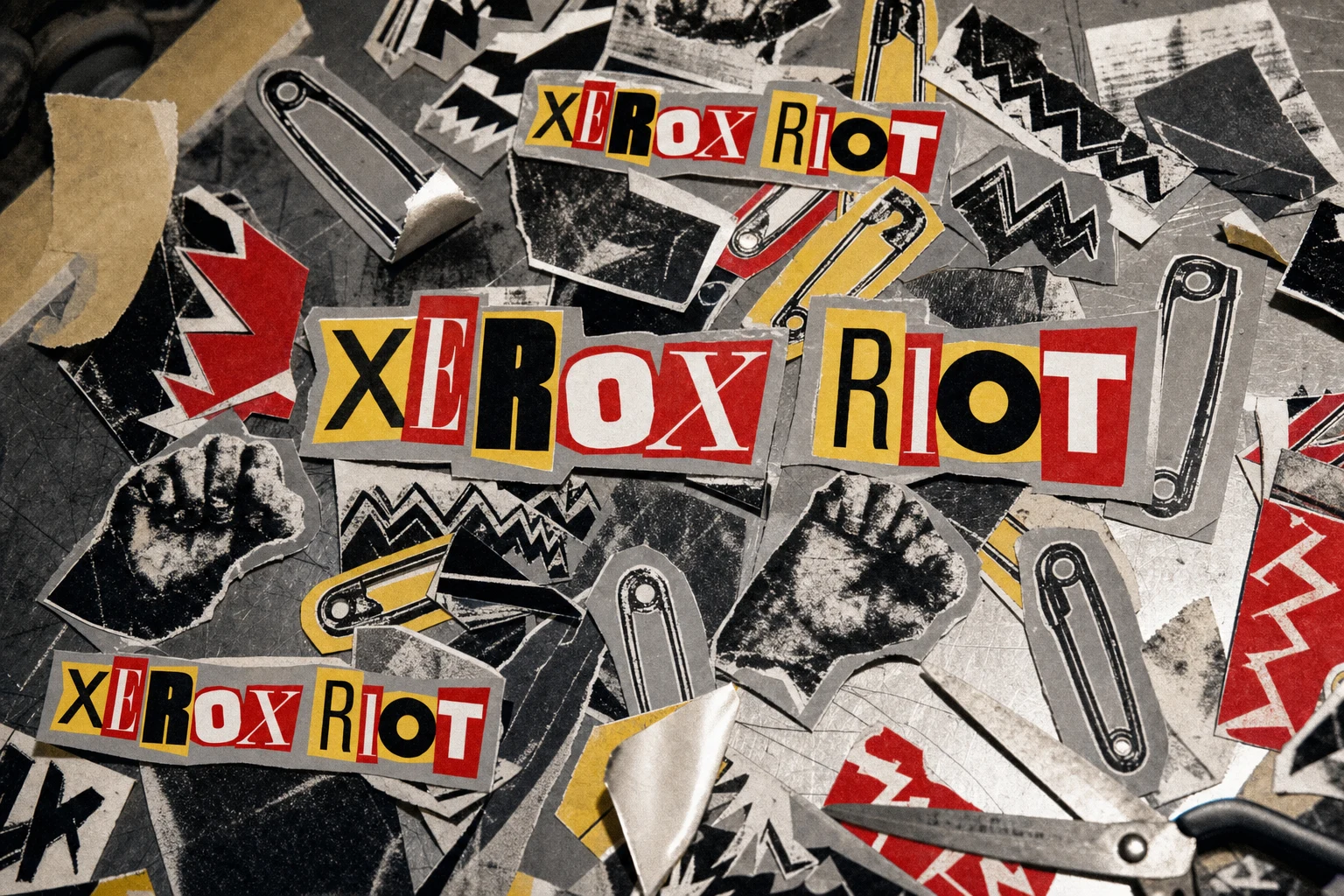
A wordmark built from ransom-note construction: each letter pulled from a different typeface, scaled 80-130% against the average letter height, rotated between -4° and 6° per letter, tracking deliberately uneven. Colors cycle through Ink Black
#111111, Riot Red #E10600, and Tape Yellow #F2C230 on cut-paper-style tabs, over a Xerox Grey #8C8C8C ground. The rule stays fixed even as the mark scales from a 20mm enamel pin to a two-story billboard.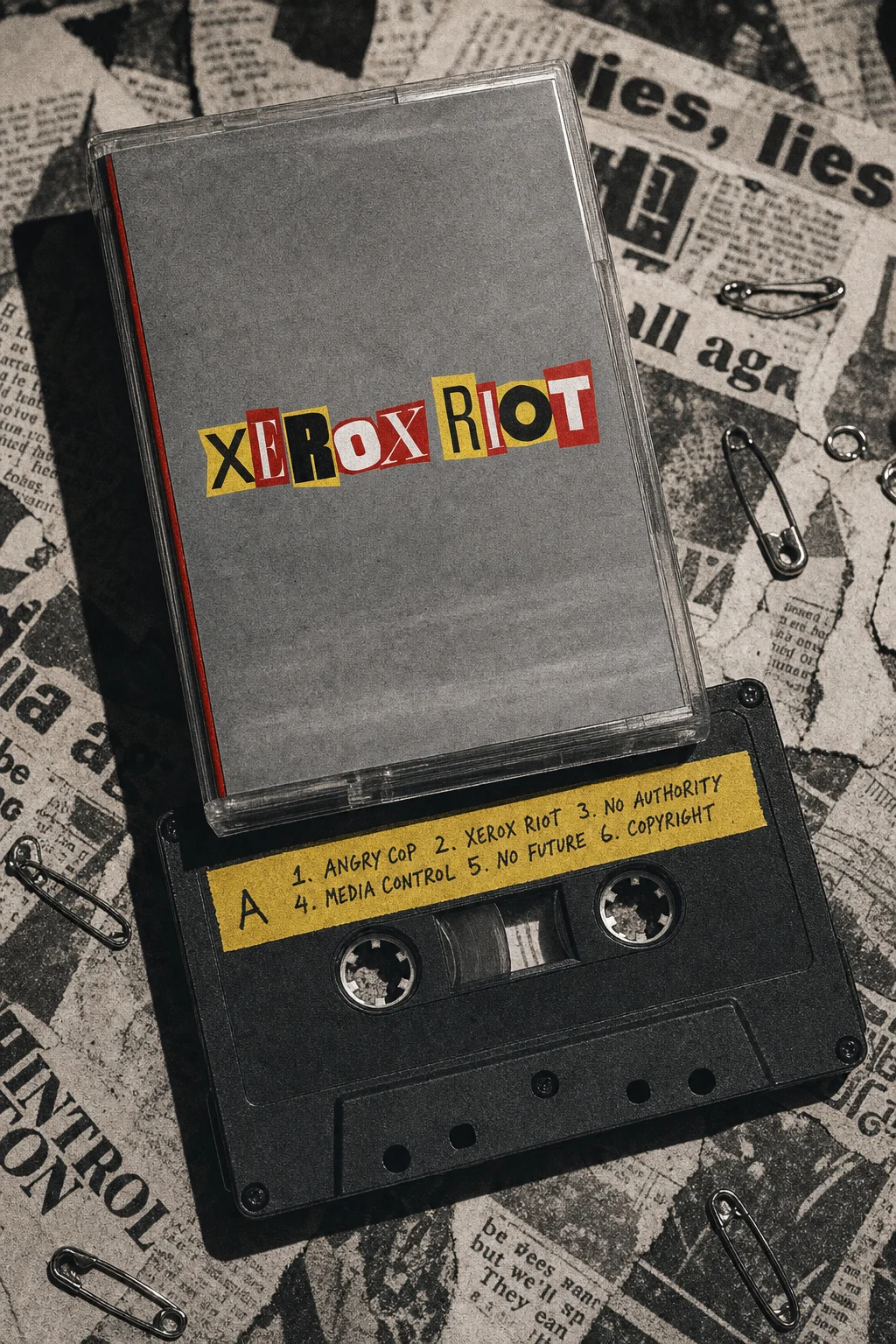
TYPOGRAPHY SYSTEM
Headlines run in the ransom-note mixed-lettering system described above. Supporting copy drops into a plain monospace/typewriter face — the one moment of restraint in the whole system, which is what keeps the ransom-note headline legible instead of exhausting.
COLOR SYSTEM
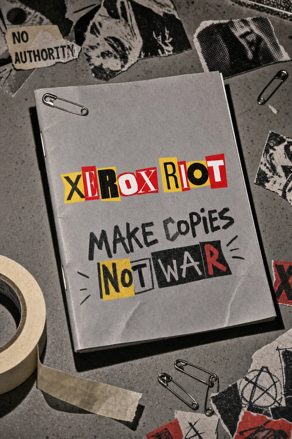
A hard four-color palette: Ink Black
#111111, Riot Red #E10600, Tape Yellow #F2C230, Xerox Grey #8C8C8C. No fifth color is permitted anywhere in the system — packaging, photography, or digital.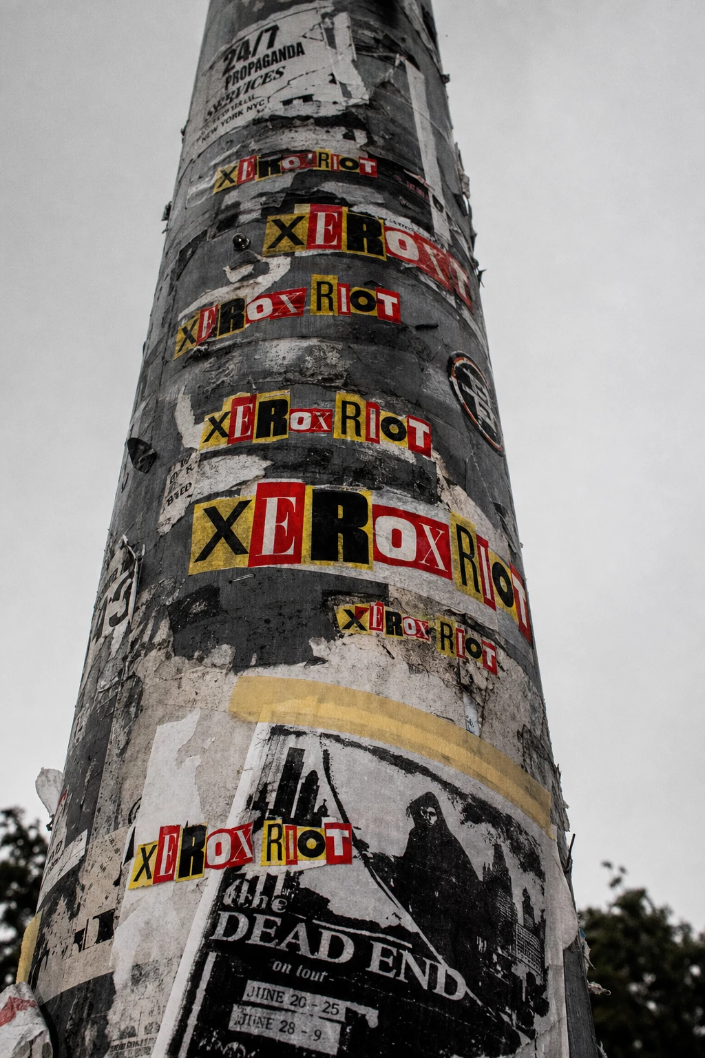
CAMPAIGN PHOTOGRAPHY
Shot to read like a cheap point-and-shoot flash photo, not a studio campaign: harsh single-source lighting, blown-out edges, heavy grain, crushed blacks. Solo portraits, a group shot, and a mid-motion action shot all follow the same lighting logic so the campaign holds together across very different compositions.
PRINT / COLLATERAL
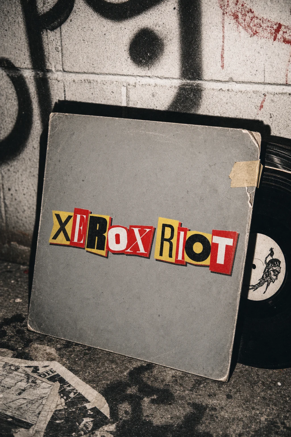
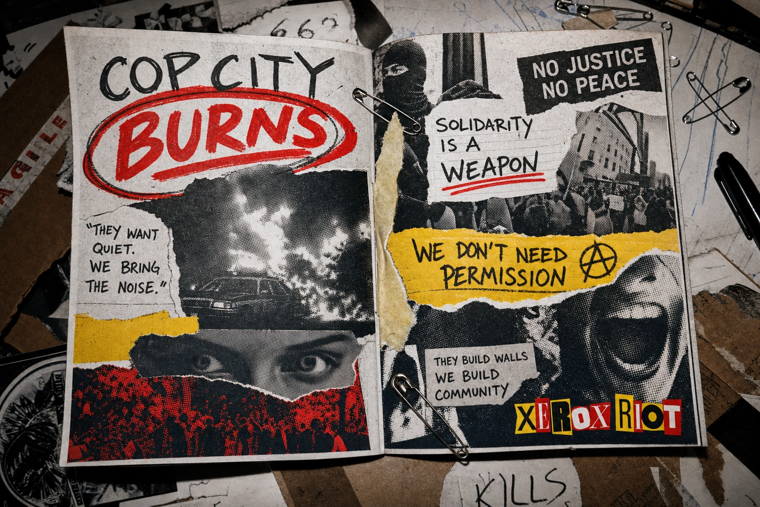
Business cards, zine cover and interior spread, vinyl sleeve, and cassette J-card all carry the ransom-note wordmark at different scales, with toner-banding, misprint ghosting, and masking-tape repairs used as a shared "damage vocabulary" across formats.
MERCH / OBJECTS
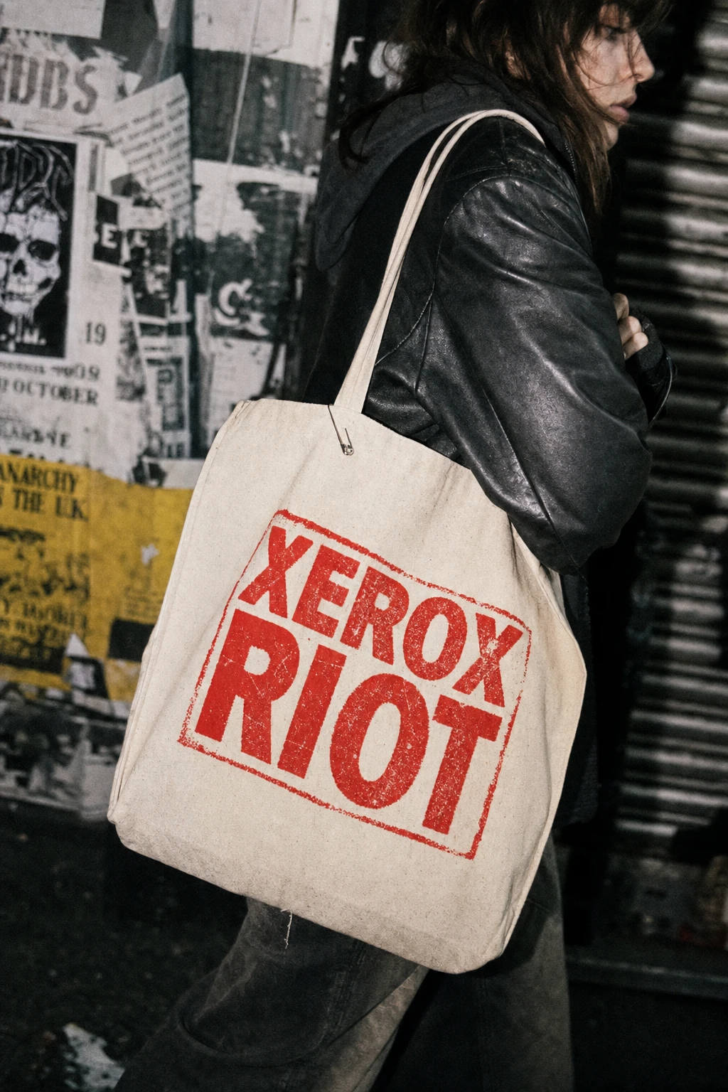
Enamel pin, screen-printed tee, skate deck, and canvas tote all treat the logo as a fixed, non-negotiable asset — reproduced exactly, never redrawn — while the surrounding photography (cardboard, garage doors, street scenes) carries the system's texture.
OOH / ENVIRONMENTAL
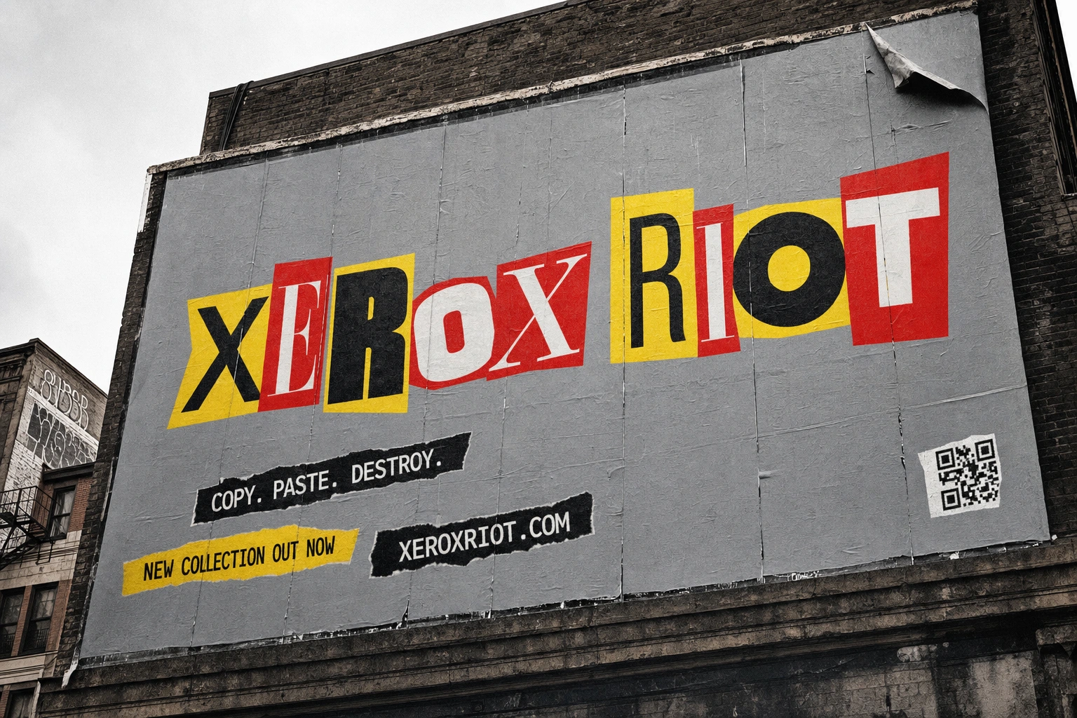
Wheatpaste poster, sticker-bombed lamppost, storefront window signage, and a full billboard takeover push the system into public space, each one showing a different stage of wear — freshly pasted, weeks-old and peeling — to suggest the brand has an actual life on the street, not just in a deck.
DIGITAL
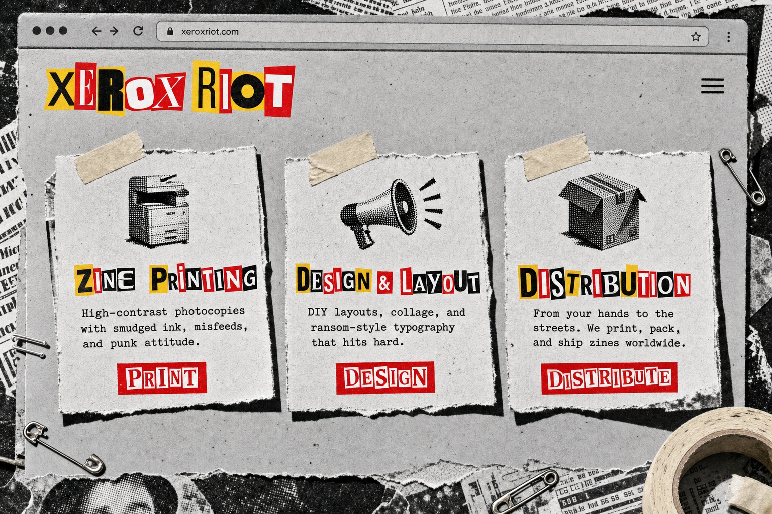
A landing page with a three-card feature row, styled as torn paper "pinned" with masking tape rather than clean digital cards, and a motion/glitch video still with VHS scan-line banding, proving the system survives the jump from paper to screen without losing its logic.
THE RESULT
Twenty assets in, the system still reads as one brand whether it's a 2-inch enamel pin or a building-sized billboard — which was the actual test I was running. The "bounded chaos" rule is the reason it holds: nothing in XEROX RIOT is random, even though everything in it looks like it is. As a portfolio piece, it's doing exactly what I wanted — proving that a maximalist, DIY-coded identity can be just as systemized as a minimalist one, if you're honest about the rules underneath the mess.
Révolté — revolte.design
Project: XEROX RIOT
Year: 2026
Scope: Brand Identity, Logo Design, Typography System, Campaign Photography, Print Collateral, Merchandise Design, OOH/Environmental, Digital Design
Industry: Speculative / Self-Initiated — Punk & Streetwear Identity Systems
See more at revolte.design
Like this project
Posted Jul 25, 2026
A photocopied punk identity where every torn edge and mismatched letter follows one rule — chaos with a system underneath it
Likes
3
Views
30
Timeline
Jul 15, 2026 - Jul 25, 2026

